Tag: headlines

Aranjuez Font
Aranjuez is the latest Koziupa and Paul adventure. This time, they max out on calligraphic art deco, then add a healthy dose of the thick-and-thin mantra that’s been so trendy for quite a few years now. The result is neo-psychedelia
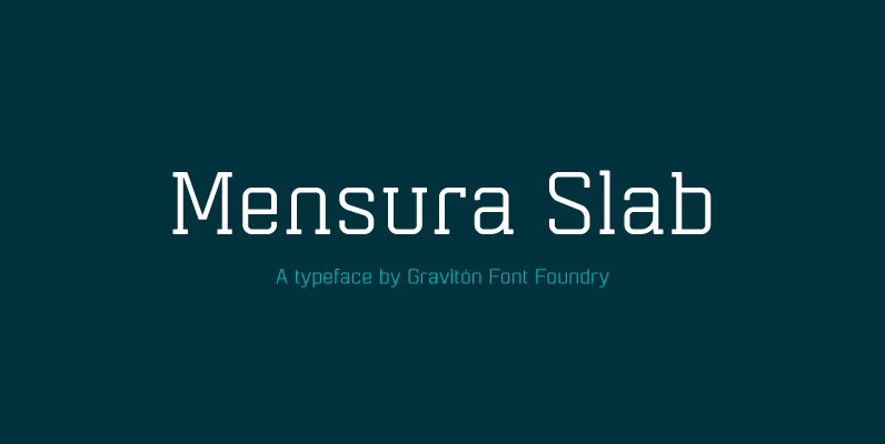
Mensura Slab Font
Mensura Slab font family has been designed for Graviton Font Foundry by Pablo Balcells in 2013. It is a modular, geometric typeface with subtle rounded angles that provides a soft, pleasant appearance. It has been conceived to be primarily a
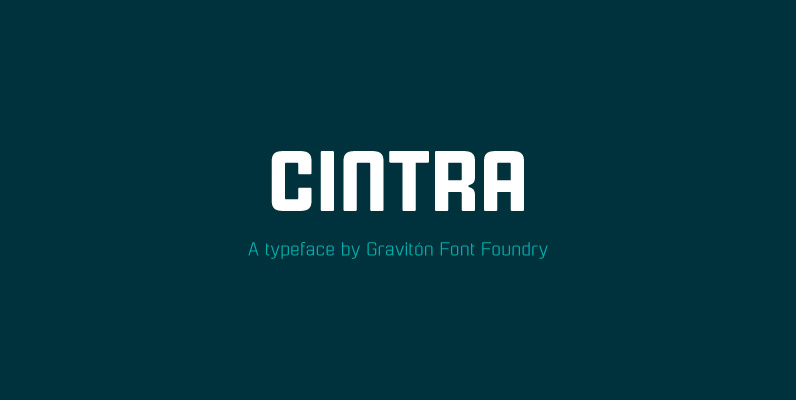
Cintra Font
Cintra font family has been designed for Graviton Font Foundry by Pablo Balcells in 2014. It is a sans serif, bold, geometric typeface with subtle rounded angles, which provides a soft, pleasent appearence. Cintra consists of 4 styles. Published by
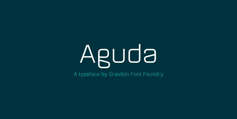
Aguda Font
Aguda font family has been designed for Graviton Font Foundry by Pablo Balcells in 2014. It is a modular, geometric typeface which has been conceived to be primarily a display typeface, but given its clarity it can also be used

Herradura Font
Herradura font family was designed for Graviton Font Foundry by Pablo Balcells in 2013. It is a wood-type slab serif typeface with a slightly techno angular look. Herradura consists of 8 styles including 4 shadowed styles, each containing framed characters
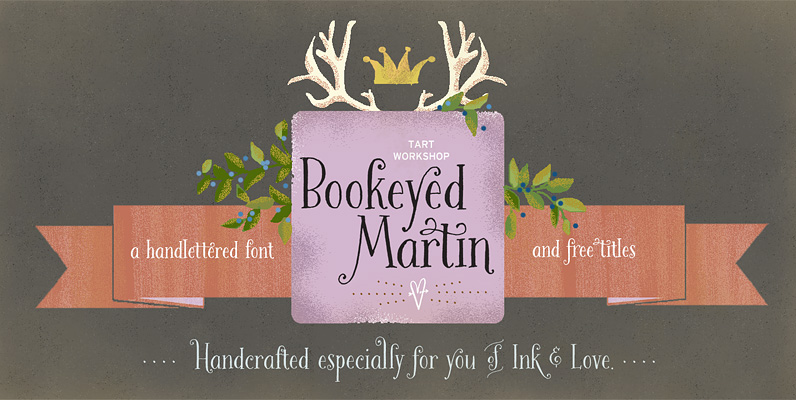
Bookeyed Martin Font
Huzzah for Bookeyed Martin, the much anticipated addition to the popular Bookeyed family. Upright & Strong he attracts eyes to his flashy serifs and ball terminals. His handsome lines, created with an old-fashioned dip pen & sepia ink, reference vintage
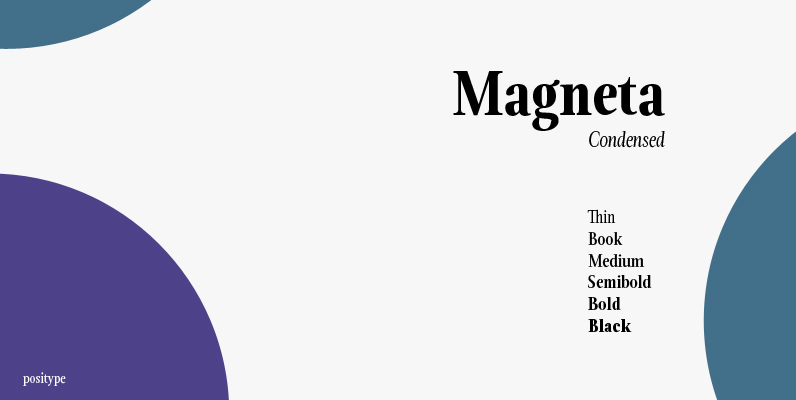
Magneta Condensed Font
To describe what inspired Magneta would be to add a little Dwiggins, throw in some Benton with a hint of Austin, wrap it up in a crisp, contemporary package and serve. The skeleton of the family is a Garalde (like
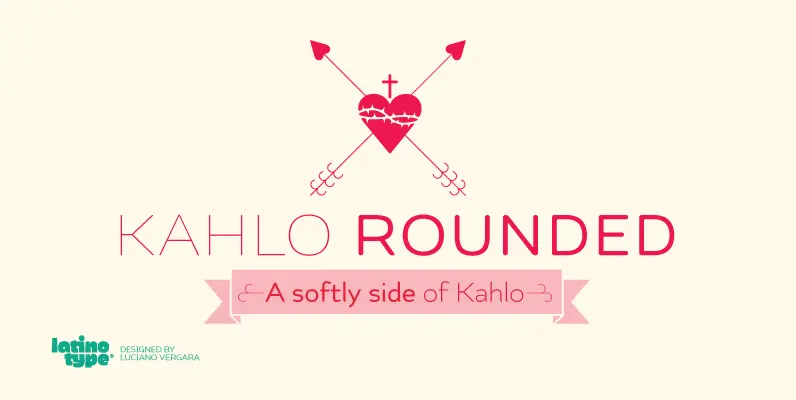
Kahlo Rounded Font
Kahlo rounded is a new version that plays hipster style with a Latin flavor. This time inspired by the strong influence of Mexican decorative we can see on the set of ornaments and patterns. Is a font with four weights
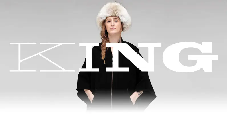
King Tut Font
King Tut is a restoration and expansion of the original Egyptian Expanded, a single bold face cut in 1850 by Miller & Richard, the famous Edinburgh founders. This aesthetic, though originally issued to help drive simple print advertising of those
Magneta Font
To describe what inspired Magneta would be to add a little Dwiggins, throw in some Benton with a hint of Austin, wrap it up in a crisp, contemporary package and serve. The skeleton of the family is a Garalde (like