Tag: headlines

Folty Font
Folty is a geometric sans serif design that was inspired by modern graphic design and contemporary typefaces. The family contains 6 weights from thin to bold, which works best for advertising, packaging, editorial, logo, branding and numerous other purposes. Published
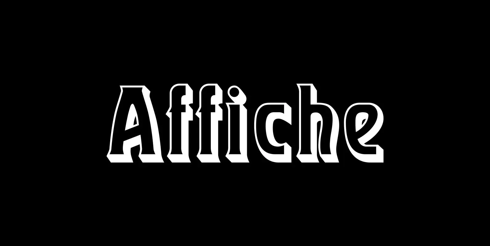
Affiche Font
Based on the fin-de-siècle Helios Reklameschrift of the Klinkhardt foundry, Leipzig, Affiche preserves the beautiful art nouveau character of its hot-metal forerunner and was carefully extended to make it multilingual. For more historical authenticity, you can use the long s
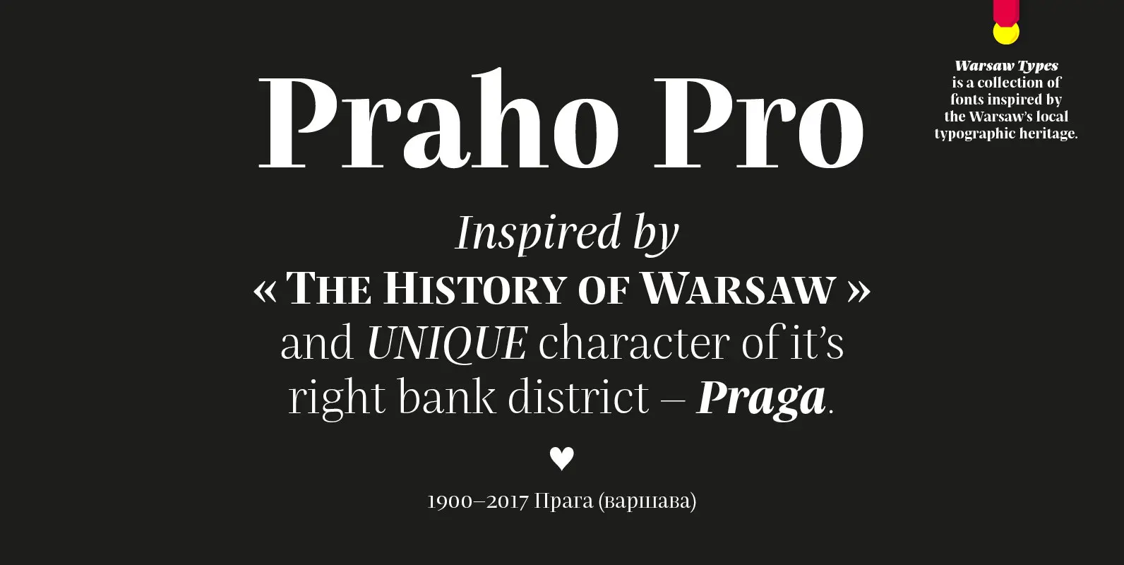
Praho Pro Font
Praho Pro is a part of Warsaw Types – a project based on Warsaw’s local typographic heritage. The project, presented at the Museum of Praga, is a collaboration of 12 young Polish typographers. Praho Pro is a multilingual family inspired
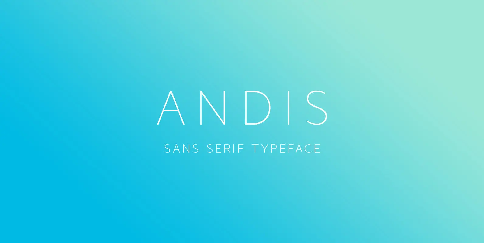
Andis Font
Andis’ rough cut makes it an interesting display typeface, but thanks to its generous x-height and firm serifs, Andis works equally well in text sizes. The typeface’s idiosyncratic italic builds a strong contrast with the roman. Andis is both functional
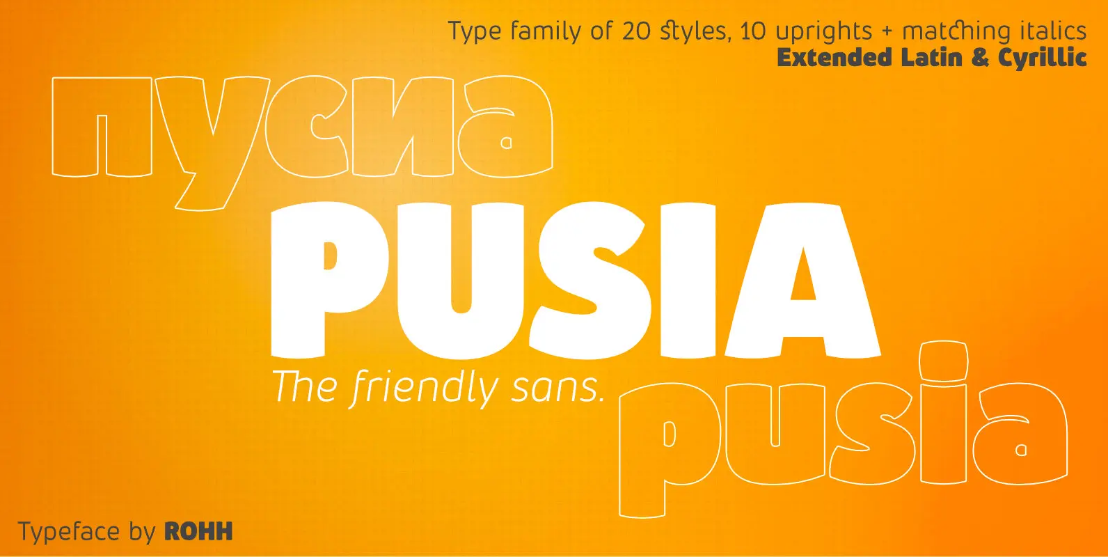
Pusia Font
Pusia is a versatile font family with a lot of character and warmth. It is a professional, contemporary sans serif with original letter forms, friendly and dynamic feel. Its subtle curved shapes and attention to details give Pusia a very
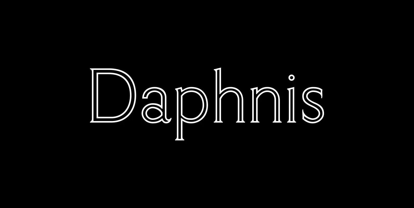
Daphnis Font
Walter Tiemann’s elegant display font brought to life again and carefully extended with Baltic, Turkish and Central European character sets. Published by RMU TypedesignDownload Daphnis
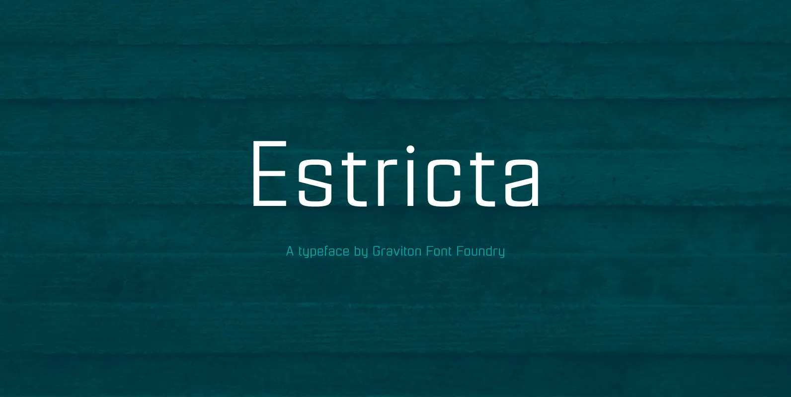
Estricta Font
Estricta font family has been designed for Graviton Font Foundry by Pablo Balcells in 2017. It is a sans serif typeface with a geometrical and mechanical appearance, its sharp, angular edges provide a strong and solid design. It has been
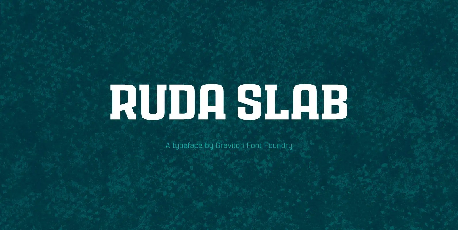
Ruda Slab Font
Rauda Slab font family has been designed for Graviton Font Foundry by Pablo Balcells in 2017. It is a display, slab serif, geometric typeface, with sharp angles that provides a strong and solid appearence. Rauda Slab consists of 8 styles.
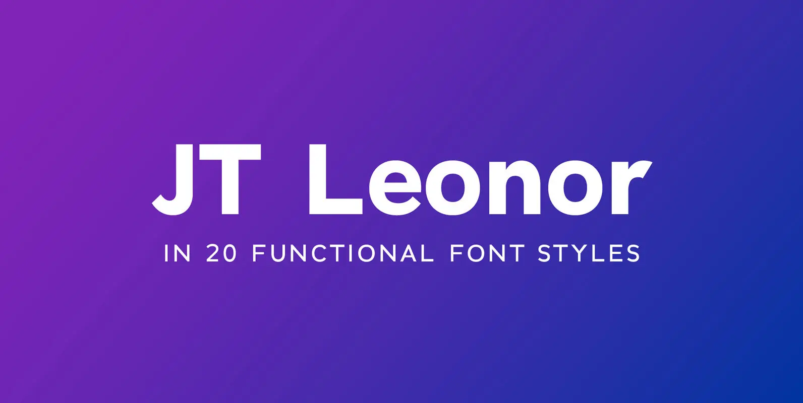
JT Leonor Font
JT Leonor is inspired by the world renowned Gotham typeface but with a more square feel in its light weights and a rounder bold range, this typeface is perfectly suited to both large chunks of body copy as well as

JT Alvito Font
The JT Alvito family includes 5 weights with matching italics. It is ideally used as a display typeface but can also be used in body copy. You will find that it works particularly well in advertising, packaging, logo design and
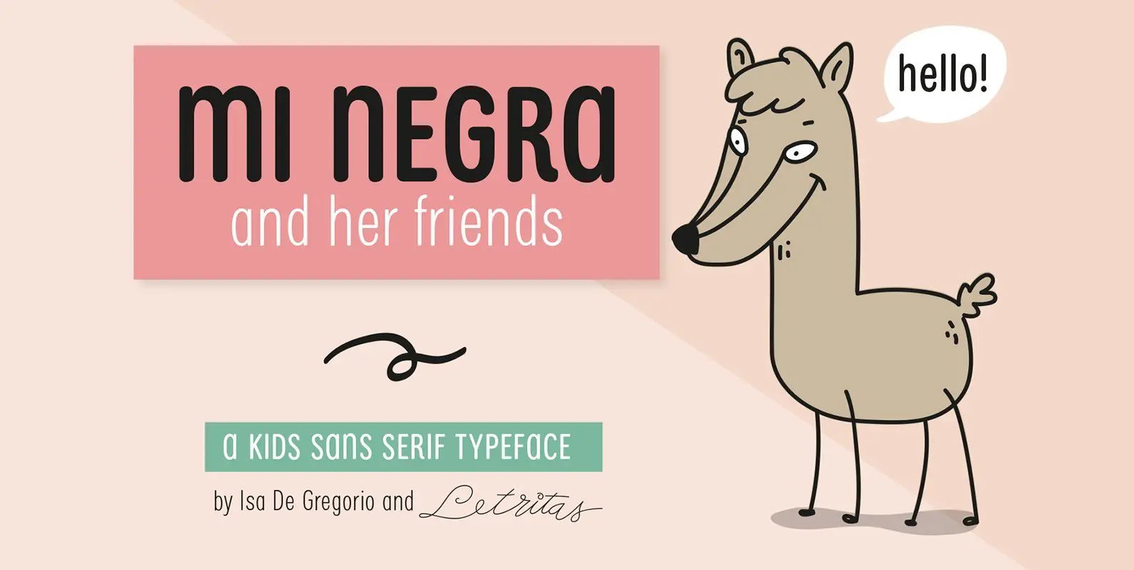
Mi Negra Font
Mi Negra is a funny and hilarious typography designed especially for children, thought and created by Isabel de Gregorio. It could be described as an original combination between a semi-handwright and semi sans-serif font. Thanks to its structure and nice
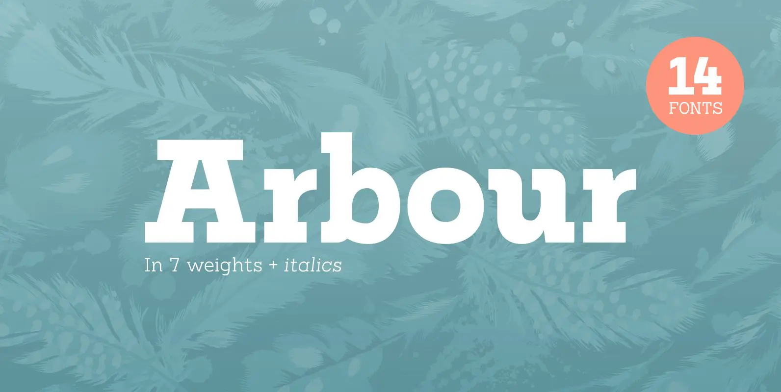
Arbour Font
With its solid slab form, mixed with subtle curved terminals, Arbour is a unique font with the versatility to work in many different scenarios, from branding to digital applications. It comes in 7 weights, from a delicate extra-light to a
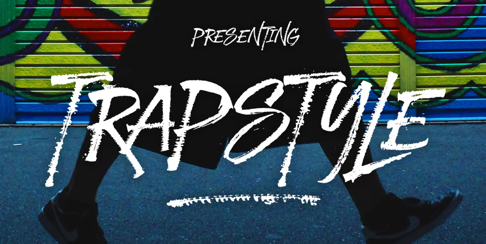
Trapstyle Font
Trapstyle is a distressed style script font, designed and published by Dhan Studio. Published by Dhan StudioDownload Trapstyle

Trenda Font
Designed by Daniel Hernández and Paula Nazal. Corrections and review by Alfonso García and Rodrigo Fuenzalida. Trenda is a geometric sans-serif typeface based on the uppercase of Trend—a Latinotype font, released in 2013, that was very well received. This new
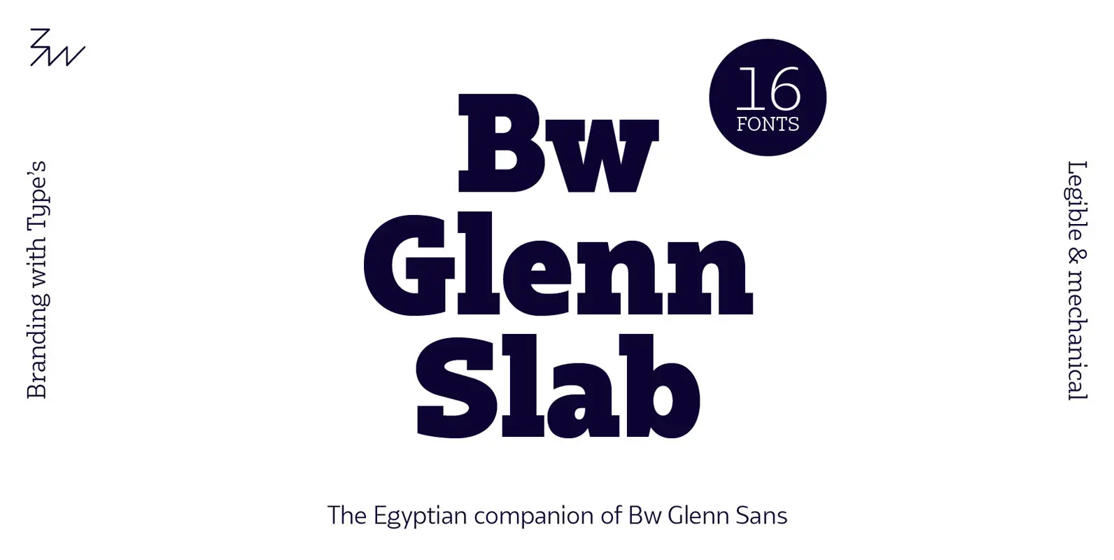
Bw Glenn Slab Font
Bw Glenn Slab is a confident and robust font family with a sturdy feel offering no concessions for ambiguity. Its strict geometry and open shapes provide a very legible and clean texture, performing well on print and screens alike. It’s
