Tag: helvetica
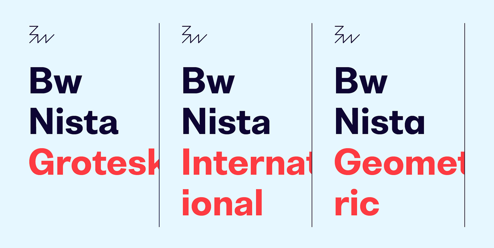
Bw Nista Font
Bw Nista is a clean modernist sans serif font family. Designed to provide a neutral tone of voice, it comes in three different sets each with subtle features portraying different personalities. Bw Nista Grotesk's clean shapes are peppered with subdued
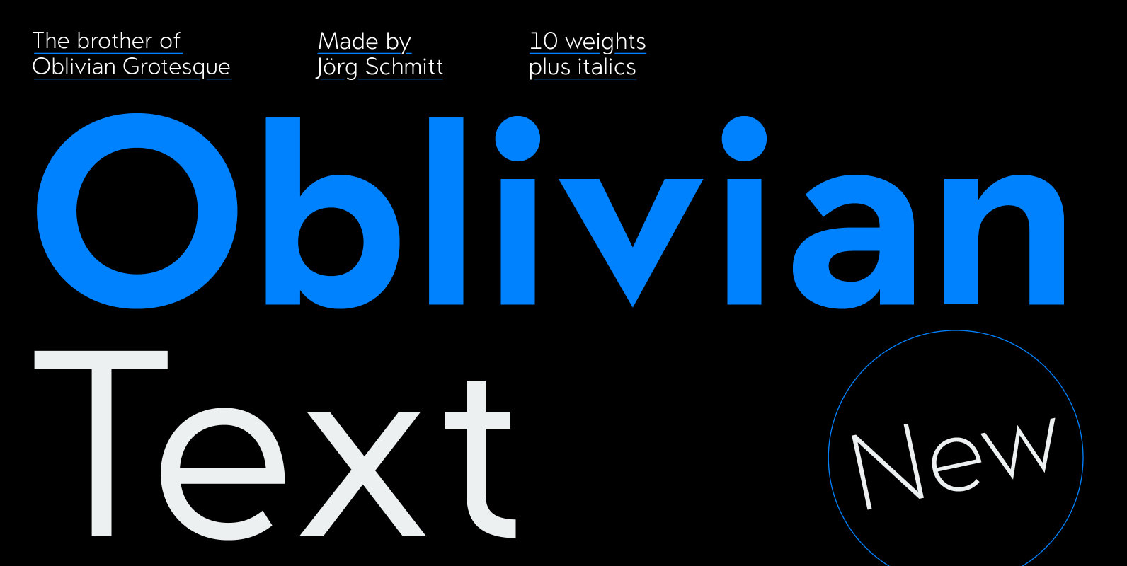
Oblivian Text Font
Oblivian Text is a sans serif type family of ten weights plus italics. The typeface is based on geometric forms with bits and pieces of modern humanistic grotesque fonts. It comes along with various OpenType features such as table, old
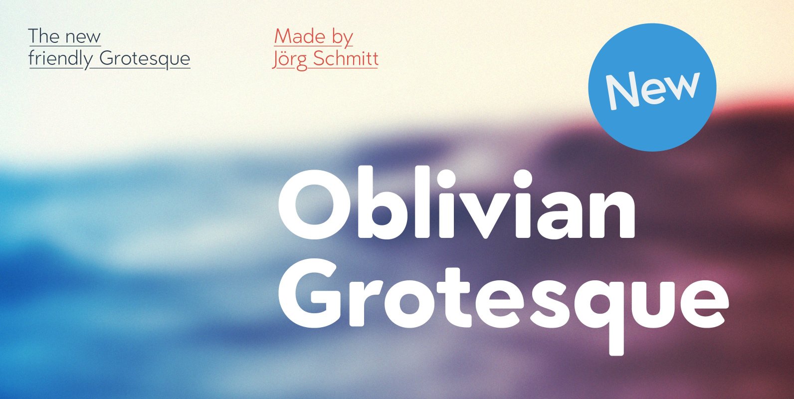
Oblivian Grotesque Font
Oblivian Grotesque is a sans serif type family of ten weights. The typeface is based on geometric forms with bits and pieces of modern humanistic grotesque fonts. Due the the rounded edges it has a very soft / warm look
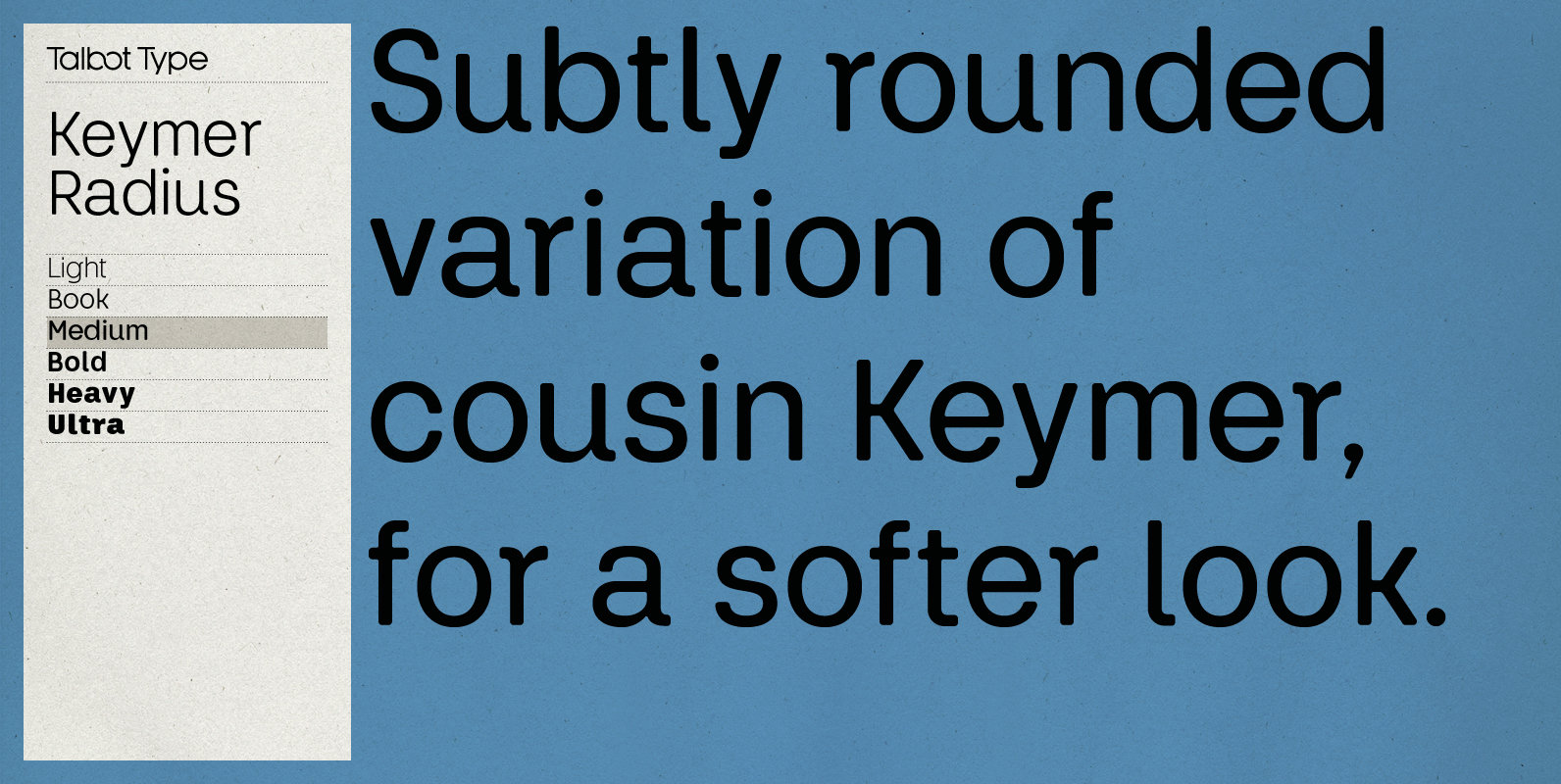
Keymer Radius Font
Talbot Type Keymer Radius is related to Talbot Type Keymer; where Keymer is square-edged, Keymer Radius is subtly rounded for a softer look. Keymer Radius mixes geometric and humanist traits to achieve a modern, clean, elegant appearance. It is a
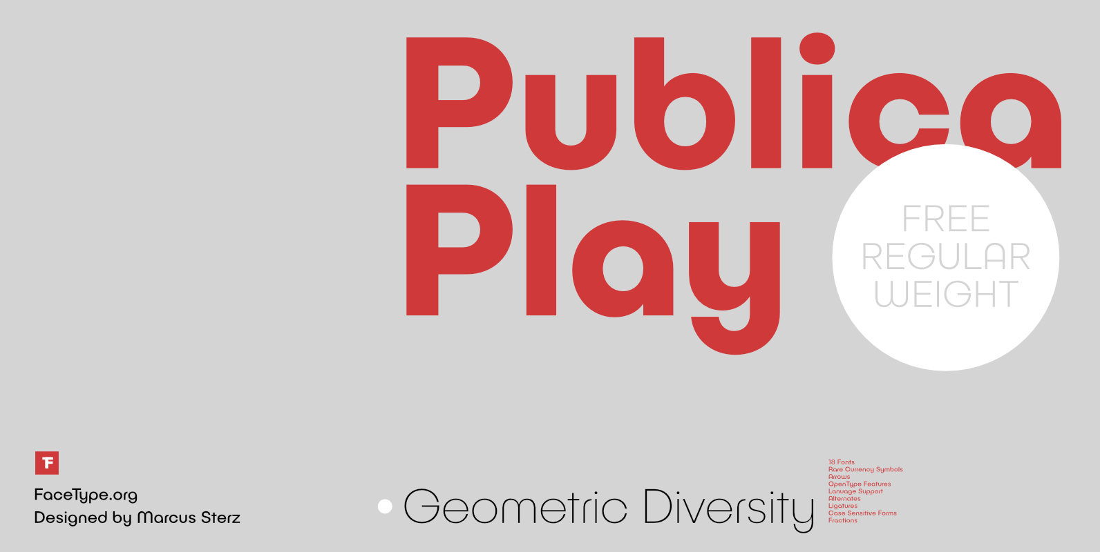
Publica Play Font
Publica Play is Publica Sans’ playful sister. It comes with loads of subtle open type features, tabular options, rare currencies signs and symbols and arrows – ‘Publica Play’ has everything you need for playful design tasks. Take a close look
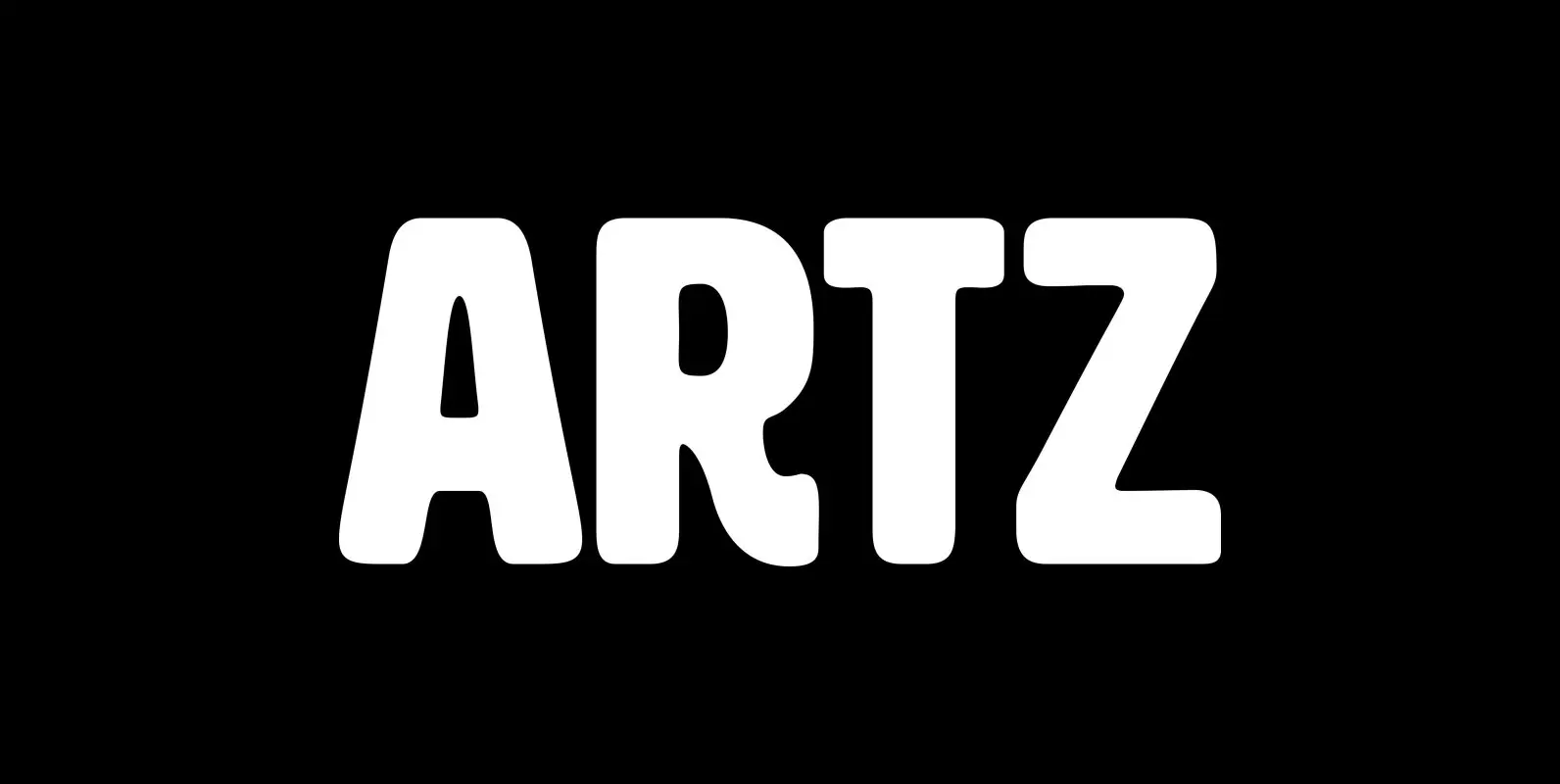
HWT Artz Font
HWT Artz is the newest wood type to be cut at Hamilton Wood Type and Printing Museum. It was designed by venerable type designer Erik Spiekermann for his own print studio (P98a in Berlin), specifically to be cut into large
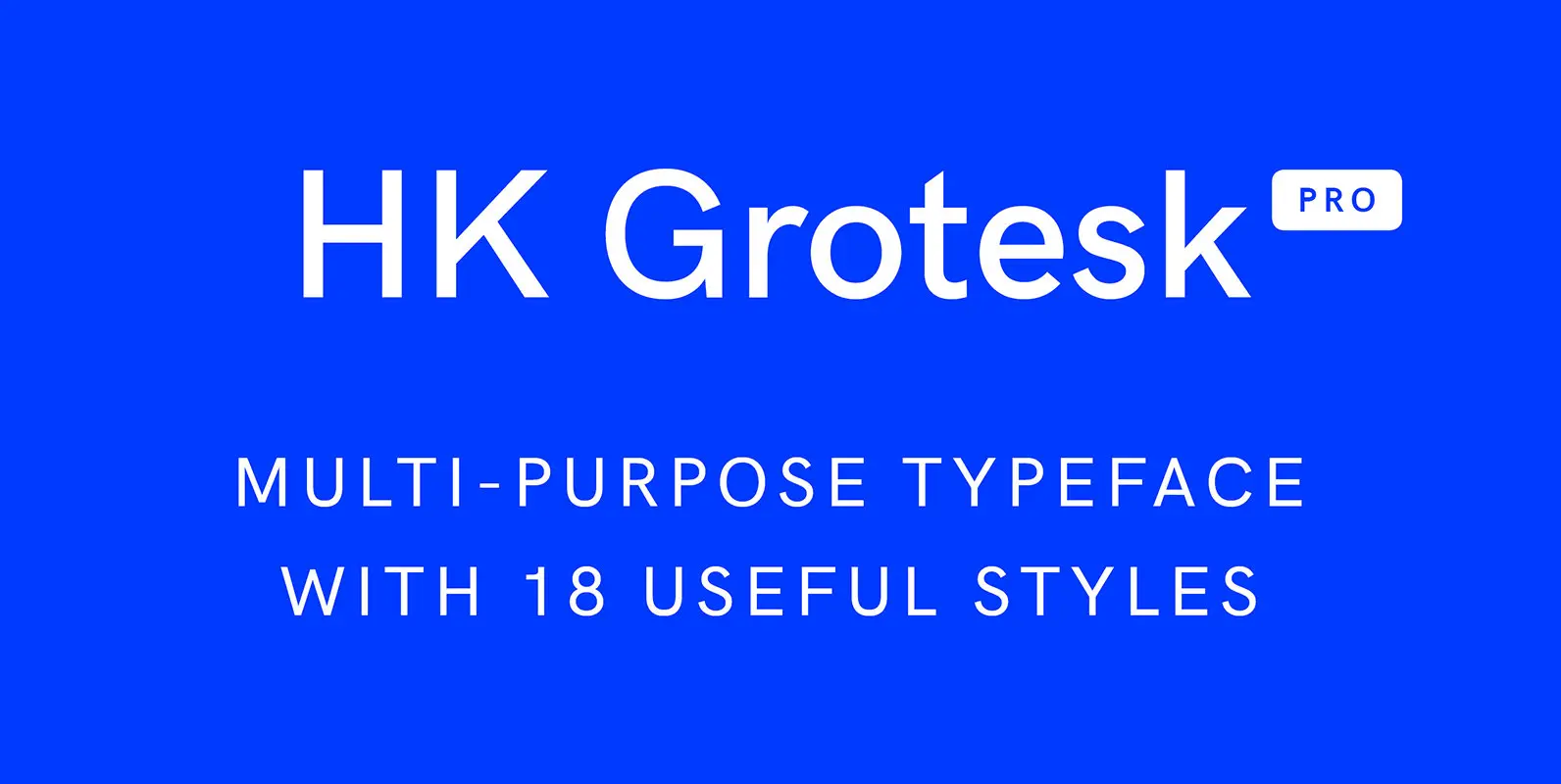
HK Grotesk Pro Font
HK Grotesk Pro is a sans serif typeface inspired by the classic grotesques. It is a multi-purpose typeface that can be used on a wide range of topics without being obtrusive to the reader’s eye. It has features that can
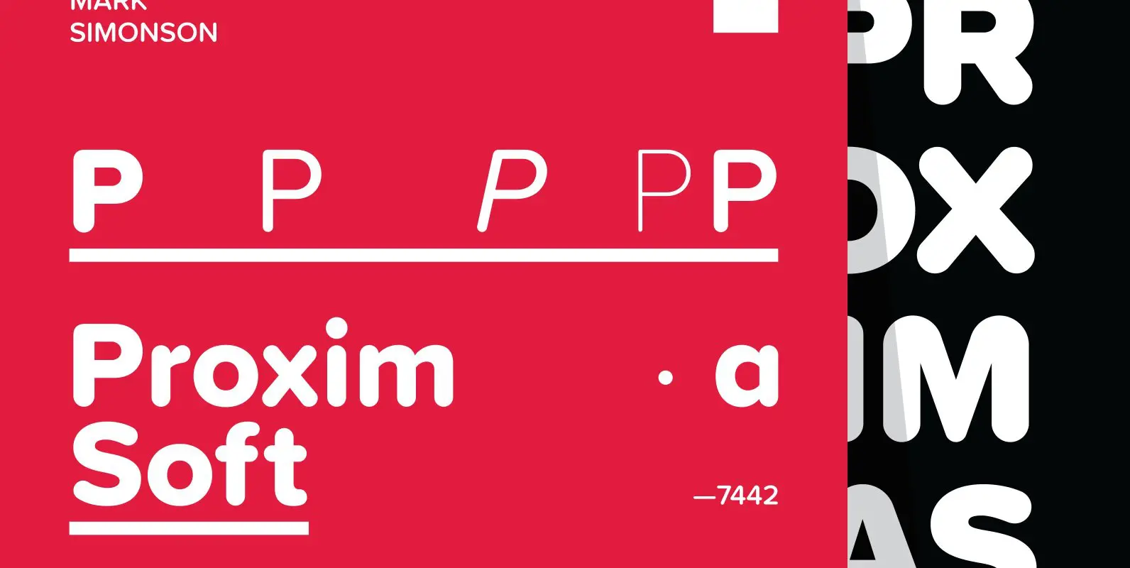
Proxima Soft Font
Proxima Soft (2017) is a rounded version of Proxima Nova. With the same forty-eight styles (eight weights in three widths, plus italics), Proxima Soft fits the bill when you want something a bit warmer and more playful than its older
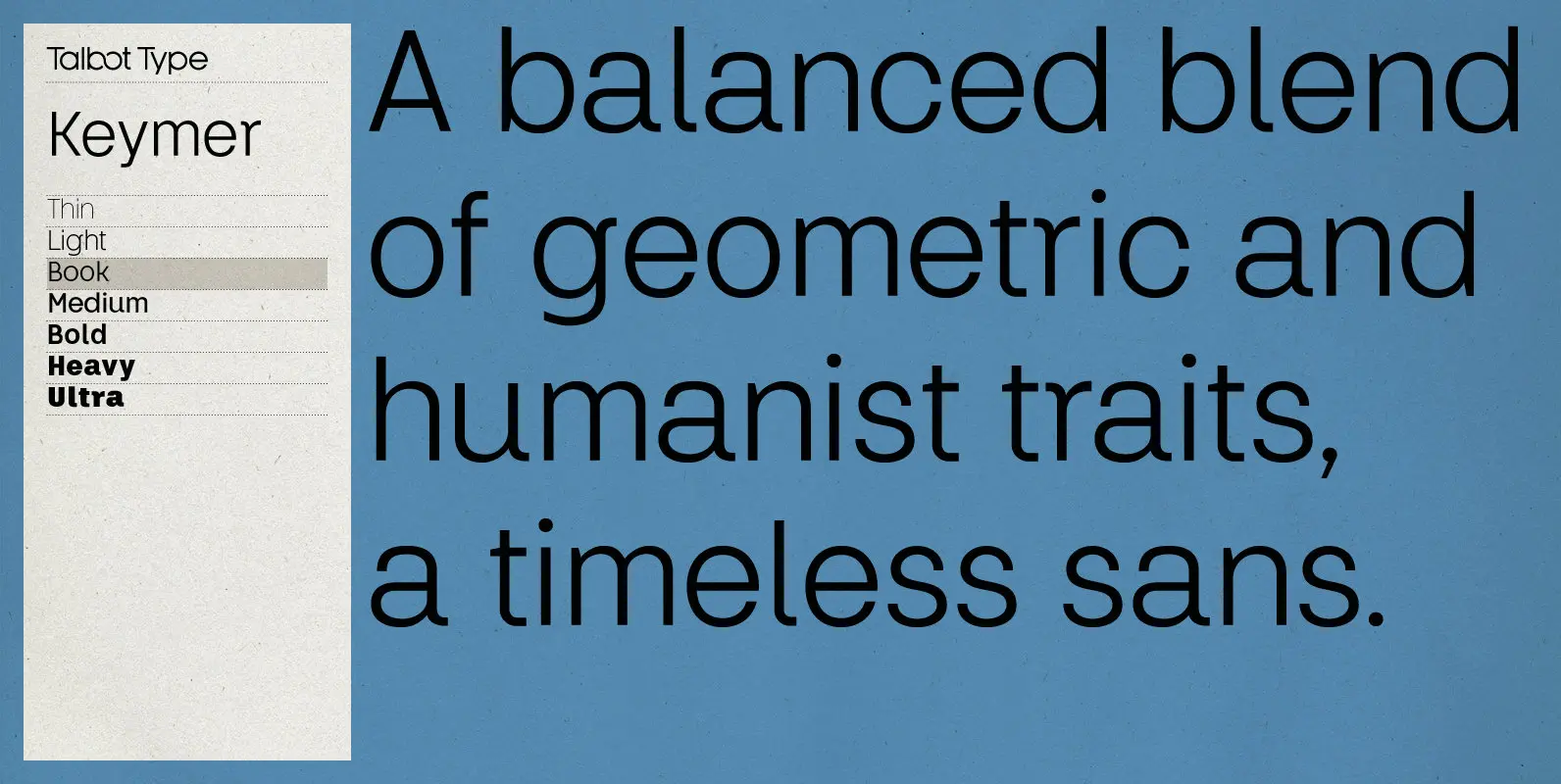
Keymer Font
Talbot Type Keymer is inspired by Margaret Calvert’s Transport typeface, designed for the British road sign system in the early 1960s. Keymer mixes geometric and humanist traits to achieve a modern, clean, elegant appearance. It is a legible and versatile
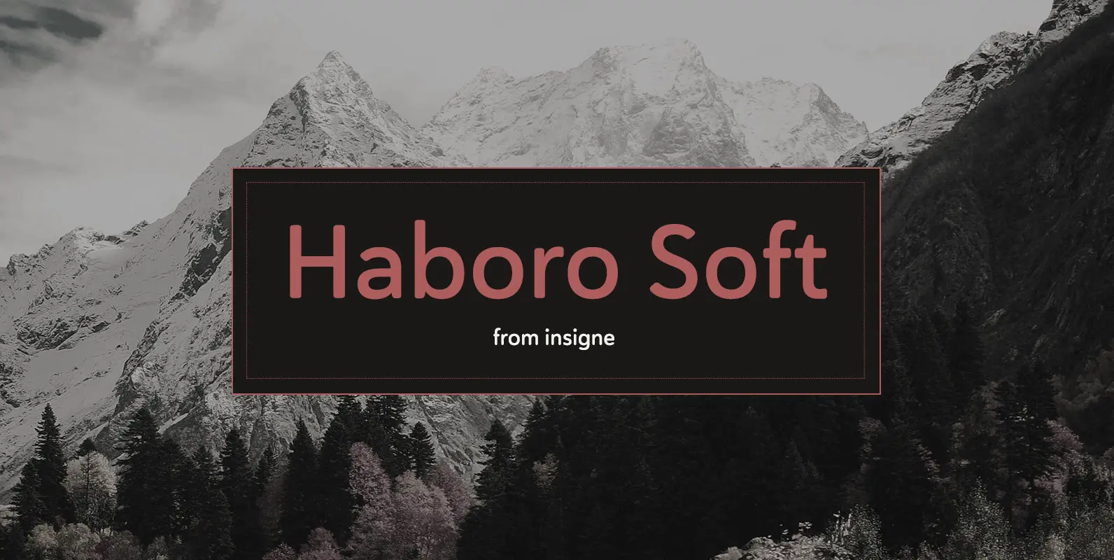
Haboro Soft Font
Stop trekking through the thick, wintery font forest, and step lightly into the fresh life of the Haboro hyper family. Though simple in nature, the Haboro hyper family provides you with a variety of options. Take, for instance, Haboro Soft,
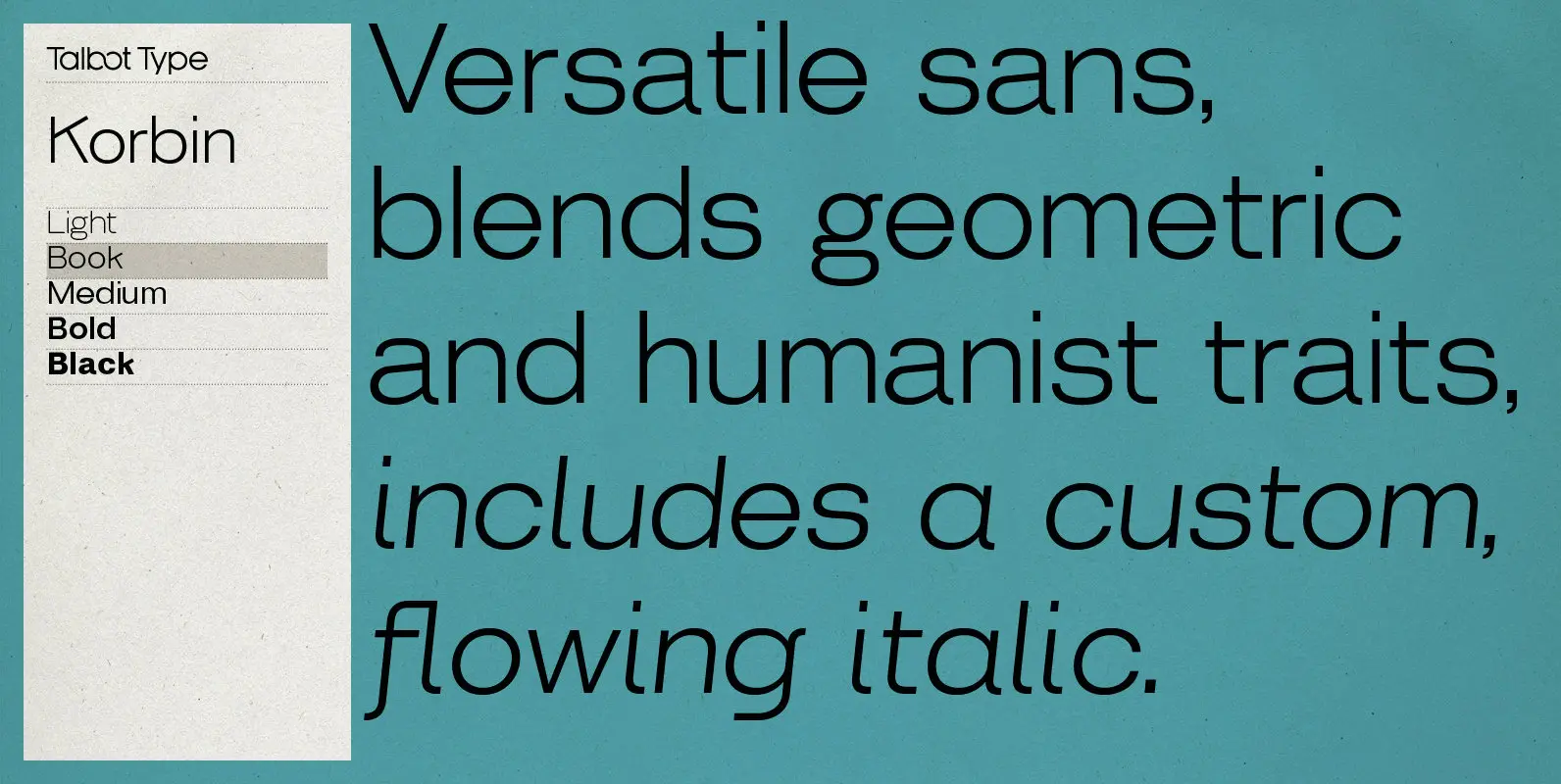
Korbin Font
Inspired by the sans-serifs of the late 19th and early 20th century, Korbin is a legible and versatile text and display face available in five weights. It mixes geometric and humanist traits to achieve a modern, clean, friendly appearance. The
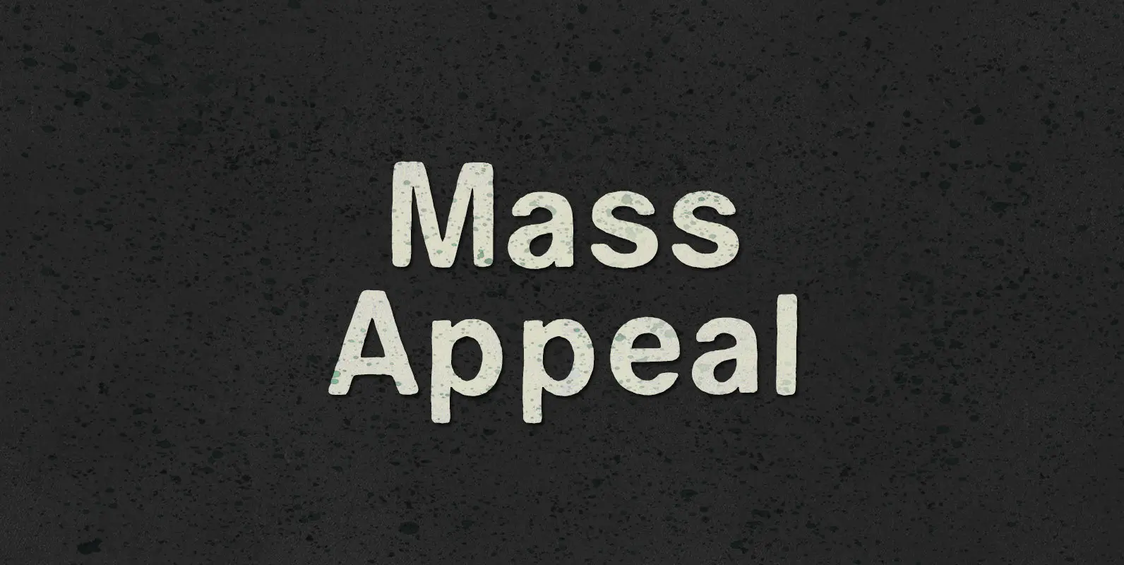
Mass Appeal Font
Down but standing tall under the weight of having it all. Above the clouds, or holding it down on the ground, the solution to and absolution of all problems with gravity: a pillar of planetary Mass Appeal. Published by BLKBKDownload
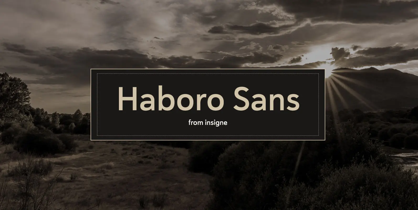
Haboro Sans Font
Quit trudging through the thick with encumbering fonts, and spring to the front of the pack with the cutting edge sans serif, Haboro Sans. With nothing to clutter up your work, your editorial designs, websites, and software will be sharp
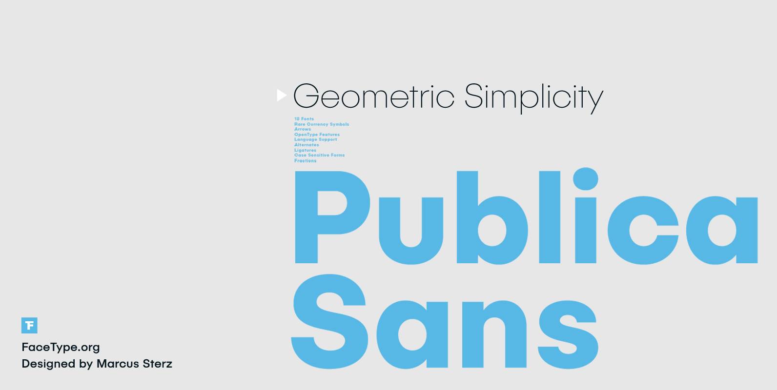
Publica Sans Font
Publica Sans is a clean geometric typeface, equipped with a variety of OpenType features to give you all you need for great typography: Alternates, arrows, rare currency symbols, case sensitive forms, various sets of figures and discretionary ligatures. Alternates: Give
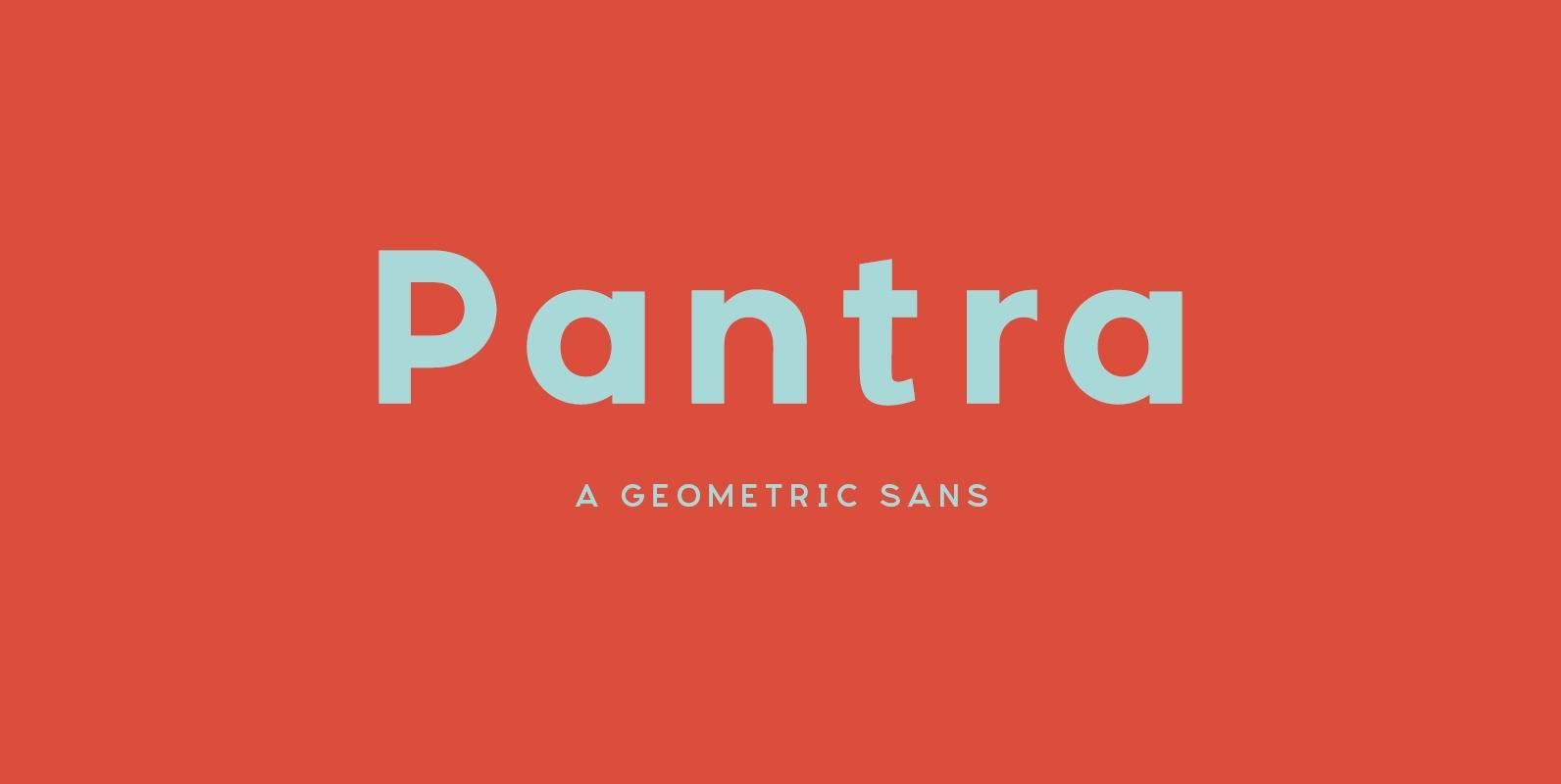
Pantra Font
Pantra is a minimal and clear geometric sans. Influences range from Futura to Akzidenz Grotesk. Pantra is clear, approachable, and effective in both headings and paragraphs and comes in 4 weights: light, regular, medium and bold. Published by Nicolas DesleDownload
