Tag: helvetica
Yorkten Font
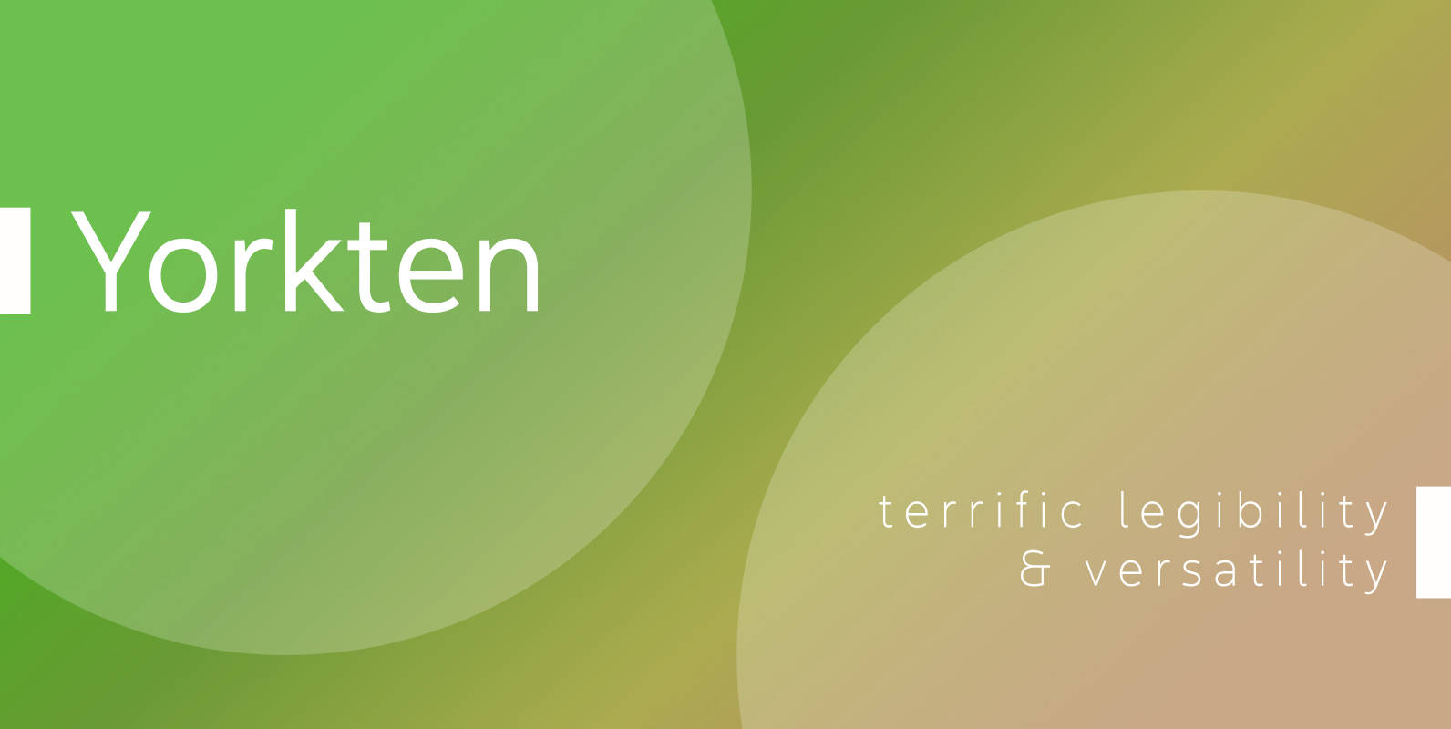
Clean and welcoming, the distinct look of Yorkten is remarkably satisfying to the eye. Straight to the point, Yorkton features a fashionable, geometric composition with angled main stems. There are no fewer than fifty-four fonts in the family, all of

Corporative Sans Complete Family Font
Corporative Sans typeface is developed by Latinotype Team. Corporative Sans is the new version of Corporative. This font has a marked personality and distinctive traits, what makes it suitable to be used at large text sizes. Since it is a
Nimbus Sans Novus Font
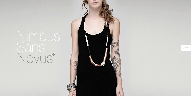
Break the Fontopoly. Helvetica. The boss of the 600-lb gorillas. A famous name, known in every corner of the world as the end-all, be-all of sans-serif typefaces. It even has its own feature film. But, what if everything you assumed
YWFT Absent Grotesque Font
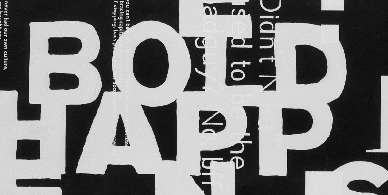
In these over-Photoshopped times, a little imperfection can make your work stand out and excel. YWFT Absent Grotesque was created to be an imperfect typeface, exploring ideas found in Univers and Helvetica without the serious attitude and over-marketing. It was
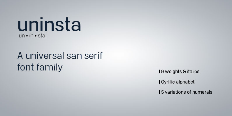
Uninsta Font
Uninsta is a neutral sans serif font family intended for use across a variety of modern applications in both digital and print media. Geometric letter forms are combined with subtle humanist touches to create a legible, low contrast typeface with
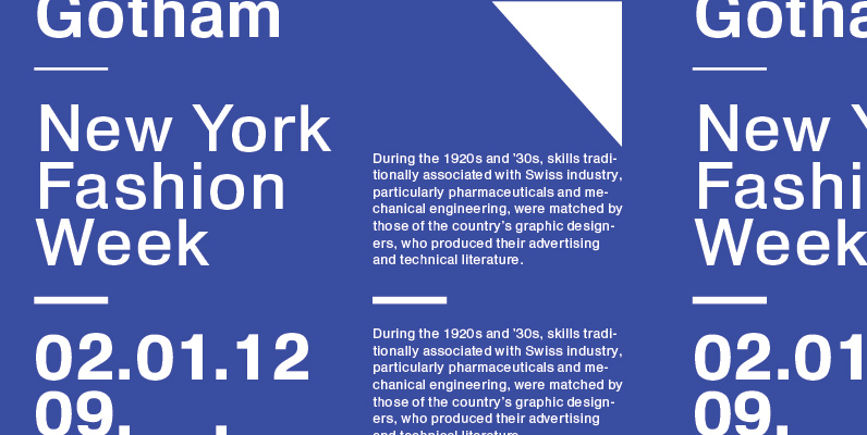
Heldustry Font
Designed in 1978 by Phil Martin, Heldustry is a clean, modern and great type design for corporate and or minimal type layouts. Published by URW Type Foundry GmbHDownload Heldustry
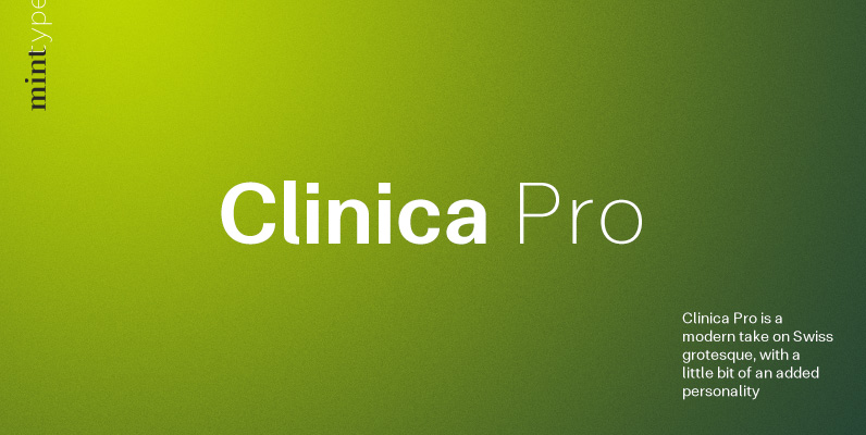
Clinica Pro Font
Clinica Pro is a modern take on Swiss grotesques, with a little bit of an added personality. It features 8 weights, italics, 6 sets of figures, small caps and a bunch of ligatures. Still relatively neutral, it lets a brand
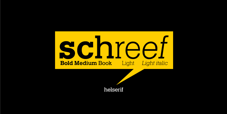
Helserif Font
Designed in 1978 by Phil Martin, Helserif is a clean, modern and great slab design that works as a viable solution for numerous design projects. Published by URW Type Foundry GmbHDownload Helserif
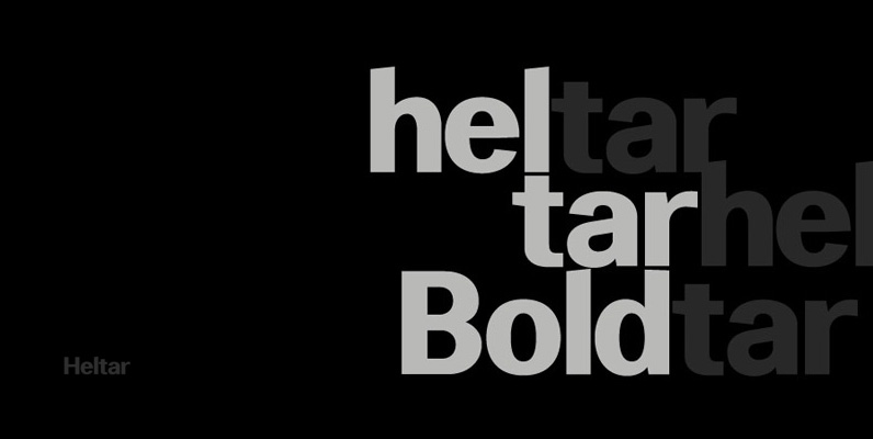
Heltar Font
A modern neo-grotesque typeface. Having grown up in Sheffield and been completely immersed in the work of The Designers Republic I became very drawn to their treatment of Helvetica, especially the close tracking of the letter space. This visual investigation
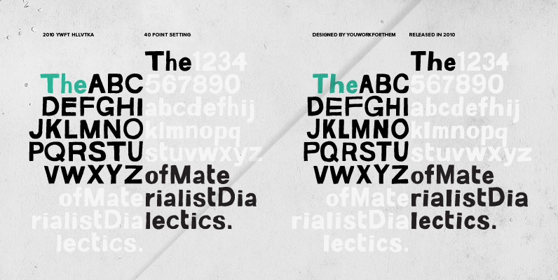
YWFT HLLVTKA Font
With great pride, we present this hand-drawn alphabet in both upper and lower case, derived from the beloved standard of all existing things: Helvetica. Originally hand drawn in 2007 by YouWorkForThem, we revisited these drawings in 2010 and developed them

Familiar Pro Font
This family was inspired by a Type Battle over at Typophile: How would you design a font metrically compatible with Helvetica, but better than Arial? Working with preset letter widths was an interesting constraint, both a relief and a limitation
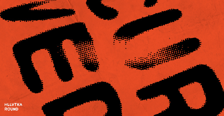
YWFT HLLVTKA Round Font
With great pride, we present this hand-drawn alphabet in both upper and lower case, derived from the beloved standard of all existing things: Helvetica. Originally hand drawn in 2007 by YouWorkForThem, we revisited these drawings in 2010 and developed them
Nimbus Sans No 5 Font
Designed by Max Miedinger, Nimbus Sans is a sans-serif typeface created by URW, based on Helvetica. The family supports Western Europe, East Europe, Turkish, Baltic, Romanian languages. Some of the fonts have history predating Helvetica’s first release. For example, Nimbus
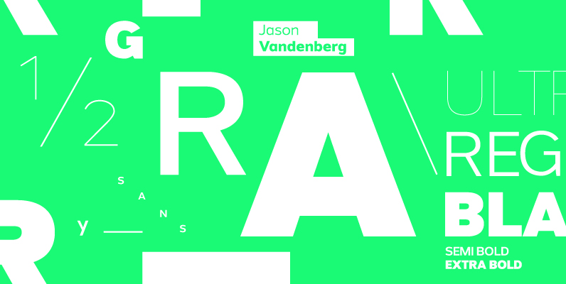
Grey Sans Font
Grey Sans is a contemporary sans with an angular design. Routed in both modern geometry and historical handwriting, Grey Sans bridges the gaps of neutrality and warmth, precision and humanism, and serious and fun. Grey Sans covers the grey areas
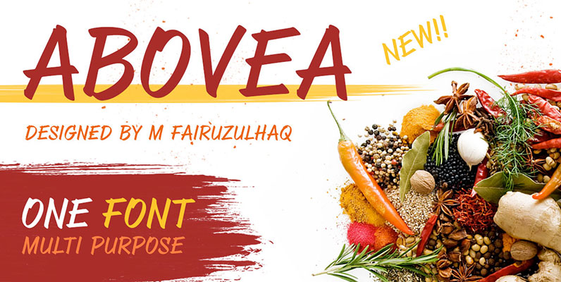
ABOVEA Font
Abovea have been designed by M Fairuzulhaq, Process design derived by freehand scratches with sans sherif style and slightly italic. What are special of the Abovea font is the anatomy font itself (stem, terminal, stroke, bar, tail, bowl, counter, axis,
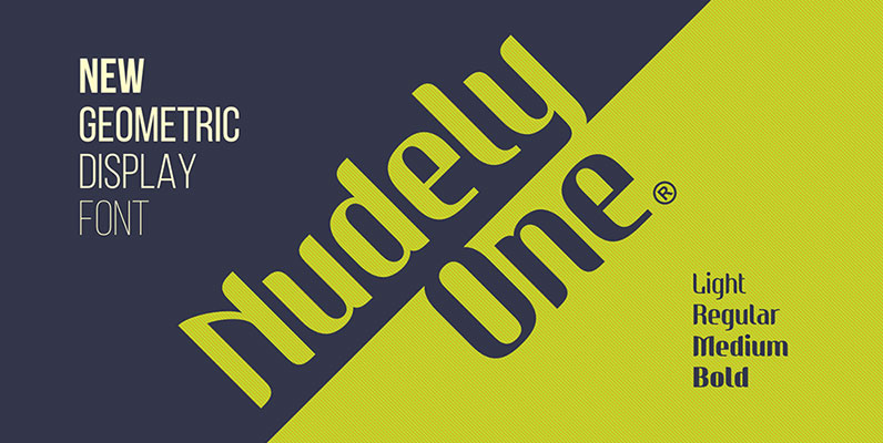
Nudely Font
Nudely is a geometric display font family consisting of 8 font weights. The Nudely Duo is optional of the Nudely One font, you can see the most striking difference anathomy at the 'shoulder' and arch of stem in the letters
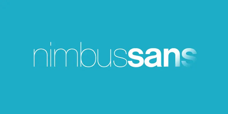
Nimbus Sans Font
Break the Fontopoly. Helvetica. The boss of the 600-lb gorillas. A famous name, known in every corner of the world as the end-all, be-all of sans-serif typefaces. It even has its own feature film. But, what if everything you assumed
