Tag: high contrast

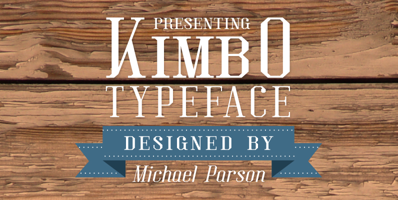
Kimbo Font
Kimbo is a squared slab serif typeface that is both rigid and defined in large sizes, but remains legible in smaller text settings. It is featured in a regular weight but equally in a very dark, black weight that provides

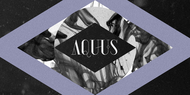
AQUUS Font
AQUUS is a contemporary all-caps display font that refines the elegance of a classic Didone with experimental interventions. Geometric elements and subtle details are found in its letters, many of which connect to ligatures. Most alternate glyphs can be switched

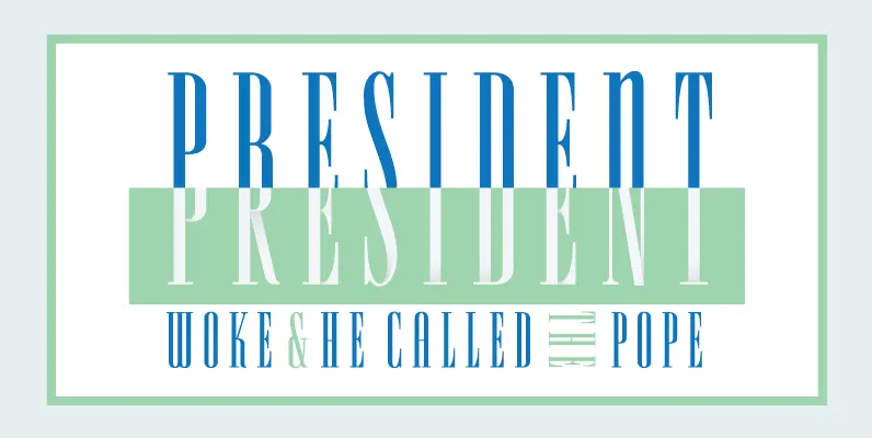
Spire Font
Originally designed by Sol Hess for the Lanston Monotype Foundry in 1938 as a fat face, this period revival was designed by Ann Pomeroy in the early 90s. Spire is extra condensed with a very retro look. Published by FontHausDownload

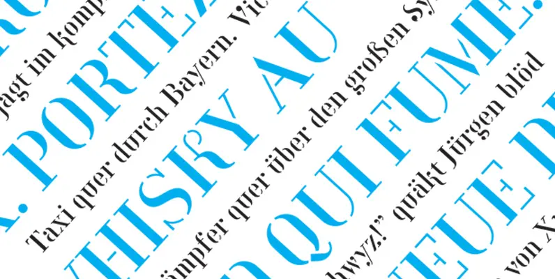
Compass TRF Stencil Font
Compass TRF Stencil is an addition to Compass TRF family and consists of three styles – Regular, Bold and Alternative. Font is recommended for use as display typeface in a large sizes. Published by TipografiaRamisDownload Compass TRF Stencil

Michel Font
This typeface wasn’t designed for use as a body typeface. Rather, I designed it with the intention of it being used as a header at a large point size. It was originally the Firmin Didot typeface, but of course I

Butti Font
In 1951 Alessandro Butti cut a fontfamily for Nebiolo which he called Fluidum. Both weights, light and bold, were now revived and named Butti. Published by RMU TypedesignDownload Butti
