Tag: historical
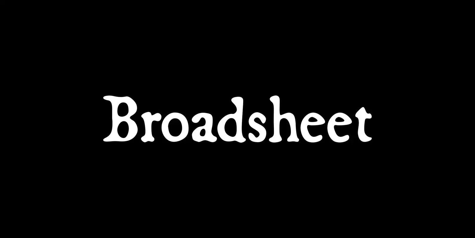
Broadsheet Font
Broadsheet simulates old newspaper text from the 1700s, chiefly from two specimens: an original copy of The New-England Weekly Journal, published in Boston on April 8, 1728, and a commemorative reprint of the Massachusetts Sun, published in Worcester, Mass., on
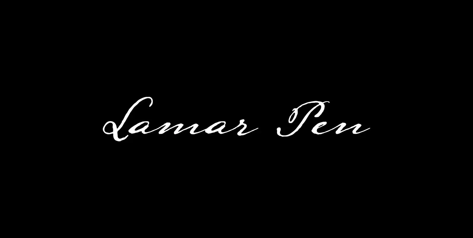
Lamar Pen Font
Lamar Pen gets its name from Mirabeau Buonaparte Lamar, whose penmanship it’s modeled after. Lamar, born in Georgia in 1798, migrated in 1835 to Texas, where he supported—and the following year fought for—the then-Mexican province’s independence. He stuck around, too,
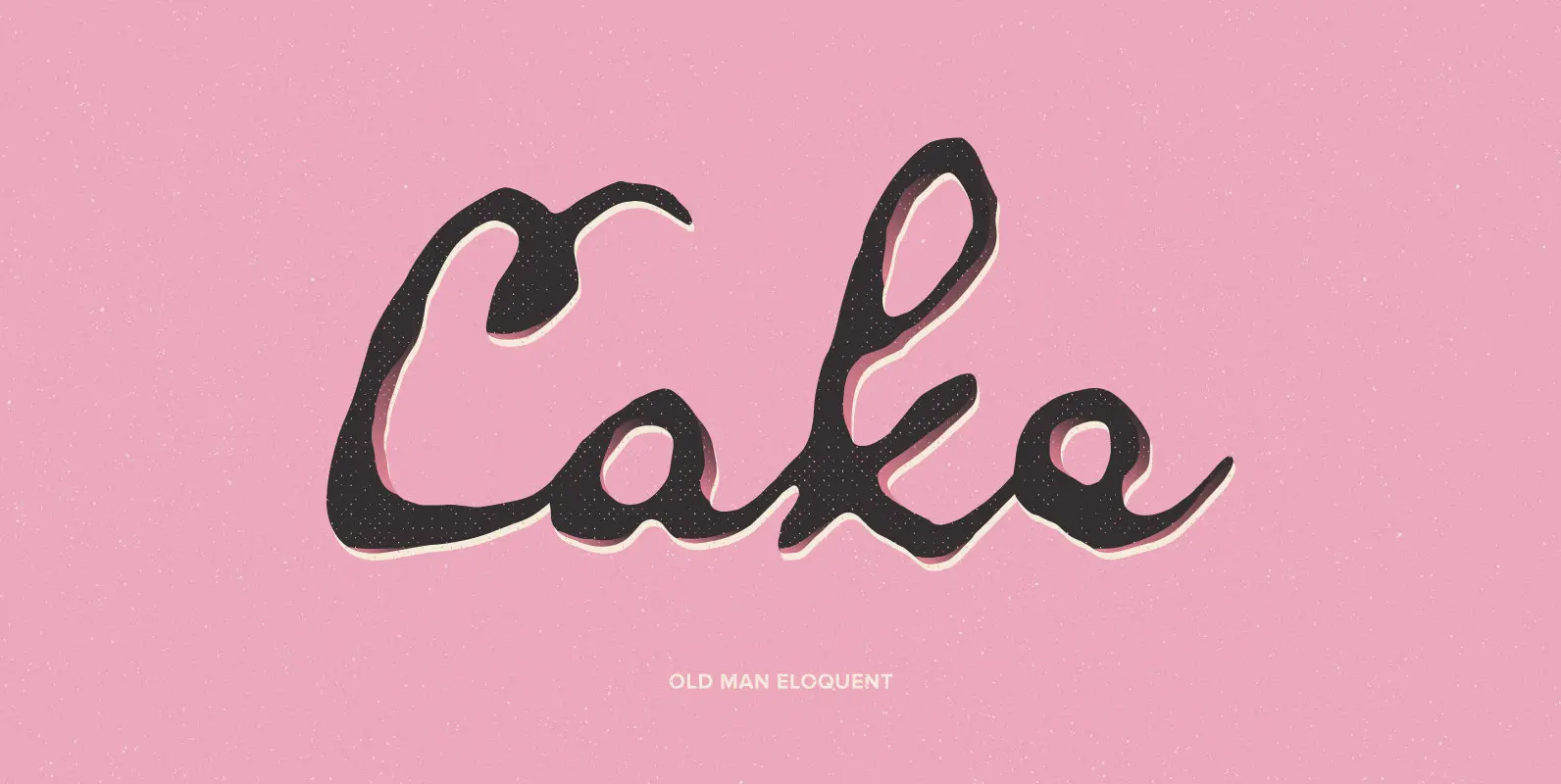
Old Man Eloquent Font
Old Man Eloquent simulates the handwriting of John Quincy Adams, the second President of The United States, in pages of his famous diary, circa 1810. Adams kept his diary from 1779, when he was a boy, until 1848, the year
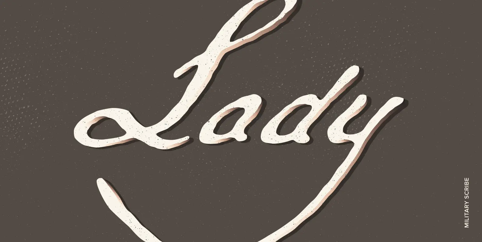
Military Scribe Font
The 10th Regiment of Foot is a British military unit raised more than three centuries ago—and perhaps most famous in the U.S. for seeing action on American soil during the Revolutionary War in the Battles of Lexington and Concord and
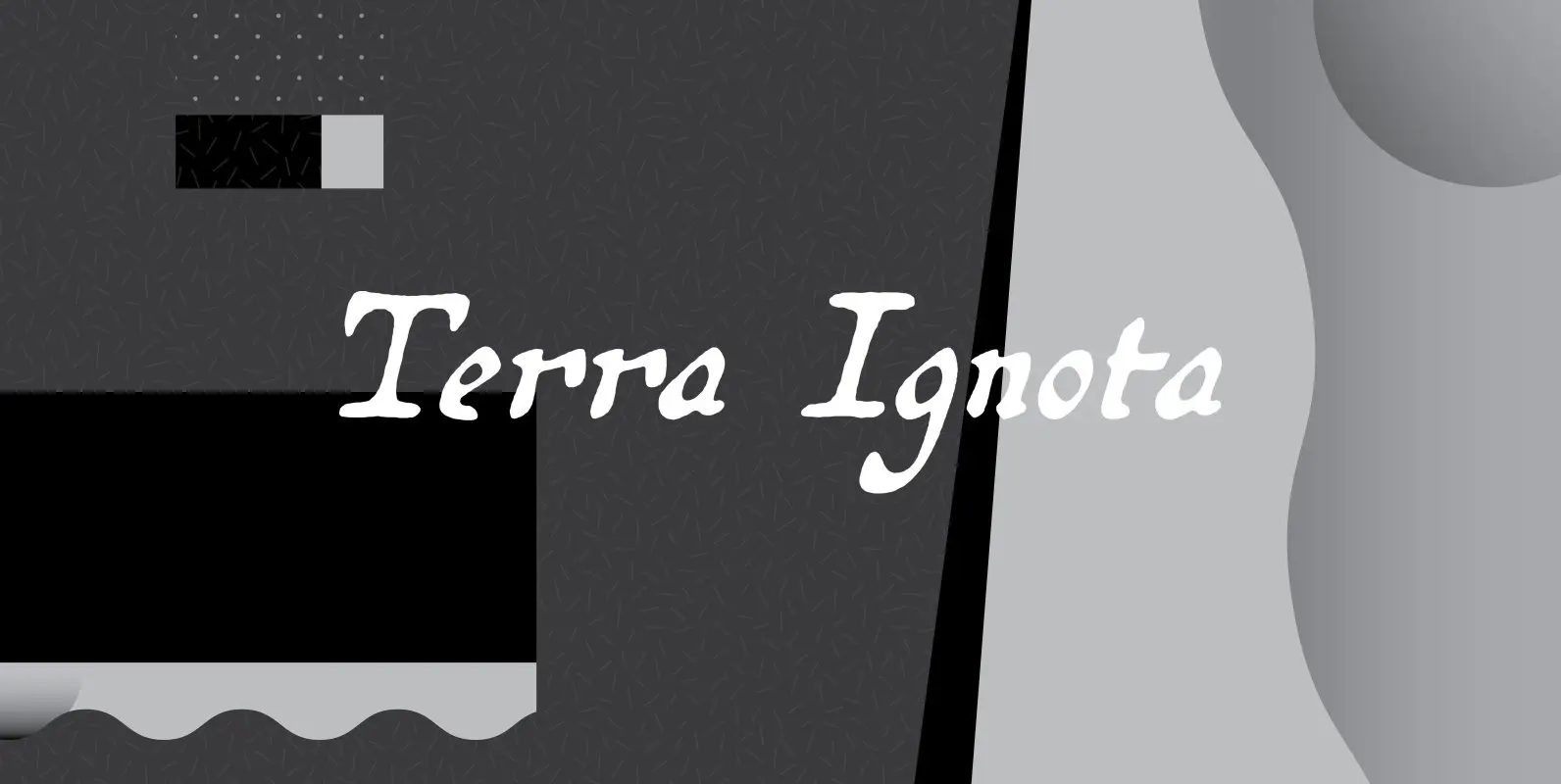
Terra Ignota Font
The idea for Terra Ignota came years before I actually designed it, as I was admiring a reproduction of “Amerique Septentrionale,” a 1650 map by French cartographer Nicolas Sanson, given me by my parents. The hand-lettering has a sort of
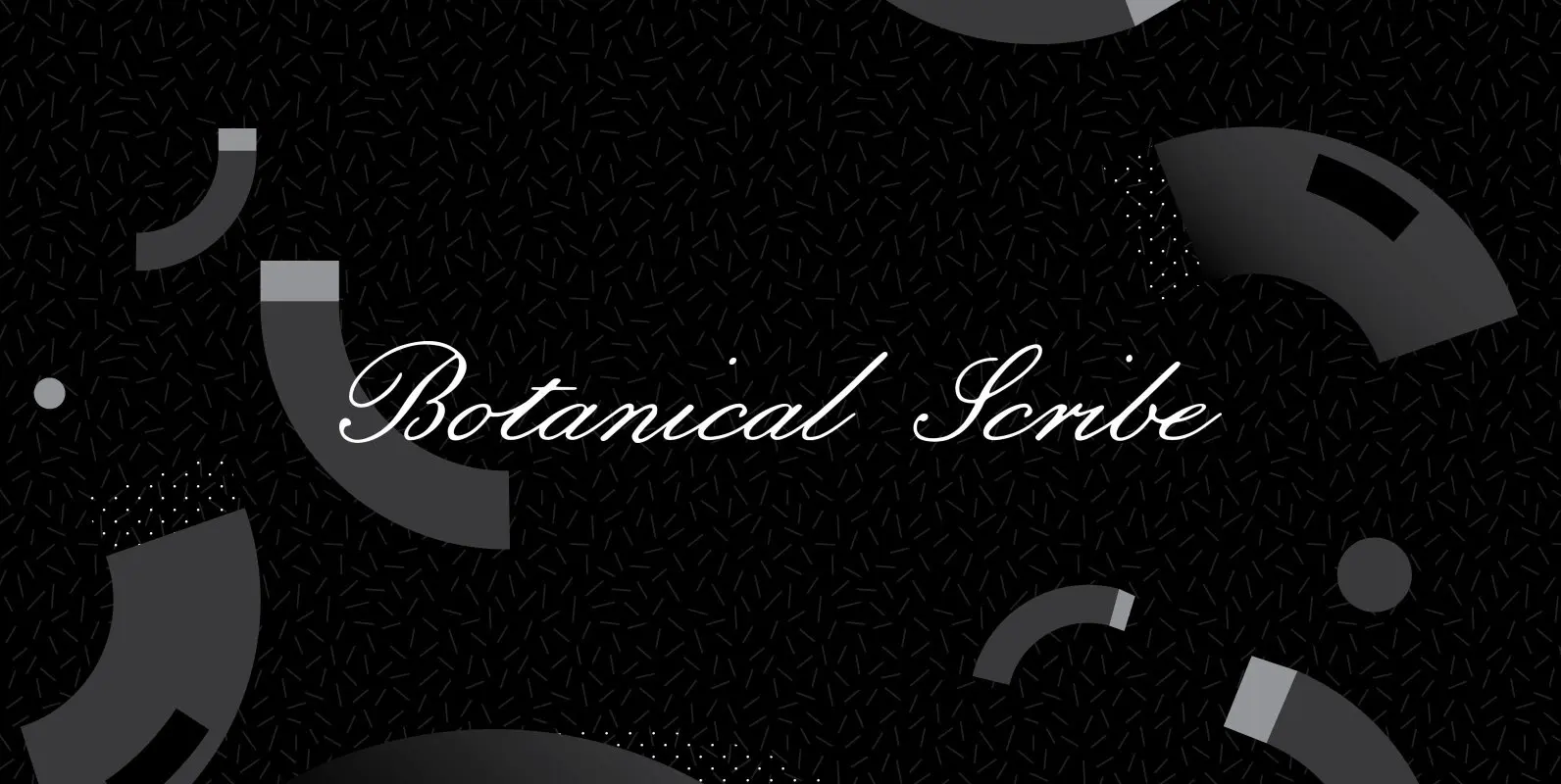
Botanical Scribe Font
Botanical Scribe is modeled after the elegant hand-inscribed legends on the antique floral prints of Belgian artist Pierre-Joseph Redouté, perhaps the most famous painter of flowers. Redoute’s engravings used the stipple method—innovative for the early 1800s—and have survived in large
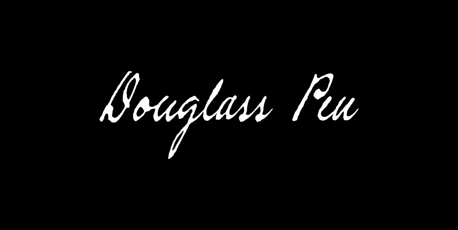
Douglass Pen Font
Douglass Pen was inspired by the handwriting of Frederick Douglass, who was born an American slave but died a distinguished 19th century statesman, orator, and abolitionist leader. He also had fine penmanship. Douglass Pen is modeled chiefly after Douglass’s handwritten

Bonnycastle Font
Sir Richard Henry Bonnycastle (1791–1847) was an English officer and military engineer who served in the War of 1812 and ultimately settled in Canada. I stumbled upon copies of some of his charts and maps and became so infatuated with
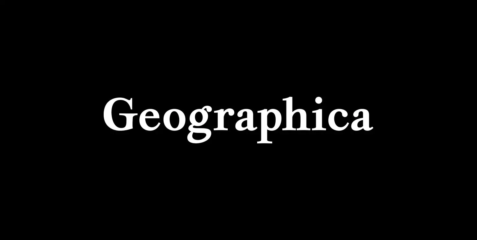
Geographica Font
Geographica is a four-style serif text-type family modeled after the neat hand-lettered place names and peripheral text on the maps of Thomas Jefferys (ca. 1710–1771), the best-known map engraver in 18th-century England. Although he won (and hyped) the title “Geographer
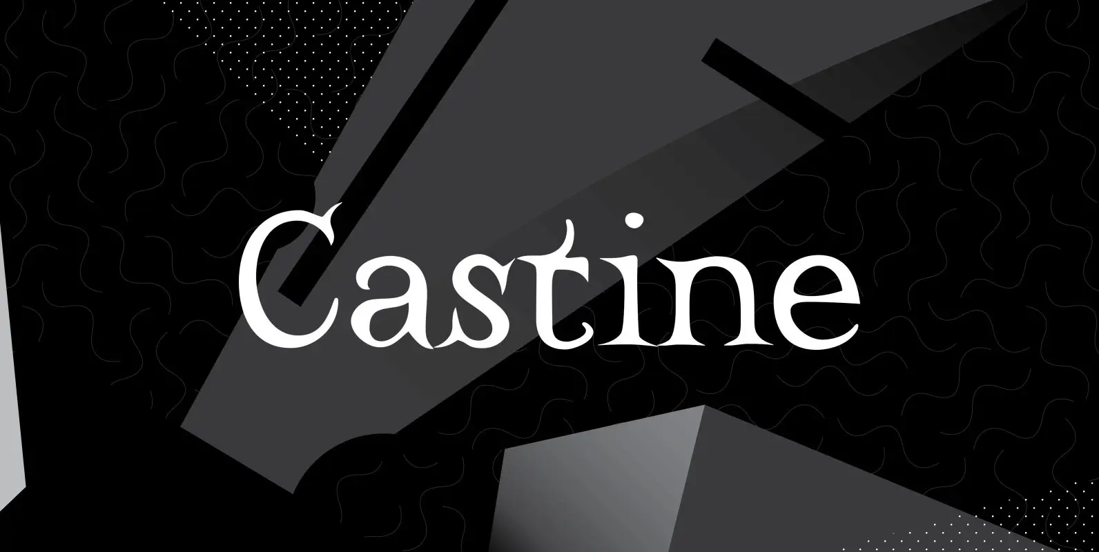
Castine Font
Castine gets its name from a small coastal Maine town with a seagoing heritage and long history. The town has an old cemetery with a few 200-plus-year-old headstones whose distinctive carved lettering inspired the typeface that shares its name. Castine’s

Attic Antique Font
Attic Antique replicates the warn, weathered text in a friend’s old copy of John Burroughs nature essays. It shares the wide spacing and ample serifs of the Century faces. Use it to represent age, to suggest photocopied archives, or to
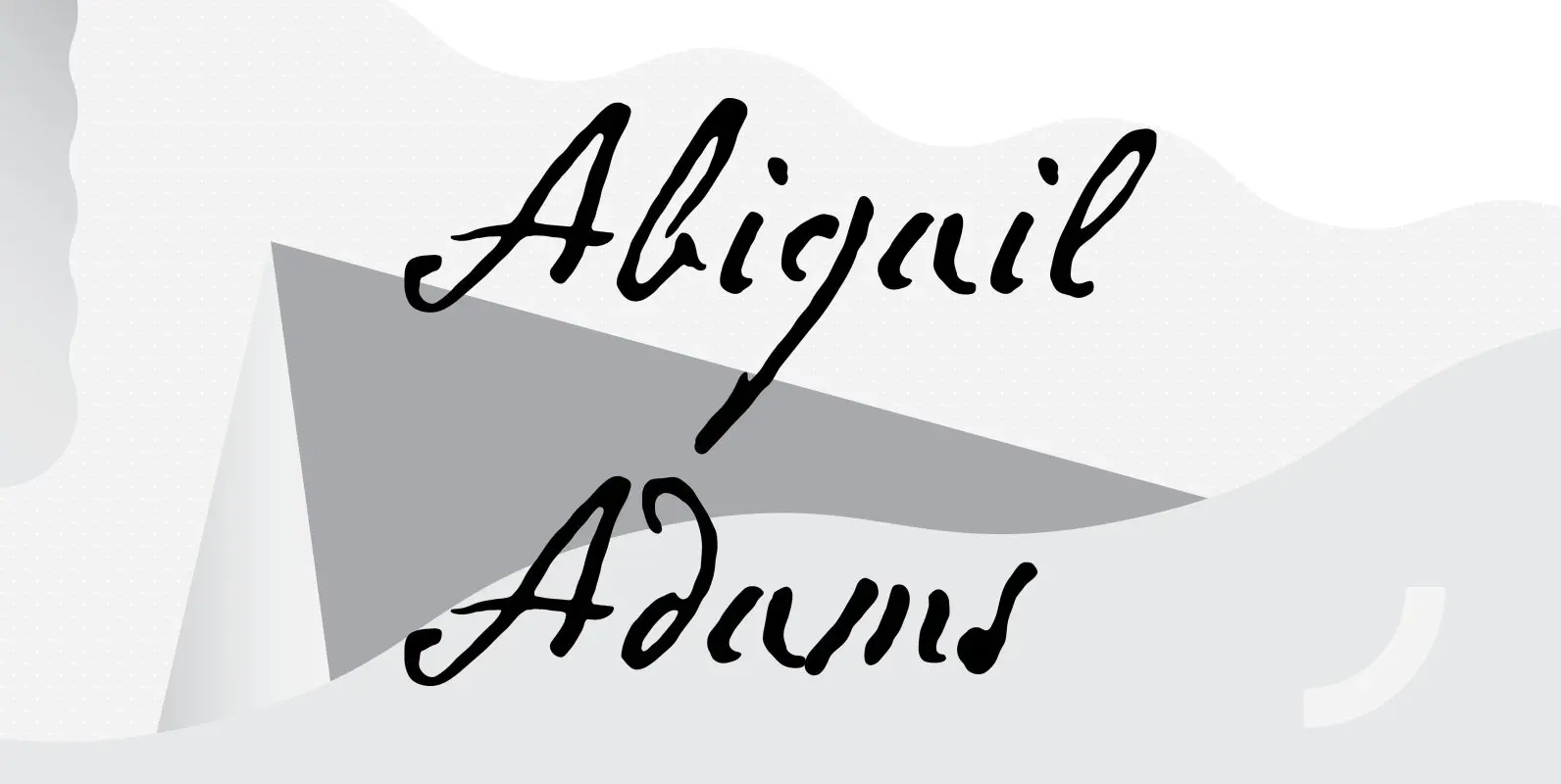
Abigail Adams Font
“My Dearest Friend” is how she began nearly all her letters to her husband, John. I refer, of course, to Abigail Smith Adams, first Second Lady and second First Lady of the United States. Her famous correspondence with John Adams

Bonsai Font
The name “Bonsai” seems appropriate for this font for two reasons: its source of inspiration—some top-heavy text type I found in an old handbook on bonsai from the Brooklyn Botanic Garden—and its glyphs’ resemblance, however vague, to the ancient miniature
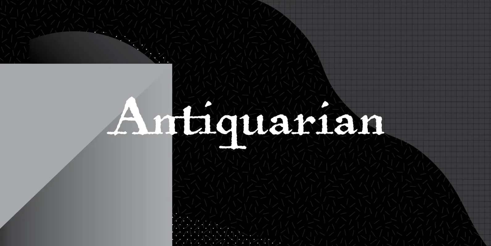
Antiquarian Font
Antiquarian was inspired by the hand-lettered headlines and captions that appear on an original page of “Atlas Historique, ou Nouvelle Introduction a L’Histoire’—a world atlas published by Henri Abraham Chatelain between 1705 and 1732 in Amsterdam—that I picked up at
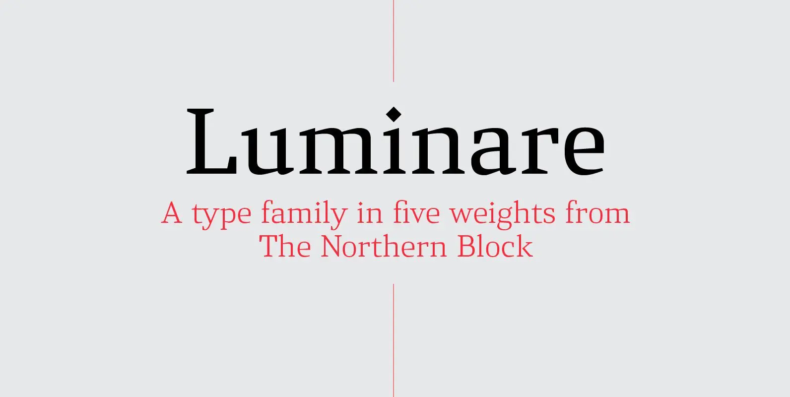
Luminare Font
Luminare is a serif type family with a strong rhythmical structure, clean cut serifs and balanced proportions. Luminare began life as a personal and academic enquiry into stencilled lettering. The key sources of this research where found in liturgical manuscripts
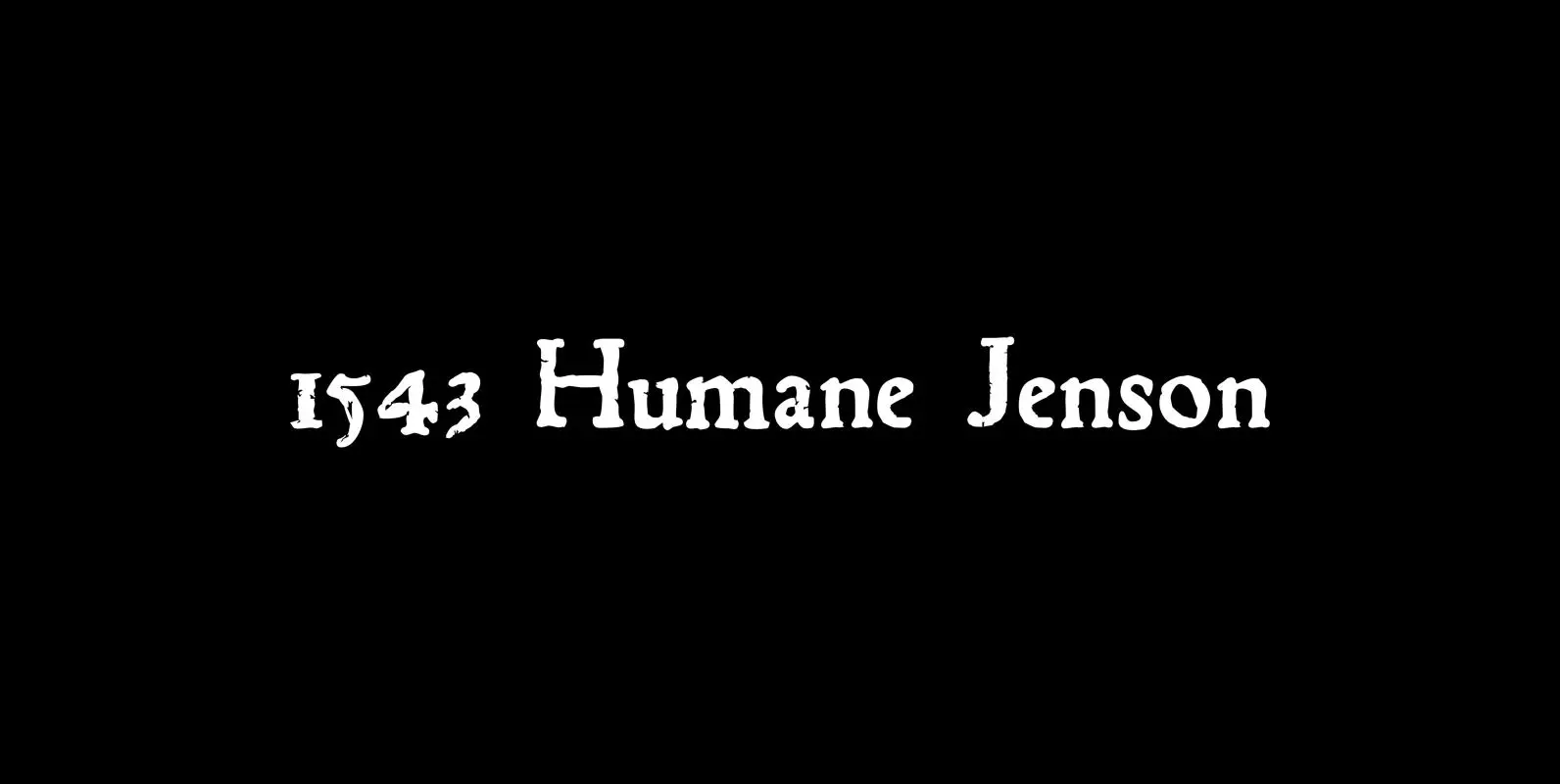
1543 Humane Jenson Font
In 1543 the well-known “De humani corporis fabrica” treatise on anatomy by André Vesale, was printed by Johann Oporinus in Basel (Switzerland). Various typefaces were used for this work, mostly in Latin but including Greek characters. Its Jenson-type font was
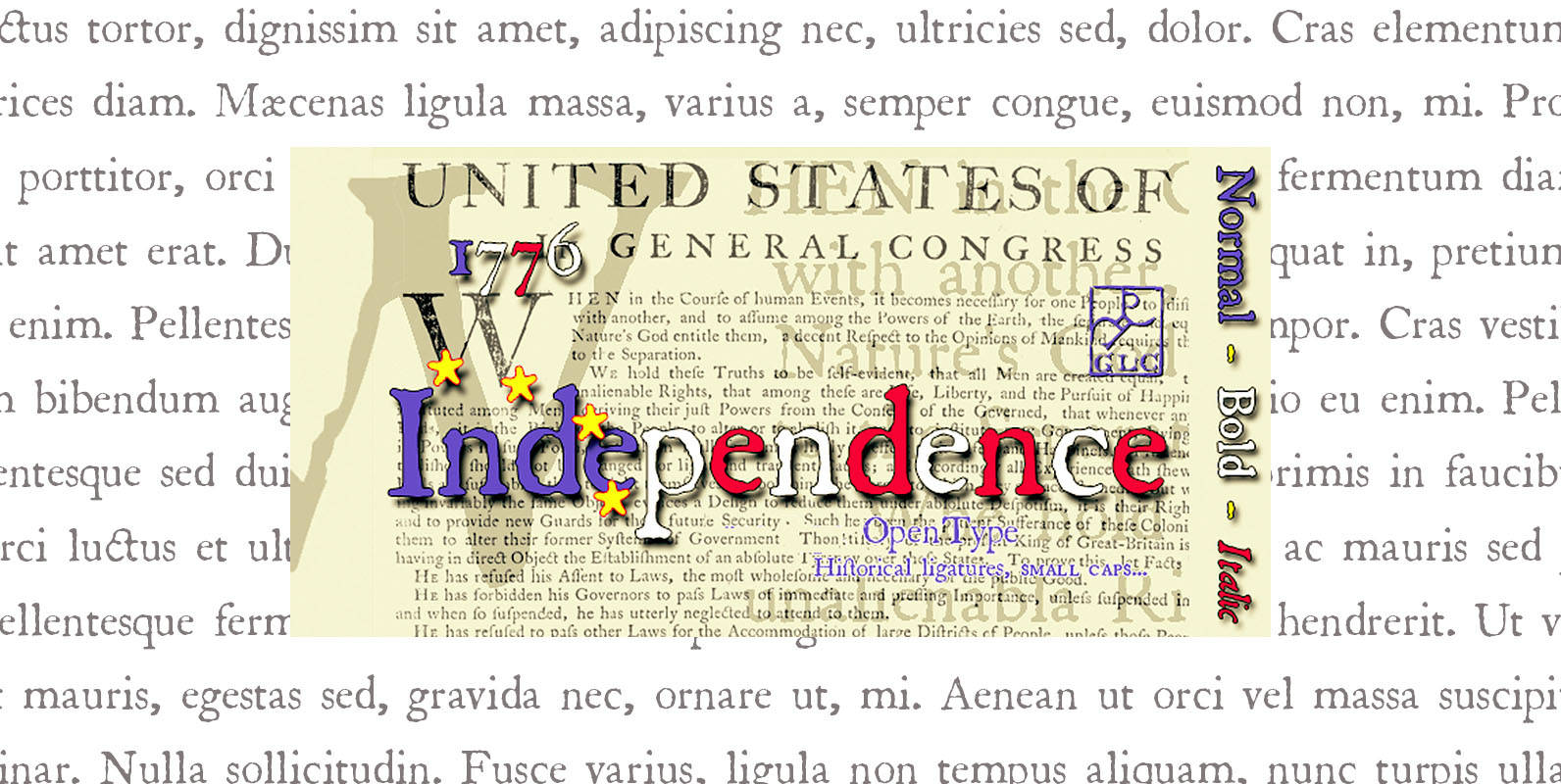
1776 Independence Font
1776 Independence was designed inspired mainly from the font used by John Dunlap in the night of 1776 July 4th in Philadelphia to print the first 200 sheets of the Congress’ Declaration of Independence establishing the United States of America.
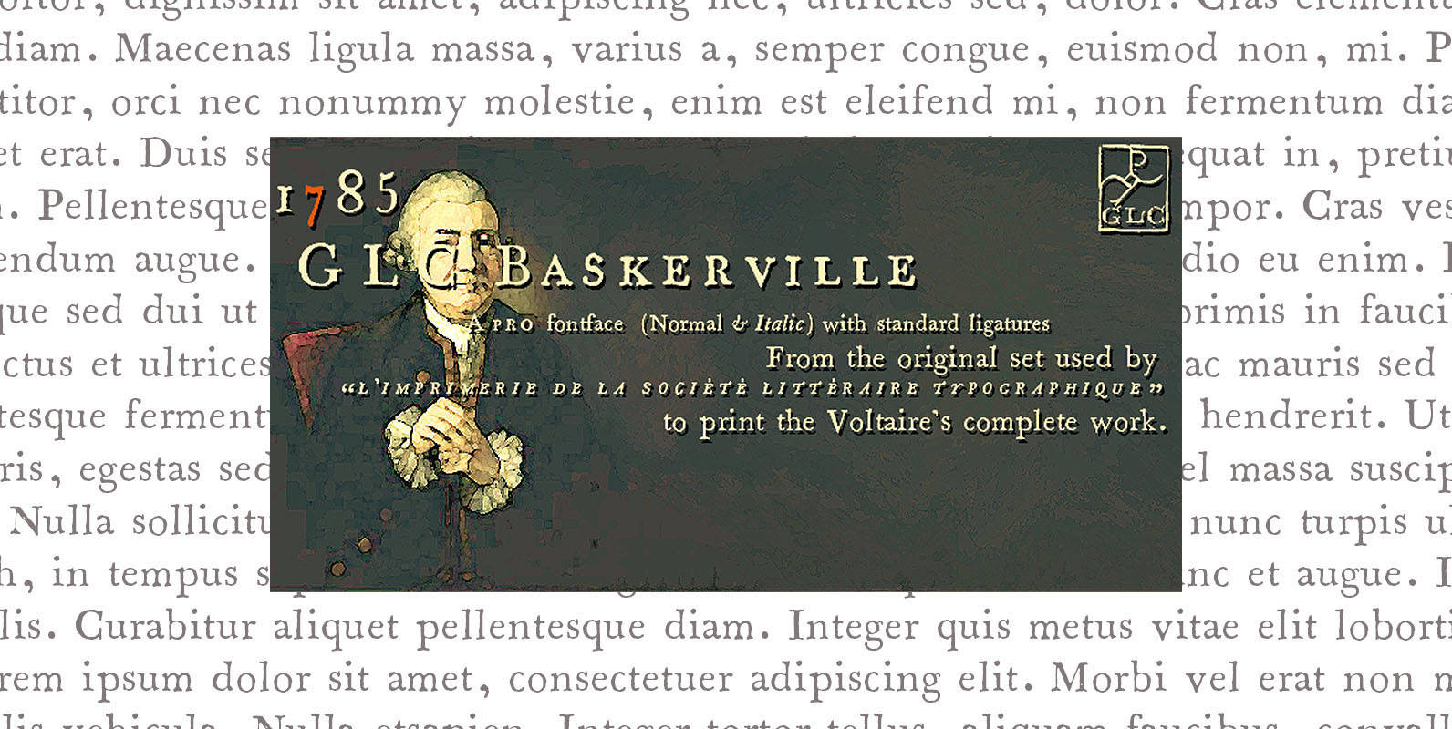
1785 GLC Baskerville Pro Font
This family was created inspired from the well-known Baskerville Roman and Italic typefaces created by John Baskerville, the English font designer. We were inspired from the original family sent by Baskerville’s wife after he was death. The Baskerville’s full collection