Tag: humanist
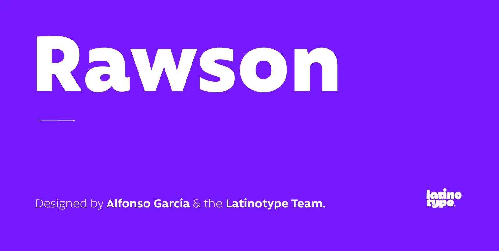
Rawson Font
Designed by Alfonso García and Latinotype Team. Rawson is inspired by early humanist sans-serif English typefaces. We have added a bit of Johnston, a bit of Gill and a lot of Latinotype to the font. Rawson is an elegant font—but
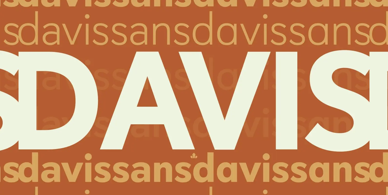
Davis Sans Font
Over the past couple of decades, the many applications that joined print as media requiring design solutions have combined to necessitate a visual evolution that favours controlled optical geometry and careful counter-space consideration over ornamental features traditionally associated with print
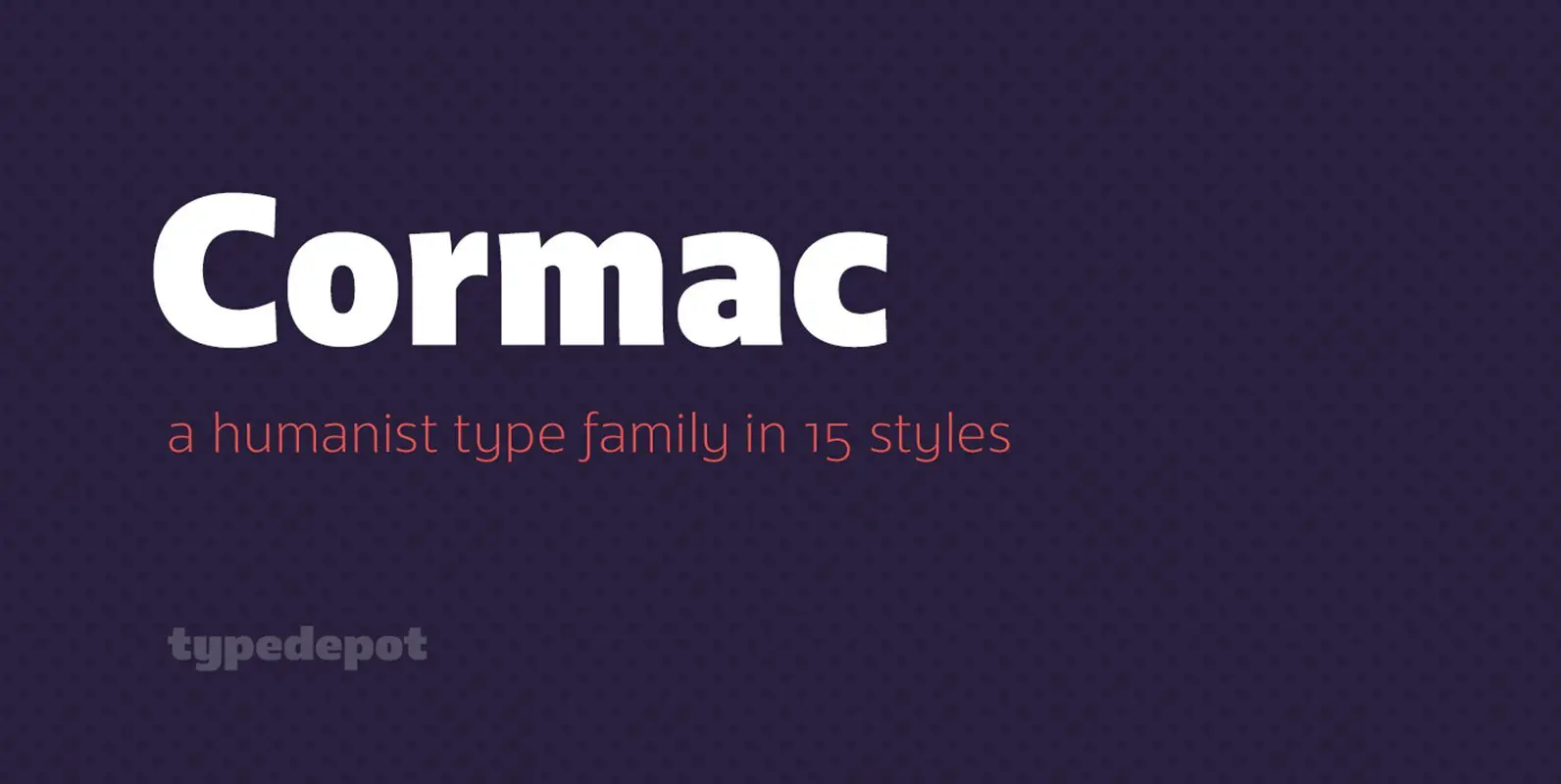
Cormac Font
Cormac is a humanist typeface characterized with it’s large x-height and slightly flared stems. The word that best describes our ideas in the beginning of the project is “simple” – the idea behind it was to strip the letter forms
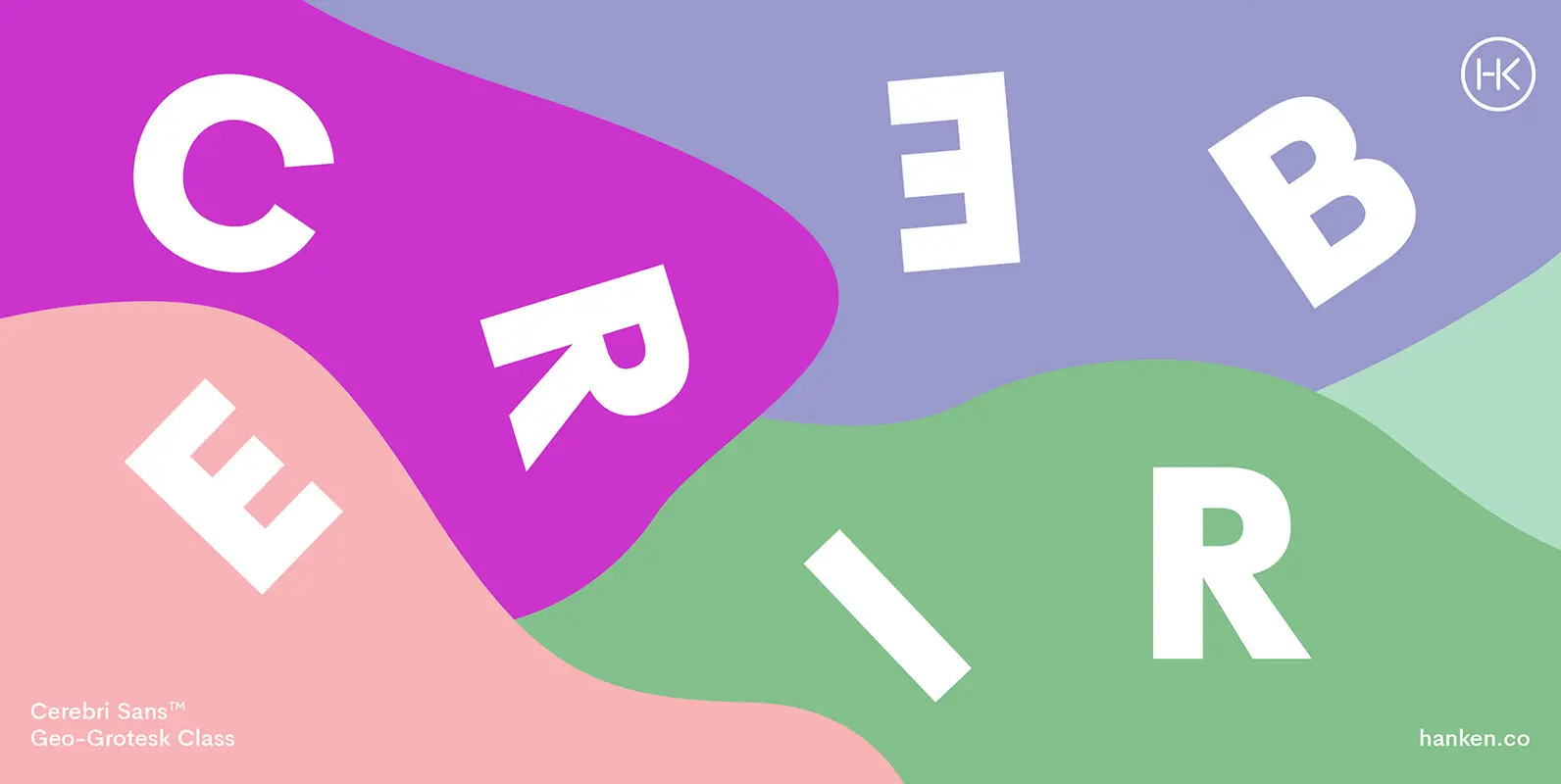
Cerebri Sans Font
Cerebri Sans is a sans serif inspired by the early geometric and grotesque typefaces that are both functional and elegant—with humanistic features. Published by Hanken Design Co. Download Cerebri Sans
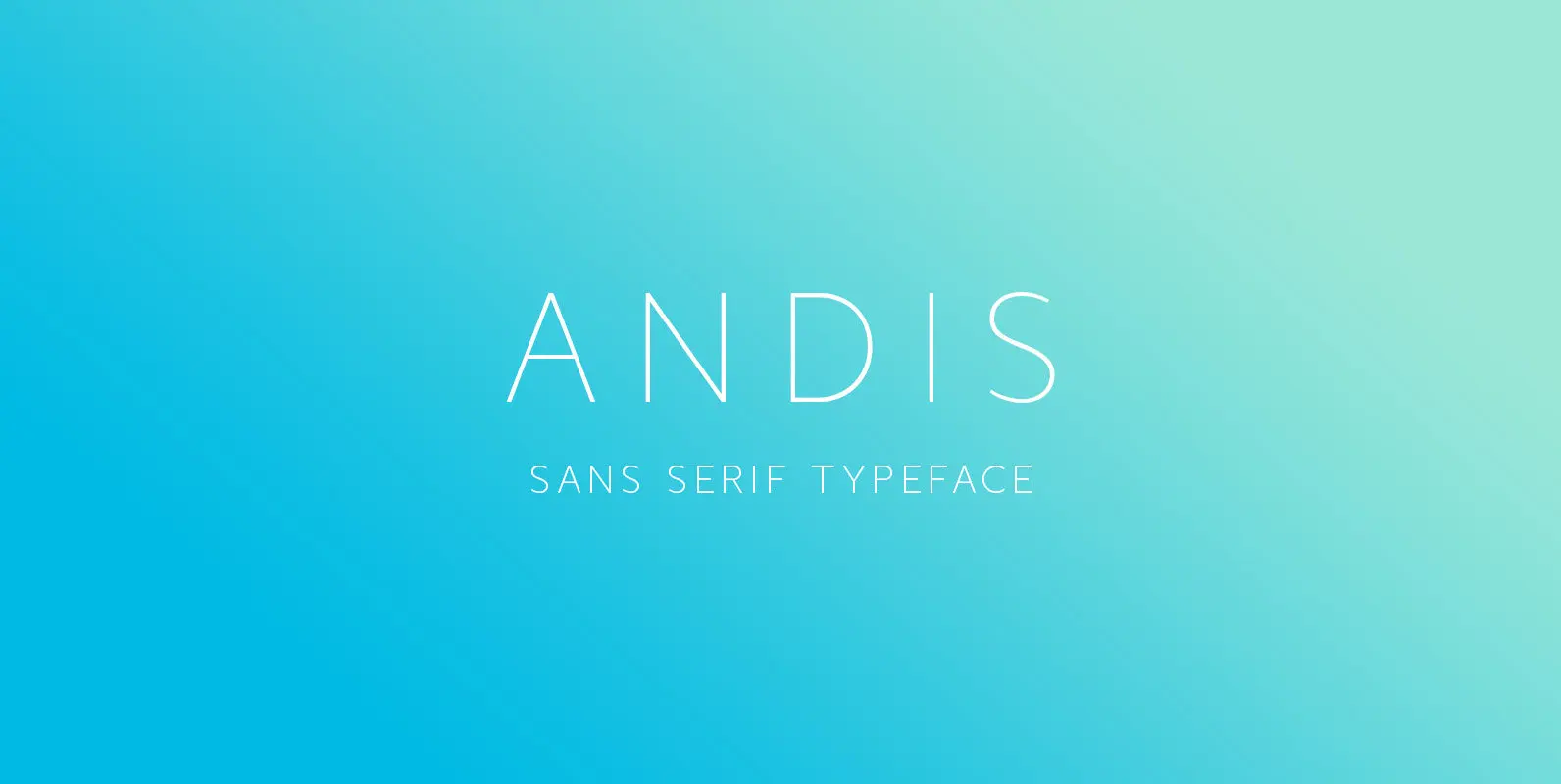
Andis Font
Andis’ rough cut makes it an interesting display typeface, but thanks to its generous x-height and firm serifs, Andis works equally well in text sizes. The typeface’s idiosyncratic italic builds a strong contrast with the roman. Andis is both functional
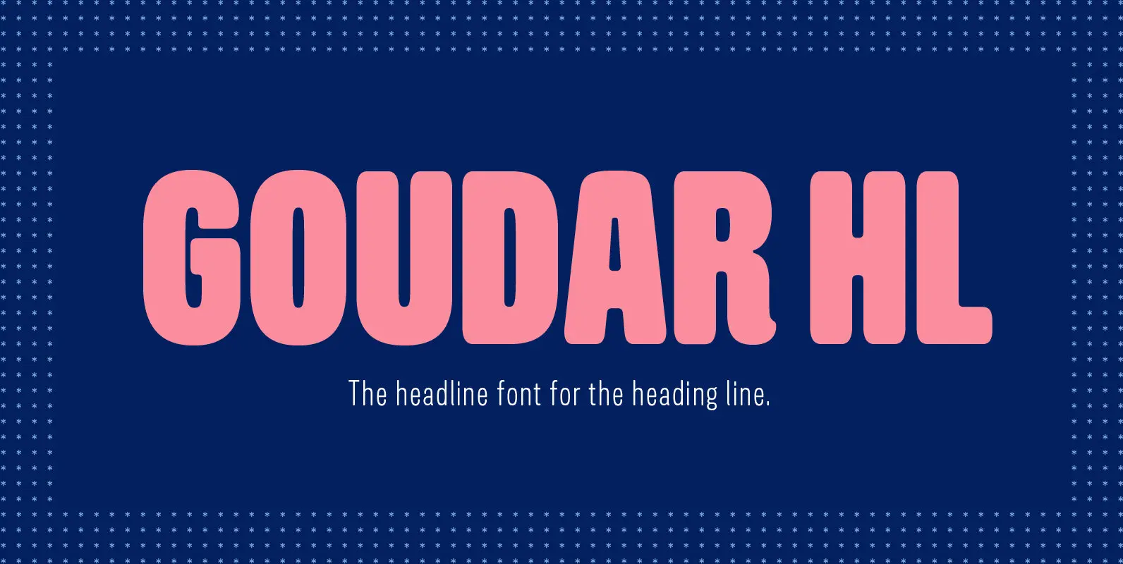
Goudar HL Font
From the old days technique to the present technology of type design, Gouda is the font that meets in the middle. With the design that has acquired the essence of wooden type letterpress but added with our own modern twist.
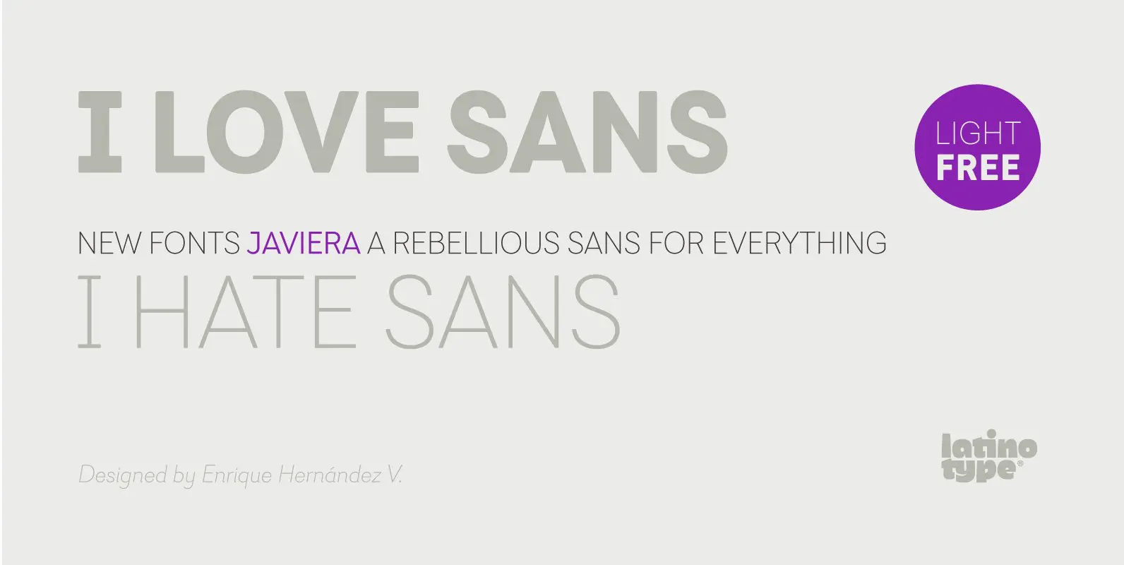
Javiera Font
Javiera is a geometric sans-serif typeface with humanist attributes. One of its main features is its small x-height, which makes ascenders and descenders look longer. The contrast gives the font a more stylised look, typical of humanist fonts. Curves and
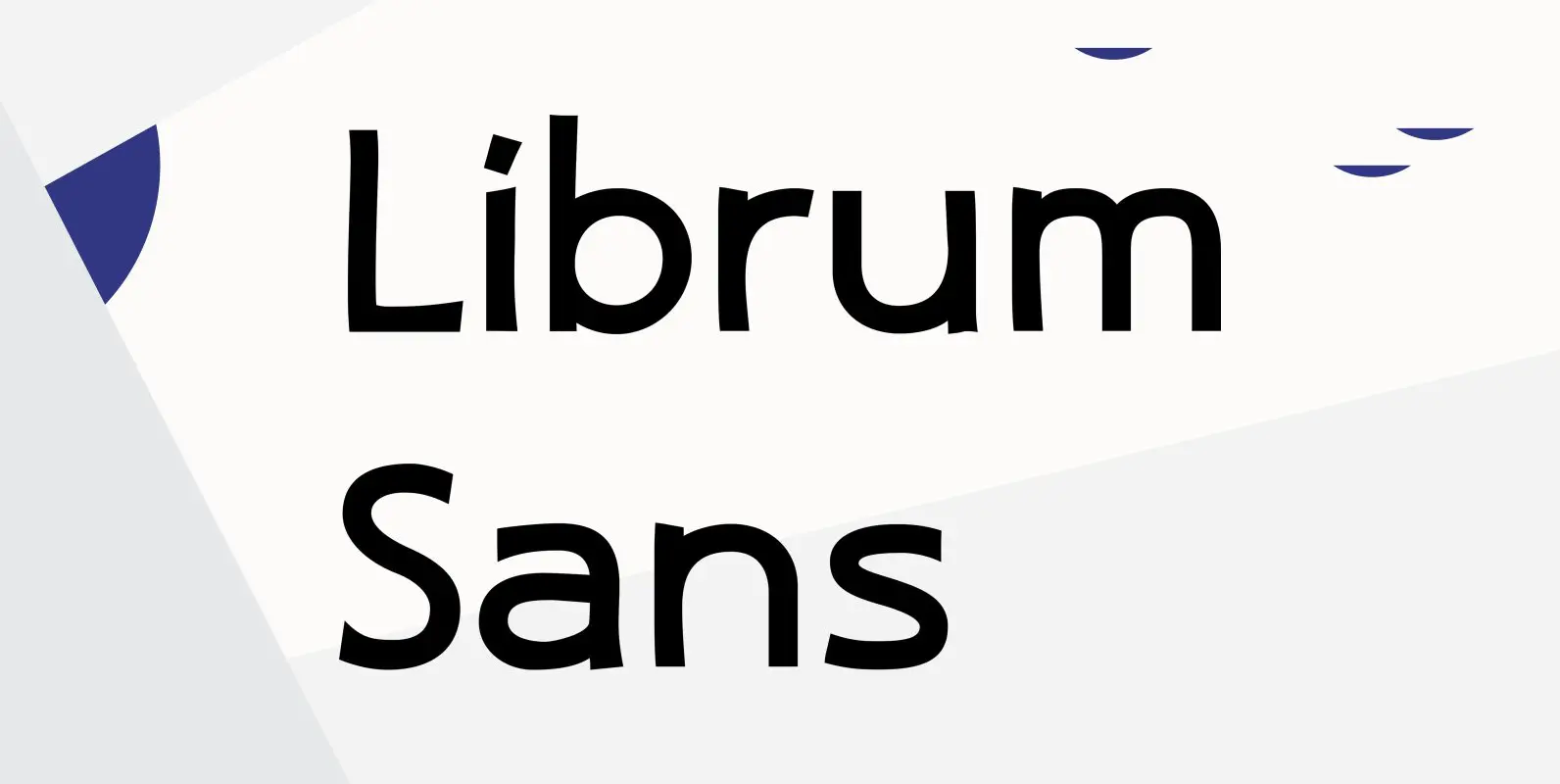
Librum Sans Font
This is the companion sans family to make the Librum serif families work as well as they do. By companion, I do mean stylistically compatible. But mainly, they have the same vertical metrics. So they work very well for run-in
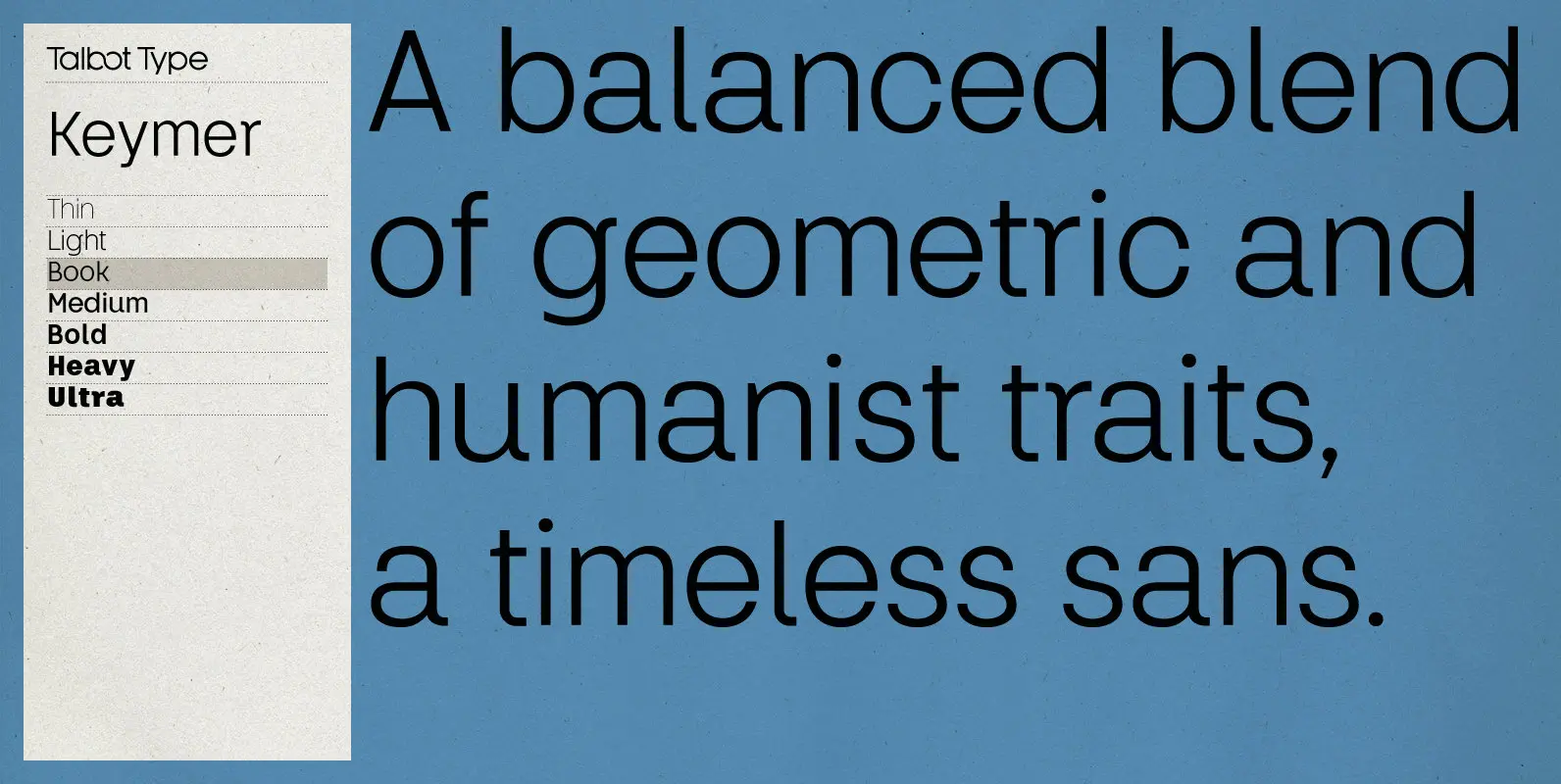
Keymer Font
Talbot Type Keymer is inspired by Margaret Calvert’s Transport typeface, designed for the British road sign system in the early 1960s. Keymer mixes geometric and humanist traits to achieve a modern, clean, elegant appearance. It is a legible and versatile

Odisseia Font
Plau presents Odisseia, a monospace type family in 8 styles designed with simplicity of shapes and a humanist touch. We’ve ventured into monospace territory, where all letters must occupy the same amount of space. This style is usually associated with

Cabarno Font
Cabarno is a sans-serif organic typeface that can be use in any typographic situation. It has his own unique style in expressed perfect condensed forms with a warm and humane feeling. This font can function as headings, subheadings and body
Favela Font
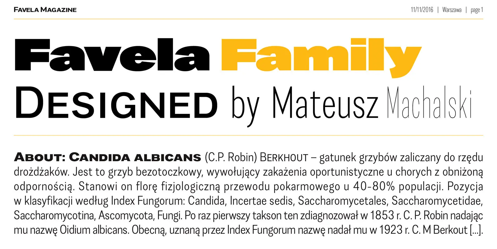
Favela is an experimental, geometric and sans serif type family. It is characterised by scalable construction of glyphs – hairline version is at the same time condensed, regular is normal, and black is super extended, with short ascenders. Favela was
Centrale Sans Pro Font
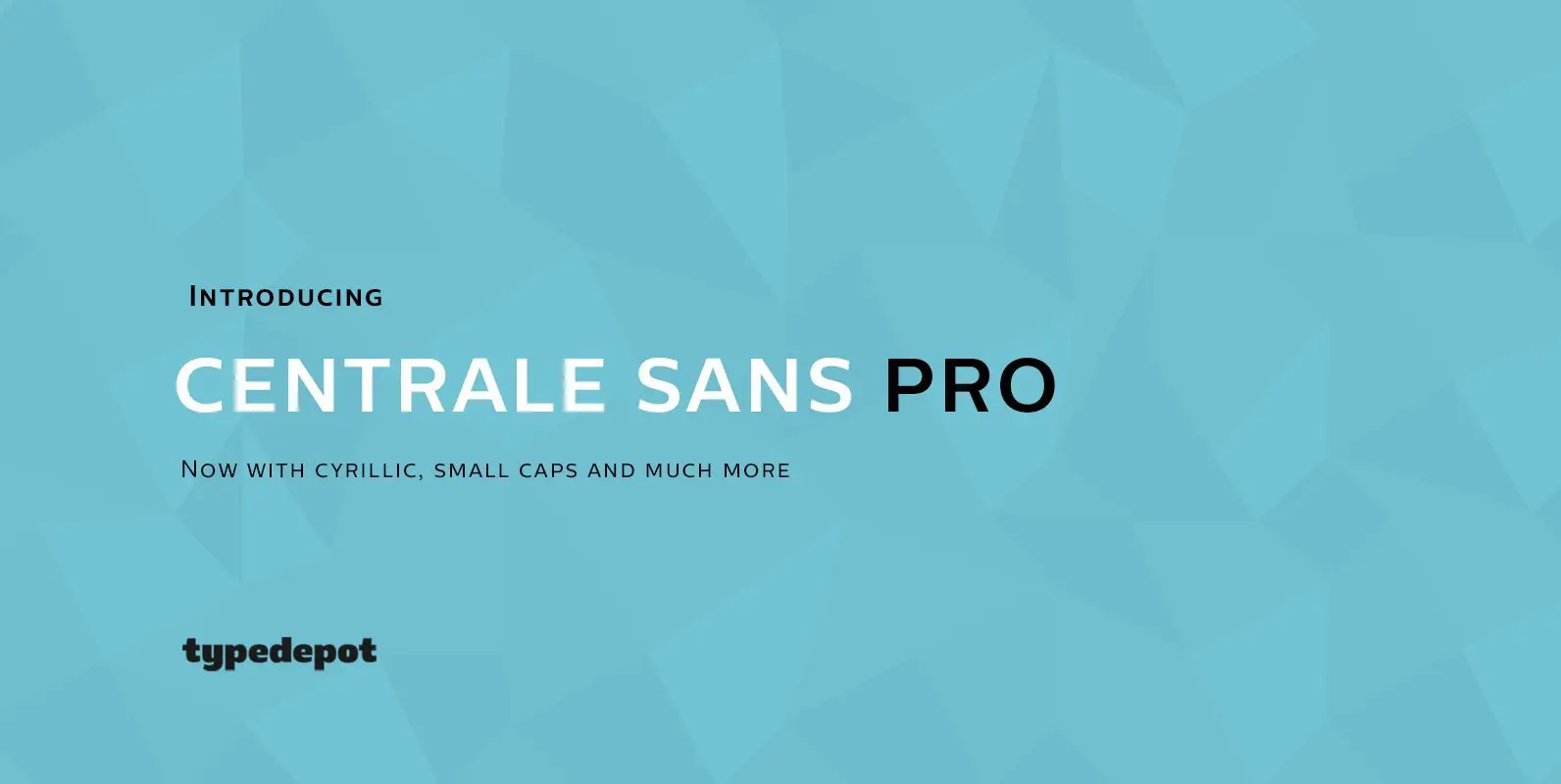
We have finally finished our work on Centrale Sans. A lot of mistakes have been made, and we hope a lot of them have been fixed. But finally we are ready to end this five-year journey and present you the
Synerga Pro Font
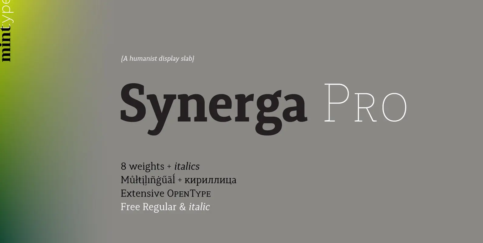
Synerga Pro is a contemporary slab-serif typeface with humanist features. In smaller text sizes it exposes the characteristics of its slab built, but as the size grows, lots of fine features become visible: rounded terminals, dynamic horizontal serifs, non-vertical endings
Diaria Sans Pro Font
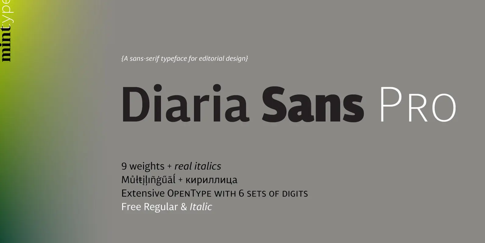
Diaria Sans Pro is a sans-serif counterpart of Diaria Pro. With its extensive 9 weights and corresponding italics, extensive language support, and various OpenType features it is meant to build visual hierarchies of any detail and complexity in editorial design.
