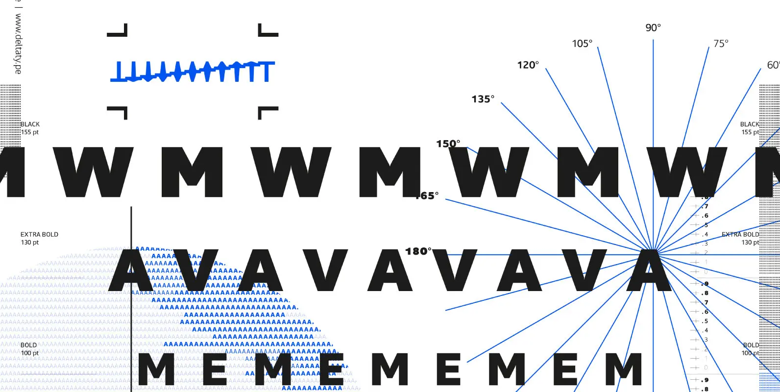
Maiden Font
Maiden is a humanist sans-serif based typeface with reverse pen-head style and a bit sweet link which contains nine weights from thin to black. Designed to use as body text to headline. Published by DeltatypeDownload Maiden
Here comes the updated Pro version of Centrale Sans Condensed – not just a “squished” version of the normal Centrale Sans but designed from scratch with all the family characteristics in mind – combination of the grotesque and the humanist
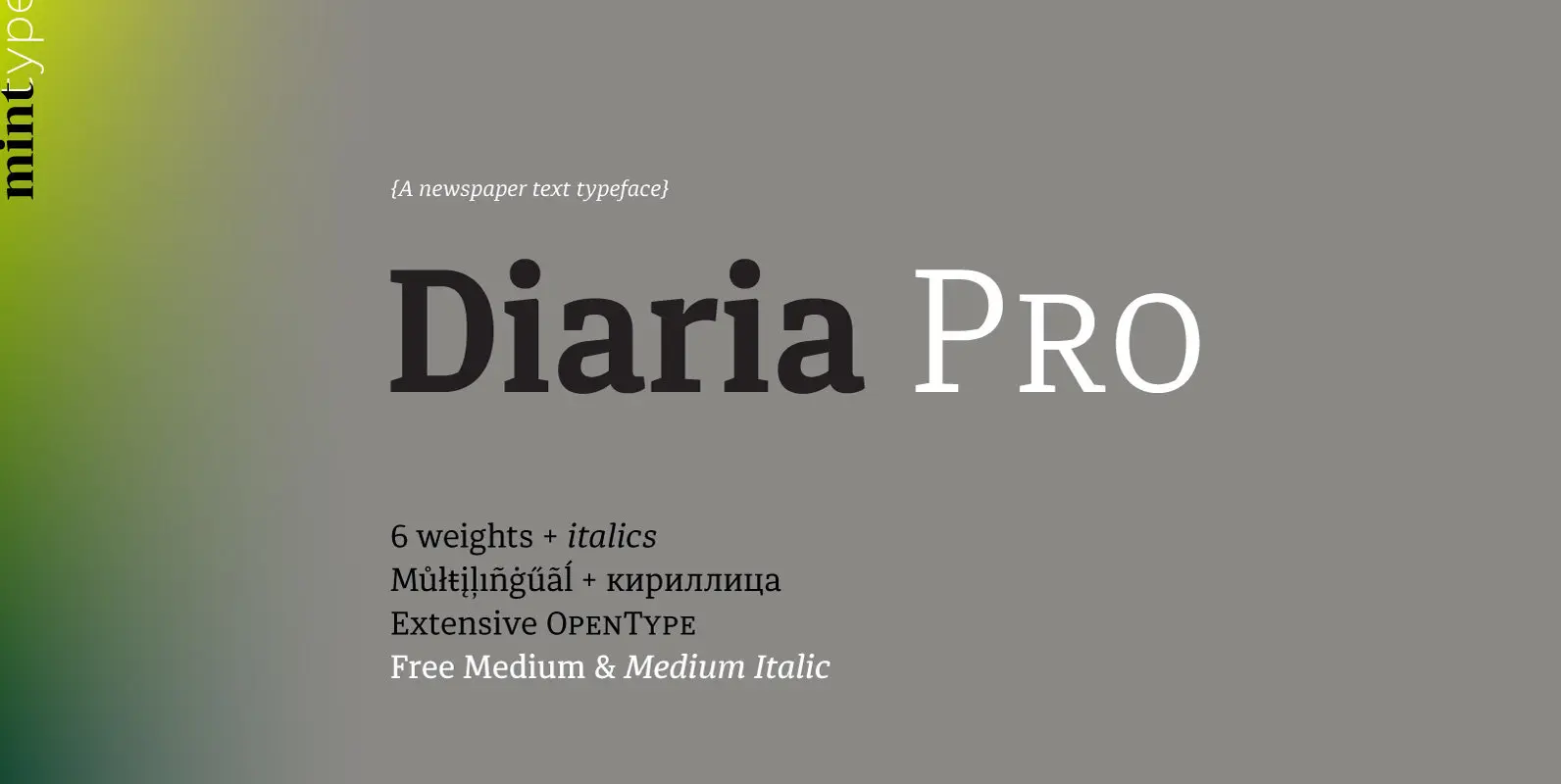
Diaria started as a project in Typeface Architecture for Master in Advanced Typograghy at EINA, Centre Universitari de Disseny i Art de Barcelona, a course tutored by Laura Meseguer and Íñigo Jerez Quintana. Later it has developed into Diaria Pro,
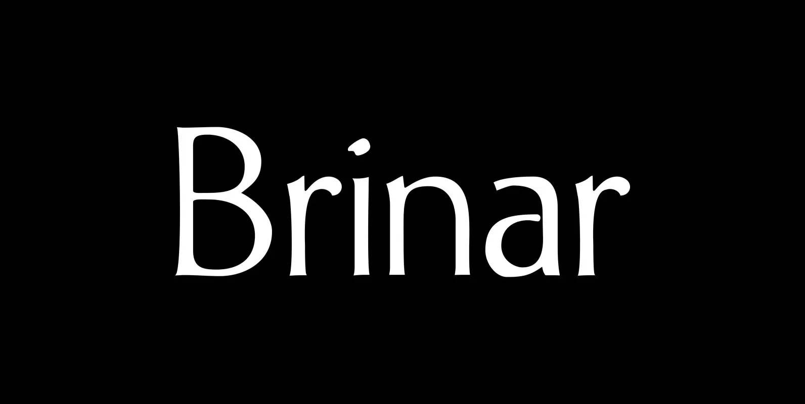
I’ve been working on a usable sans serif for body copy since the mid-1990s (though I certainly did not know it at the time). This one works well. It started life back in the mists of time as an old
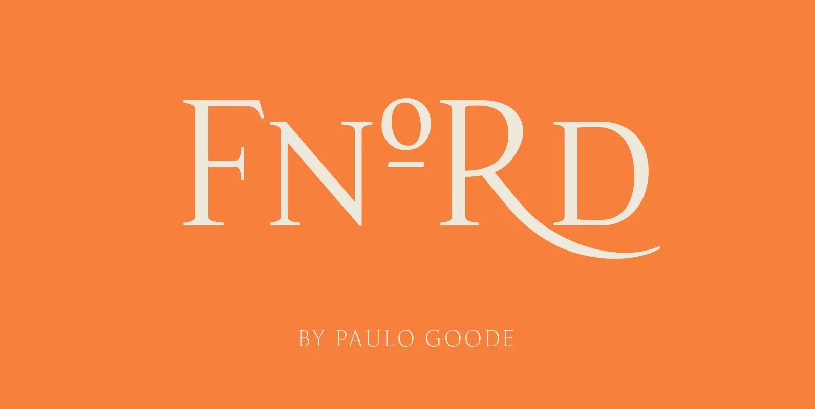
Fnord is a contemporary humanist serif typeface, it is ideally suited for display purposes and branding. The family has been designed to be highly versatile, containing a total of 23 fonts – each font features discretionary ligatures, swash alternates and
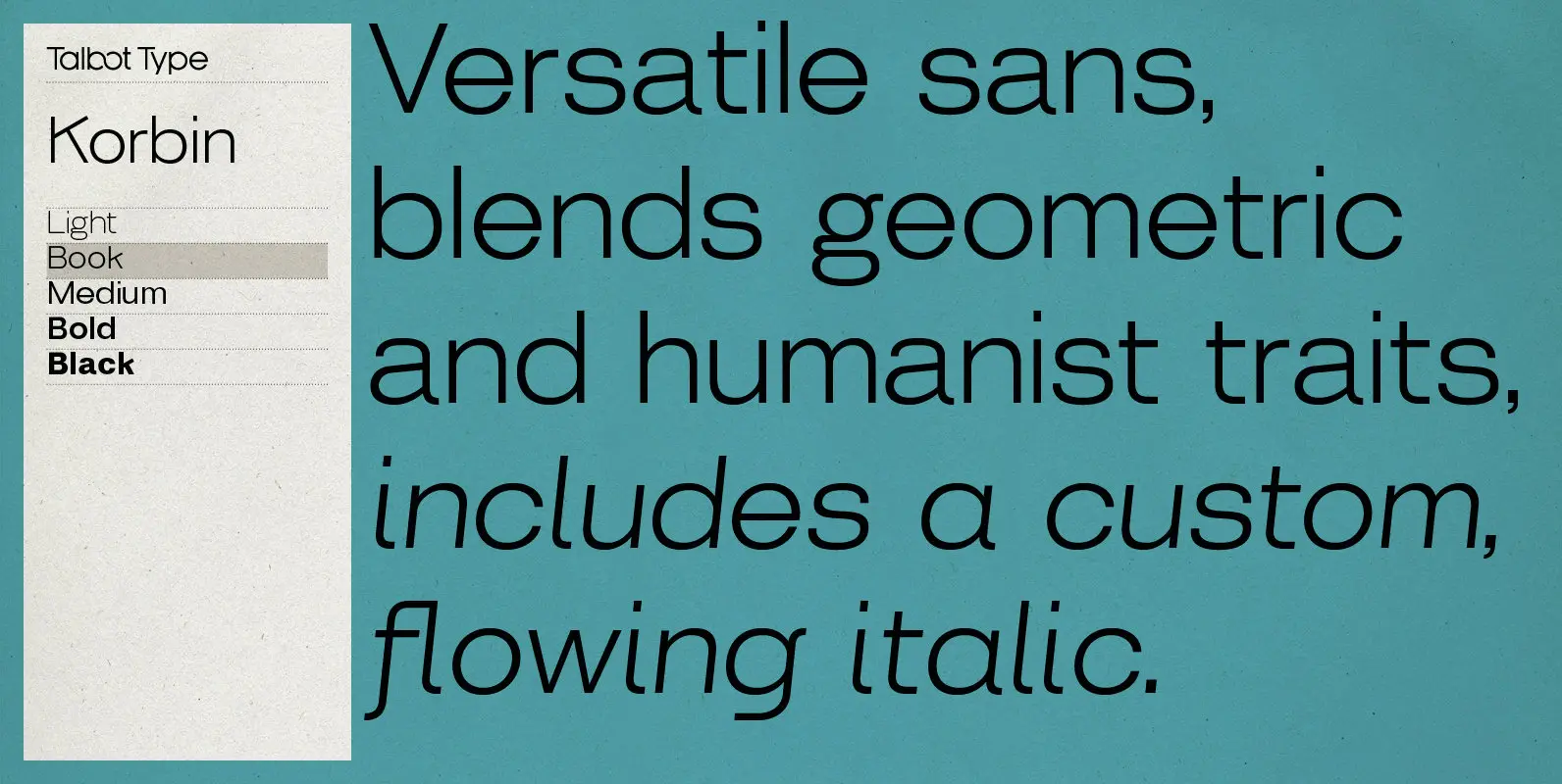
Inspired by the sans-serifs of the late 19th and early 20th century, Korbin is a legible and versatile text and display face available in five weights. It mixes geometric and humanist traits to achieve a modern, clean, friendly appearance. The

Buddy is the new companion sans for Contenu, the book font family designed for an upcoming book on book family design. It has the same vertical metrics as the Contenu families, so it fits perfectly in run-in heads, nested styles,

Maiden is a humanist sans-serif based typeface with reverse pen-head style and a bit sweet link which contains nine weights from thin to black. Designed to use as body text to headline. Published by DeltatypeDownload Maiden

Bambino New font is a geometric sans serif with humanist readability. It comes in 7 different weights, 14 styles and plenty of OpenType features. It can be said it’s an arrogant cousin of Bambino font , mostly because of its
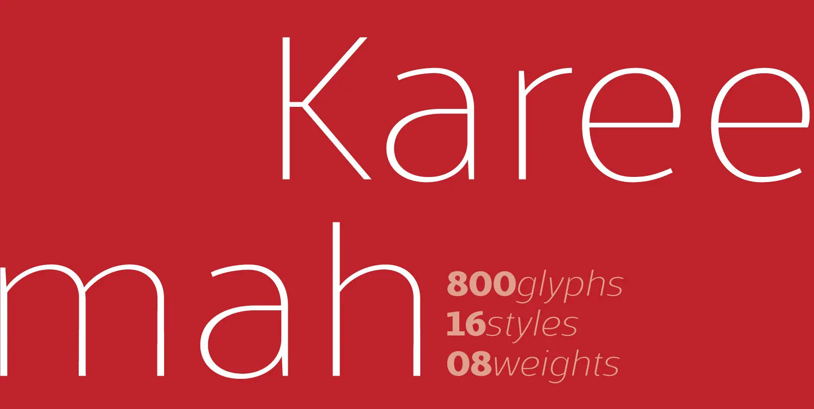
Kareemah is a humanist typography, composed by roman and italics with 16 styles and 08 weights (800 glyphs) including ligatures, alternates, small caps, old styles figures, fractions, superiors, inferiors and more. Perfectly legible and clean in the long, simple texts
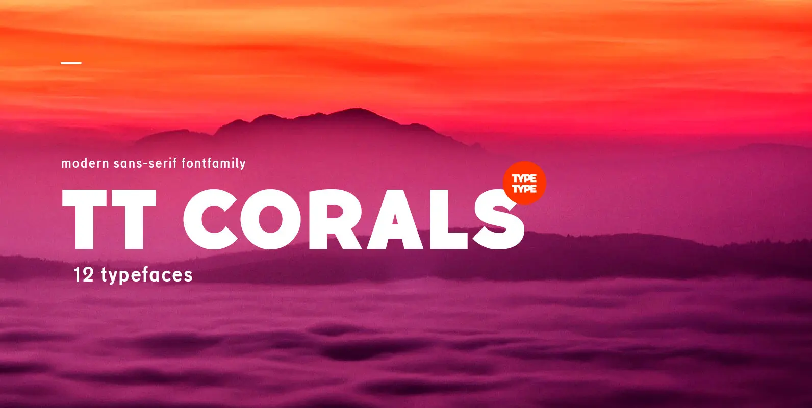
TT Corals is a modern humanistic sans-serif which has many typical traits of the beginning of the 20th century. For an increased functionality of the font family we’ve created 6 typefaces of various weights: Thin, Light, Regular, Bold, Extrabold, Black.
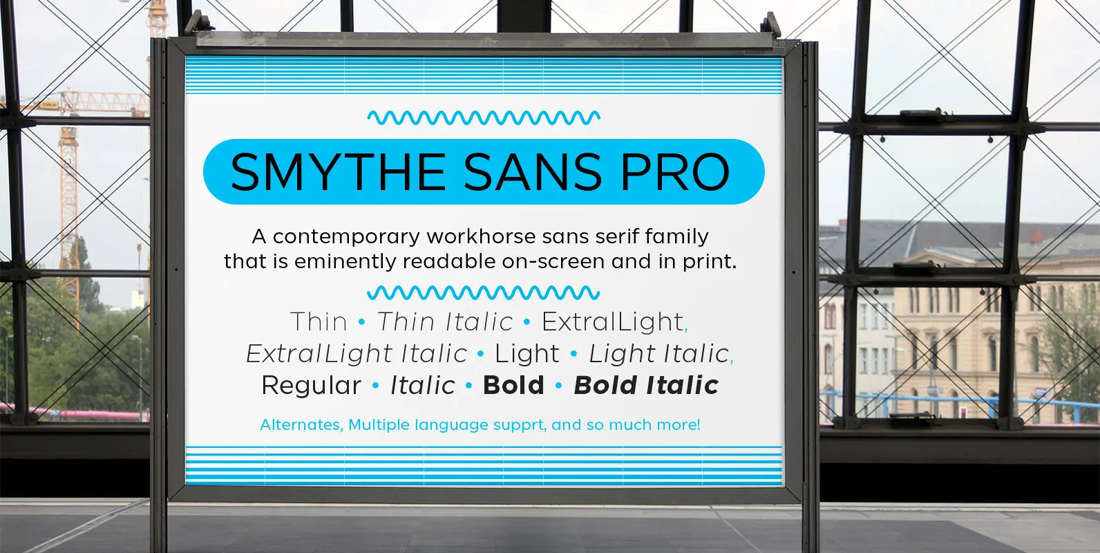
SmytheSans Pro is a contemporary workhorse sans serif family that is eminently readable on-screen and in print. It is an updated version of our popular family Smythe Sans—we extended the characters sets, redrew most of the characters, rigorously spaced and
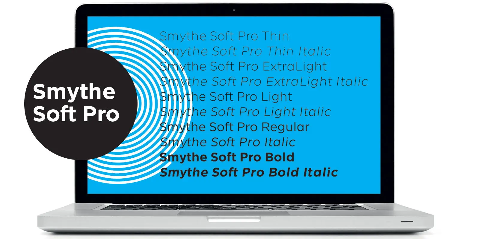
SmytheSoft Pro is a contemporary workhorse sans serif family that is eminently readable on-screen and in print. It is an updated display version of our popular family Smythe Sans with custom rounded terminals, rigorously spaced and kerned. Smythe Soft Pro
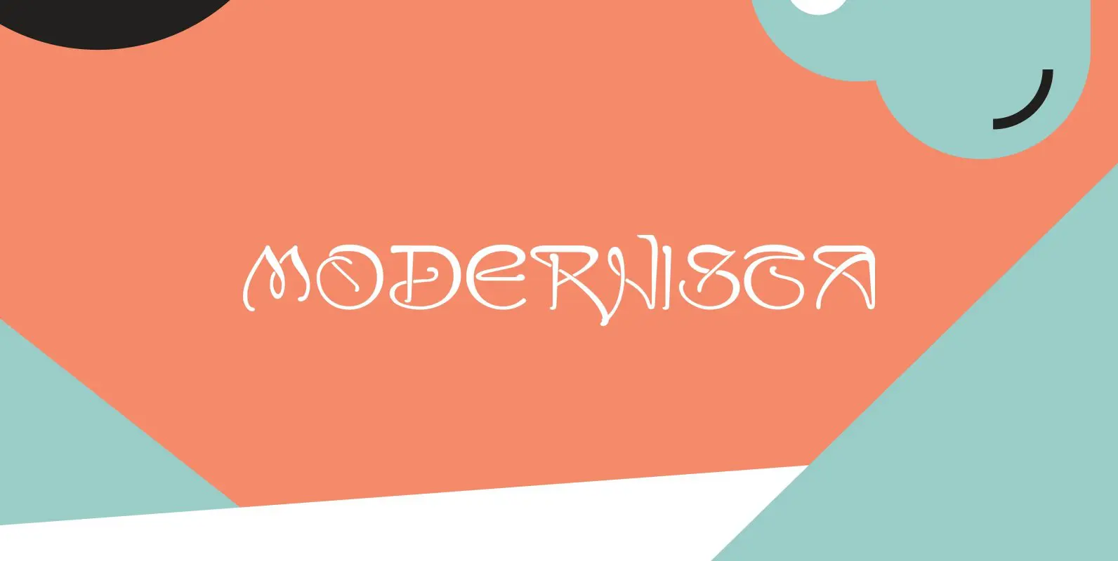
“Art Nouveau” happened over Europe under different names. They called it “Jugenstil” in Germany, “Le style moderne” in France, »Sezessionsstil« in Austria and Eastern Europe, “Stile Liberty” in Italy and “Modernista” in Spain. “Jugendstil” in Germany is what started modern