Tag: humanist
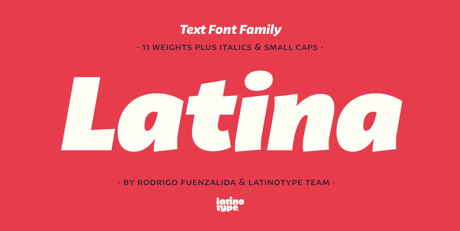
Latina Font
Latina is our first humanist typeface designed for use in continuous text. This font is based on calligraphy, but calligraphic features have been changed in order to make Latina a more neutral font. This prevents readers from losing their focus
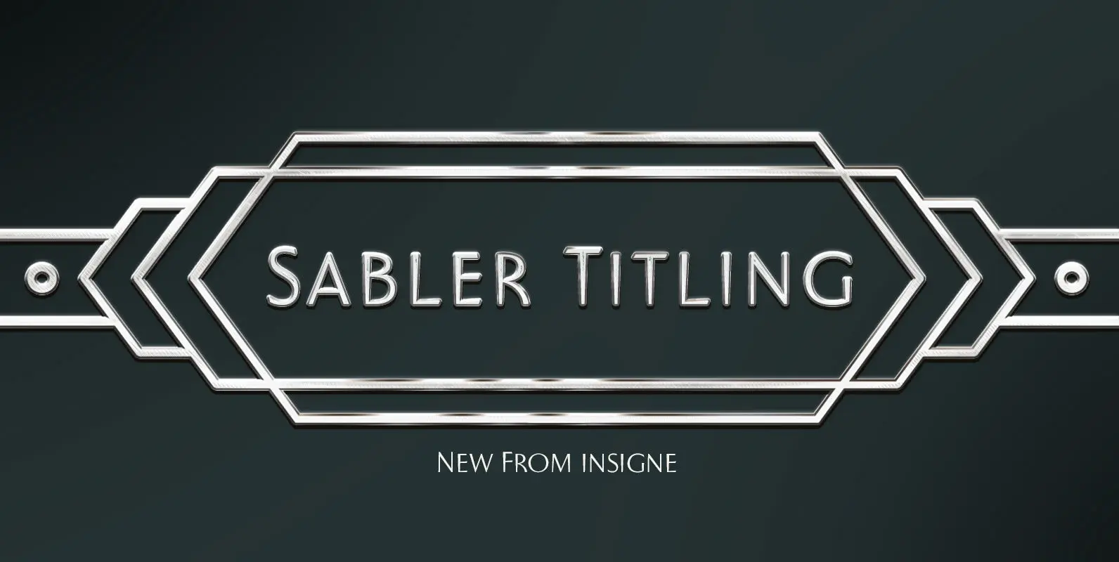
Sabler Titling Font
Make the right statement with the elegant Sabler Titling. This showstopping font features an inherent grace combined with the classic style of the Art Deco period. The subtle beauty of its letters is highlighted by the typeface’s stems, which taper
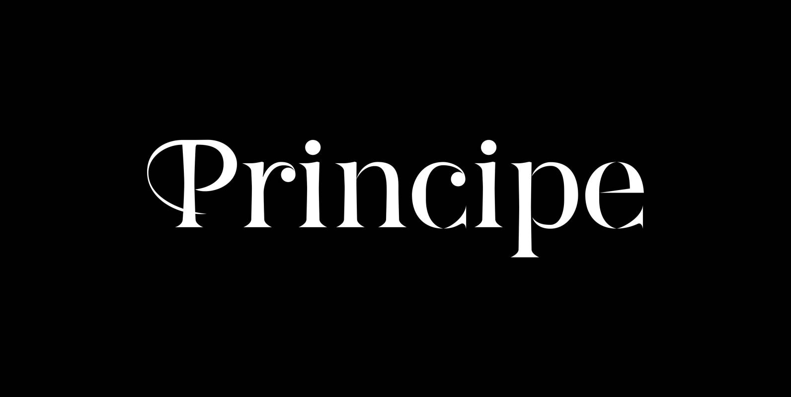
Principe Font
“Principe” is the Bodonian idea driven to the limit by abolishing most of the hairlines! The shape is completed only by the eye of the reader. This gives room for elegant embellishments and makes for a surprisingly new look to
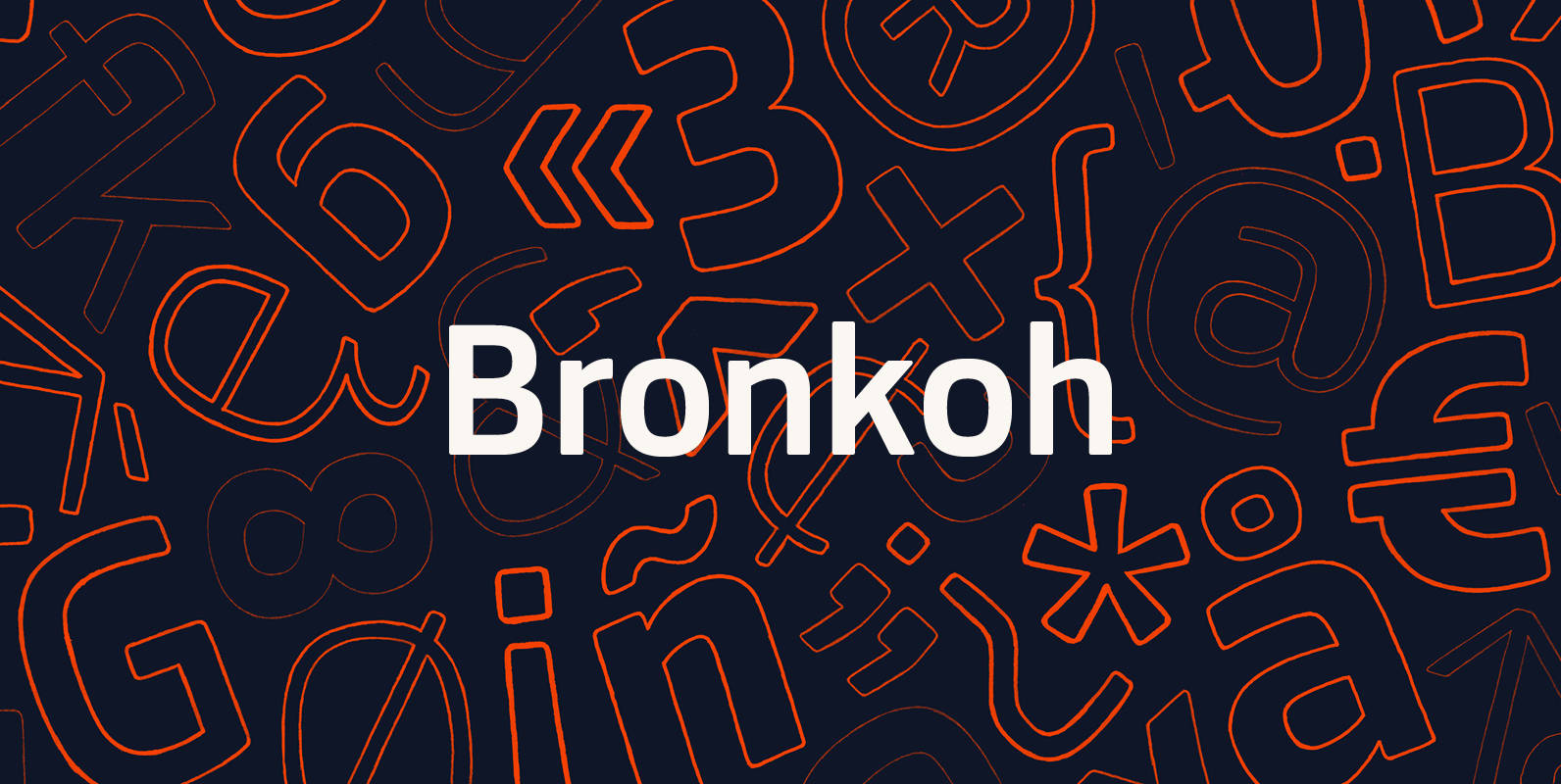
Bronkoh Font
A subtly softened sans, Bronkoh aims to give a friendly face and soft touch to type both onscreen and in print. Humanist forms and generous apertures make this a sturdy and legible face while it's softened curves and terminals give
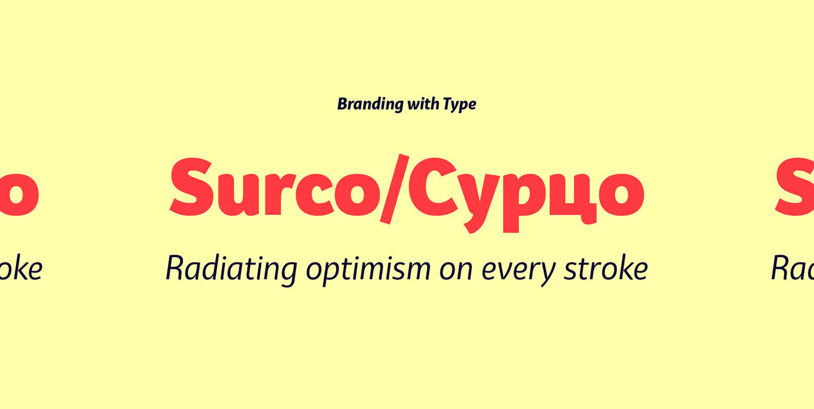
Bw Surco Font
Bw Surco is a fresh and optimistic humanist sans serif with hand-stroke cues. Its soft, rounded shapes, balanced x-height and the contrast between the romans and the true italics, all build towards a very practical font family with a friendly
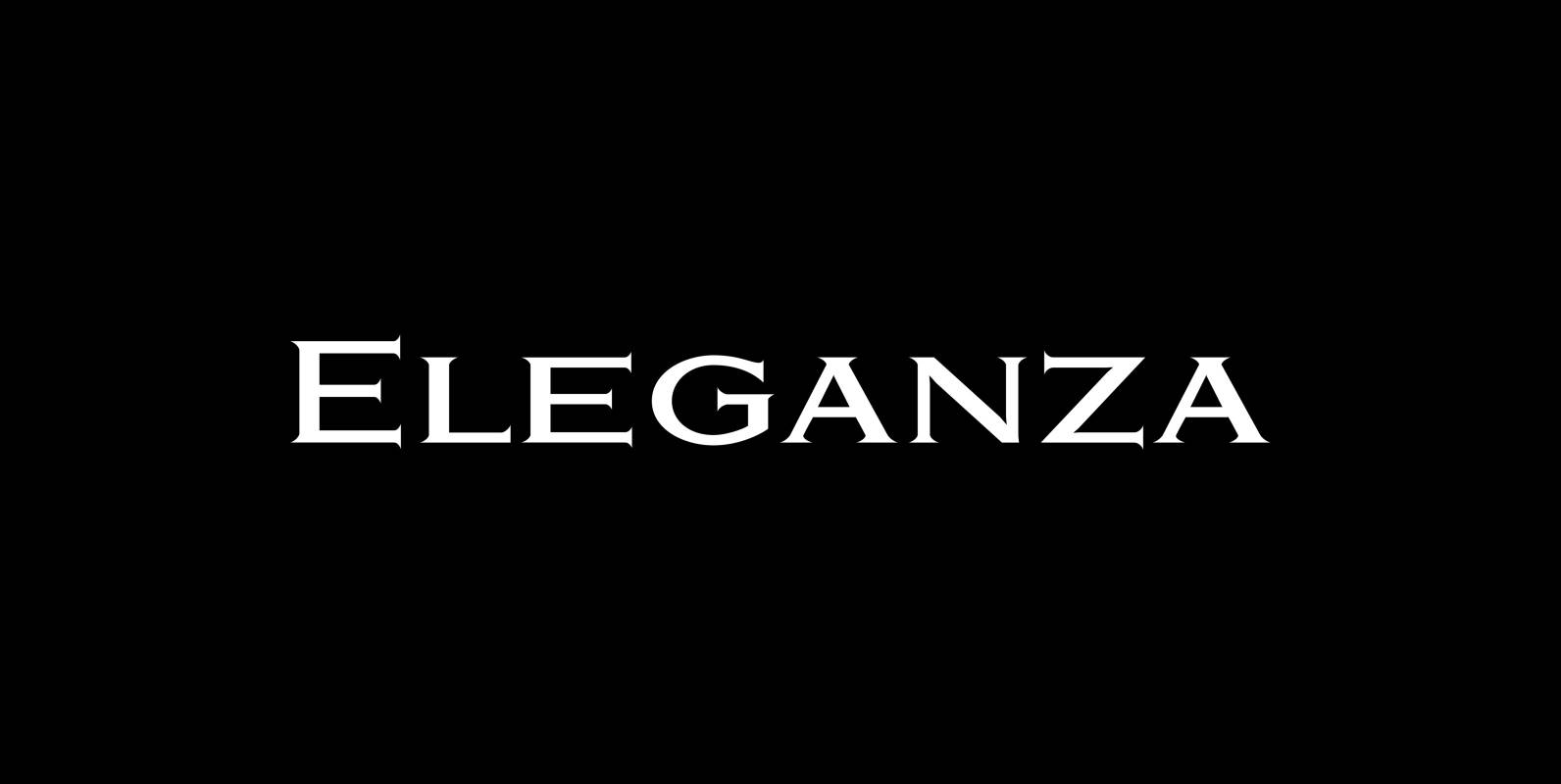
Eleganza Font
“Eleganza” is my most elegant typeface. At least that is what I think! I use it for business cards and everything that has to be elegant with that extra touch. The font comes in pairs for the price of one.
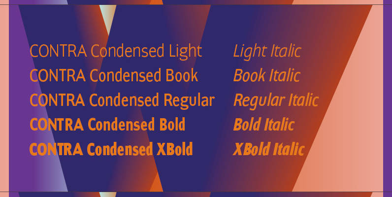
Contra Condensed Font
Contra Condensed is the condensed version of my Contra family of fonts. It is very condensed, but not yet narrow. It is well suited in all situations where one needs to save space. Published by Wiescher DesignDownload Contra Condensed
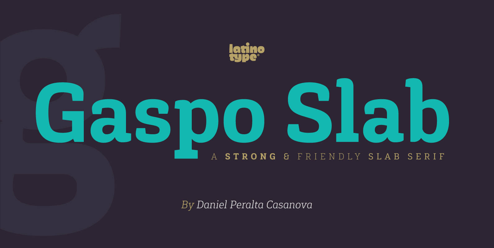
Gaspo Slab Font
Gaspo Slab is a fresh slab serif typeface that features aesthetically pleasing curves, strong serifs, ample counters, humanist proportions and ink traps. The result is a very functional font with a contemporary design and highly readable at small sizes. Gaspo
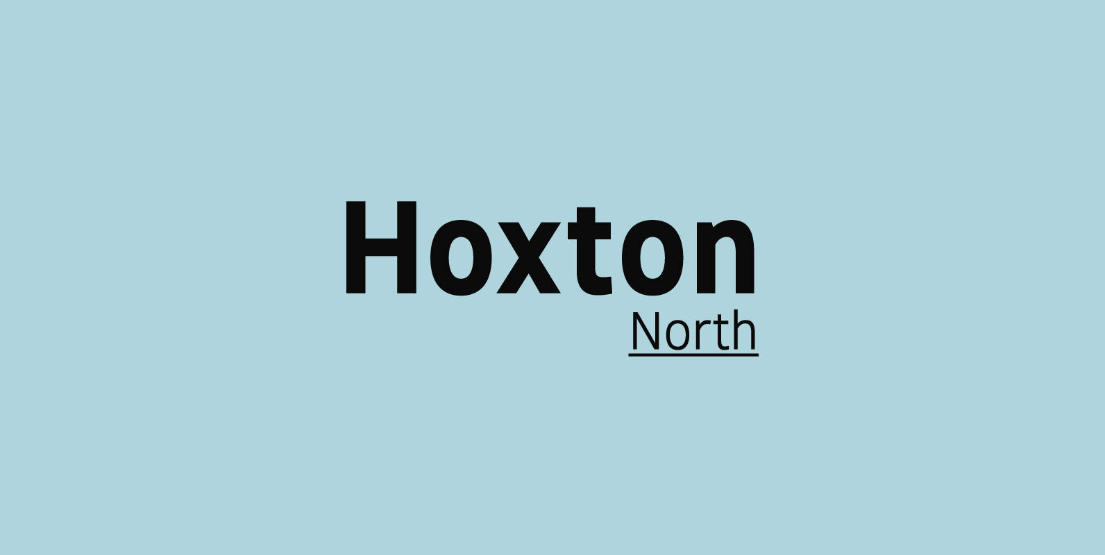
Hoxton North Font
Hoxton North came out of the concept to create something distinctly British, drawing on modernist influences such as Edward Johnston's typeface for the London Underground and Gill Sans. A humanistic san serif typeface with a British modern quality. Open forms

Danos Font
Danos is a flexible family of modern sans serif and characterized by some humanistic. It has his own unique style in expressed perfect condensed forms, inspired by the classic industrial grotesque and geometric typefaces. Danos is an ideal font family
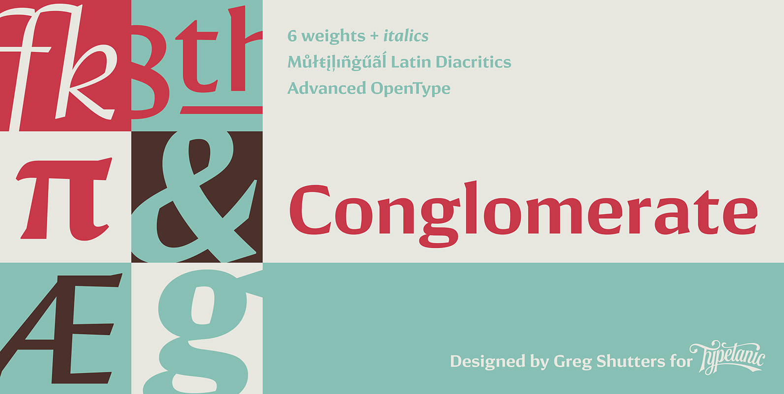
Conglomerate Font
Sans or serif? Square or rounded? Calligraphic or geometric? Conglomerate is both all and none of these things — a subtle yet unorthodox blend of typographic traits resulting in a clean, unique, and versatile font family with large, open counters

Sana Sans Font
Sana Sans is a humanist functional typeface with a modern feel. It is intended to be a face well-suited for multiple purposes, especially in publishing. Sana Sans looks perfectly legible and clean in long texts, and neat and simple in
