Tag: Impact
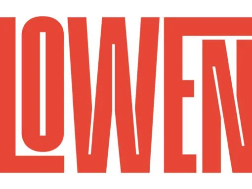
Lowen Font
Get noticed today with Lowen: A modern typeface designed for impact In the rapidly evolving world of digital design, impactful and versatile typography is no longer just a luxury—it’s a necessity. Today’s graphic and digital designers need to efficiently cut

Popart Pixel Font
The digital age has revolutionized how we view and consume art, with graphic design playing a pivotal role in shaping the aesthetic of our time. One innovative and eye-catching embodiment of this movement is Popart Pixel, a unique sans serif
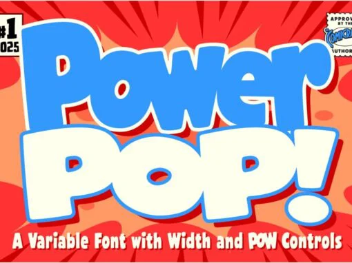
Power Pop Font
For the conscientious graphic designer, looking to give their latest digital design project a thematic edge, the Power Pop Font presents an intriguing option. Steeped in comic-inspired aesthetics and doused with a layer of onomatopoeic fun, it stands as a
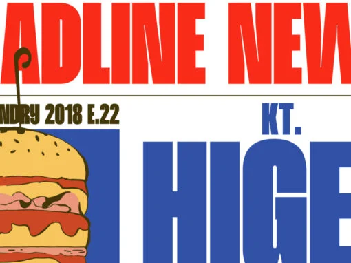
Higer Font
As a graphic or digital designer, you will understand the allure of delving into the essence of your craft, inspired by a nuanced blend of traditional structures and modern aesthetics. Such is the allure offered by the distinguished display font,
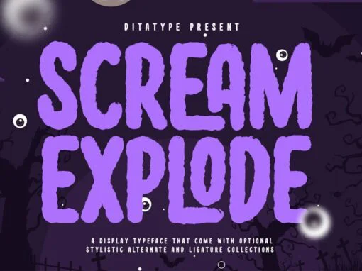
Scream Explode Font
As a graphic designer or digital artist, you understand the crucial role that typography plays in the overall aesthetic and communicative success of any design project. Whether you’re working on branding materials, magazine covers, or social media content, the right

Flinton Font
In the universe of graphic and digital design, the name Flinton resonates with elegance and versatility. From logotype creation to the designing of distinctive posters and other merchandising materials, the prestige and adaptability of the Flinton Font are unequaled. Taking

Sakina Font
Artistic expression permeates the fabric of society, existing in every shape and form. It is quite rare, but truly magical, when text – commonly associated with mundane communication – douses itself in the colors of creativity, emerging as a work
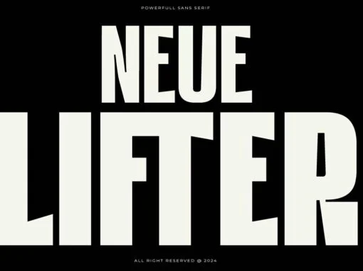
Revolutionizing Design: Introducing the Dynamic HN Neue Lifter Typeface
Opens a world of possibilities for any designer, whether one’s canvas be physical, or digital—the HN Neue Lifter font. A typeface that is as contemporary as it’s functional, this font marries modern aesthetics with a sporting ethos, creating a perfect
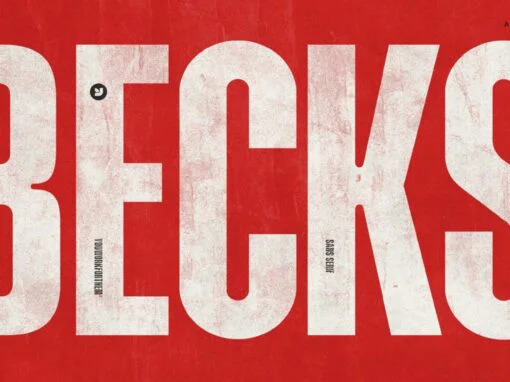
Transforming Typography: Unveiling the Distinctive Power of YWFT Becks Font
In the world of typography, the quest for a distinctive font often feels like an arduous journey. Digital and graphic designers tirelessly scroll through an endless trove of options, all in pursuit of that one font that can singularly communicate
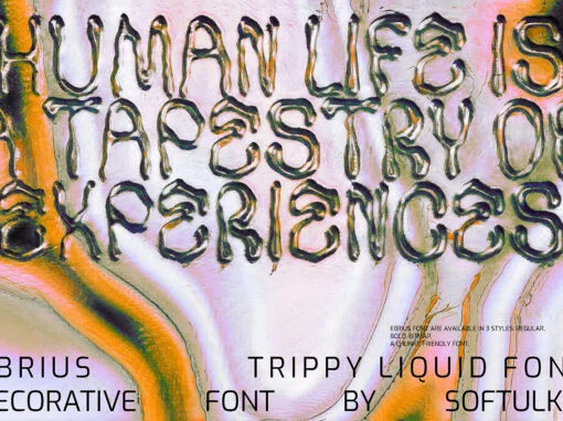
Y2K Fonts Style in Modern Design: Reviving Nostalgia
Do you remember the vibrant and futuristic design styles of the late 1990s and early 2000s? If so, you may be familiar with Y2K fonts, which were widely popular during that era.
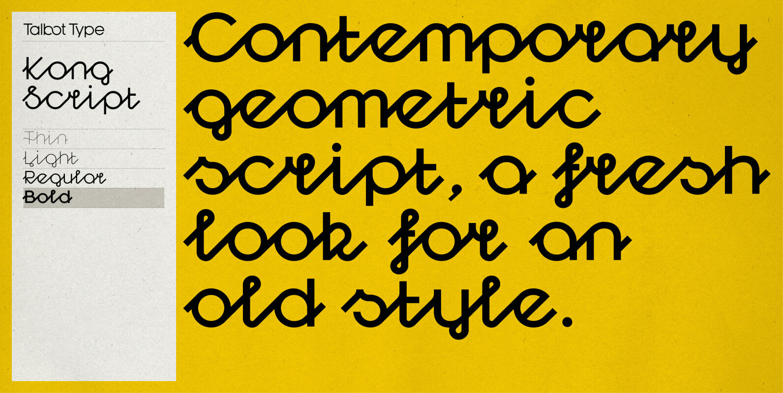
Kong Script Font
Kong Script is a geometric, script typeface, a contemporary interpretation of a traditional style. The upper and lower case character sets link seamlessly, in the manner of a traditional script, to create an easy, flowing look but with a crisp,
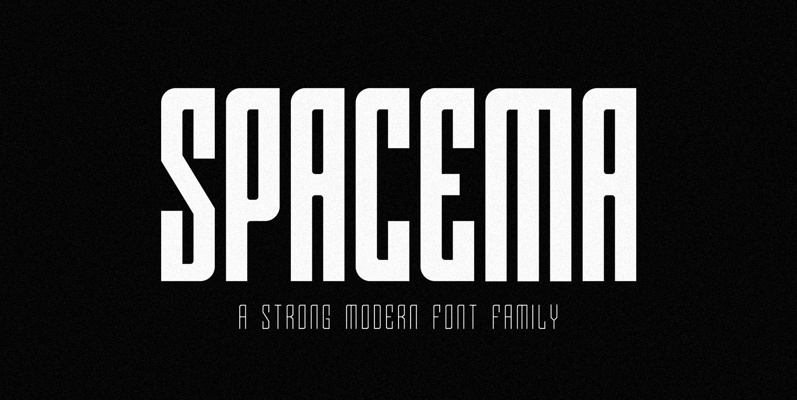
SPACEMA Font
Spacema is a modern condensed typeface with a strong vertical emphasis while maintaining prominent geometric quality to it. With a balance of hard lines and smooth curves, Spacema is an eight-weight typeface which includes uppercase, numerals, extended characters and accents.
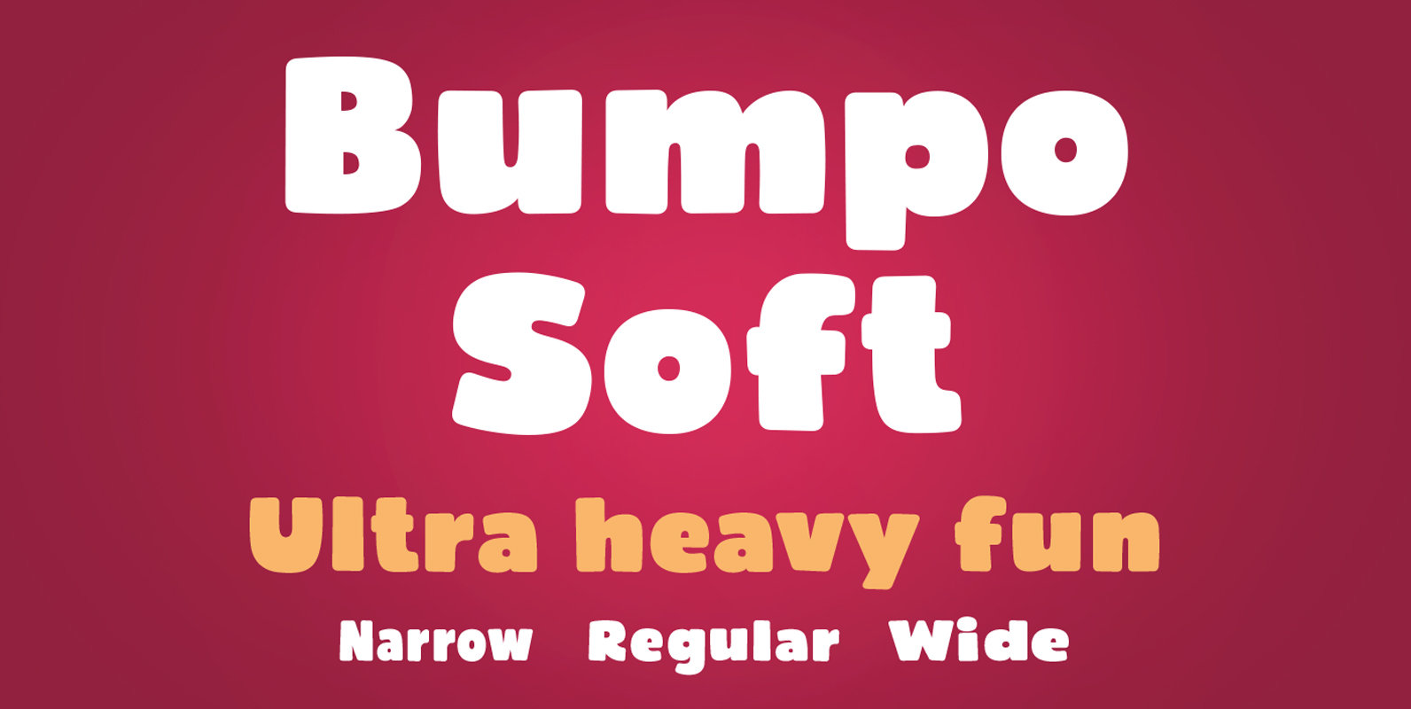
Bumpo Soft Font
Bumpo Soft is a chunky and a fun display typeface family with rounded edges. It is the softer version of Bumpo. With an extra heavy but friendly personality, Bumpo Soft works well for posters, food packaging, children’s products and books,
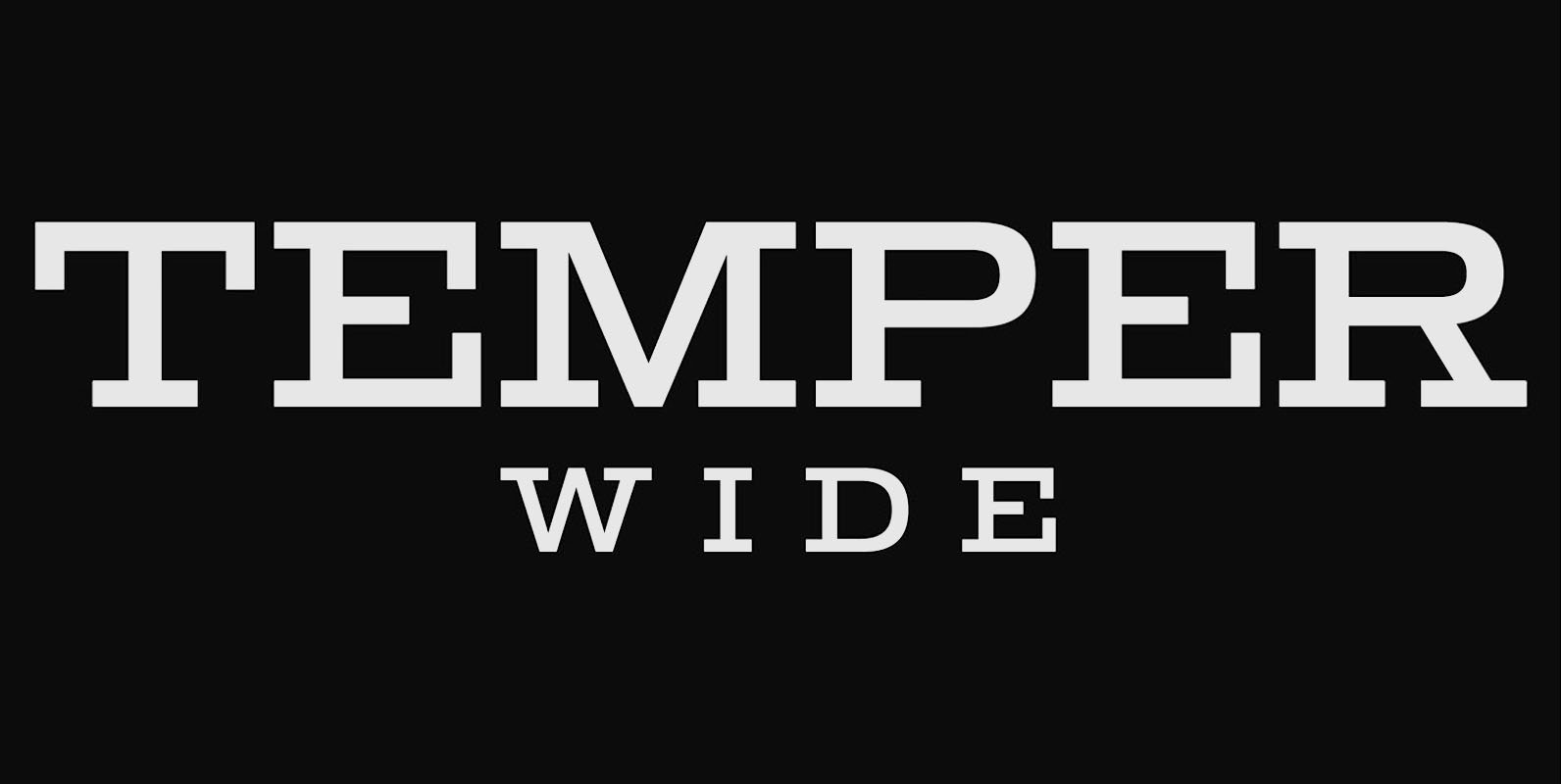
Temper Wide Font
Temper Wide was designed in 2018 by type designer Jeschke in Berlin. The font consists of many cuts from light to bold and is formally based on its predecessor, Sequel 100. A characteristic feature of the Temper Wide is the
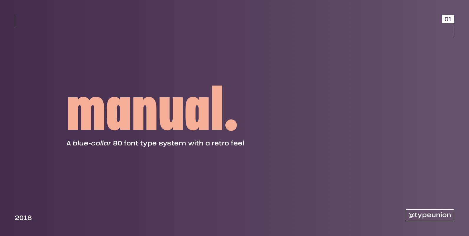
Manual Font
Manual is an 80 font super family formed of 10 weights in 4 different widths. The font is styled with a slight retro feel to give it a unique appearance. Manual is a blue-collar font that works hard for you
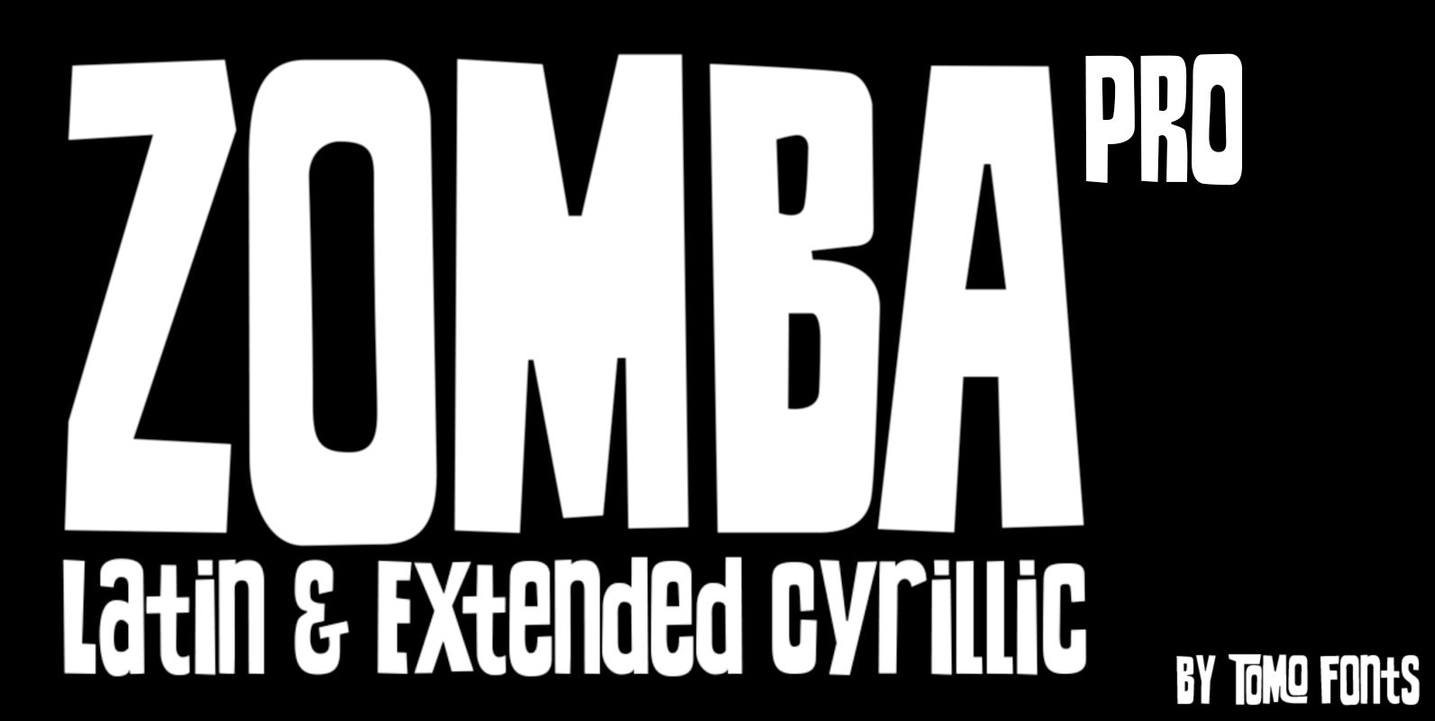
TOMO Zomba Pro Font
ZOMBA PRO! means we added Cyrillic and more latin languages. Zumba Pro is a retro-horror typeface that speak by itself. Ideal for big and strong messages. Kids gonna love it. Carefully hand crafted includes almost all latin languages and Cyrillic!
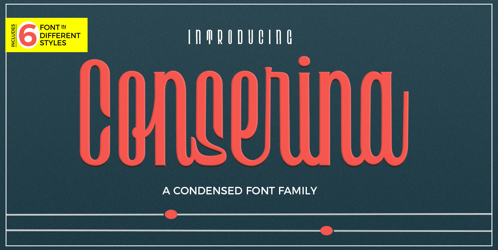
Conserina Font
A powerful and beautiful condensed sans serif display typeface. It brings charming curves and satisfying patterns to traditional condensed fonts. It's designed for impact, without sacrificing style or legibility. It looks especially stunning in large scale, although it still carries
