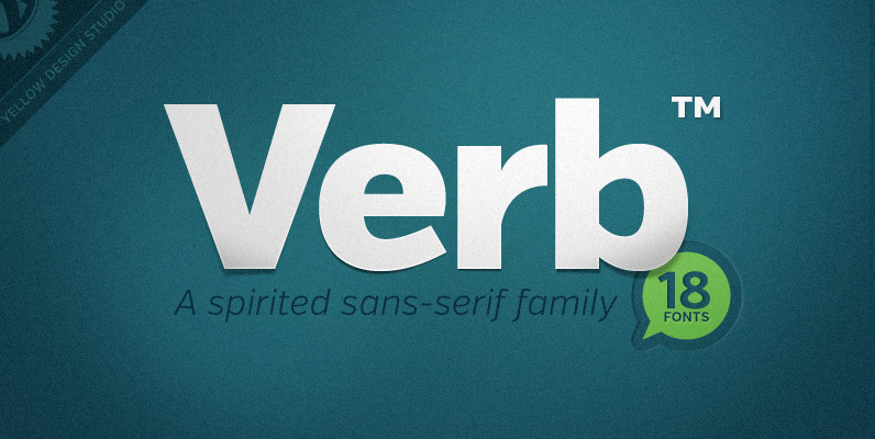
Tag: industrial sans
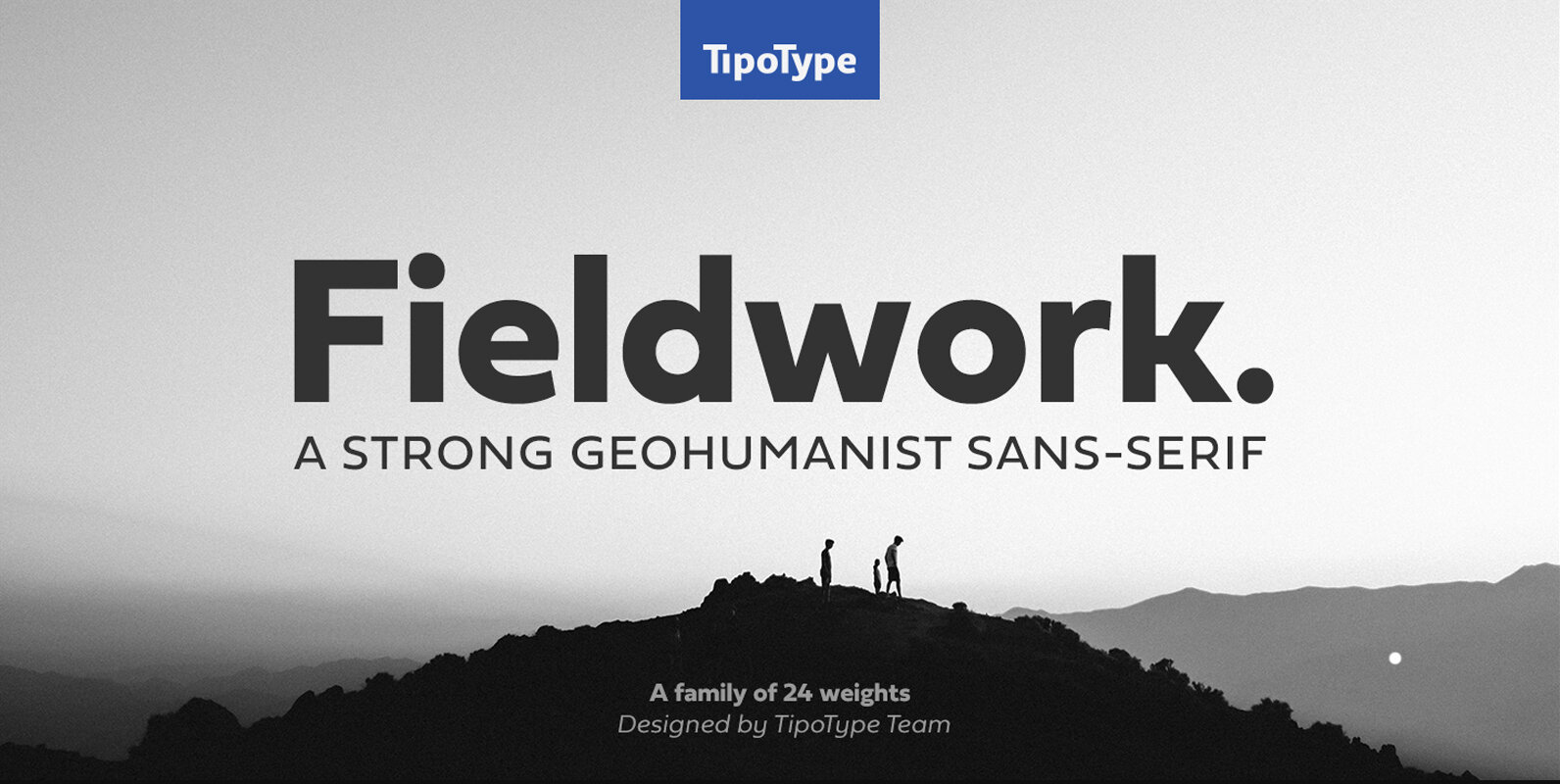
Fieldwork Font
Fieldwork brings back the manual tradition of typography production, veering away from lab interpolations. Each of its 24 variants was drawn based on optical evaluation; many of its curves and details were specifically adjusted for each weight, reformulating them to
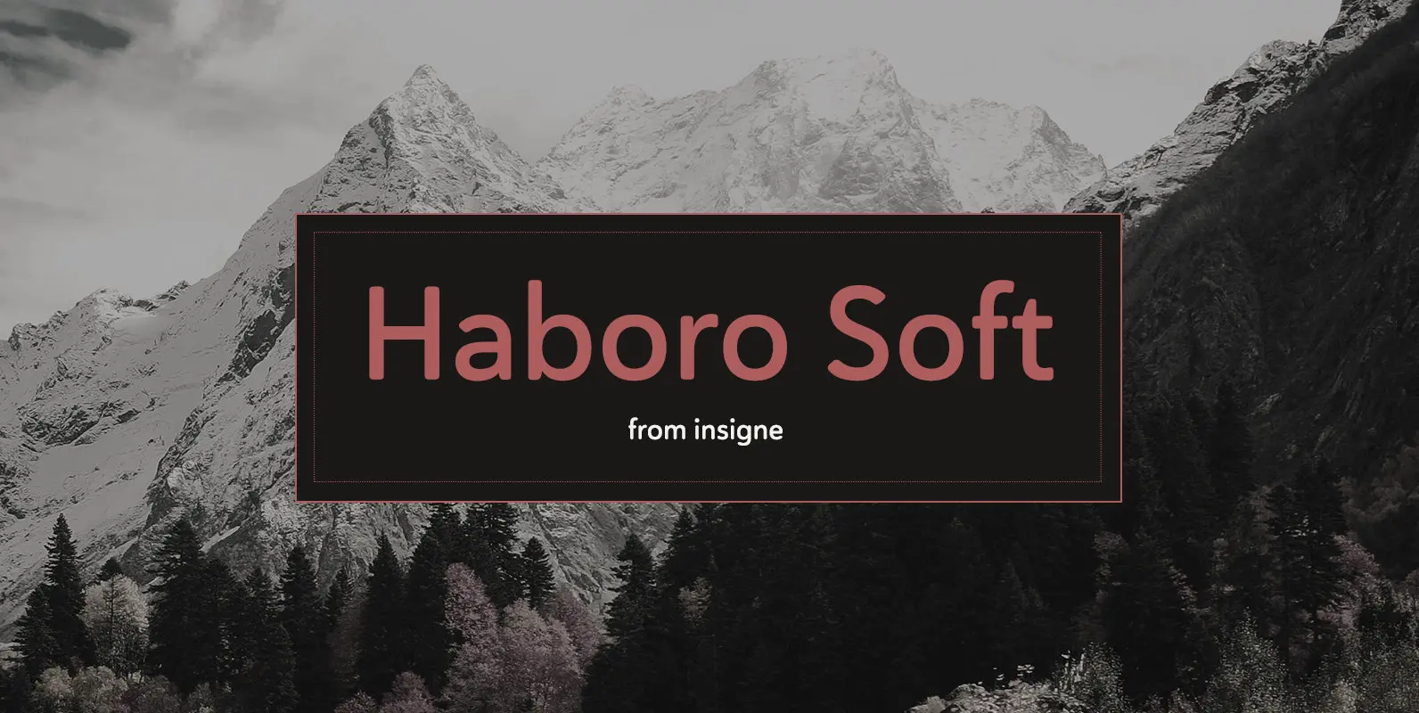
Haboro Soft Font
Stop trekking through the thick, wintery font forest, and step lightly into the fresh life of the Haboro hyper family. Though simple in nature, the Haboro hyper family provides you with a variety of options. Take, for instance, Haboro Soft,
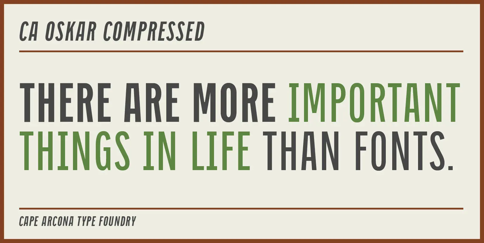
CA Oskar Compressed Font
CA Oskar came into being as a custom typeface for the international Traumzeit music festival. As a substantial part of the new corporate identity, it had to be characteristic, but also flexible in use. Starting with the design of compressed
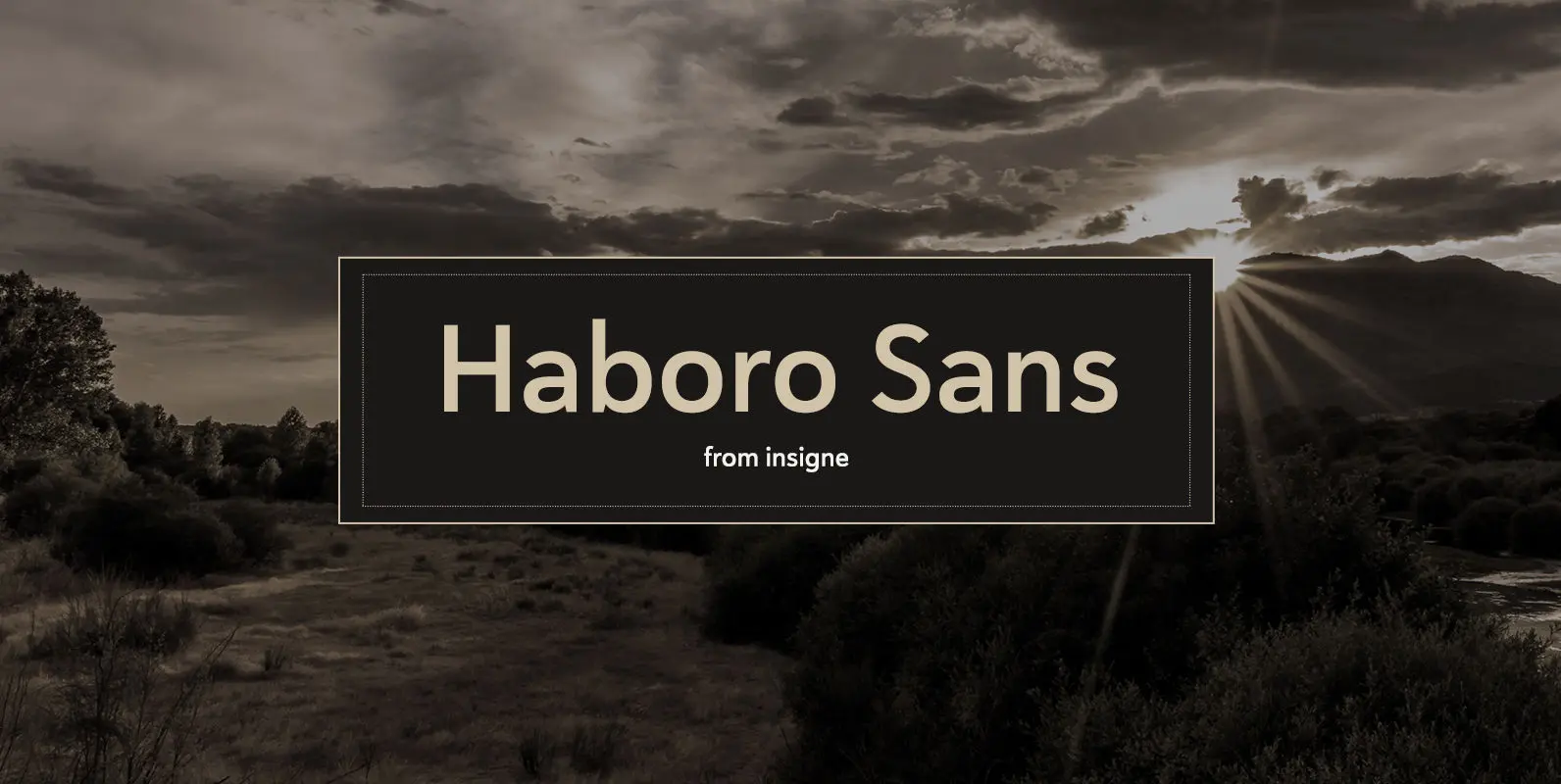
Haboro Sans Font
Quit trudging through the thick with encumbering fonts, and spring to the front of the pack with the cutting edge sans serif, Haboro Sans. With nothing to clutter up your work, your editorial designs, websites, and software will be sharp
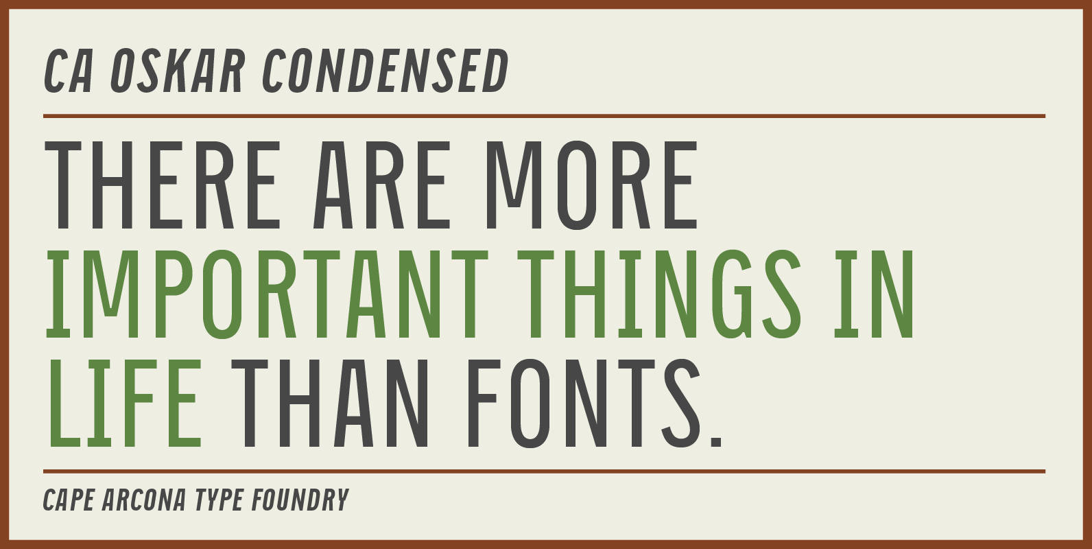
CA Oskar Condensed Font
CA Oskar came into being as a custom typeface for the international Traumzeit music festival. As a substantial part of the new corporate identity, it had to be characteristic, but also flexible in use. Starting with the design of compressed
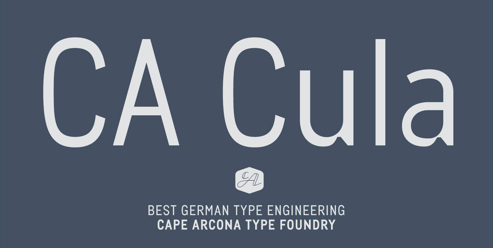
CA Cula Font
CA Cula is standing in the tradition of cool tempered sans serif typefaces like DIN. But at a closer look it reveals a tendency towards rounder reading-friendly forms. The denaturalized ink traps give CA Cula a very special and individual
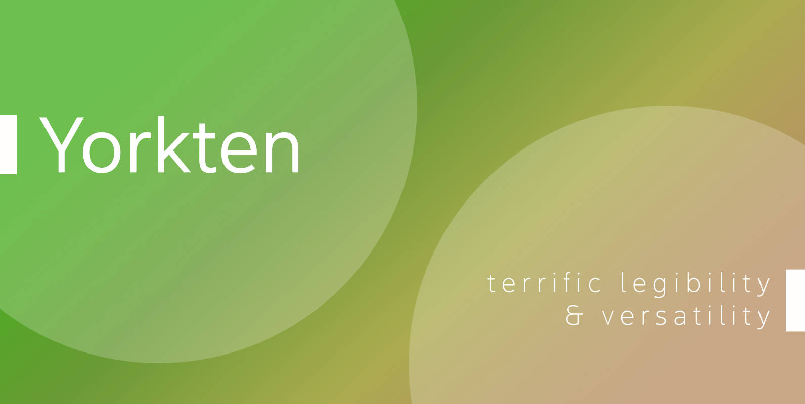
Yorkten Font
Clean and welcoming, the distinct look of Yorkten is remarkably satisfying to the eye. Straight to the point, Yorkton features a fashionable, geometric composition with angled main stems. There are no fewer than fifty-four fonts in the family, all of
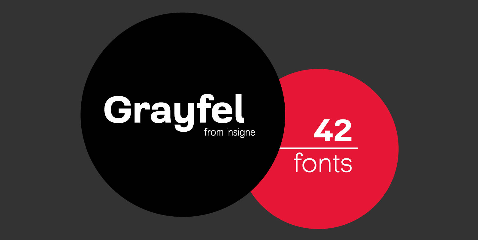
Grayfel Font
As designers, we seek perfection and originality. The more we step back and look at our work, the more changes we tend to find necessary. Drastic modifications are inevitable. The same is true of Grayfel. Grayfel began as an exercise
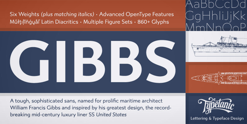
Gibbs Font
Gibbs is a tough, sophisticated sans, named for prolific maritime architect William Francis Gibbs and inspired by his greatest design, the record-breaking mid-century luxury liner SS United States. Taking various cues from the unique cast aluminum signs found on board,

Cantiga Family Font
“Cantiga” is a monophonic song or melody, sometimes repetitive, often with unpretentious themes. In the same simplicity, this font family combines robustness with some very fine details, with 44 versions for various purposes. Choose thinner (or thicker) versions for titles,
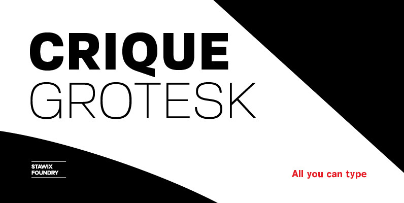
Crique Grotesk Font
The Crique Grotesk This contemporary typeface is inspired from Neo-humanist and Geomatric industrial tone presented the late 2000s typeface. The font family is also composed of the normal width and display width in order to support the different applications on the delicate
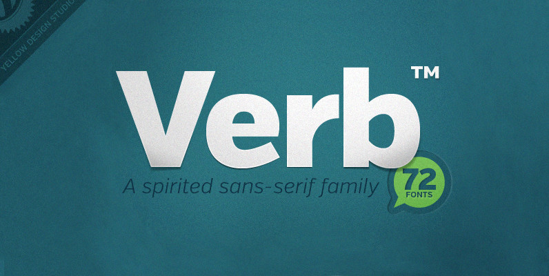
Verb Complete Series Font
Verb from Yellow Design Studio is a 72-font sans-serif superfamily that’s confident, friendly and energetic. At text sizes it’s highly legible, while at larger sizes it reveals lively shapes and personality. It has four subfamilies including Regular, Condensed, Extra Condensed,
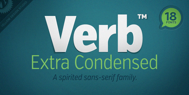
Verb Extra Condensed Font
Like the original Verb family, Verb Extra Condensed from Yellow Design Studio is confident, friendly and energetic, but has been carefully re-drawn with space saving proportions. At text sizes it’s legible and economic, while at larger sizes it reveals lively
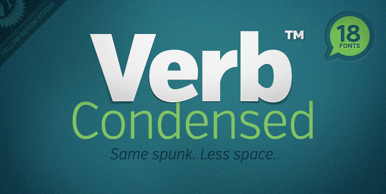
Verb Condensed Font
Verb Condensed from Yellow Design Studio is a modestly condensed version of the original Verb family, taking on more classic sans-serif proportions. It shares the same confidence, energy, and friendliness. At smaller sizes Verb Condensed is open and legible, and
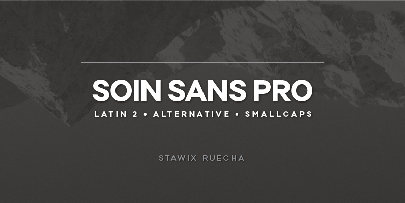
Soin Sans Pro Font
Soin Sans Pro is a clean and modern sans-serif design by Stawix Ruecha. Published by STAWIXDownload Soin Sans Pro
