Tag: informal
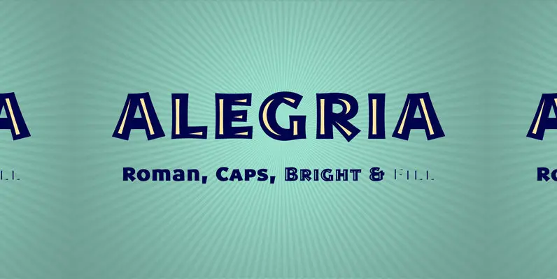
Alegria Font
Alegria is a font family for joyful communication. The family consists of Alegria Roman (with upper/lowercase and oldstyle figures), Alegria Caps (with uppercase, small caps and lining figures), Alegria Bright (a small caps version with a three-dimensional feel) and Alegria
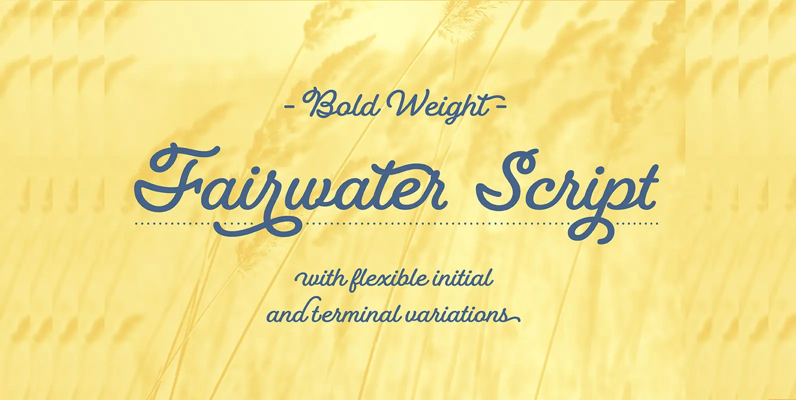
Fairwater Script Font
Fairwater’s aesthetic derives from the cursive handwriting styles popularized in the early to mid 1900s. Friendly, monoline, and casual – available in light, regular and bold weights. As with many of her faces, Laura can’t resist adding a plethora of
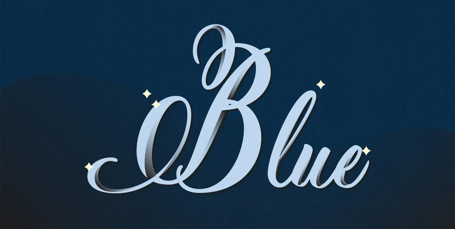
Pen Swan Font
Pen Swan is the latest offering from Jen Maton & Great Lakes Lettering. A Pen Swan is the species of an adult female swan. It is a fitting name as it contains ‘pen’ in the name which is the tool
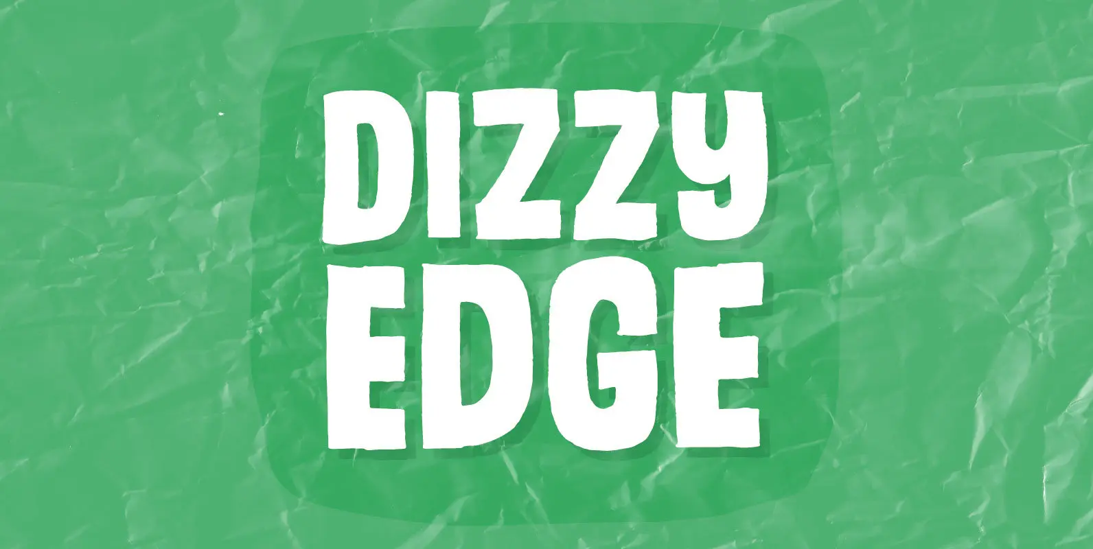
Dizzy Edge Font
My Dizzy Edge font is really not that dizzy! Actually it’s quite steady and legible – super good for packaging, greeting cards and perhaps even commercials for toys, candy, t-shirts, movie posters…yep, that list is long! What’s more interesting is
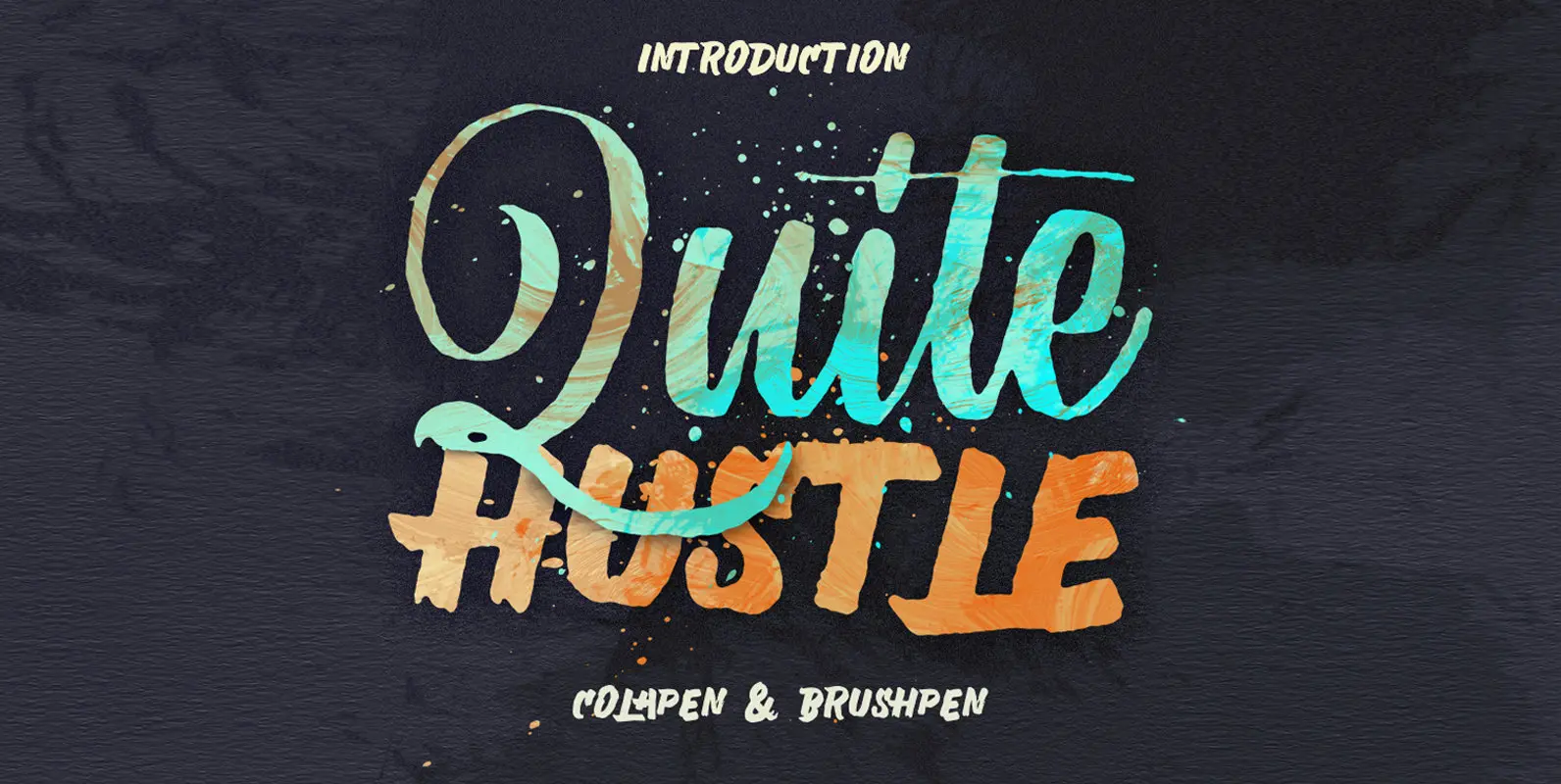
Quite Hustle Font
Quite Hustle type is hand painted typeface designed to help you create the look of stunning custom hand-lettering. Published by MaghribDownload Quite Hustle
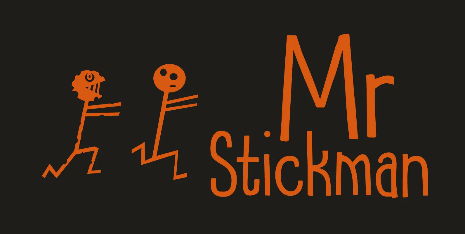
Mr Stickman Font
Mr Stickman is a happy clappy kind of font, inspired by an older font of mine called Oranjerie. Oranjerie is an all caps typeface, but Mr Stickman comes with lower case letters – AND – a Stickman Action Figures pack!
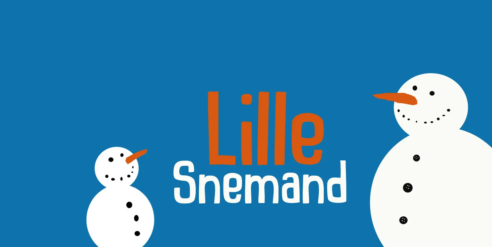
Lille Snemand Font
Lille Snemand, in Danish, means Little Snowman – like the Little Mermaid, but then colder… Lille Snemand is kin to the original Snemand font, which is an all caps typeface, but unlike its big brother, Lille Snemand comes with lowercase
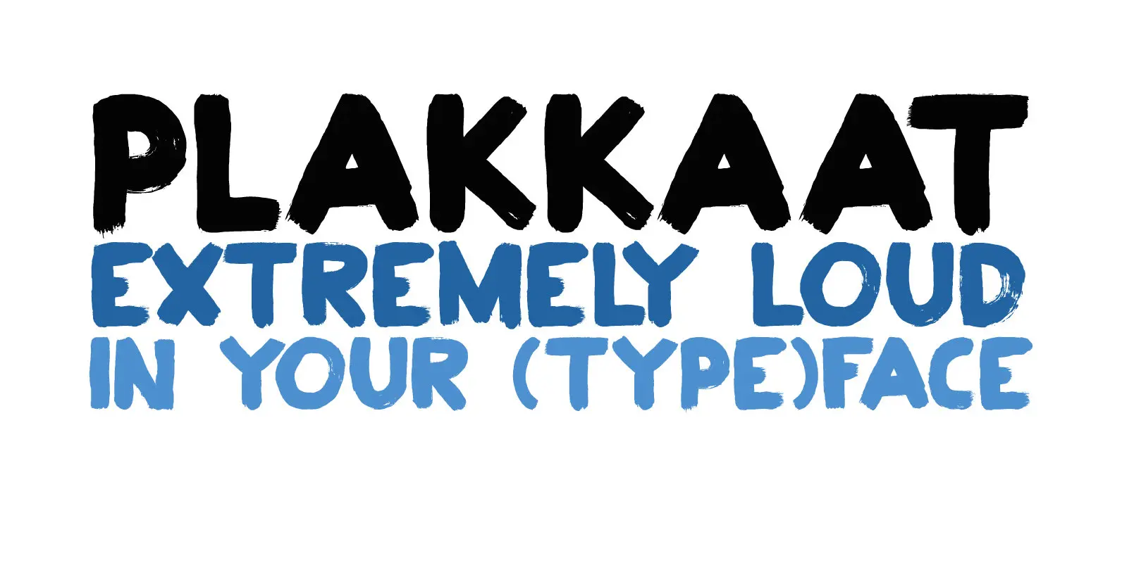
Plakkaat Font
Plakkaat is a fat brushed font, made with wide brushes and paint. Since it is a very easy to read font (and not to be missed), it is ideal for advertising campaigns, or demonstration signs.. This 2019 version comes with
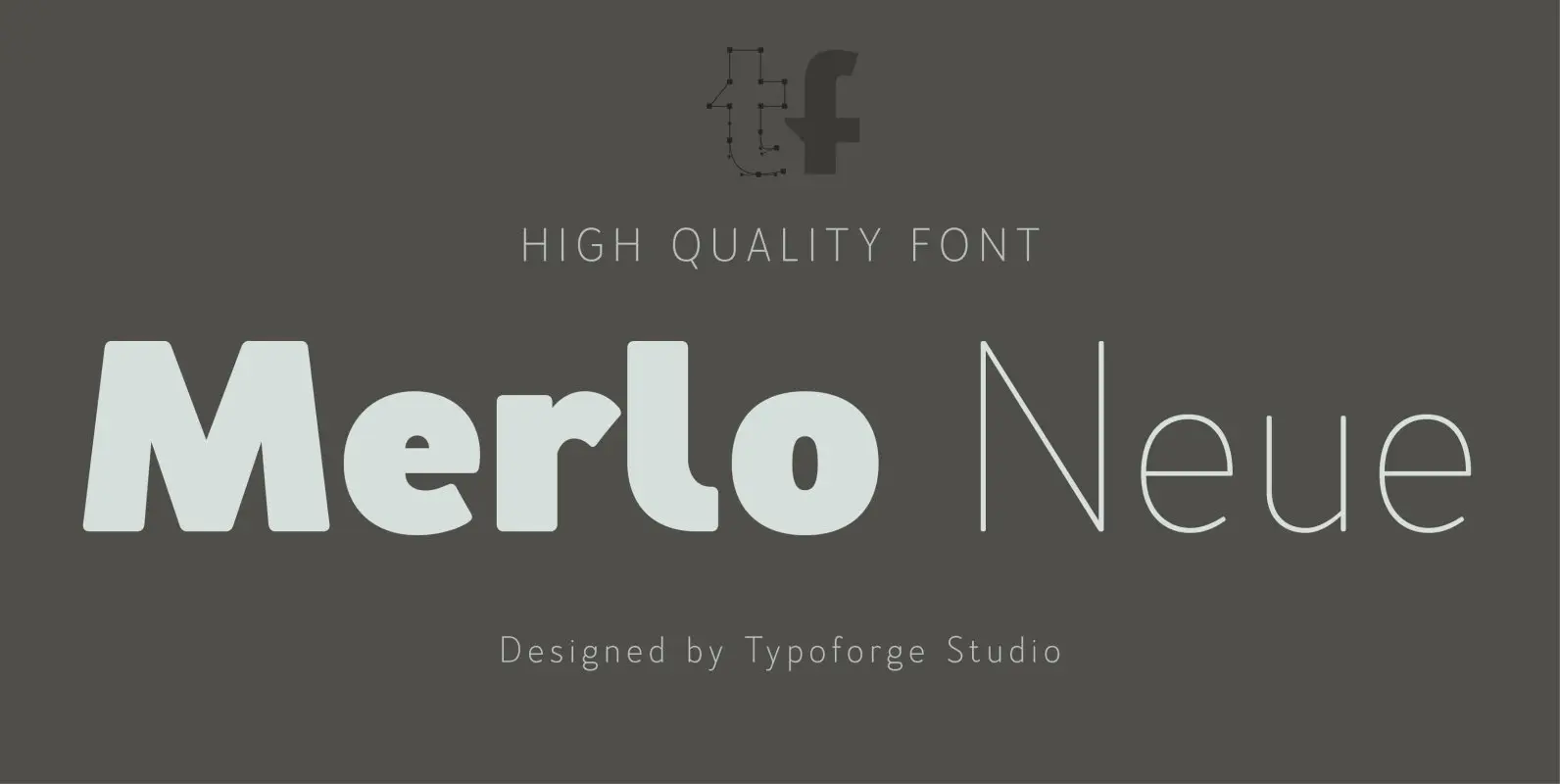
Merlo Neue Font
Merlo Neue is the younger brother of Merlo. New family received refreshed, more square proportions and a new shape of many glyphs. However, what is the most important in new Merlo, is the wide range of instances – nine new weights,
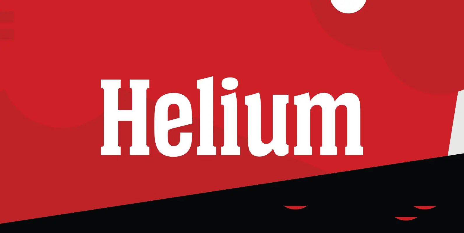
Helium Font
Designed by Steve Jackaman, Helium is a unique serif design re-tooled from the classic BF Collection. Published by Red RoosterDownload Helium
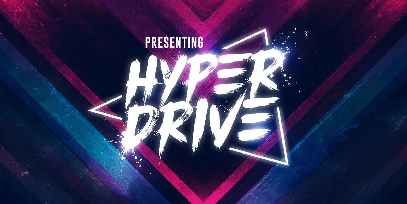
HYPER DRIVE Font
Thanks for checking out the HYPER DRIVE brush font! It's loud, fast, raw, and guaranteed to propel your text into hyperspace. Hand-painted with distinctive rough brush strokes, HYPER DRIVE is bound to make a big impact on logos, apparel, quotes,
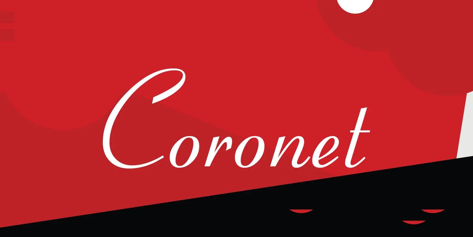
Coronet Font
Designed by R.H. Middleton for Ludlow (1937), Coronet is a script font that was digitally engineered by Steve Jackaman for the Red Rooster Collection. Published by Red RoosterDownload Coronet

Sunbeat Font
Sunbeat is a quite groovy face, but that’s not all: this upbeat family is packed with cool interlocking pairs for adding that twist when you need it. Available in three tones, suitable only for projects that sound great. Hell yes!
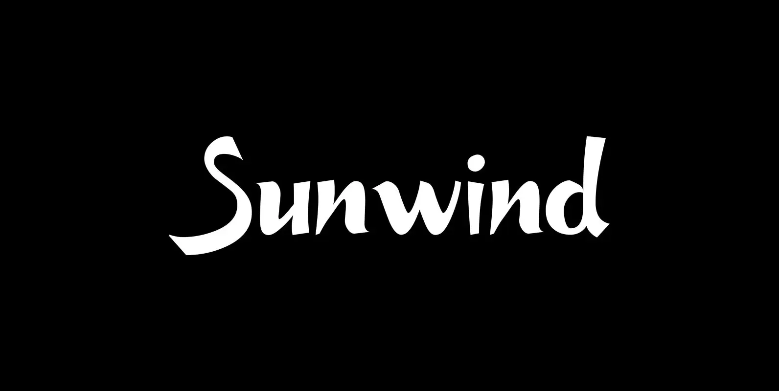
Sunwind Font
“Sunwind” is not really made to write long copy. It is a font for shop signs and short sentences that need that hot, sunny and windy touch. And that is how I got around to designing it: I saw some
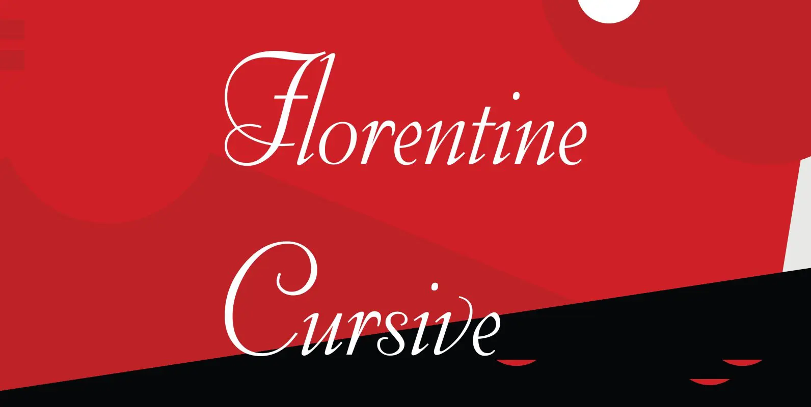
Florentine Cursive Font
Florentine Cursive was designed by R.H. Middleton for Ludlow, circa 1956. Digitally engineered by Steve Jackaman. Published by Red RoosterDownload Florentine Cursive
