Tag: informal
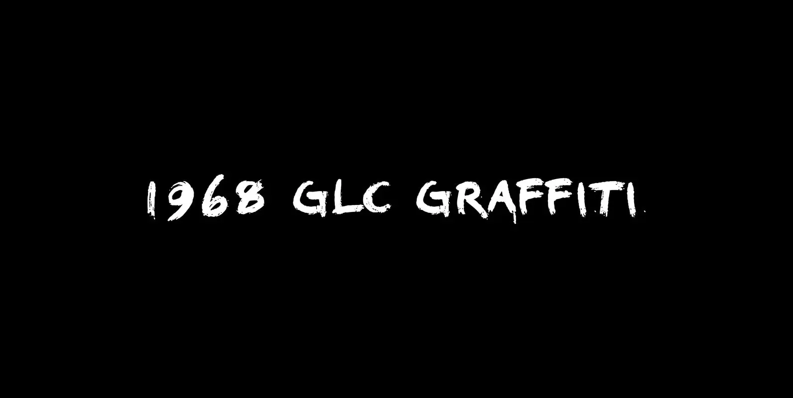
1968 Garaffiti Font
This font was created inspired by the paint brush letters pattern in use in the 60 – 70’s for the protest slogans tagged on the cities walls. By this distant period, we didn’t commonly used aerosols like today, and often
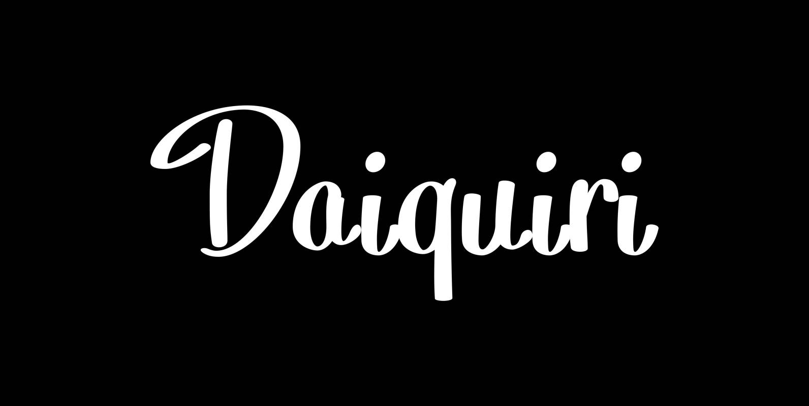
Daiquiri Font
“Daiquiri” is a revival of a handlettered font in two weights, from an ad for Puerto Rico Rum dating back to the forties or fifties. I found the ad on a French antique market on my last visit for Mardi
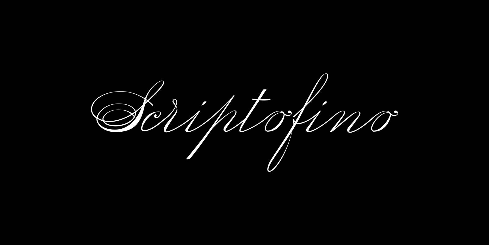
Scriptofino Font
Scriptofino is a very fine and elegant script with lots of contrast. It is based on traditional American letterforms of Jefferson’s day. Published by Wiescher DesignDownload Scriptofino
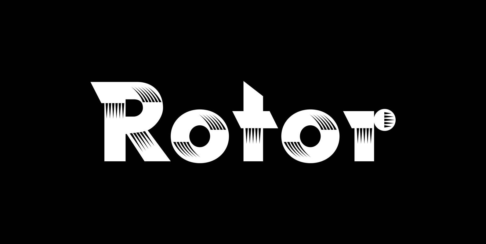
Rotor Font
“Rotor” is a speedy font. In 1929 K. Sommer designed a typeface for Linotype called »Vulcan«, some years later they re-published the typeface and called it “Dynamo”. The early Vulcan design inspired me to do this new, faster typeface in
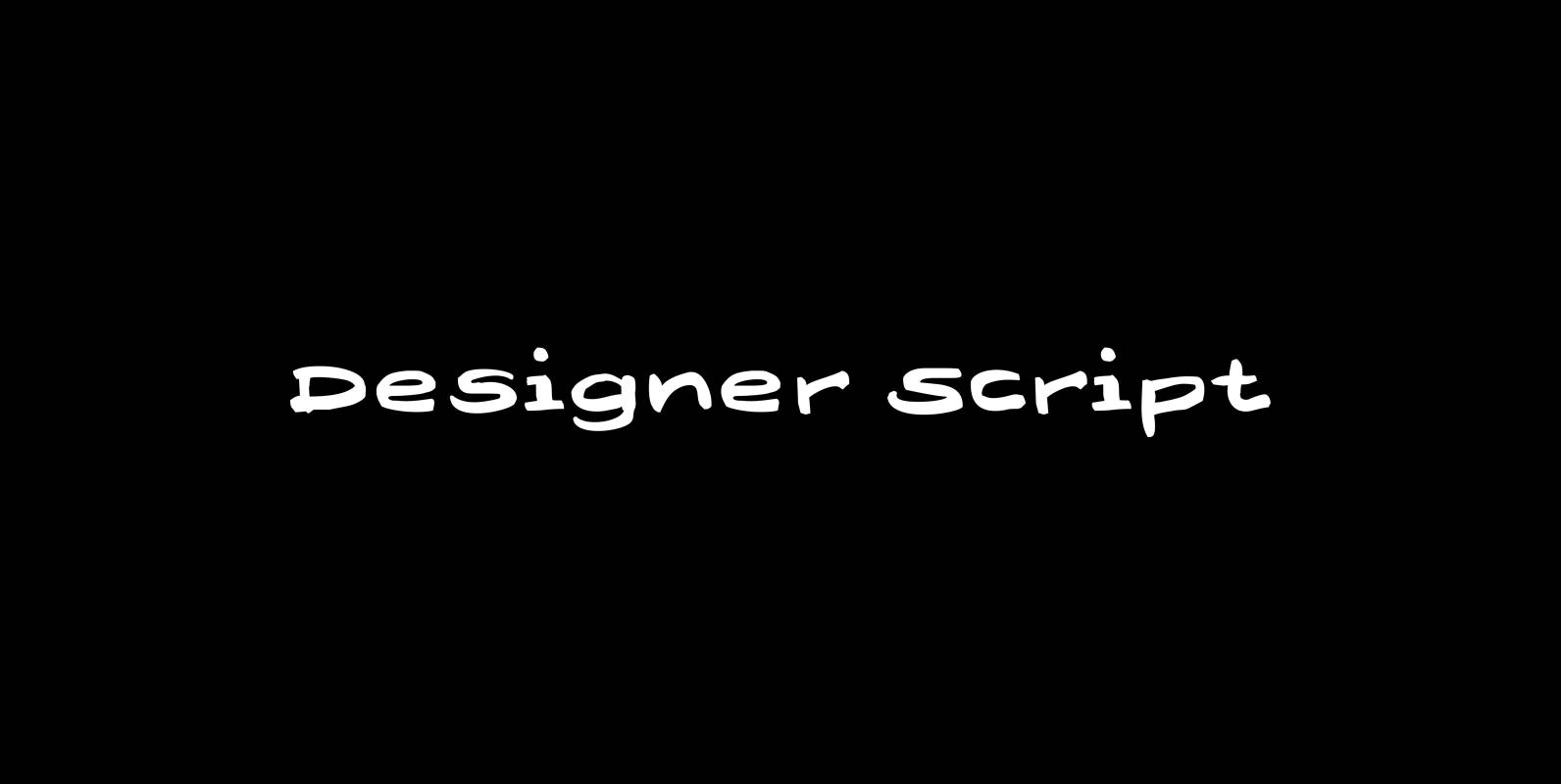
Designer Script Font
“Designer Script” is a very cool script, that has only one objective and that is pure transportation of information. Attracting as little attention to the script itself as possible. Published by Wiescher DesignDownload Designer Script

Donna Bodoni Font
“Donna Bodoni” was inspired by David Farey. He once wrote, somebody should honor the widow of Giambattista Bodoni the brave Signora Paola Margherita Dall ‘Aglio for her effort to have the “Manuale tipografico di Giambattista Bodoni” published after his death.
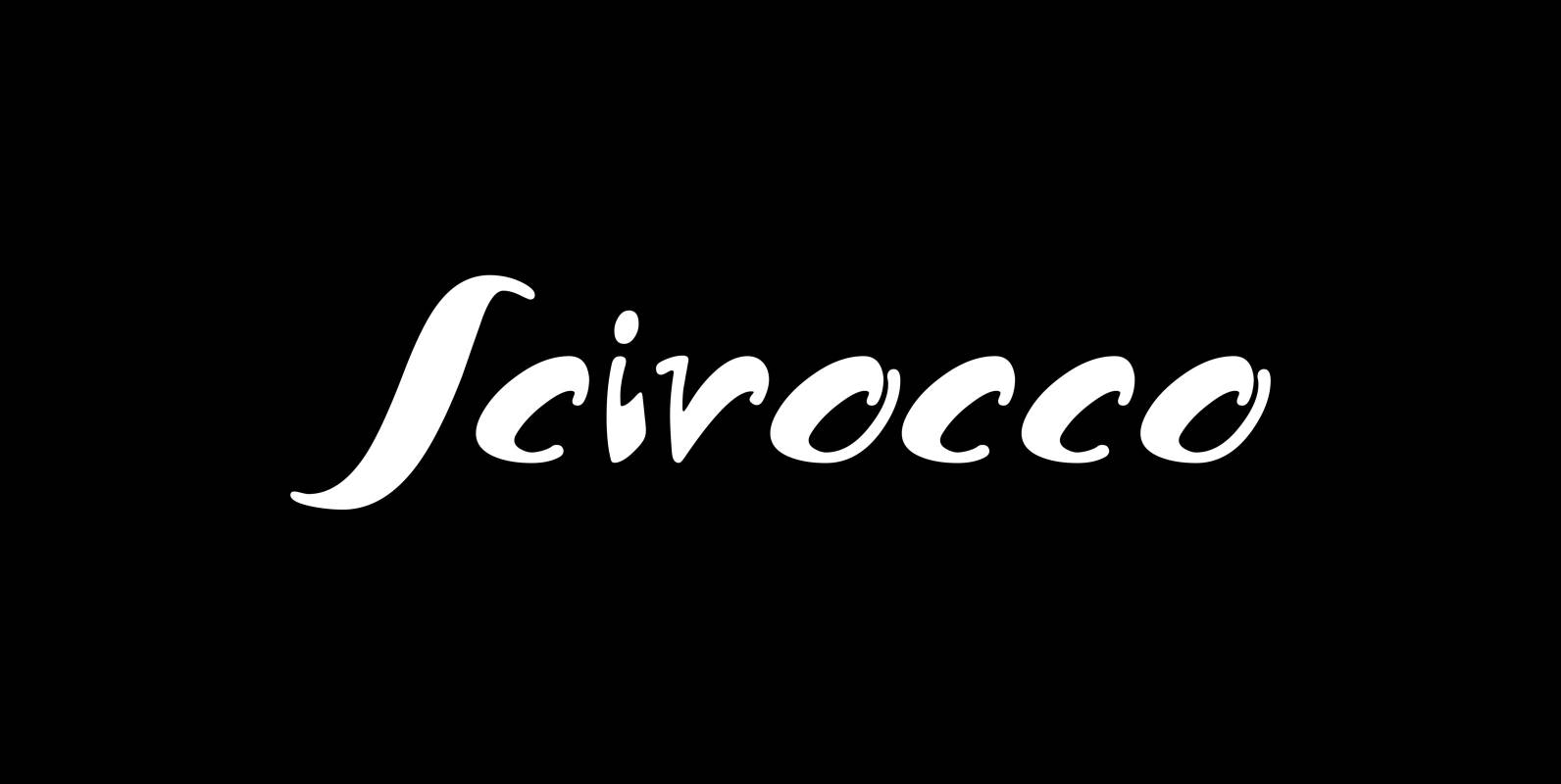
Scirocco Font
“Scirocco” is a hot and humid wind that blows from the Sahara over to France and Italy. It crosses the mediterranean sea and carries lots of fine desertdust with it. Once it hits the costs of Provençe one can feel
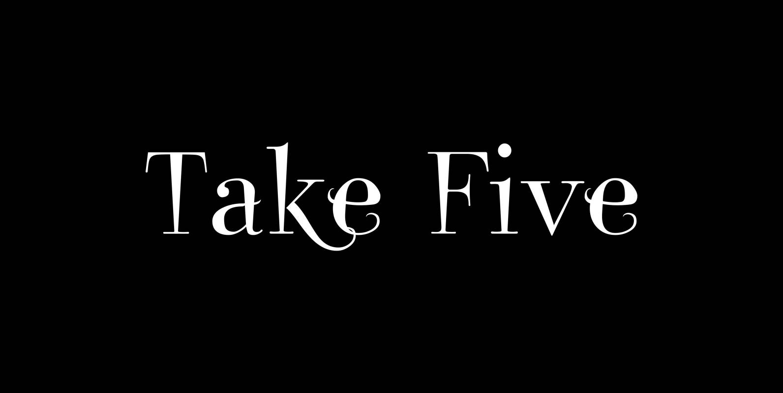
Take Five Font
“Take Five” is a very jazzy typeface. It is more Swing than Bebop but it also evokes memories of the Cool Jazz era. Take Five can be used for jazzy covers or childrens birthdays as well as jumble sales leaflets.
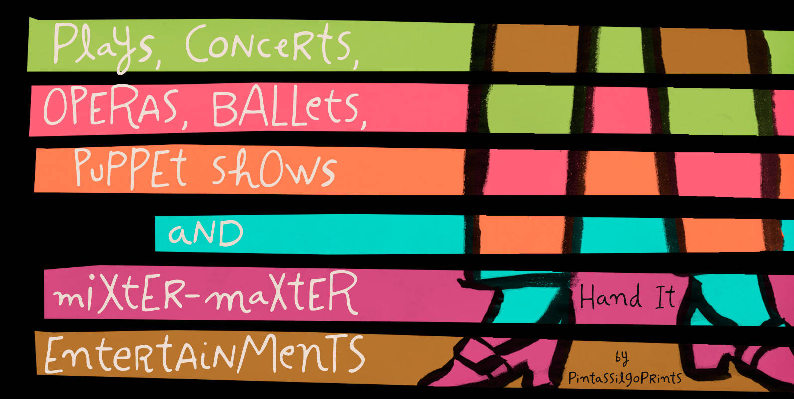
Hand It Font
Carefully messy, sweetly odd, this friendly family conveys a cool – but warm – organic feel. With mixed letterforms and somewhat unexpected choices here and there, each font brings a handful of alternates for a nice natural look: there are
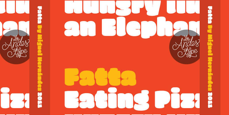
Fatta Font
Huge, bold and friendly. With original fat curves & paintbrush terminals. Fatta is Miguel Hernandez font, an ultra black humanist sans. It has three variants: Regular, Italic & Italic Swash, which allow the user to compose display text in a
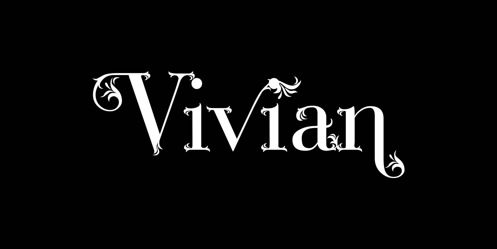
Vivian Font
“Vivian” is a heavily decorated serif typeface based on my “Bodoni Classic” font. I have this “flaw” in my personality that just enjoys designing decorative typefaces. I designed three cuts. First: the straight forward “Vivian” with nicely decorated capitals and
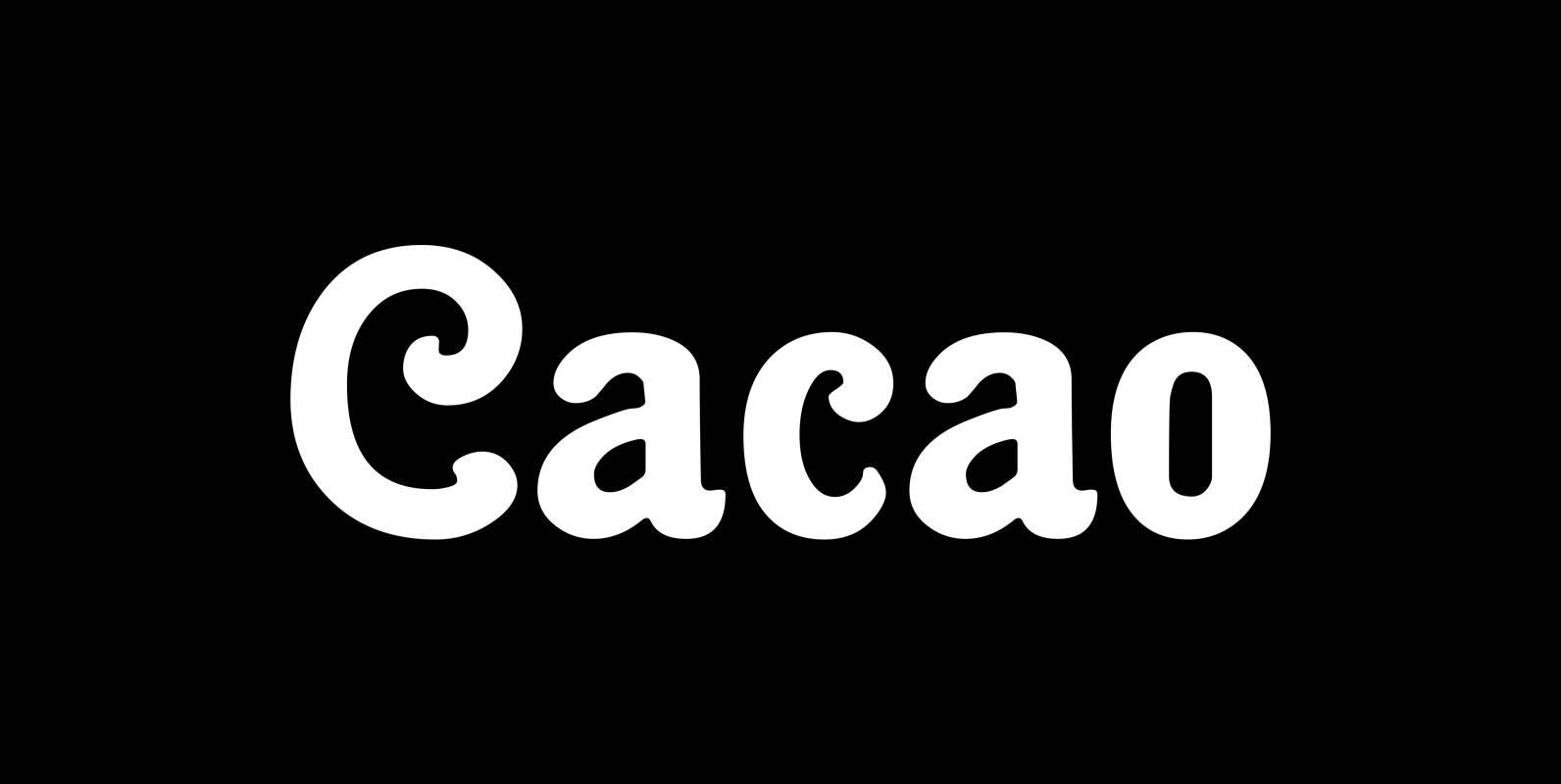
Cacao Font
“Cacao” is another one of my “found fonts”. I found this one in an old advertising for a French cocoa drink. Since I am a fervent lover of cocoa, I will give you my recipe for a normal coffee mug
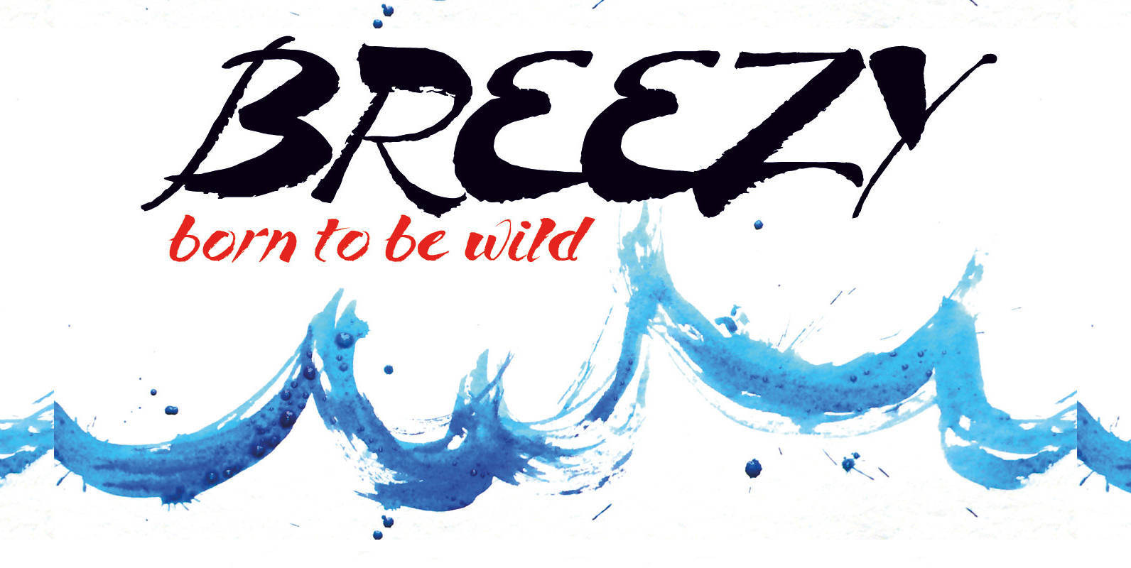
Breezy Font
“Breezy” is a brush script with very expressive strokes and surprising connections. “Breezy” is a great script if you really want to have that crude, rough feeling. Published by Wiescher DesignDownload Breezy

Semikolon Font
Optimal readability by reduced, distinct letter forms. Appropriate for early readers of any age in schools and other educational institutions. SemikolonPlus minimizes the risk of confusing similar characters and therefore is predestinated for the use in text blocks, work sheets,


