Tag: inscribed
Mynaruse Flare Font
Mynaruse Flare is a new version of the Mynaruse superfamily. This version eliminates the elongated serifs of the original, and instead stems end with a flare. You will find that the thinner weights are delicate and beautiful, while the heavier
Aviano Copper Font
The retro-inspired design of Aviano Copper echos the bold style of America’s Gilded Age. Inspired by the copper-inscribed intaglio printing designs of the early 20th century, the powerful, wide character shape of this font walks softly across your page while
Civane Font
High atop the mountain of fonts, a new structure has been raised–one solid and strong against the challenges of time. Civane is a victorious conqueror among fonts, standing above the clutter and the mundane. Its firm structure joins effortlessly with
Imperia Font
“Imperia” is derived from my Classic font “Imperium” – the Roman Original from the ‘Trajan column. I pushed “Imperia” a lot further, added two versions of swings. To make the family more usable threw in my own version of lowercase
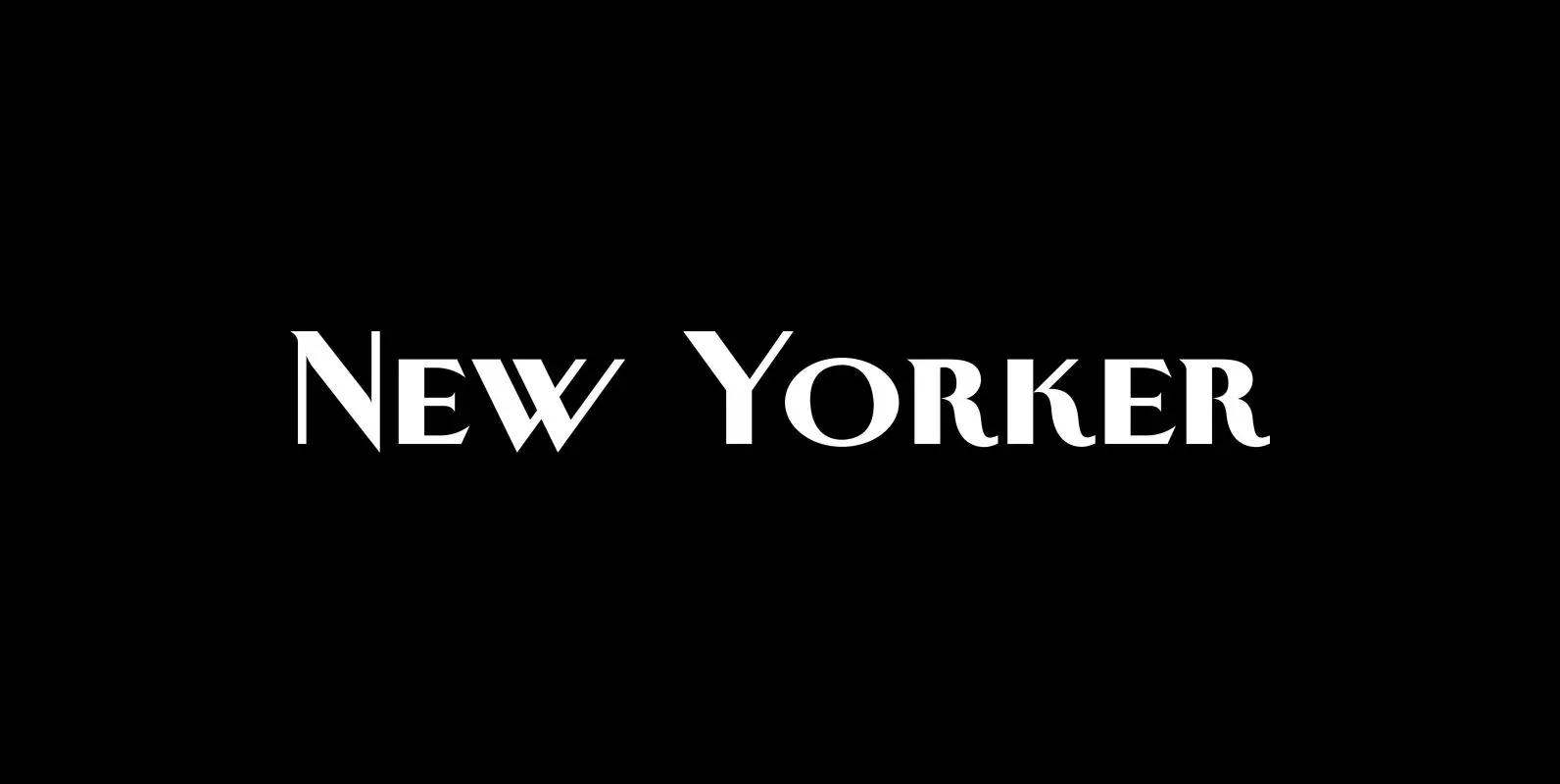
New Yorker Plus Font
New Yorker Type was one of the first typefaces I tried my hand at in 1985. I meant it as a revival of the typeface used by the New Yorker magazine. I did not scan it in, I just looked
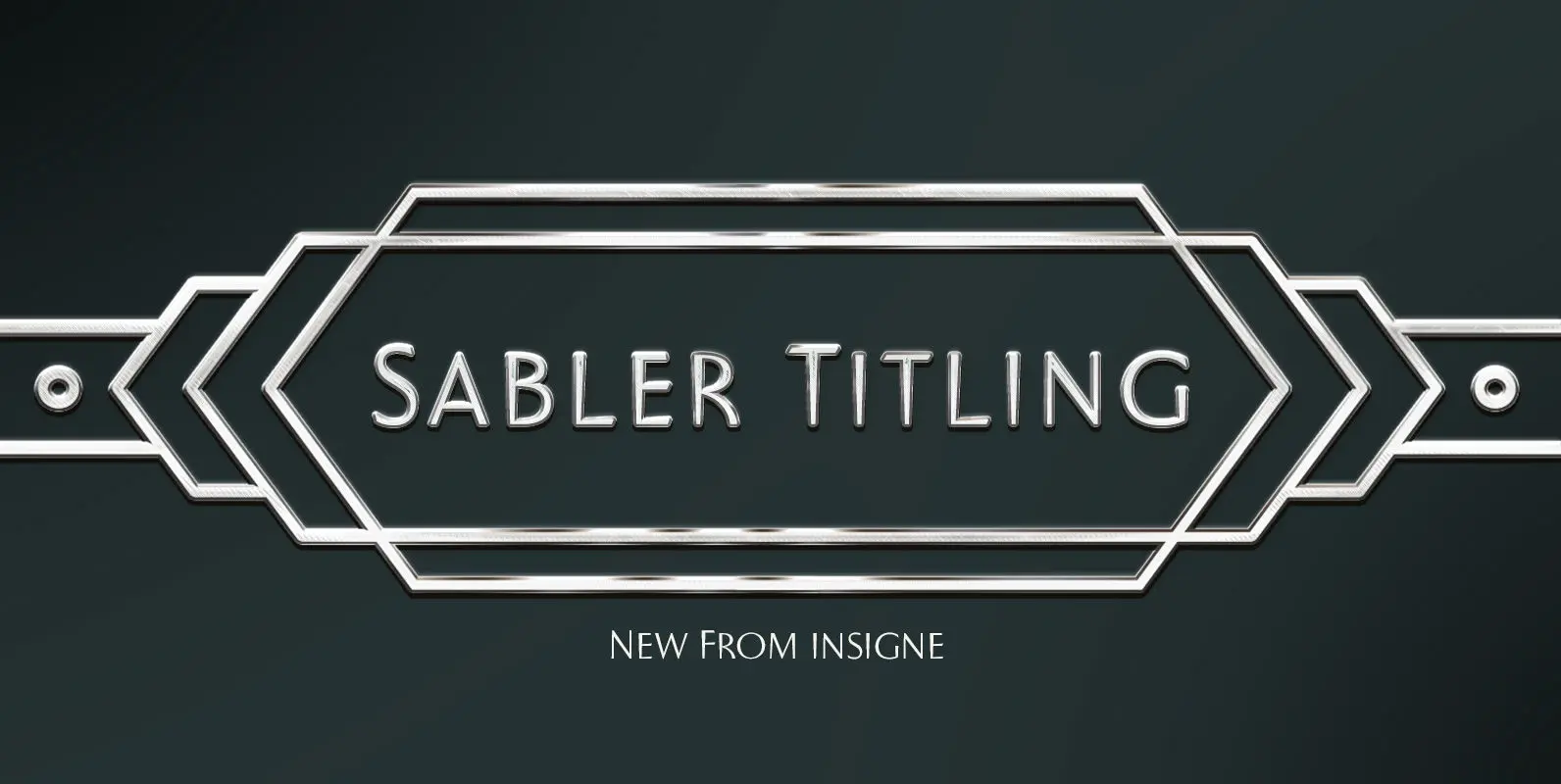
Sabler Titling Font
Make the right statement with the elegant Sabler Titling. This showstopping font features an inherent grace combined with the classic style of the Art Deco period. The subtle beauty of its letters is highlighted by the typeface’s stems, which taper
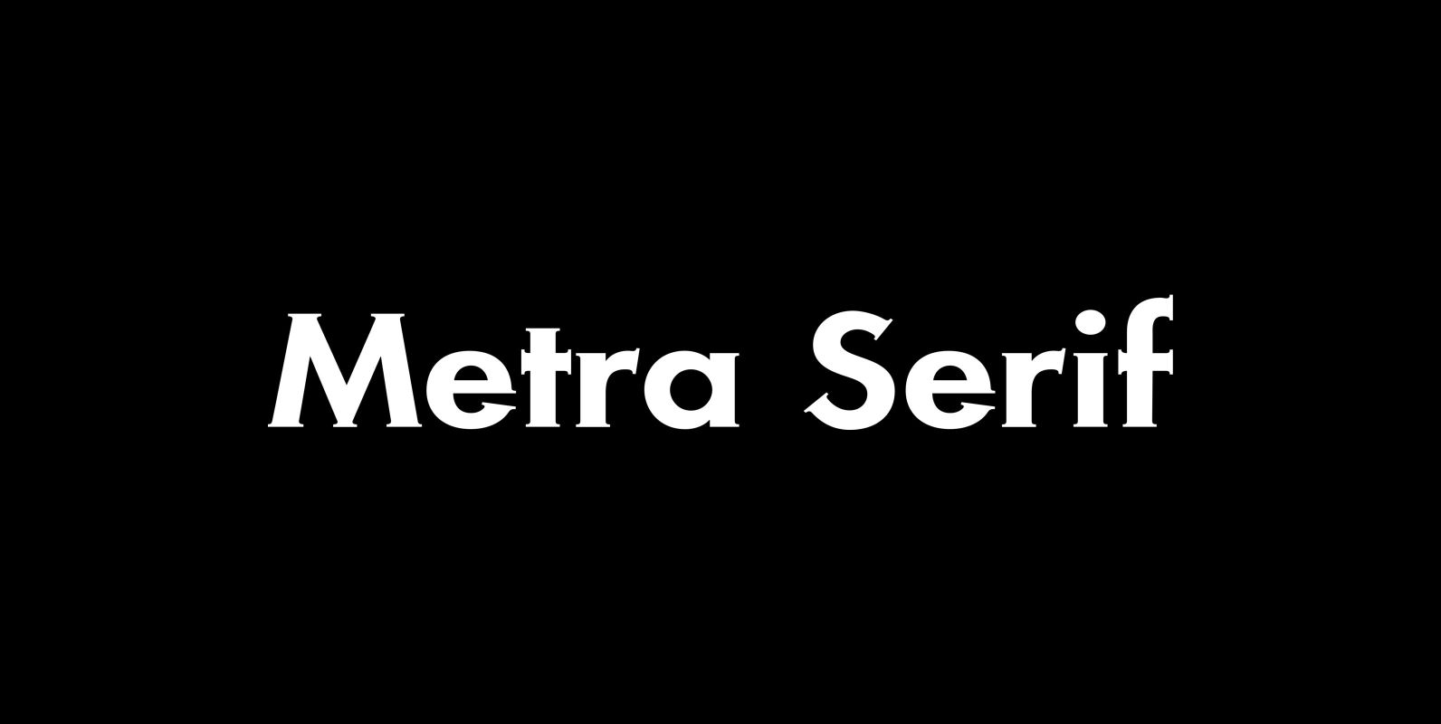
Metra Serif Font
“Metra” has the clarity of a classical Sans font and the charm and elegance of a Gothic Copperplate. I designed it because for some purposes one needs a Serif with that cool “Sans” look. I sell the font in 5
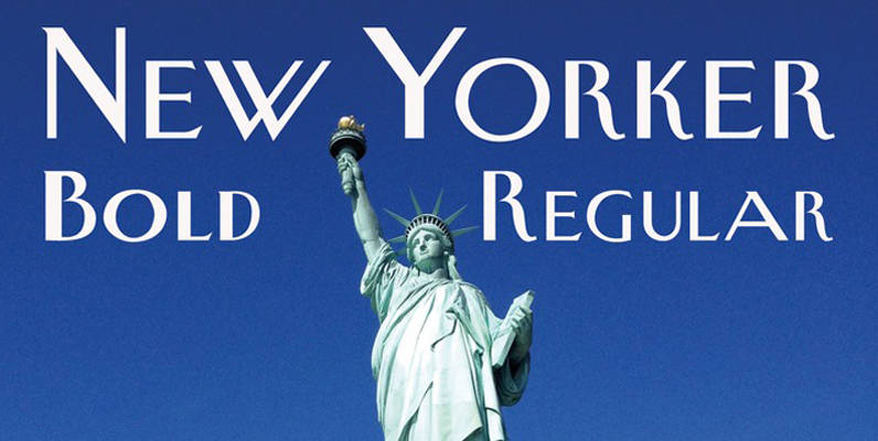
New Yorker Type Font
New Yorker Type was one of the first typefaces I tried my hand at in 1985. I meant it as a revival of the typeface used by the New Yorker magazine. I did not scan it in, I just looked
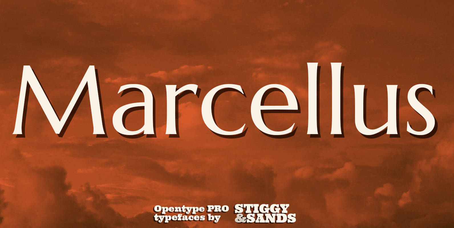
Marcellus Pro Font
Our Marcellus Pro was inspired by classic Roman inscription letterforms. Clarity and beauty are embodied in the standard lowercase, while this historically influenced typeface also nods to the powerful presence of the Trajan titling style with its SmallCaps set. When

Watertown Font
Watertown is a font design published by Fonthead. Published by Fonthead Design Inc.Download Watertown
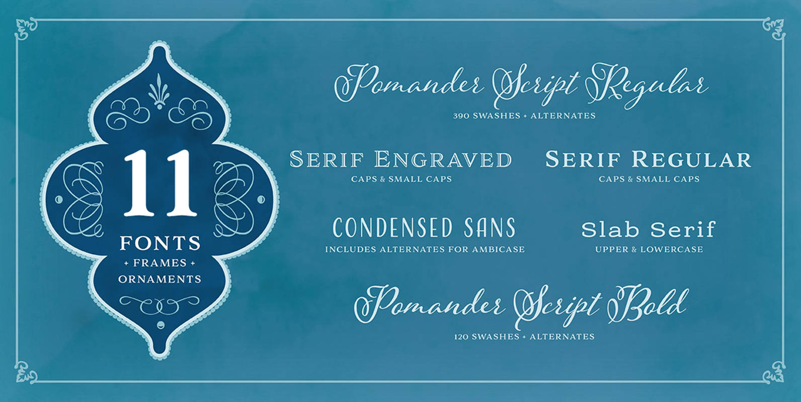
Adorn Pomander Smooth Collection Font
Like the original Adorn family on which it’s based, Adorn Smooth provides a suite of distinctive typeface designs designed to complement each other rather than match exactly. Adorn Smooth revisits 6 faces from Adorn — Pomander, Serif, Slab Serif, Engraved,
Azalea Rough Font
Azalea’s careful, inky strokes reference classic brush script styles of the 1950s, but its jaunty angularity is distinctly modern. Artfully irregular thicks and thins lend it an organic feel. This rough-edged version is a rustic complement to Azalea Smooth. Azalea
Azalea Smooth Font
Azalea’s careful, inky strokes reference classic brush script styles of the 1950s, but its jaunty angularity is distinctly modern. Artfully irregular thicks and thins lend it an organic and slightly rustic feel, which is further enhanced in its rough-edged counterpart
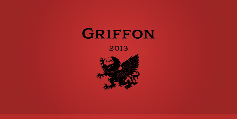
Griffon Font
Griffon, titling face with influence from classic letterforms, inspired by retro faces in the early 20th century. This font family was all redesigned from scratch and now released ranging in 5 weights with small caps from Light to Bold. The
Globe Font
A retro and clean typeface designed by Phil Martin, works great in body and headline usage. Published by URW Type Foundry GmbHDownload Globe
Killernuts Font
Killernuts is a woodtype design with a unique twist on its serifs. The small brush-like serifs were intended to resemble aspects of Japanese calligraphy, a sort of east meets west combination. Published by Dharma TypeDownload Killernuts
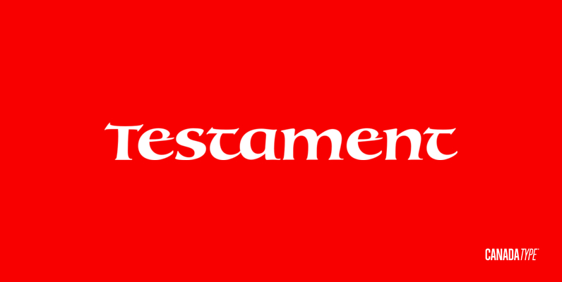
Testament Font
From the standpoint of calligraphy, a font family of capitals and uncials makes perfect sense. The Roman square capitals, the quadrata, are matched by round capitals of older Greek origin; the word “uncus” means hook-shaped like a beak or talon.
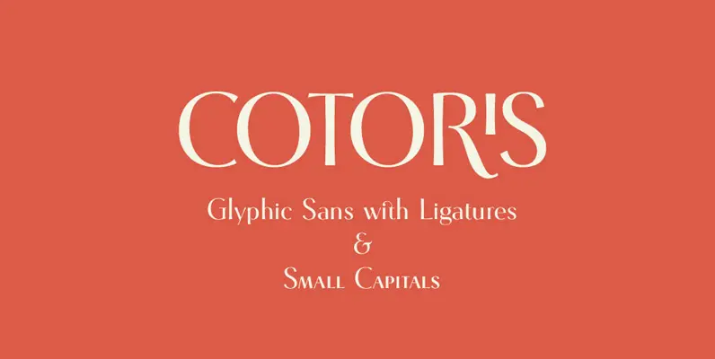
Cotoris Font
Cotoris is beautiful glyphic sans serif. This font include ligatures and small capital for advanced typography. Highly effective where a graceful and feminin design is desired. Published by Dharma TypeDownload Cotoris