Tag: interesting
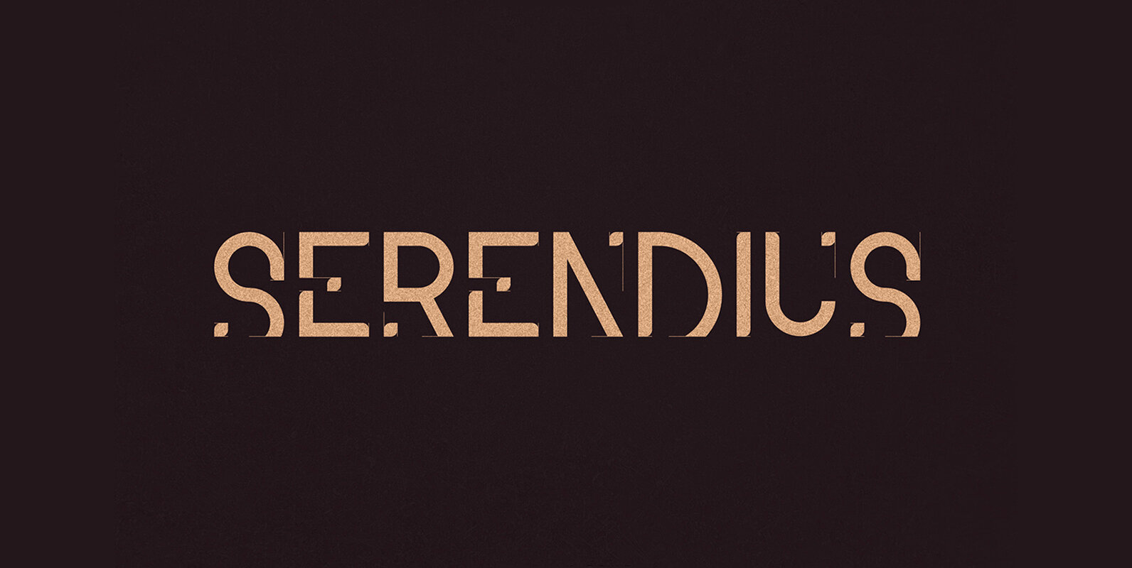
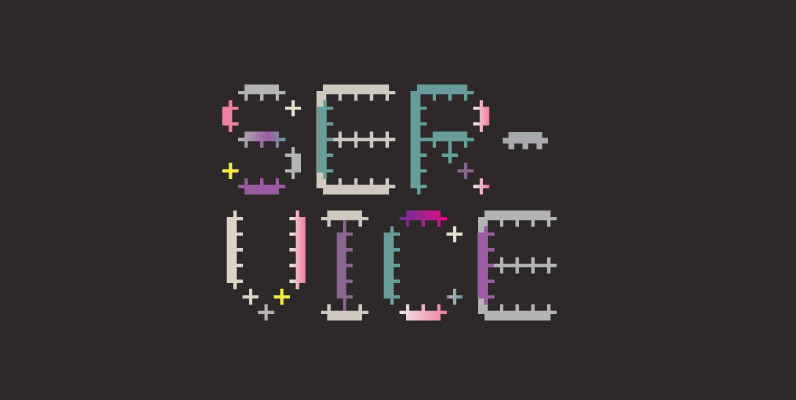
Serendius Font
Serendius is a tech font design published by Vladimir Fedotov Published by Vladimir FedotovDownload Serendius
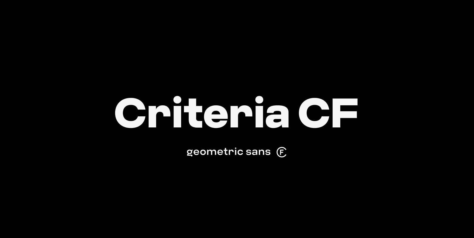
Criteria CF Font
Criteria CF is a geometric sans built with simple, efficient construction. Straight lines and clean circles combine with a tight vertical design that allows for cleanly-stacked lowercase text, striking headlines, and bold word marks. Hints of Swiss style and unconventional
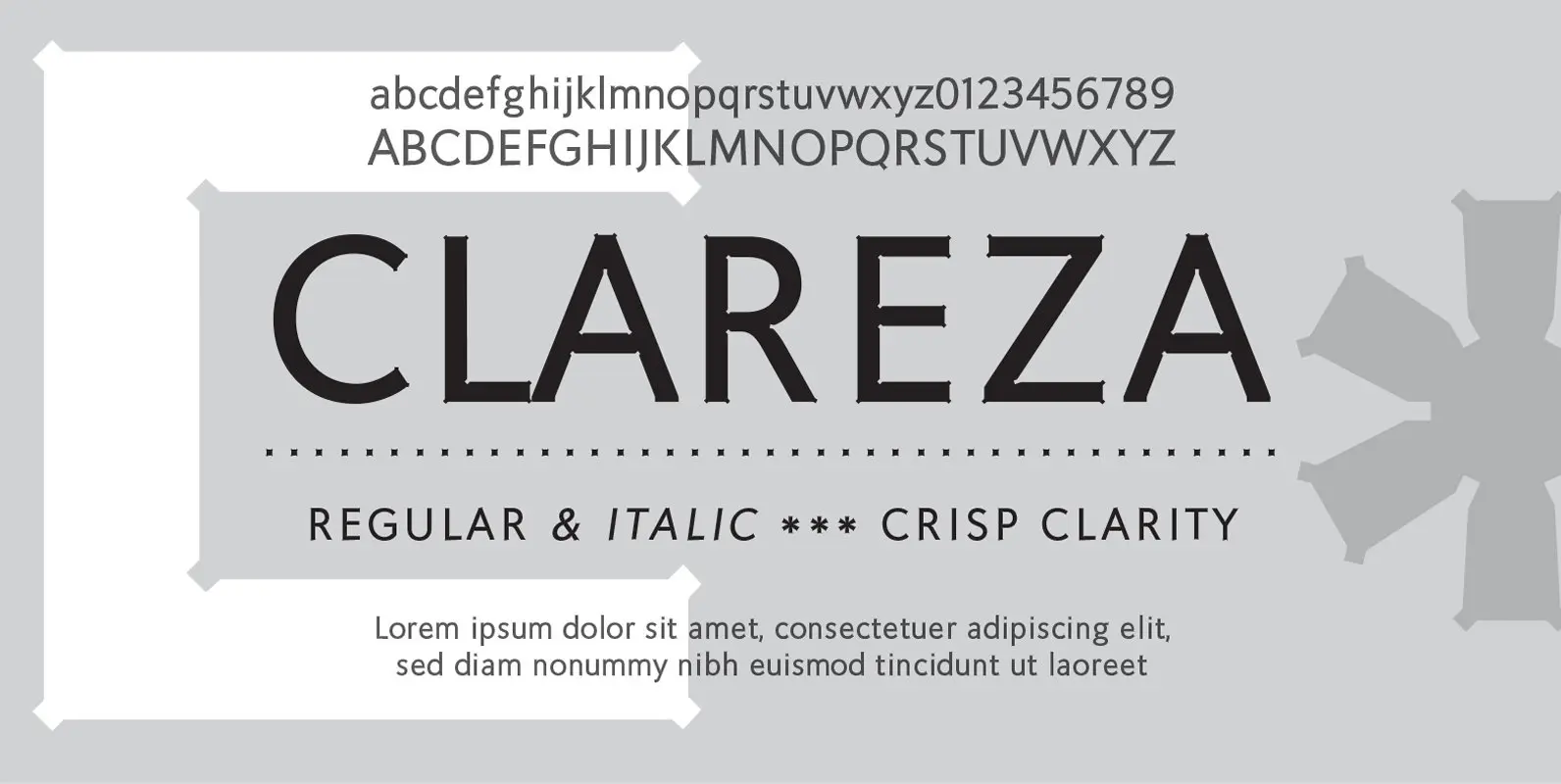
Clareza Font
Clareza means “Clarity” in Portugese. That was exactly the goal in creating this font. We managed to create a font that is crisp and extremely legible at all sizes but then comes to life in an interesting and unusual way
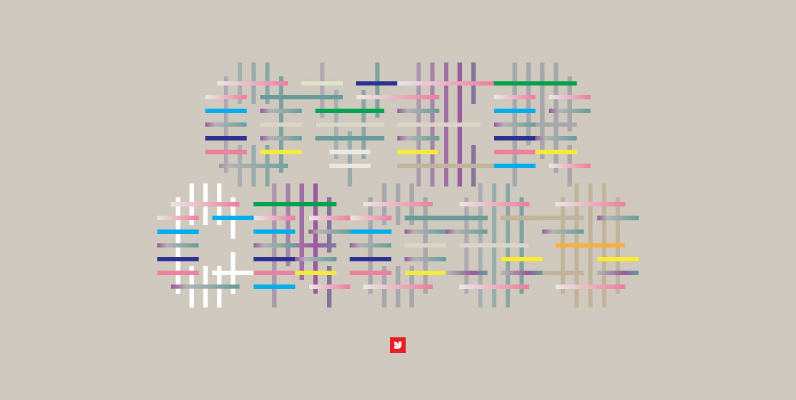
YWFT OneCross Font
Comprised entirely of “plus signs” of varying weights, YWFT OneCross had its genesis in YWFT OverCross (2002). When it was reworked later that year in order to create a more integrated blend of positive and negative space, Over became One,
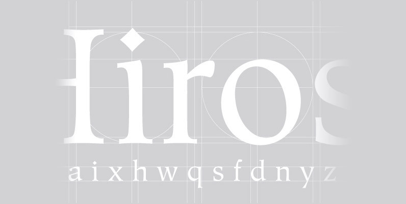
Hiroshige Font
A vintage and classic serif designed by Cynthia Hollandsworth, Hiroshige brings elegance and class to any project. Works great in both content and headline usage. Published by URW Type Foundry GmbHDownload Hiroshige
YWFT OverCross Font
YWFT OverCross originally started as a typeface design that set out to explore visual form while retaining legibility. At close range, YWFT OverCross is visually beautiful but rather unreadable. Take a step back, however, and it becomes completely legible, perfect
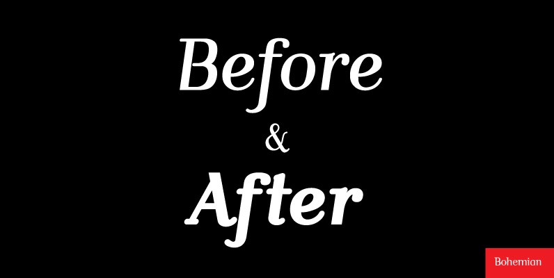
Bohemian Font
Mixed designs of Futura and Bodoni (Fudonis) are quite popular. Apart from being contemporary, such fonts provide excellent readability. However, most of the existing mixtures were not good enough in terms of balance for P. Kraft. He was finally inspired
Diskus Font
Designed by Martin Wilke in 1938, Diskus is a script font release by URW. Contains language support for West, East, Turkish, Baltic, and Romanian. Published by URW Type Foundry GmbHDownload Diskus
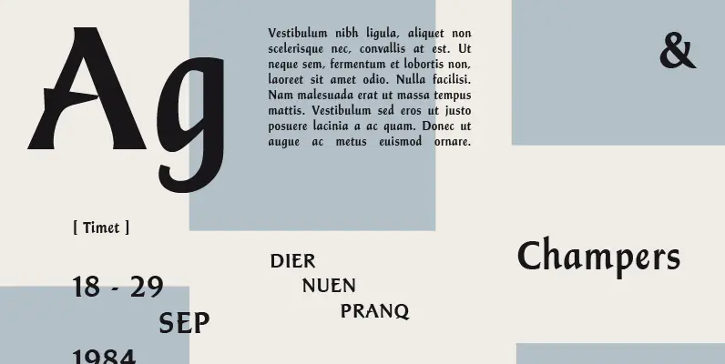
Champers Font
A strong, timeless Roman display typeface with two unique features: the lower case is condensed and the capitals are of a normal set. Both upper and lower cases benefit from close letter spacing. Excellent for nearly any headline requirement. Created