Tag: interface
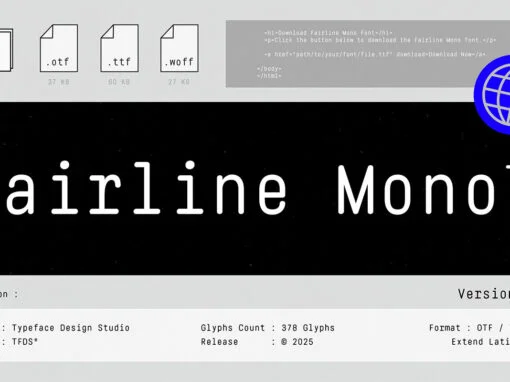
Fairline mono Font
As we traverse the ever-evolving landscape of digital design, the importance of selecting the ideal typeface has become a paramount consideration. A typeface can significantly influence the perception of your design, whether it’s a logo, a website, or an entire
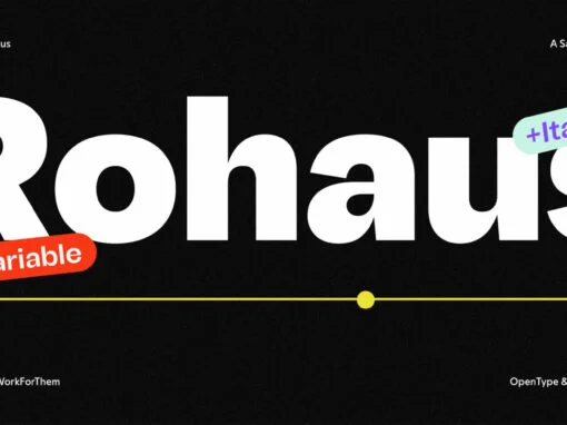
YWFT Rohaus Font
The realm of typography, a cornerstone in the vast landscape of digital and graphic design, is ever-evolving, birthing creations of profound character and quality. One such manifestation of ingenuity is YWFT Rohaus, a sans-serif font conceived in the heart of
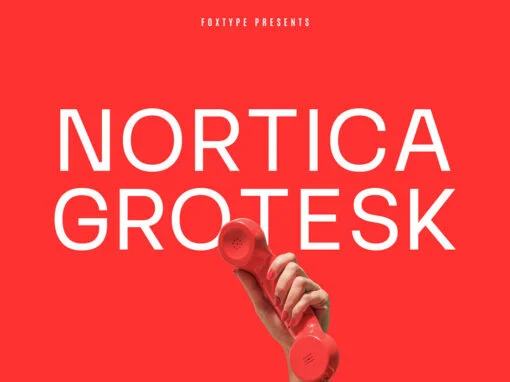
Nortica Grotesk Font
In the realm of graphic and digital design, the choice of typography greatly influences the tenor of an entire project. Whether it’s sculpting striking headlines for a revolutionary brand or crafting engaging web content, a font can speak volumes. Today,
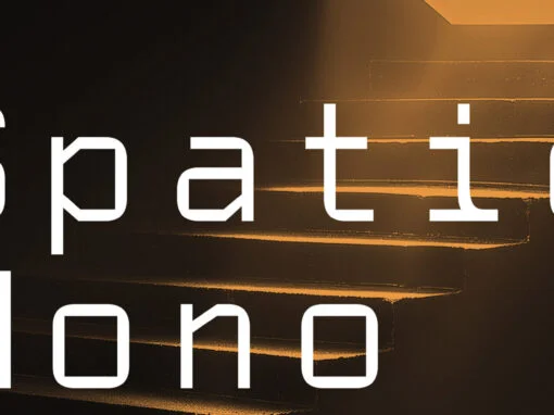
Spatio Mono Font
In a creative landscape defined by evanescence, there emerges an uncompromising, trailblazing beacon like the Spatio Mono Font, a steadfast exception. This ultimate monospace typeface, inspired by the infinite frontiers of space, effortlessly merges the narratives of modernity and futurism.
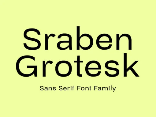
Sraben Grotesk Font
Sraben Grotesk is a beautiful, versatile font that's perfect for all kinds of projects! It features balanced and harmonious proportions, plus bold variations to make certain elements stand out. This font offers classic characteristics inspired by Grotesk typography, making it
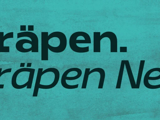
Prapen Font
Prapen and Prapen Neu are powerful monospaced sans serif typefaces that let you add texture and rhythm to your designs. With an impressive range of weights, widths, languages (from Latin to Cyrillic) and the variable version with multiple options –
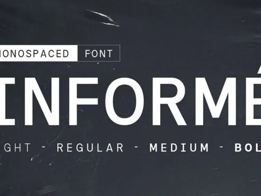
Informe Font
Informe is a modern monospaced typeface. Built with strong letter shapes, this typeface was designed to read well in small and large sizes. Informe is suitable for digital interfaces, simple coding projects, labels, editorials, tickets, and more. Available in 4

Tastes Font
Tastes font is a casual font with an authentic value that it carries, made like a relaxed handwriting and pays attention to authenticity in its creation. suitable for use in casual-themed graphic designs. Published by Arief RochmanDownload Tastes
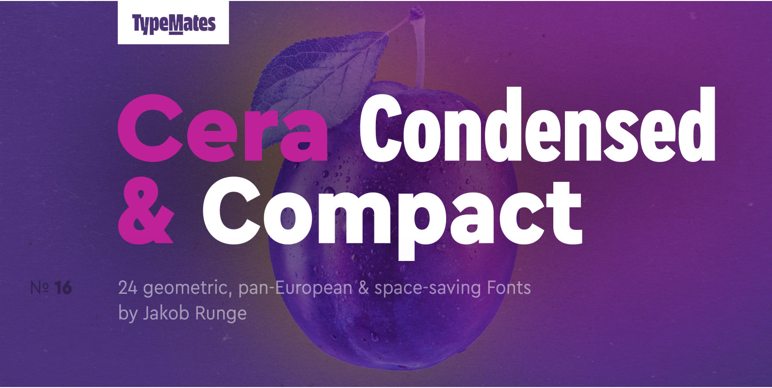
Cera Condensed Pro Font
The pan-European Cera Collection is driven by pure geometry and contains the bestselling Cera, its stenciled counterpart Cera Stencil, Cera Condensed, the hand-crafted display Cera Brush and the soft Cera Round. Developed for the narrow reading environments of mobile devices,
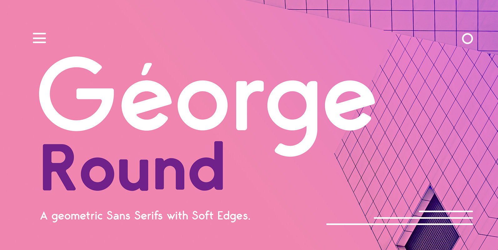
George Round Font
George Round v1.5 is an elegant contemporary sans serif font family of 8 fonts with soft edges,. Designed with clean and stylized modern European geometry with harmonious appearance for both texts and headlines. George Round is perfect companion for branding,
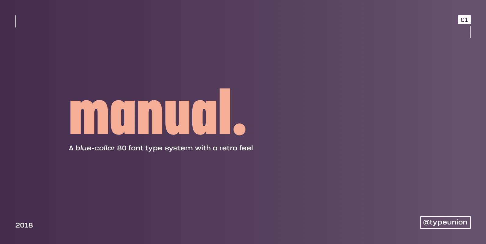
Manual Font
Manual is an 80 font super family formed of 10 weights in 4 different widths. The font is styled with a slight retro feel to give it a unique appearance. Manual is a blue-collar font that works hard for you
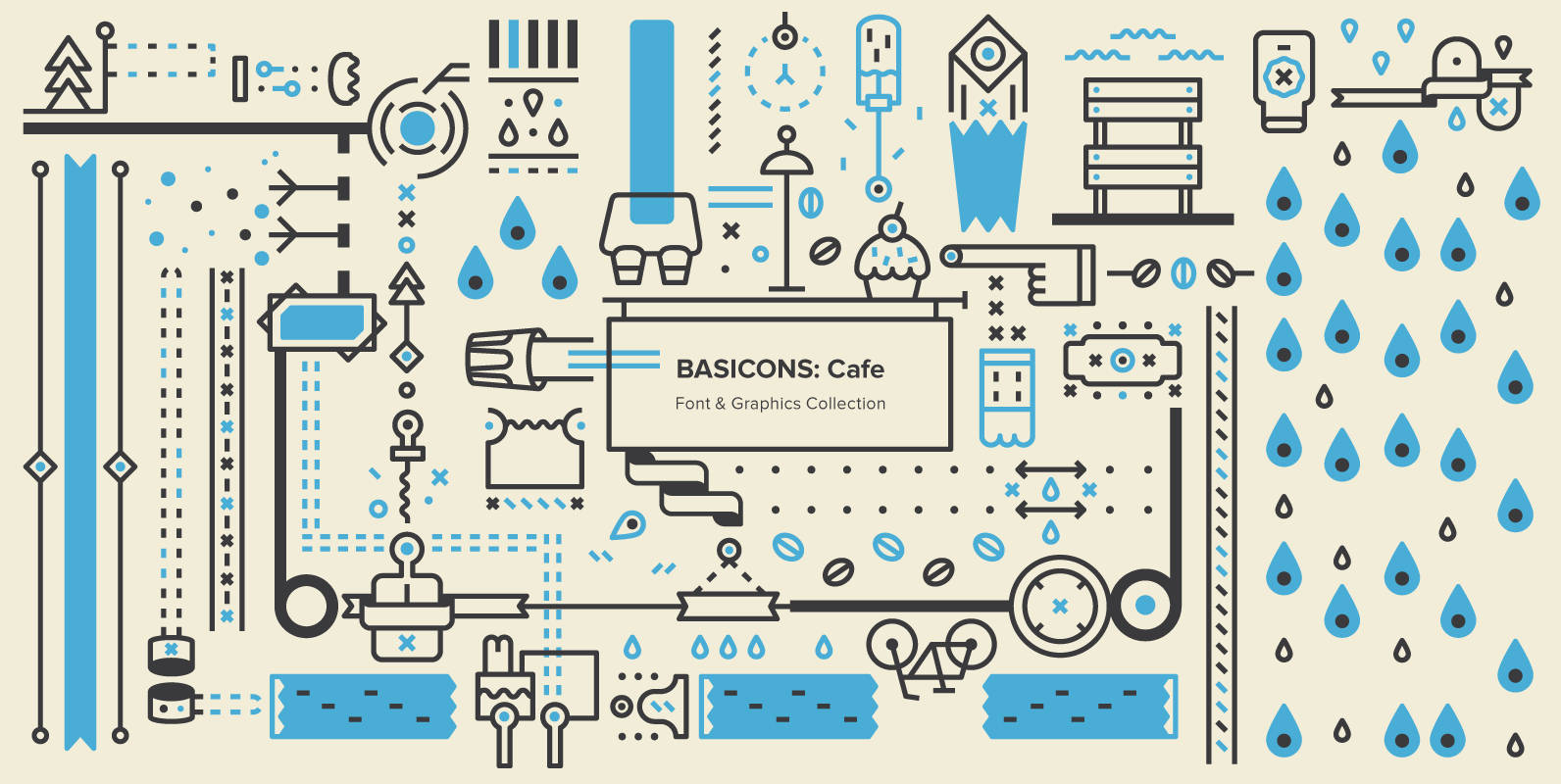
Basicons: Cafe Font
Stylish, adaptable, versatile and above all, simple, this set of 100 icons works very well for restaurant menus, cafe signage, product designs, window displays, presentations, web site designs, and many other restaurant, cafe and food-based design scenarios. BONUS: Includes a
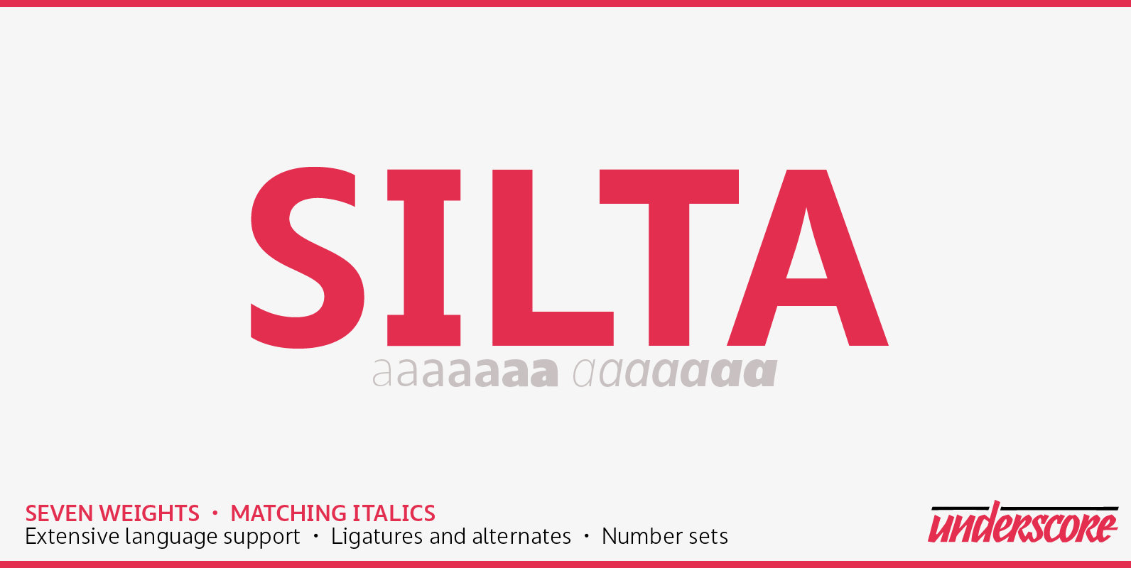
Silta Font
Silta is a humanist sans designed for interface typography and screen legibility. Sharp where it counts, flexible where you need it — and always a friendly tone. With seven weights and matching italics it has the range required for complex
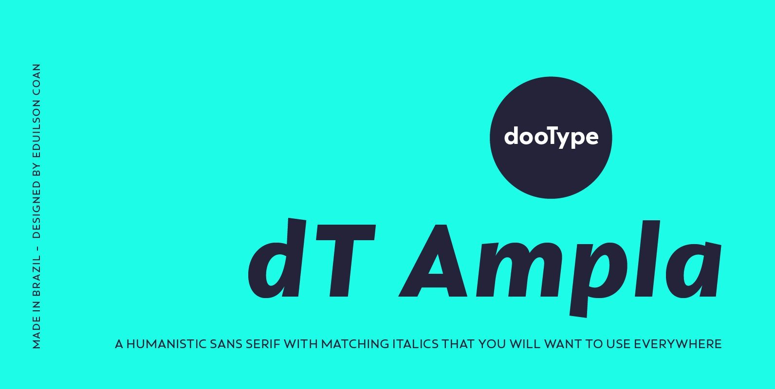
dT Ampla Font
dT Ampla shares many characteristics of the versatile sans typefaces of today: nice range of five weights with matching italics, 40+ supported languages, contemporary upper-to-lowercase proportions and impeccable performance in big and text sizes. However, all these features are designed
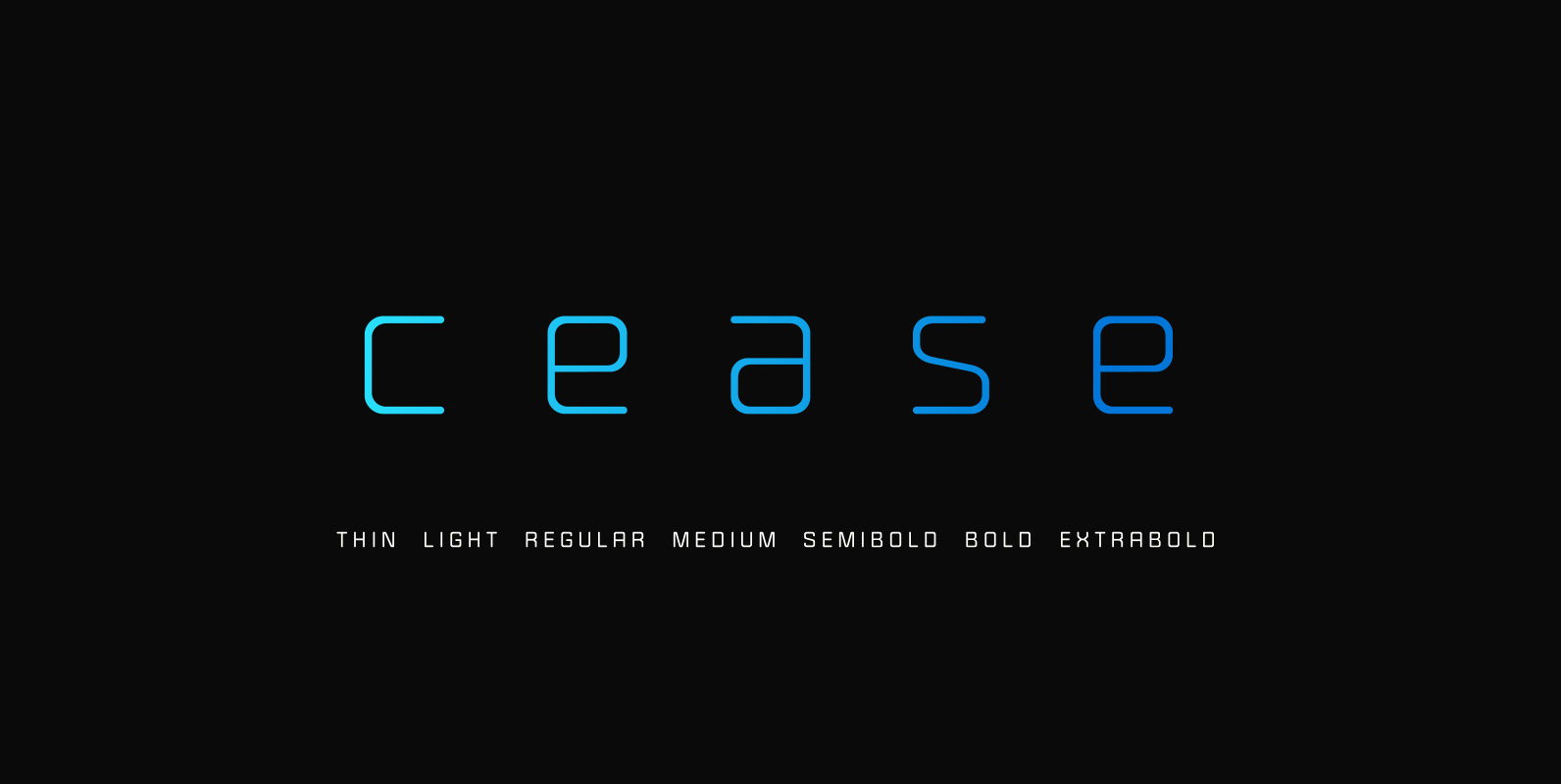
Cease Font
Cease rolls off the tongue. It is smooth, round, and unique in both upper and lower cases. Numerals are fixed widths, across all weights/styles and for clarity. It was created to perform well at any size. Published by Tyler Finck
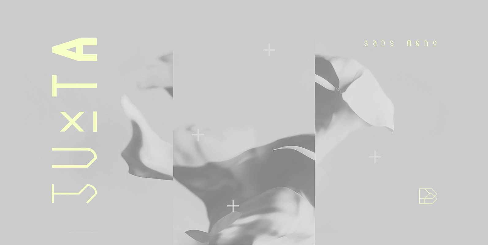
Juxta Sans Mono Font
Juxta Sans Mono is a tech font design published by NaumType Published by NaumTypeDownload Juxta Sans Mono
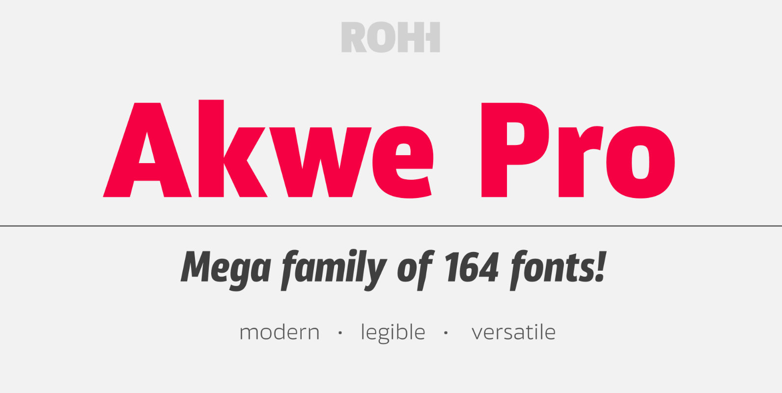
Akwe Pro Font
Akwe Pro is a professional, ultra versatile sans serif typeface characterized by excellent legibility and modern design perfect for all design purposes. It is designed for use in long and short paragraphs of text, headlines and user interfaces. Its distinctive
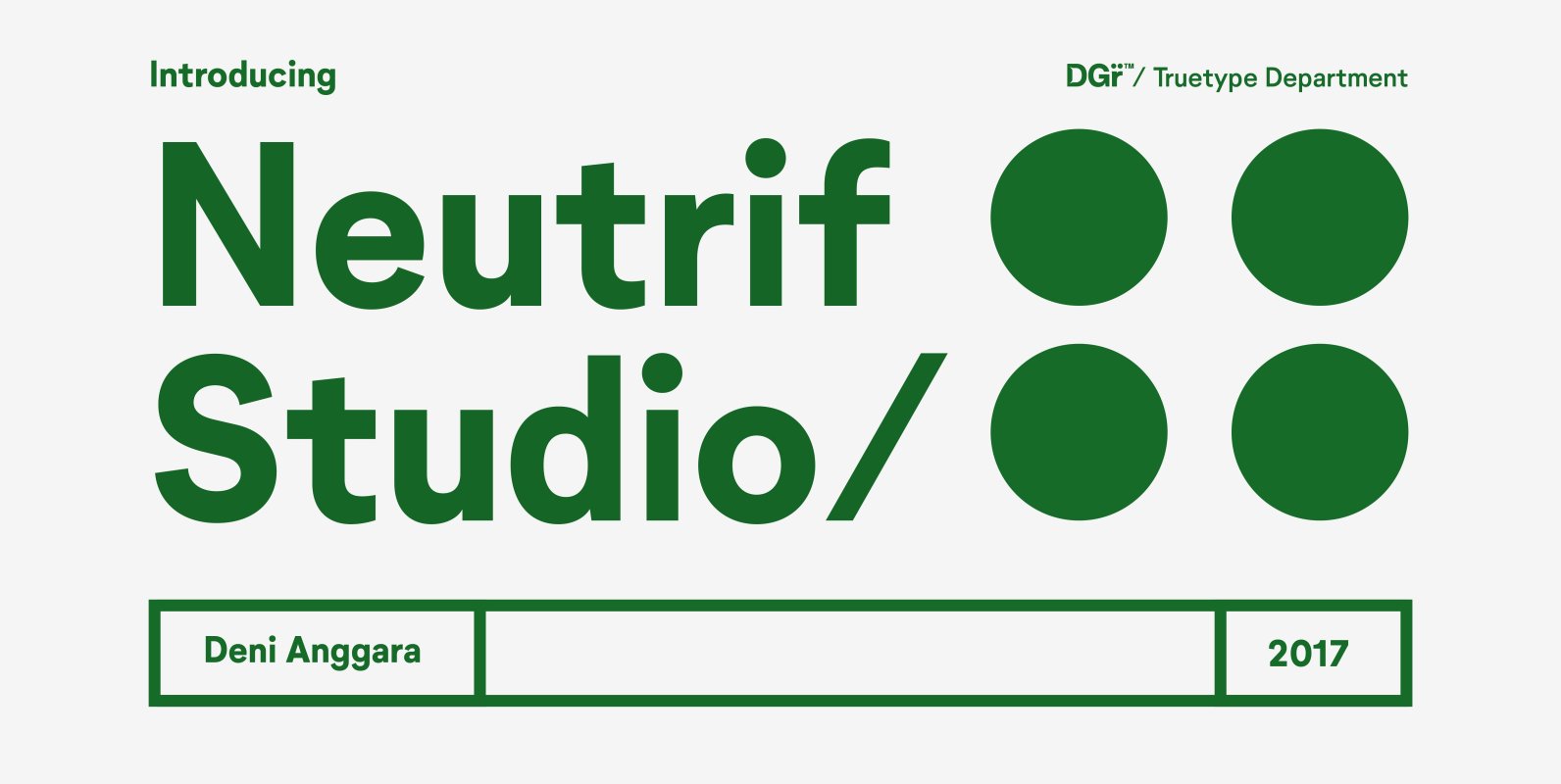
Neutrif Studio Font
Neutrif Studio is a modernist sans serif typeface. Its design combines typically grotesk-style letterforms, with some characters that are quite geometrically-designed. In terms of its appearance, Neutrif Studio was inspired by Modernism and Industrial-Era graphic and typographic design. The family