Tag: Italian
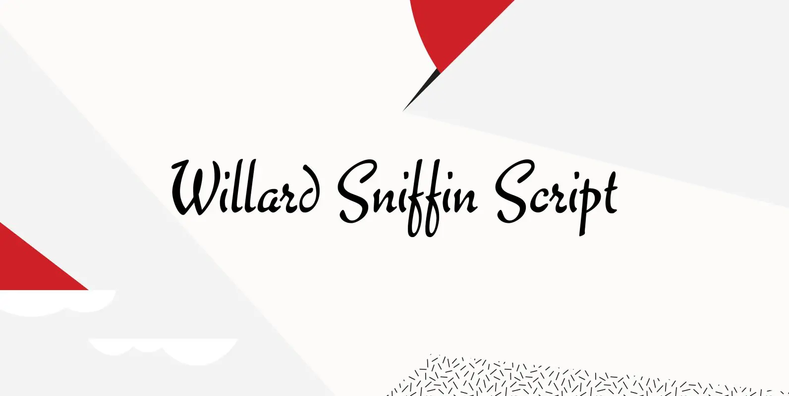
Willard Sniffin Font
Designed by Willard T. Sniffin. Digitally engineered by Steve Jackaman. Based on the original Willard T. Sniffin design of 1933 for ATF, this informal brush script was known as Keynote. Published by Red RoosterDownload Willard Sniffin
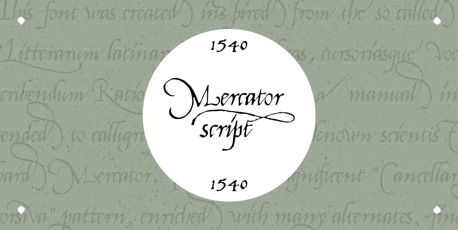
1540 Mercator Script Font
This font was created inspired from the so called “Litterarum latinarum, quas italicas, cursoriasque vocant, scribendum Ratio” (Louvain 1540), a manual intended to calligraphers by the well known scientist Gerhard Mercator. It was a magnificent “Cancellaresca corsiva” pattern, enriched with
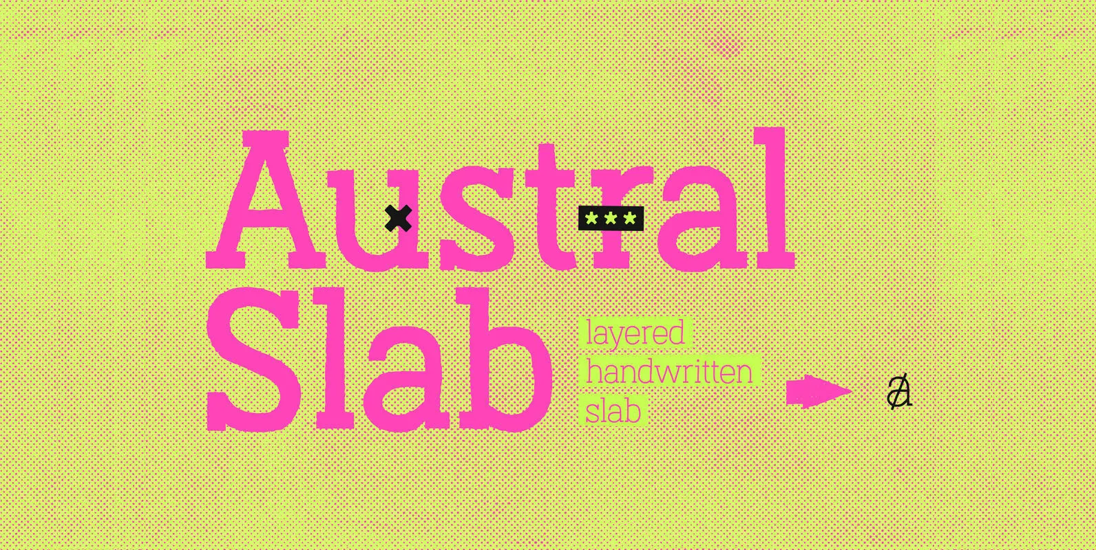
Austral Slab Font
Austral Slab is a hand-drawn layered font designed by Antipixel, with unique textures & styles that combine giving your work a distinctive impression. This font comes in three weights, Regular, Light & Thin, with irregular outlines and uneven/crooked strokes, giving
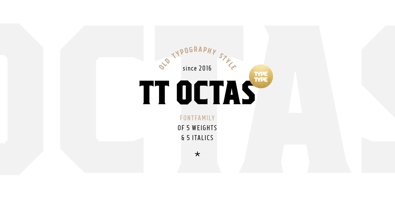
TT Octas Font
TT Octas is a narrowly proportioned font family built upon the principle of octagonal forms: all circles in this font family are actually octagons. Thanks to small serifs, TT Octas has a saturated and vintage character to it. Simple depiction
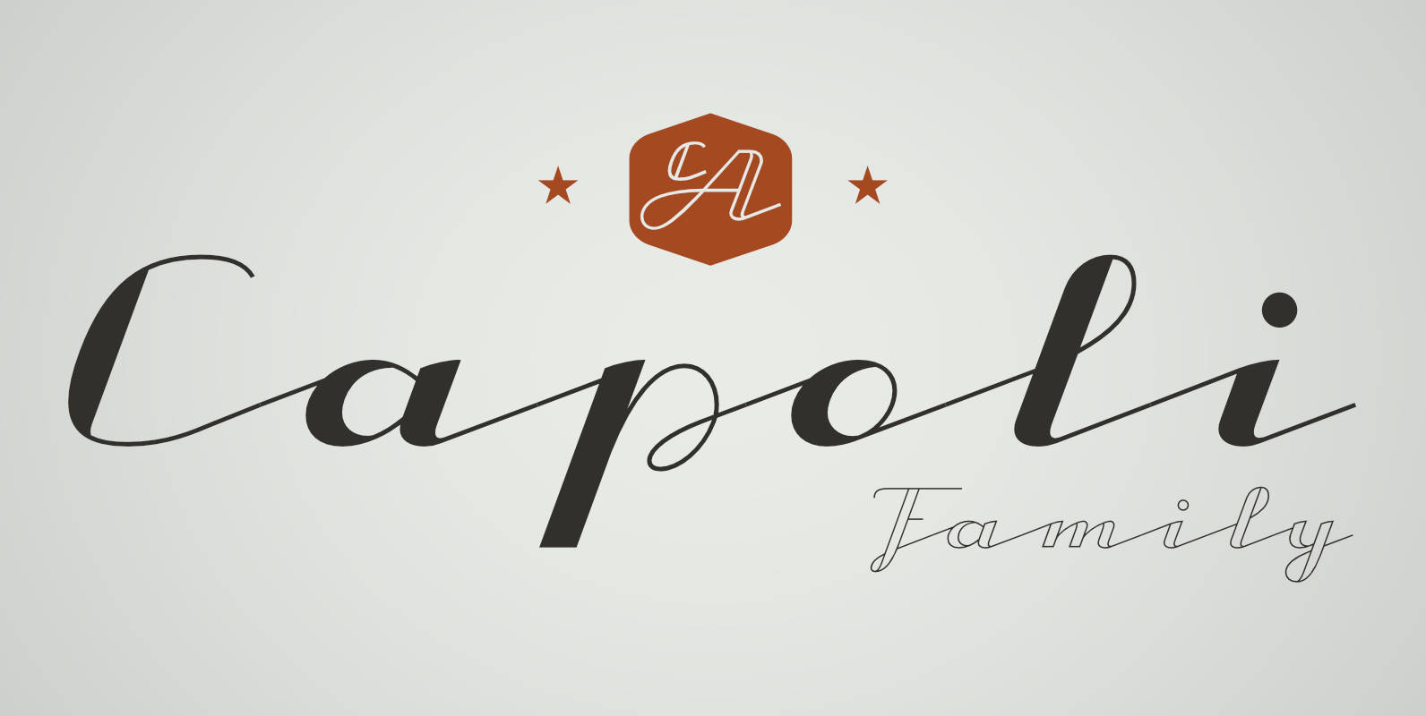
CA Capoli Font
CA Capoli is a fine script typeface with a vintage touch. Perfect for illustrative titles or logotypes. It comes in two styles, Regular and Stroke. The inspiration came during our trip to Italy, where we took a short rest in
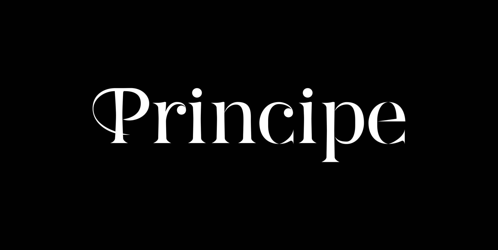
Principe Font
“Principe” is the Bodonian idea driven to the limit by abolishing most of the hairlines! The shape is completed only by the eye of the reader. This gives room for elegant embellishments and makes for a surprisingly new look to
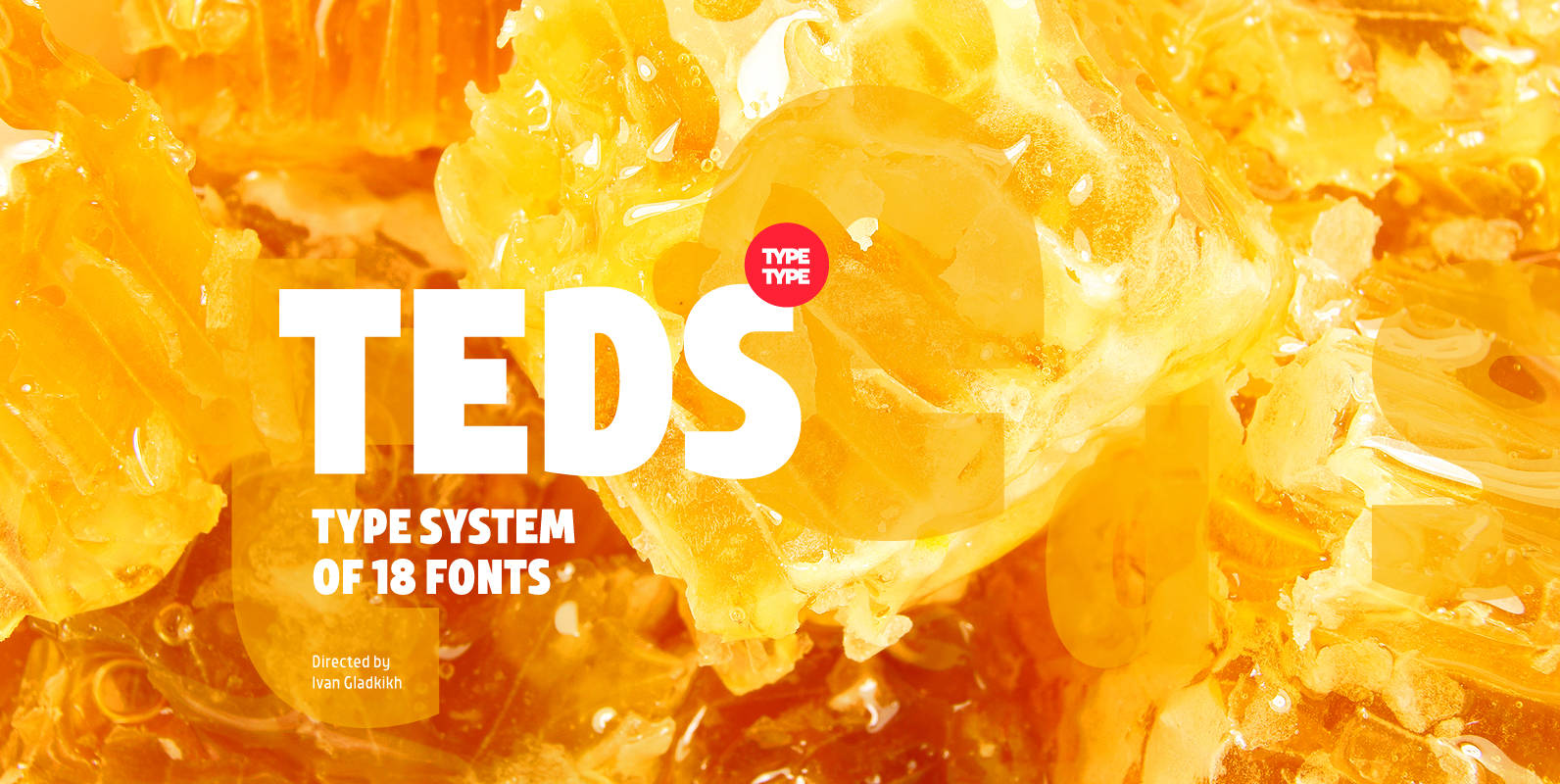
TT Teds Font
Teds is a geometric non-serif with narrow proportions created for universal application in any types of text. Relatively tall lowercase characters, open forms of semicircular characters, and low contrast between vertical and horizontal lines make this font type easy to
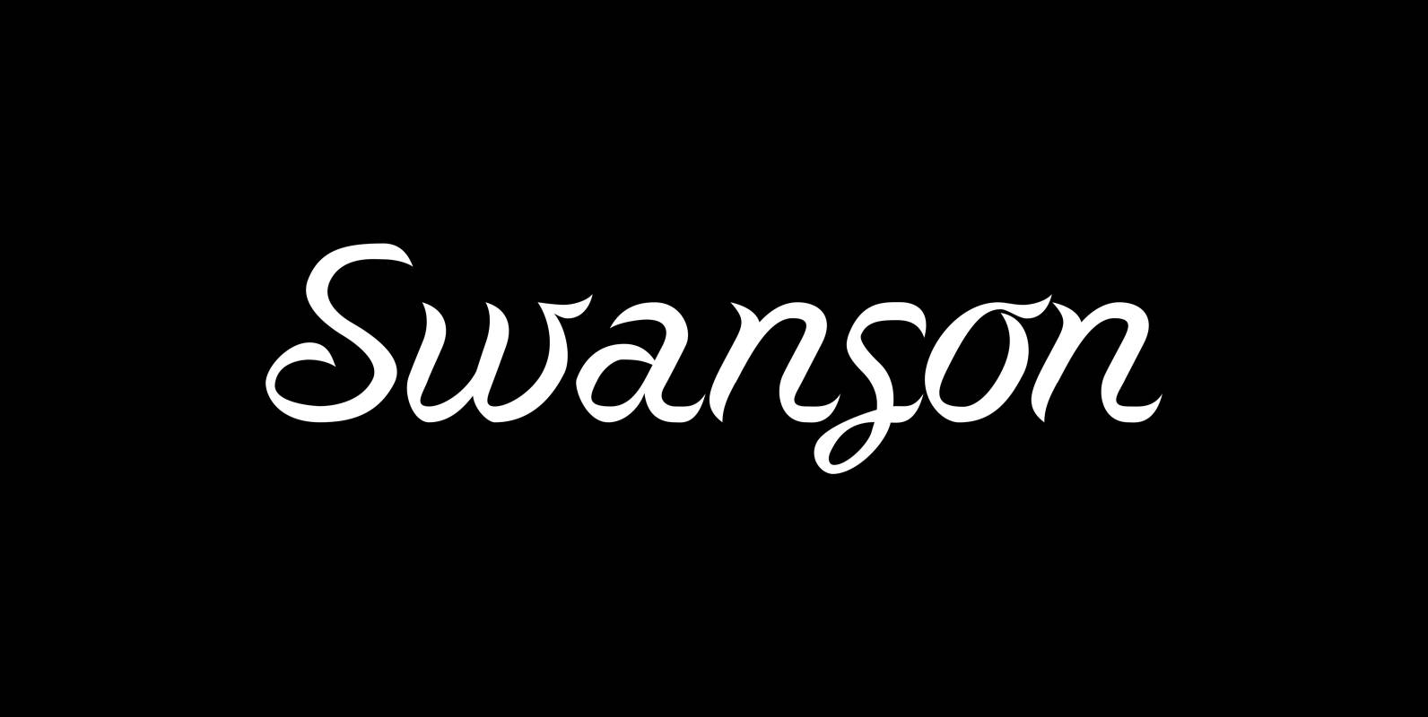
Swanson Font
“Swanson” is the son of the swan. This doesn’t make a lot of sense to non-typedesigners so I need to explain. The late, great italian typedesigner Aldo Novarese designed around 1950 a typeface for Nebiolo that he called “Cigno” which
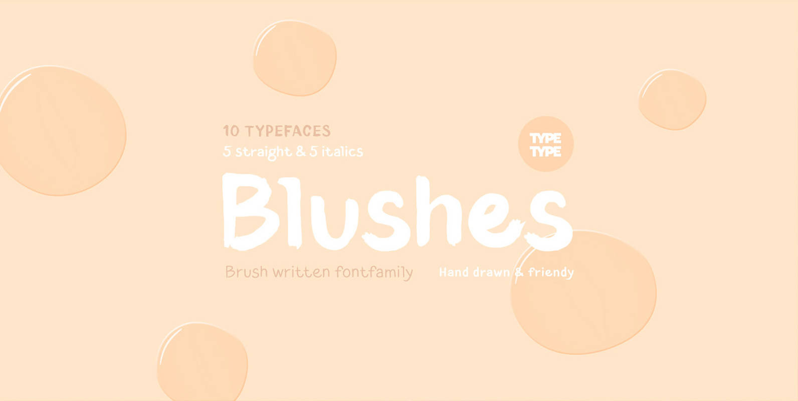
TT Blushes Font
Glitter, flashing cameras and fame – now you know how to deal with this stuff! Freshness and brightness is what defines the Blushes fontfamily, which is created for beauty and fashion industries. TT Blushes is a vibrant part of you

Binario Font
Binario is a simple and friendly font with three weights and matching italics (obliques). It is an excellent choice for giving a clean, unique, and modern look to headlines or body text. Use it for branding, menus, posters, magazines, and
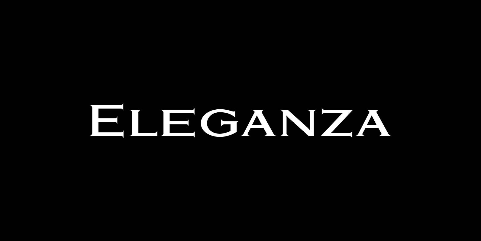
Eleganza Font
“Eleganza” is my most elegant typeface. At least that is what I think! I use it for business cards and everything that has to be elegant with that extra touch. The font comes in pairs for the price of one.
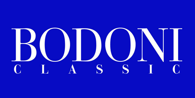
Bodoni Classic Font
I became interested in designing Bodoni Classic because of a lazy graphic designer at Jacques Damase publishing house. He had to change a single letter on a bookcover about J. B. BODONI. The French call him Jean Baptiste instead of
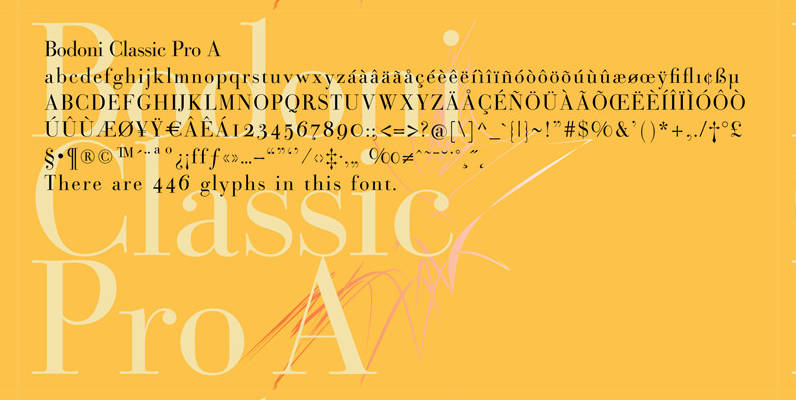
Bodoni Classic Pro Font
This is my new, completely worked over and fine-tuned Bodoni Classic for Europe (no Greek and Cyrillic). I have added a set of elegant Swashes (B) and 2 alternating uppercase swirly Initials (C) as well as two lowercase end-letters (D).
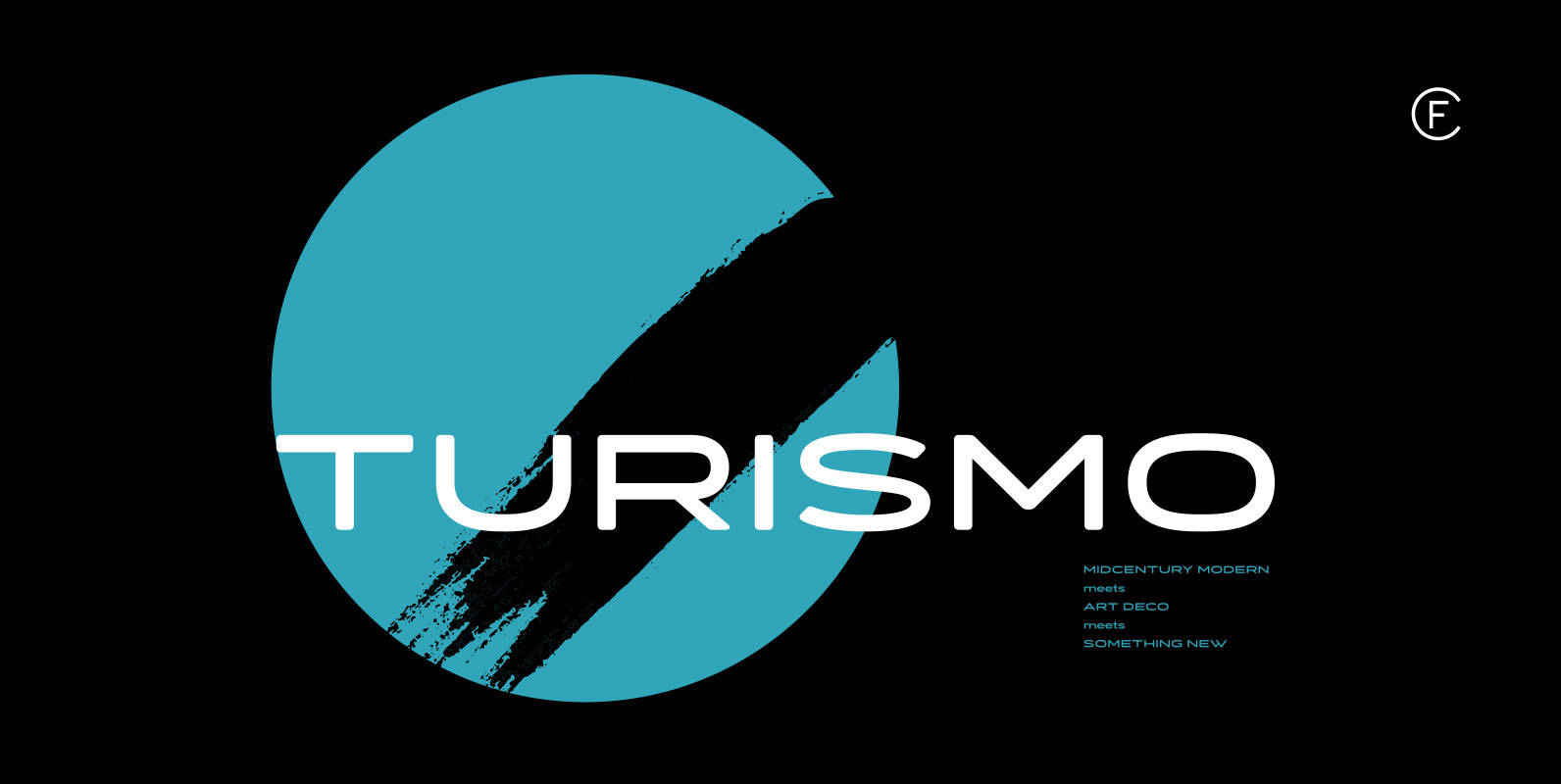
Turismo CF Font
Inspired by midcentury motorsports, technology, and business, Turismo CF is designed for stunning logotypes and gripping headlines. Taking cues from both the 1960s and 1920s, Turismo combines strong rectangular shapes with sloping, elongated curves. Includes seven weights, upper and lower
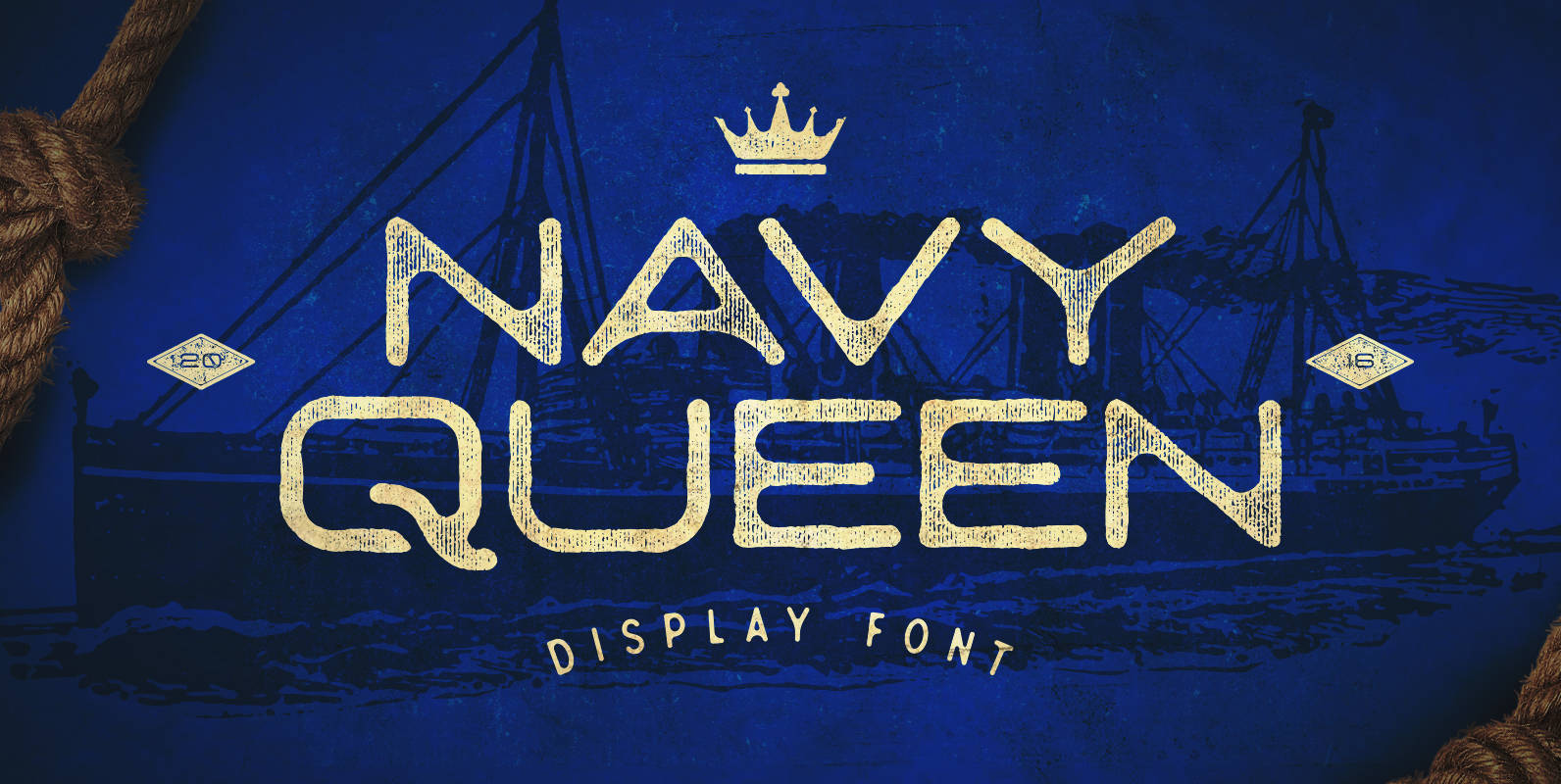
Navy Queen Font
Navy Queen is a over-extended, geometrically designed sans serif display font that pays homage to simpler times. This font will act as a great addition to any vintage design project including posters, logos, crests, packaging, and so much more! Navy
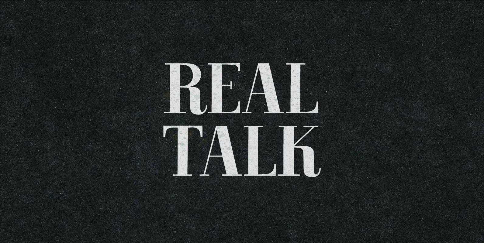
Real Talk Font
Real Talk packs the same lip flapping smacks and pharyngeal grunts as any old nonsense. But while a baby can only babble, a grown man can mean something. Put words in perspective, located on the axes of breadth and depth,
