Tag: italic
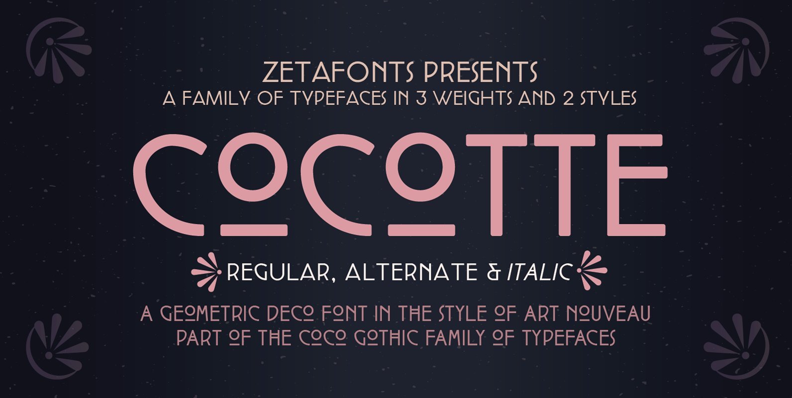
Cocotte Font
Cocotte is a small caps sans serif display typeface inspired by the graphic style of early art nouveau. It comes in three weights with matching italics and features a regular style, inspired by arts&crafts and geometric jugendstil, and an alternate
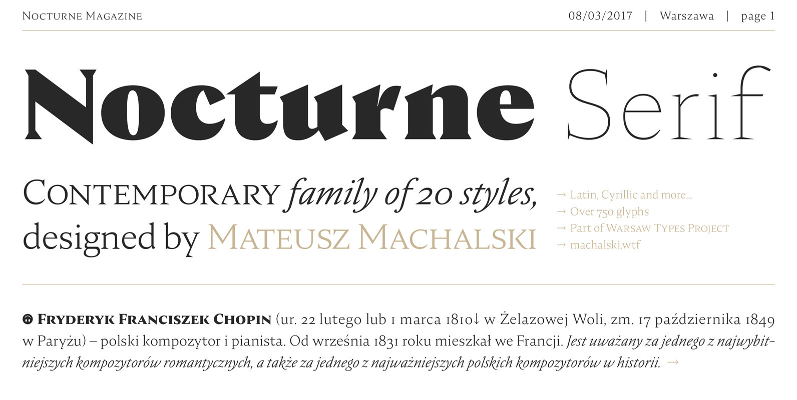
Nocturne Serif Font
Nocturne Serif is a font inspired by the lettering on stone tablets commemorating the victims of World War II and Warsaw architecture. Nocturne is a text font that features clean geometrical shapes, high contrast and is modernist in character. All
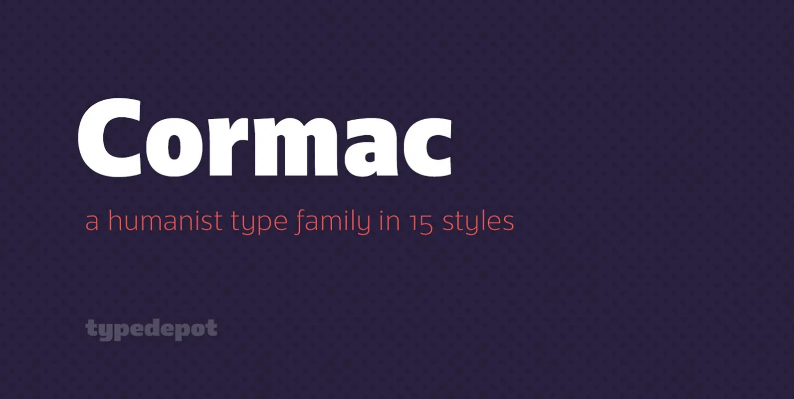
Cormac Font
Cormac is a humanist typeface characterized with it’s large x-height and slightly flared stems. The word that best describes our ideas in the beginning of the project is “simple” – the idea behind it was to strip the letter forms

Rinstonia Font
Rinstonia is a signature style typeface that is such a pleasure to work with! The perfect flow and easy signature style works perfectly on invitations, blog headers, logo & branding, art quote, book / cover title, magazine and so much
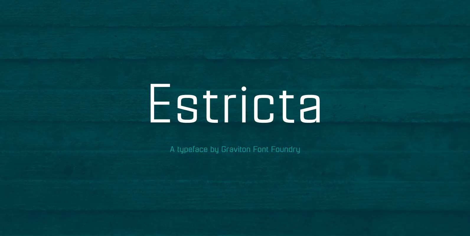
Estricta Font
Estricta font family has been designed for Graviton Font Foundry by Pablo Balcells in 2017. It is a sans serif typeface with a geometrical and mechanical appearance, its sharp, angular edges provide a strong and solid design. It has been
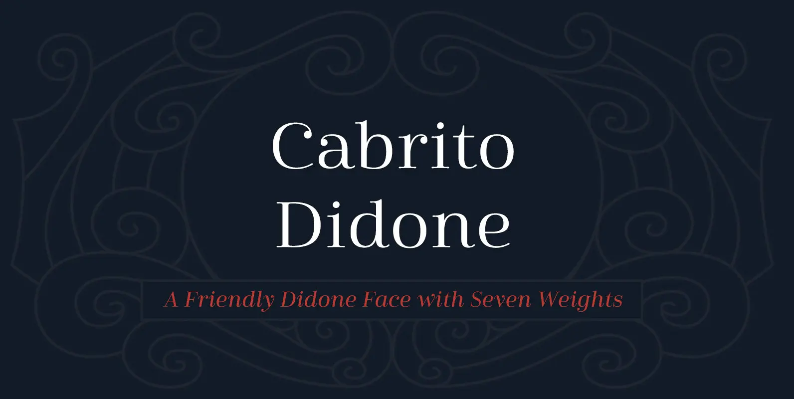
Cabrito Didone Font
A graceful kid if ever you’ve seen one, Cabrito Didone joins the Cabrito family of fonts–a family designed to provide young infants with clear recognition of letter forms. The original letters were released as part of the children’s book about
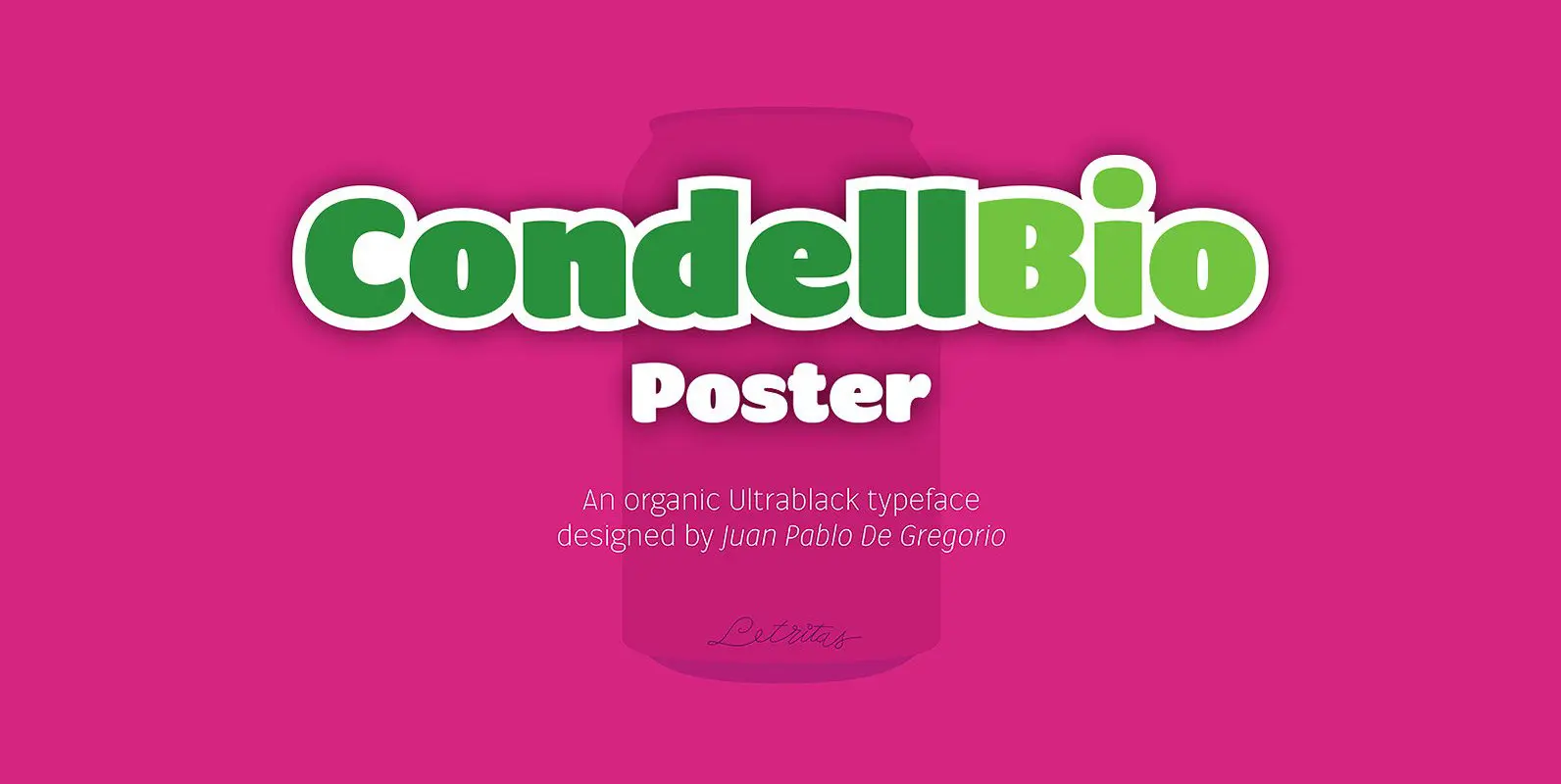
Condell Bio Poster Font
Condell Bio Poster is part of the bigger Condell family: a project who involves series of typographies who started to be conceived and developed since 2006. It also includes a bigger legibility version and a sans serif. Condell Bio is
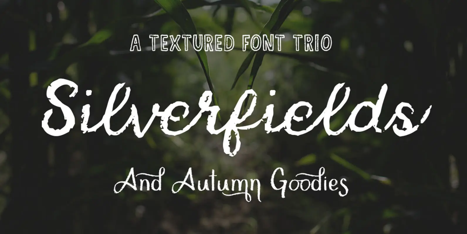
Silverfields – Font Trio Font
The Silverfields Font trio makes life so much easier when trying to come up with a design. Being that it is textured yet elegant, it covers many different styles and can be used in many various ways The Fonts: Silverfields
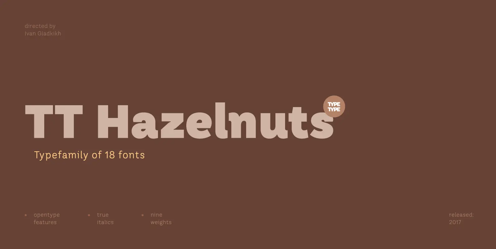
TT Hazelnuts Font
TT Hazelnuts is a display sans-serif font family containing a set of elegant and delicate decorative elements. Initially the family was designed for highly specialized areas, but we’ve decided to extend the number of typefaces and to make the family
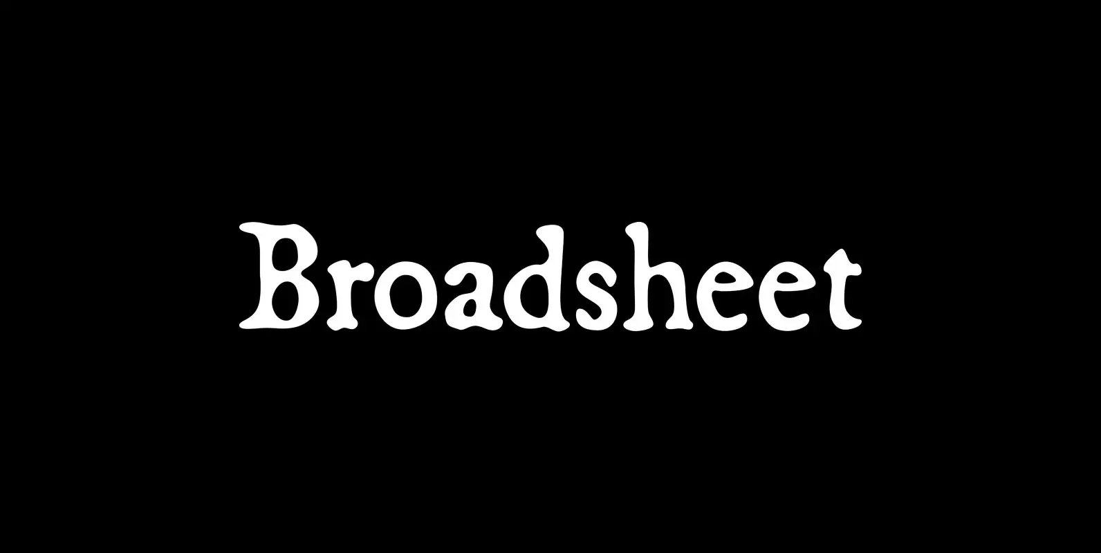
Broadsheet Font
Broadsheet simulates old newspaper text from the 1700s, chiefly from two specimens: an original copy of The New-England Weekly Journal, published in Boston on April 8, 1728, and a commemorative reprint of the Massachusetts Sun, published in Worcester, Mass., on
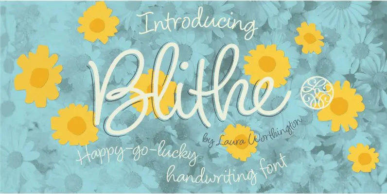
Blithe Font
Bouncy, effortless-looking handwriting can put us at ease or make us smile. Blithe captures the casual flair of a felt-tip pen with clean monoline strokes. Laura Worthington has retained the distinctive quirks of real handwriting – such as characters that
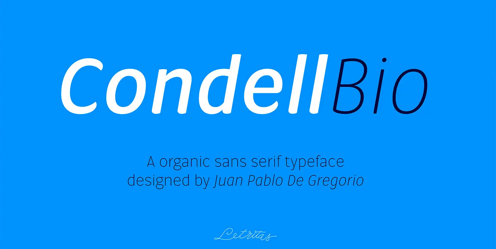
Condell Bio Font
Condell Bio is part of the bigger Condell family: a project who involves series of typographies and whose early conception and development began in 2006. Unlike its Poster version, with its excessive and eccentric forms, Condell Bio tries to adapt
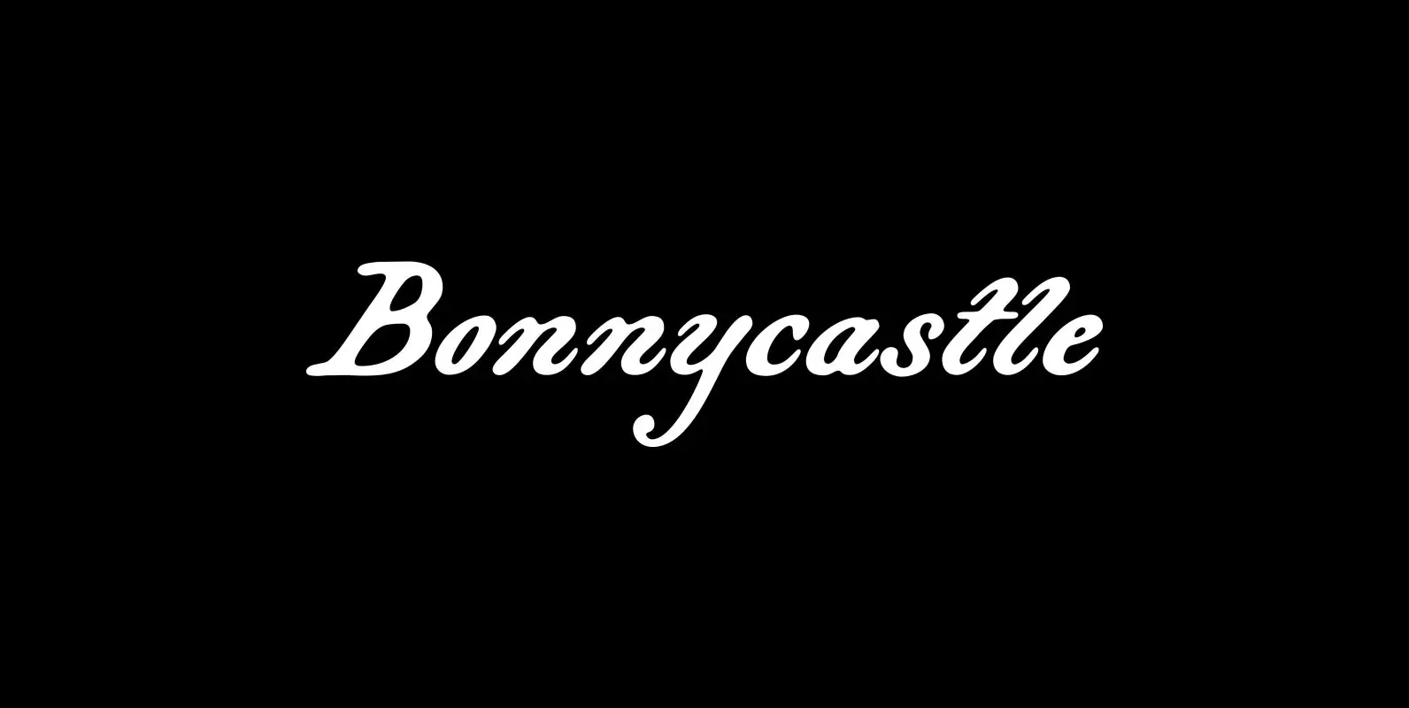
Bonnycastle Font
Sir Richard Henry Bonnycastle (1791–1847) was an English officer and military engineer who served in the War of 1812 and ultimately settled in Canada. I stumbled upon copies of some of his charts and maps and became so infatuated with
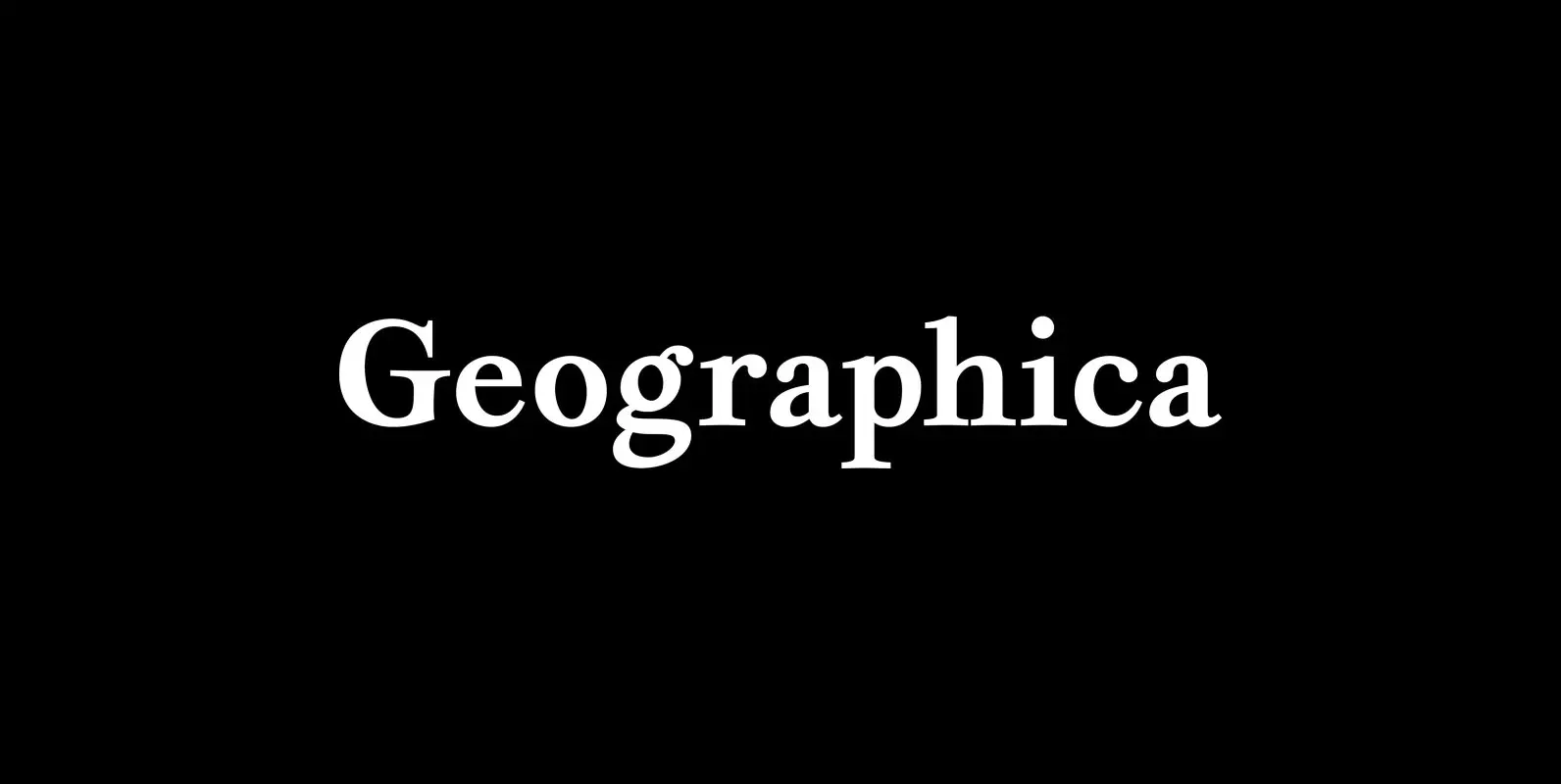
Geographica Font
Geographica is a four-style serif text-type family modeled after the neat hand-lettered place names and peripheral text on the maps of Thomas Jefferys (ca. 1710–1771), the best-known map engraver in 18th-century England. Although he won (and hyped) the title “Geographer
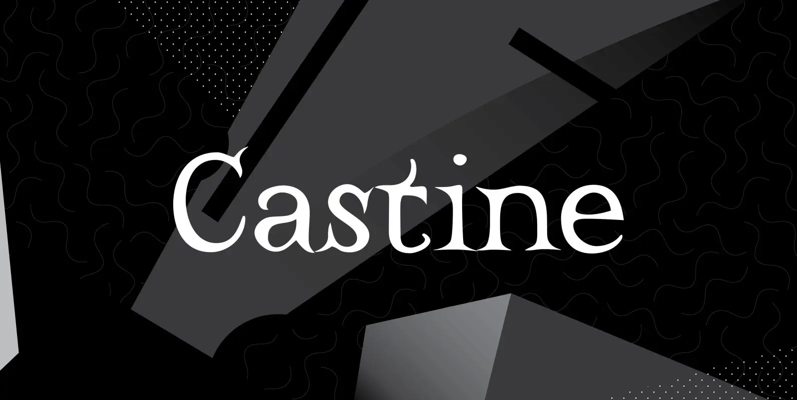
Castine Font
Castine gets its name from a small coastal Maine town with a seagoing heritage and long history. The town has an old cemetery with a few 200-plus-year-old headstones whose distinctive carved lettering inspired the typeface that shares its name. Castine’s
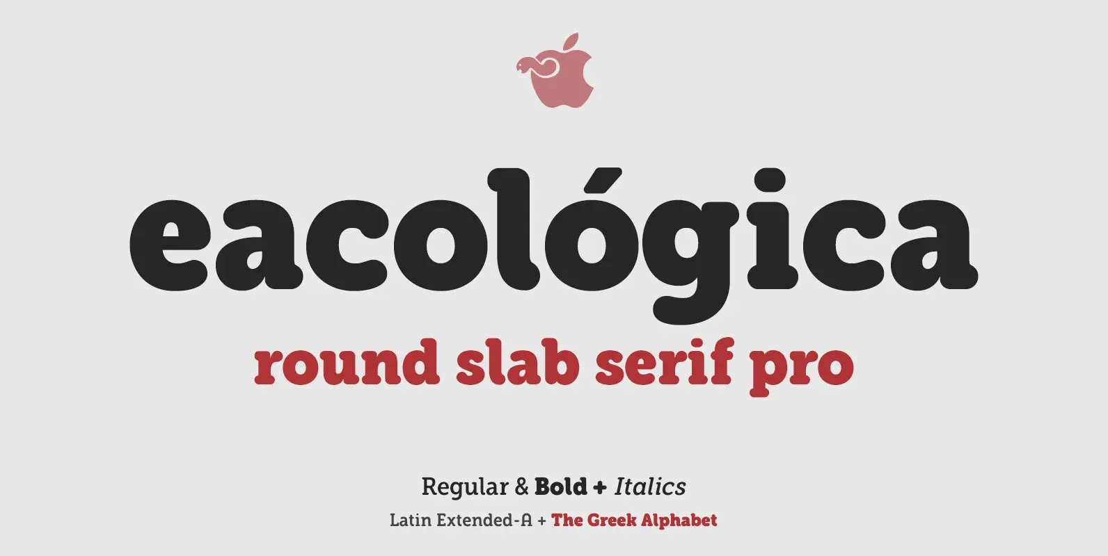
eacologica Font
Eacológica round slab is a chunky slab serif typeface with thick rounded, ideal for very readable sturdy-looking titles. You can use this font for headlines in editorial design, advertising and also for designing posters, signs or posters in all cases
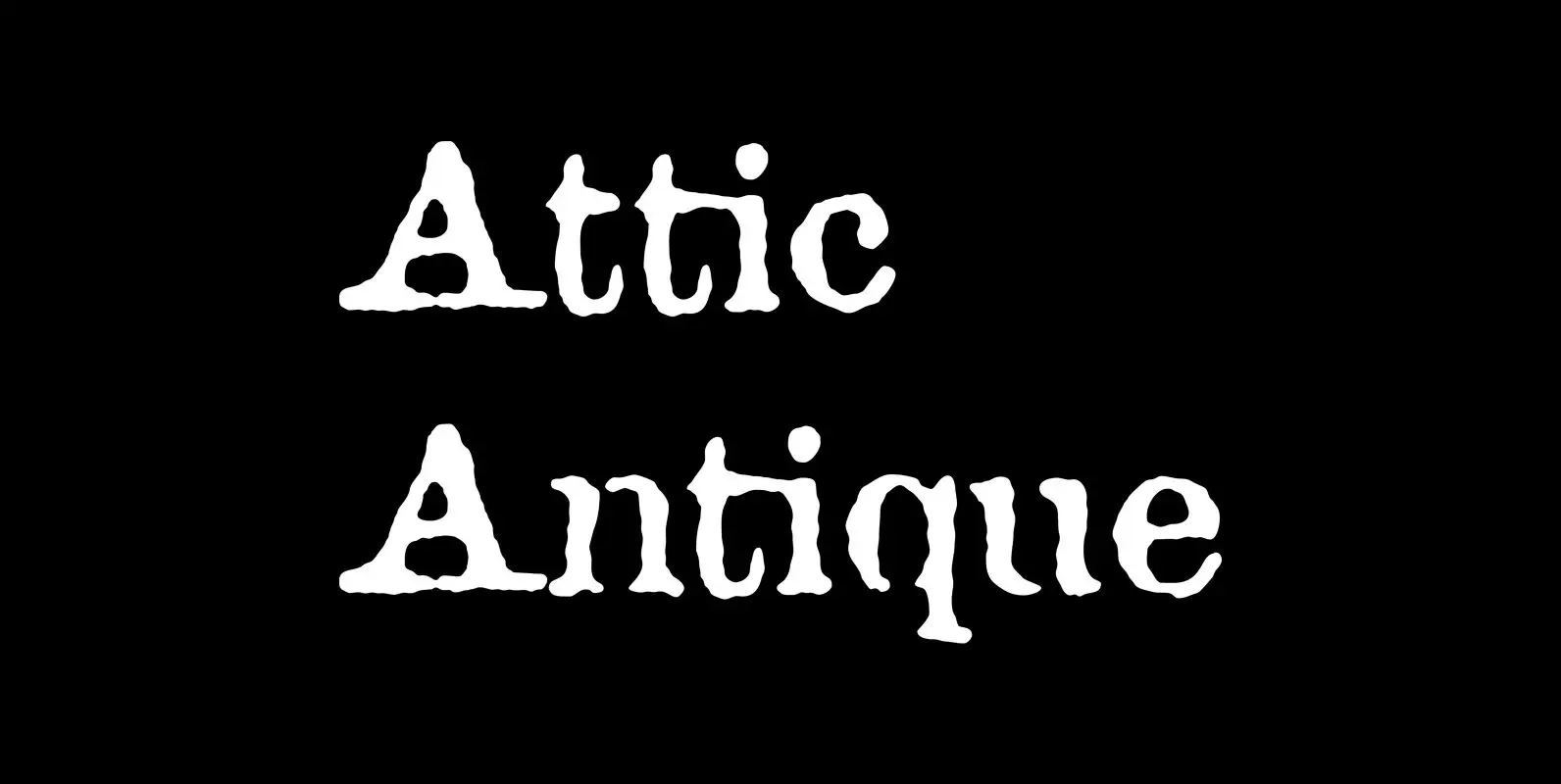
Attic Antique Font
Attic Antique replicates the warn, weathered text in a friend’s old copy of John Burroughs nature essays. It shares the wide spacing and ample serifs of the Century faces. Use it to represent age, to suggest photocopied archives, or to
