Tag: italic
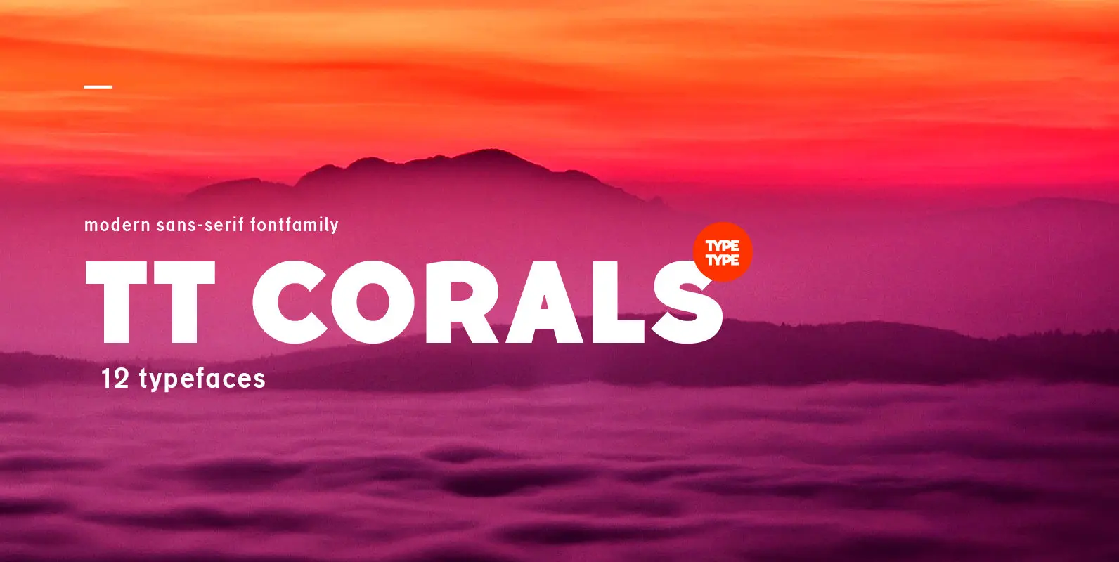
TT Corals Font
TT Corals is a modern humanistic sans-serif which has many typical traits of the beginning of the 20th century. For an increased functionality of the font family we’ve created 6 typefaces of various weights: Thin, Light, Regular, Bold, Extrabold, Black.

Gerlach Sans Font
As the foundry’s new flagship family, Gerlach Sans was named after the highest peak in Slovakia. Its functional design is enhanced by a few subtle ingredients, adding life and giving words a more playful voice. The family has eight weights

CA Geheimagent Font
CA Geheimagent is perfect for setting text about restrictions, or permissions if you prefer. Not quite a text font, not quite a headline font, it’s a bit of both. The Italic style break up the strictness of the regular fonts.
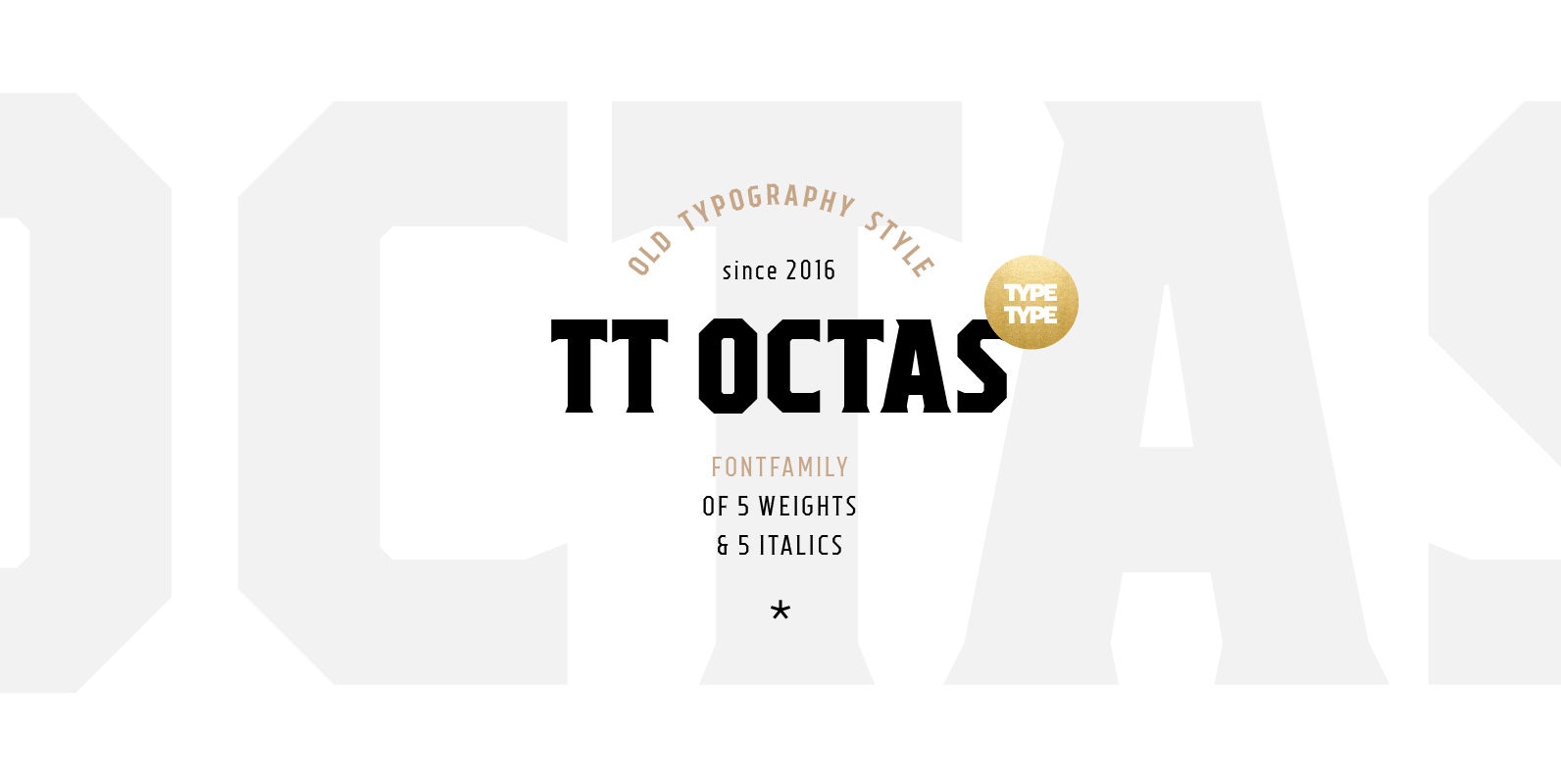
TT Octas Font
TT Octas is a narrowly proportioned font family built upon the principle of octagonal forms: all circles in this font family are actually octagons. Thanks to small serifs, TT Octas has a saturated and vintage character to it. Simple depiction
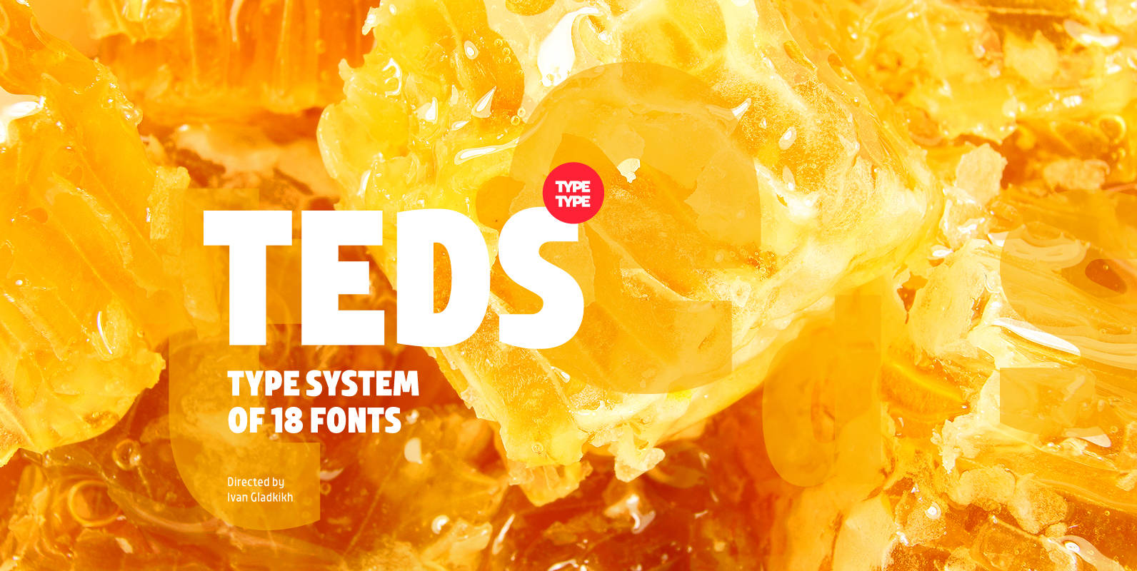
TT Teds Font
Teds is a geometric non-serif with narrow proportions created for universal application in any types of text. Relatively tall lowercase characters, open forms of semicircular characters, and low contrast between vertical and horizontal lines make this font type easy to
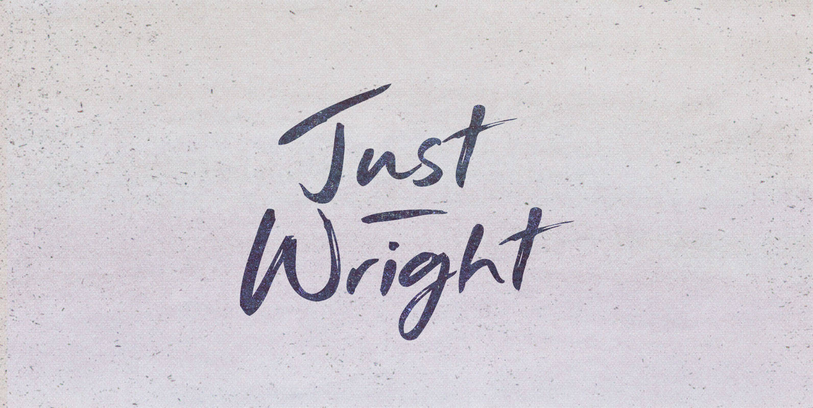
Just Wright Font
They had come for justice. It had been on order for centuries and they carried the bill their ancestors bestowed upon them. They came as a nation seeking her grand fleet, long under the nurturing of a great ship wright.
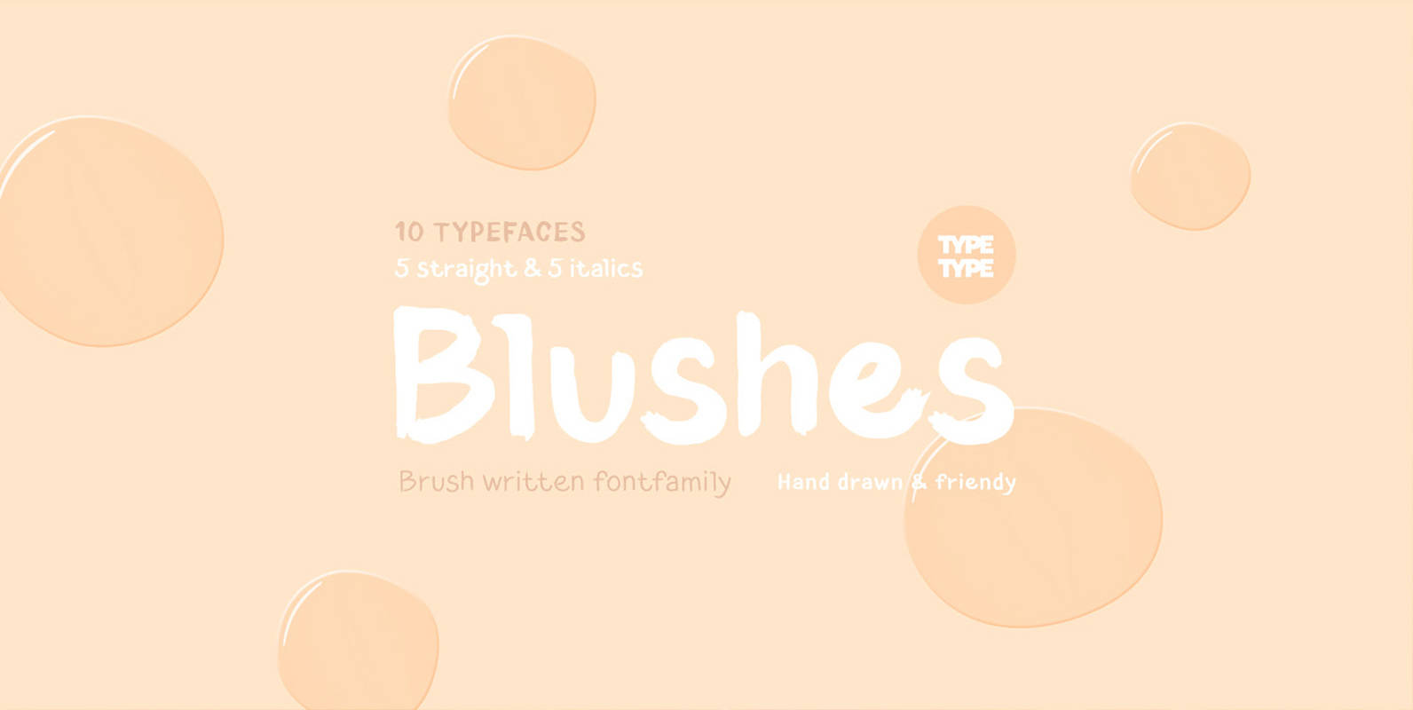
TT Blushes Font
Glitter, flashing cameras and fame – now you know how to deal with this stuff! Freshness and brightness is what defines the Blushes fontfamily, which is created for beauty and fashion industries. TT Blushes is a vibrant part of you

Emilia Font
Emil Rudolf Weiss’s 1920s Antiqua font family, redrawn and redesigned for nowadays use. This well-proportioned serif font family makes a good impression in ads, magazines and books. Published by RMU TypedesignDownload Emilia
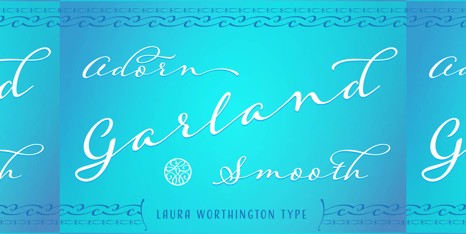
Adorn Garland Smooth Font
Adorn Garland is a script face that runs along a different, and somewhat “vintage” direction. Rather than deriving its strength from a heavy skeleton or structure, it uses its sense of contrast, its light touch upon the page, and its
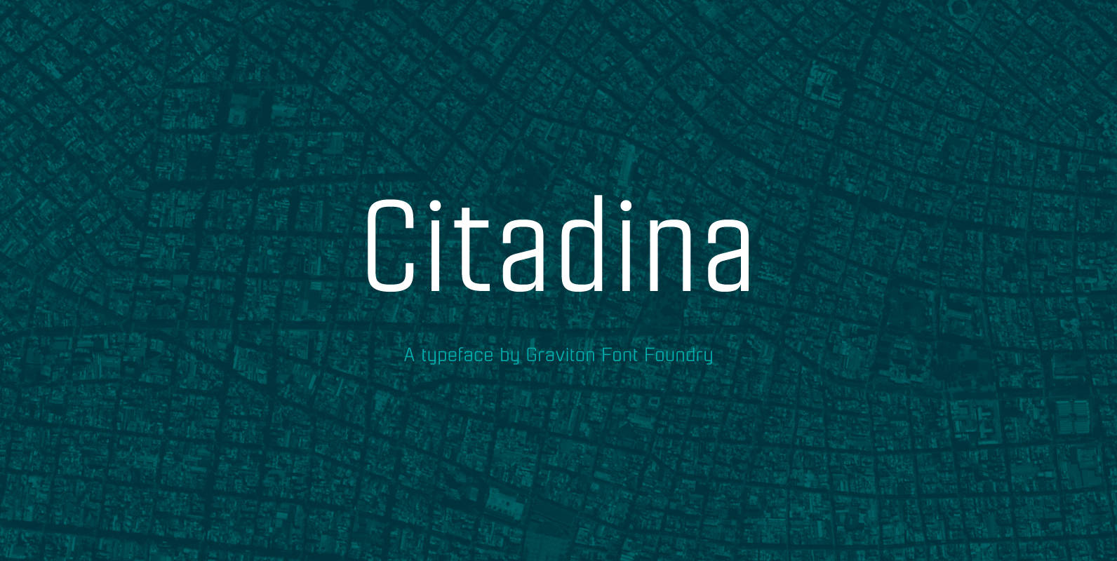
Citadina Font
Citadina font family has been designed for Graviton Font Foundry by Pablo Balcells in 2016. It is a sans serif typeface with a geometrical, mechanic, neutral appearance and a slightly condensed design which makes it particularly effective for space economizing.
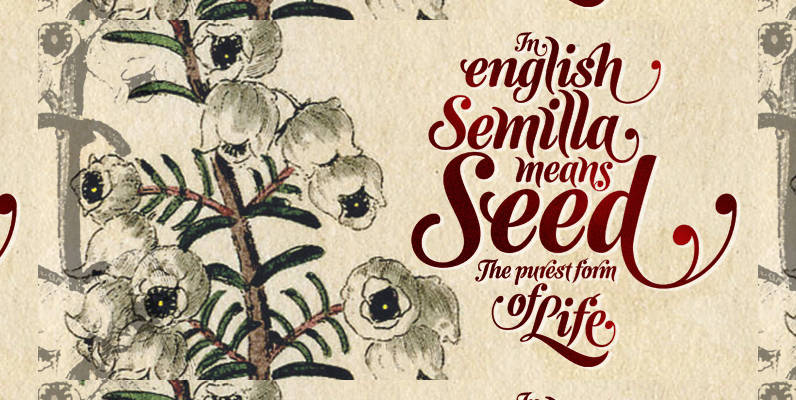
Semilla Font
I spend a lot of time following two obsessions: packaging and hand lettering. Alongside a few other minor obsessions, those two have been my major ones for so many years now, I’ve finally reached the point where I can actually
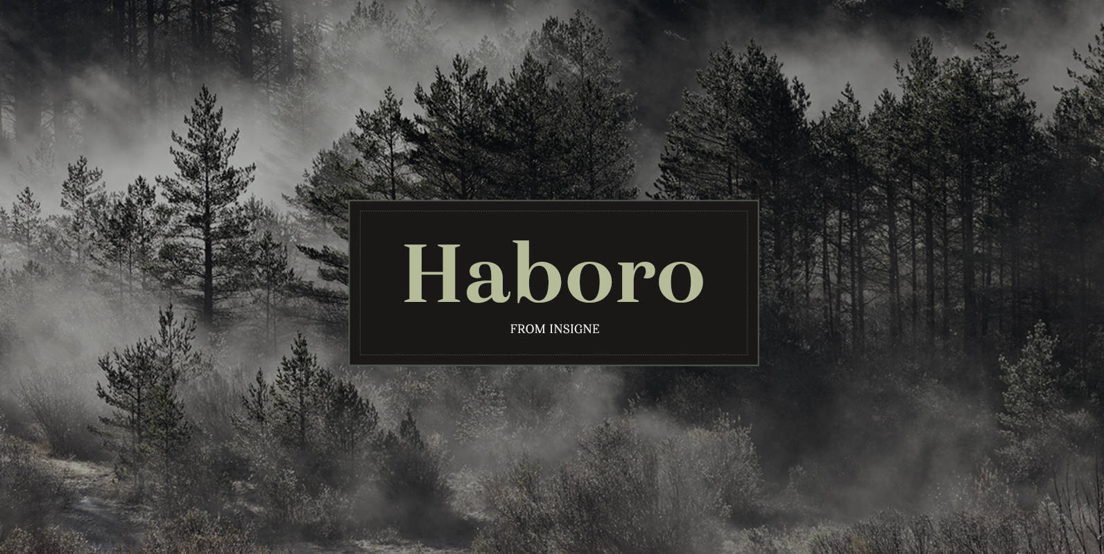
Haboro Font
Haboro is a powerful workhorse. It’s a neoclassical font developed for numerous uses, ranging from editorial and corporate to web pages and apps. This new face from insigne Design takes a modern twist on the high-contrast typeface genre known as
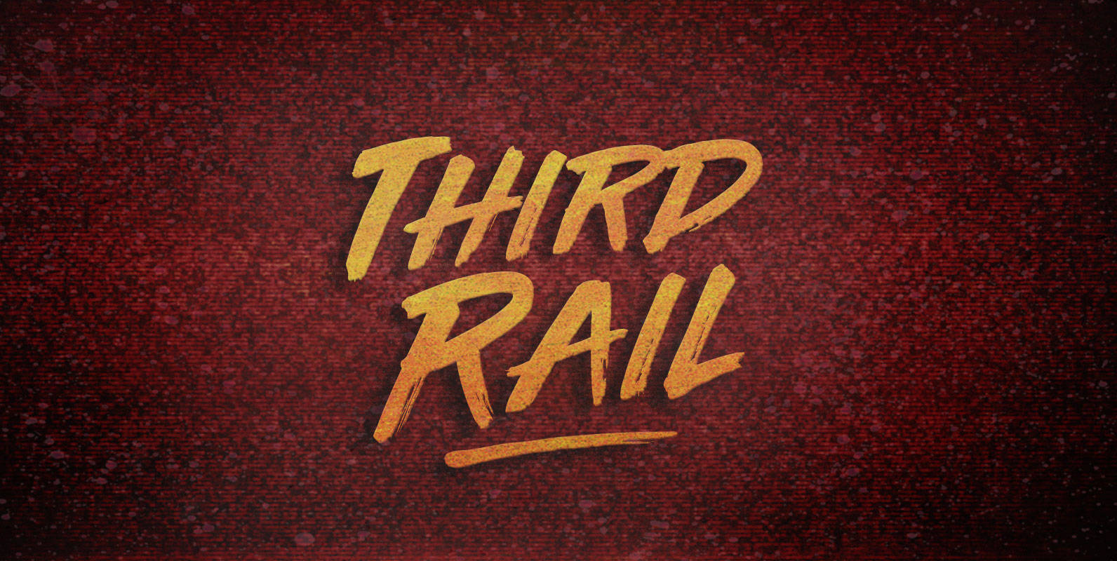
Third Rail Font
When new stock rolls on elevated electrics, riders reap the benefit. Lay down the Third Rail and exorcise the steamworks. Substations charge the spark effect and take traffic through the turnstiles. Published by BLKBKDownload Third Rail
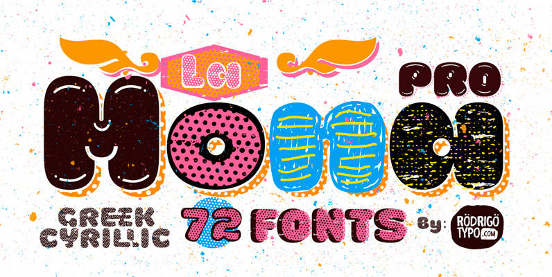
La Mona Pro Font
La Mona Pro is a rounded font design by Rodrigo Araya Salas. Published by RodrigoTypoDownload La Mona Pro
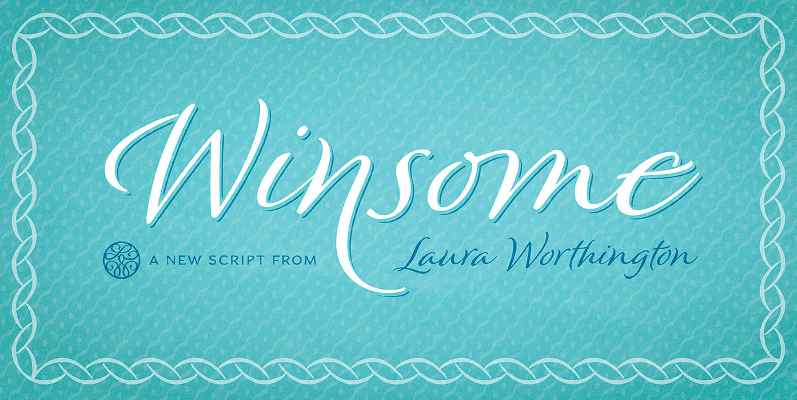
Winsome Font
How many ways can a typeface charm its reader? The aptly named Winsome offers virtually endless variety, in a friendly script face that balances the casual with the calligraphic. Customize it with over 600 alternates, swash characters, and ligatures. Winsome


