Tag: italics
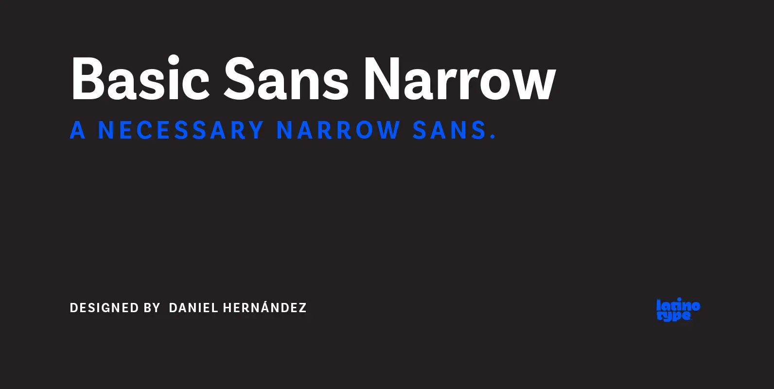
Basic Sans Narrow Font
Basic Sans Narrow is a narrower version of Basic Sans. It is a family of Grotesque features with a functional, neutral and seeming clean style that looks to keep a neutral (or basic) appearance on paper, but including lots of
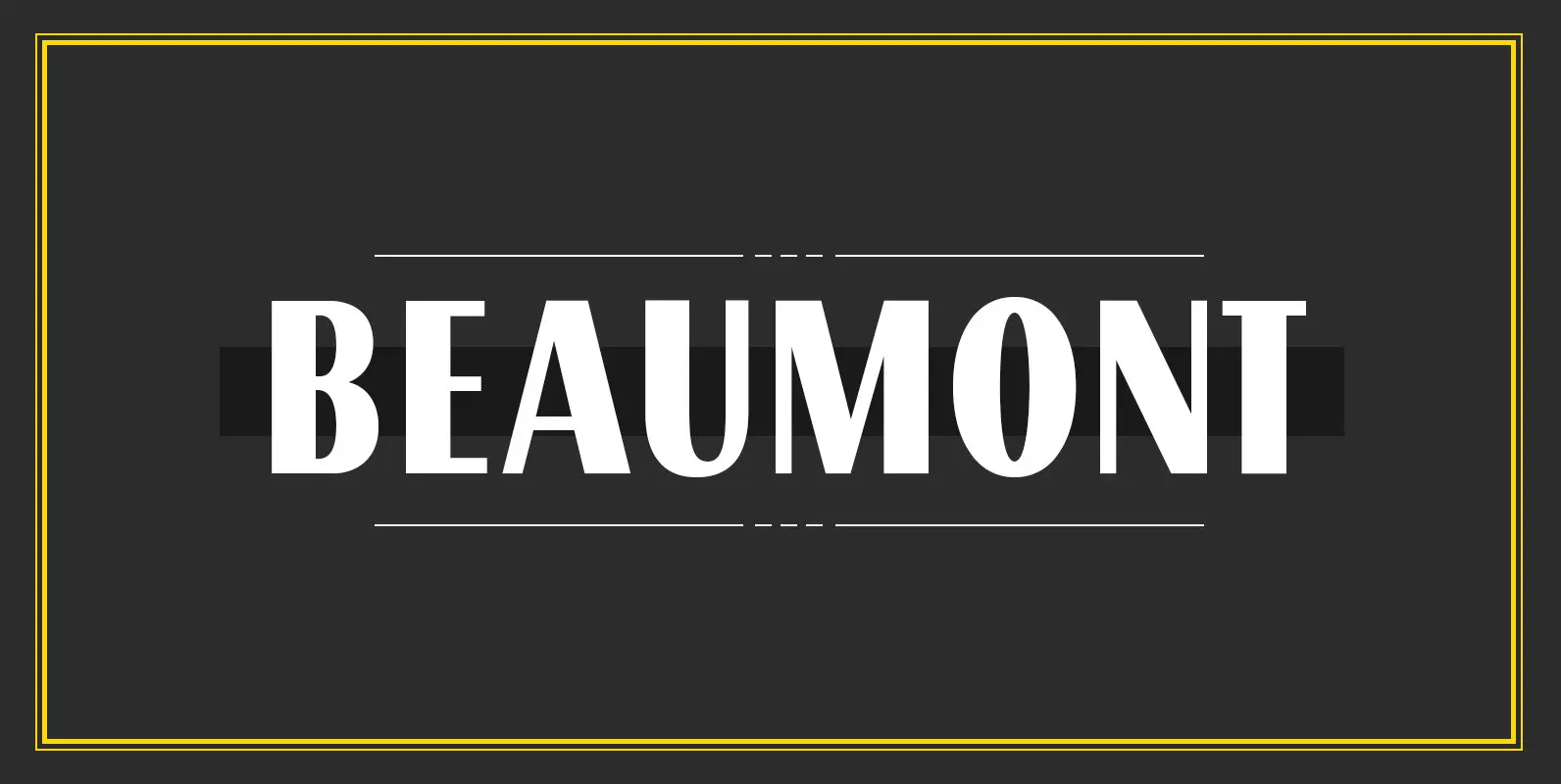
Beaumont Font
Beaumont is a modern take on classic 1920’s type, playing with stroke contrast and art deco forms. The result is a 10 font family, providing options for setting readable body copy or high impact display headings. With full multilingual character
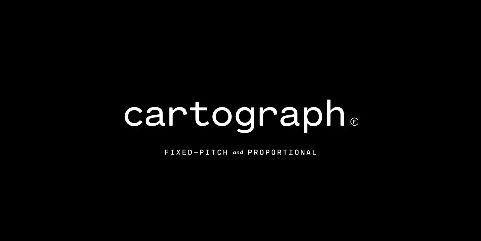
Cartograph CF Font
A monospaced typeface with character and warmth, Cartograph© CF is a handsome font family featuring a lush, cursive italic, code-friendly ligatures, and a proportional set accessible via OpenType. A tribute to the utilitarian beauty of terminals and typewriters, Cartograph excels
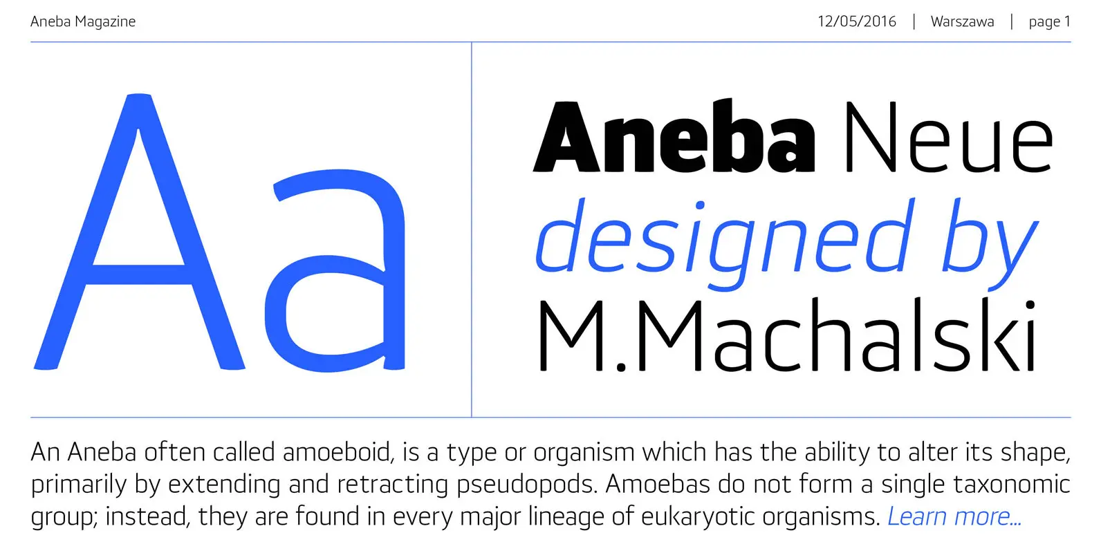
Aneba Neue Font
Aneba Neue is refreshed version of my old type family. It's a geometric sans serif typeface with a clean feel. The low contrast and high x height is perfect for headlines and display purposes. Aneba_Neue contains 5 weights in two

Basic Sans Font
Basic Sans: A necessary sans. Designed by Daniel Hernández A family of Grotesque features with a functional, neutral and seeming clean style that looks to keep a neutral (or basic) appearance on paper, but including lots of details that give
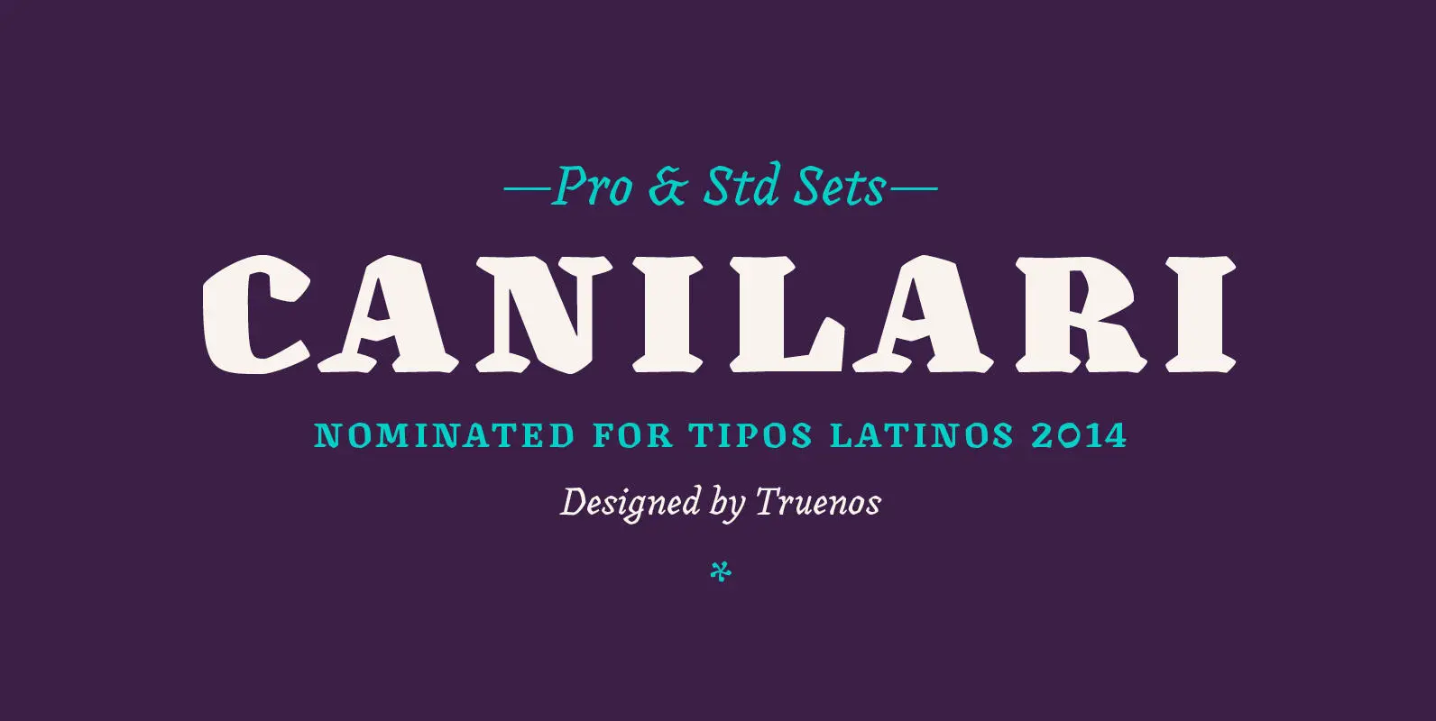
Canilari Font
Canilari is a post-modern type family inspired by contemporary serif typefaces. Its intense and consistent personality makes it a functional font for a wide range of uses: from continuous text in the most challenging environments to pithy, high-impact headlines. The
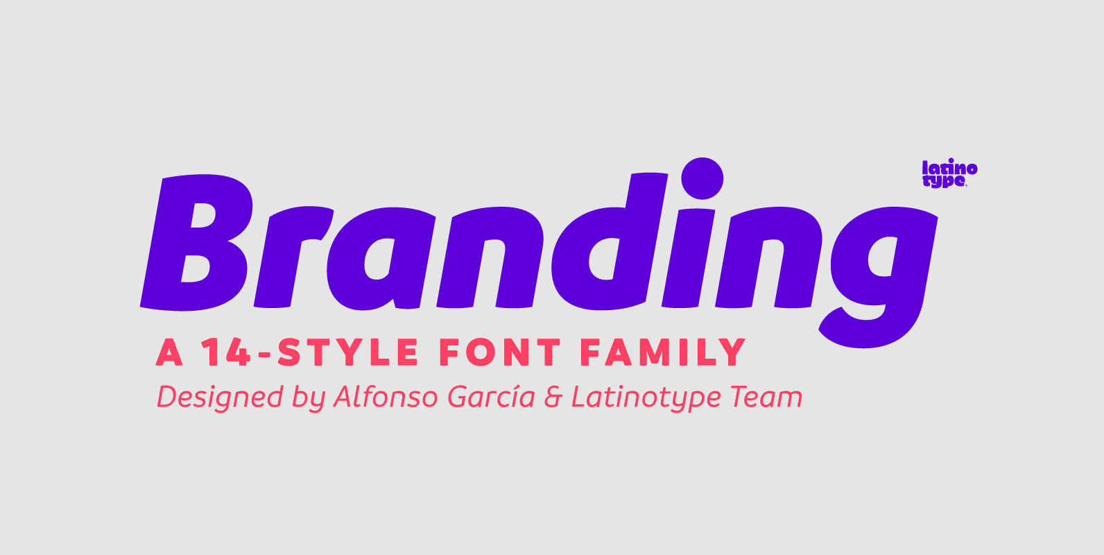
Branding Font
Branding, a modern typeface for modern needs! Branding, especially designed for meeting contemporary aesthetic and functional needs, is the interpretation of a modern typeface from the designer’s own perspective. This typeface encapsulates a wide range of nuances and combines, seemingly,
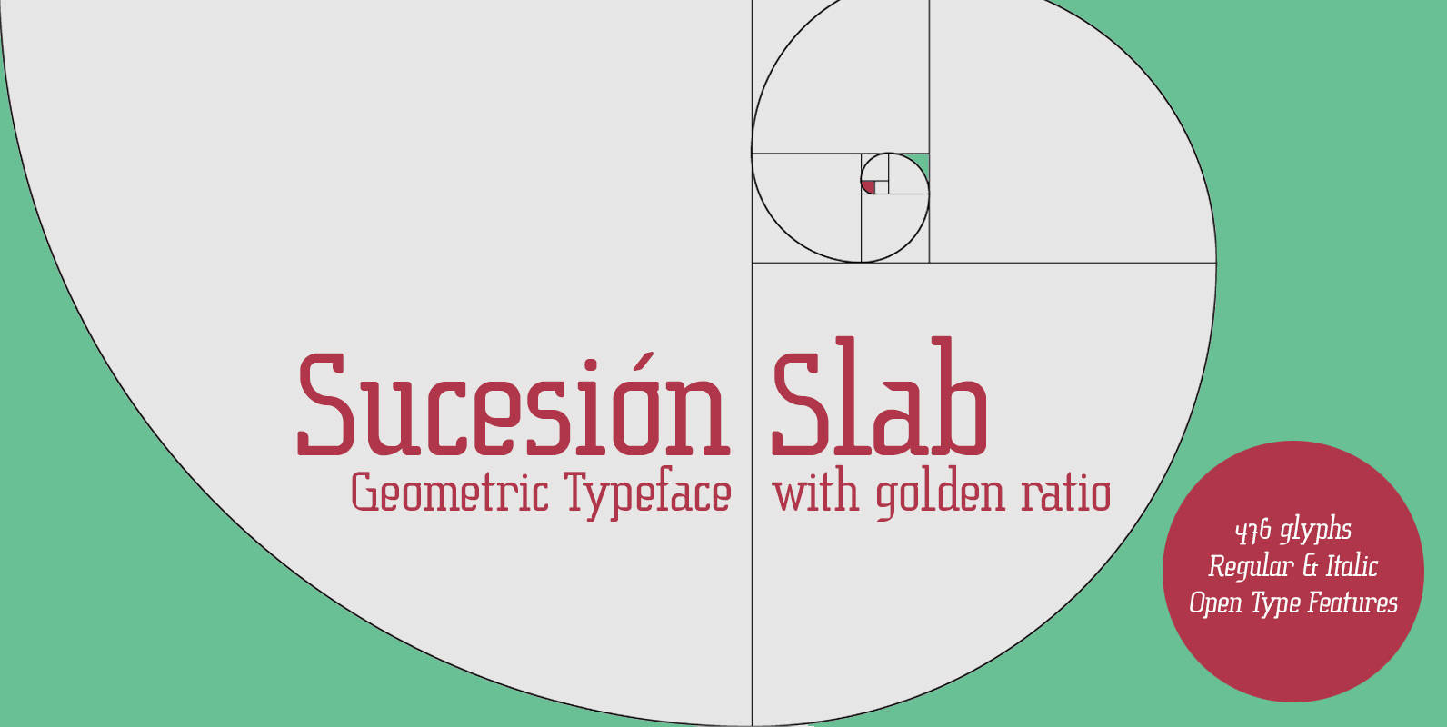
Sucesion Slab Font
This is a semi condensed font with Slab Serif and corresponds to my series of typefaces built proportions derived from mathematical sequences. An experiment in the sense of proportion, to define all I have relied mainly on the Fibonacci sequence.
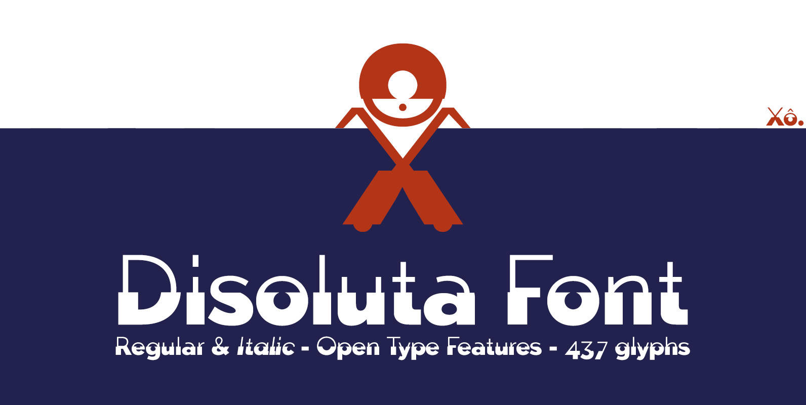
Disoluta Font
Disoluta is a typographical experiment fusion of two sans fonts with different weights, for which I used my previous Typefaces: Tabarra Light and Black. The Commercial version includes: 2 fonts (Regular & Italic) • 437 glyphs • OTT & TTF
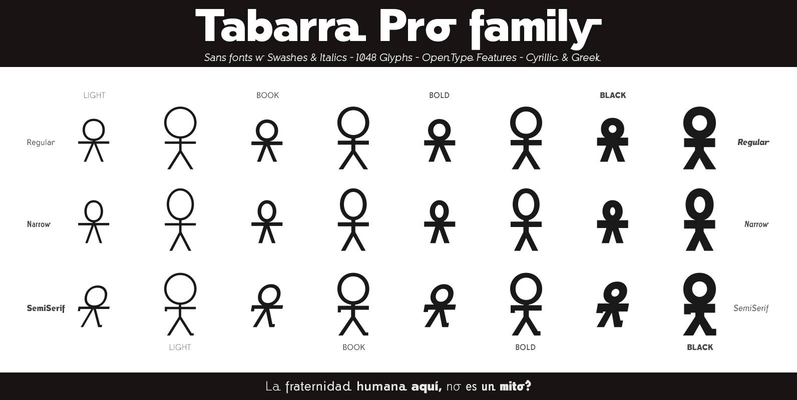
Tabarra Pro Font
Tabarra Pro is a new typographic project, is a family of 32 fonts in 4 types: Regular, Narrow, Round and SemiSerif and 4 weights: Light, Book, Bold and Black versions with corresponding italics and swashes in all versions. These Swiss-style
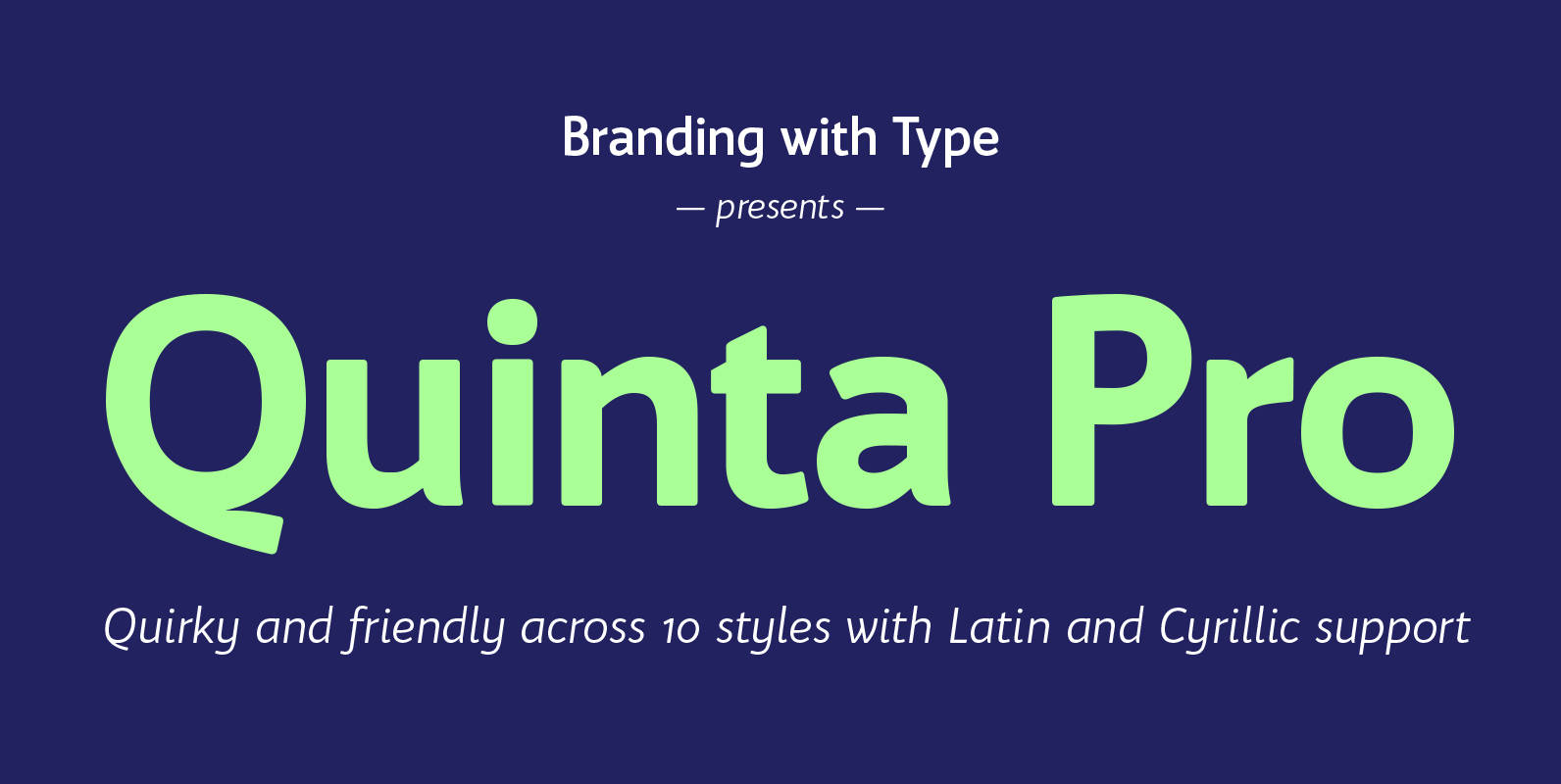
Bw Quinta Pro Font
Bw Quinta is a new face that instantly feels familiar. It’s a contemporary humanist sans that is approachable but well-grounded, getting any content delivered with efficiency while looking smart and professional. The Pro version comes with 590 glyphs per style
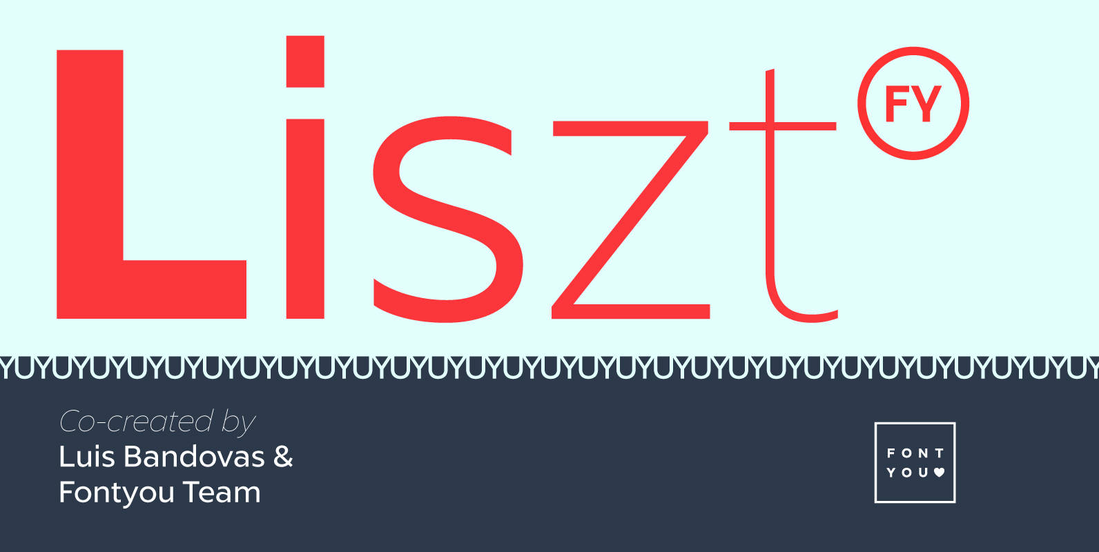
Liszt FY Font
Listz FY is definitely the new sans serif family you were waiting for. With its friendly & sharpened shapes and its big contrasts from hairline to black, this contemporary font family will be perfect for any kind of uses, from

Pekora Font
To design a font Pekora I was inspired by a You And Me Monthly published by National Magazines Publisher RSW Prasa that appeared from Mai 1960 till December 1973 in Poland. Published by Typoforge StudioDownload Pekora

Cervo Font
Font Cervo is the younger sister of Kapra. It is characterized by eight different varieties – lower and uppercase characters and in contrast to Kapra is “slimmed” version (from Medium to Thin). It is inspired by a You And Me
