Tag: Large x-height
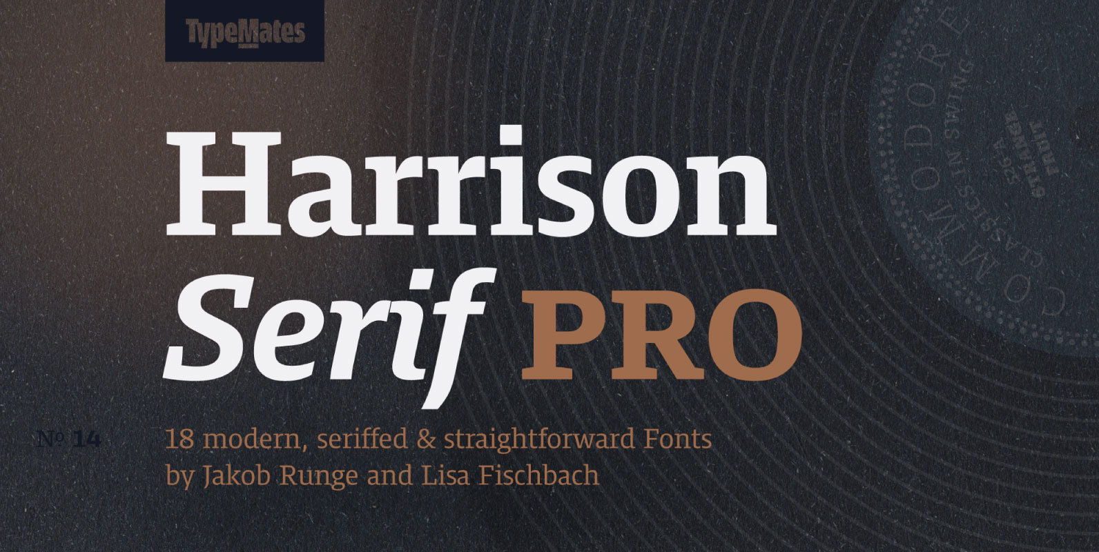
Harrison Serif Pro Font
Harrison Serif Pro is a sturdy yet contrasted slab serif that combines a rational and efficient approach with a warm voice. A typeface of nuances, the slightly carved and occasionally extended serifs evoke the friendly side of Harrison Serif and
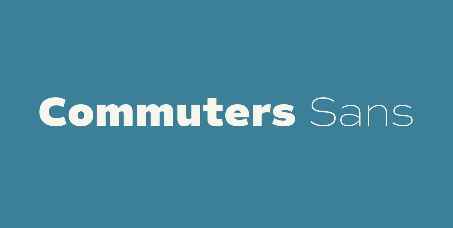
Commuters Sans Font
Commuters Sans is a classic and simple geometric font design, published by Ryoichi Tsunekawa. Commuters Sans is useful for both body-text and titling by their minimal glyph shapes and slightly wide and eye-catching proportion. It consists of eight weights and
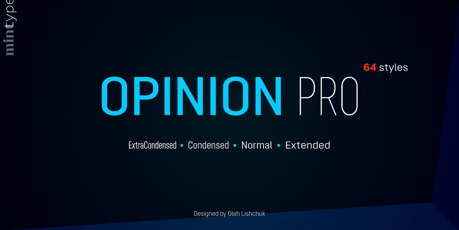
Opinion Pro Font
Opinion Pro is a geometric sans-serif typeface with extra-large x-height that comes in 64 styles. It is composed of 4 width variations, each in 8 weights with respective italics. Its rigid curves with pronounced vertical stems makes it useful as
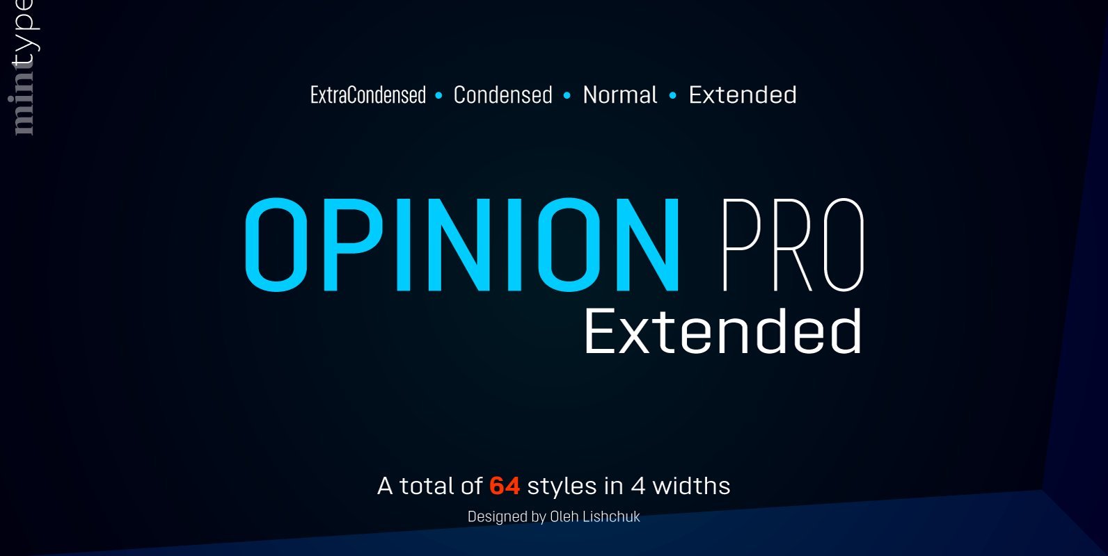
Opinion Pro Extended Font
Opinion Pro is a geometric sans-serif typeface with extra-large x-height that comes in 64 styles. It is composed of 4 width variations, each in 8 weights with respective italics. Its rigid curves with pronounced vertical stems makes it useful as
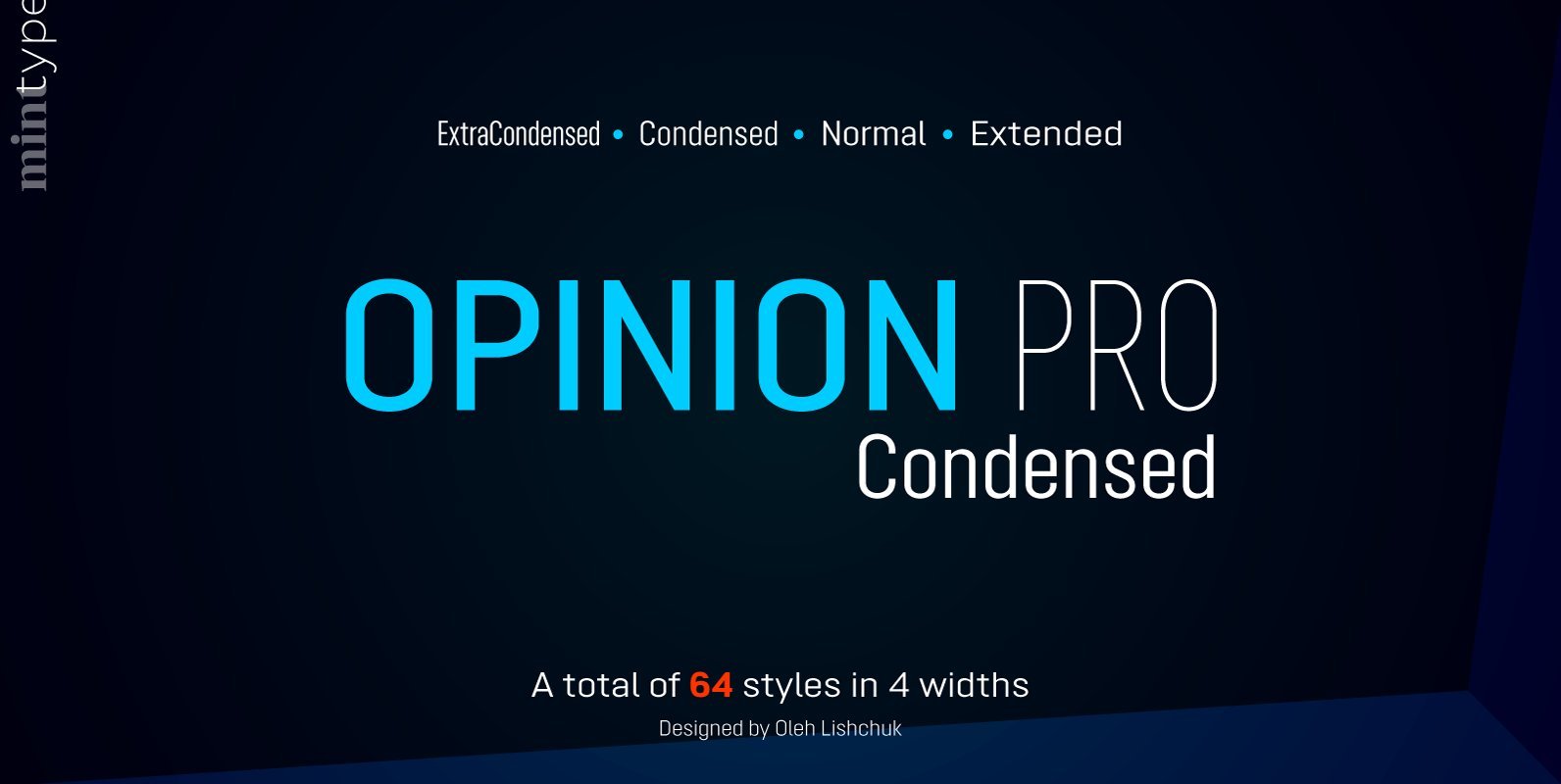
Opinion Pro Condensed Font
Opinion Pro is a geometric sans-serif typeface with extra-large x-height that comes in 64 styles. It is composed of 4 width variations, each in 8 weights with respective italics. Its rigid curves with pronounced vertical stems makes it useful as
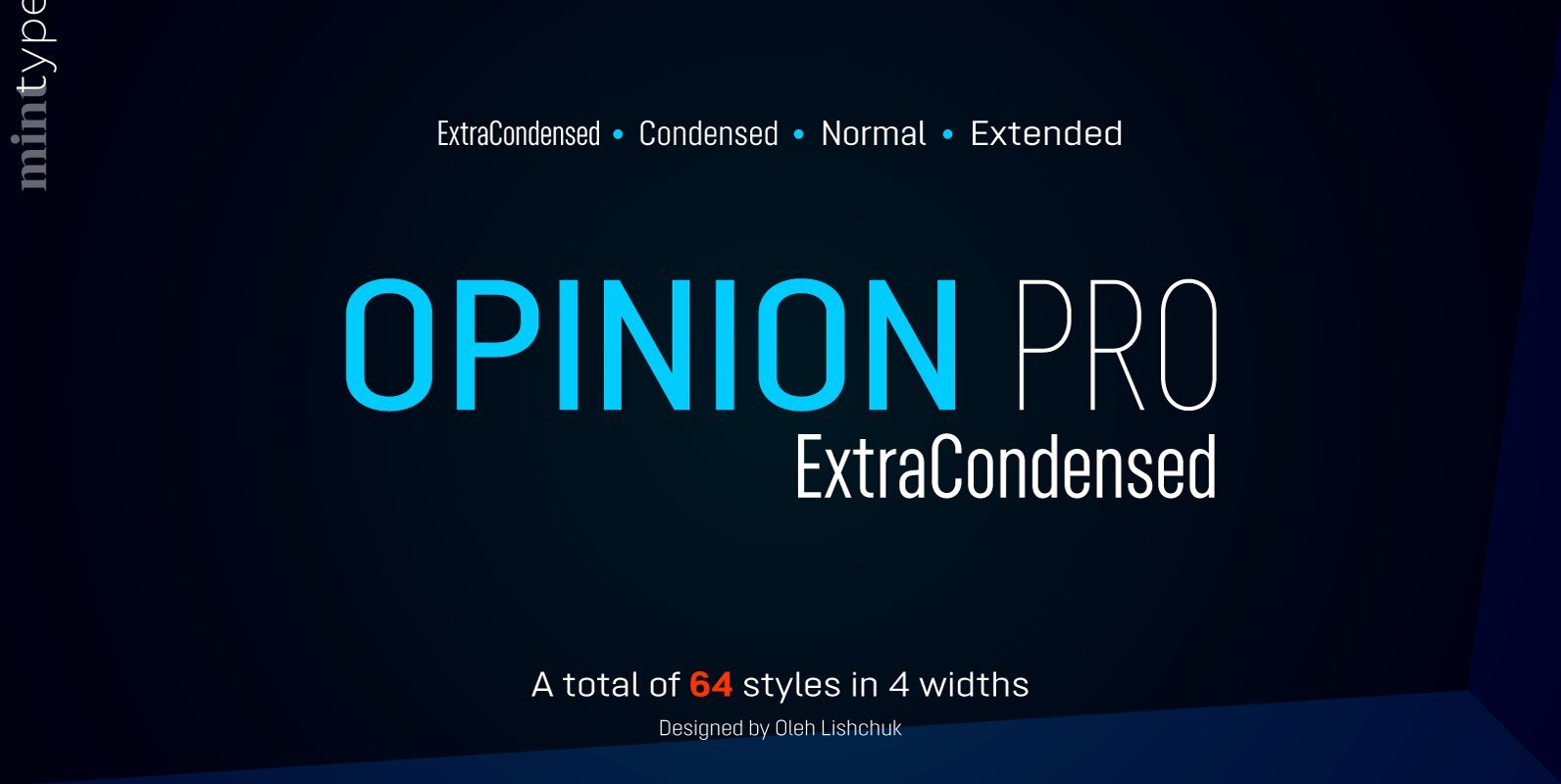
Opinion Pro ExtraCondensed Font
Opinion Pro is a geometric sans-serif typeface with extra-large x-height that comes in 64 styles. It is composed of 4 width variations, each in 8 weights with respective italics. Its rigid curves with pronounced vertical stems makes it useful as
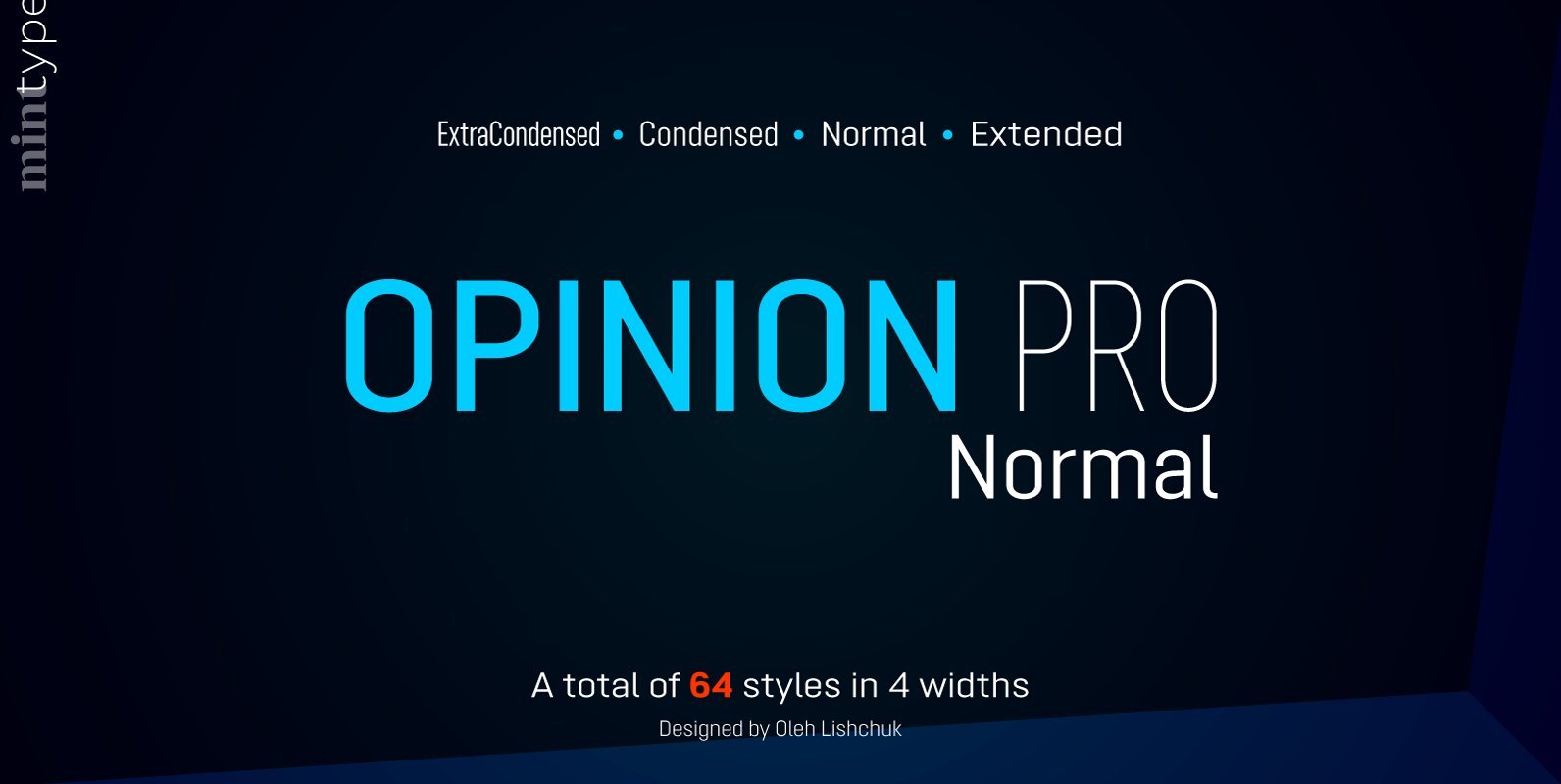
Opinion Pro Normal Font
Opinion Pro is a geometric sans-serif typeface with extra-large x-height that comes in 64 styles. It is composed of 4 width variations, each in 8 weights with respective italics. Its rigid curves with pronounced vertical stems makes it useful as
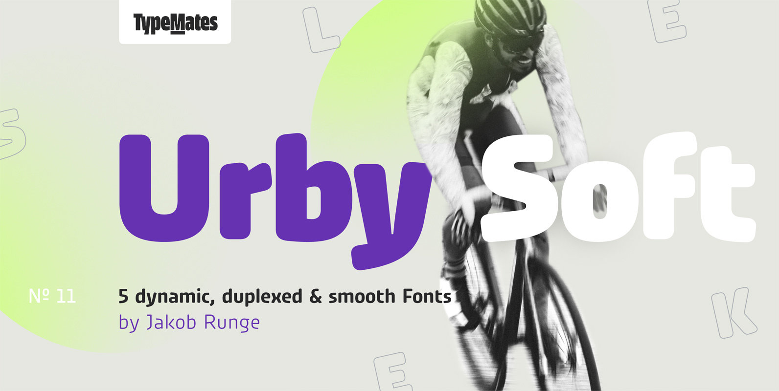
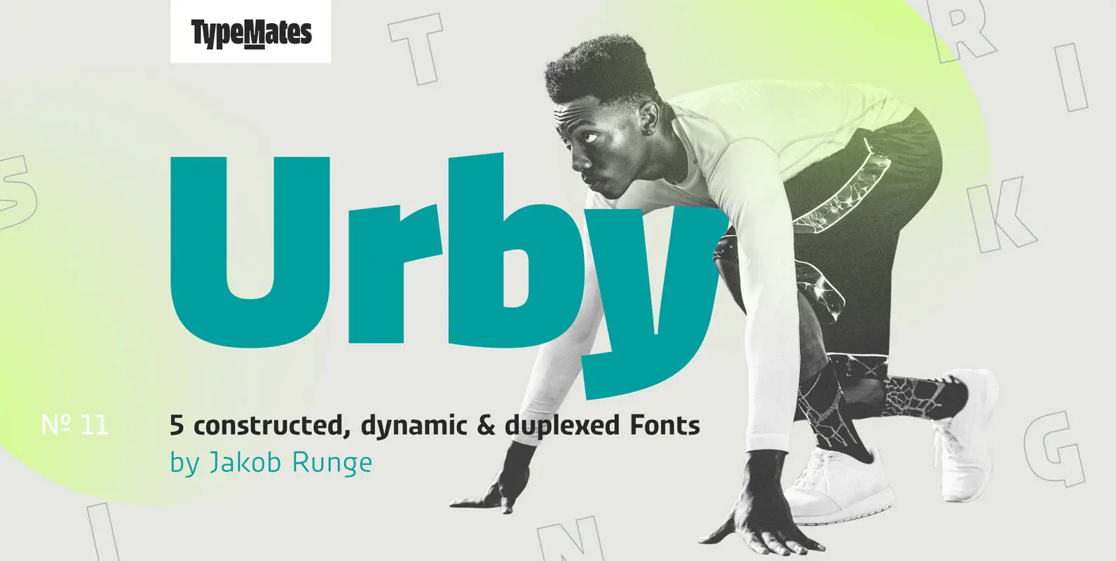
Urby Soft Font
Urby Soft’s rounded corners are complemented by Urby’s sharp-edged character and together they make up the Urby Collection. Although each has their own look, both families and their five weights each can be used interchangeably. The idea of Urby Soft
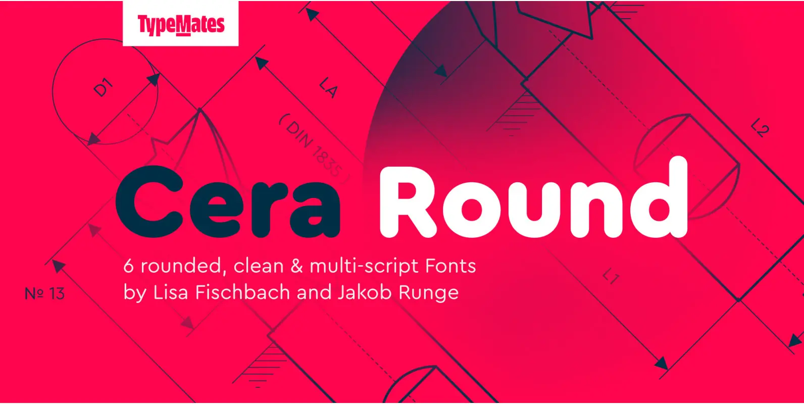
Cera Pro Round Font
The pan-European Cera Collection is driven by pure geometry and contains the bestselling Cera, its stenciled counterpart Cera Stencil, Cera Condensed, the hand-crafted display Cera Brush and the soft Cera Round. As powerful as any other member of the collection,
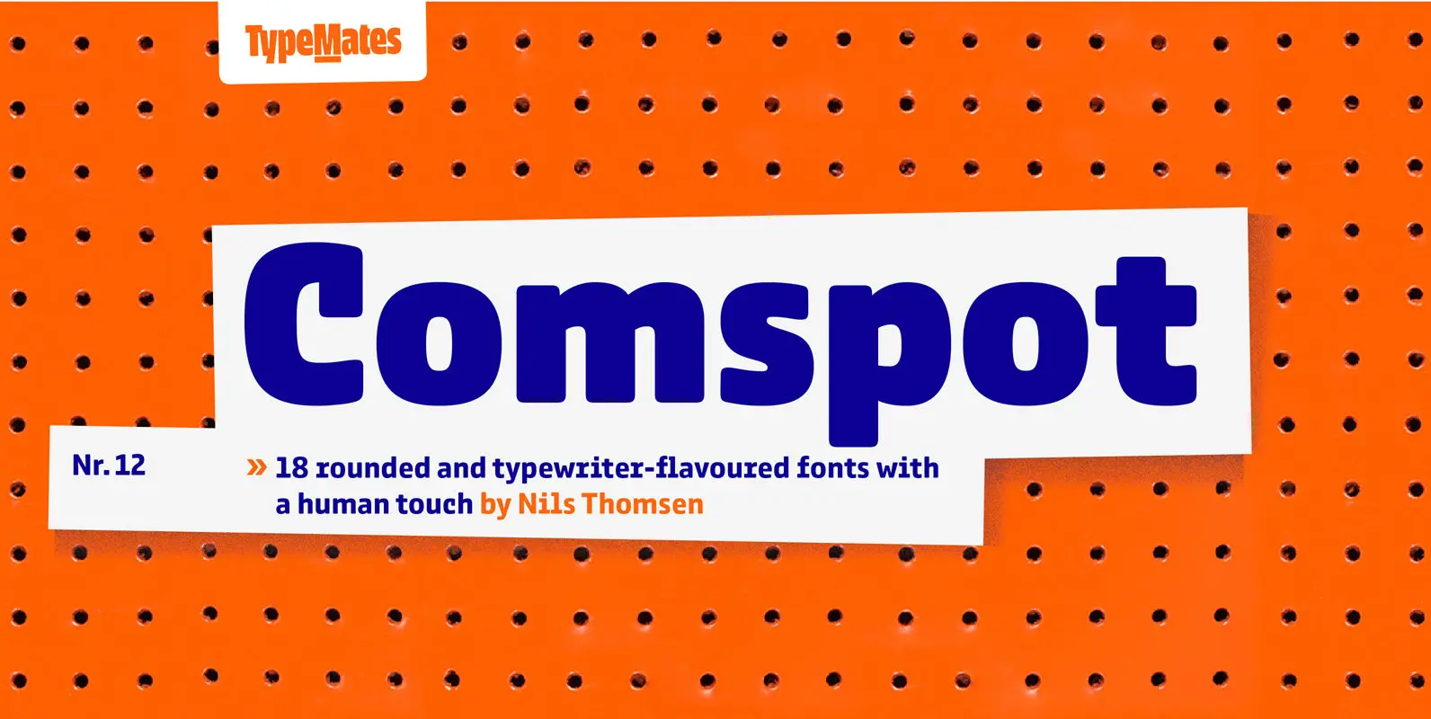
Comspot Font
Comspot is a rounded, typewriter-flavoured font family with a human touch. Originally designed as a custom typeface Comspot’s nine weights — razor-thin hairline to ultra black — and 14 stylistic alternates fulfil every need, from extended to display text. Comspot’s
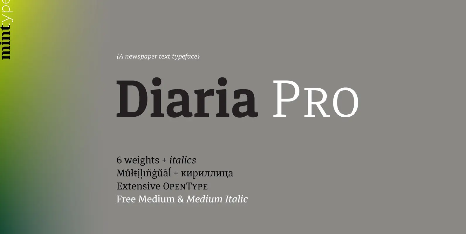
Diaria Pro Font
Diaria started as a project in Typeface Architecture for Master in Advanced Typograghy at EINA, Centre Universitari de Disseny i Art de Barcelona, a course tutored by Laura Meseguer and Íñigo Jerez Quintana. Later it has developed into Diaria Pro,
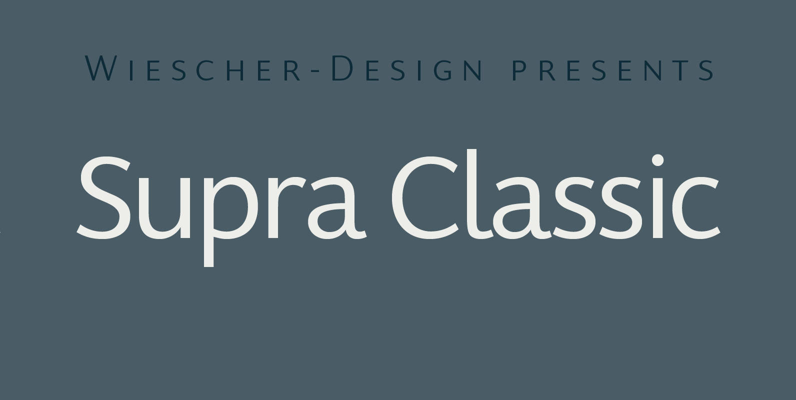
Supra Classic Font
“Supra Classic” designed by Gert Wiescher in 2014 – has 10 weights with corresponding italic cuts. The designs elegant contrast in the up- and downstrokes makes for better legibility and a pleasing personality. The dominant x-height with its high ascenders

Supra Condensed Font
“Supra Condensed” designed by Gert Wiescher in 2013 – is the condensed version to this new sans typeface family of eight weights with matching italics. The condensed version is designed for space-saving typography but with high legibility in mind. The
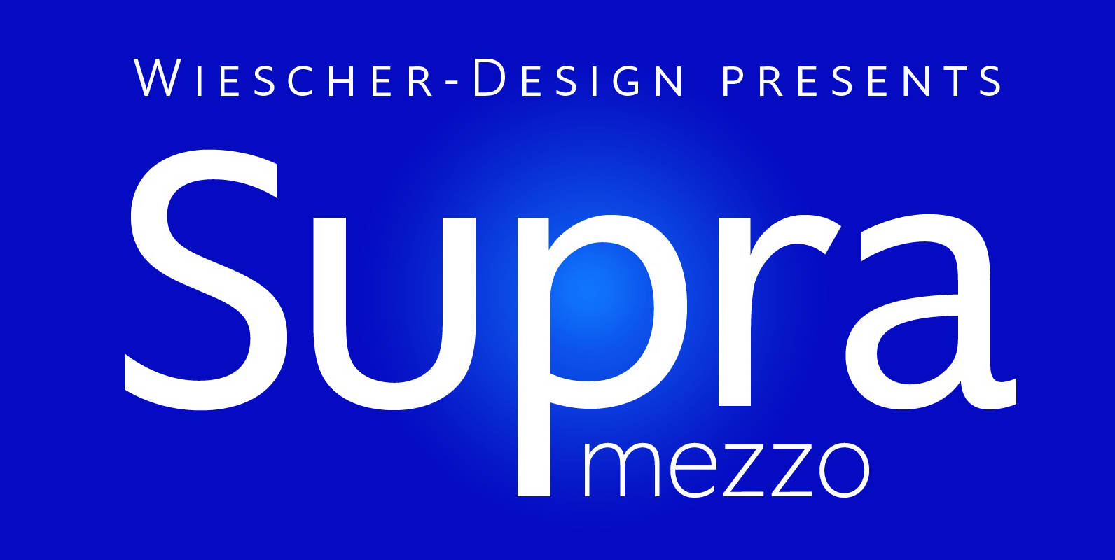
Supra Mezzo Font
Supra Mezzo designed by Gert Wiescher in 2012/13 – is an unusual addition to the Supra family, aweight in between the normal and the condensed width. This cut comes in very handy if you need to put lots of text

Supra Extended Font
Supra Extended – designed by Gert Wiescher in 2013 – is the extended version to this new sans typeface family of eight weights. The extended version is designed for sheer elegance and has no italics because they didn’t look nice

Supra Font
“Supra” – designed by Gert Wiescher in 2012/13 – is a new sans typeface family of eight weights with matching italics. Supra is influenced by current and past sans typefaces, but has a completely new look. The pleasant flow and
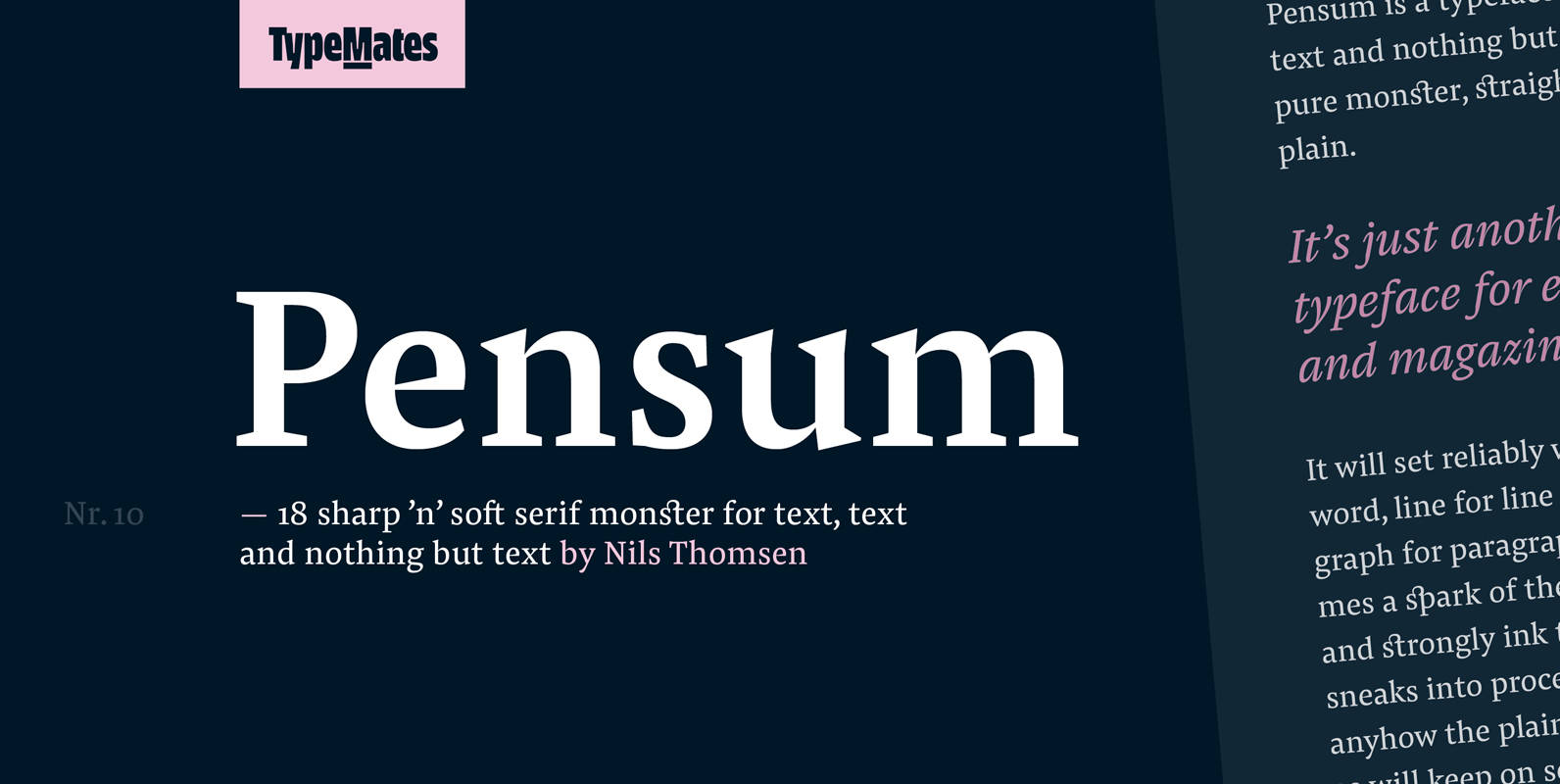
Pensum Pro Font
Pensum is a typeface for text, text and nothing but text. A pure monster, straight and plain, it will reliably set word after word, line after line and paragraph after paragraph. Sometimes a spark of the sexy, curvy and sharply