Tag: Latino
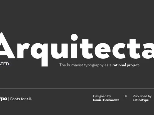
Arquitecta Font: Perfected Union of Tradition and Modern Typeface Innovation
Introducing Arquitecta, a versatile digital product merging the grandeur of classic typefaces with the efficiency of modern design. A welcome alternative to stalwarts like Futura and Kabel, Arquitecta is the humanist typography as a rational project; a sublime blend of
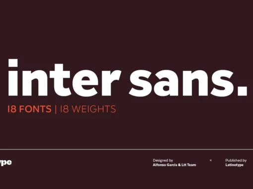
Inter Sans: An Aesthetic Dance of Geometry and Timeless Charm
In the ever-evolving sphere of digital and graphic design, finding a font that embodies both versatility and personality can be a veritable challenge. Enter Inter Sans, a stirring fusion of early 20th-century charm and contemporary geometrical precision. Designed to respond
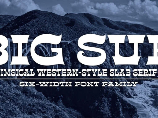
Big Sur Font
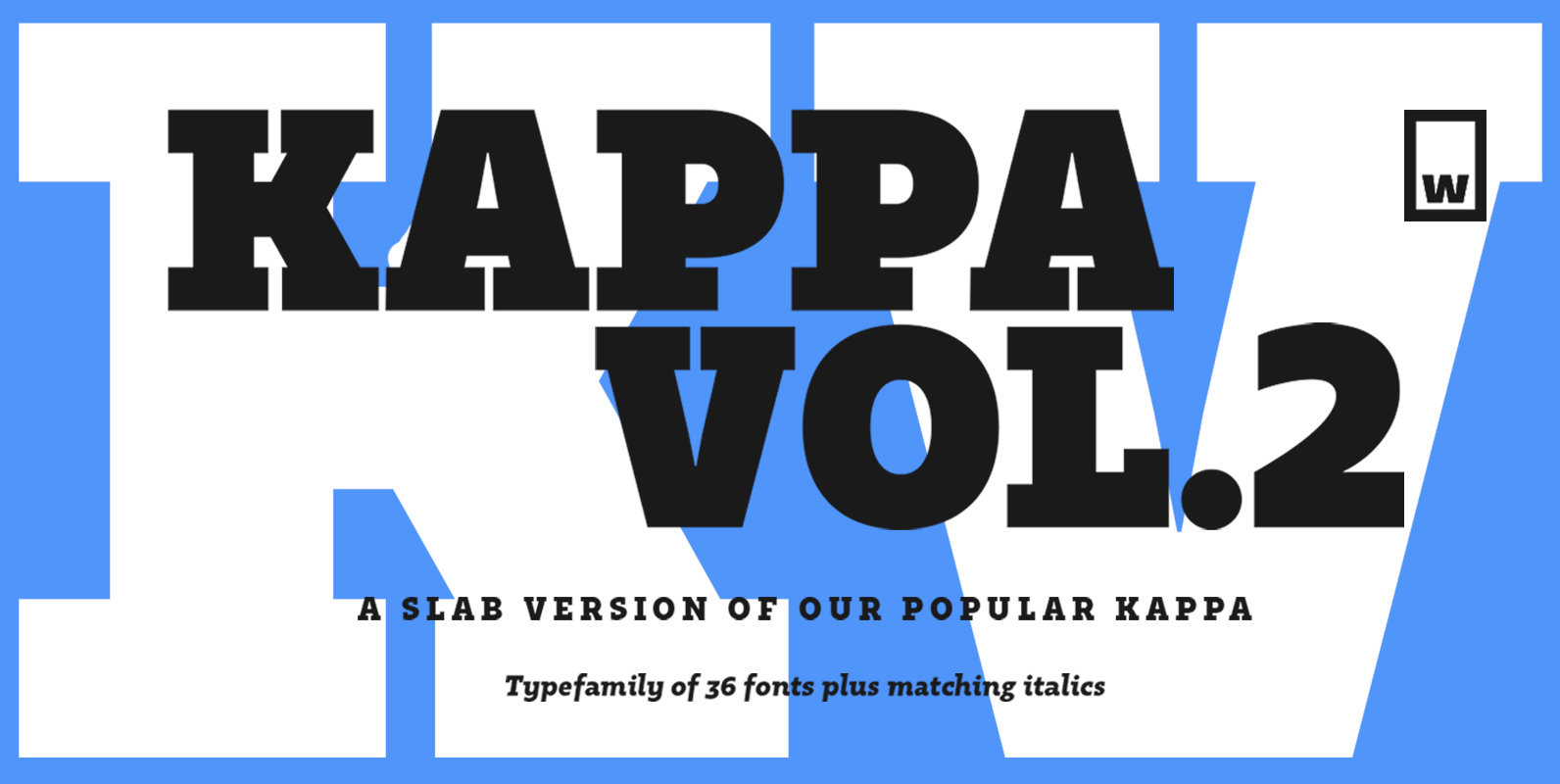
Big Sur is a six-width slab serif font family with a unique look. At first glance, it is clearly in the tradition of old west style and wood-type alphabets, with its chunky top and bottom strokes and serifs. But it
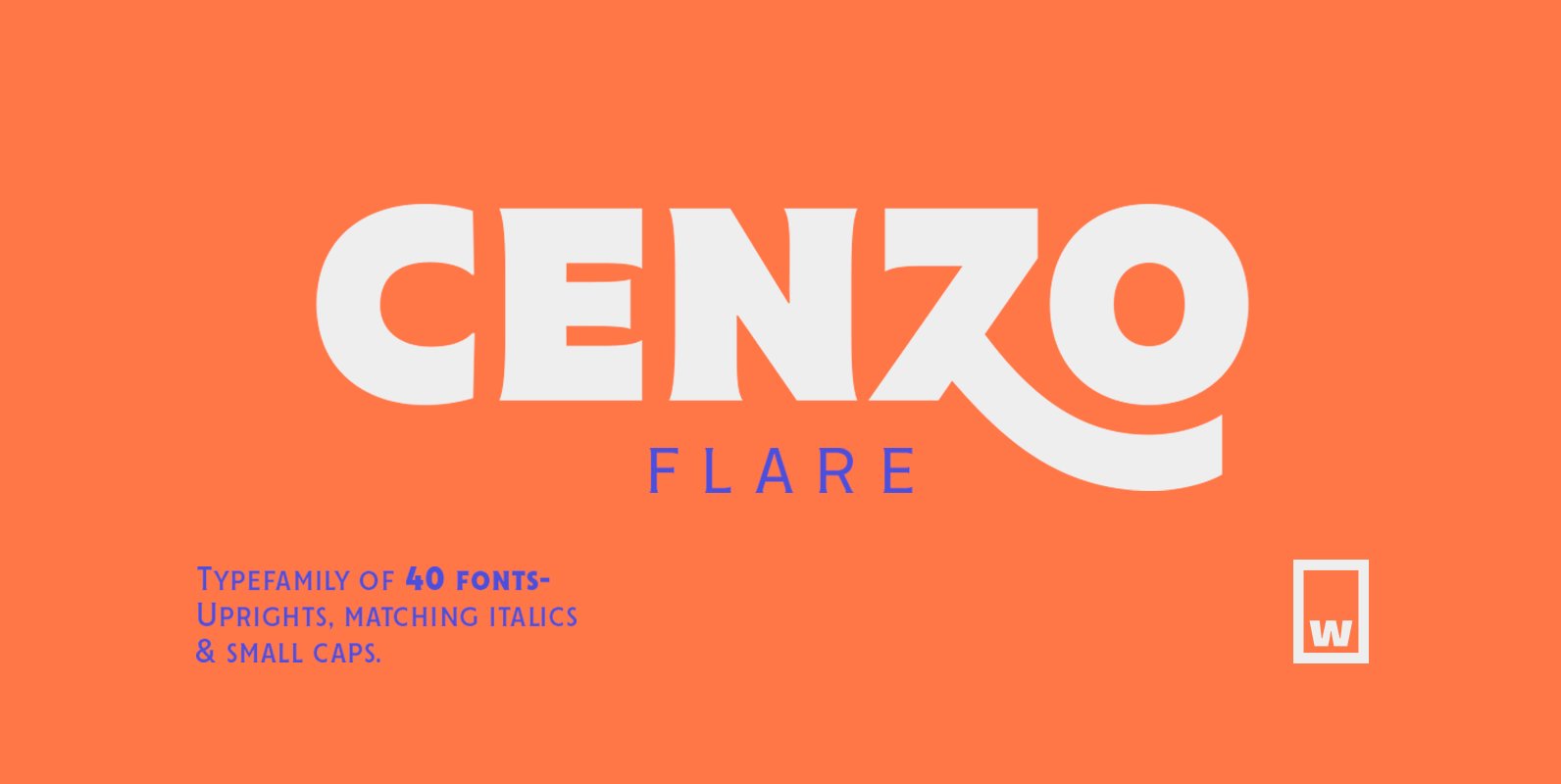
Cenzo Flare Font
Cenzo Flare is a mixture of modern san serif base with a touch of flare to it. The inspiration is drawn from all kinds of old Americana advertising, Italian posters, old century logos and signs. All that plus the strong
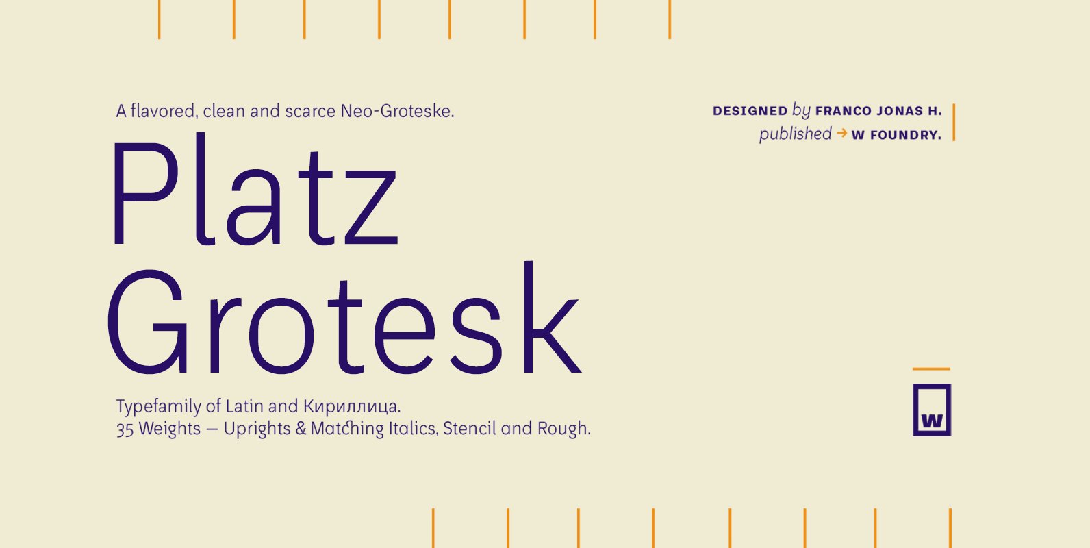
Platz Grotesk Font
Platz Grotesk has been designed parallel within the neogrotesque universe of typefaces and is inspired by humanist proportions and humanist-grotesk features. Firstly, this hybrid has a smaller x height, thus it possesses wider typeface whites in order to be legible
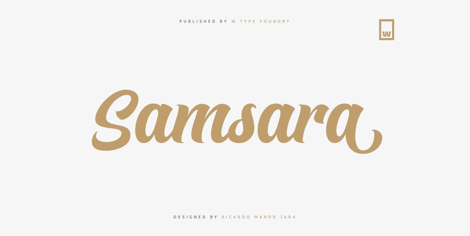
Samsara Font
Samsara is a cursive typeface inspired by calligraphy tools. Its shapes and gestures convey an organic-modern style which generates the texture of a brush tip. Samsara not only has a great versatility, but also is suitably to create short texts
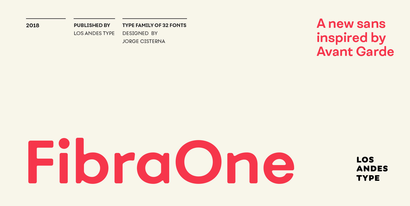
Fibra One Font
Fibra One looks like a “soft” version of the Fibra font, but it is actually more than that—the second part of its name suggests that it is a reinterpretation of the original typeface. While this new version maintains the overall
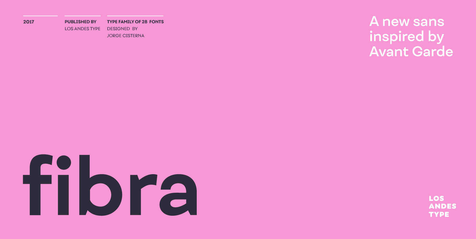
Fibra Font
The font is actually not a revival of ‘Avant Garde’—by Herb Lubalin—but it takes its spirit. Fibra is a geometric sans serif, yet without the typical structural strictness of these kind of fonts, that represents experimental type design. This can
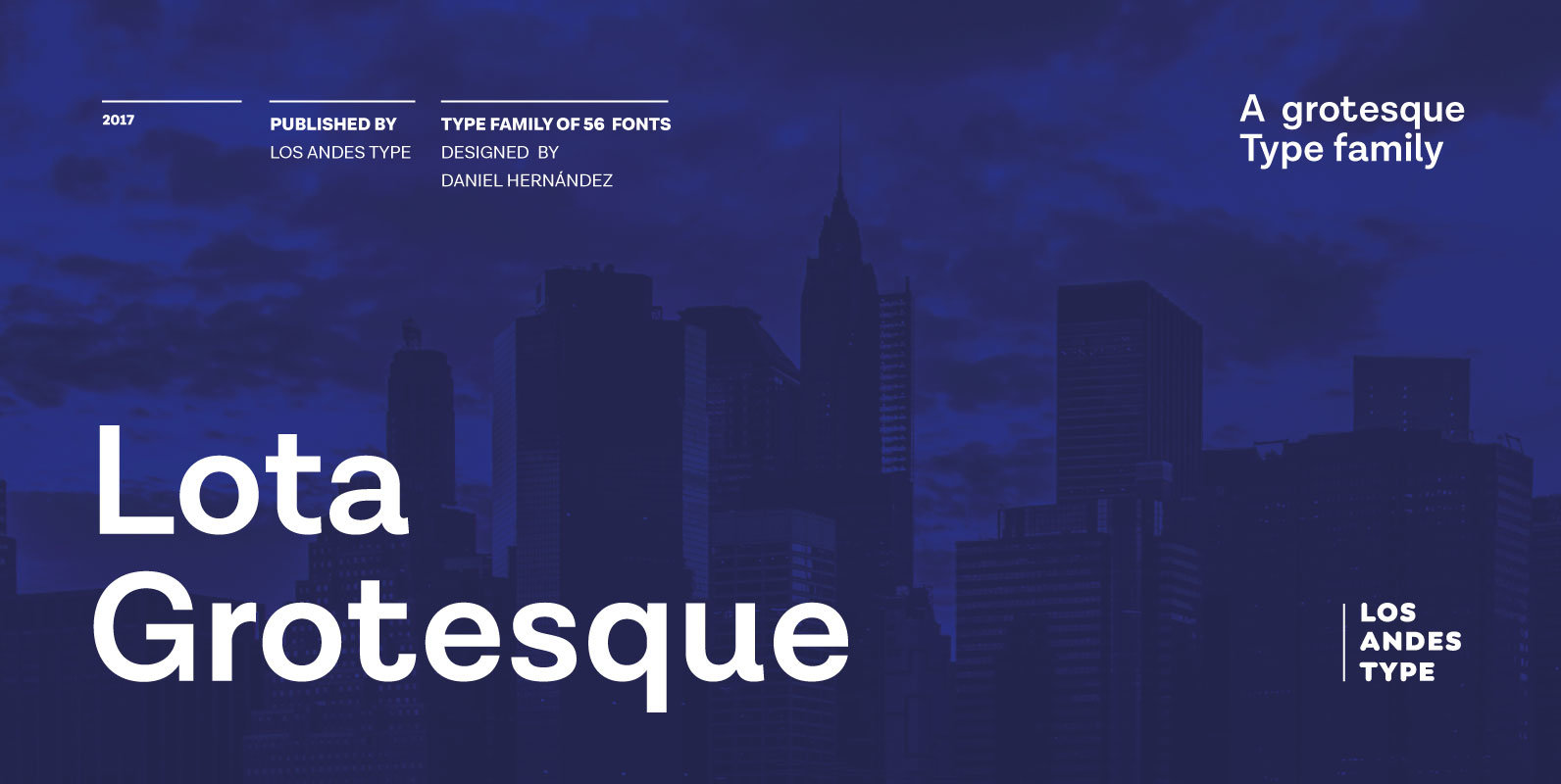
Lota Grotesque Font
Lota Grotesque was designed by Daniel Hernández with the collaboration of Rodrigo Fuenzalida and Latinotype Team in digital editing. The family comes in 7 weights with matching italics and includes alternative versions that provide high versatility and functionality. The whole
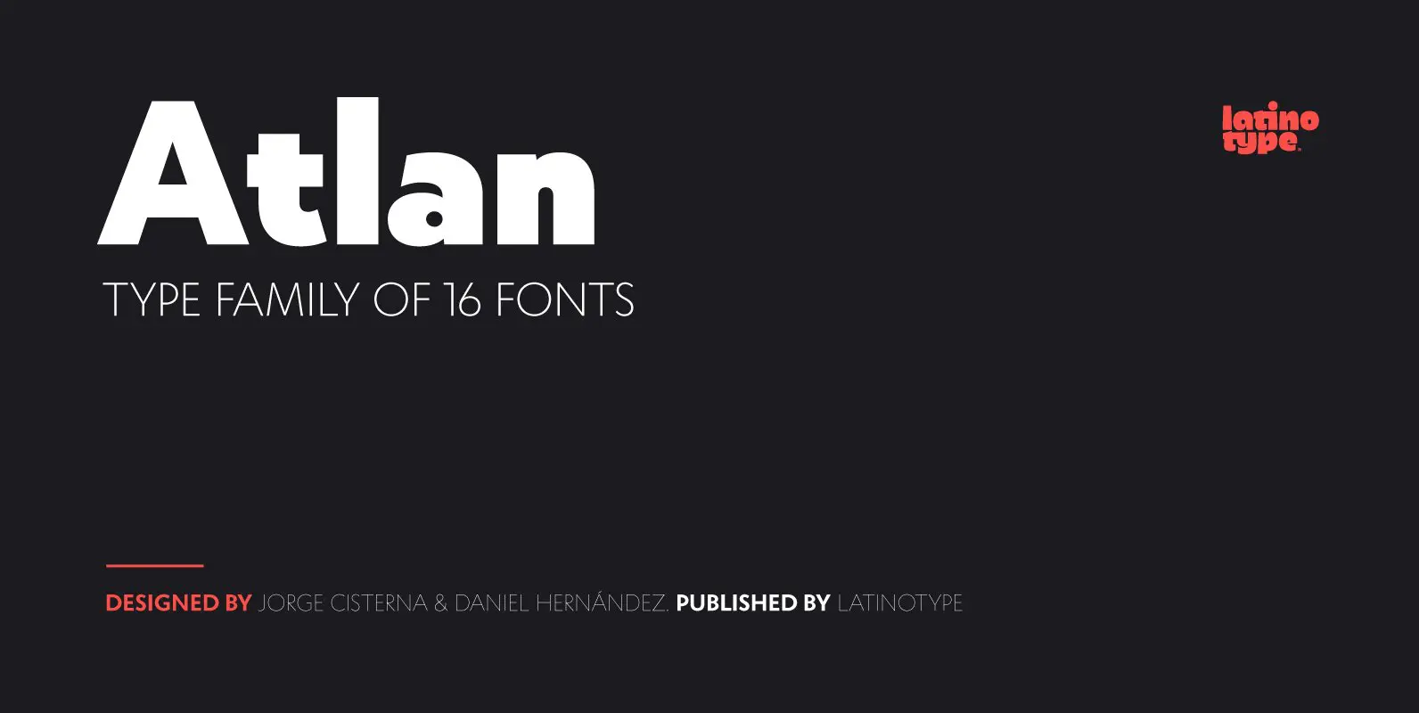
Atlan Font
Atlan—a Latin ’spin-off’ of classic geometric sans typefaces. Remembering typefaces like ‘Kabel’ by Rudolf Koch while paying attention to current design needs was the starting point for ‘Atlan’—a simple, elegant and appealing font. This typeface is based on highly expressive
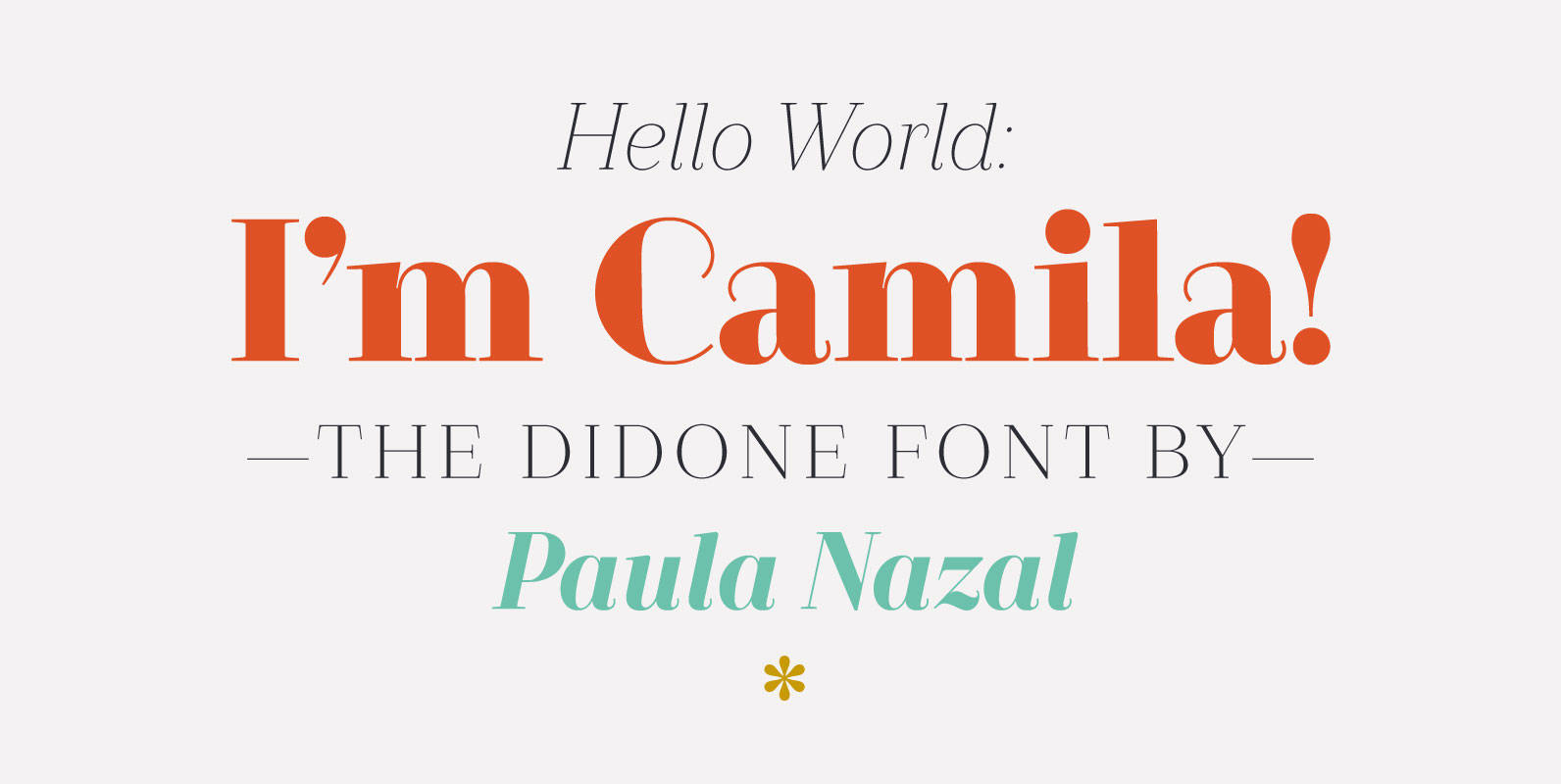
Camila Font
Camila is a delicate and smooth Didone typeface designed by Paula Nazal. The family is inspired by concepts such as elegance, simplicity, femininity, and primarily based on Coco Chanel. A remarkable feature of this font is that it lacks of
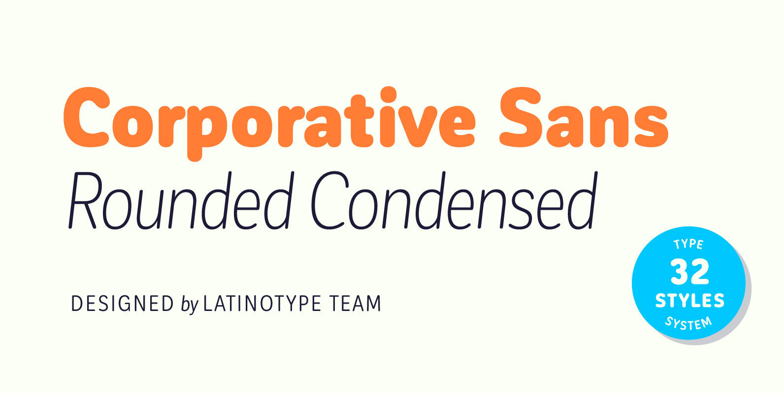
Corporative Sans Rounded Condensed Font
Corporative Sans Rounded Condensed is the narrowed version of Corporative Sans Rounded that offers high performance when using for text, what makes it the perfect match for Andes Rounded. The font works well at both display and small sizes. Corporative
