Tag: layers

Paintlay Font
Paintlay is a casual and laid-back brush script font. Bouncy baseline, upright strokes and soft forms are the main characteristic of Paintlay. What sets this font apart from others is the layers that include Base layer, two different highlight layers
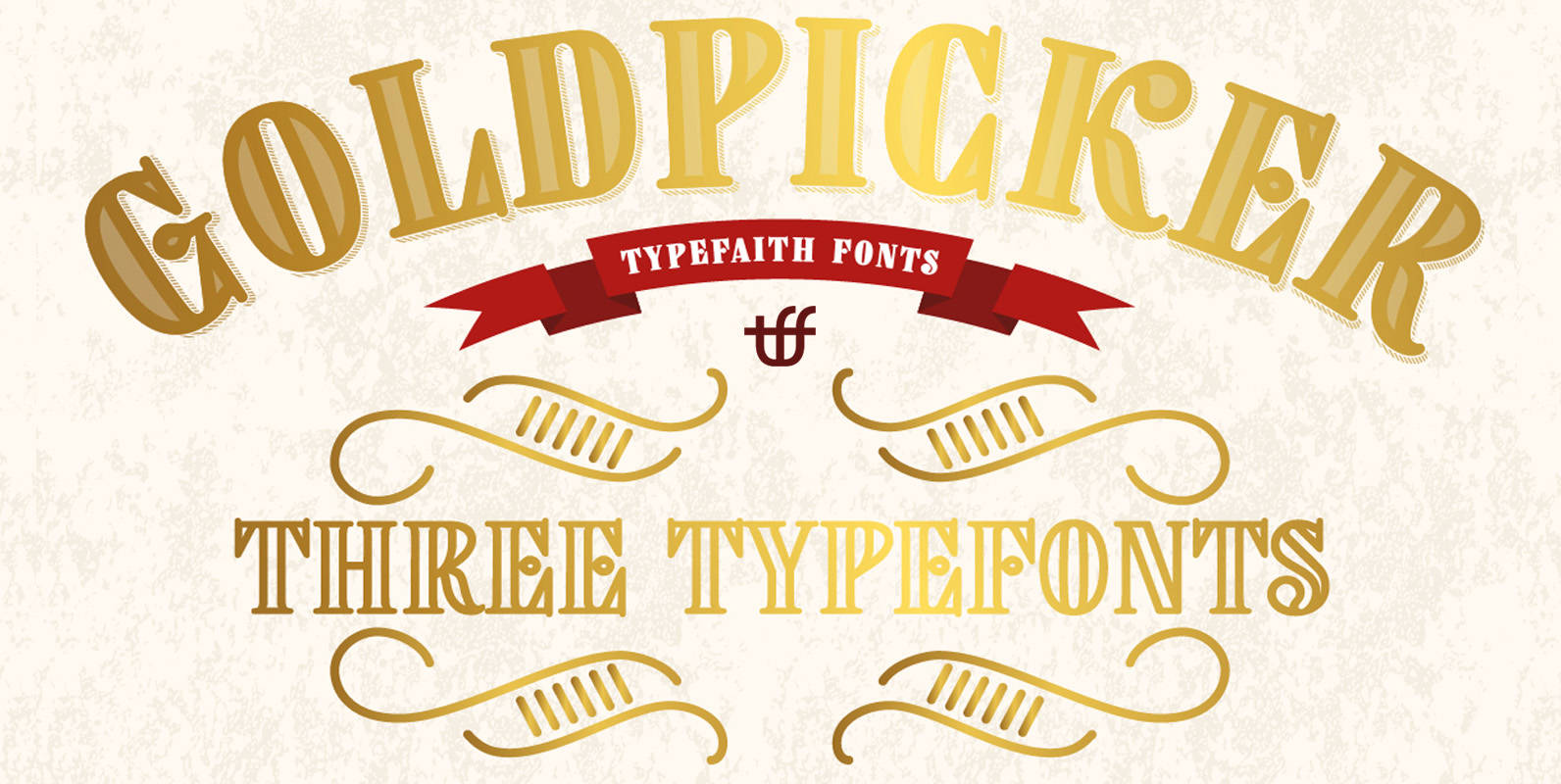
Goldpicker Font
Goldpicker is a vintage retro styled typeface with a western look and feel. It refers to the American wood block type of the previous century. Goldpicker is very useful for covers, poster, labels, t shirt and logo’s. Each font comes

Mrs Lollipop Font
Mrs Lollipop is a hand drawn narrow typeface designed for one of our books. You can layer different styles over the background style to achieve lots of colorful effects. Check out the manual for details. Mrs Lollipop has upper and
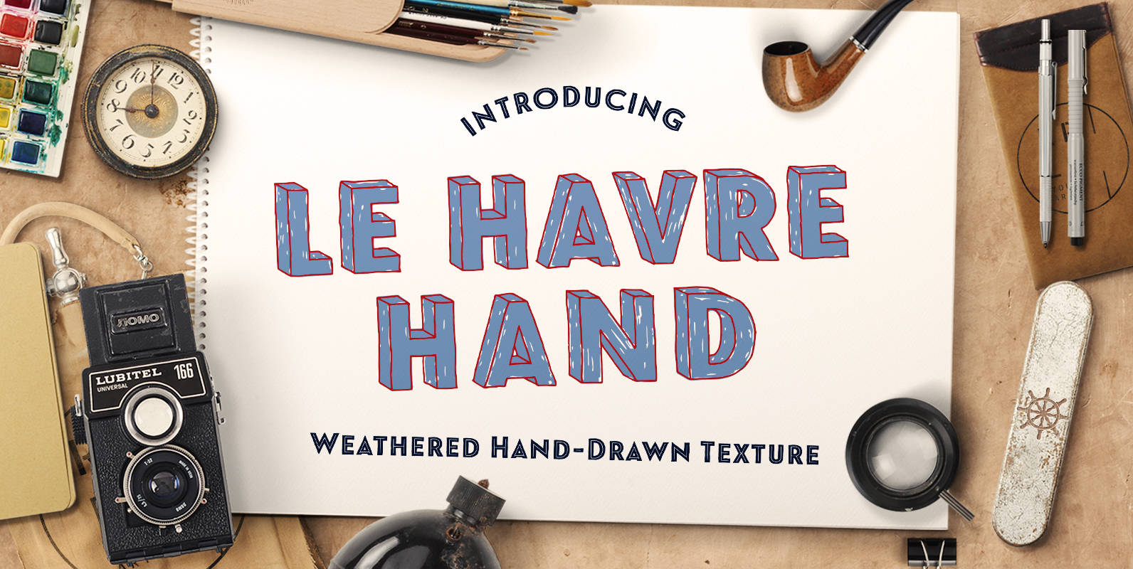
Le Havre Hand Font
Tall and lean, the well-aged face carries with it the stories of a thousand miles. Starting with a sans as its origin, this handwritten font’s layered structure has been shaped through time and trial, ultimately capturing the simple beauty of
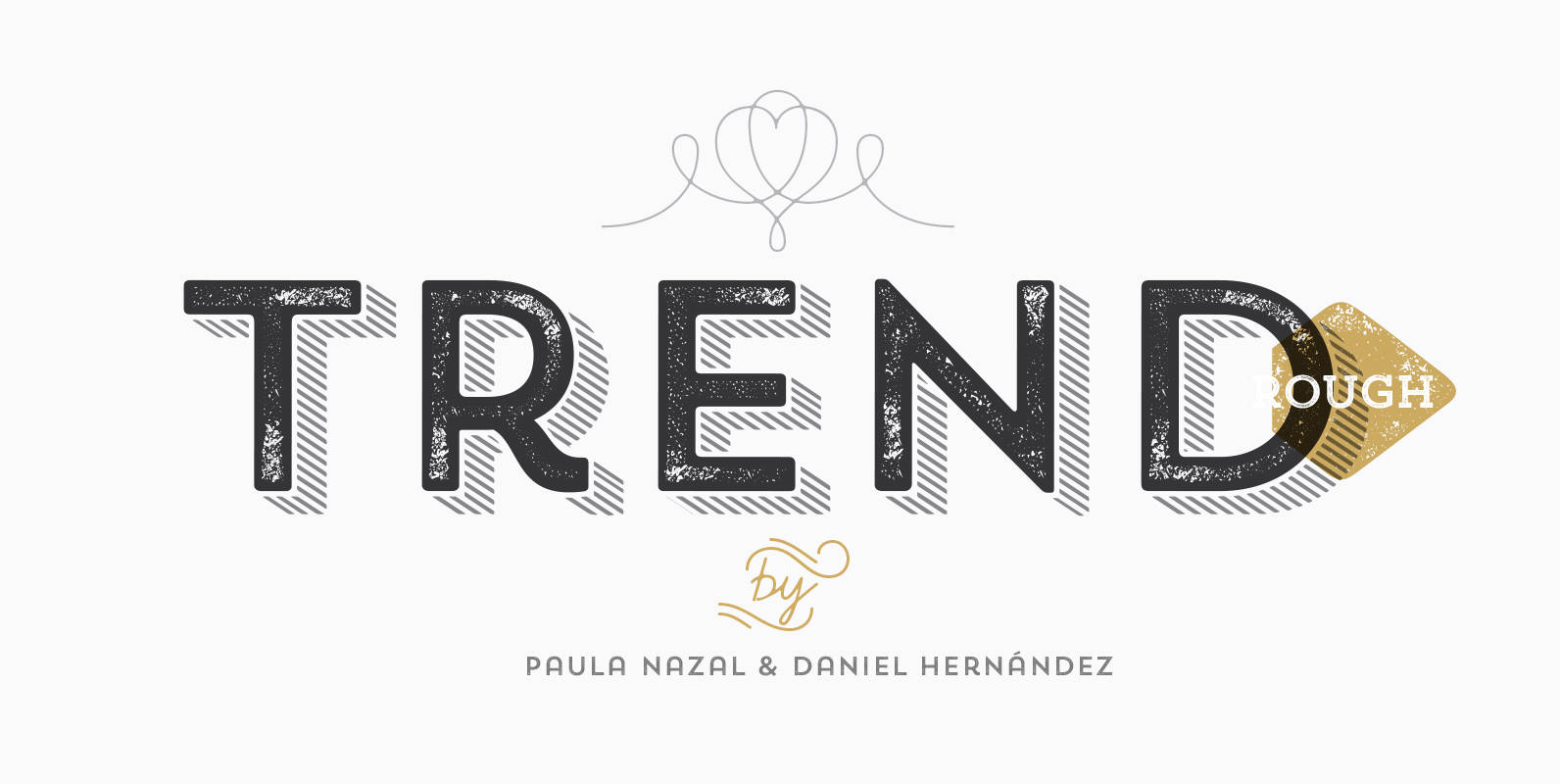
Trend Rough Font
Trend Rough, Trend & Trend Hand Made is a font made of layers, taking as a basis a sans and a slab font. It is the result of observation, search and study of the last global trends. Trend tries to
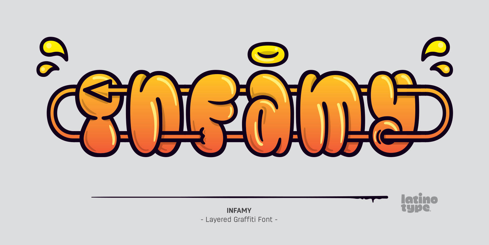
Infamy Font
Infamy is a display typeface inspired by graffiti and street art, featuring the ‘bubble letter’ style of writing which was very popular among subway and suburban graffiti artists in the early days of American graffiti. This font recovers graffiti horizontal
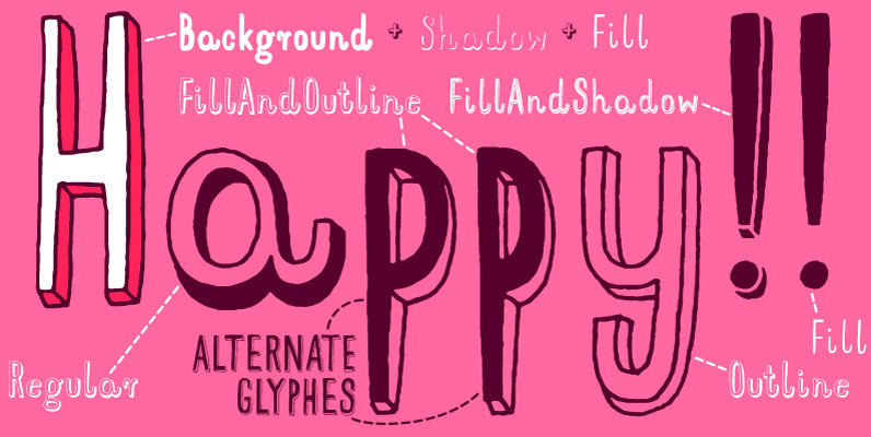
Mr Happy Font
Hand drawn narrow typeface designed for one of our books. You can layer different styles over the background style to achieve lots of colorful effects. Use just one style to get a single color letter or set the shadow and

Cluster Font
A hand-drawn shadowed and textured display sans. Strong and stylish, definitely. Two glyphs per letter for a nice natural feel. And let’s not forget to remark the hi-versatile solo versions. These fit many design applications, with the amazing ability of

Karisans Font
Karisans is a hand drawn, layerable sans serif font. By layering the various styles differently the user can achieve many different effects. Published by MJWallner FontsDownload Karisans

Emblema Headline Font
Based in Corradine Fonts font Emblema 65, Emblema Headline was thought to be a powerful tool for modern designers who need a vintage Art Deco style font with personality and high quality. The Emblema Headline family have four layers each
Butternut Font
Butternut’s origins can be traced back to handwriting in felt-tipped marker. Because of this, you’ll find a slight degree of roughness to the edges, yet a fluid softness to the letterforms themselves. As well as some weird, fun details here

Bobbin Cyrillic Font
To design a font Bobbin I was inspired by a You And Me Monthly published by National Magazines Publisher RSW Prasa that appeared from Mai 1960 till December 1973 in Poland. In the Bobbin family, every variety contains 3 alternative

Trend Font
Trend is a font made of layers, taking as a basis a sans and a slab font. It is the result of observation, search and study of the last global trends. Trend tries to capture the aesthetics of fashion or
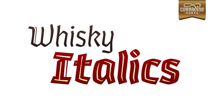
Whisky Italics Font
Whisky is a blackletter font family with a casual touch that makes it look friendly and current. The stroke varies its thickness and angle endings making it form very dynamic bodies of text. Whisky Italics are the corresponding versions to

Slab Happy Font
Inspired by neutral slab serifs with an added twist, Slab Happy is a typographic system consisting of eight layerable fonts with infinite combinations. Slab Happy looks best when set in display sizes, but functions just as well at smaller point
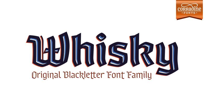
Whisky Font
Whisky is a blackletter font family with a casual touch that makes it look friendly and current. The stroke varies its thickness and angle endings making it form very dynamic bodies of text. The family includes seven weights, each with
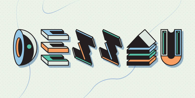
YWFT Dessau Font
Think drugs, lots of drugs. Pictograms and schizograms. This is a whole new level of crazy for YWFT, and is quite possibly the most seriously f**ked up thing we’ve ever done. Designed with numerous different styles that you can layer