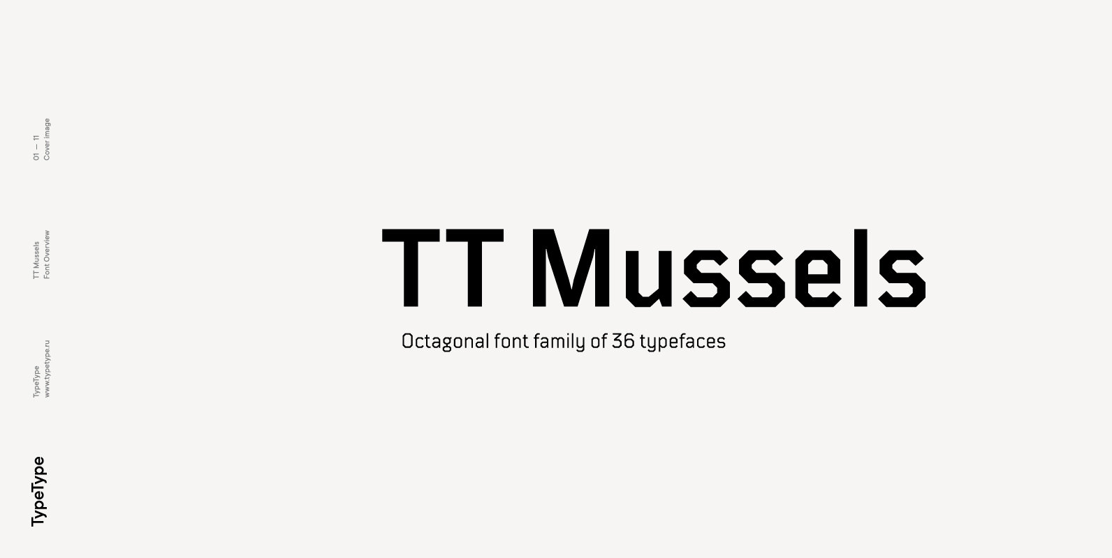
TT Mussels Font
The TT Mussels font family is the successor of such popular fonts as Bender and TT Squares. At the same time, TT Mussels has a number of fundamental differences that make it a unique font family that stands out from

The TT Mussels font family is the successor of such popular fonts as Bender and TT Squares. At the same time, TT Mussels has a number of fundamental differences that make it a unique font family that stands out from
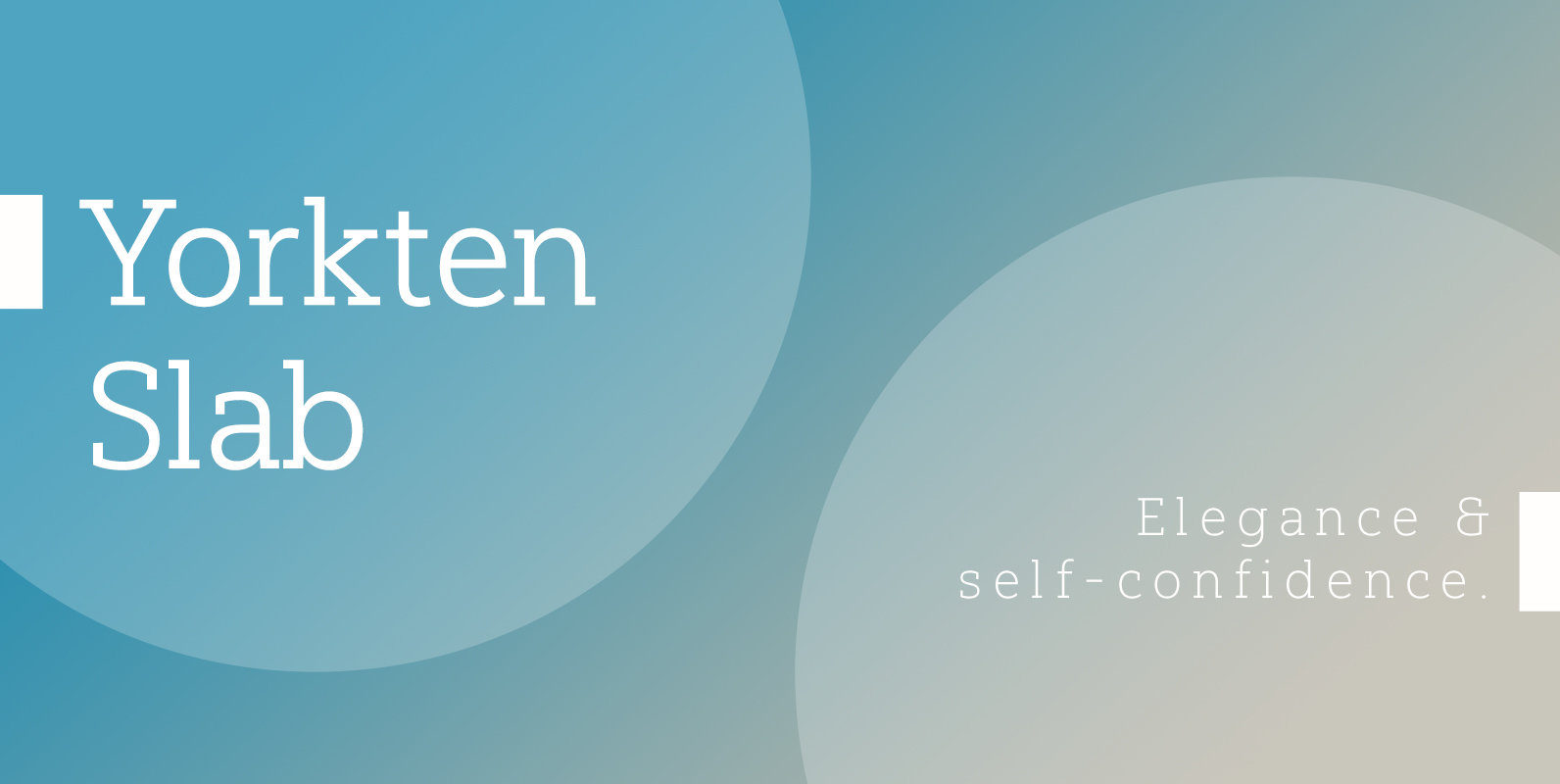
The Yorkten family of fonts is back with another satisfying addition to its clean style. The rhythmic, new Yorkten Slab expands Yorkten’s basic, contemporary form of geometric and simple lines and adds a level of self-confidence and elegance to your
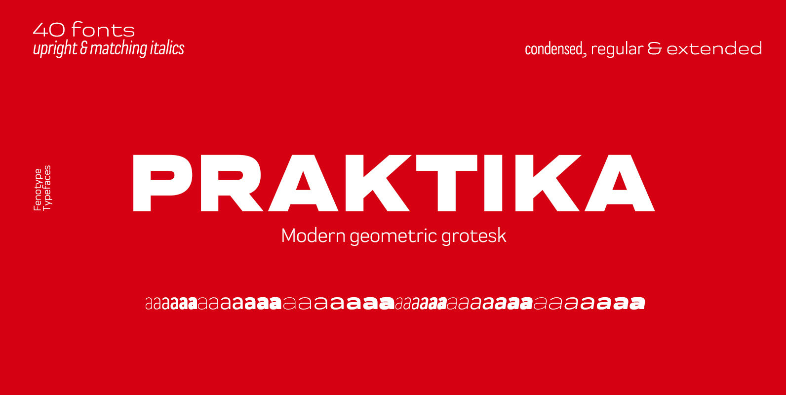
Praktika is a multifunctional super family of 40 fonts. It consists of three distinct widths and weights from extra light to extra bold. Conceptually, it is a rendition of the familiar early 20th century European grotesque styles, used in road
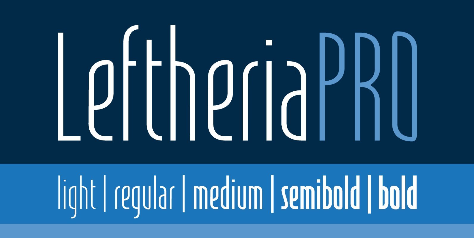
Leftheria has its structure projected from the capitals of the Greek columns of Ionian order, it is a typography condensed with vertical emphasis composed by 05 weights (light, regular, medium, semibold, bold) including ligatures, alternates, small caps, old styles figures,
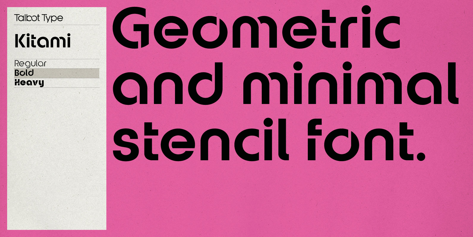
Talbot Type Kitami is a minimal, geometric, stencil display font, inspired by Herbert Bayer’s Universal Typeface, created at the Bauhaus in the 1920s. Each character is created from a single continuous stroke, or combination of strokes. Kitami features an extended
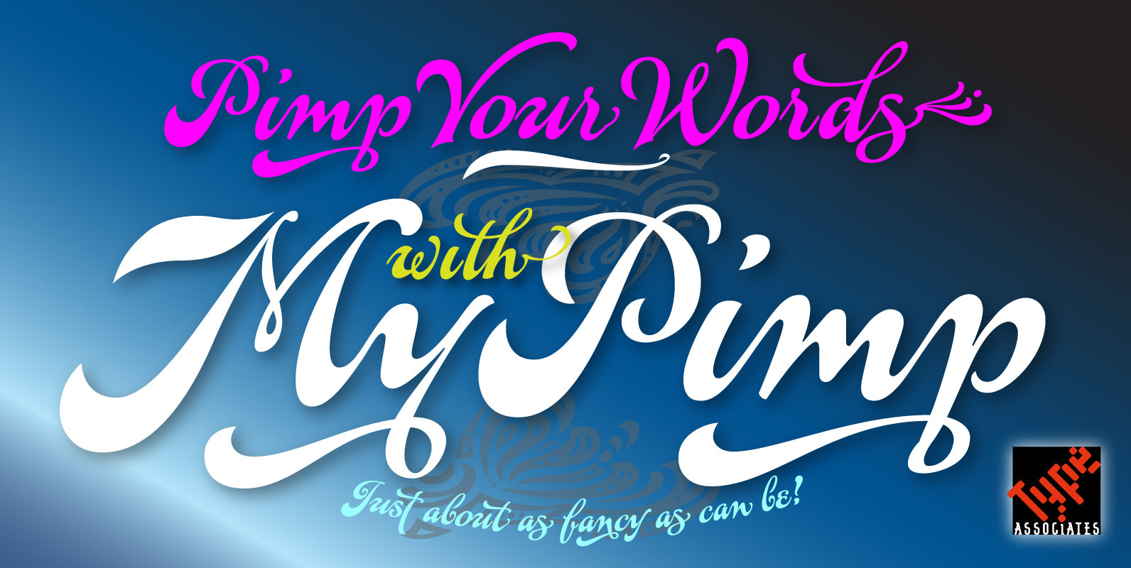
The concept of a bold connected script with a hand-lettered feel has been on my bucket-list for decades. I imagined a pretentious, ornate, swashy look, a variety of word-end embellishments, heaps of ligatures and underscores. It took a weekend workshop
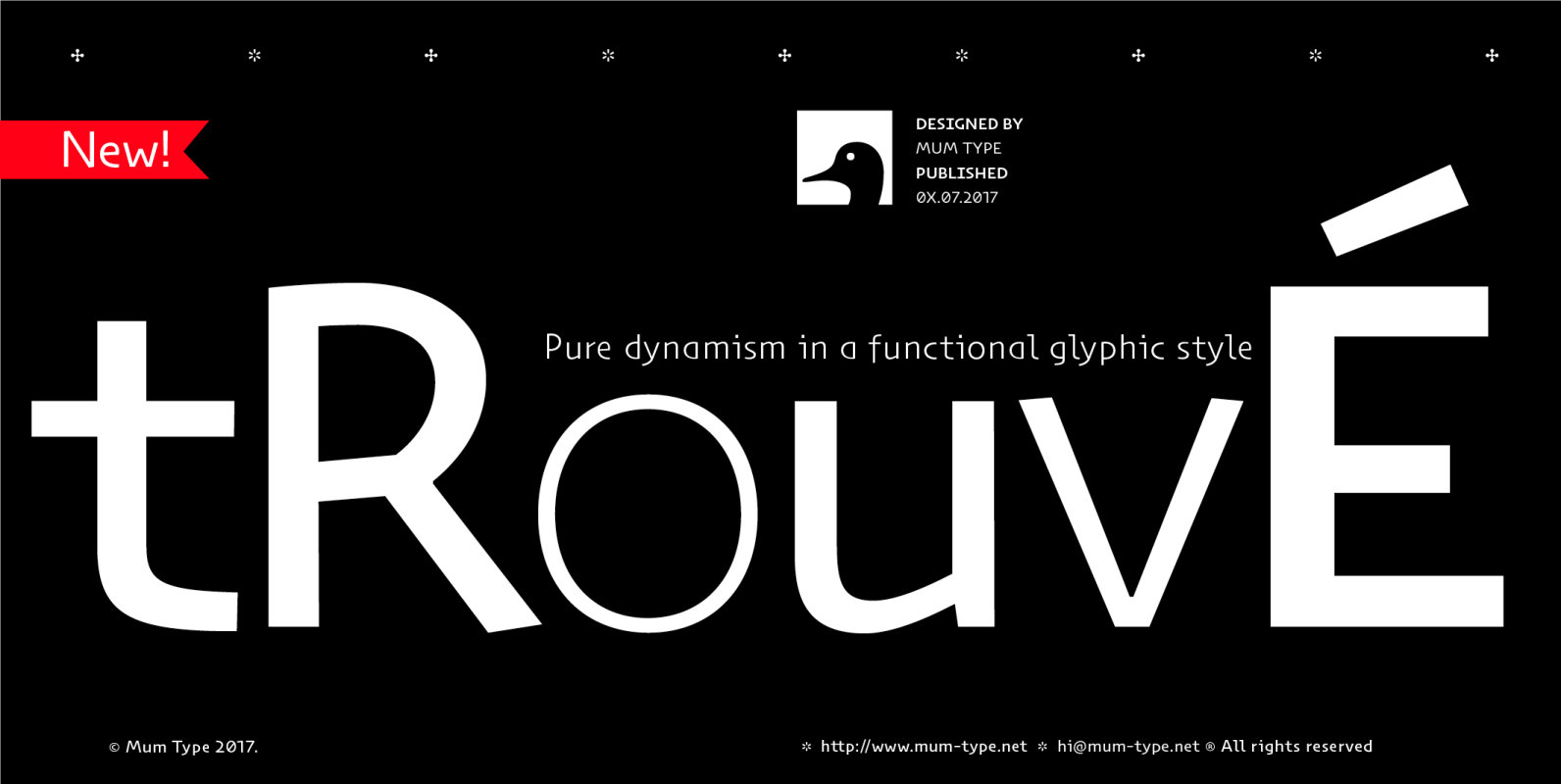
When we started Trouvé, we read about some old paleontologist who found an old greek inscription back in the days. The anecdote tells that when he found the inscriptions on the stones, he jelled “trouvé! trouvé!.”. Now Trouvé is an
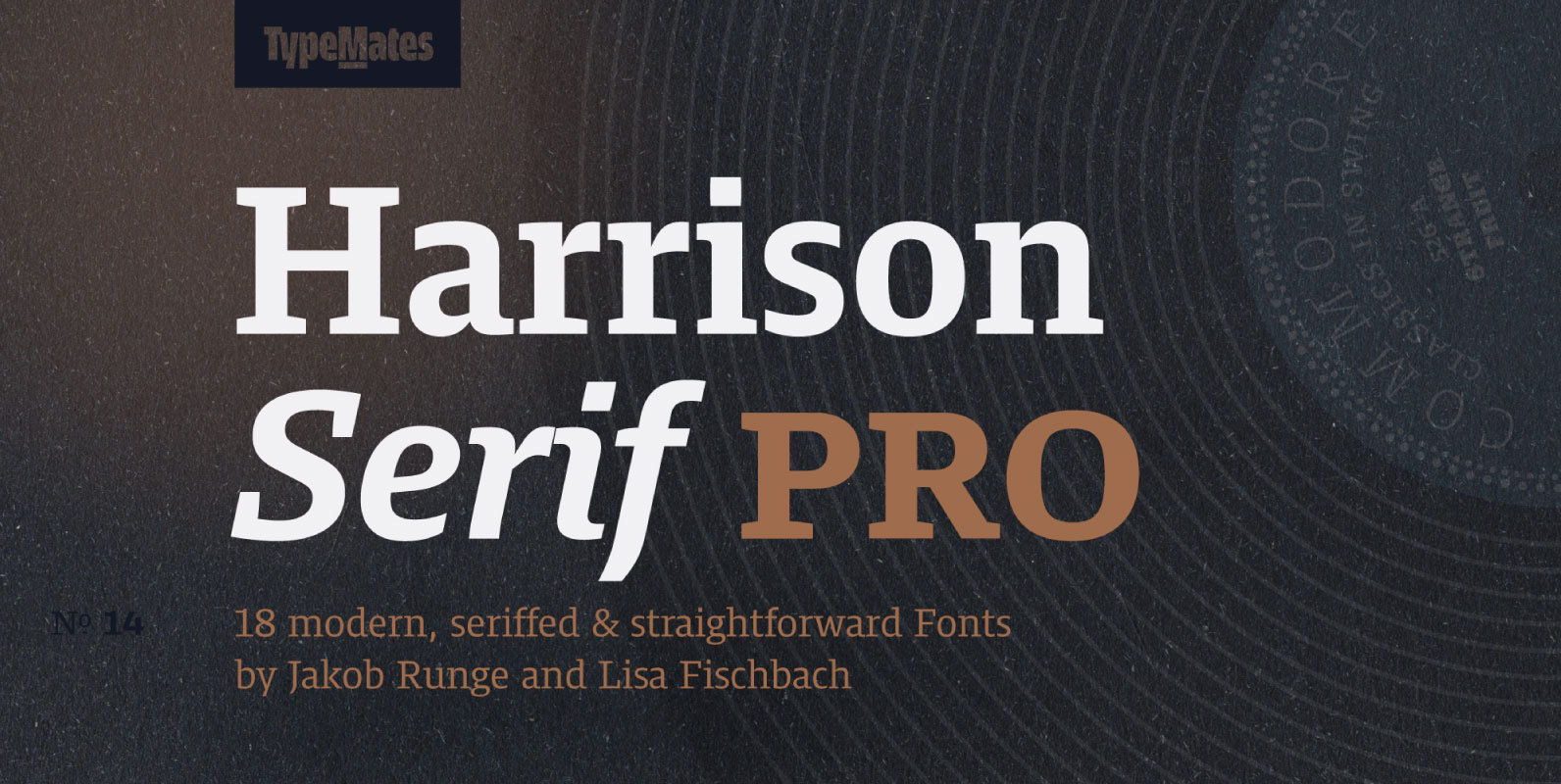
Harrison Serif Pro is a sturdy yet contrasted slab serif that combines a rational and efficient approach with a warm voice. A typeface of nuances, the slightly carved and occasionally extended serifs evoke the friendly side of Harrison Serif and
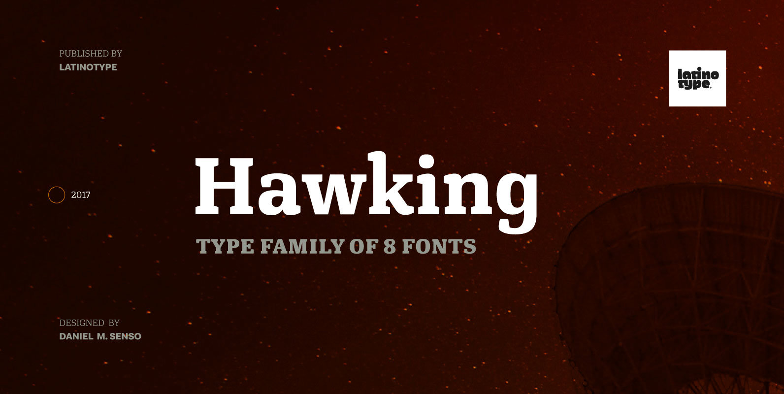
Hawking is a slab typeface with slightly squarish shapes and a rational, modern look. The font has a minimal modulation, generous counter forms and relatively large x-height with lowercase ascenders extending above the cap-height for more legibility. Serifs are composed
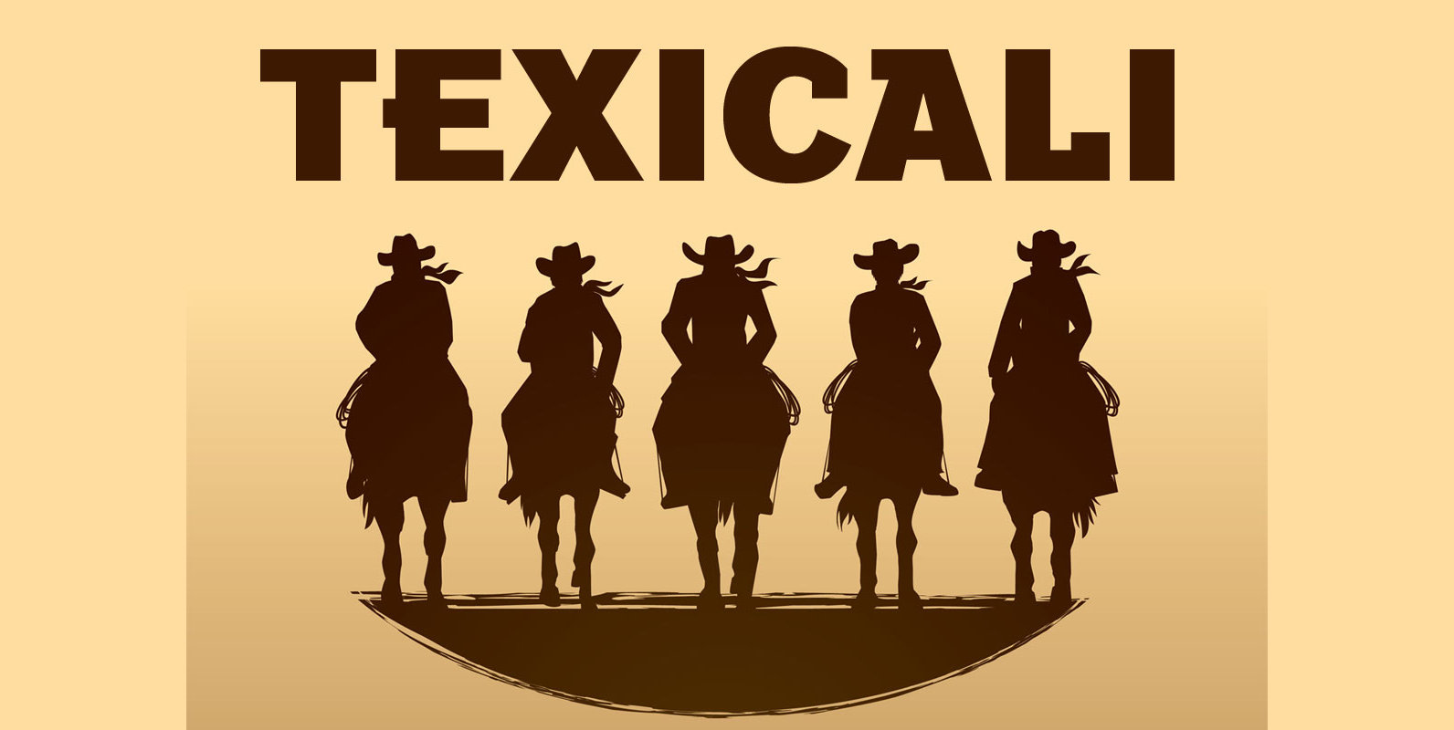
Texicali is a new multiple weight type design based on our FontMesa logo, the idea was simple, create a sans serif with a few slab serifs added resulting in a style that could feel at home just about anywhere. The
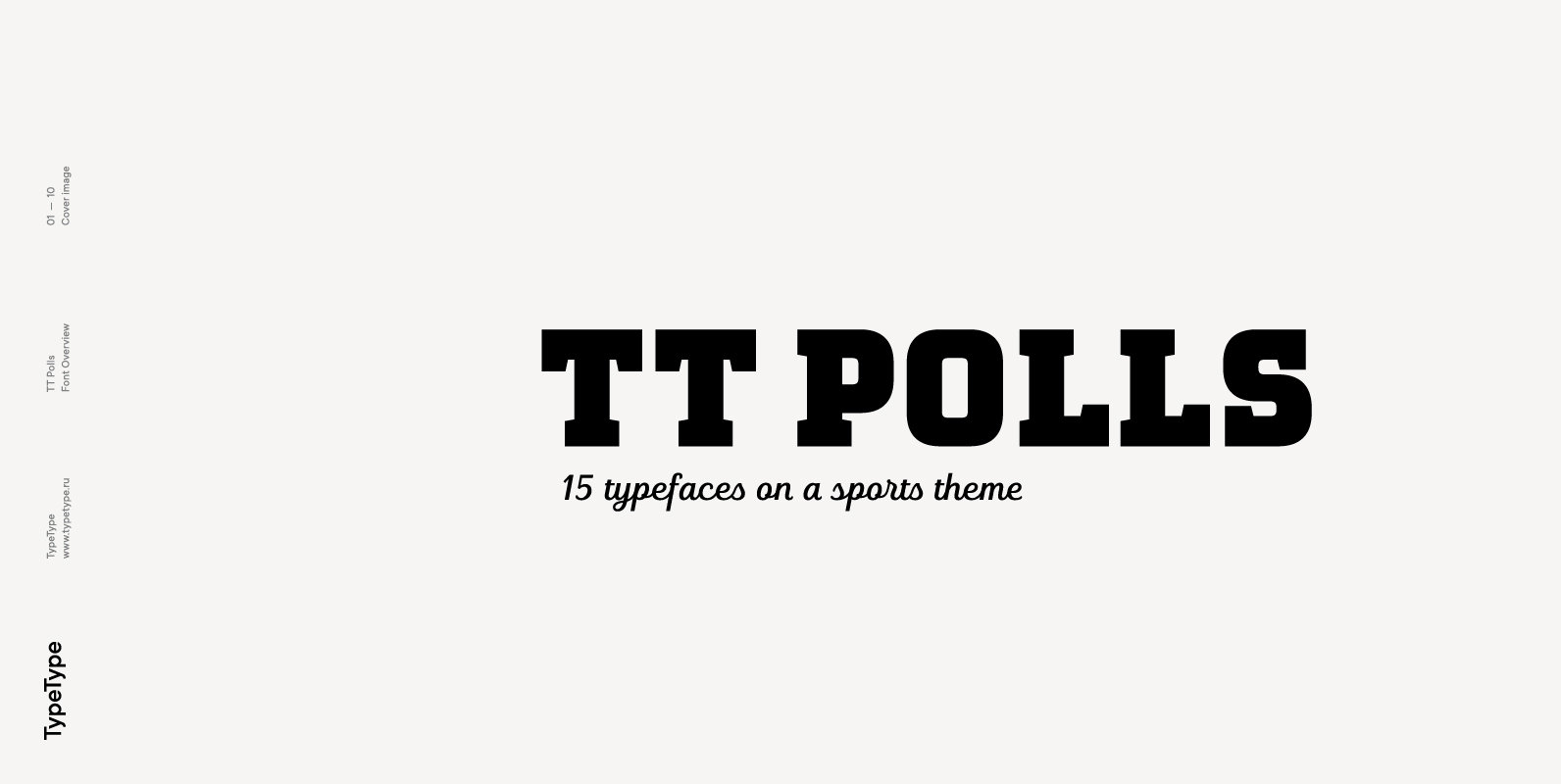
TT Polls emerges as a modern modular slab serif inspired by American sports graphics. As we wanted to create a really special and remarkable project, we’ve decided to broaden the character palette and implement the OT features support, and also
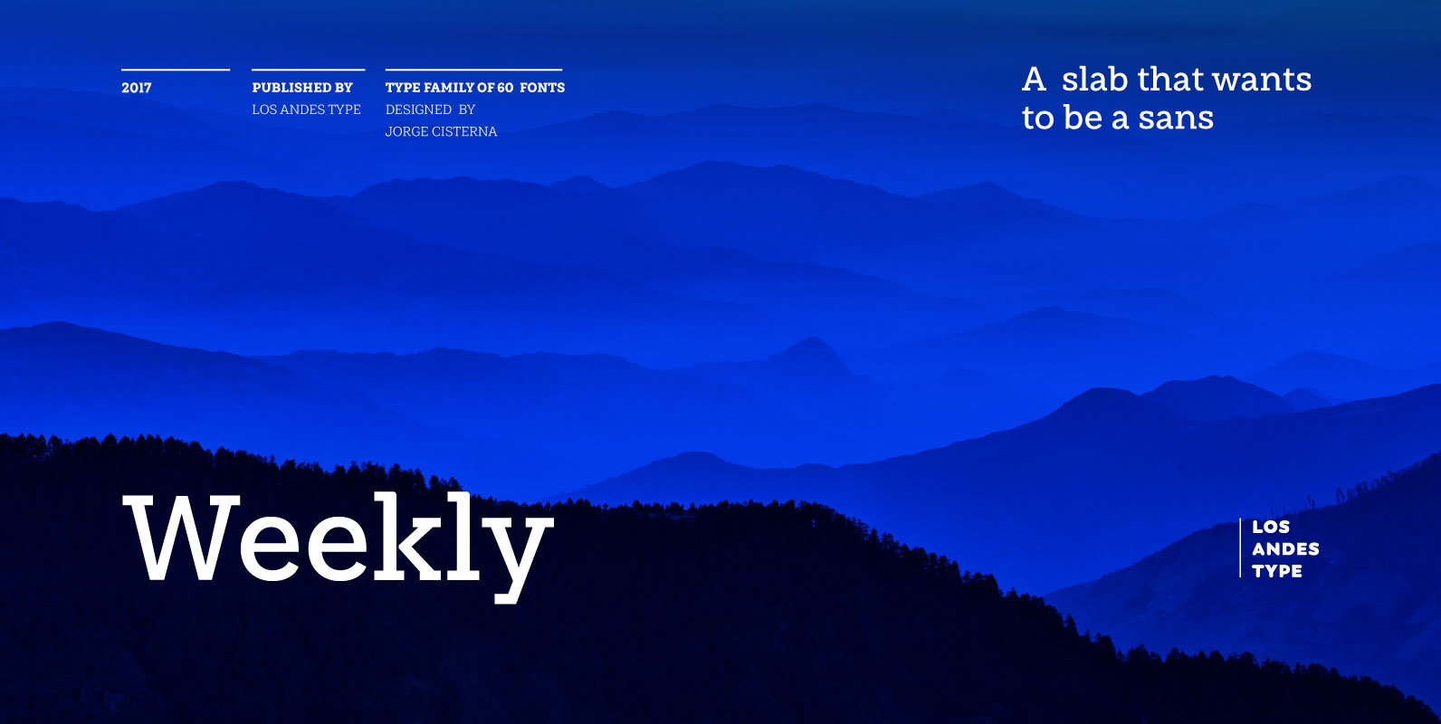
Weekly: a slab serif that wants to be a sans. The font was created under the premise that it can be used as a sans: a fresh design without that retro feel typical of slab fonts. As a result, we
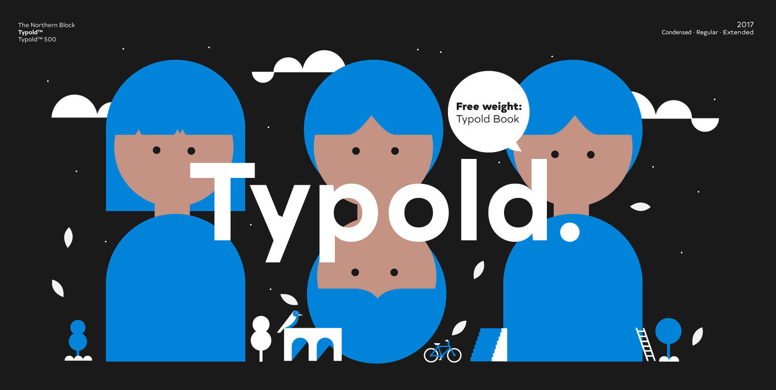
Typold originated out of the desire to improve, geometric forms and push beyond previous achievements through collaborative working methods and knowledge sharing. The result is a finely balanced modern sans serif constructed from mathematical inputs, typographers needs, and the natural
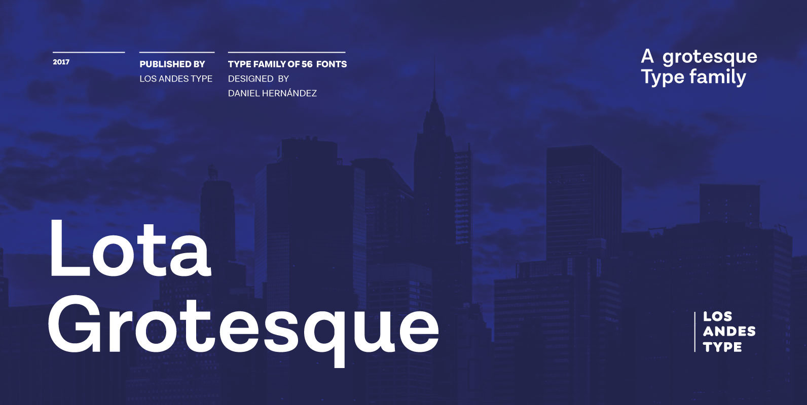
Lota Grotesque was designed by Daniel Hernández with the collaboration of Rodrigo Fuenzalida and Latinotype Team in digital editing. The family comes in 7 weights with matching italics and includes alternative versions that provide high versatility and functionality. The whole

ZELDA my new font family is named after Zelda Fitzgerald, the »Flapper« wife of »Tender is the Night« F. Scott Fitzgerald. They really lived it up at the French Riviera. Despite Scott making money in bundles, being the best paid