Tag: legible
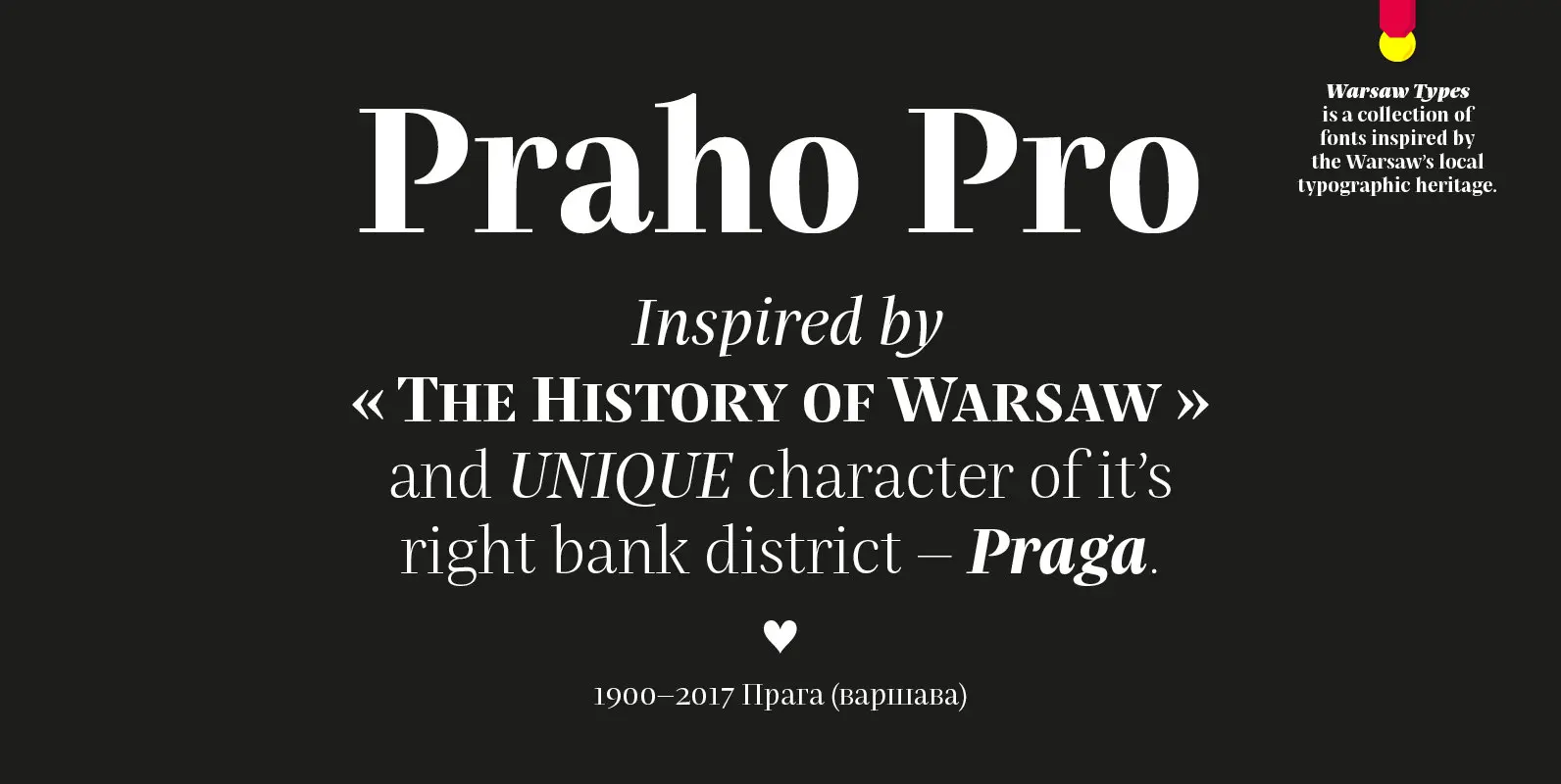
Praho Pro Font
Praho Pro is a part of Warsaw Types – a project based on Warsaw’s local typographic heritage. The project, presented at the Museum of Praga, is a collaboration of 12 young Polish typographers. Praho Pro is a multilingual family inspired

Schnebel Sans Pro ME Font
It took me 12 years to bring this extensive font family to completion. A lot has been changed, transformed, peeled and developed in all those years. For many of my projects I used it as my quarry and so it
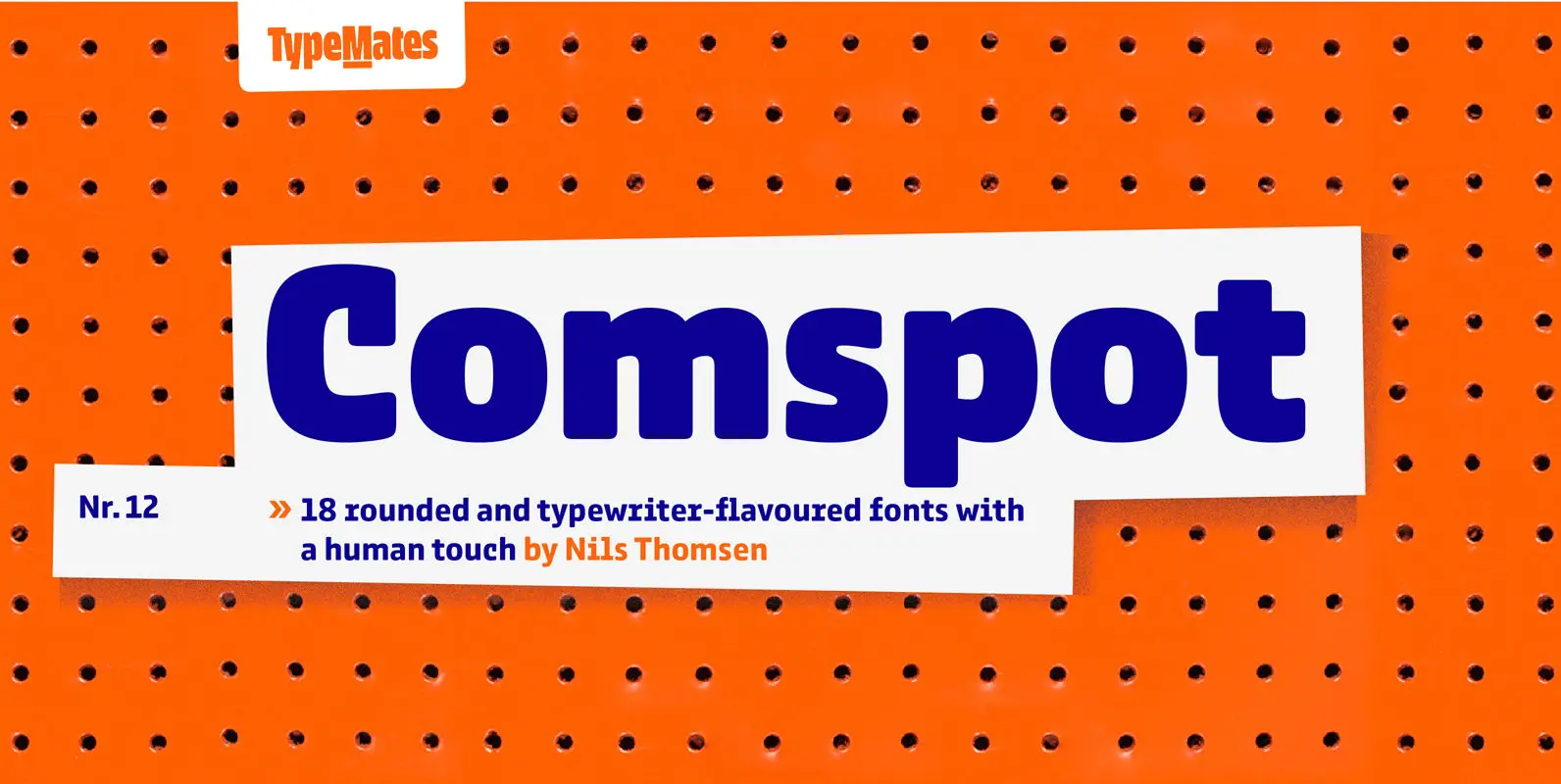
Comspot Font
Comspot is a rounded, typewriter-flavoured font family with a human touch. Originally designed as a custom typeface Comspot’s nine weights — razor-thin hairline to ultra black — and 14 stylistic alternates fulfil every need, from extended to display text. Comspot’s
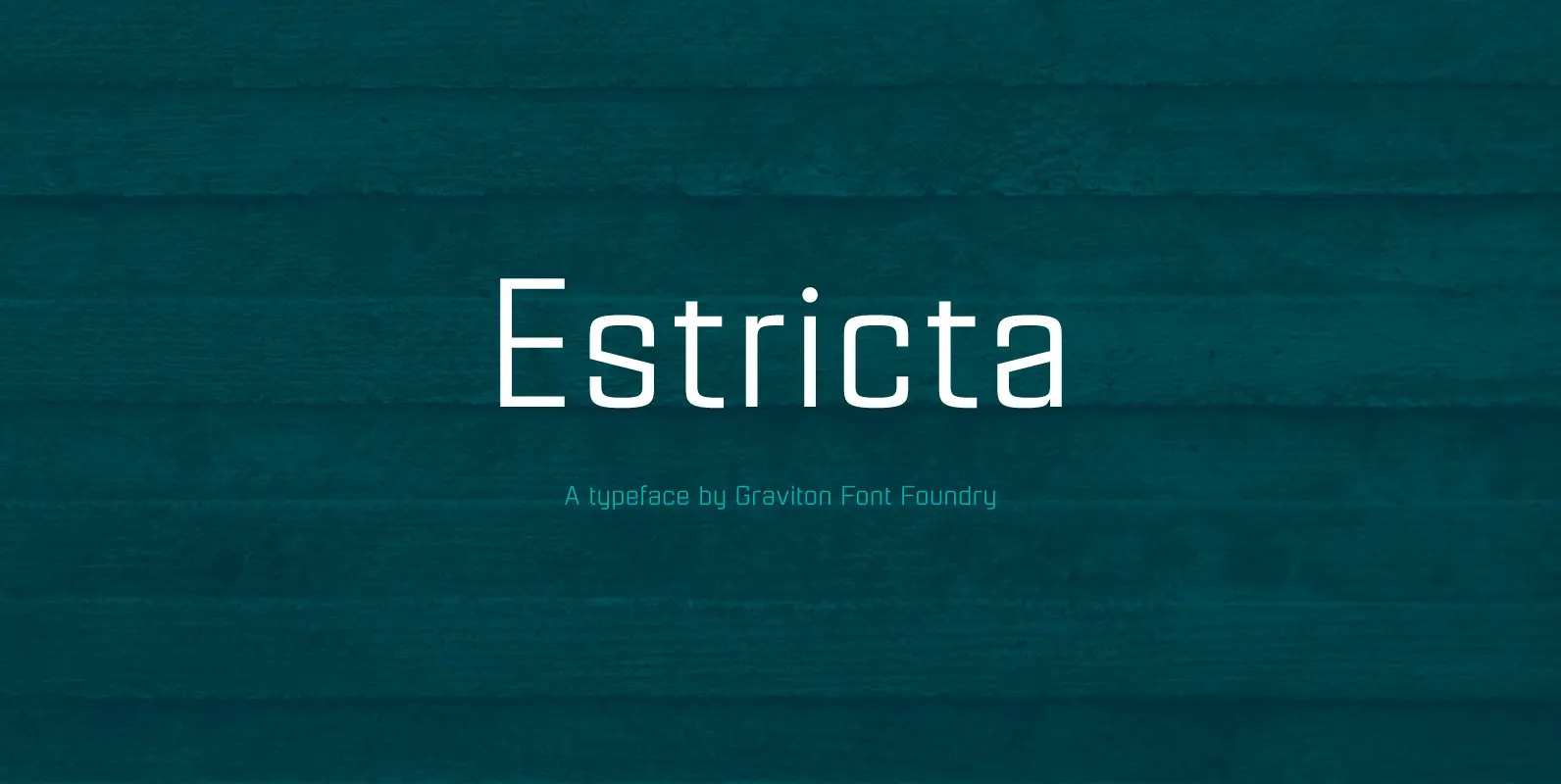
Estricta Font
Estricta font family has been designed for Graviton Font Foundry by Pablo Balcells in 2017. It is a sans serif typeface with a geometrical and mechanical appearance, its sharp, angular edges provide a strong and solid design. It has been
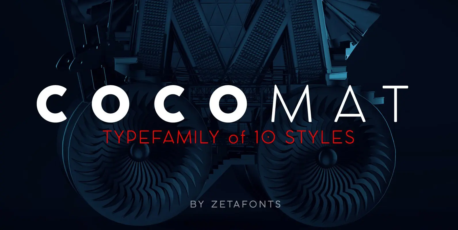
COCOMAT Font
COCOMAT is a typeface variant from the COCO GOTHIC family of sans serif geometric typefaces. It’s inspired by the style of the twenties and the visions of italian futurists like Fortunato Depero, Giacomo Balla and Antonio Sant’Elia. It’s a typeface
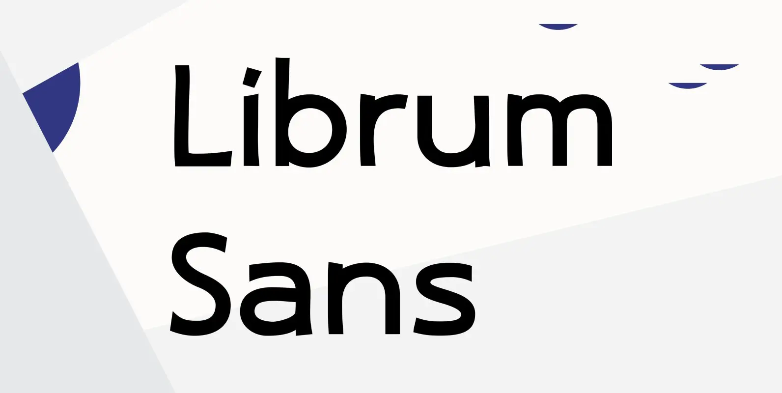
Librum Sans Font
This is the companion sans family to make the Librum serif families work as well as they do. By companion, I do mean stylistically compatible. But mainly, they have the same vertical metrics. So they work very well for run-in
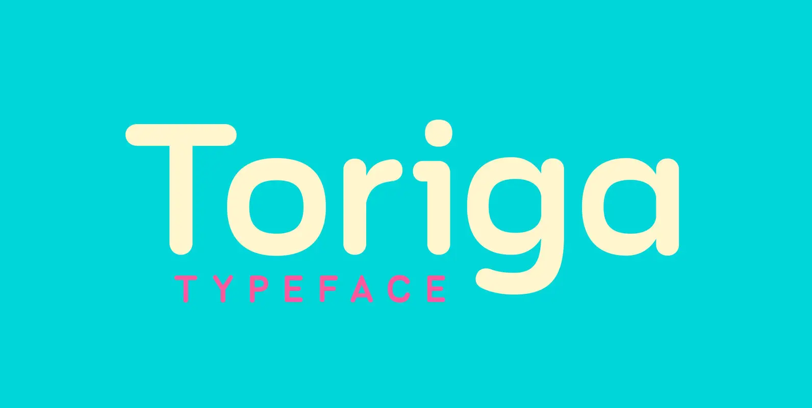
Toriga Font
The Toriga typeface was named after the Portuguese grape variant known as Touriga Nacional. This fun typeface boasts the features of a well-balanced, versatile, modern sans which is highly legible as a text font and with a clean, elegant look
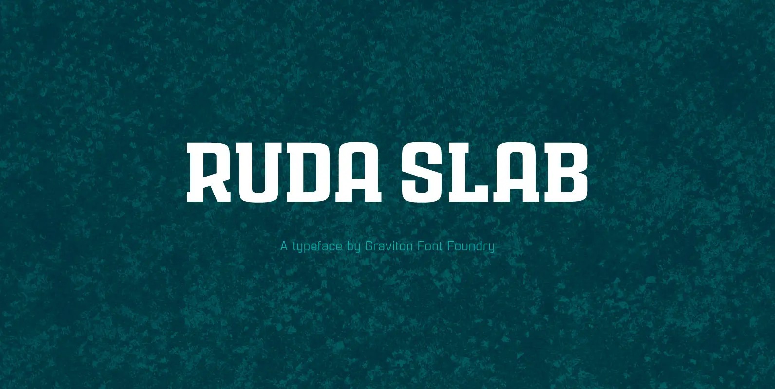
Ruda Slab Font
Rauda Slab font family has been designed for Graviton Font Foundry by Pablo Balcells in 2017. It is a display, slab serif, geometric typeface, with sharp angles that provides a strong and solid appearence. Rauda Slab consists of 8 styles.
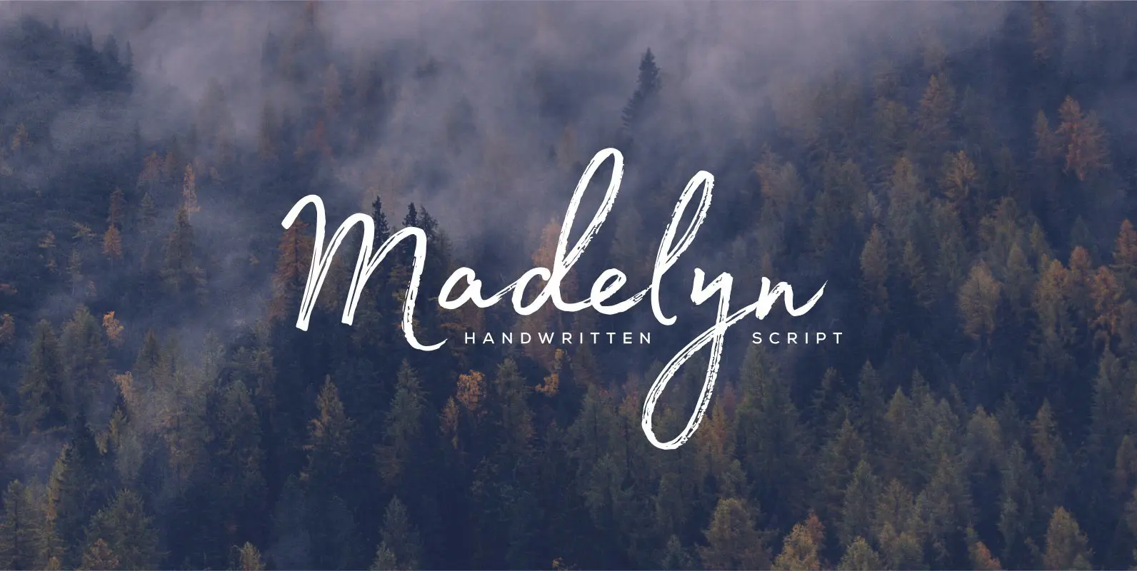
Madelyn Font
Madelyn is a handwritten script font based on the expression of real handwriting. Amiable and organic, it is perfect if you want to convey individuality and style. It’s written with a calligraphy pen with casual dry strokes and a signature
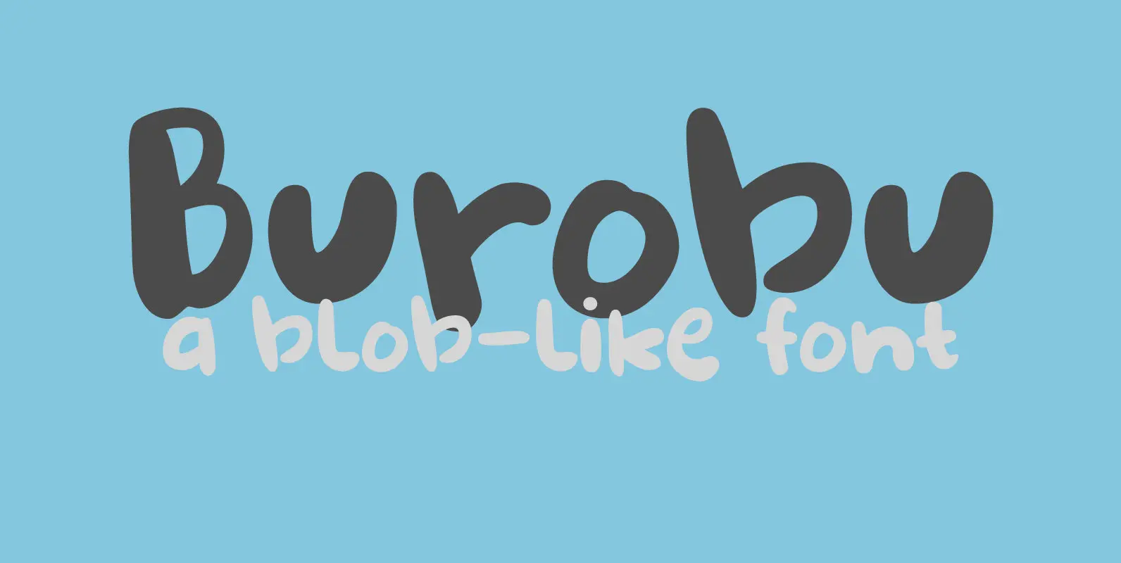
Burobu Font
Burobu, in case you’d like to know, means ‘blob’ in Japanese. I thought it was quite an appropriate name for this blob-like font! Burobu is a messy font and comes with a generous helping of jittery, jumping glyphs, exaggerated strokes
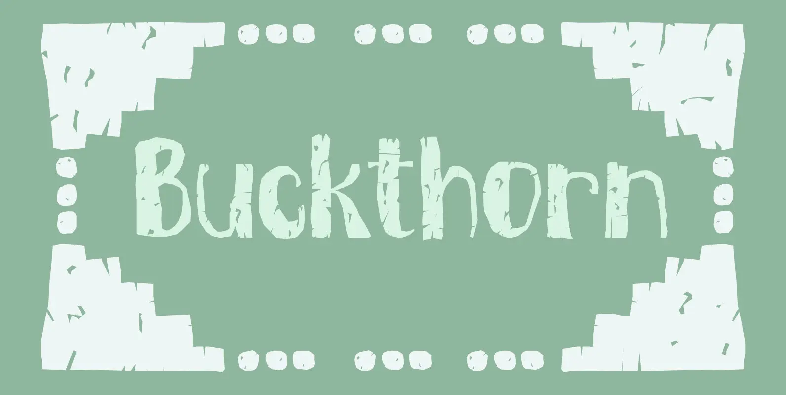
Buckthorn Font
Buckthorn is a genus of about 110 species of shrubs and small trees, native to North America and Asia. Its uses are varied: it is used for dye, oil, printing ink and oil. That concludes the botany class for today,

Cool Daddy Font
It’s a brand new year, but I have been going back in time. To the seventies to be precise. A ‘bubblegum’ font was on the top of my to-do list, so when it was finally finished, it reminded me of
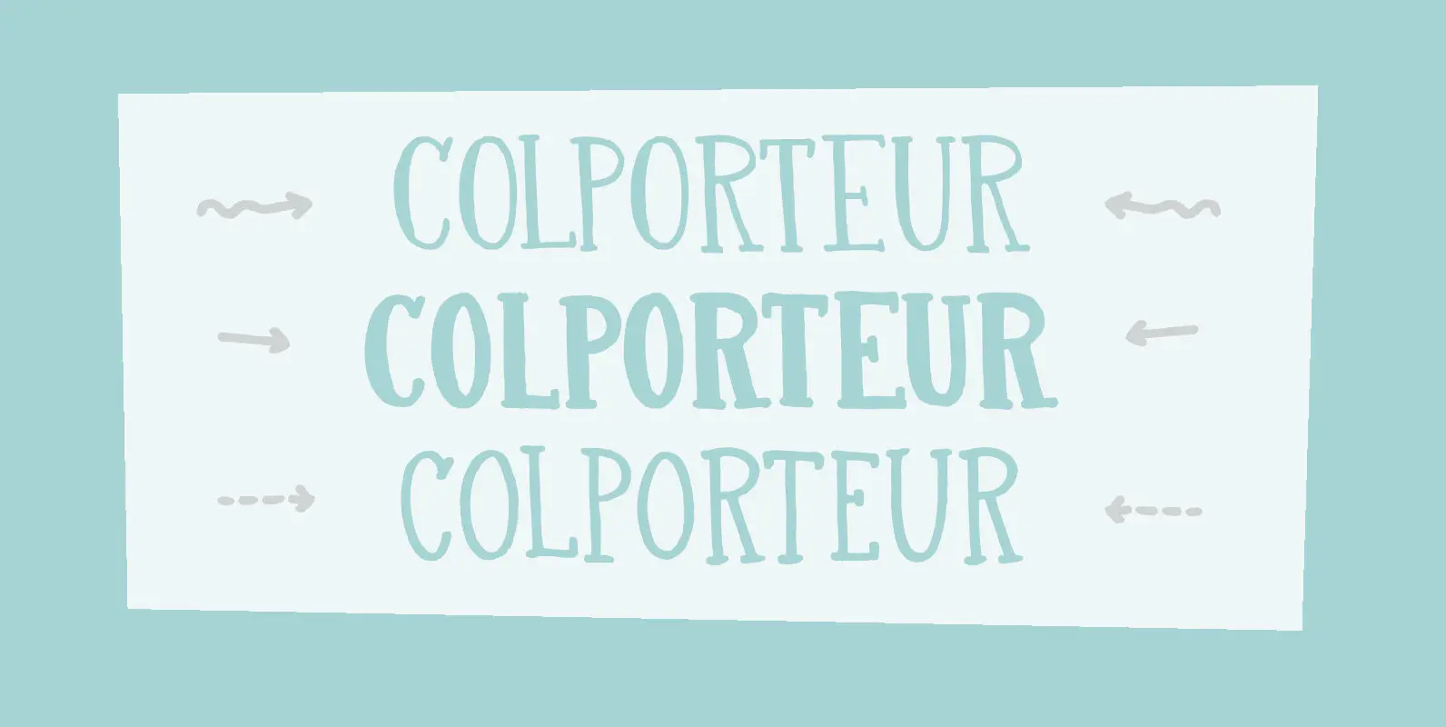
Colporteur Font
A Colporteur is a peddler of books, newspapers, and similar literature. When I was young, we often got visits from colporteurs – mostly they wanted to sell us a very expensive encyclopaedia. I haven’t seen them for a while –
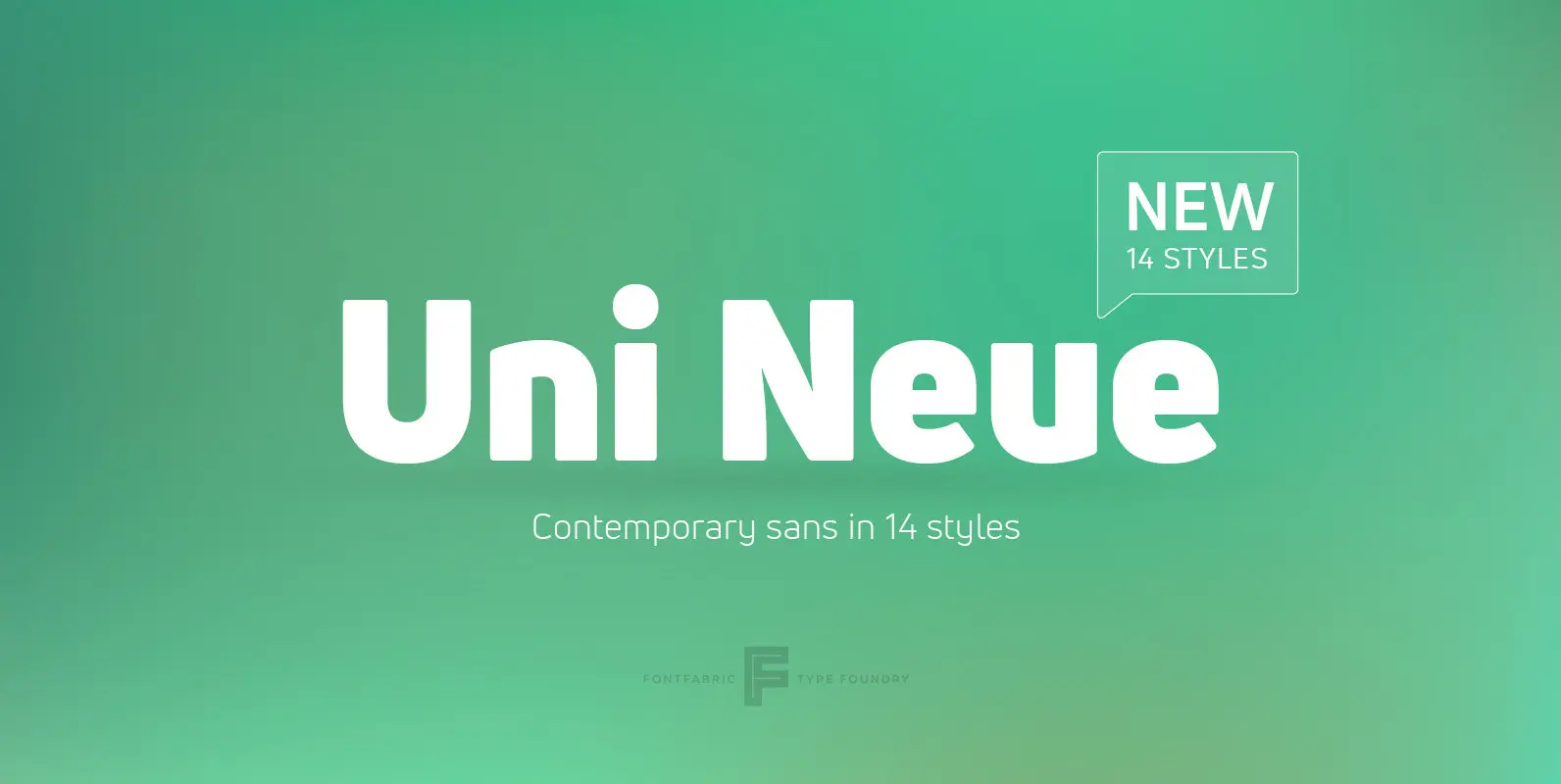
Uni Neue Font
Uni Neue is the whole new redesigned version (remake) of Uni Sans – one the most recognizable and signature font families of Fontfabric type foundry. From major changes like proportions, widths and thickness (weights) to the smaller details, this new

Carina Pro Font
Like Phenix out of the ashes the former Schriftguss hot-metal font “Rautendelein” has come to live again. Carina Pro was carefully extended for multilingual use, and contains a few alternates which can be activated via the swash OpenType feature. Published
