Tag: legible
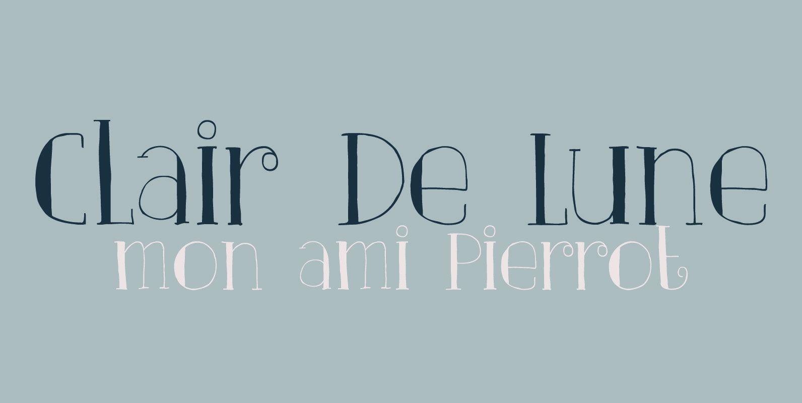
Clair De Lune Font
Clair De Lune is part of the famous Suite Bergamasque, written by Claude Debussy in 1890, and published in 1905. It means Moonlight in French, a kind of romantic name. The name is exactly what I had in mind for
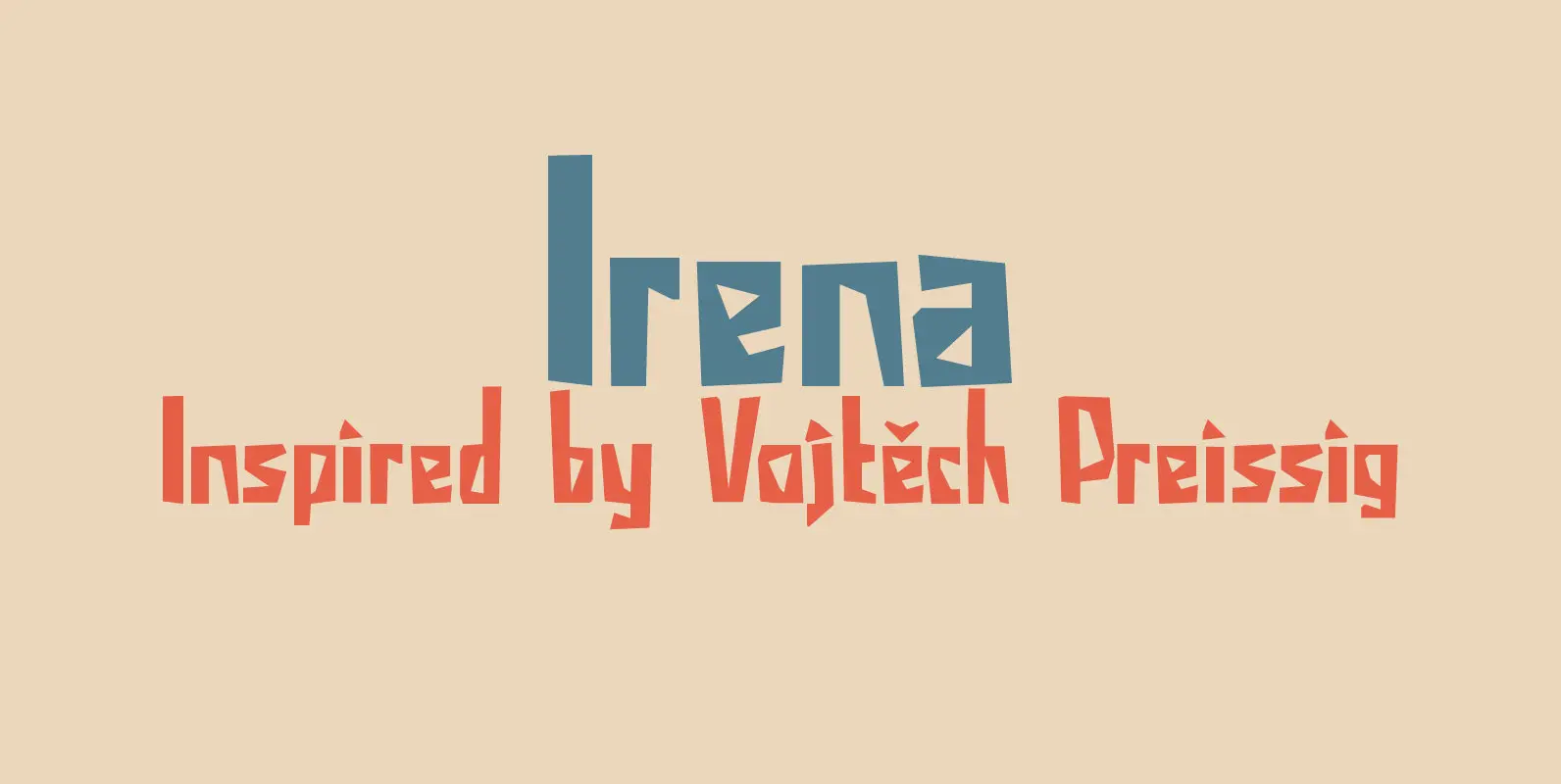
Irena Font
Irena is a cubist/expressionist font inspired by Vojtěch Preissig. Preissig (1873-1944) was a Czech typographer, printmaker, illustrator and teacher, whose work was influenced by Japanese Art and Symbolism. During WWII, Preissig supported the Czech resistance and he was arrested in

Lemon Yellow Sun Font
Lemon Yellow Sun is a line from my favorite Pearl Jam song – Jeremy. It also happens to be the title of a Stiltskin song, so I had to name a font after it. LYS is a tall, all caps
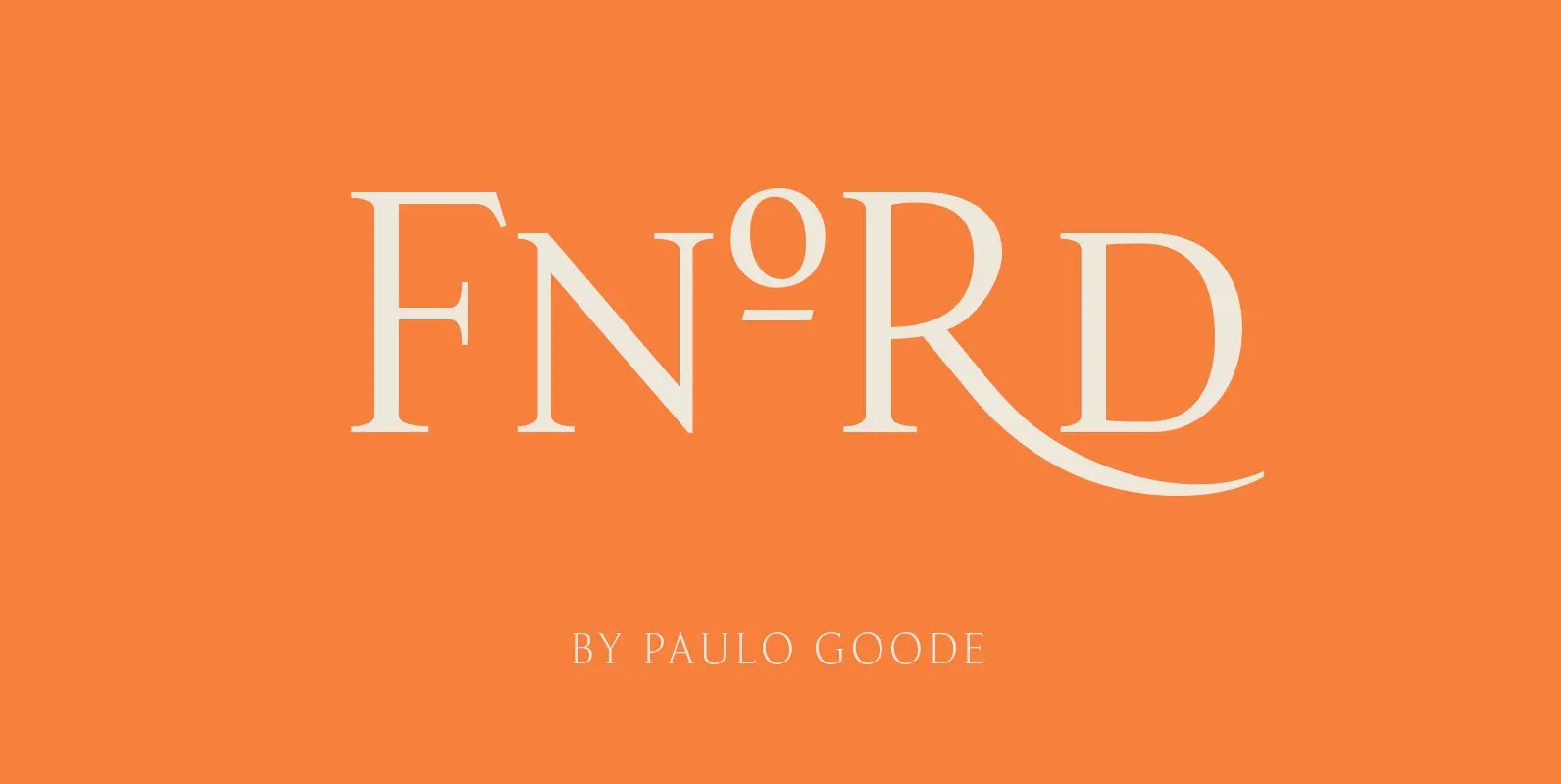
Fnord Font
Fnord is a contemporary humanist serif typeface, it is ideally suited for display purposes and branding. The family has been designed to be highly versatile, containing a total of 23 fonts – each font features discretionary ligatures, swash alternates and
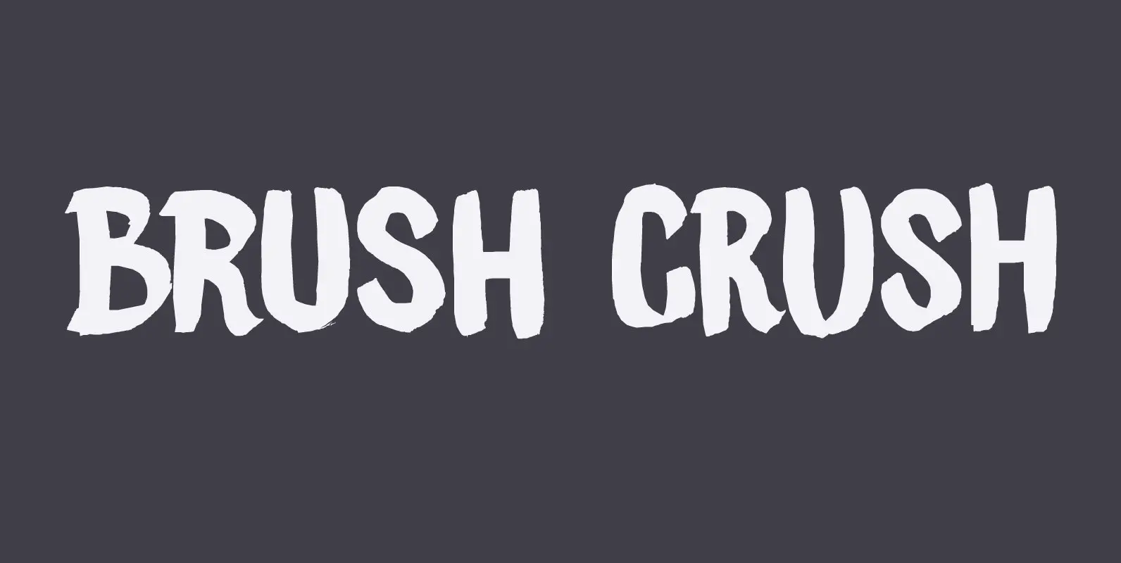
Brush Crush Font
I bought a few new pencils and I tried them out using Chinese ink and quality French watercolor paper. The result is Brush Crush – a very nice brush font. Brush Crush would look perfect on packaging, book covers, posters
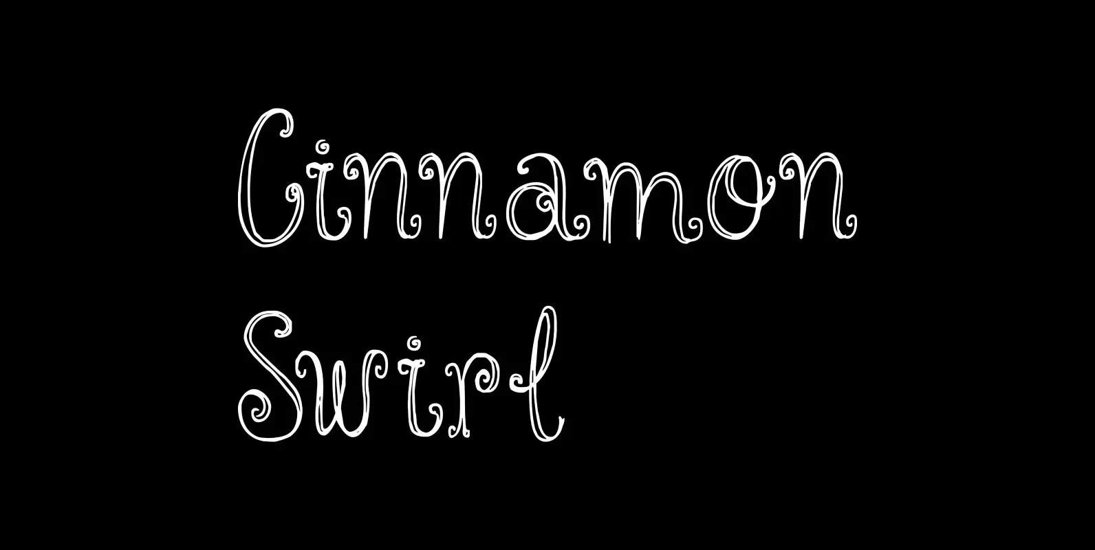
Cinnamon Swirl Font
Cinnamon scent: check. Swirls: check. Curls: check. Cinnamon Swirl is a very romantic, very ‘sugar-and-spice-and-all-things-nice’ kinda font. It would look great on book covers, slumber party posters and postcards. The Swirl comes with some lovely ligatures and stylistic alternates –
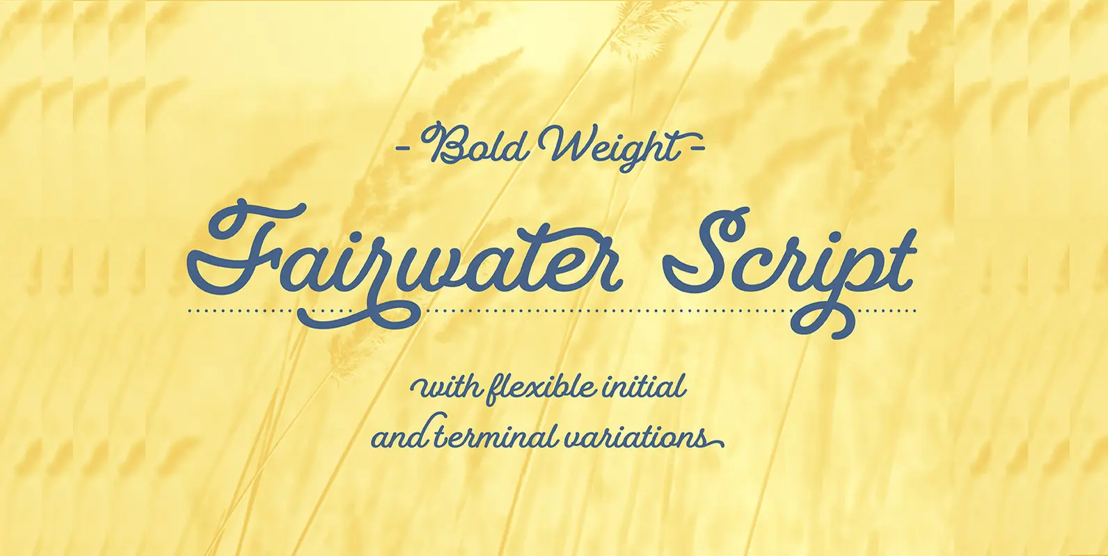
Fairwater Script Font
Fairwater’s aesthetic derives from the cursive handwriting styles popularized in the early to mid 1900s. Friendly, monoline, and casual – available in light, regular and bold weights. As with many of her faces, Laura can’t resist adding a plethora of
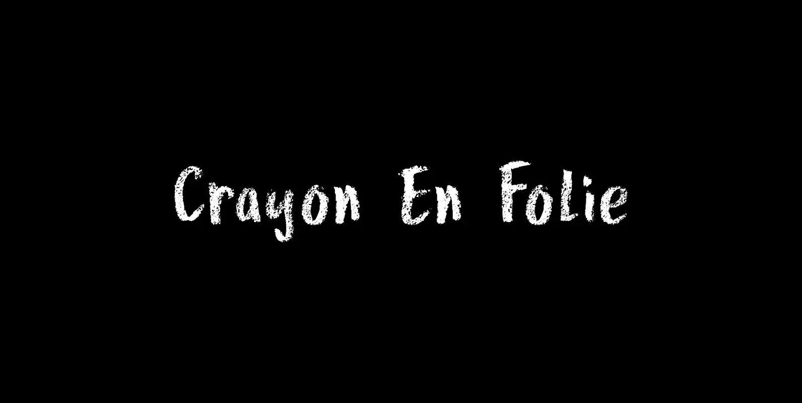
Crayon En Folie Font
Crayon En Folie (‘Pencil Madness’ in French) is a straightforward pencil font, created with an extra thick black pencil. Use it for books, posters and packaging. Comes with a coloring box full of diacritics. Published by HanodedDownload Crayon En Folie

Smurrie Font
Smurrie means ‘sludge’ in Dutch. It is not an exact translation, but as good as I could find. The name refers to the rounded, blob-like shape of the glyphs. I think this font would look very good on posters, book
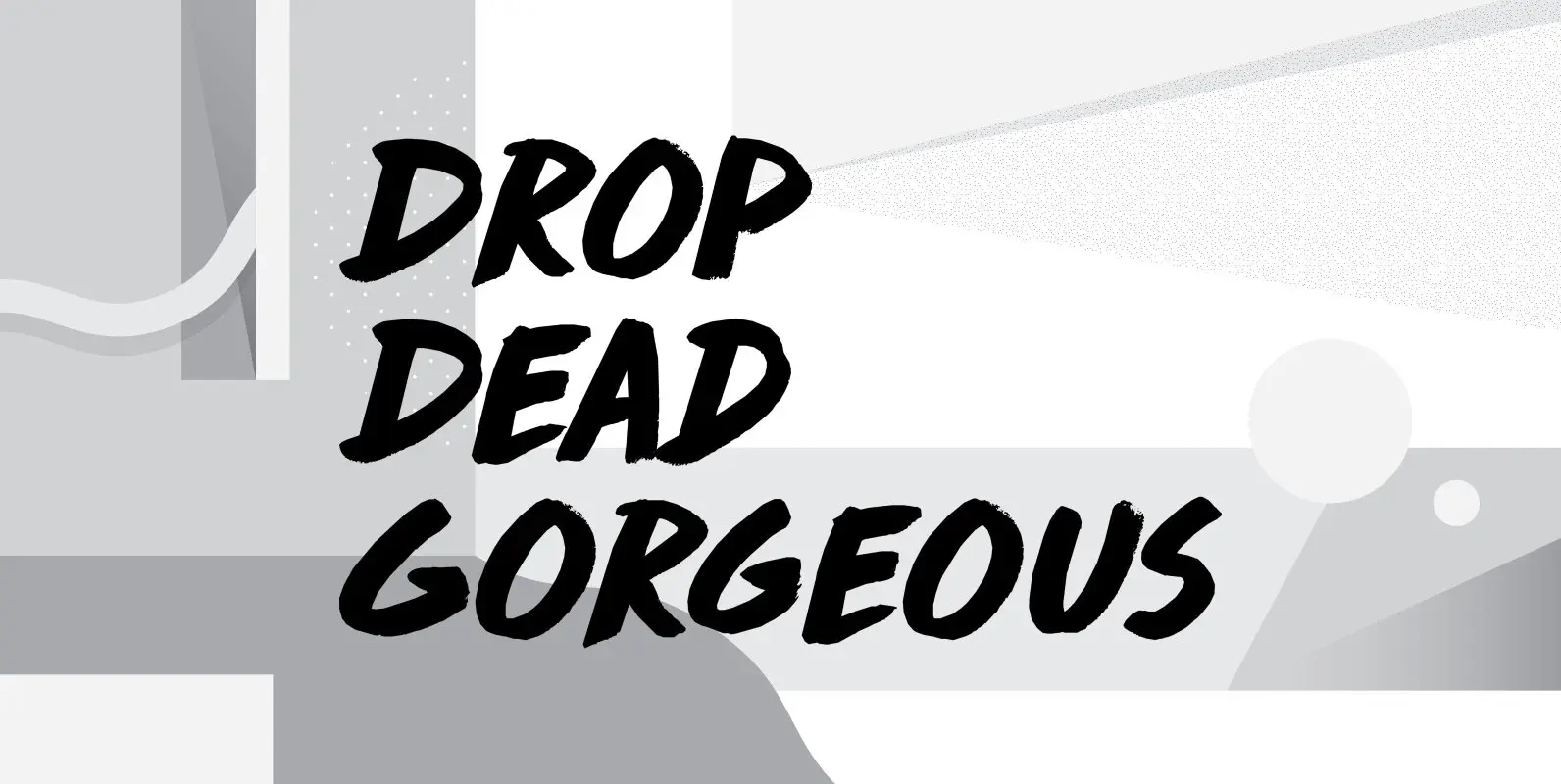
Drop Dead Gorgeous Font
Drop Dead Gorgeous is a slightly slanted all caps Brush font. I made it with the last of my Chinese ink (I ordered a new batch, it should arrive tomorrow). Drop Dead Gorgeous is a very legible font, ideal for
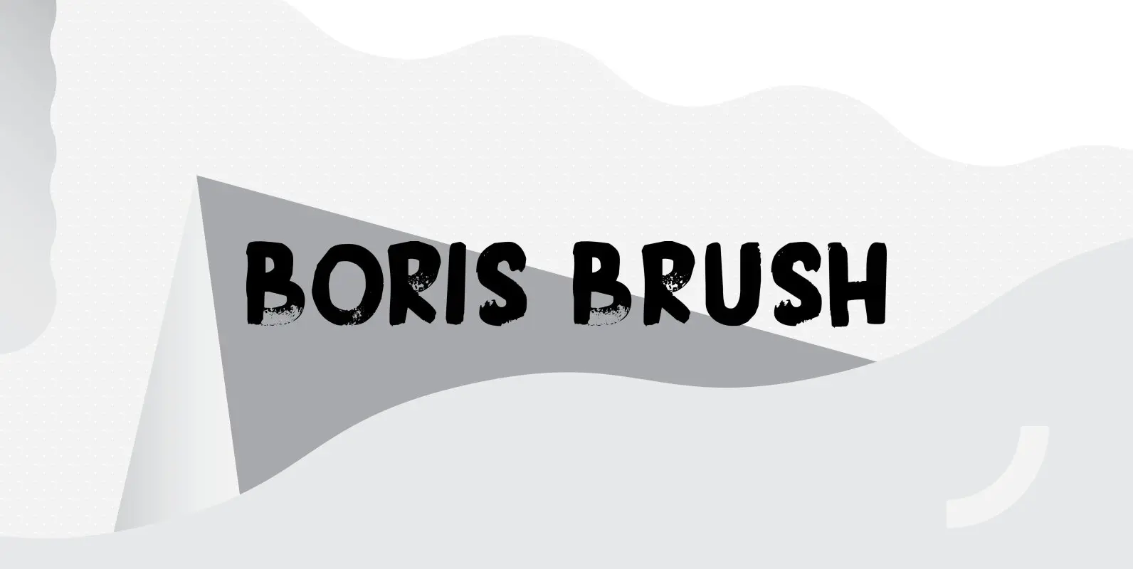
Boris Brush Font
Boris is my son: he was born on January 7th and he is as cute as can be. Boris Brush font is a very loud, very useful brush typeface, which I created using some fine-haired brushes and black paint. It
Keswick Font
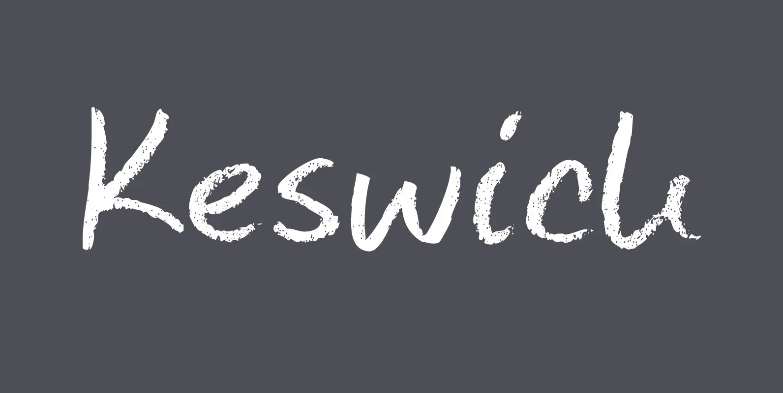
Keswick is a beautiful small town in the English Lake District. It is a good place to hang out for a while and explore the surrounding National Park. During your stay you could visit the Keswick Pencil Factory – which
Contenu Publishing Suite Font
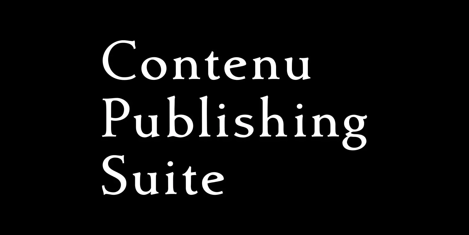
Contenu is the new book font family designed for an upcoming book on book family design. The name is French for content and this is what the family is designed for: text, body copy, and book layout. If it has
Garden Gnome Font
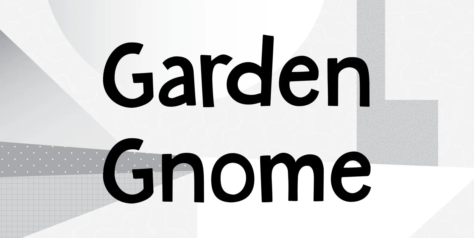
I am not really fond of Garden Gnomes, but this font is kinda cute and I figured it’d be a nice name. Garden Gnome is a very happy, easy to read Children’s Book font. It is bouncy, rounded and comes
Kaleko 205 Font
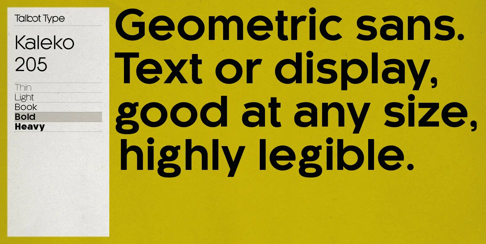
Kaleko 205 is inspired by the classic, geometric sans-serifs such as Gill Sans, but has shallower ascenders and descenders for a more compact look. It’s a well-balanced, versatile, modern sans, highly legible as a text font and with a clean,
