Tag: legible
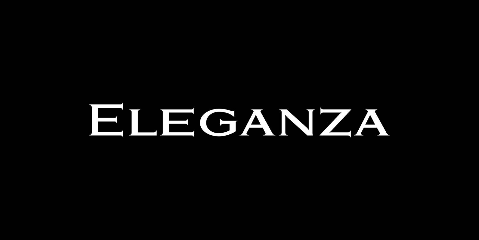
Eleganza Font
“Eleganza” is my most elegant typeface. At least that is what I think! I use it for business cards and everything that has to be elegant with that extra touch. The font comes in pairs for the price of one.
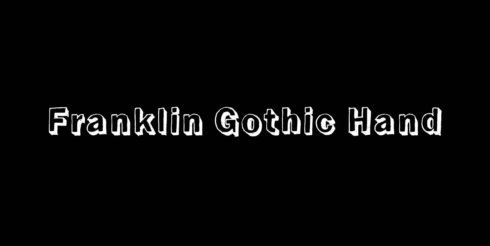
Franklin Gothic Hand Font
Franklin Gothic Hand Demi Shadow is another one in my series of hand-drawn fonts from way back in time – before computers changed the way we worked in advertising. This one was especially used for what we called “pork-belly-ads”: ads

Hard Times Font
“Hard Times” has been hard work, designing a handmade typeface must always have the right balance between rough and smooth, specially with this Times-like face. It has the big European glyph-set, so that it can be used all over the

Bodoni Classic Font
I became interested in designing Bodoni Classic because of a lazy graphic designer at Jacques Damase publishing house. He had to change a single letter on a bookcover about J. B. BODONI. The French call him Jean Baptiste instead of
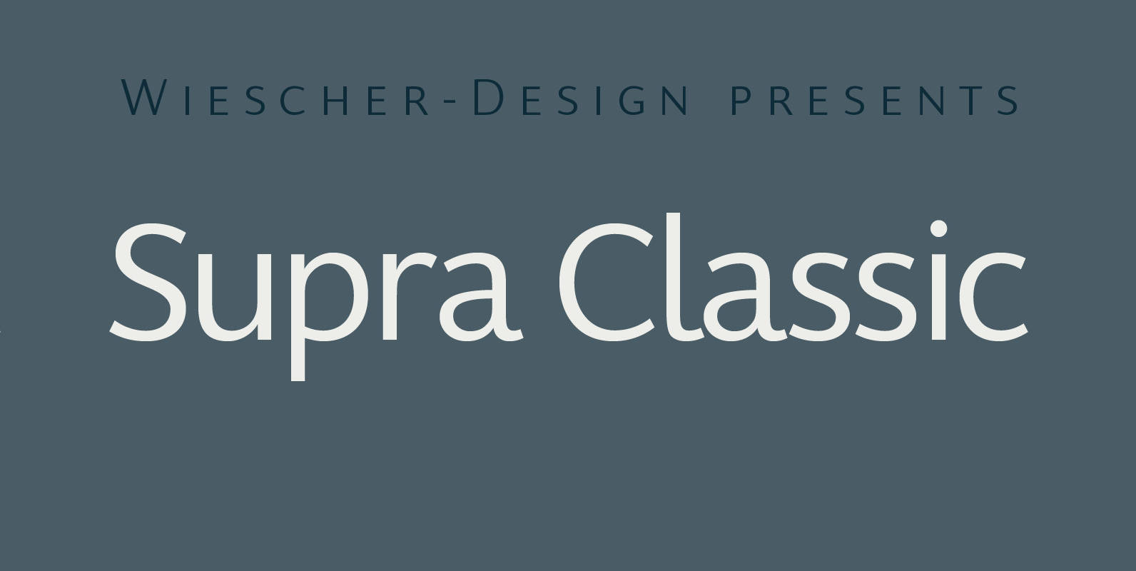
Supra Classic Font
“Supra Classic” designed by Gert Wiescher in 2014 – has 10 weights with corresponding italic cuts. The designs elegant contrast in the up- and downstrokes makes for better legibility and a pleasing personality. The dominant x-height with its high ascenders

Supra Condensed Font
“Supra Condensed” designed by Gert Wiescher in 2013 – is the condensed version to this new sans typeface family of eight weights with matching italics. The condensed version is designed for space-saving typography but with high legibility in mind. The
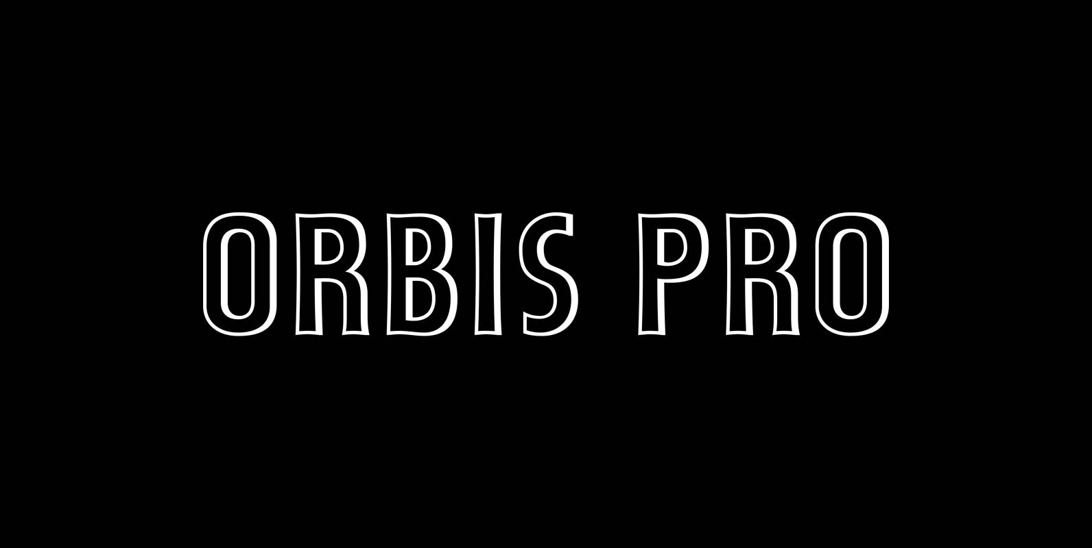
Orbis Pro Font
Walter Brudi’s elegant shadowed display font brought to life again and carefully extended with Baltic, Turkish and Central European character sets. Published by RMU TypedesignDownload Orbis Pro
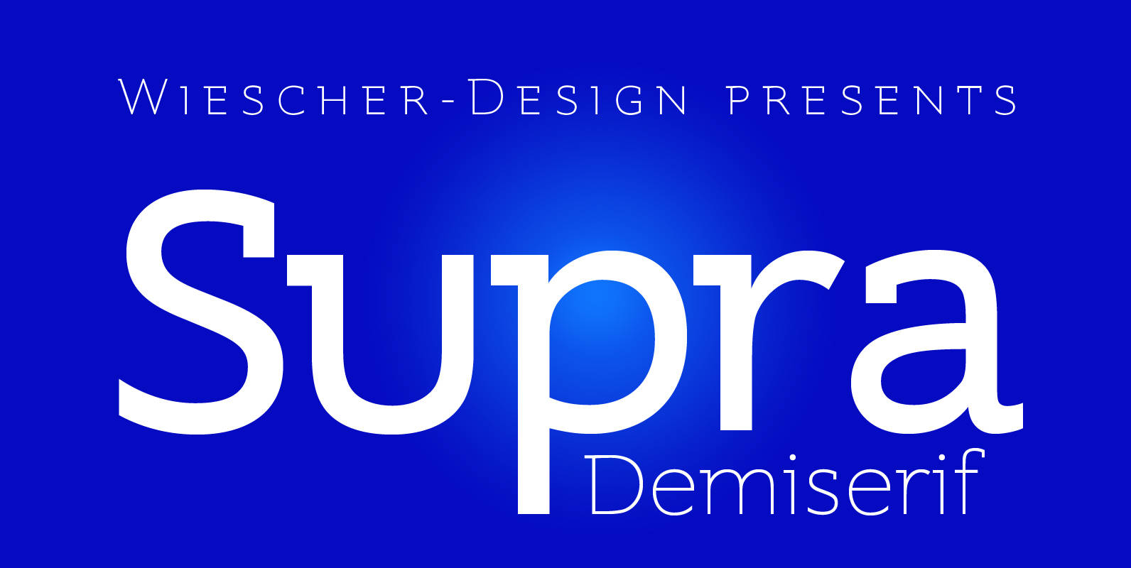
Supra Demiserif Font
“Supra Demiserif” is the demi serif addition to the Supra family. I am no fan of slab serif fonts, so I designed this one with half serifs, that makes the serifs less important. Then I found, that the italic does
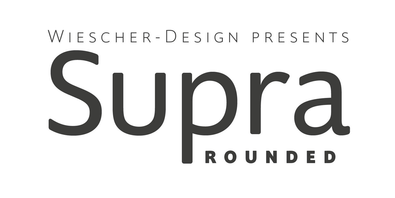
Supra Rounded Font
“Supra Rounded” is the newest addition to my big Supra family. It really rounds of the huge family with a friendly design, that makes it an excellent and elegant text-typeface. It is an OpenType family for professional typography with an
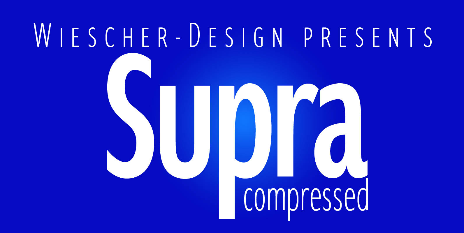
Supra Compressed Font
“Supra-compressed” designed by Gert Wiescher in 2013 – is the extreme version of this family. But despite it being very slim it is still – because of its openness – a very readable font. The light and normal weights and
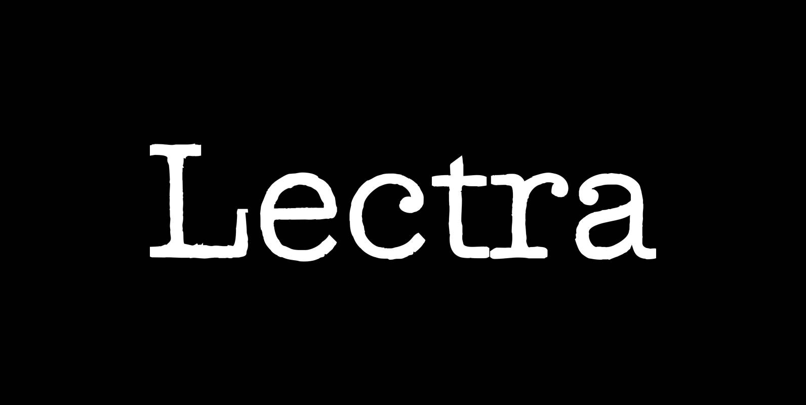
Lectra Font
“Lectra” is a typical typewriter-family with 5 normal cuts and 5 – not so typical for typewriter-fonts – swashes. Published by Wiescher DesignDownload Lectra
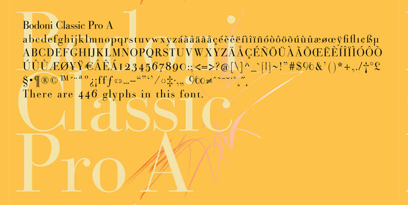
Bodoni Classic Pro Font
This is my new, completely worked over and fine-tuned Bodoni Classic for Europe (no Greek and Cyrillic). I have added a set of elegant Swashes (B) and 2 alternating uppercase swirly Initials (C) as well as two lowercase end-letters (D).
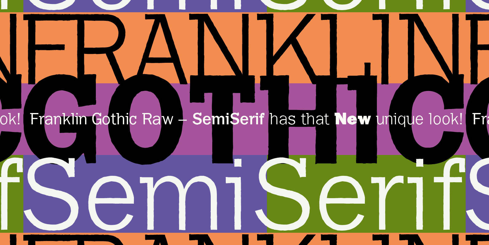
Franklin Gothic Raw Semi Serif Font
When drawing a new font, there is a time when the final form is found – almost – but the curves are not slick and clean yet, that’s what I call the “raw” form. Raw – no sweeteners added! In
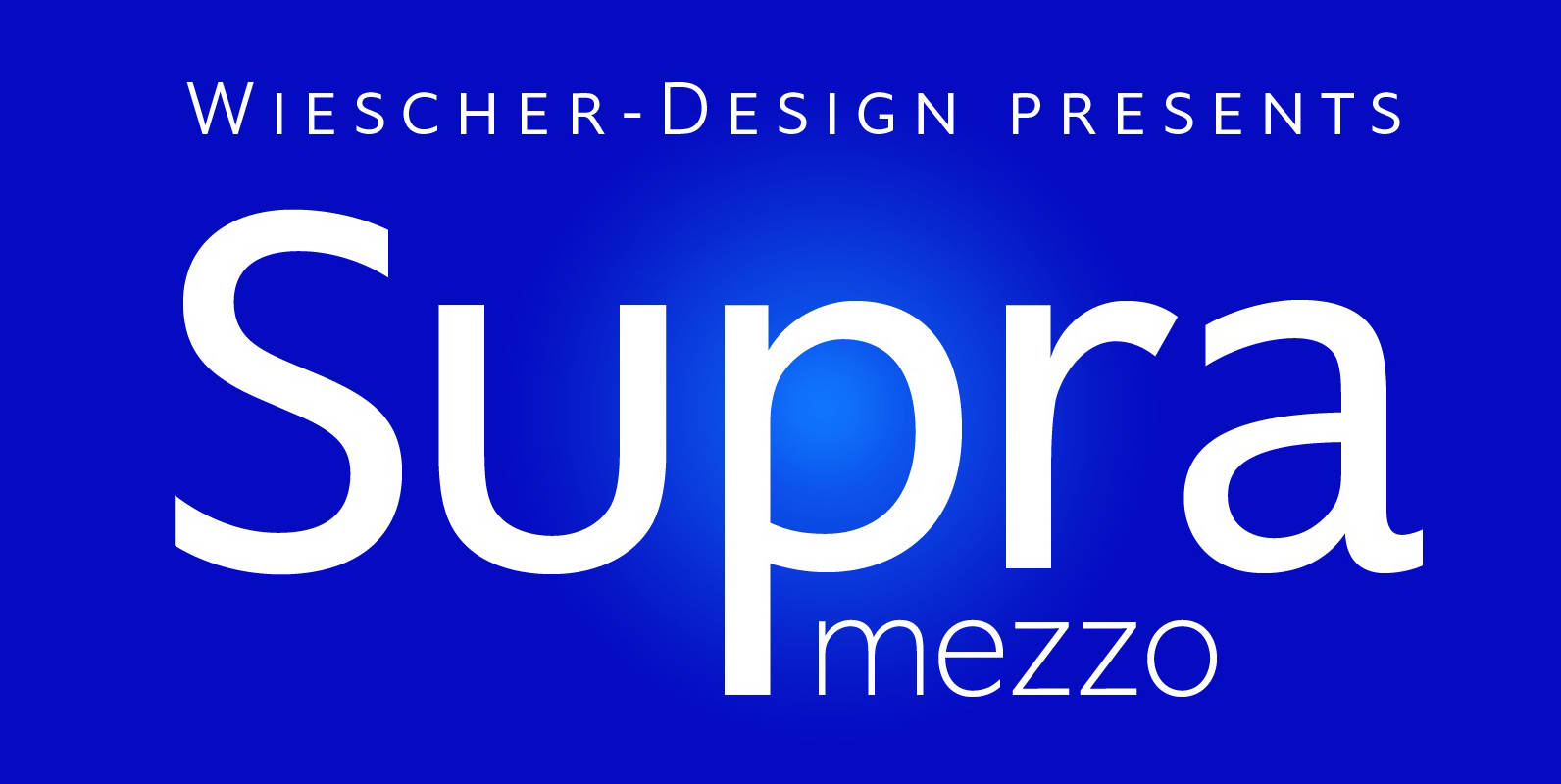
Supra Mezzo Font
Supra Mezzo designed by Gert Wiescher in 2012/13 – is an unusual addition to the Supra family, aweight in between the normal and the condensed width. This cut comes in very handy if you need to put lots of text

Franklin Gothic Hand Light Font
Franklin Gothic Hand Light is part of a series of hand-drawn fonts from way back in time – before computers changed the way we worked. When I was in advertising – before computers – a very time consuming part of

Supra Extended Font
Supra Extended – designed by Gert Wiescher in 2013 – is the extended version to this new sans typeface family of eight weights. The extended version is designed for sheer elegance and has no italics because they didn’t look nice
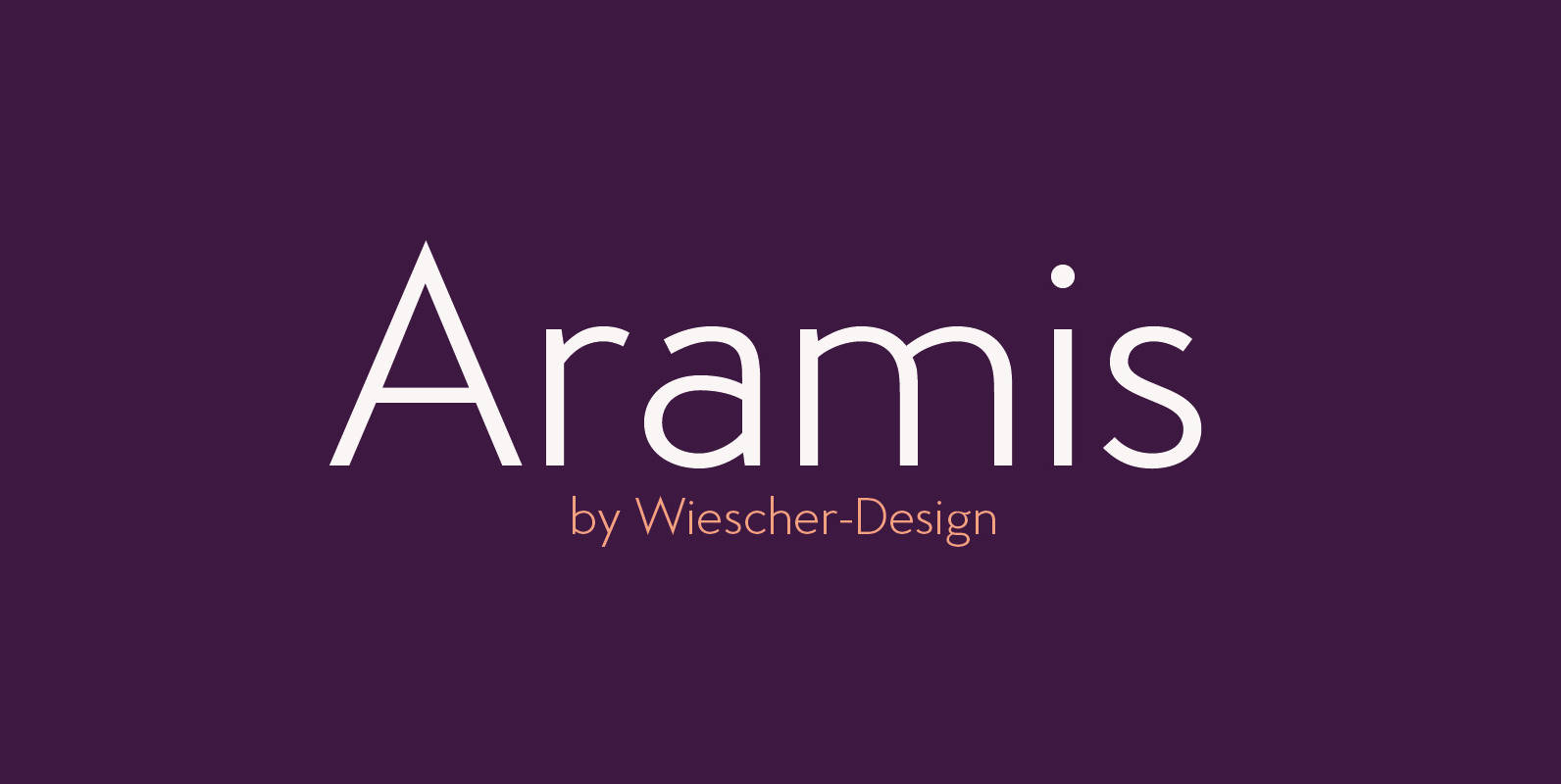
Aramis Font
“ARAMIS” is a new linear Sans with a French touch– designed by Gert Wiescher in 2014 and 2015 – has 7 weights with corresponding italic cuts. The small contrast in the linear Sans makes it not quite so linear and