Tag: legible
Anthro Font
Discover Anthro, a unique UI font with a tall x-height, angled terminals, and medium contrast, skillfully crafted by Samuel Oakes. This typeface masterfully blends Grotesque and Humanist styles, striking the perfect balance between legibility and personality. As a bonus, every
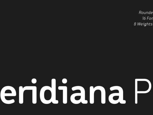
Meridiana Pro Font
The concept behind Meridiana Pro was to create an amalgamation between a rounded sans and a monospaced font in order to obtain an extensive and usable variable type-system. This typeface encapsulates a symmetrical and balanced rhythm due to the unique
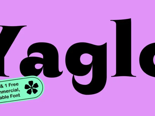
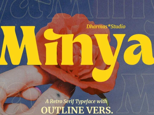
ZT Yaglo Font
ZT Yaglo is a dynamic and expressive display font, from the first impression you may have noticed that this font is a fishing rod-like concept, with a consistent rhythmic curve that gets sharper at the ends. The ZT Yaglo typeface
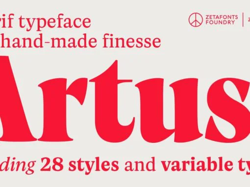
Artusi Font
Pellegrino Artusi was a celebrated Italian food writer, who is credited with the creation of one of the most influential cookbooks in the history of Italian cuisine. Taking inspiration from his legacy, Francesco Canovaro decided to work on a typographic
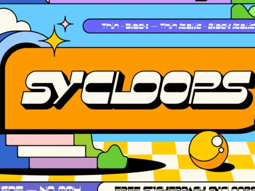
Sycloops Font
Sycloops is a retro font design published by Tegh.Co Published by Tegh.CoDownload Sycloops
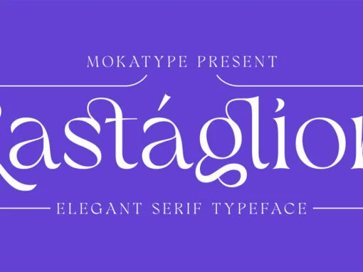
Rastaglion Font
Rastaglion is old-modern serif font with single weight only, it has been inspired by the modern classification of serif typeface in early 20th century. Rastaglion is designed to look very fluid and combined with some connected letters, which makes beauty
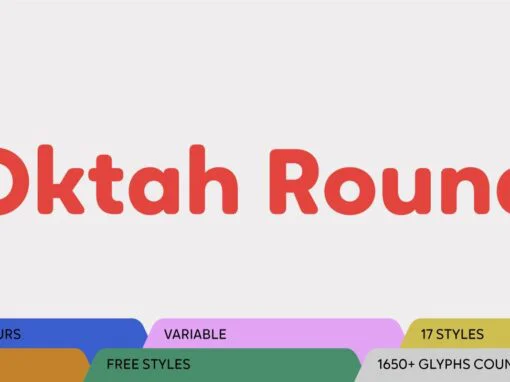
Oktah Round Font
Oktah Round is a rounded version of Oktah Neue. Oktah Round is soft and friendly, modern and warm. It’s a typeface that combines human touch with high functionality. Oktah Round comes equipped with 1600+ characters per font and is available
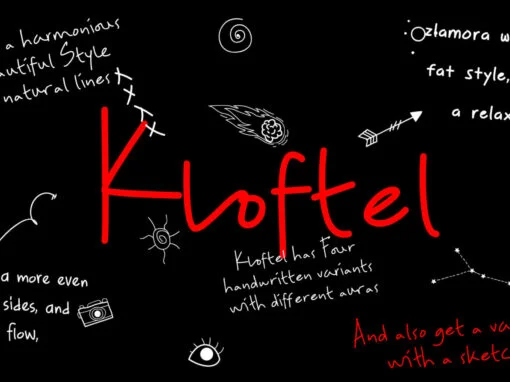
ZT Kloftel Font
ZT Kloftel has three variants of handwriting with different auras and also gets one variant of icons with a sketch style, this helps add depth to the art of handwriting. ZT Kloftel Stalle is a well-matched and Beautiful Style with
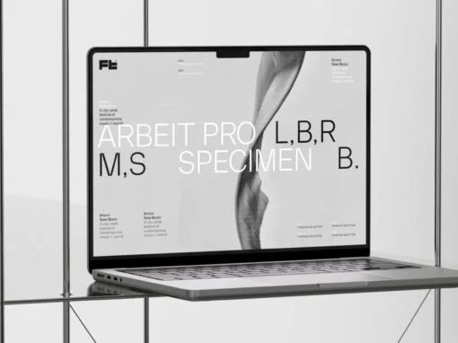
Arbeit Pro Font
Rediscover the acclaimed Neo Grotesk family with our remastered Arbeit – featuring perfect letterform balance and contrast, plus all-new alternates in each weight for an extra dose of style. Published by Samuel OakesDownload Arbeit Pro
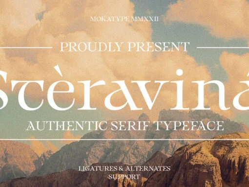
Steravina Font
Take your design to the next level with Steravina – an elegant serif font, crafted for modern sophistication. Inspired by FS Renaissance yet reimagined for today’s designs, it features vintage and traditional nuances seamlessly blended into a clean aesthetic that
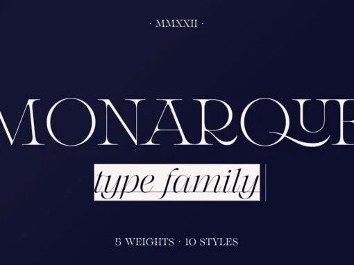
Monarque Font
Monarque is a serif font design published by The Paper Town Published by The Paper TownDownload Monarque

Rahere Slab Font
Part of the extended Rahere typeface family, Rahere Slab is a humanist slab serif (or Egyptian) in six weights from light to extra bold with corresponding italics. Rahere Slab – like its siblings Rahere Sans & Rahere Informal – features
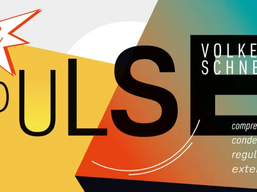
Pulse JP Font
Pulse JP is a constructivist text and display font that differs from comparable fonts due to its special sharpness and harmonious balance. Its technical and constructed form creates a somewhat artificial impression of special appeal. It is ideal for display
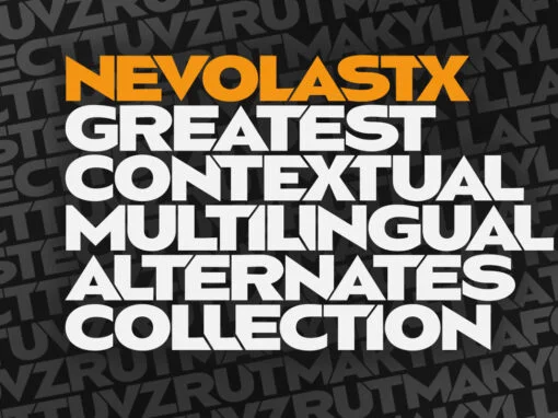
Nevolastx Font
Nevolastx is a tech font design published by Grzegorz Luksza Published by Grzegorz LukszaDownload Nevolastx
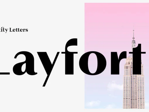
Layfort Font
What do you get when you cross Industrial Revolution with Art Déco? The raw force of steam-powered vessels with the panache of dashing streamliners? A sturdy industrial grotesque with a swanky stylized sans? We don’t know, but our Layfort is
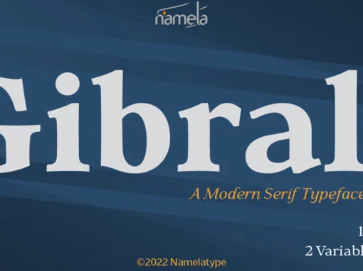
Gibralt Font
Gibralt inspired by Venetian style Typeface that appeared in the late 14th century, with some improvisation. Designed with high contrast. The stems are not completely straight, slightly narrow in the middle, combining rounded and right angle at the terminals and
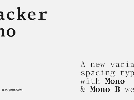
Blacker Mono Font
Blacker Mono was developed out of a brief by Isabella Ahmadzadeh, by Cosimo Lorenzo Pancini and Francesco Canovaro for the editorial project “A beautiful mistake” by OFFF Tlv in 2022. It is a monospaced version of our typeface Blacker, bringing