Tag: legible

Gauthier Next FY Font
Our famous Gauthier FY is now available with an extended character set, including small caps! Inspired by Renaissance typefaces, Gauthier FY is a contemporary old-style serif typeface with big x-heights and quite small caps. Accompanied by a lovely and detailed
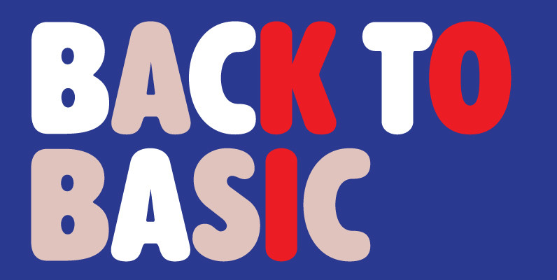
Alphabet Soup Pro Font
Designed by Steve Jackaman. In the early 1980’s, Steve worked at Typographic House in Boston, Massachusetts. At the time, ‘Typo’ House, as it was affectionately known, was the largest type house in New England. This font was designed and produced
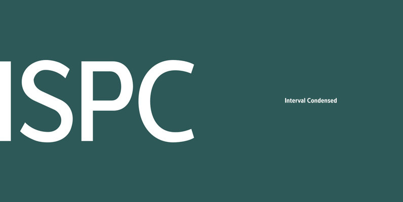
Interval Sans Pro Condensed Font
The new Interval Sans Pro is a pratical choice when you need a contemporary sans serif for text typography, headlines, signage or brands creation. This new version has many more OT features like small caps, ligatures, stylistic set, localized form.

URW Grotesk Font
URW Grotesk was designed exclusively for URW by Prof. Hermann Zapf in 1985. At the same time, Zapf designed URW Antiqua to go with URW Grotesk. At that time, we were working with a large German publishing house (Axel Springer)
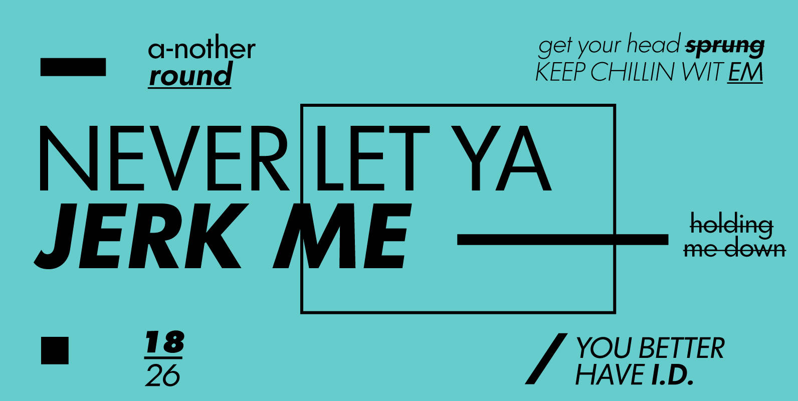
Graphicus DT Font
Graphicus DT is a sans-serif font design, published by DTP Types Limited. Published by DTP Types LimitedDownload Graphicus DT

Gilman Sans Font
Gilman Sans is the family member of Gilman, the serif that it was derived from. The idea for Gilman started simple enough, a serif typeface that works well for large amounts of text. However, after many struggles creating a quality
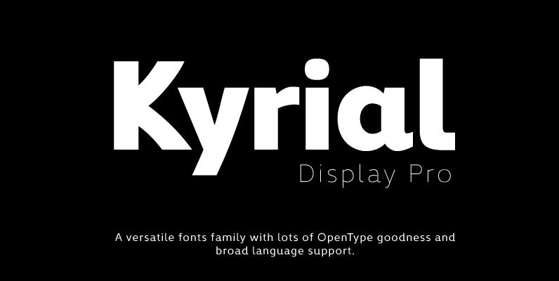
Kyrial Display Pro Font
Designed in 2011 by Olivier Gourvat, this font family has generous proportions with a range of weights make it a versatile family for print and web design work. Kyrial Display Pro is also a pratical typographic choice to express strength,
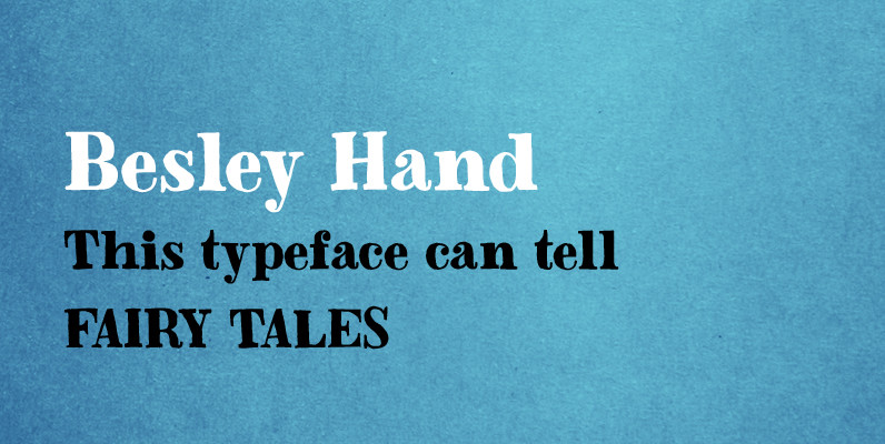
Besley Hand Font
A funny childish handwritten font, with a spirit. This typeface can tell fairy tales. Besley Hand is a slab serif that goes well with the sans serif Trango. Published by Juraj ChrastinaDownload Besley Hand
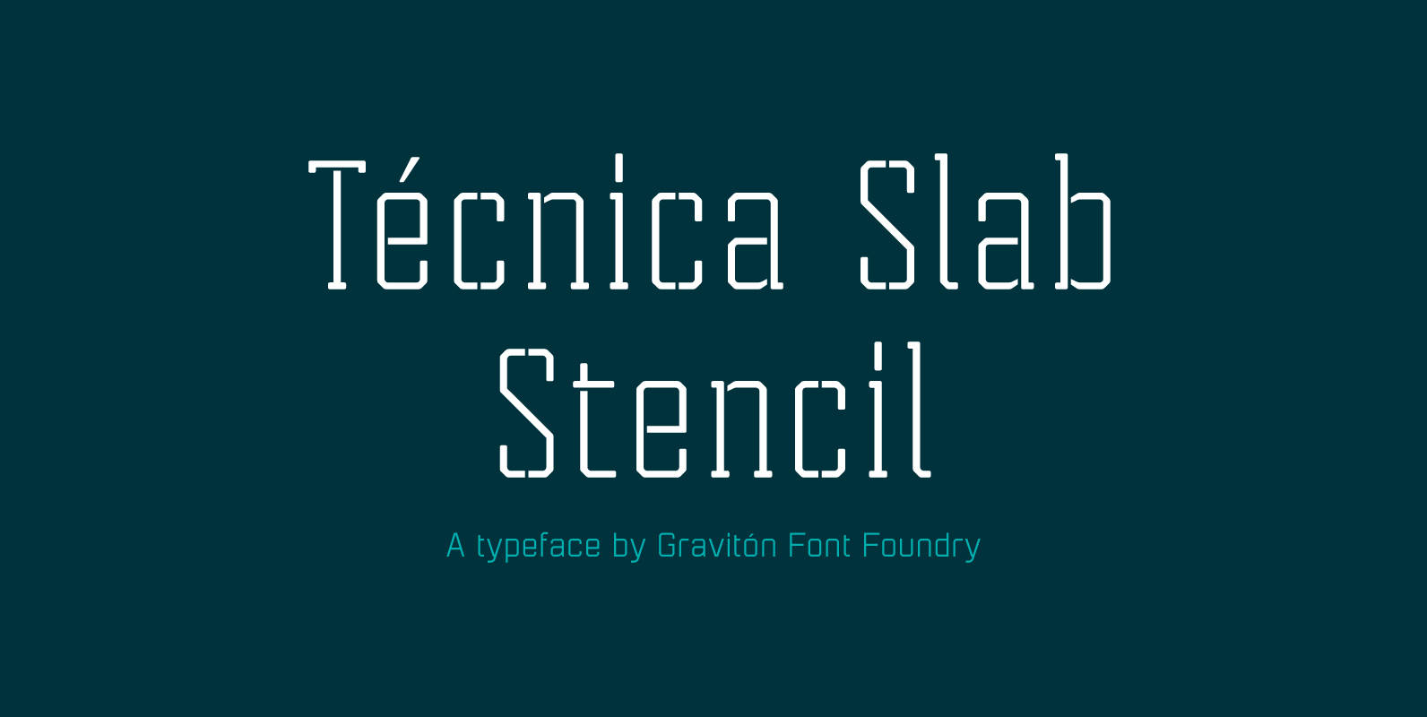
Tecnica Slab Stencil Font
Tecnica Slab Stencil font family is the stencil version of Tecnica Slab font family, it has been designed for Graviton Font Foundry by Pablo Balcells in 2014. Tecnica Slab Stencil consists of 8 styles. The 4 “Stencil 1” styles contain
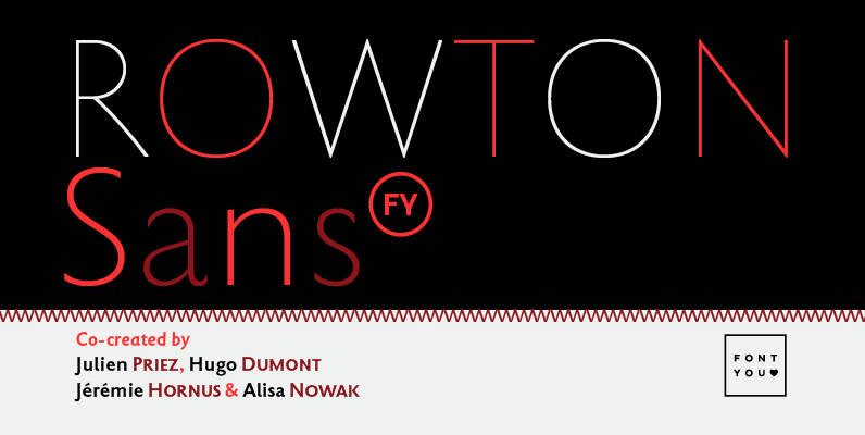
Rowton FY Font
Rowton FY digs its roots in Eric Gill’s views on typography in his book “An essay on Typography”. This typeface has the very British feel of the 20th century. Taking as inspiration the calligraphic illustrations of the book, Julien Priez,
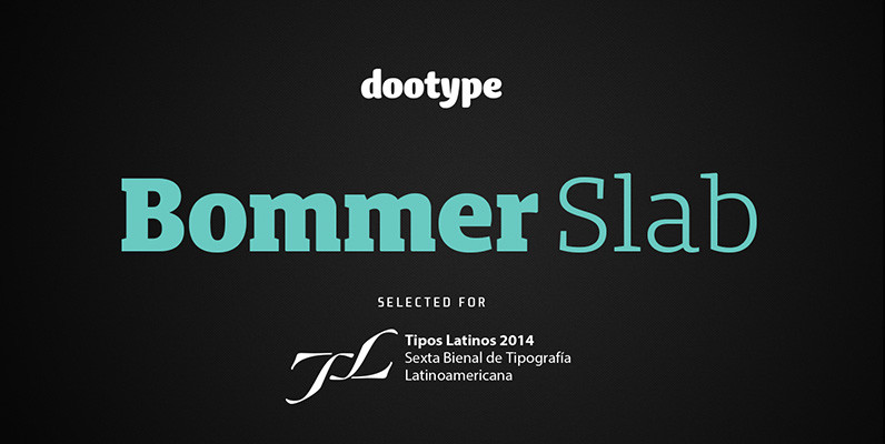
Bommer Slab Font
Bommer project started in January of 2014 and I am happy to announce the first family – Bommer Slab – is now ready for release. This family includes 14 weights – been seven uprights and seven italics. This font has
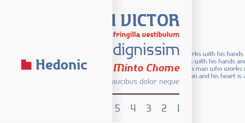
P22 Hedonic Font
Hedonic has just a hint of a slab serif and even that is used so sparingly that it almost feels like a sans serif font. Its design does appear to be painfully simple, but there are many interesting features including
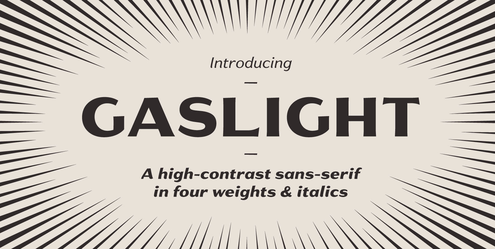
Gaslight Font
Gaslight is the result of a desire to create a sans-serif rich with humanistic charm and lyrical curves, to provide some relief from the highly rational, low-contrast faces we’re surrounded by at every turn. Gaslight can lend an old-fashioned elegance
