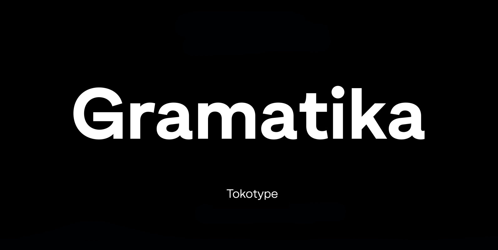
Gramatika Font
Gramatika is a sans serif font design published by Tokotype Published by TokotypeDownload Gramatika
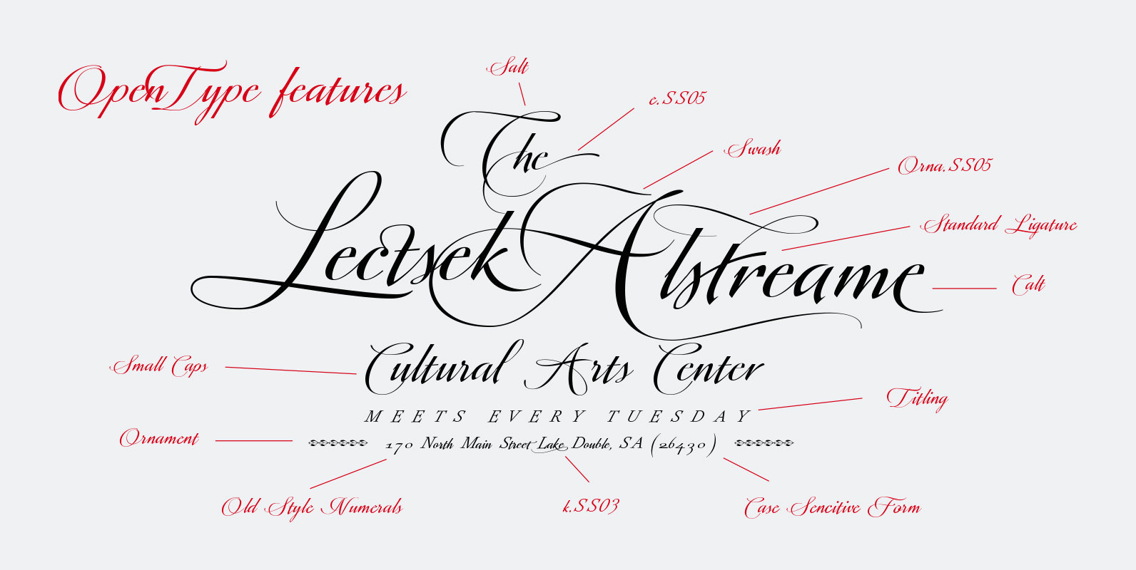
Valentia is an elegant casual and readable font, this new script typeface is based on Copperplate style. Valentia has been drawn with spontaneous strokes and slightly contrasting thicknesses. The capital letters are full of expressiveness, with very dynamic “ductus” and
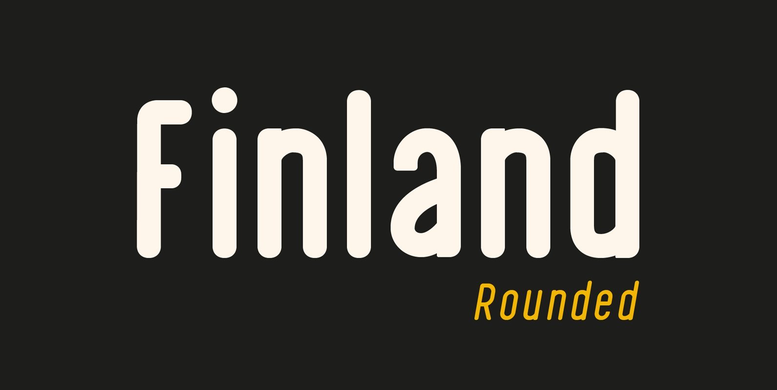
Finland Rounded Font Family has been crafted from scratch with a structural logic of its own: a fusion of pure geometry and optical balance. Finland Rounded font family comes with 6 Styles, Regular, Italic, Thin, Thin Italic, Bold, Bold Italic.
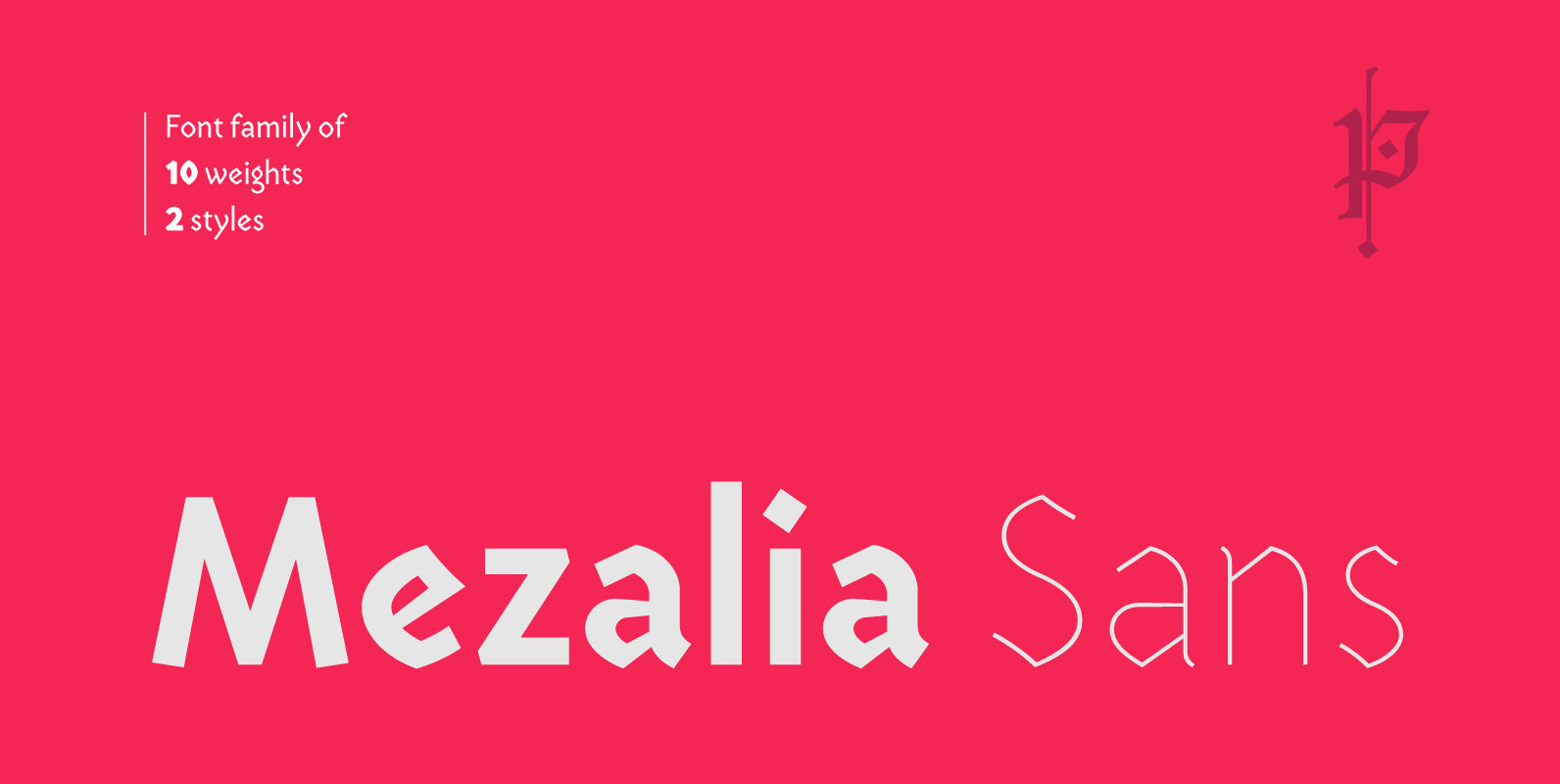
Mezalia Sans is a logical continuation of the Mezalia family. Its shapes are based on medieval calligraphic style: the Bastarda. This time the evolution is taken a step further, as these classic shapes are merged with the straightforwardness of a
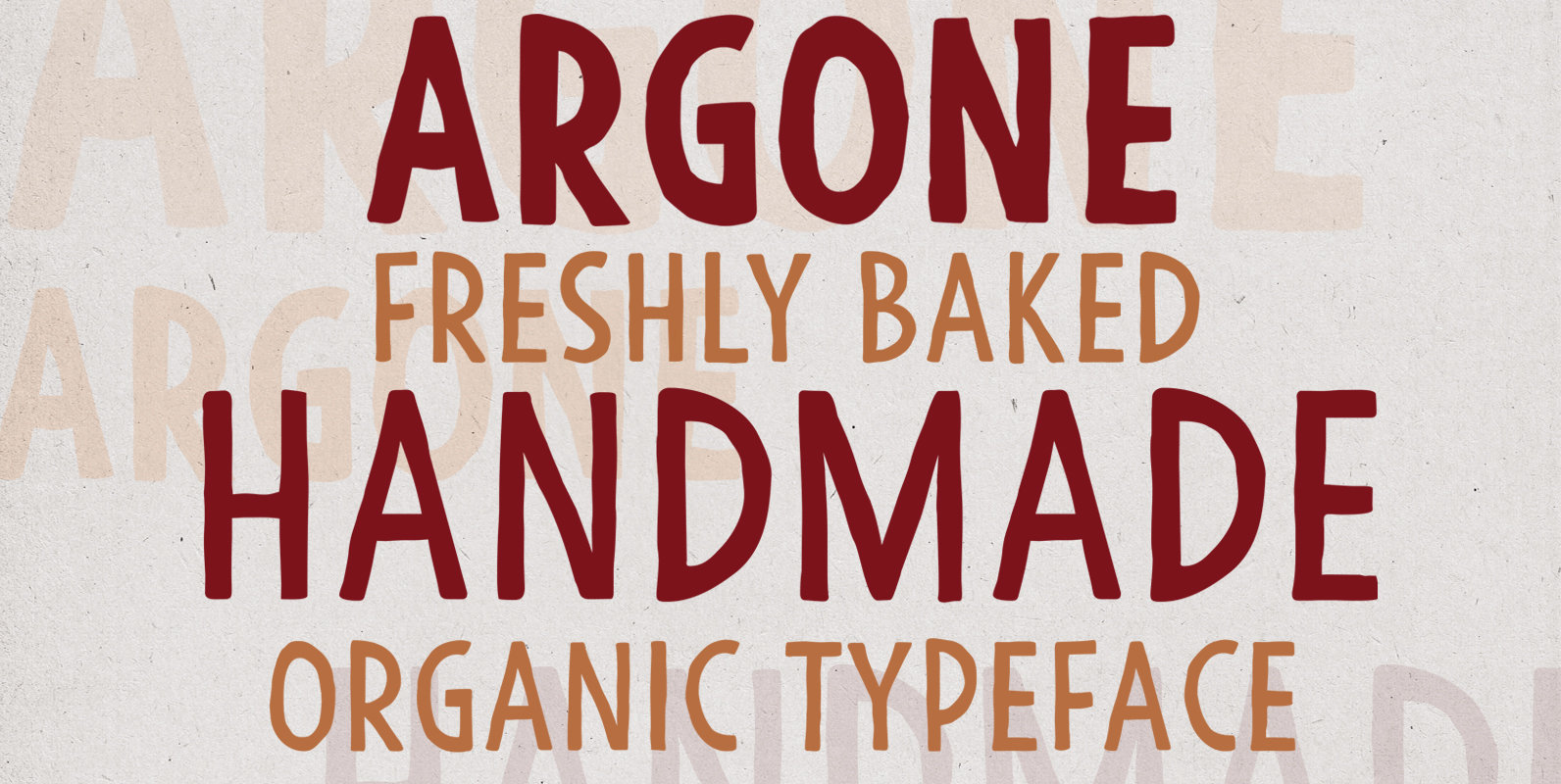
Argone is a handmade, organic, display family and comes in four weights. Published by Deepak Singh DograDownload Argone
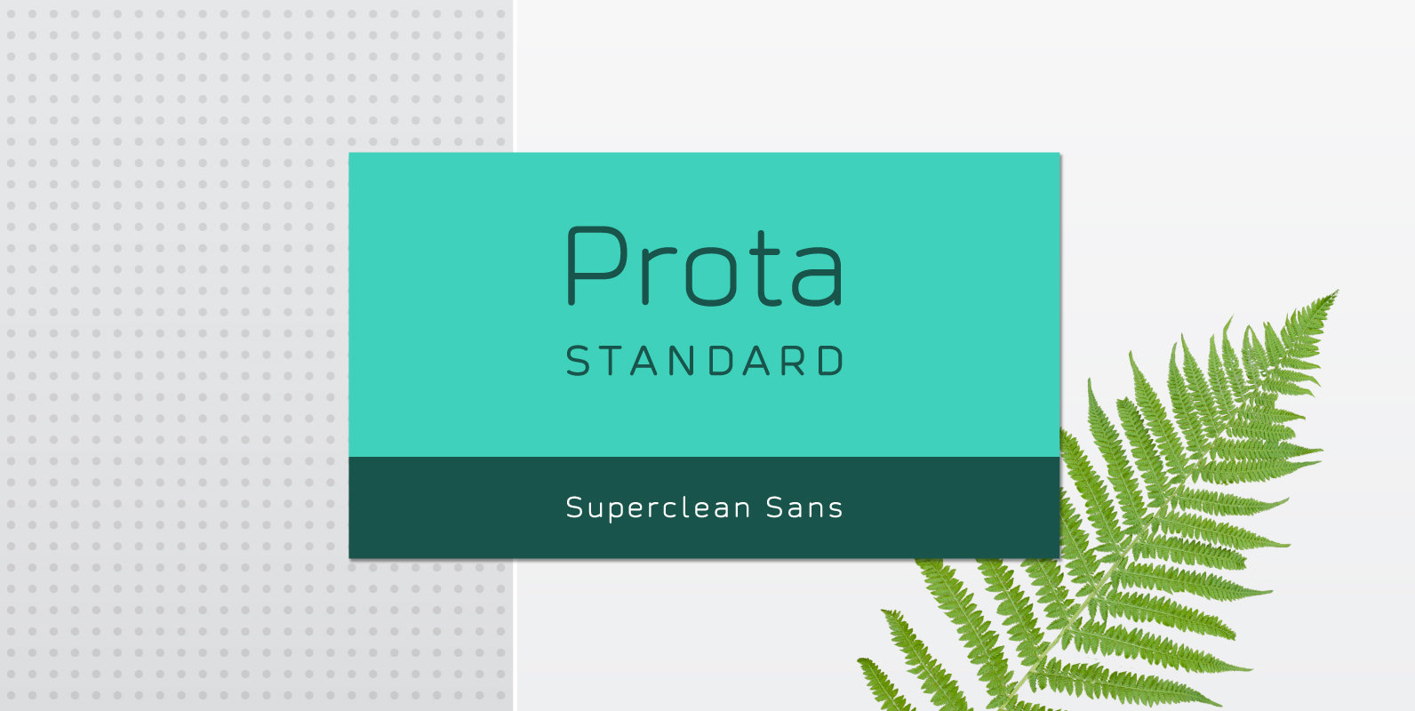
Prota Standard is a new super-clean sans serif font. Using it, you will instantly bring ultramodern and noble-tech look to your artwork (the one like Apple and Tesla have). Do you need a font which will present your business as
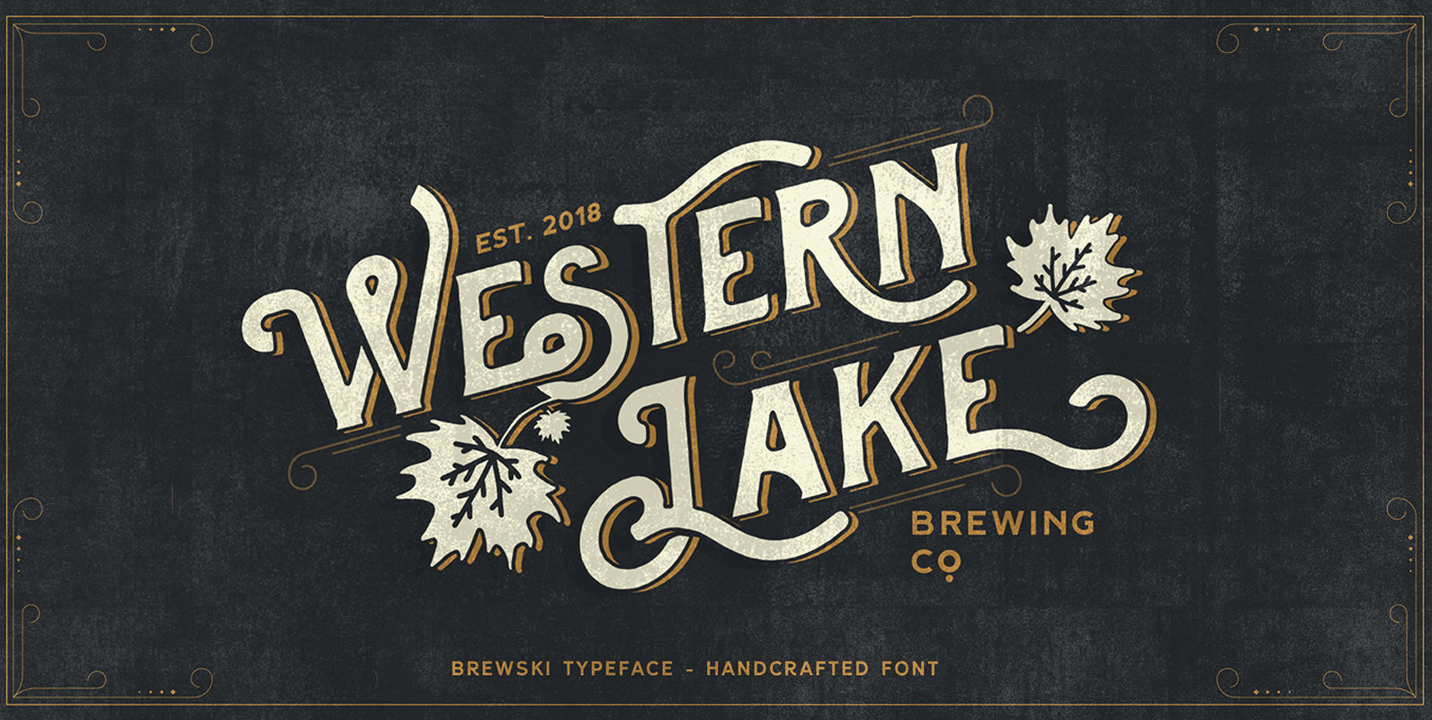
The Brewski Original is another display serif font with hand drawn Vintage style, and a touch of ornament makes this font look stylist. Inspired by vintage Brewery packaging and Beer advertising from the early 20th century. It is perfect for
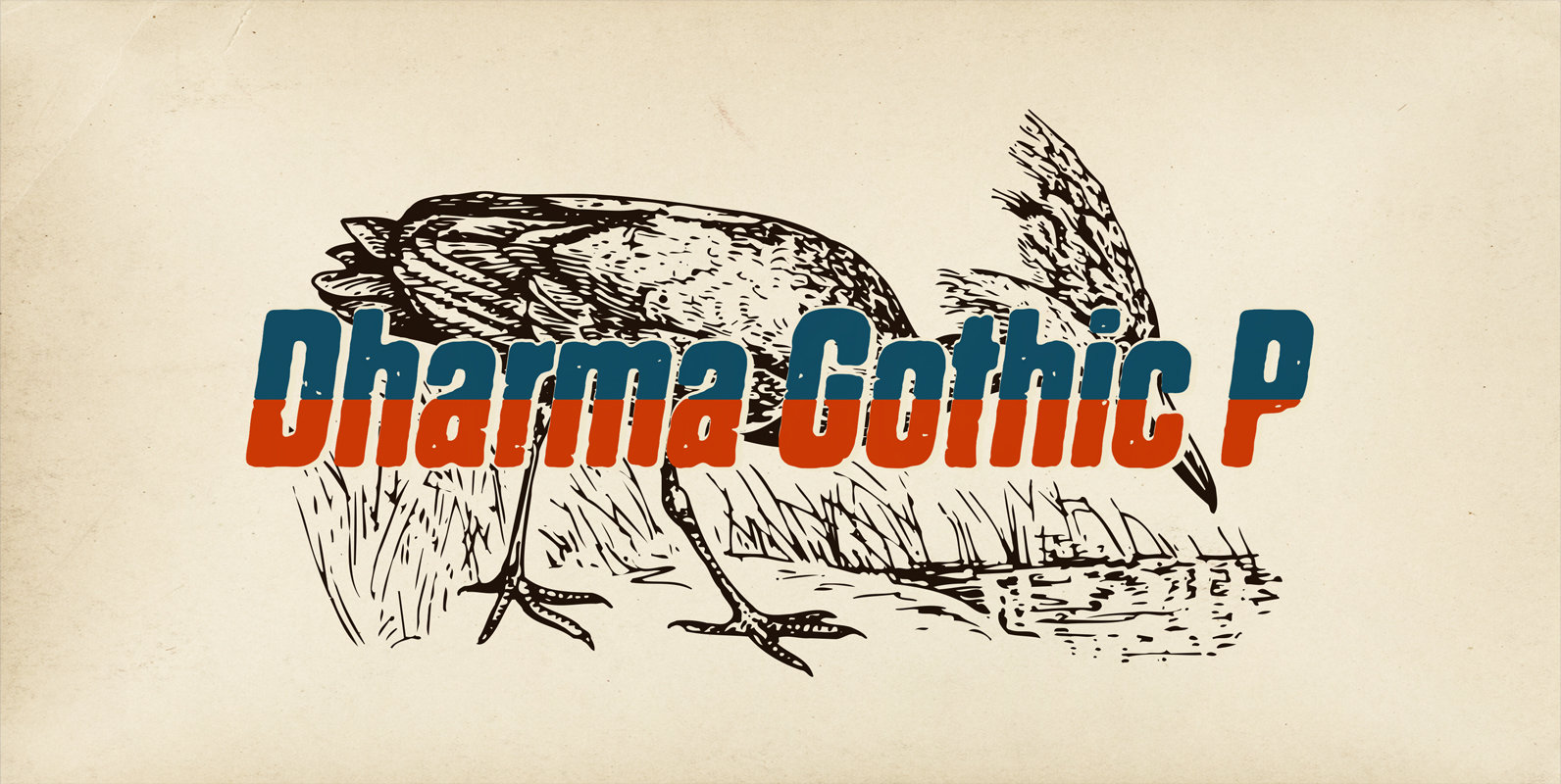
Dharma Gothic P font family is designed based on Dharma Gothic and a distressed offshoot from the original. The glyphs that damaged by printing the original had been tweaked by hand work with great care. This family contains basic Roman,
Slightly pointed apex in some glyphs, 27 styles, thin to black, oblique and italics, closed apertures and simply are the characteristics of this typefaces. The cedilla mark are different than ‘traditional form’, help to unify the concept overall. G, L,
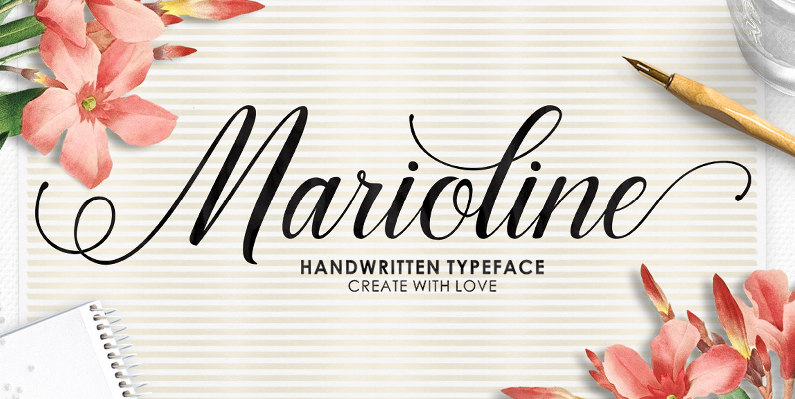
Marioline is a script font design published by Teuku Zulfikar Published by Teuku ZulfikarDownload Marioline
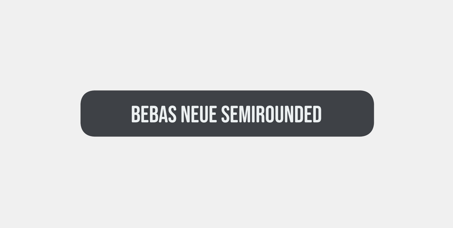
Bebas Neue SemiRounded is Bebas Neue with rounded corners. As you know, Bebas Neue is the most widely used free font recently. The basic theory and proportion are same as Bebas Neue but rounded shape gives a warm, soft and
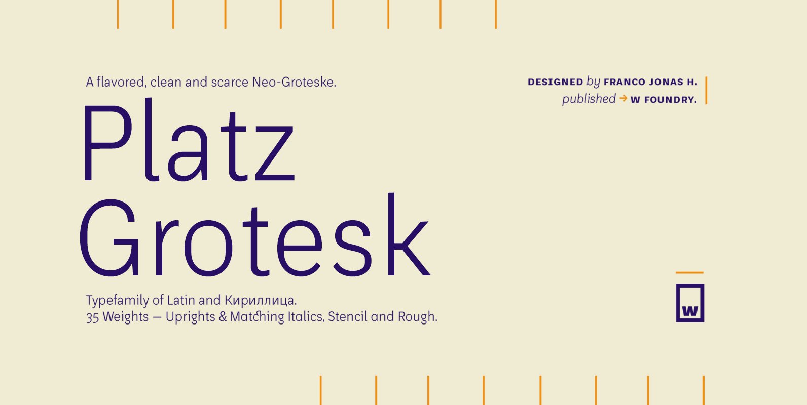
Platz Grotesk has been designed parallel within the neogrotesque universe of typefaces and is inspired by humanist proportions and humanist-grotesk features. Firstly, this hybrid has a smaller x height, thus it possesses wider typeface whites in order to be legible
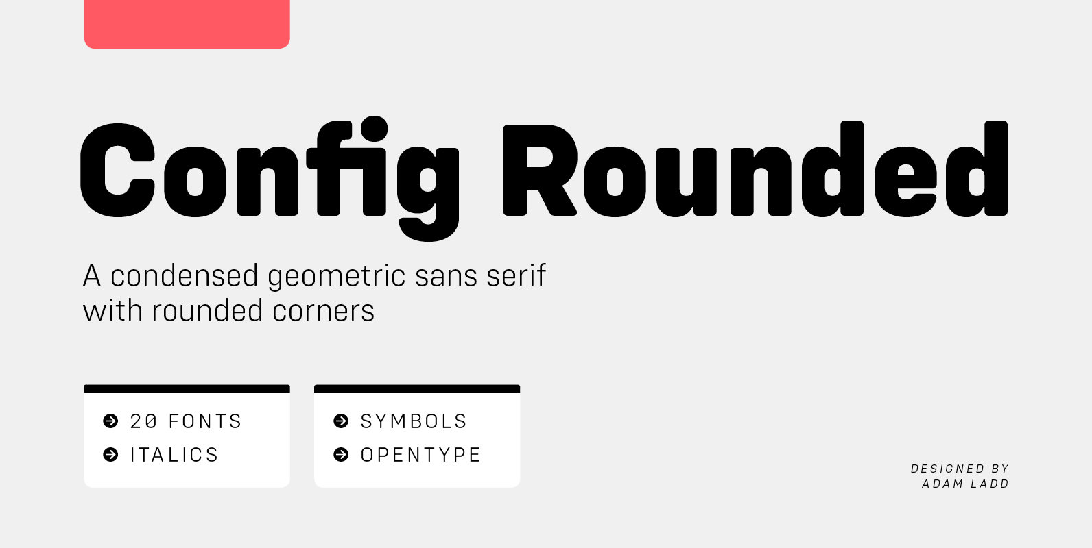
Config Rounded is a condensed geometric sans serif with rounded corners. A sibling to Config, this typeface was influenced by geometric sans serifs with circular forms on the tops and bottoms of characters, but the proportions have been condensed by
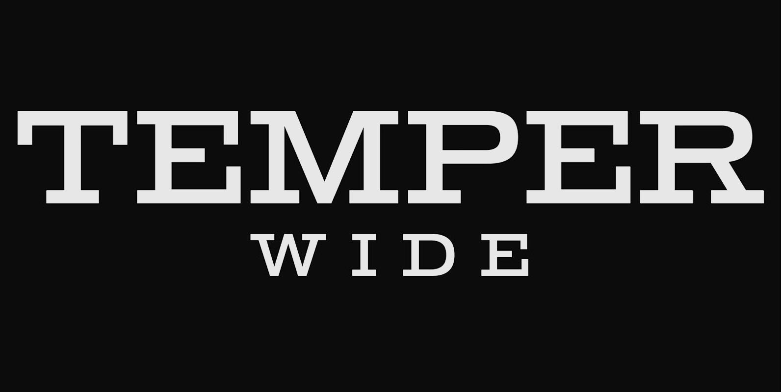
Temper Wide was designed in 2018 by type designer Jeschke in Berlin. The font consists of many cuts from light to bold and is formally based on its predecessor, Sequel 100. A characteristic feature of the Temper Wide is the
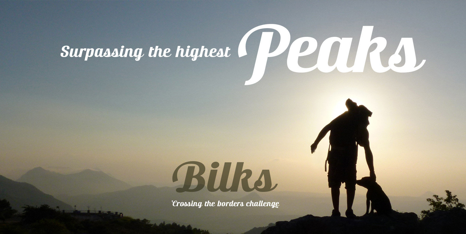
The most notable characteristic of this typeface is that it has a compact and regular shape that is slightly condensed but fluidly connected. Its glyphs emulate the look of handwritten, inked characters. Their exuberant graphic strokes and sharp edges maintain
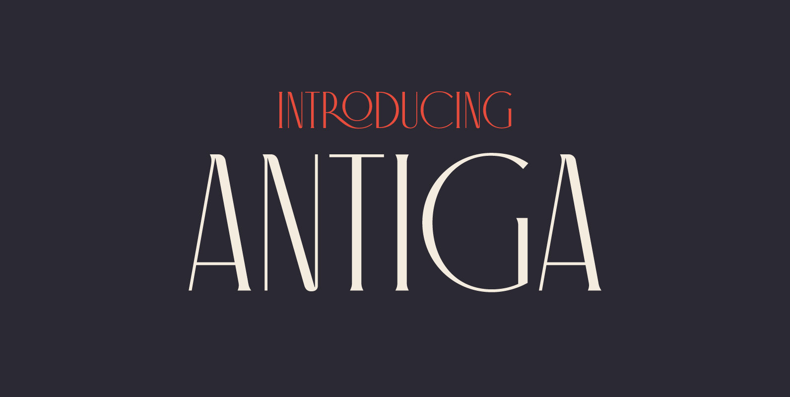
What happens when Roman and Art Nouveau heritage get together? Antiga happens. Combining an old style typeface with an elegant and modern touch, Antiga is ideal for magazines and newspaper headlines, or even book covers! With a delightful and versatile
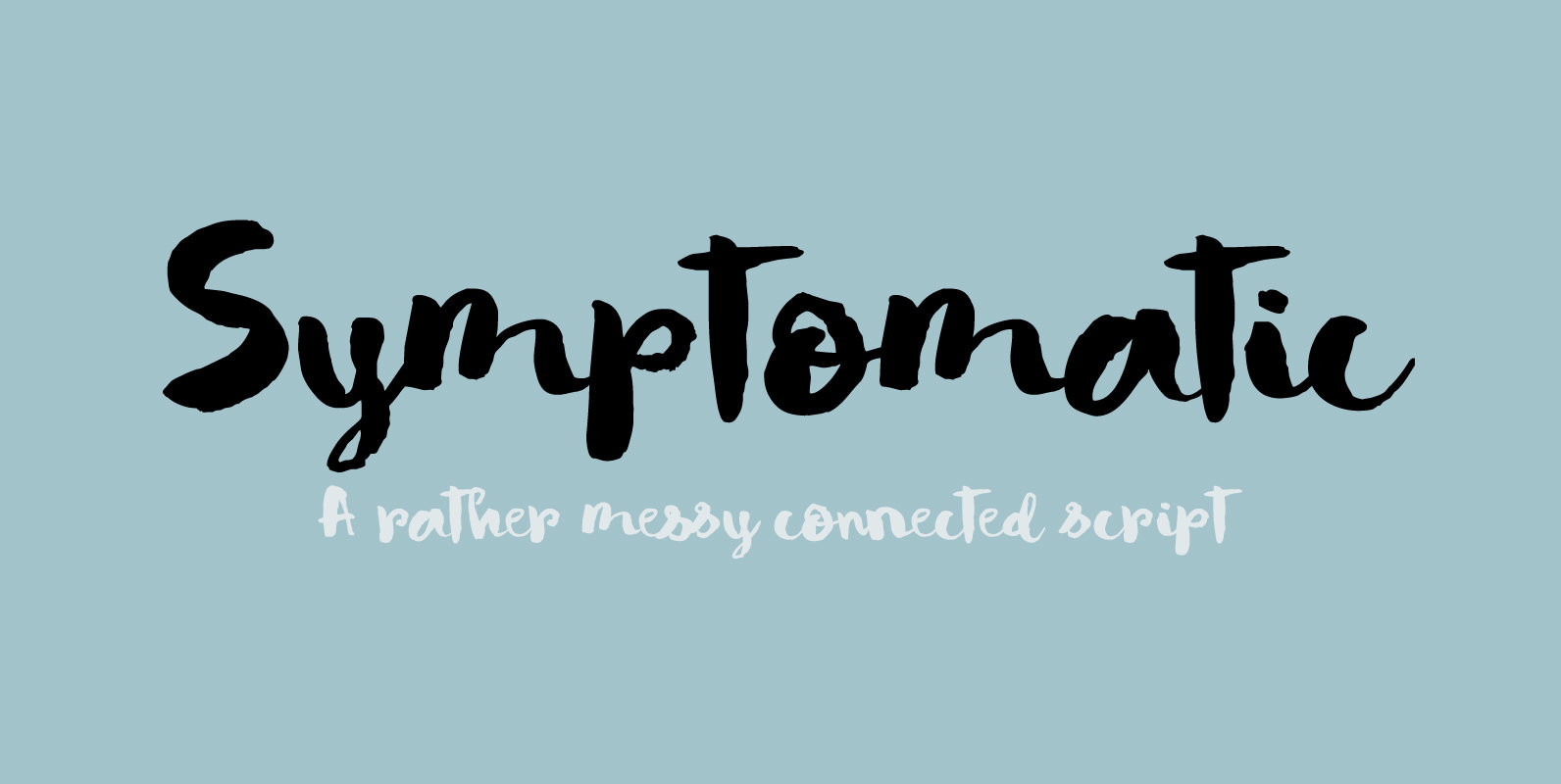
No, rest assured – I am not ill. I just liked the letter combination of Symptomatic! Symptomatic is a messy connected brush script. Use if for your book titles, posters and product packaging. Comes with double letter ligatures and a