Tag: legible
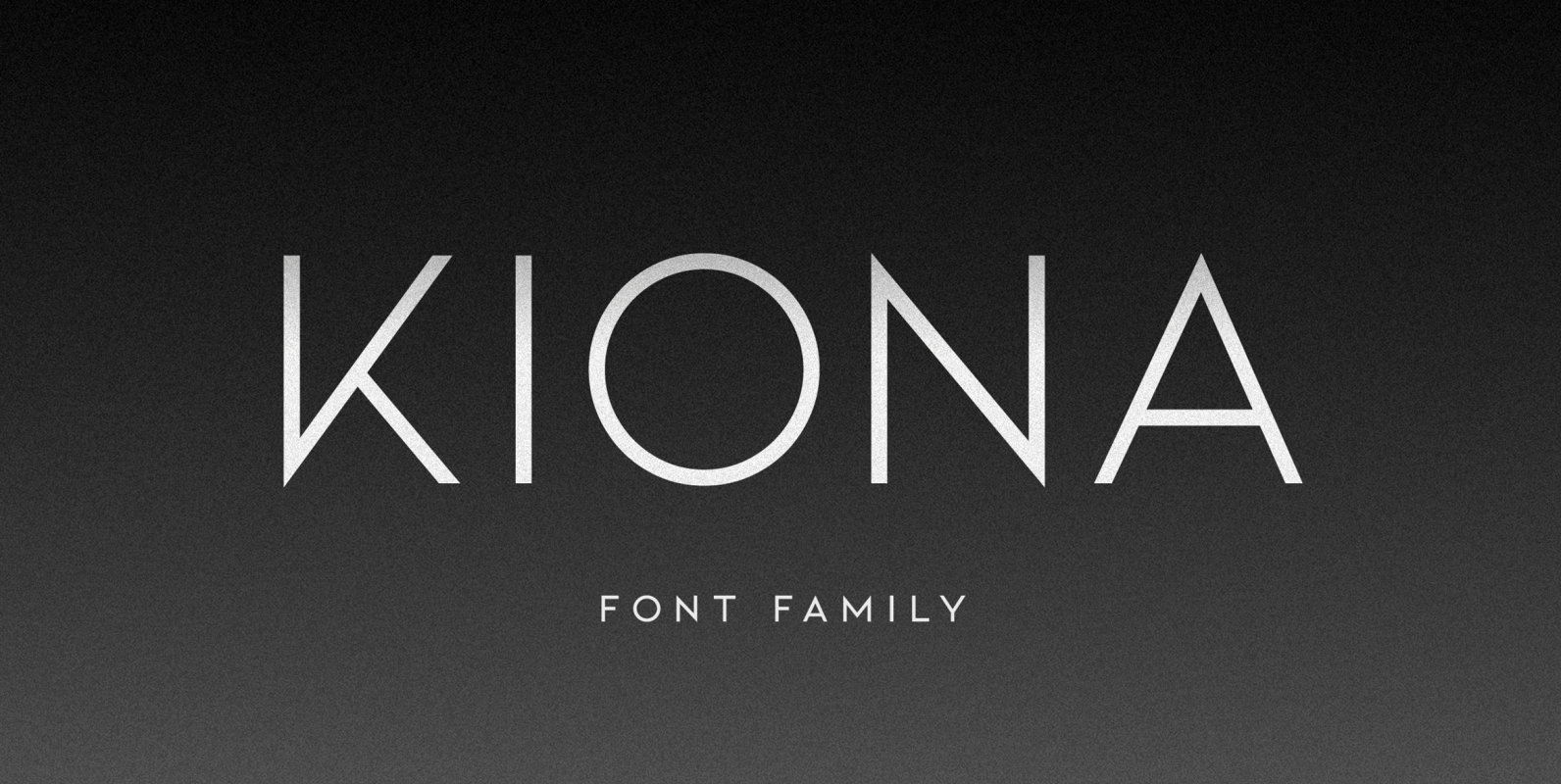
Kiona Font
KIONA is simple but significant, and defined by its crisp edges and modern touches. It is designed for optimal legibility. An all caps sans-serif, KIONA makes a statement without making a scene. Four weights, four very different personalities. KIONA Bold.
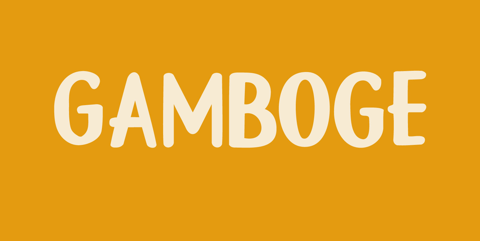
Gamboge Font
Gamboge is a deep saffron to mustard yellow pigment which is extracted from a tree. Its name comes from gambogium, the latin word for the pigment. Gambogia font is a beautiful all caps typeface with a pre-war feeling to it.
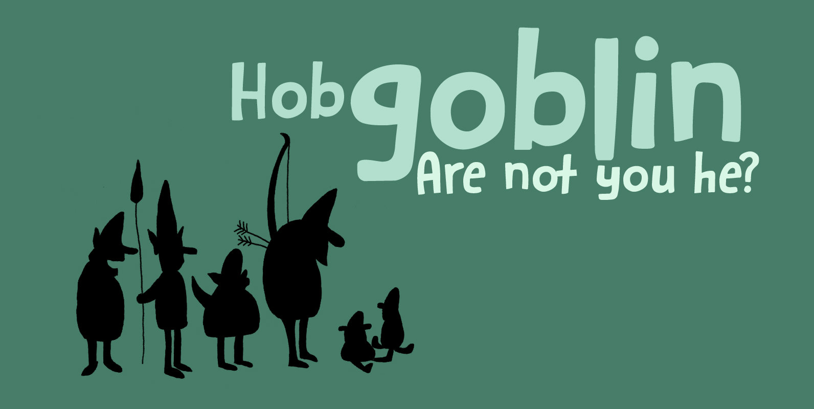
Hobgoblin Font
Hobgoblin is a cute and happy little font. It would be ideal for children’s books, games and apps. Hobgoblin come with mischievous glyphs and a pot-o-gold worth of diacritics. Published by HanodedDownload Hobgoblin
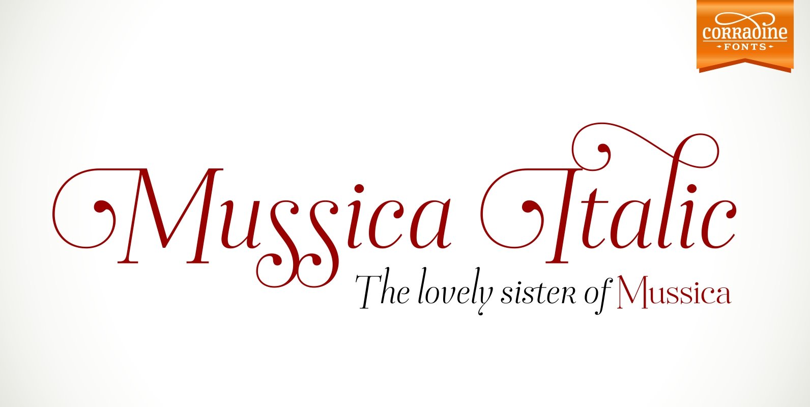
Mussica Italic Font
In 2009, Corradine Fonts released one of its most successful projects: Mussica, an experimental and hybrid typeface that explore the exaggeration of ascenders and descenders in a high contrast style. Now, around eight years later, we are proud to introduce
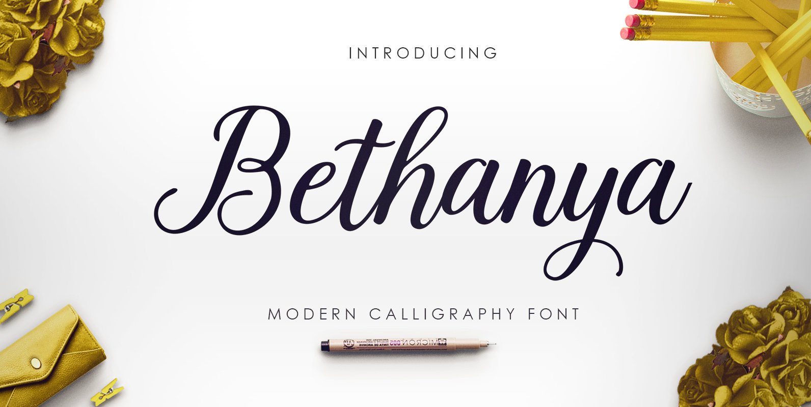
Bethanya Font
Bethanya is a script font design published by Megatype Published by MegatypeDownload Bethanya
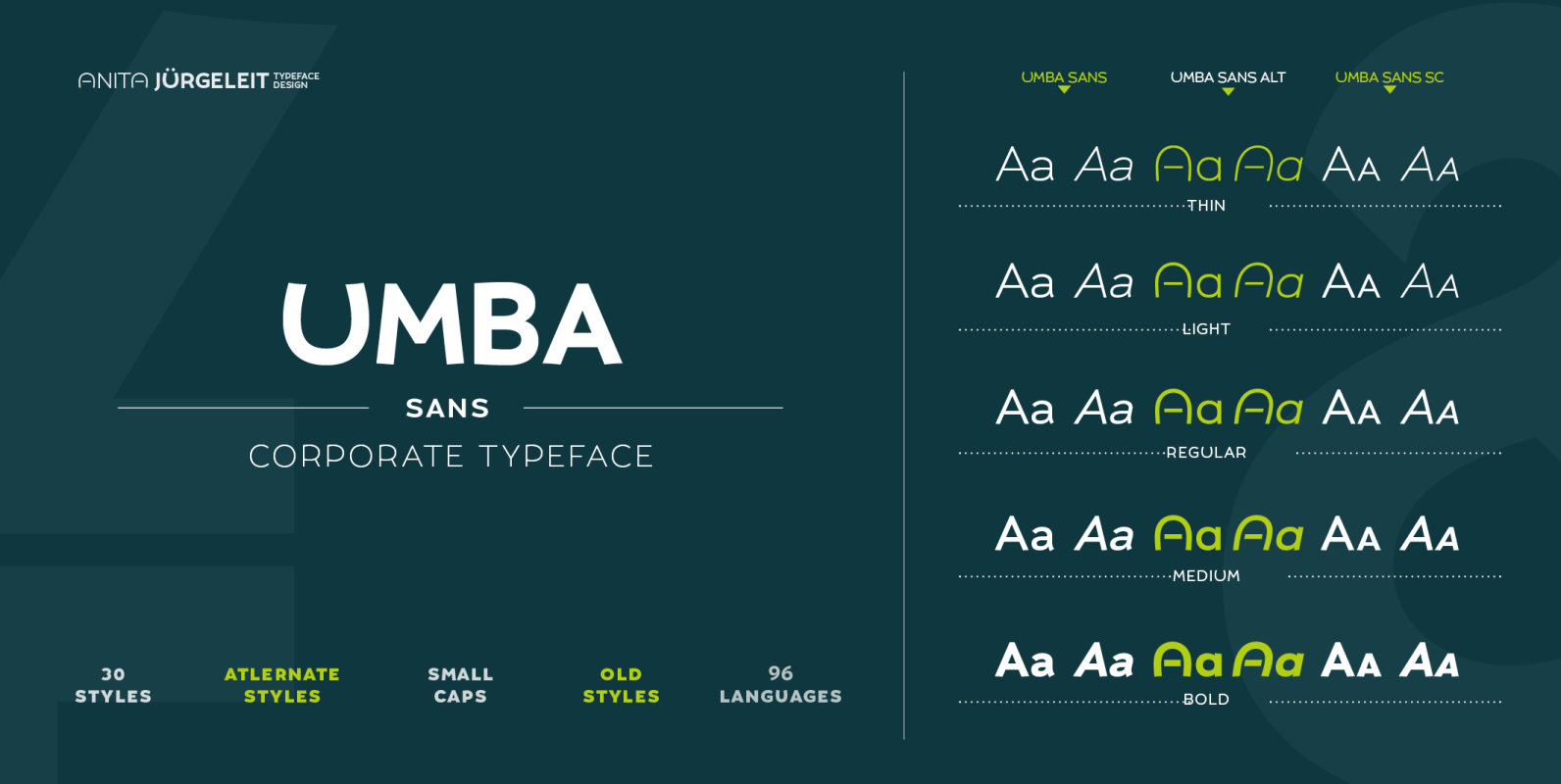
Umba Sans Font
Umba Sans is a contemporary typeface designed by Anita Jürgeleit. The undulate shaped curves create a new highly aesthetic appeal in an unexpected manner. Therefor Umba Sans fulfills your corporate identity needs as well as your editorial demands. 30 styles

Douceur Font
Douceur (pleasantness in French) is an all caps, serif typeface with a flourish. It was created by hand in one go: no sketches, no try-outs. The font comes in two styles: regular (outlined) and black. Due to style naming issues,
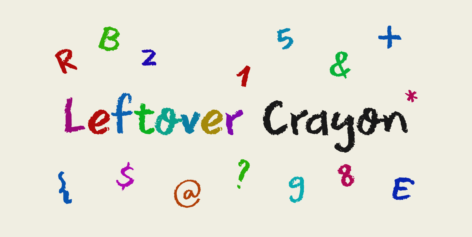
Leftover Crayon Font
My kids have a tin box filled with crayon and pencil leftovers: bits and pieces that have fallen or broken off, but are still good enough to use. For me it is a treasure trove, as I often find a

Sprout Font
Sprout is a low-contrast sans serif, slightly condensed for economy of space, and complete with 6 weights in Roman and Italic. It has open apertures and a generous x-height for clarity of reading. It also comes with a weight balanced
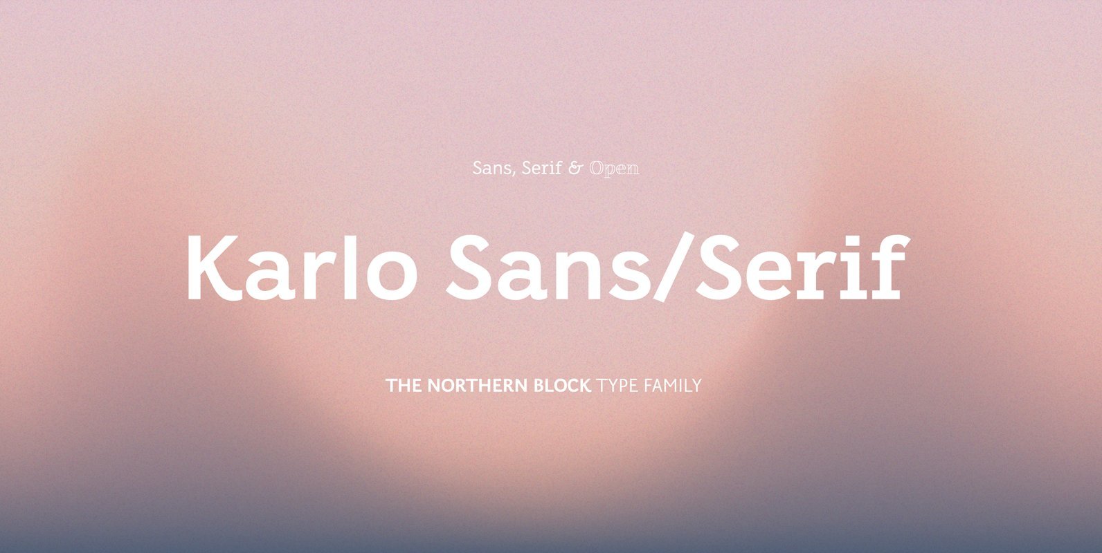
Karlo Font
Karlo is a super family of several branches, originating in the same lightweight skeleton. The lightweights are based on a pen of an even stroke-width. Inspired by the writings of calligrapher Edward Johnston, the family moves on in two directions
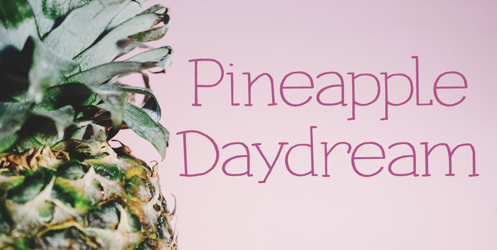
Pineapple Daydream Font
I bought a pineapple the other day, because my kids really like pineapples. Ok, ok, it may not sound like something special to you – but keep in mind that pineapples in Holland are an expensive fruit. We mostly get
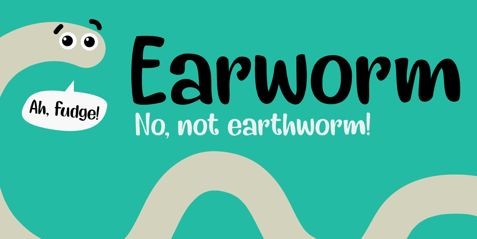
Earworm Font
An ‘Earworm’ is a catchy tune that keeps repeating itself in your head. I didn’t know this (in Holland (where I’m from), earworm (oorwurm) means earwig – you know, the animal). Earworm is a happy handmade font. It’s a little
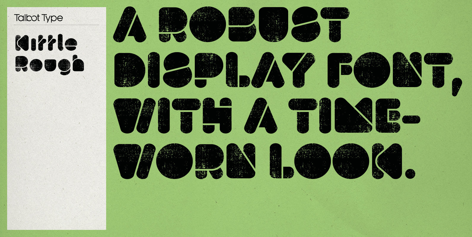
Kittle Rough Font
Kittle Rough is a robust display font with a time-worn texture. It has a strong, pared down look based on bold geometric forms. Loaded with personality, Kittle Rough features a full upper and lower case character set and an extended

Congenial Font
I wanted to design my own sans-serif typeface for my web site to complement the rest of my type library, so I designed Congenial as an understated, highly legible complement to my more decorative display faces. Of course, I’m never

Emy Slab Font
Emy Slab is a slab serif based on the classical proportions of Egyptian typefaces but with soft terminals that give the font a more friendly and modern look. Emy Slab consists of two subfamilies of 7 weights, ranging from Thin
