Tag: legible

Cool Daddy Font
It’s a brand new year, but I have been going back in time. To the seventies to be precise. A ‘bubblegum’ font was on the top of my to-do list, so when it was finally finished, it reminded me of

Colporteur Font
A Colporteur is a peddler of books, newspapers, and similar literature. When I was young, we often got visits from colporteurs – mostly they wanted to sell us a very expensive encyclopaedia. I haven’t seen them for a while –
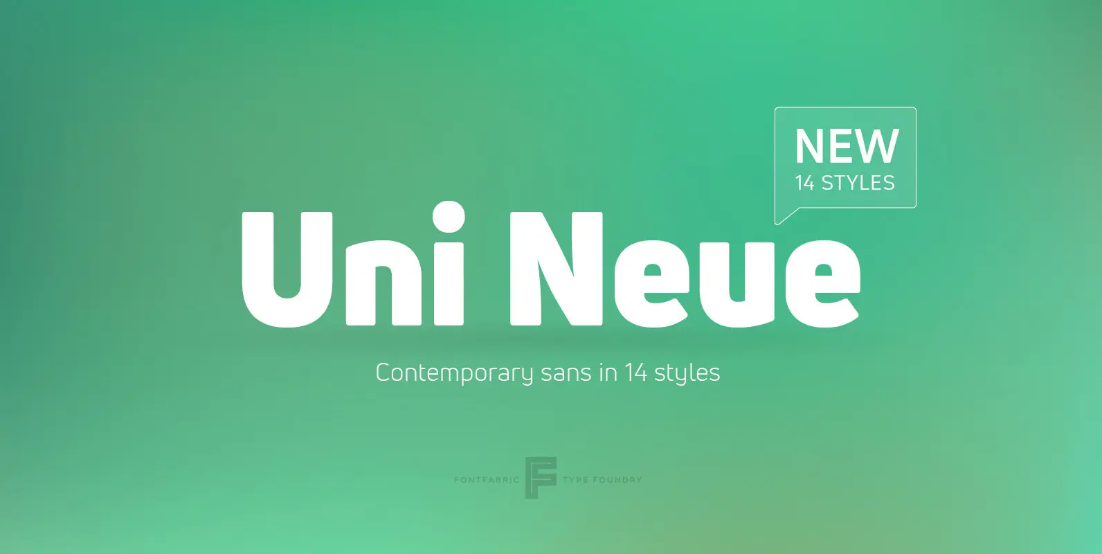
Uni Neue Font
Uni Neue is the whole new redesigned version (remake) of Uni Sans – one the most recognizable and signature font families of Fontfabric type foundry. From major changes like proportions, widths and thickness (weights) to the smaller details, this new

Carina Pro Font
Like Phenix out of the ashes the former Schriftguss hot-metal font “Rautendelein” has come to live again. Carina Pro was carefully extended for multilingual use, and contains a few alternates which can be activated via the swash OpenType feature. Published
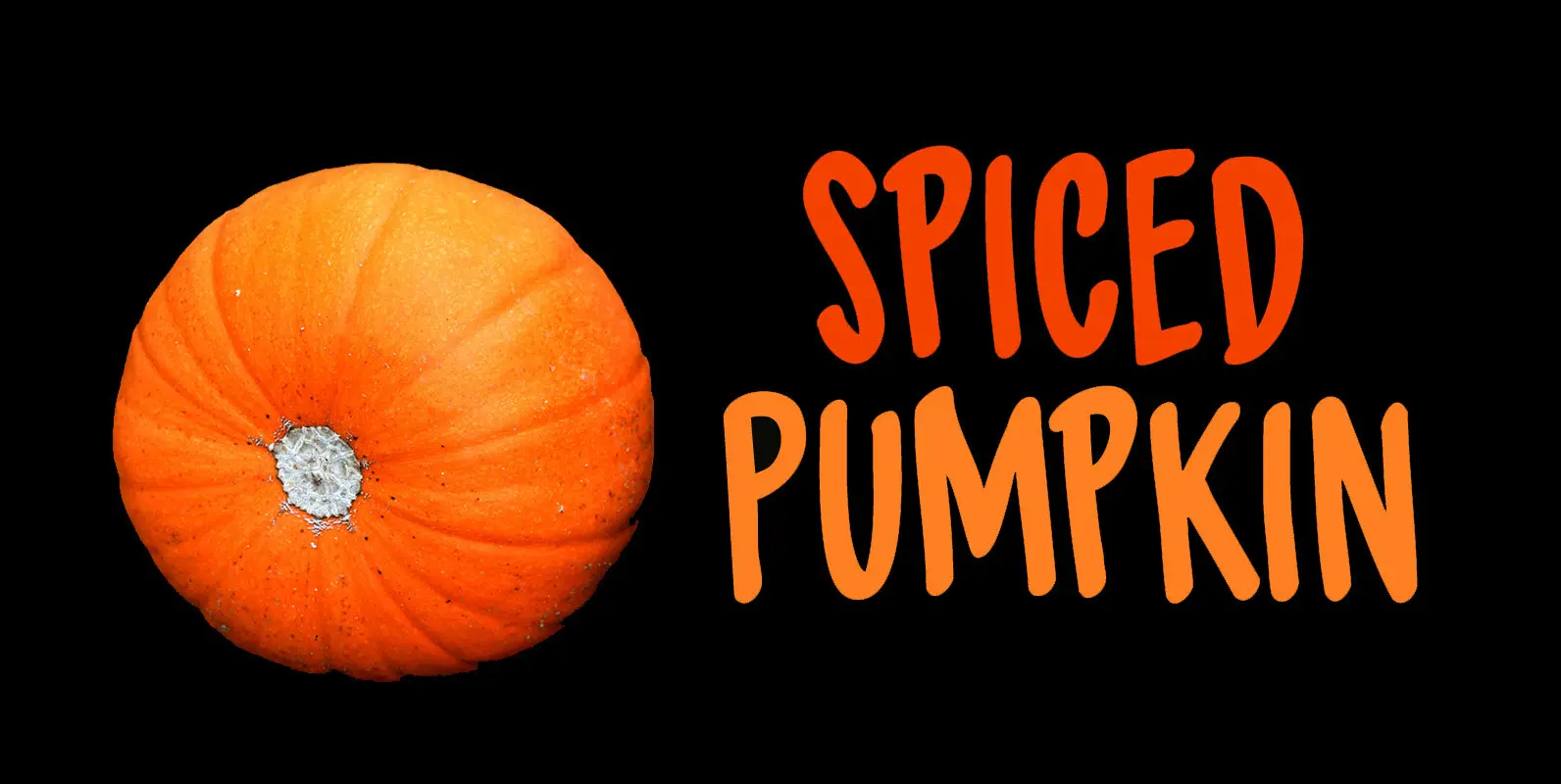
Spiced Pumpkin Font
I don’t know about the weather on your side of the globe, but here it is mighty cold! I was trying out a new technique of font-making AND I was craving a pumpkin spice latte, so I named this font
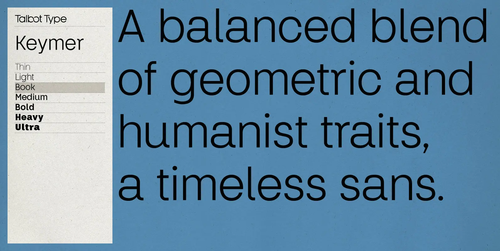
Keymer Font
Talbot Type Keymer is inspired by Margaret Calvert’s Transport typeface, designed for the British road sign system in the early 1960s. Keymer mixes geometric and humanist traits to achieve a modern, clean, elegant appearance. It is a legible and versatile
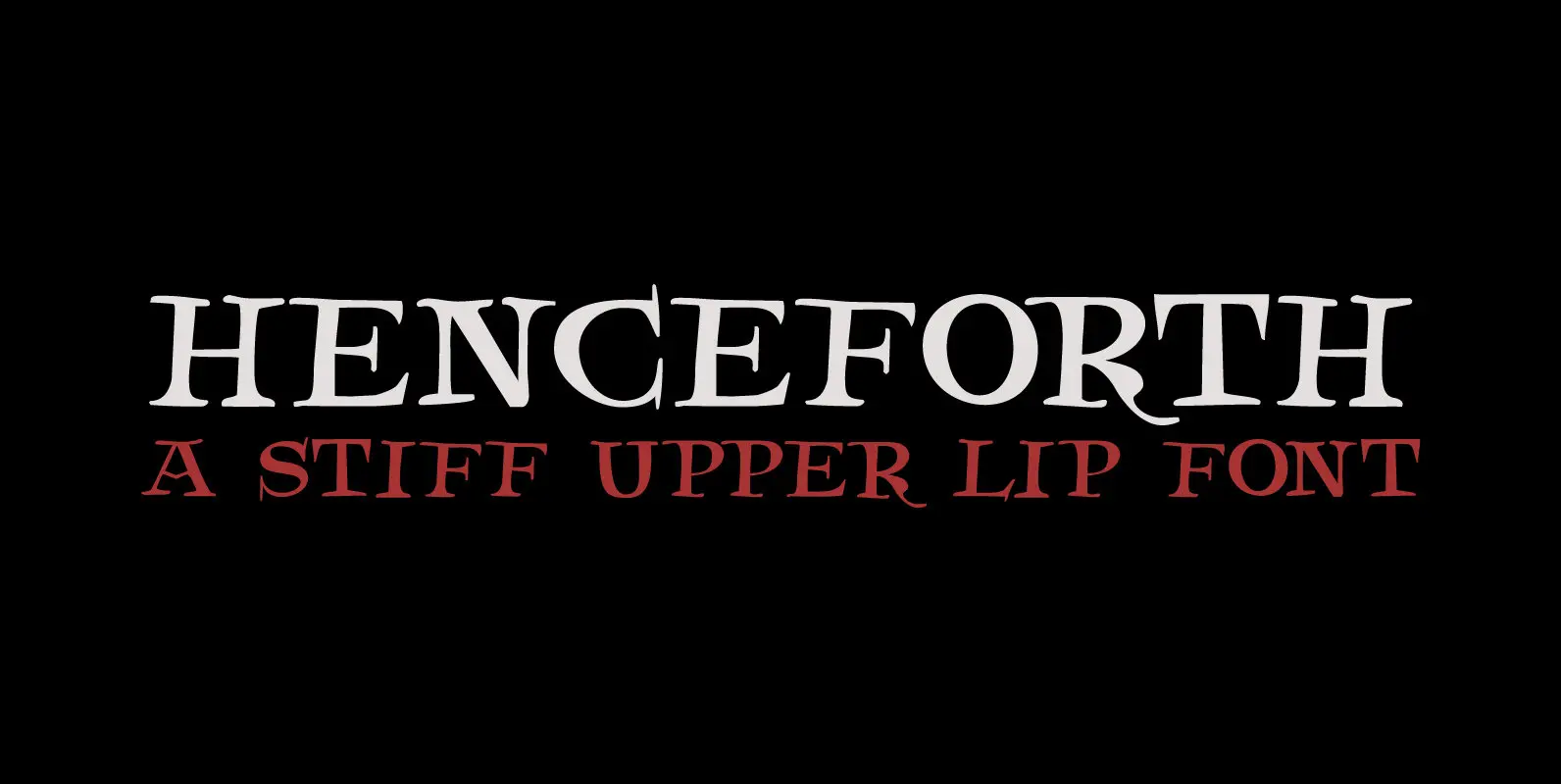
Henceforth Font
Henceforth is a hand-drawn, all caps didone-style typeface. It is a little rough, a little uneven, but lively and elegant as well. Personally I think it has a certain poshness about it: I mean, it wouldn’t look out of place
Vlinder Font
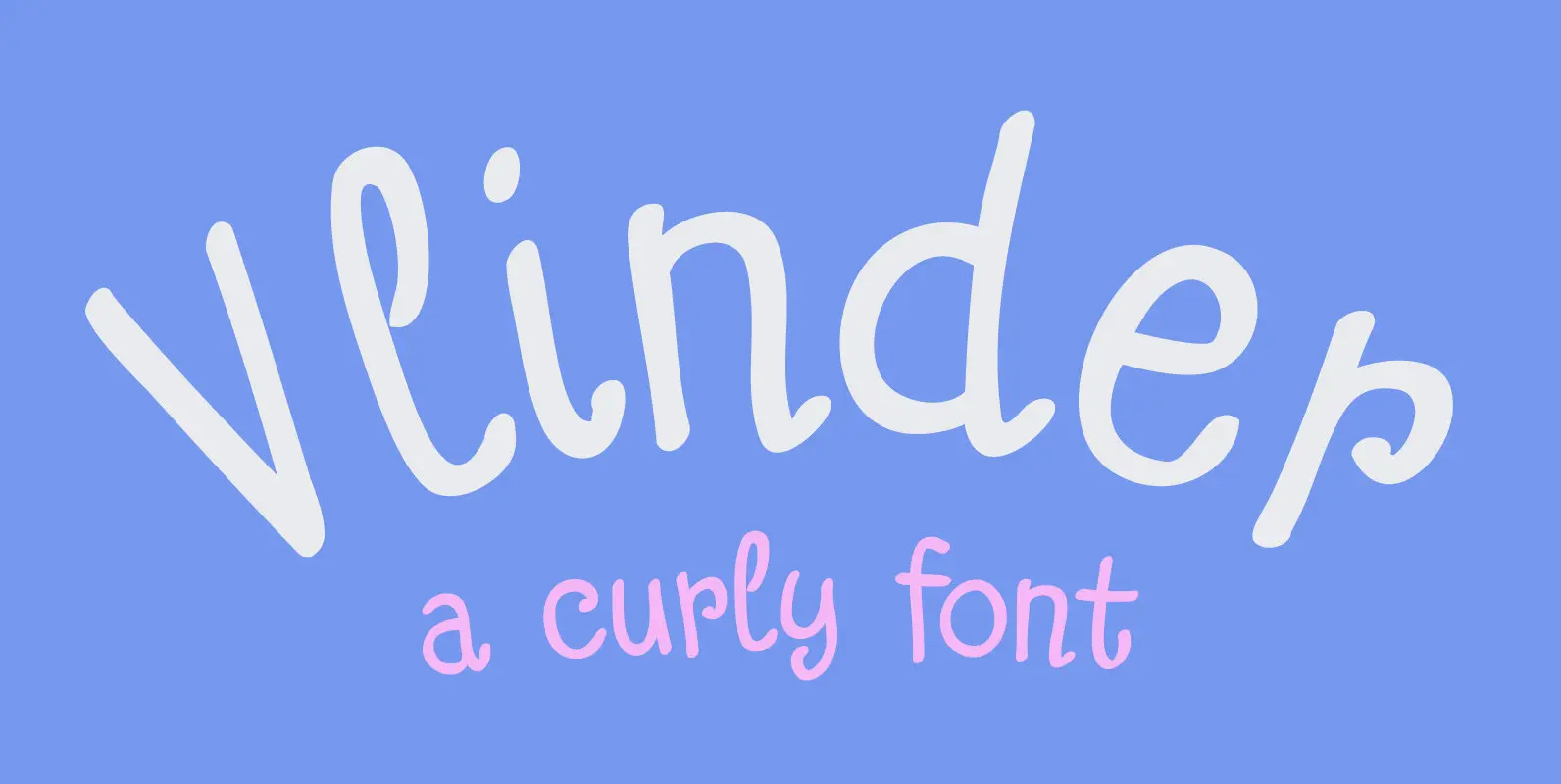
Vlinder means butterfly in Dutch. Vlinder font is a cute and curly typeface with fluttering glyphs and an overall happy feel to it. Use it for childrens books, posters and invites. Comes with flowery fields of diacritics. Published by HanodedDownload
Barack Pro Font
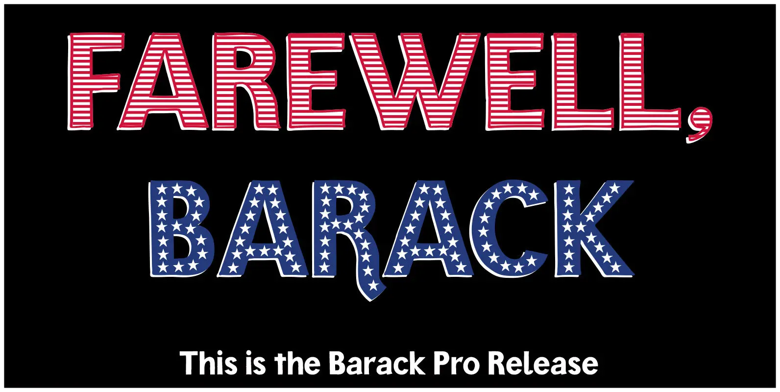
Barack Pro is the enhanced Version of Ekke Wolf’s typeface Barack. It still has got its casual and hand-drawn look and is best for designing insubordinate, cheeky campaigns. Barack Pro is set up as multi-layer fonts for multi-color lettering and
Whale Song Font
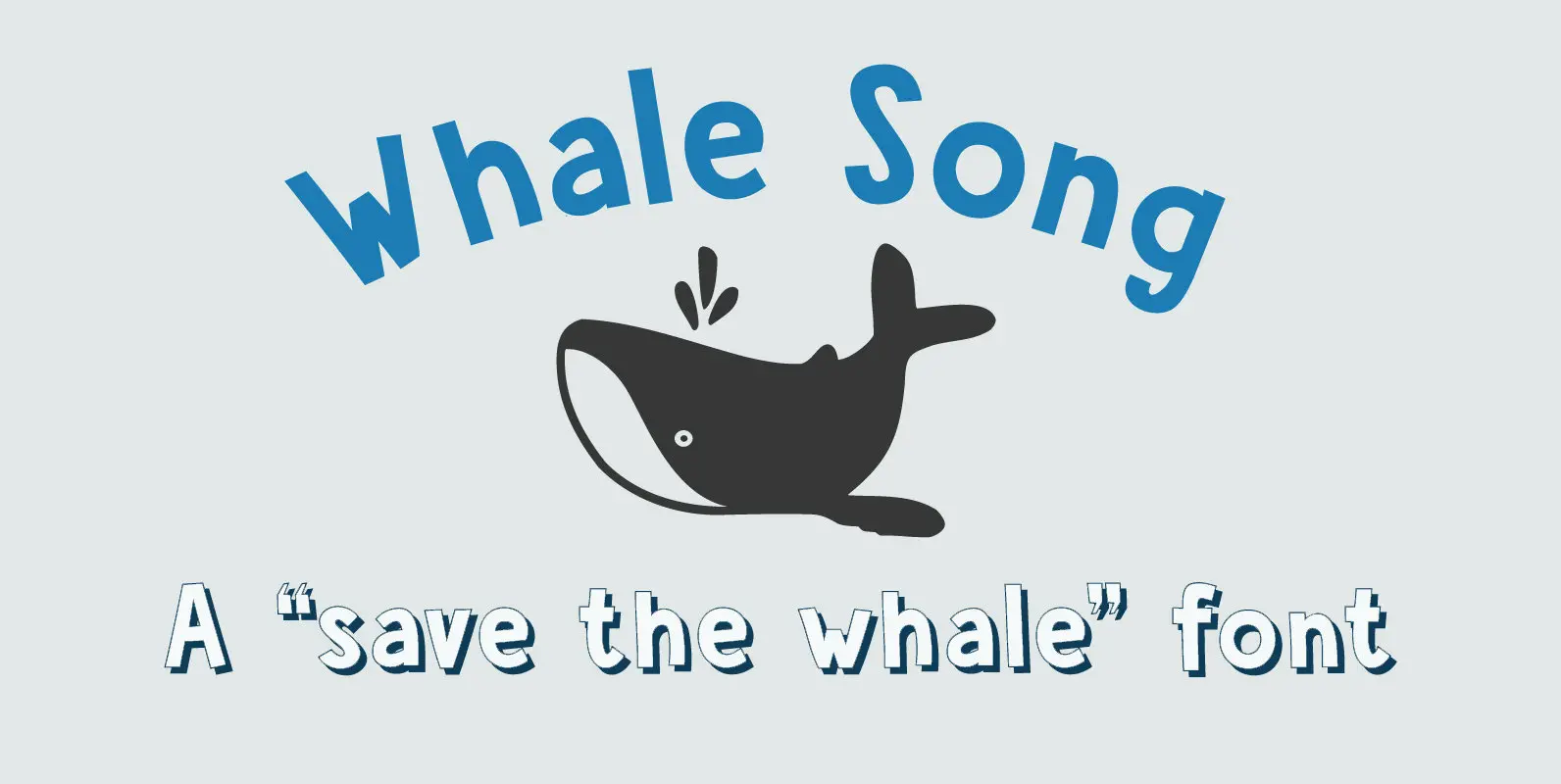
I grew up with the ‘Save The Whales’ slogan: I remember watching the news and seeing little Greenpeace dinghies taking on huge Japanese whalers, and activists clinging on for dear life. I haven’t heard that slogan for a while: maybe
Orchidea Pro Font
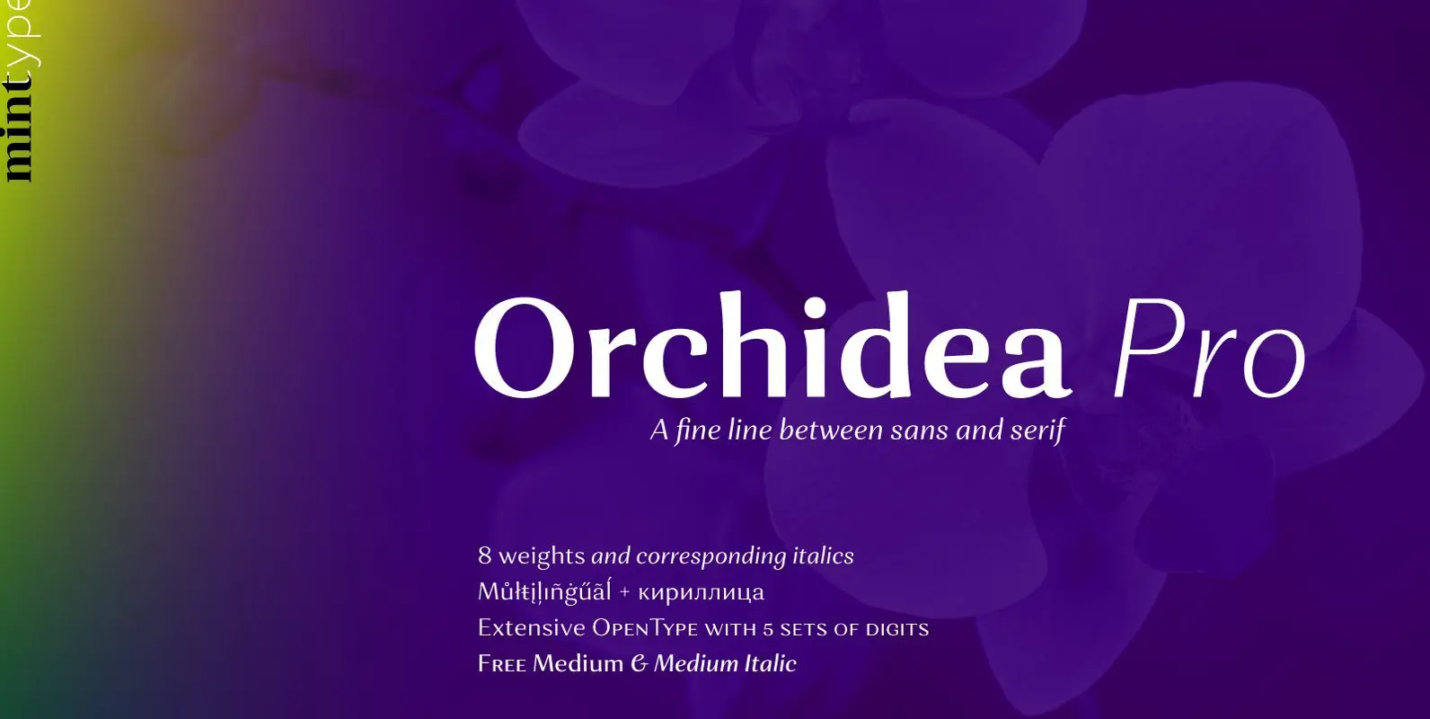
Orchidea Pro is a typeface balancing on the verge of sans and serif. Called a stressed sans or a serifless serif, it does not feature any serifs, but resembles a serif typeface by build, and features unilateral nibs that speed
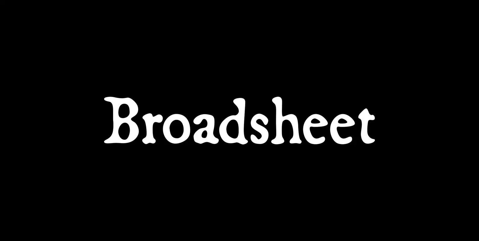
Broadsheet Font
Broadsheet simulates old newspaper text from the 1700s, chiefly from two specimens: an original copy of The New-England Weekly Journal, published in Boston on April 8, 1728, and a commemorative reprint of the Massachusetts Sun, published in Worcester, Mass., on
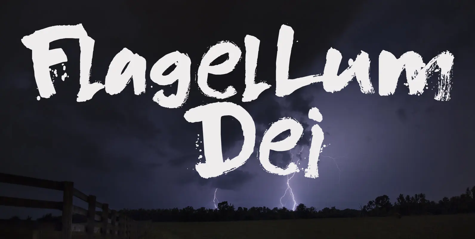
Flagellum Dei Font
Flagellum Dei is Latin for ‘The Scourge of God’. It is a title given by later generations to Attila the Hun (406-453 C.E.). Flagellum Dei is also a rather scary font, which I made with the use of a stiff
