Tag: legible
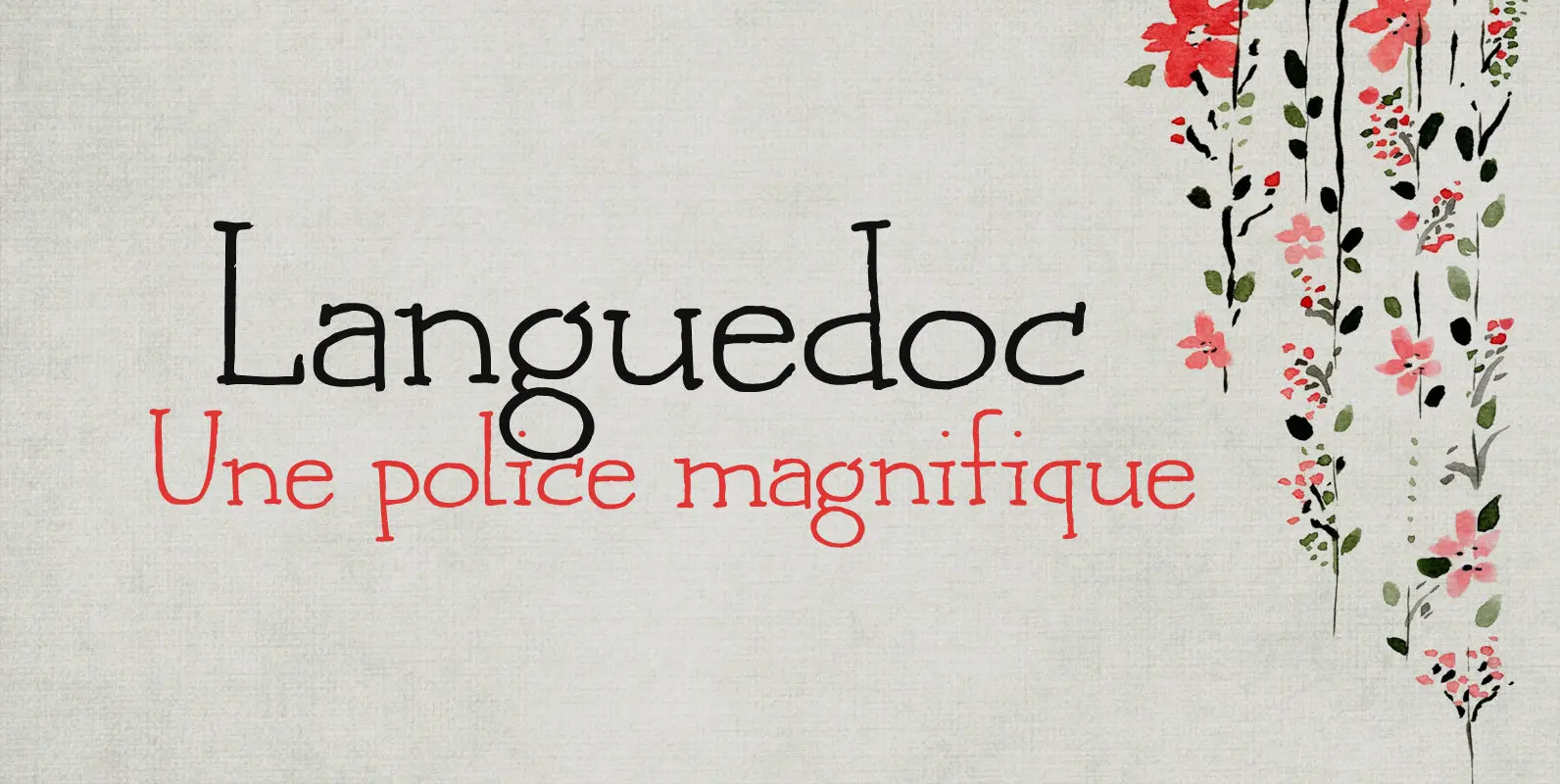
Languedoc Font
Languedoc is a former province of France. Most of its territory lies in what is now the Occitanie region. My family and I love camping there and I figured I’d name a font after it! Languedoc is a beautiful and

Blueberry Jam Font
I love blueberries. When my brother and I were young, we used to pick them in the forest by the bucket. Afterwards, we’d always look like victims of a serial killer, but it was all worth it, as nothing quite
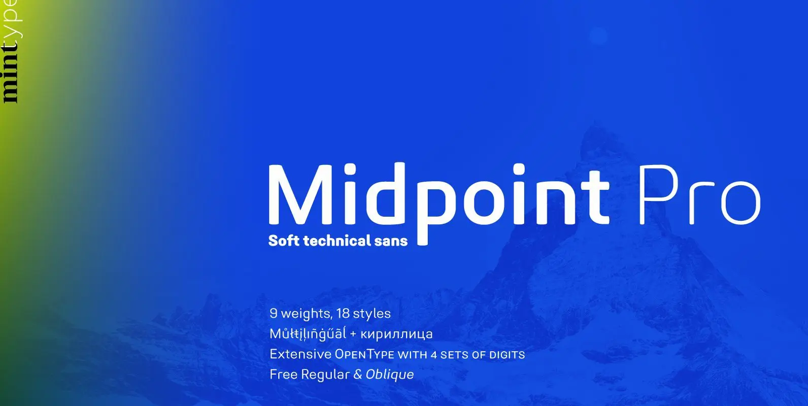
Midpoint Pro Font
Midpoint Pro is a soft sans-serif typeface with a modern technical look. Its spurless design creates a perfect balance between static rigid verticals and softened endings. The interplay of open and closed forms suggests increased legibility in small sizes and
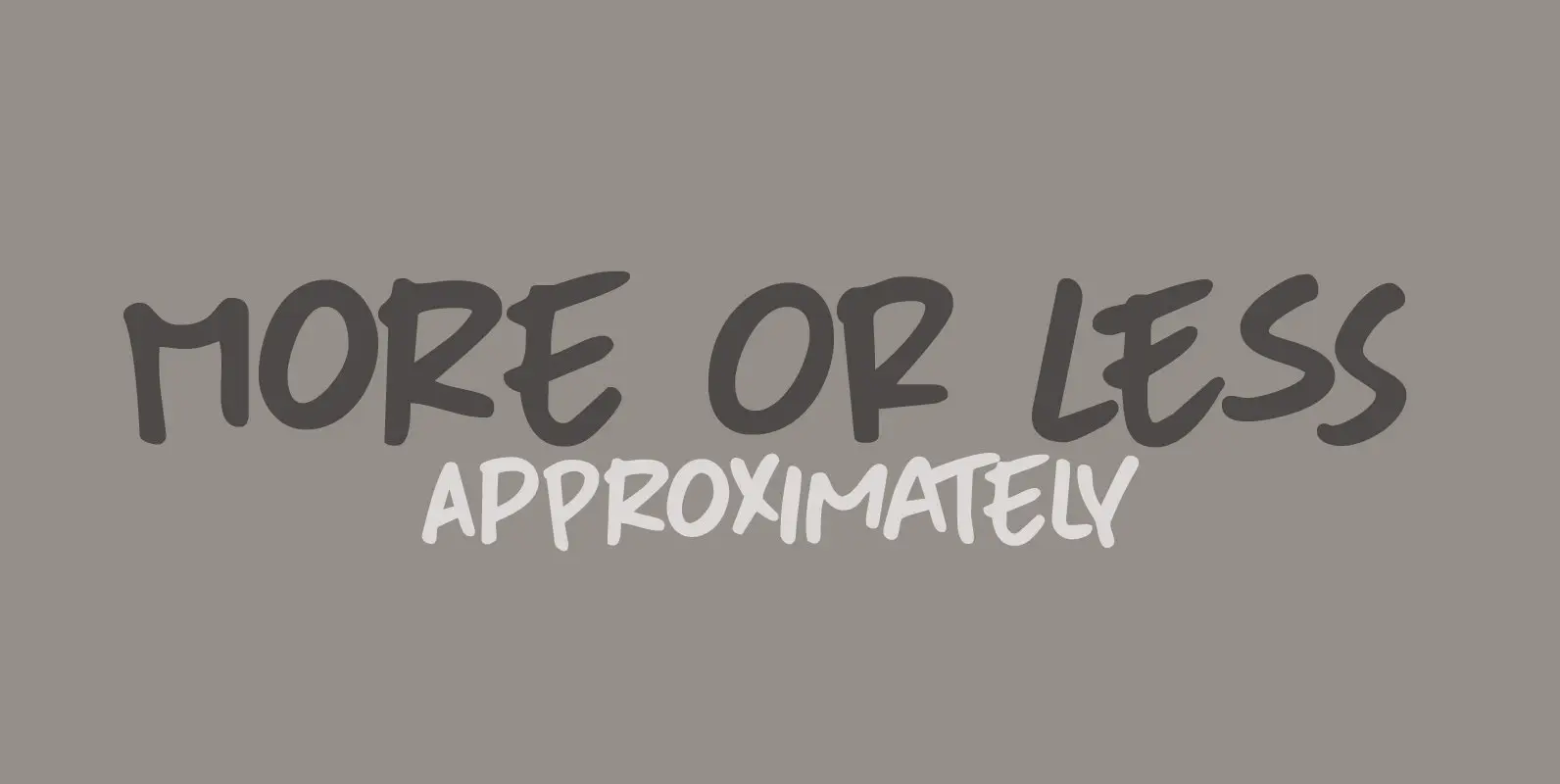
More Or Less Font
More Or Less was made with a permanent marker pen on thin Japanese paper. It is a handwritten note-style font with an uneven baseline and zippy glyphs. Comes with bells & whistles and a whole bunch of diacritics. Published by
Professor Font
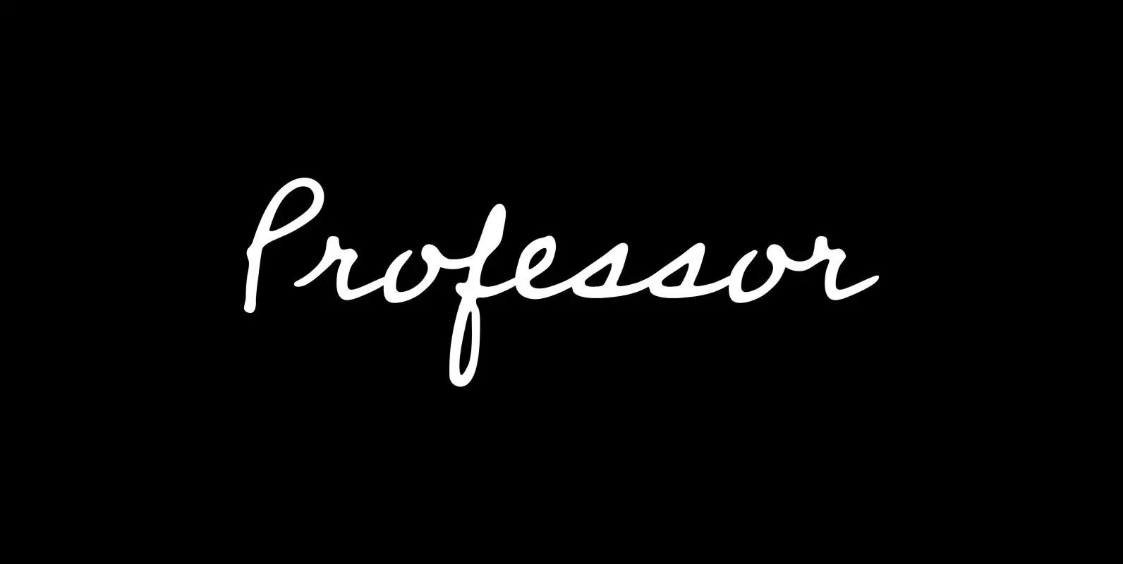
Professor is modeled after the handwriting of an actual professor emeritus whose cursive script displays just the plain-yet-handsome, casual-yet-legible feeling I’d been looking for in a contemporary hand—one that might prove as useful in a personal letter as, say, on
Rabbit Escape Font
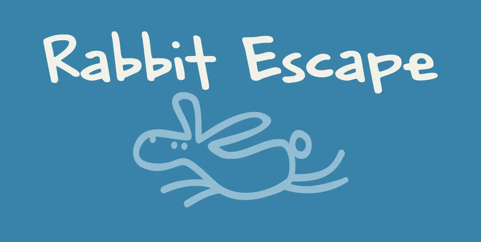
Lately I have been thinking about rabbits. Not that I have a particular love for rabbits – they’re cute, but also kind of stupid. But as Christmas dinner is approaching, I see more rabbit carcasses lining the shelves of supermarkets.
Korto Font
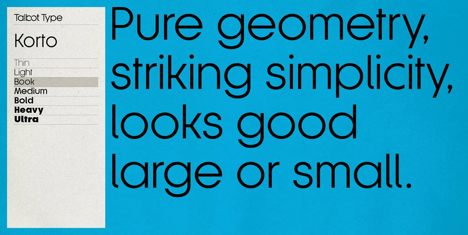
Korto is a clean, elegant and highly legible, geometric text and display font. Inspired by classic sans-serifs such as Futura and Avant Garde, this stylish, minimal typeface is available in a comprehensive family of seven weights and is suitable for
Tequileria Font
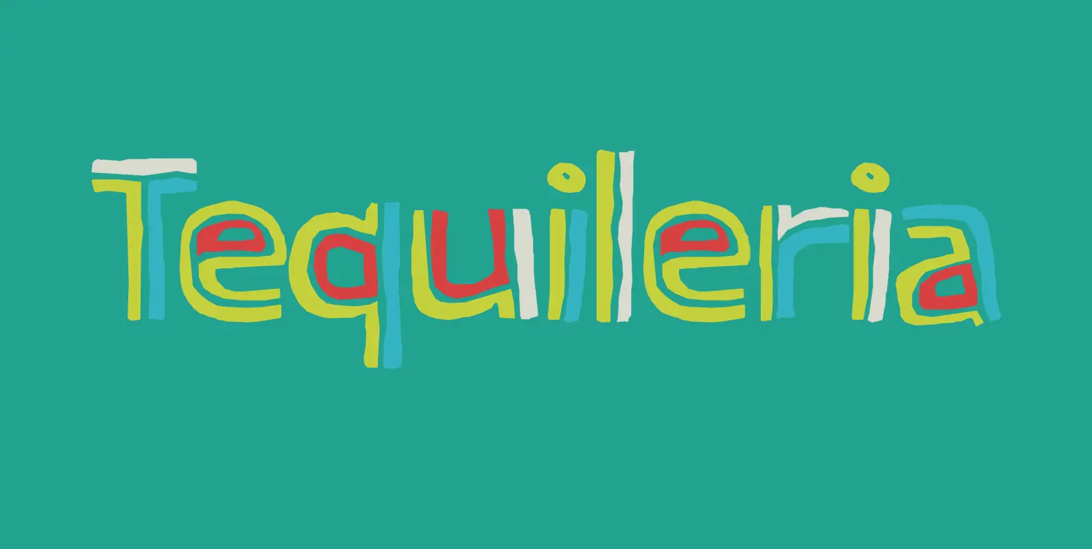
Tequila… I have to admit that I am not a drinker. I do like Tequila, though, even though I can’t remember when I last had a shot. Tequileria is a very recognisable inline display style font. It would look great
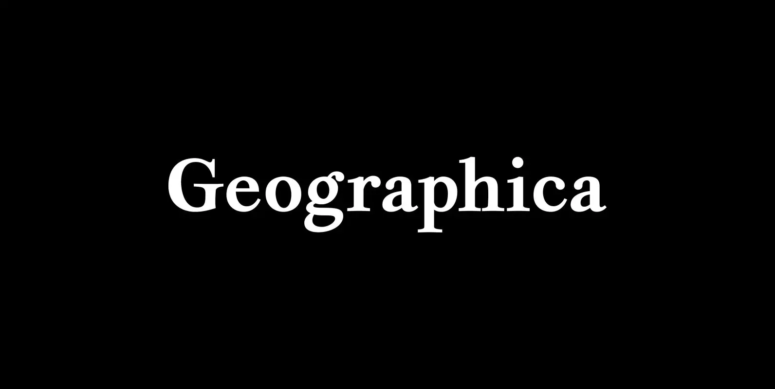
Geographica Font
Geographica is a four-style serif text-type family modeled after the neat hand-lettered place names and peripheral text on the maps of Thomas Jefferys (ca. 1710–1771), the best-known map engraver in 18th-century England. Although he won (and hyped) the title “Geographer

Starlight Lovers Font
I have always loved gazing at the stars. Too bad that you don’t get to see a true starry night these days – mostly because of light pollution. Starlight Lovers is a messy serif. It is hand painted, using a
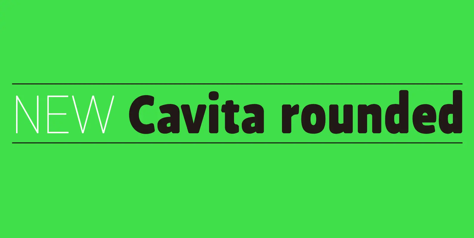
Cavita Rounded Font
Cavita Rounded typeface is a mix between both grotesque and calligraphic models: regulars have a rough grotesque spirit, while the italics were inspired in calligraphic gestures. All of these details are reinforced with an inverted modulation (horizontals strokes are thicker
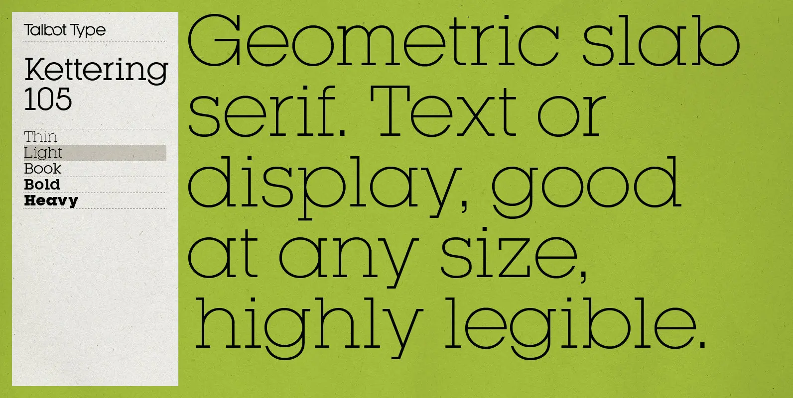
Kettering 105 Font
Kettering 105 is inspired by the classic, geometric slab-serifs such as Lubalin, but has shallower ascenders and descenders for a more compact look. It’s a versatile, modern slab-serif, highly legible as a text font and with a clean, elegant look
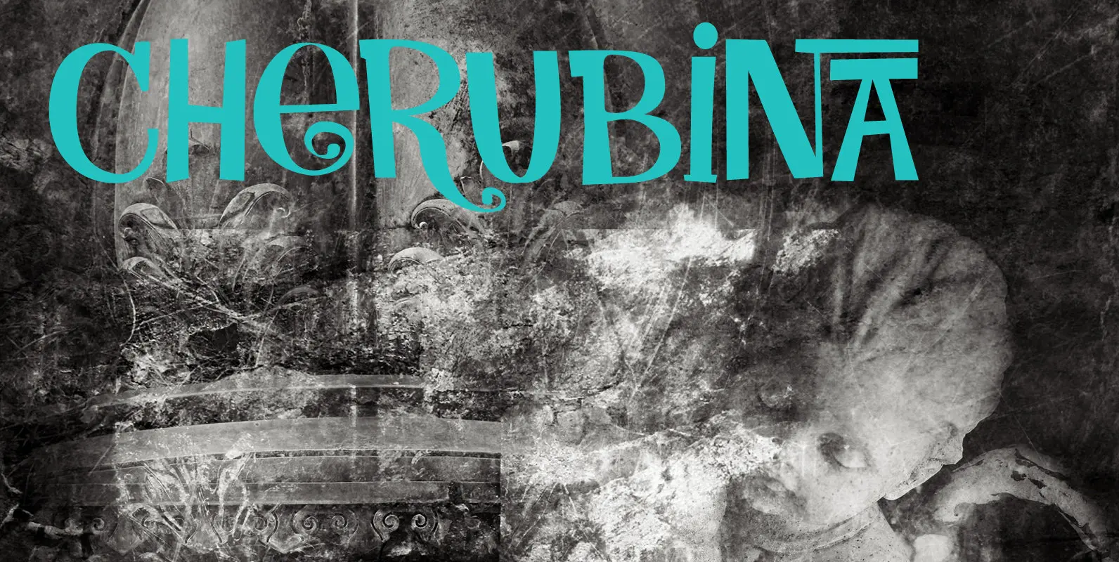
Cherubina Font
Cherubina means ‘Blessed’. It is a name derived from the Akkadian “karabu / kuribu”, meaning “blessing, blessed”. A cherub is a type of spiritual being mentioned in the Hebrew Bible, often depicted as a baby with wings. This font was
Attic Antique Font
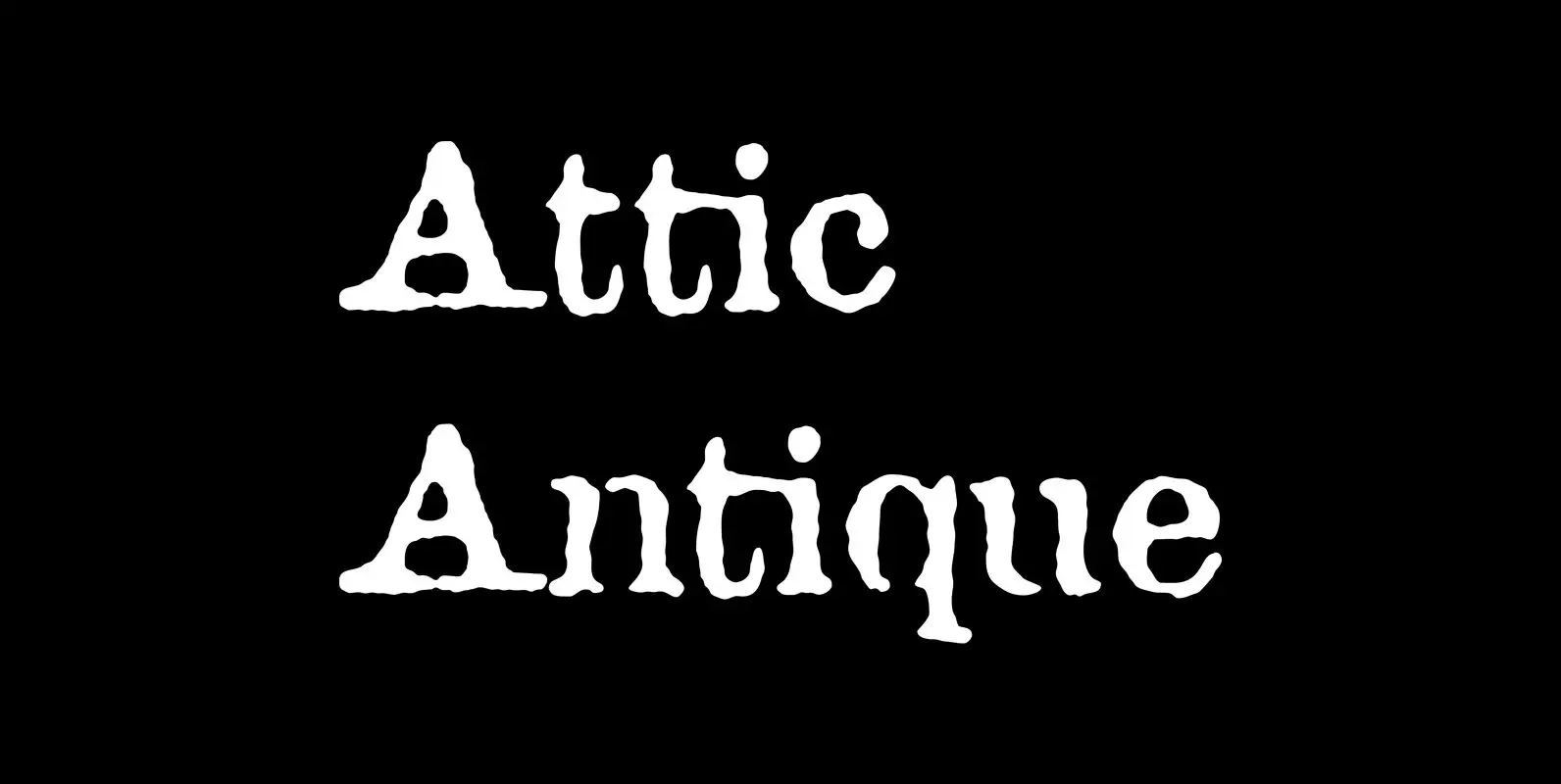
Attic Antique replicates the warn, weathered text in a friend’s old copy of John Burroughs nature essays. It shares the wide spacing and ample serifs of the Century faces. Use it to represent age, to suggest photocopied archives, or to
Hummington Font
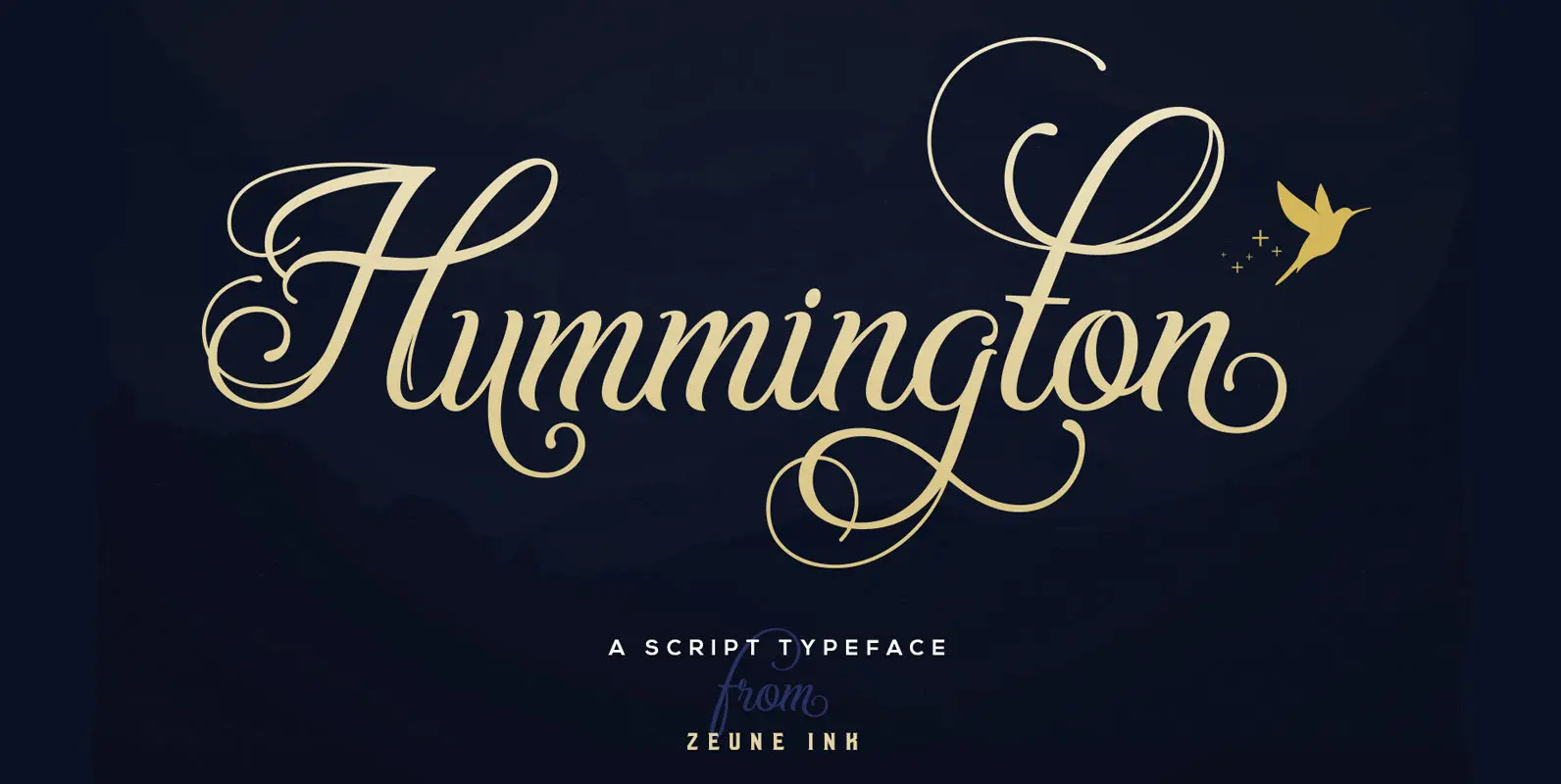
An elegant script typeface with a bunch of opentype features to make your design and digital lettering look more outstanding and fun. Hummington contains 700+ total characters, 16+ stylistic set alternates, elegant swashes, unique ligatures, oldstyle figures, multilanguage support and
Rogan Font
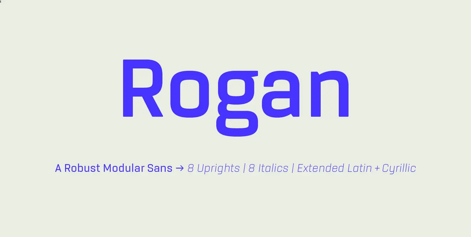
Rogan: A Robust Modular Sans. Rogans clean lines started out as an exercise in modularity and geometric forms. This initial construction approach was then adapted to improve the functionality of the family; Breaking away from the strictly modular system in
