Tag: legible
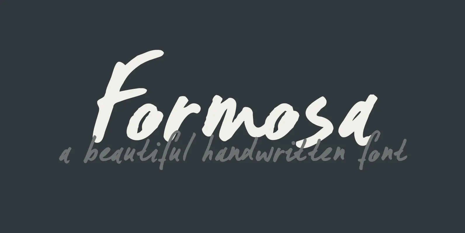
Formosa Font
Formosa is the old, colonial name for Taiwan. Formosa means beautiful in Portuguese and I think this handwritten typeface has a certain beauty itself. It comes in three styles, all of which make extensive use of ligatures, to give the
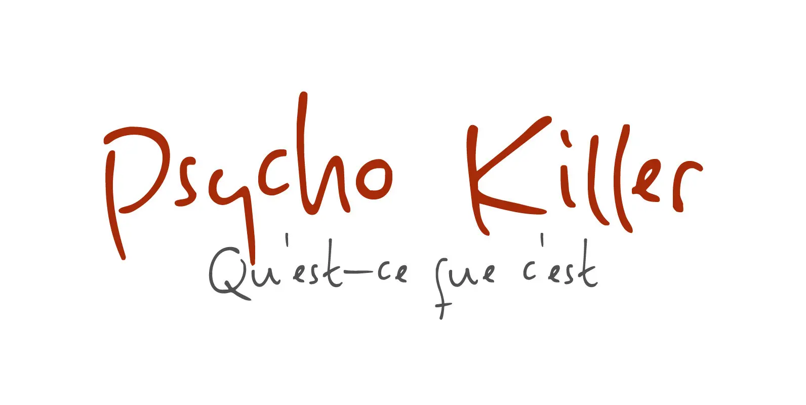
Psycho Killer Font
Psycho Killer is a song by the Talking Heads. It is also one of my favorite songs, so I figured I’d name a font after it. Psycho Killer is a script font; it contains some messy glyphs and gives the
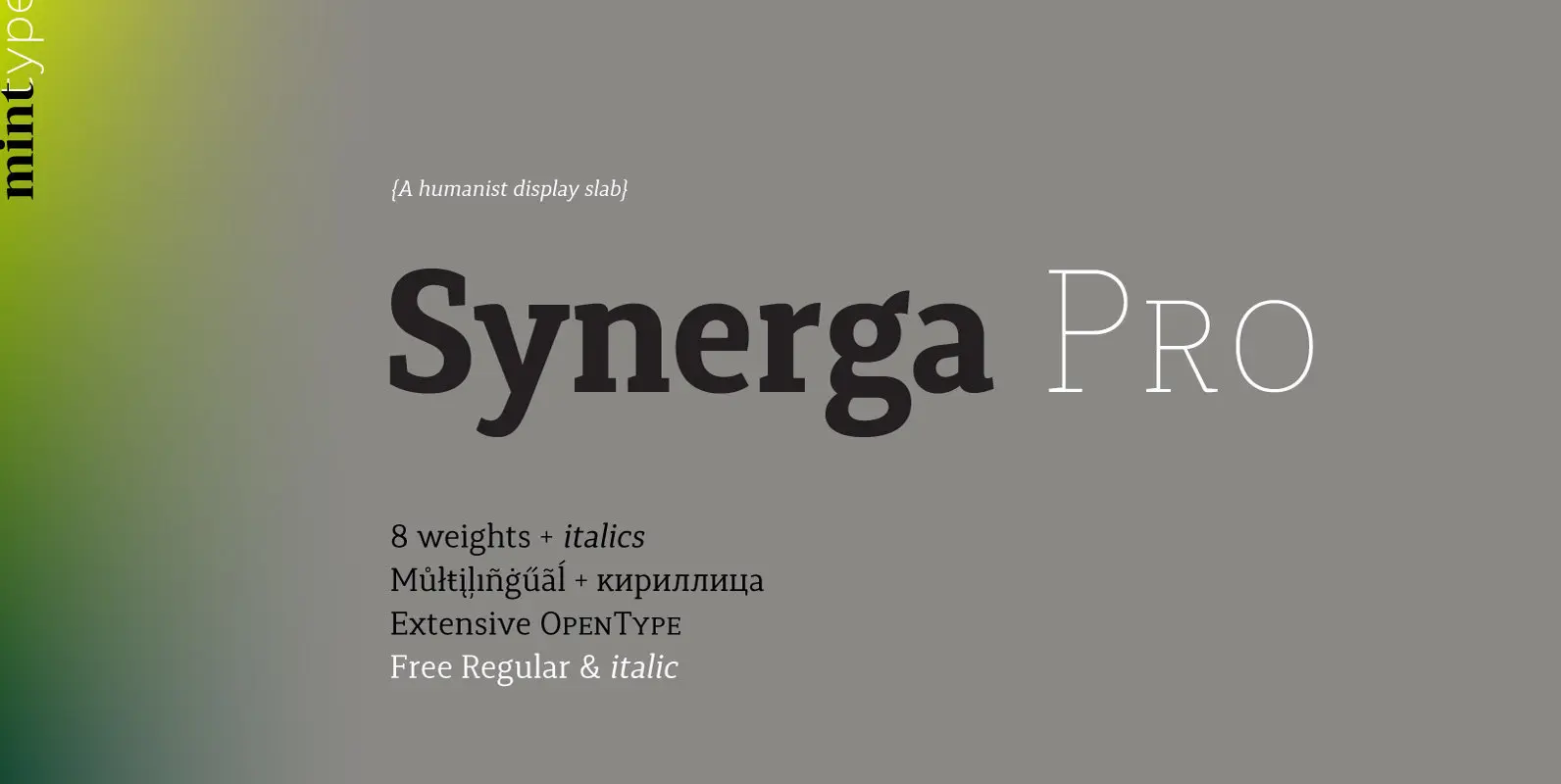
Synerga Pro Font
Synerga Pro is a contemporary slab-serif typeface with humanist features. In smaller text sizes it exposes the characteristics of its slab built, but as the size grows, lots of fine features become visible: rounded terminals, dynamic horizontal serifs, non-vertical endings
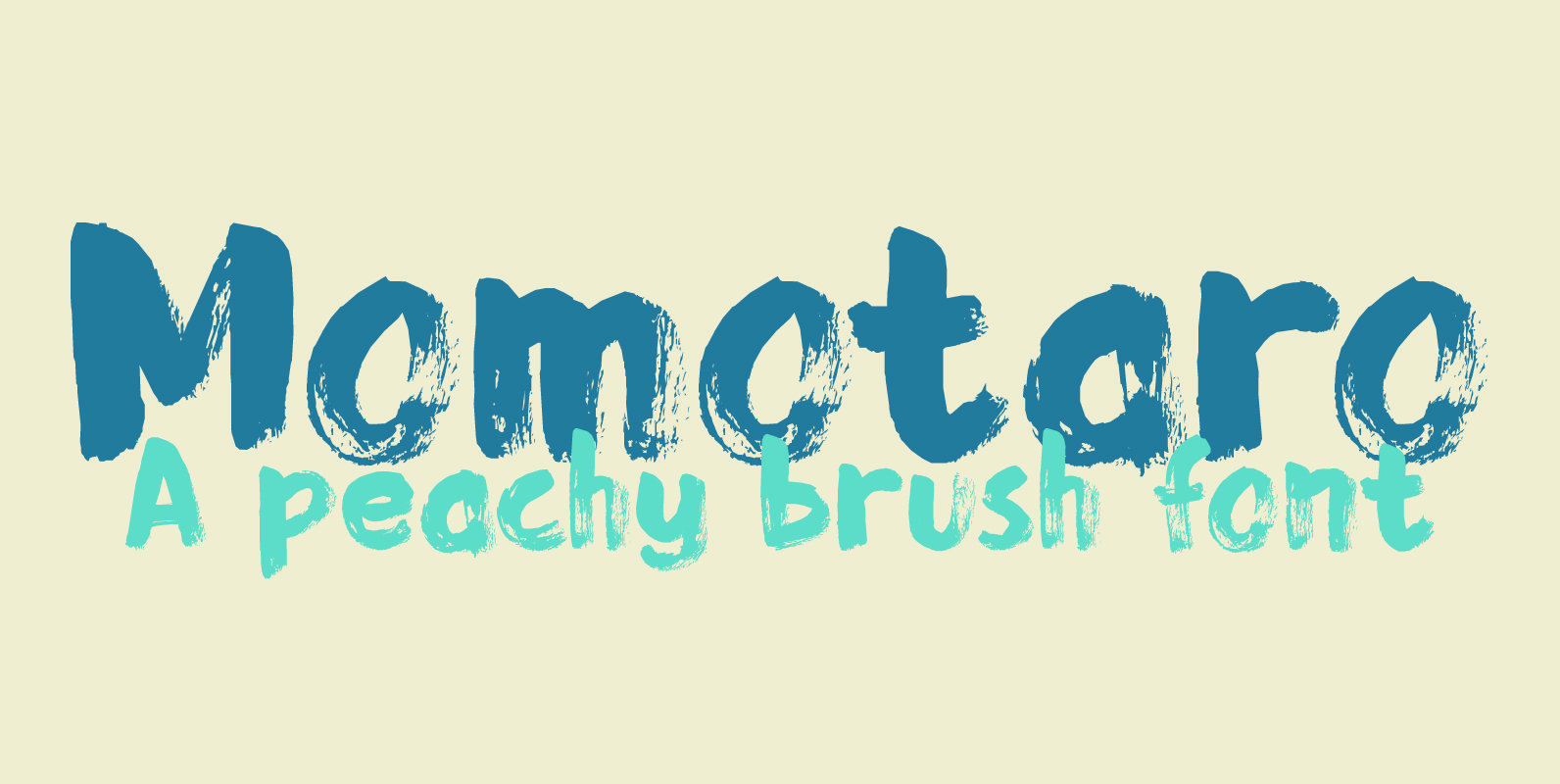
Momotaro Font
Momotarō is a Japanese legend about a boy who came to earth inside a giant peach. He was found by a childless woman and grew up to be a hero. I’m in a Japanese mood – mainly because lately I
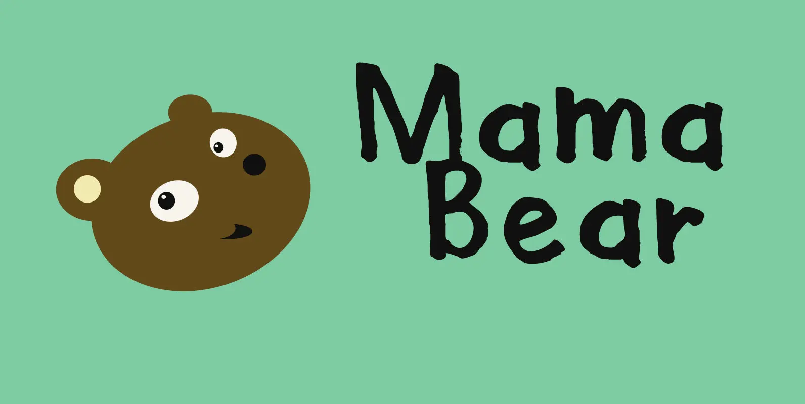
Mama Bear Font
Mama Bear is a playful, neat, children’s book typeface. It is cute and happy, very legible and comes with extensive language support, including the ‘schwa’ glyph found in a handful of languages. Mama Bear was inspired by my 16 month

Downward Fall Font
Downward Fall owes its name to one of my favorite Opeth songs, called The Funeral Portrait. The song itself is an uptempo metal composition with rather dark lyrics. This peculiar combination, a mix of good and evil if you will,
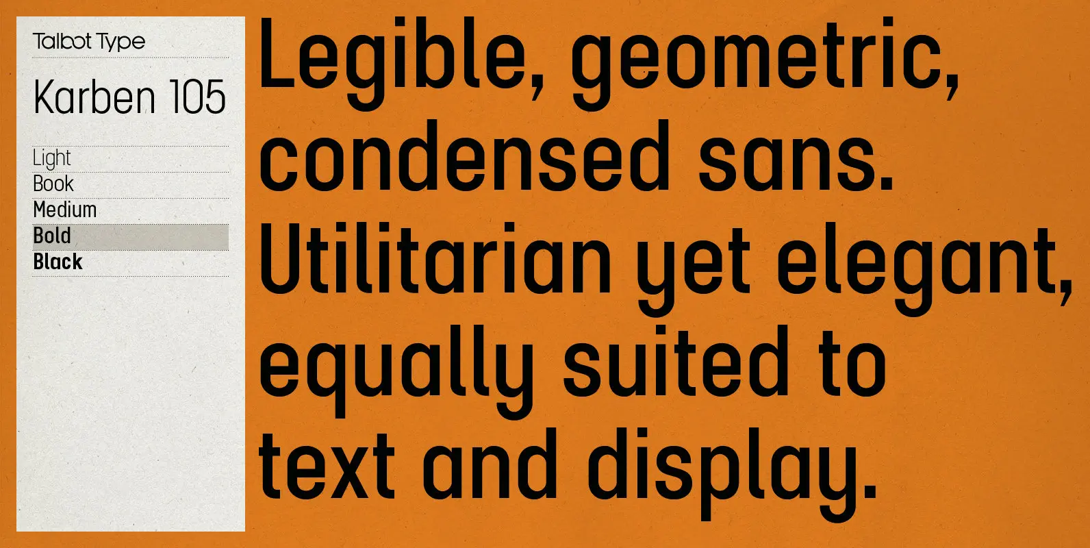
Karben 105 Font
Karben 105 is inspired by the classic, no nonsense DIN, and has a form that follows its highly legible function. Based on a lozenge, it has a clean and pure geometry with even stroke weights. Karben 105 is available in
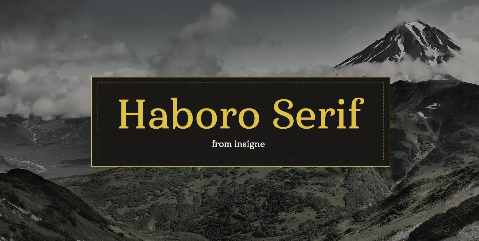
Haboro Serif Font
The polls are in. Now here by customer request–Haboro Serif, the newest edition of the Haboro Hyper family. The Haboro fonts are an outstanding upstart success from the first part of 2016. Following the release of the popular Haboro, Haboro
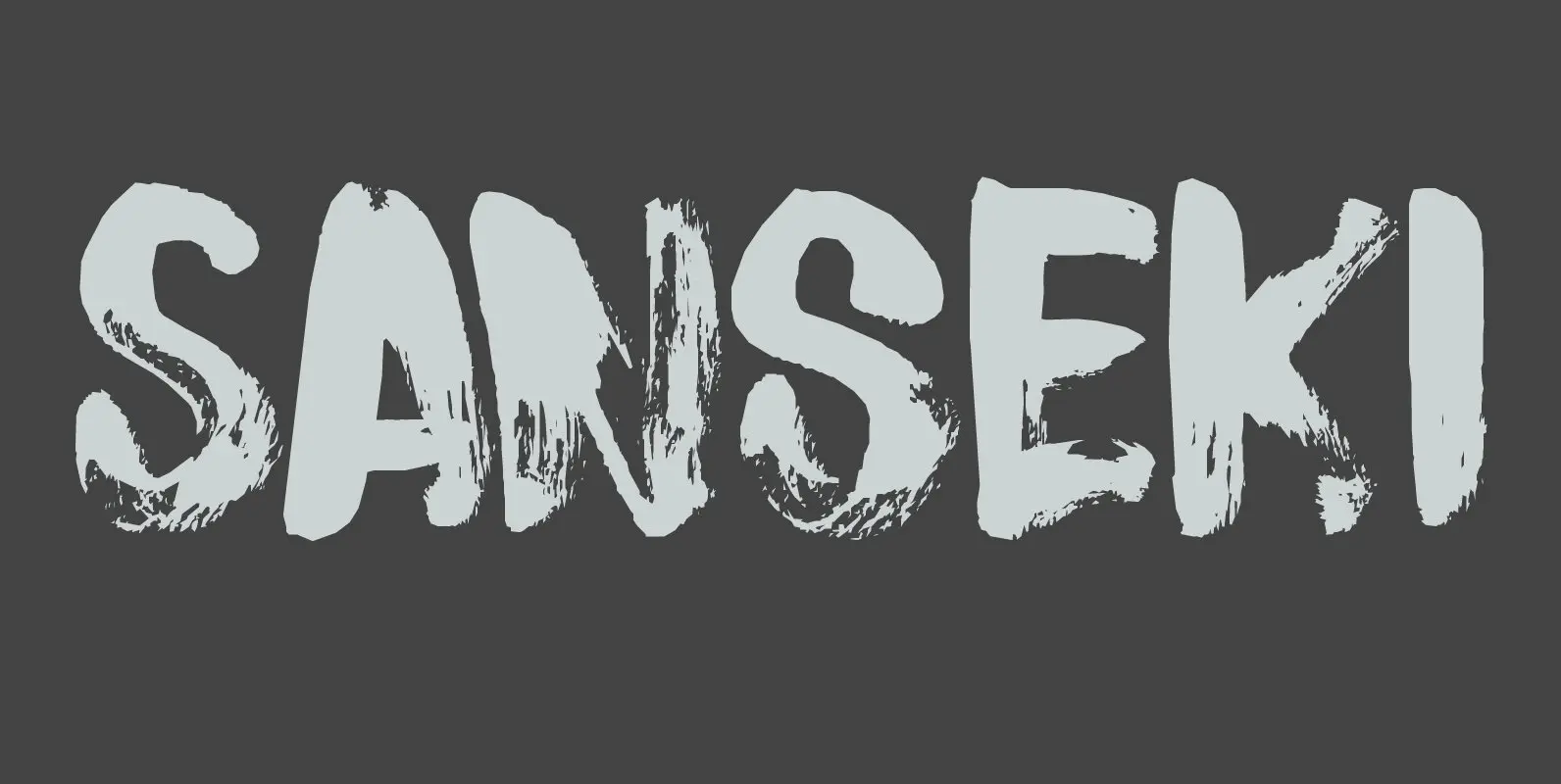
Sanseki Font
The term Sanseki (Japanese for Three [Brush] Traces) is used to describe three famous Heian period calligraphers: Yaseki, Gonseki and Saseki. Not that I would ever dream of comparing my messy brush-work with theirs, but the name stuck and I
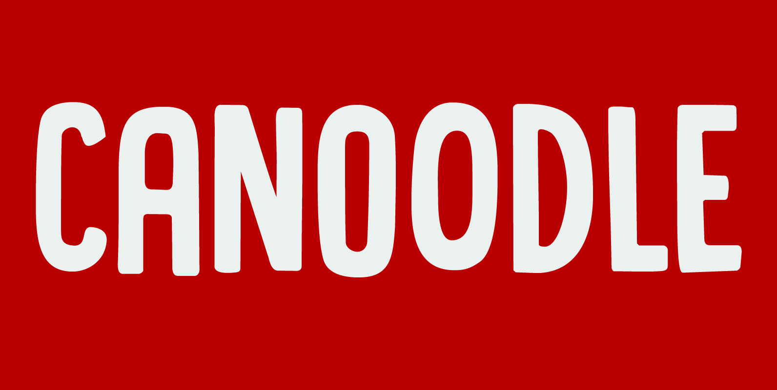
Canoodle Font
To canoodle means to hug and kiss passionately. I leave the rest to your imagination. Canoodle is also a very adorable font – some would even go as far as calling it kissable. It is an all caps typeface, but
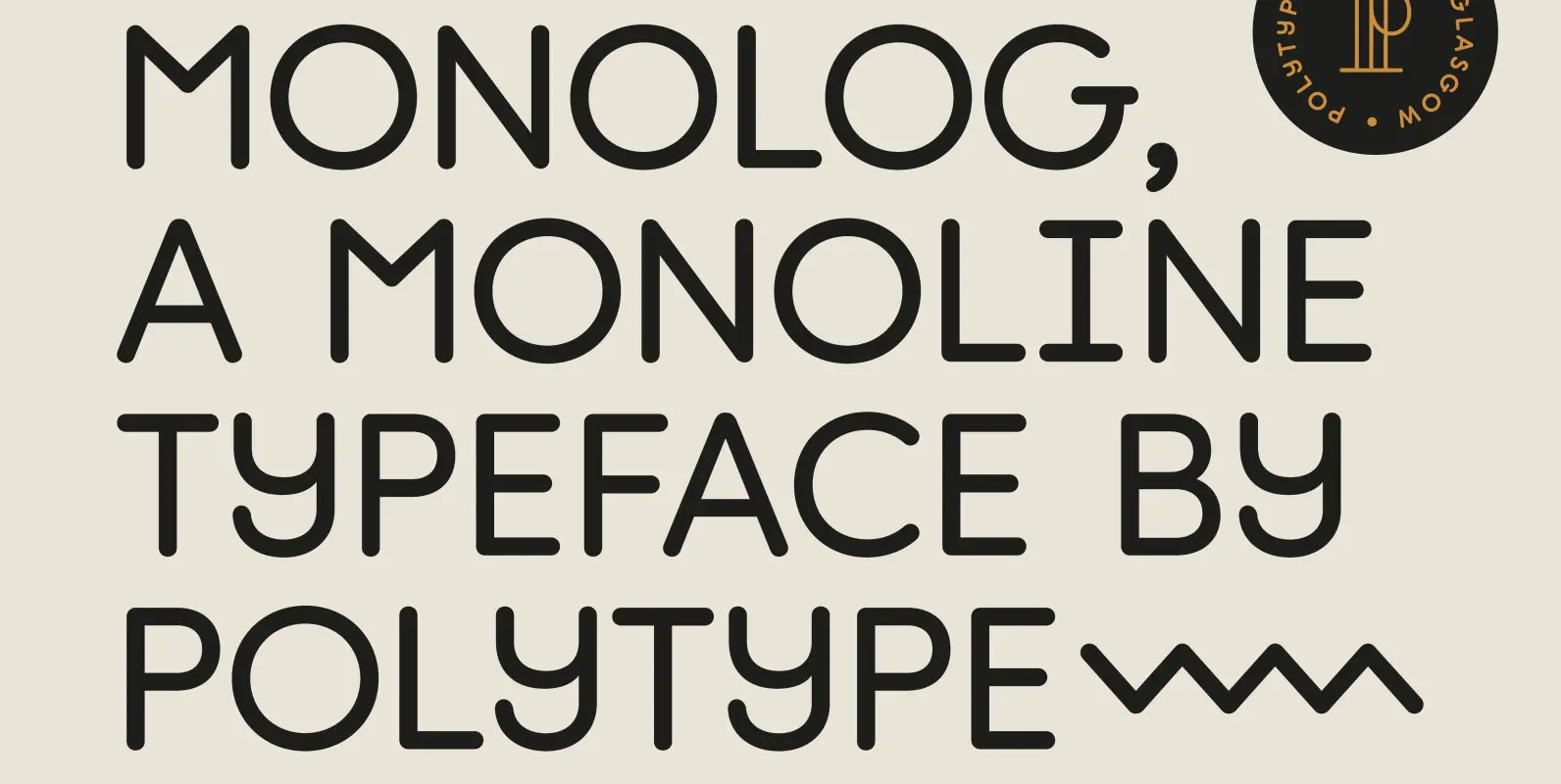
Monolog Font
Monolog is an especially monolinear rounded display typeface, designed to work great alongside monoline illustrations, logos and icons, while still performing well in some text settings. A number of contemporary quirks in its construction establish visual interest, while Monolog’s clean,
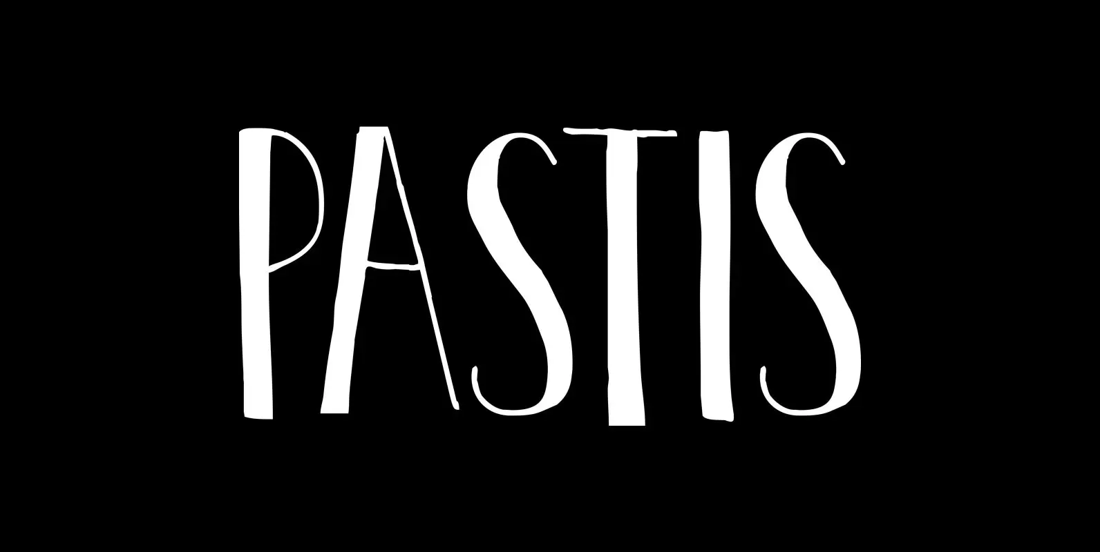
Pastis Font
Pastis is an anise-flavored drink from France – and a lovely font as well. Pastis is an all caps typeface with a different set of glyphs for upper and lower case. Use it for books, posters, ads and product packaging.
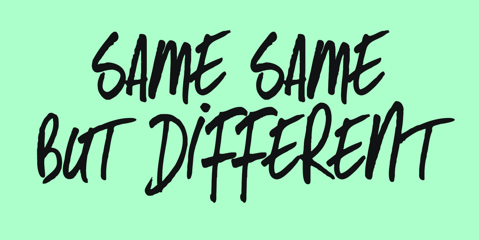
Same Same But Different Font
Same Same, But Different is a loose, handwritten font with excellent legibility. It evokes post-it scripts, or notebook doodles and can be used virtually everywhere! Published by HanodedDownload Same Same But Different
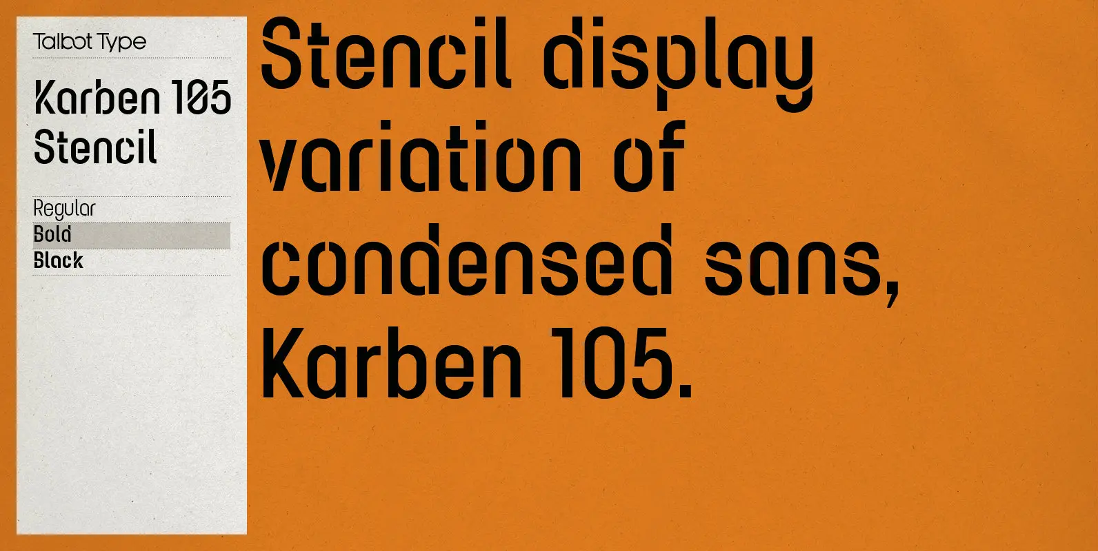
Karben 105 Stencil Font
Karben 105 Stencil is a contemporary stencil font. The stencil breaks in the letters are applied in a way that is sensitive to the forms of the character in pursuit of a more elegant stencil. Karben 105 Stencil is available
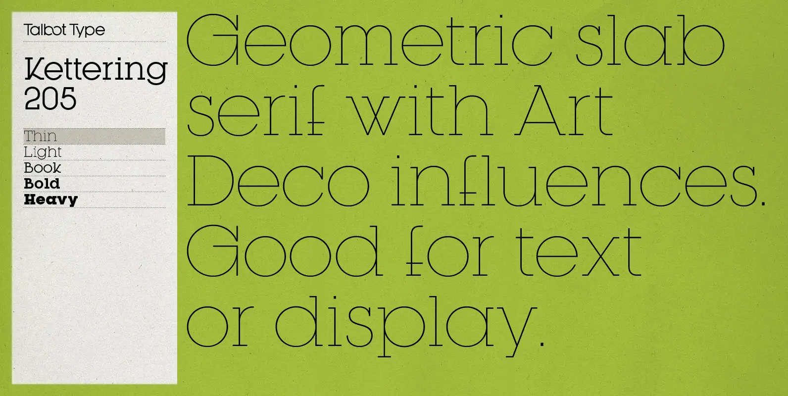
Kettering 205 Font
Kettering 205 is inspired by the classic, geometric slab-serifs such as Lubalin, but has shallower ascenders and descenders for a more compact look, and features art deco influenced, lowered crossbars and an oblique crossbar on the lower case e. It’s
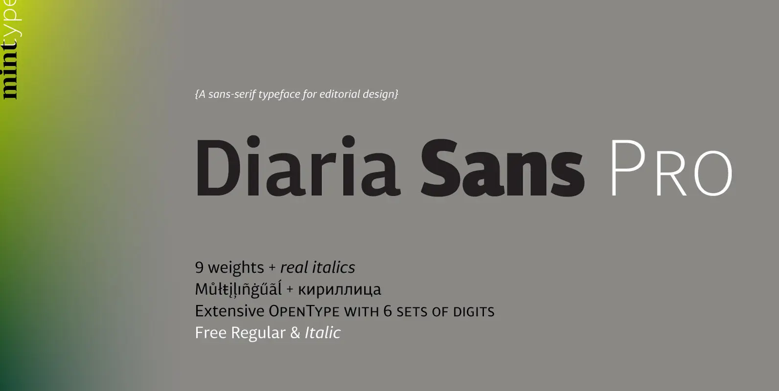
Diaria Sans Pro Font
Diaria Sans Pro is a sans-serif counterpart of Diaria Pro. With its extensive 9 weights and corresponding italics, extensive language support, and various OpenType features it is meant to build visual hierarchies of any detail and complexity in editorial design.
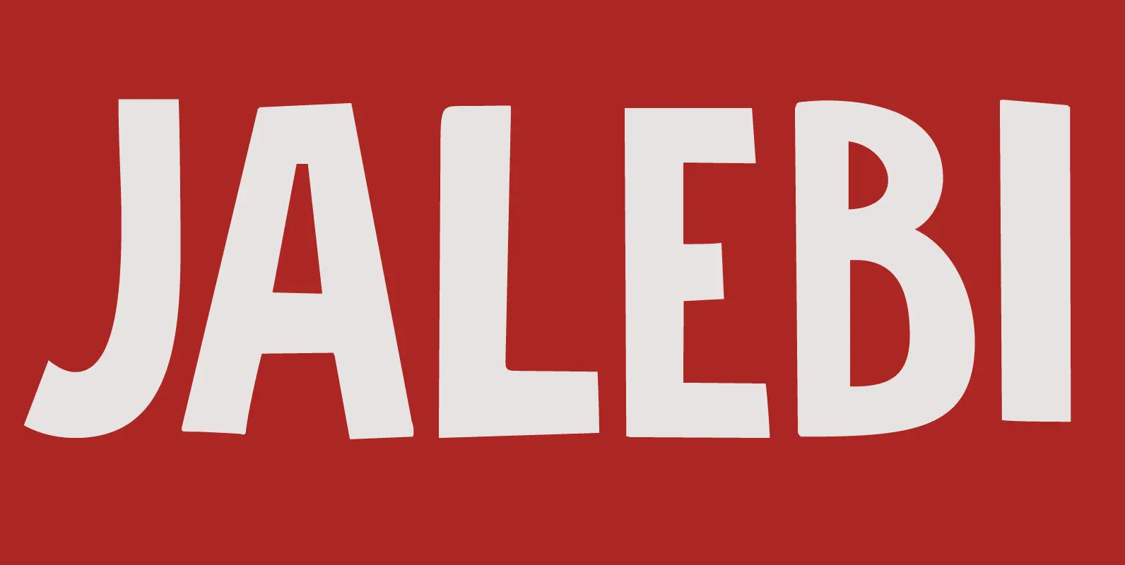
Jalebi Font
Jalebi font is quite like its namesake, the Indian deep-fried sweet. It is fat(tening), uneven, crunchy and addictive. Jalebi is an all caps font, but upper and lower case glyphs differ slightly and can be mixed. An ideal font for