Tag: legible
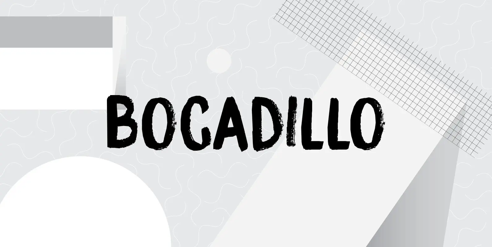
Bocadillo Font
A Bocadillo is a sandwich. I guess I was craving one when I had to name this font! Bocadillo is a sweet Brush script. It is all caps, but upper and lower case are different and like to mingle. It
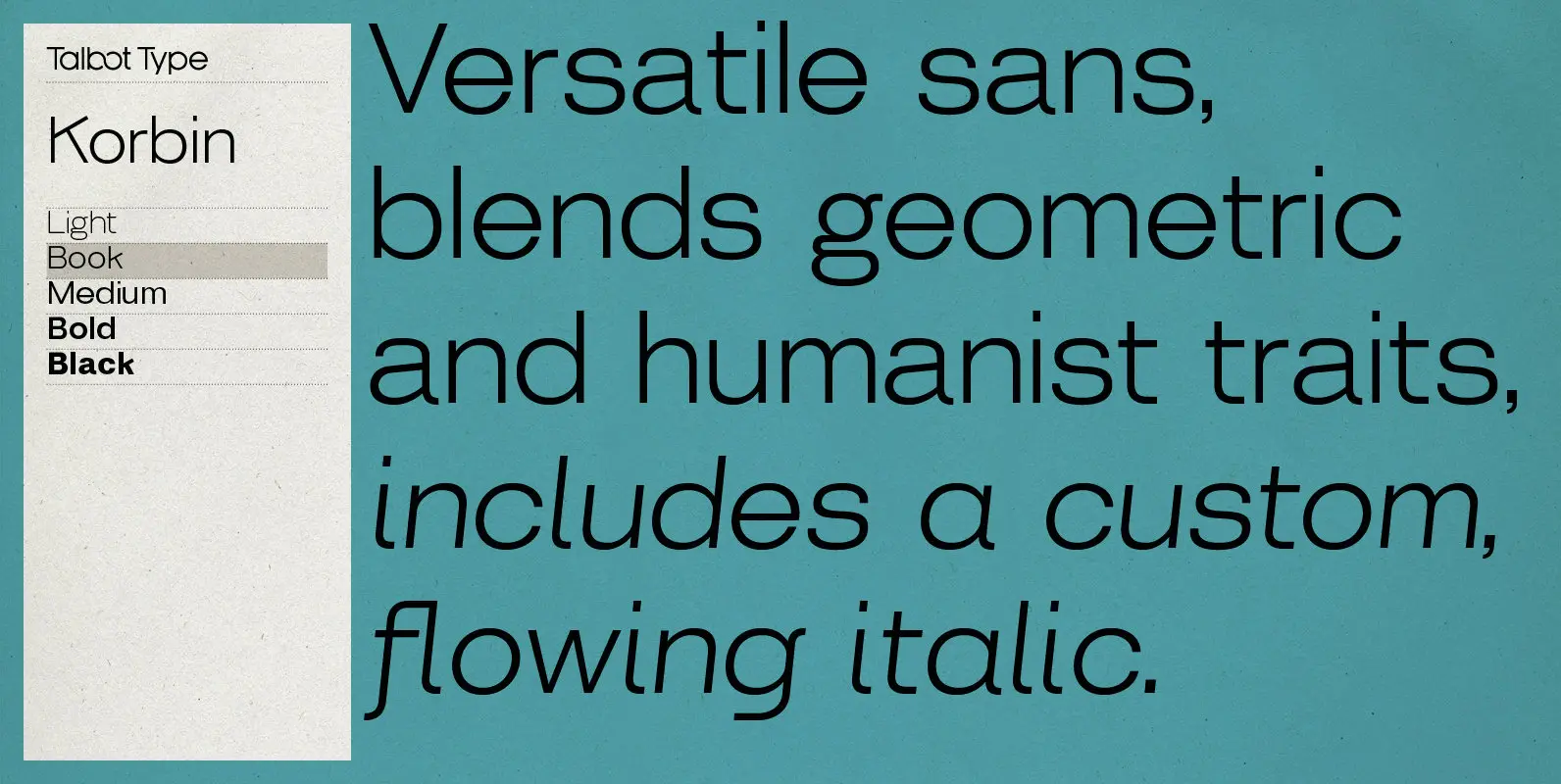
Korbin Font
Inspired by the sans-serifs of the late 19th and early 20th century, Korbin is a legible and versatile text and display face available in five weights. It mixes geometric and humanist traits to achieve a modern, clean, friendly appearance. The

Buddy Font
Buddy is the new companion sans for Contenu, the book font family designed for an upcoming book on book family design. It has the same vertical metrics as the Contenu families, so it fits perfectly in run-in heads, nested styles,
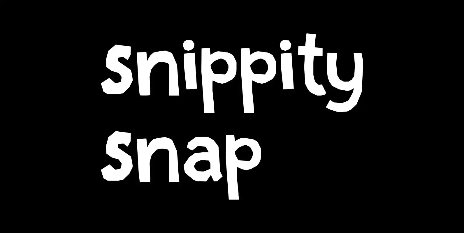
Snippity Snap Font
Snippity Snap is a font made up of glyphs I cut out from black paper with some household scissors, then pasted onto white paper. When I was cutting out the shapes, my children asked me what I was doing, and
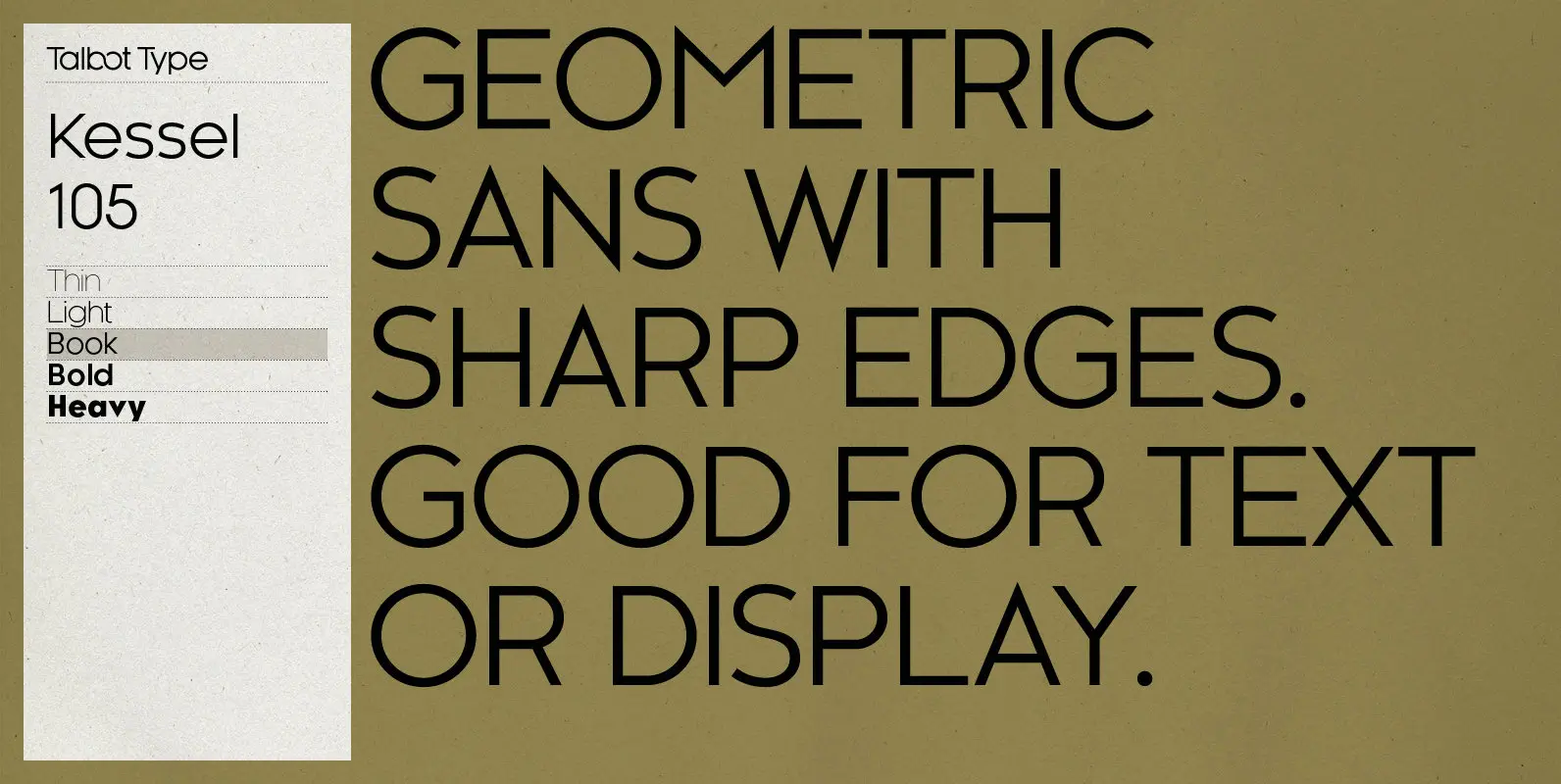
Kessel 105 Font
Kessel 105 is inspired by the classic, geometric sans-serifs such as Futura, but has shallower ascenders and descenders for a more compact look, and features an art deco influence with sharp points at the apex of many characters. It’s a
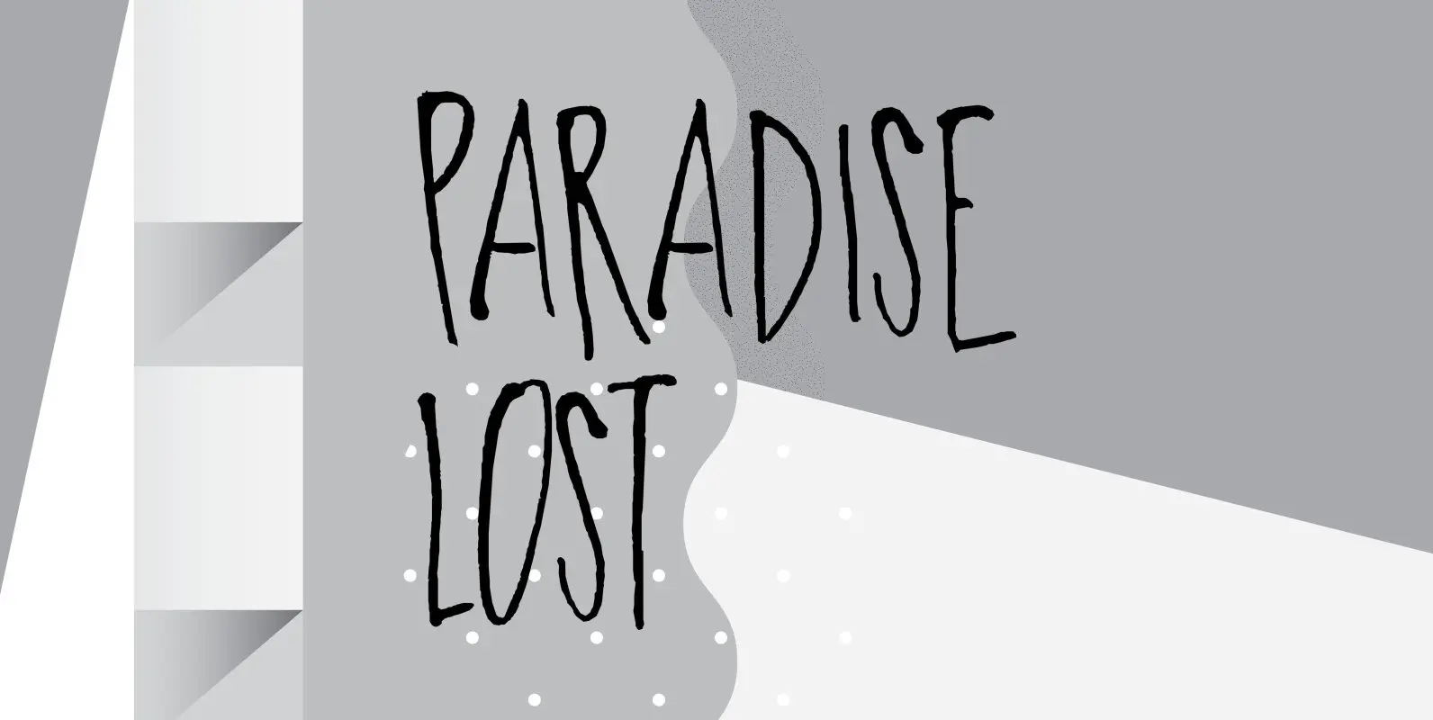
Paradise Lost Font
Paradise Lost is a 1667 poem by John Milton which mostly concerns the Biblical story of the Fall of Man, Eve’s temptation by the devil and the expulsion of Adam and Eve from Eden. It’s quite a hefty read, as
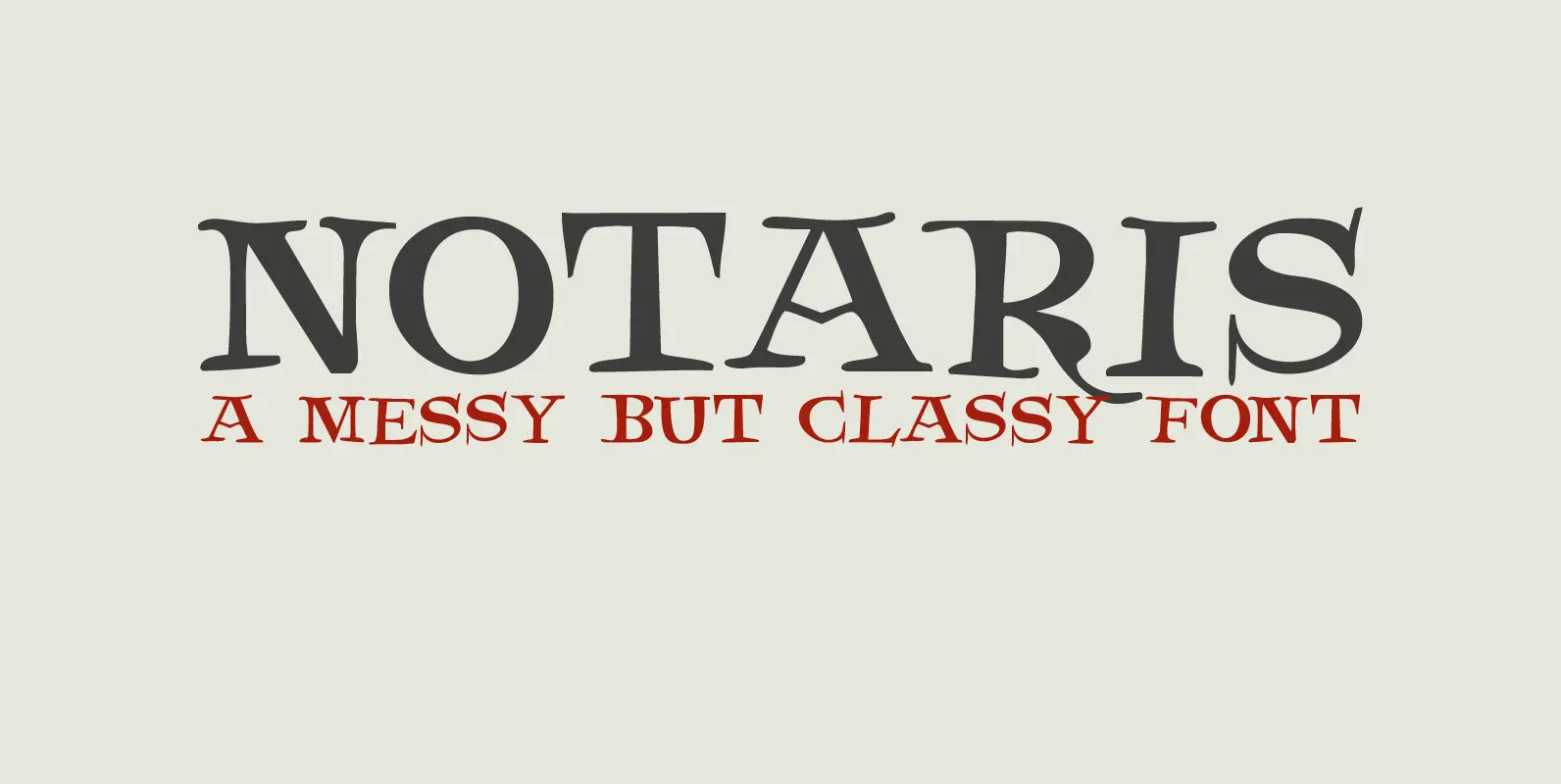
Notaris Font
Notaris (‘Notary’ in Dutch) is a hand-drawn, all caps didone-style typeface. It is a little rough, a little uneven, but lively and elegant as well. Comes with an abundance of diacritics and, lo and behold, some end-ligatures as well. Published
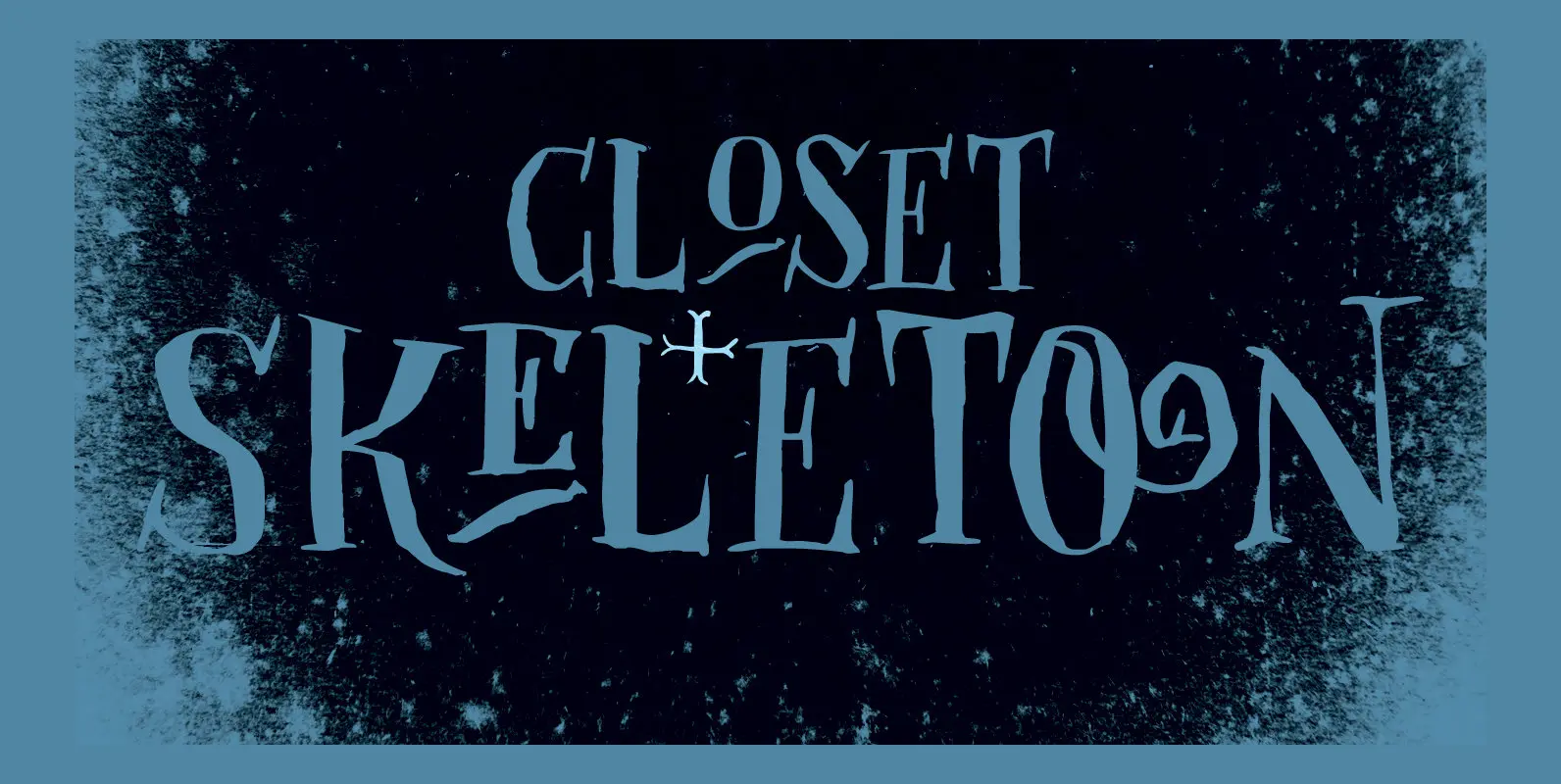
Closet Skeleton Font
Some time ago I stumbled upon a little book called ‘De Sprookjeshoorn’ (‘Horn of Fairy Tales’) by Anton Eijkens (1920 – 2012). It was published in 1946 and contains several authentic and unique fairy tales – unfortunately unreadable to modern
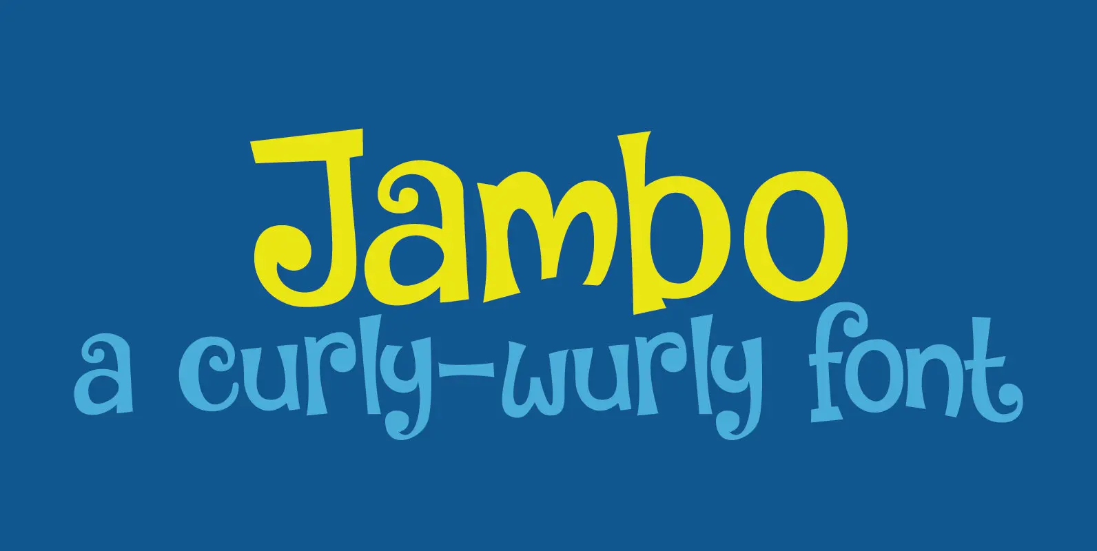
Jambo Font
Jambo (‘hello’ in Swahili) is a cute and bouncy typeface. I guess you can say that it is didone-ish in nature, but comic would also be an apt description. Jambo has generous curves, swirls and curls and comes with a
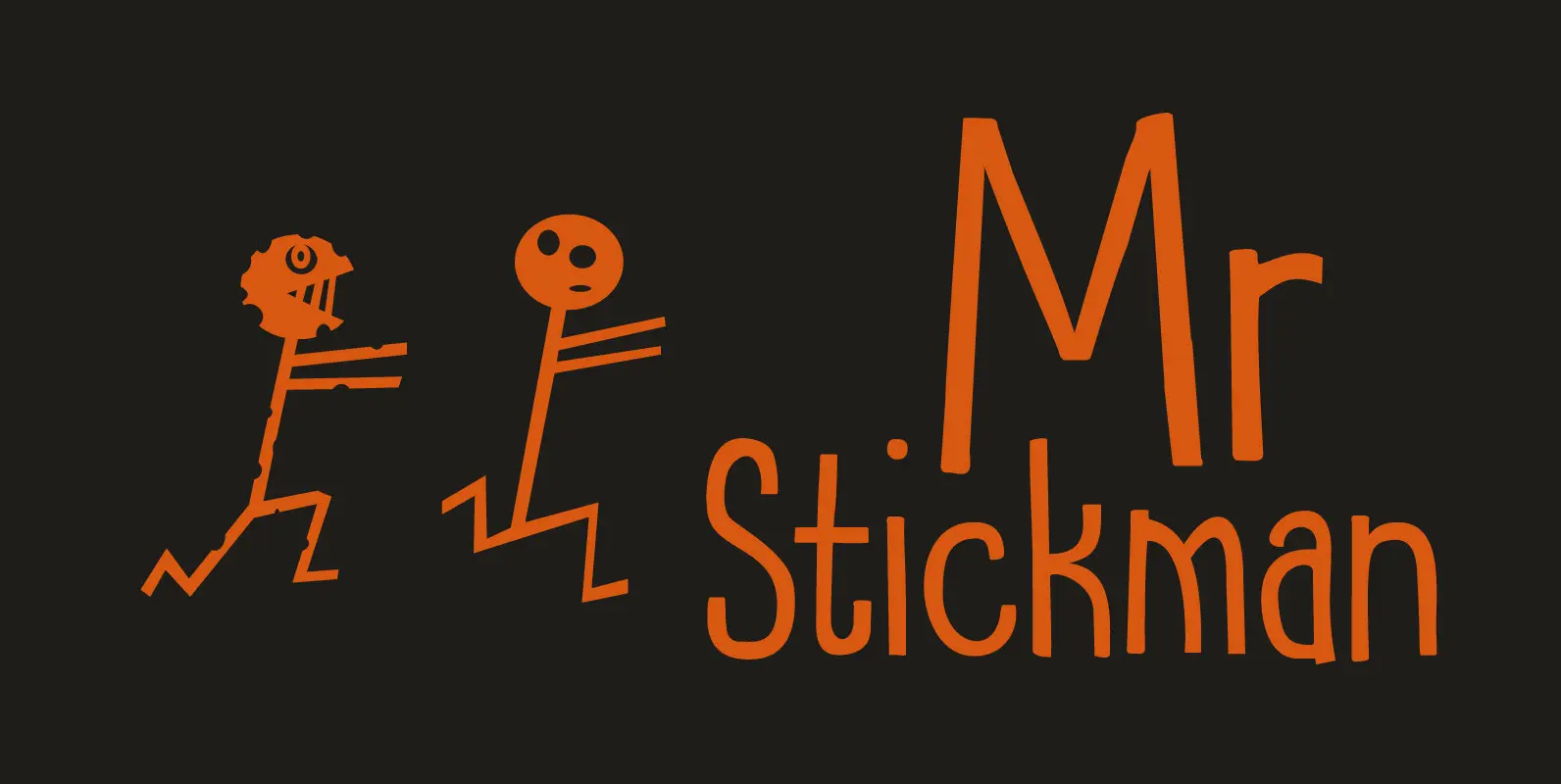
Mr Stickman Font
Mr Stickman is a happy clappy kind of font, inspired by an older font of mine called Oranjerie. Oranjerie is an all caps typeface, but Mr Stickman comes with lower case letters – AND – a Stickman Action Figures pack!
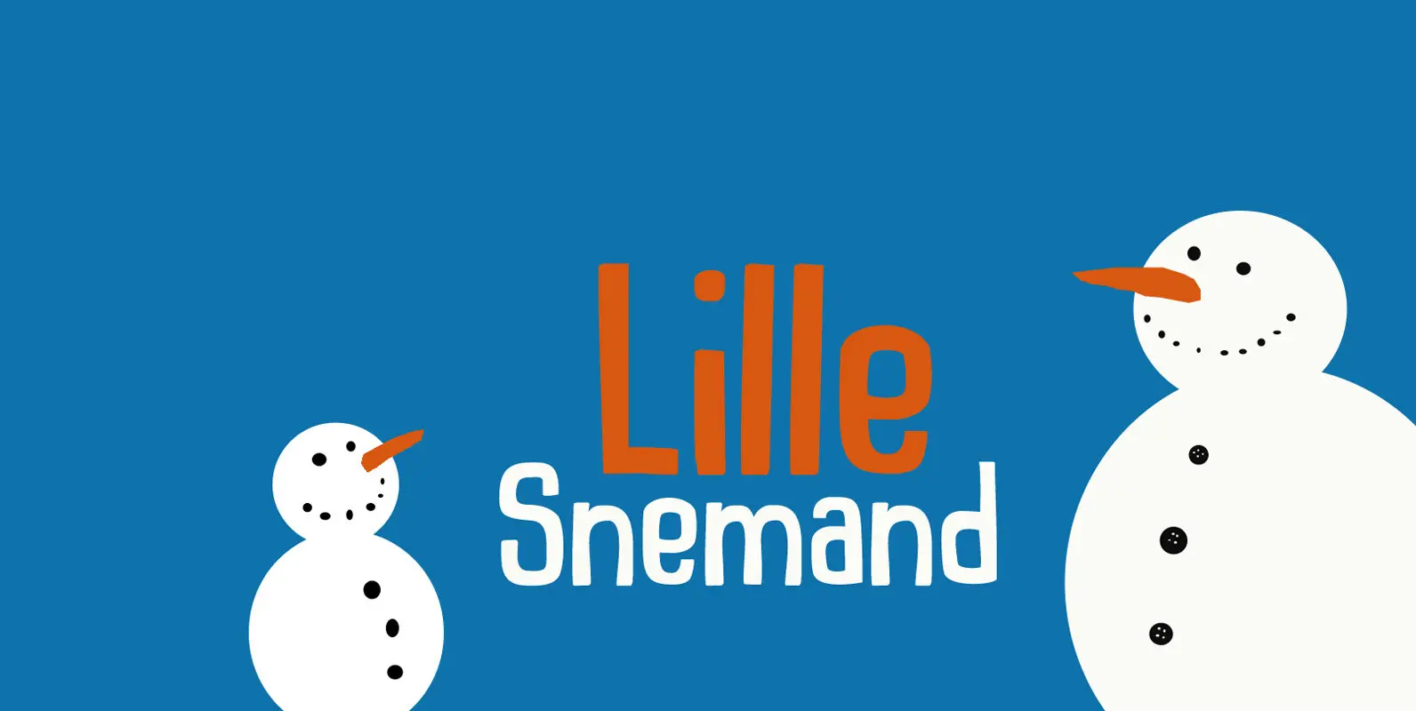
Lille Snemand Font
Lille Snemand, in Danish, means Little Snowman – like the Little Mermaid, but then colder… Lille Snemand is kin to the original Snemand font, which is an all caps typeface, but unlike its big brother, Lille Snemand comes with lowercase
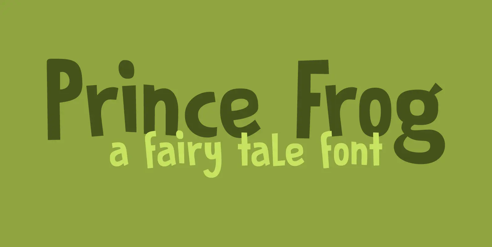
Prince Frog Font
Prince Frog started out as an attempt to ‘pimp’ Rabbit On The Moon font. It quickly evolved into an entirely different typeface with just a hint of ‘Rabbit’ in it. Prince Frog is a very happy, very legible font and
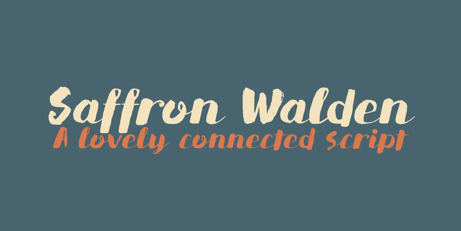
Saffron Walden Font
Saffron Walden is a small market town in Essex, England. When I created my first ever connected script font, I decided that a ‘flowery’ name would be best (since that seems to be the most popular choice for connected fonts….).
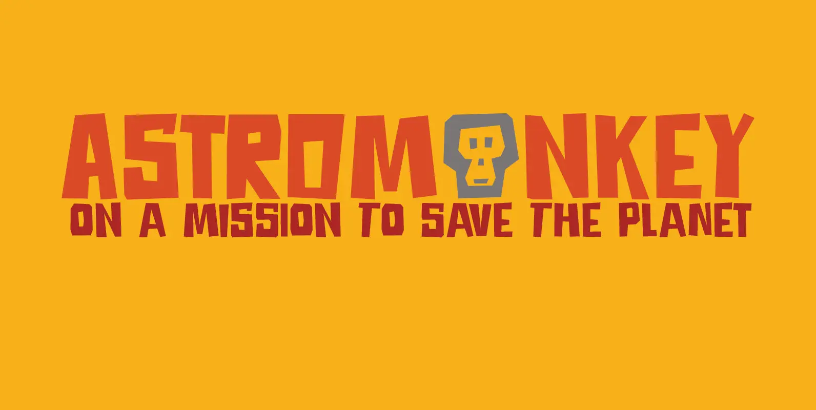
Astromonkey Font
Astromonkey – here he is, all new, all excited to be alive! Astromonkey comes from outer space, where he has rubbed shoulders with the Star Trekkers, the aliens and Major Tom, who is still floating in his tin can. The
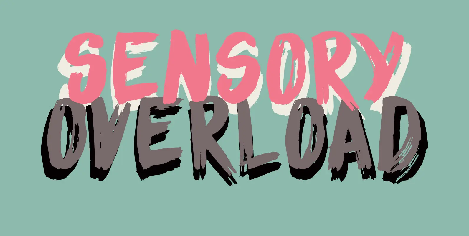
Sensory Overload Font
Whenever I create a font using a Chinese brush and ink, it almost always comes out scary-looking. Sensory Overload is not like that: it is quite a neat and tidy font, even if it is a little rough around the

Mango Smoothie Font
Summer’s almost here, so it’s time for some mango smoothies! Mango Smoothie is a tall, all caps, hand drawn font. A little shaky, a little uneven, but with a big taste and some creamy glyphs. Comes with multi-language support. Published
