Tag: legible
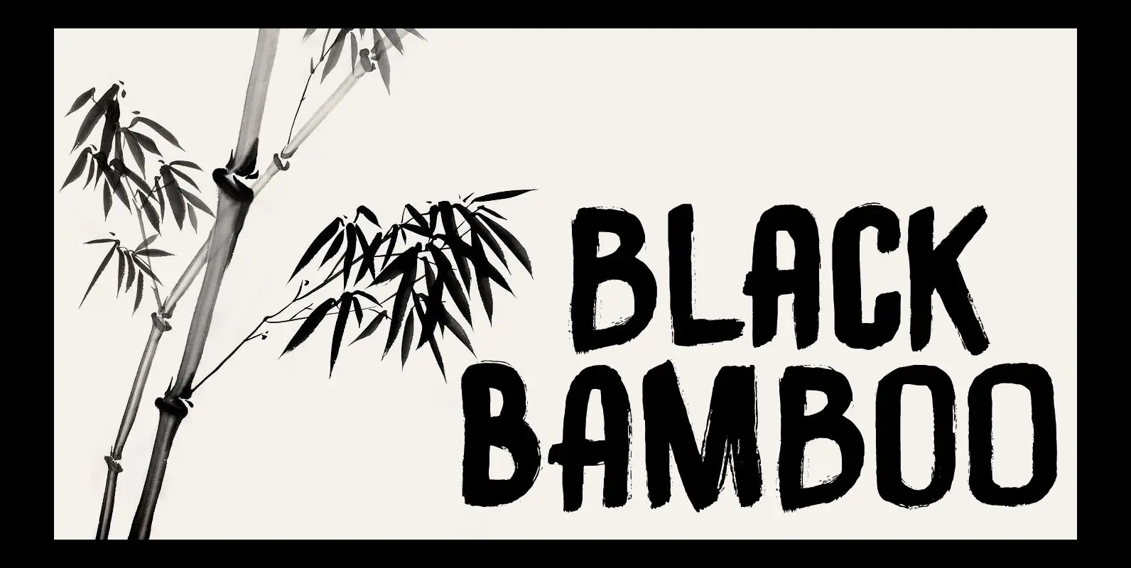
Black Bamboo Font
Black Bamboo is a beautiful plant. My father in law, who recently passed away, loved it and had a prized specimen growing in his garden. This font was named in his honour. Black Bamboo font is a bold typeface, created
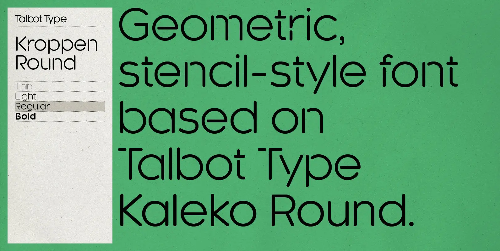
Kroppen Round Font
Kroppen Round is a geometric, stencil-style font based on Talbot Type Kaleko Round, and is available in four weights. Kroppen is not strictly a stencil font given that several characters, notably the O, are not stencilled. The design has more
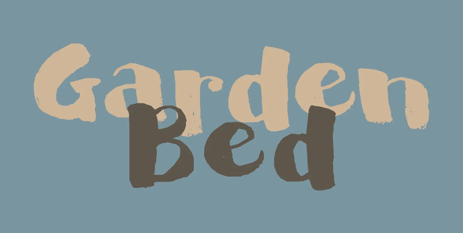
Garden Bed Font
A couple of weeks ago, I found my ink well, which I thought I had lost. I decided (there and then) to create a bunch of inky brush fonts, which resulted in Dirrrty and Scrawny Cat. And now, Garden Bed.
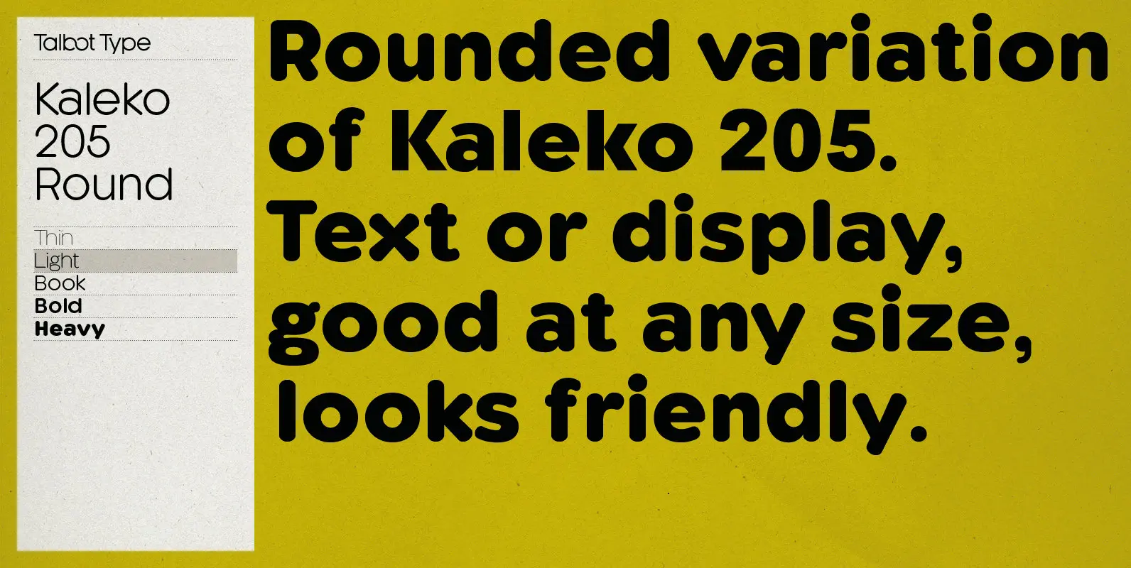
Kaleko 205 Round Font
Kaleko 205 Round is a rounded variation of Talbot Type font Kaleko 205. It’s a well-balanced, versatile, modern sans, highly legible as a text font and with a clean, elegant look as a display font at larger sizes. The rounded
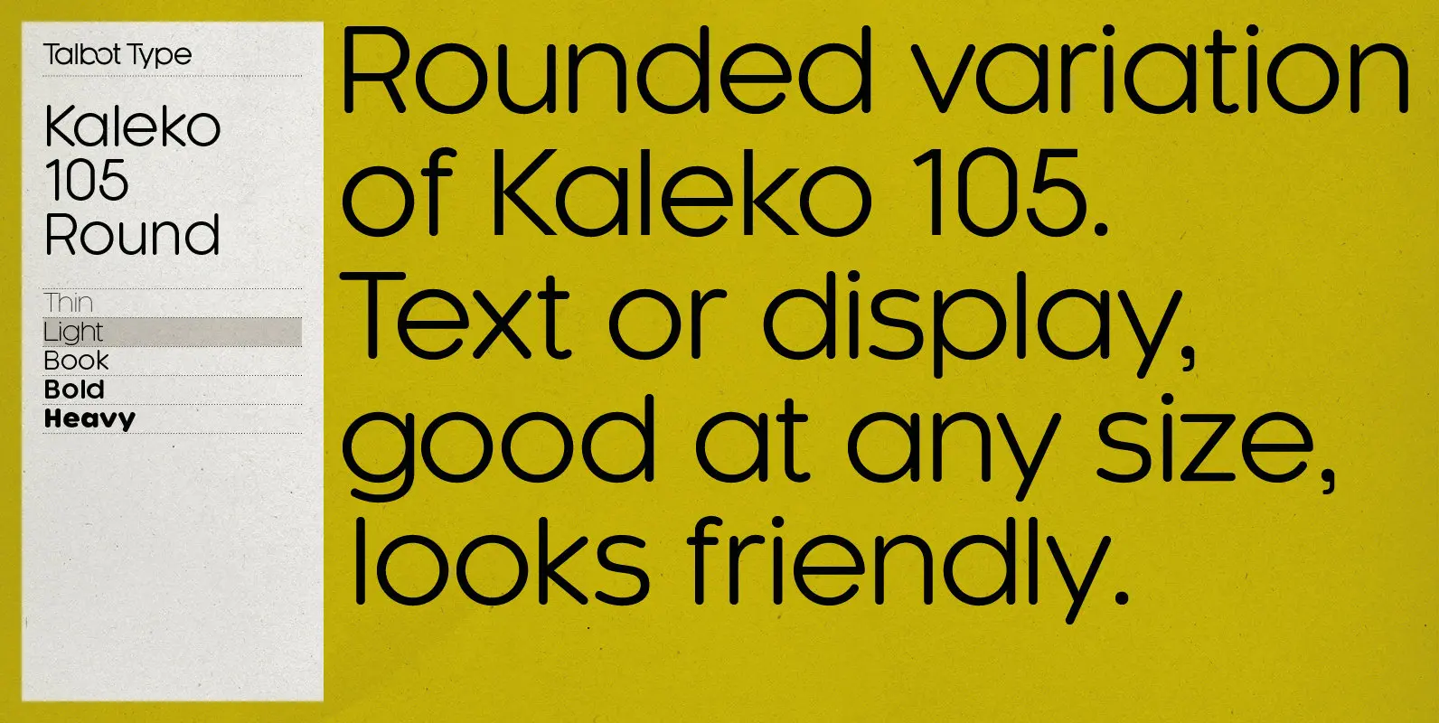
Kaleko 105 Round Font
Kaleko 105 Round is a rounded variation of Talbot Type font Kaleko 105. It’s a well-balanced, versatile, modern sans, highly legible as a text font and with a clean, elegant look as a display font at larger sizes. The rounded
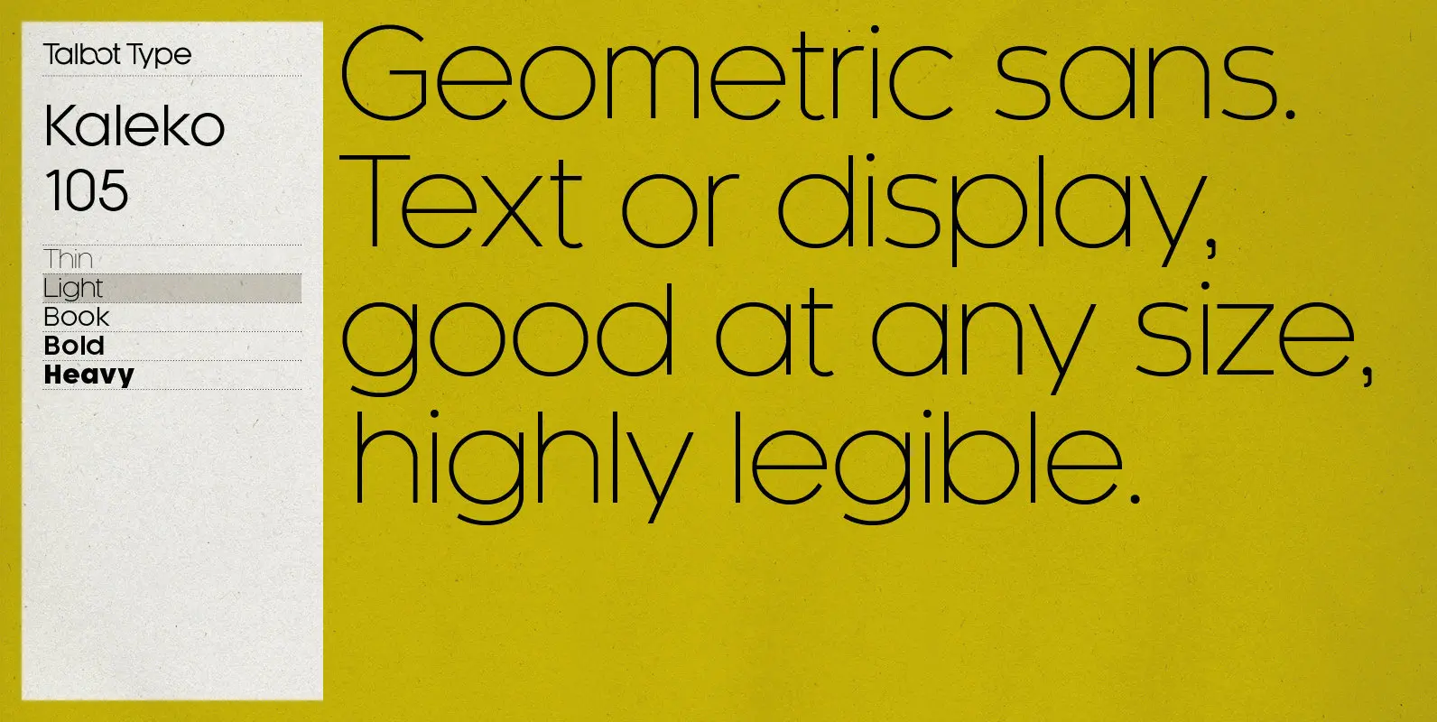
Kaleko 105 Font
Kaleko 105 is inspired by the classic, geometric sans-serifs such as Gill Sans, but has shallower ascenders and descenders for a more compact look. It’s a well-balanced, versatile, modern sans, highly legible as a text font and with a clean,
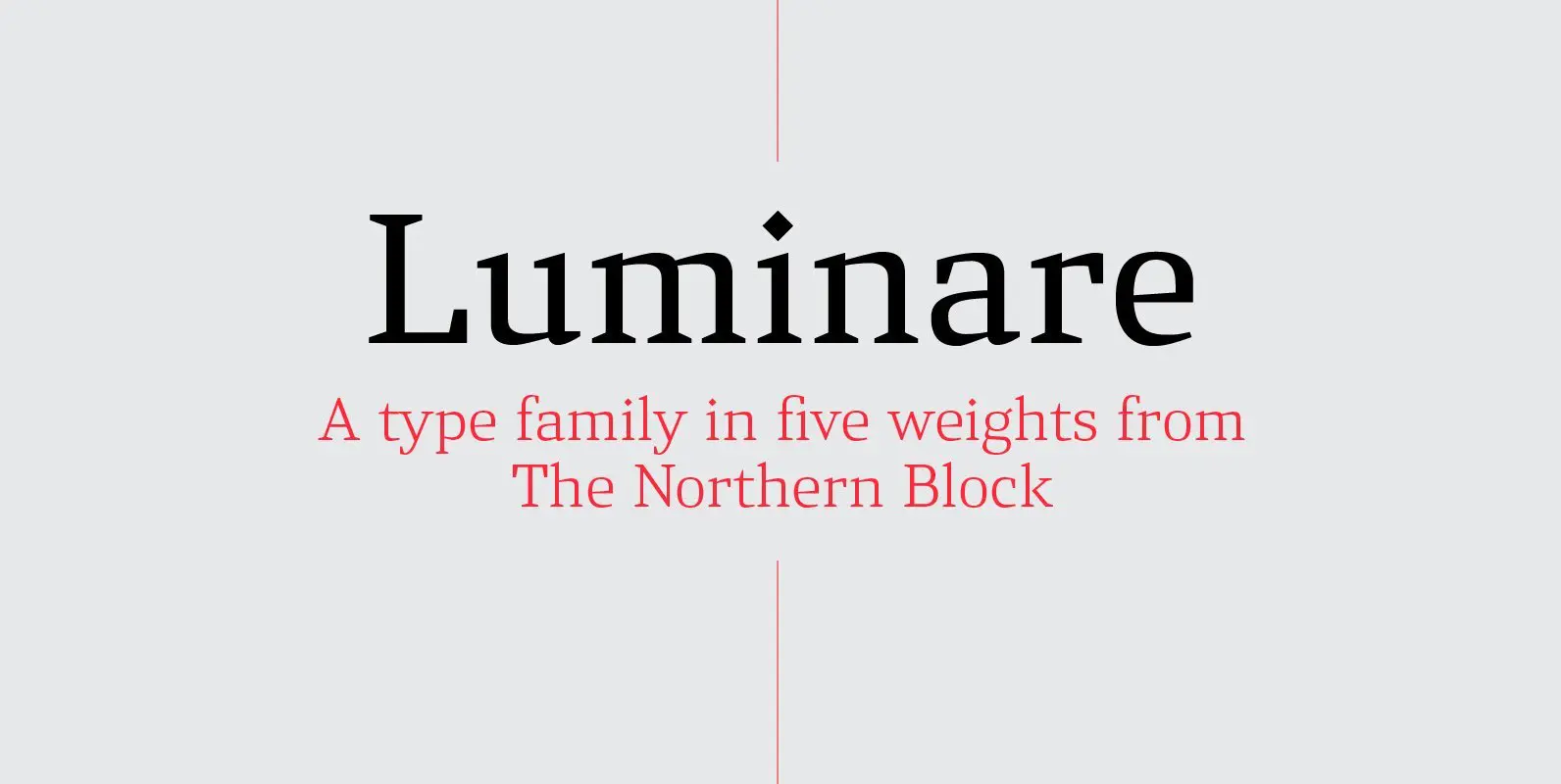
Luminare Font
Luminare is a serif type family with a strong rhythmical structure, clean cut serifs and balanced proportions. Luminare began life as a personal and academic enquiry into stencilled lettering. The key sources of this research where found in liturgical manuscripts

Henderson Slab Font
A few bold caps drawn by Albert Du Bois for the 1906 Henderson Sign Painter book started me in the direction of looking at how sign painters approached slabs after the industrial revolution. The usual happened from there. My exercise
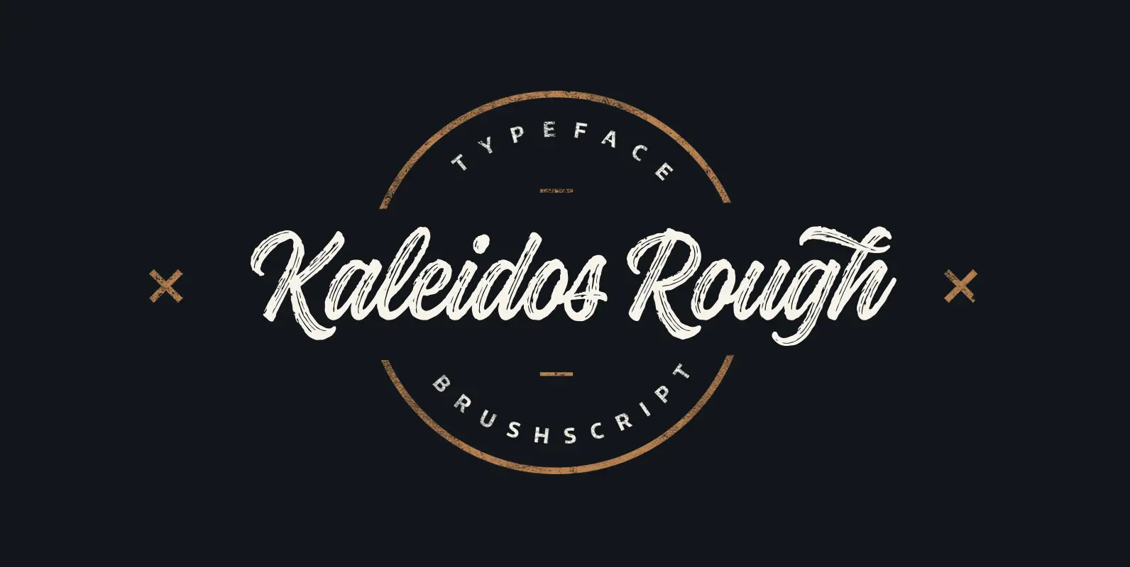
Kaleidos Rough Font
Kaleidos Rough lining brush script. It has two versions; Kaleidos Rough and Kaleidos Textured. Rough version has rough edges to mimic authentic brush strokes. Textured version has also those rough edges and in addition it has brush stroke texture to
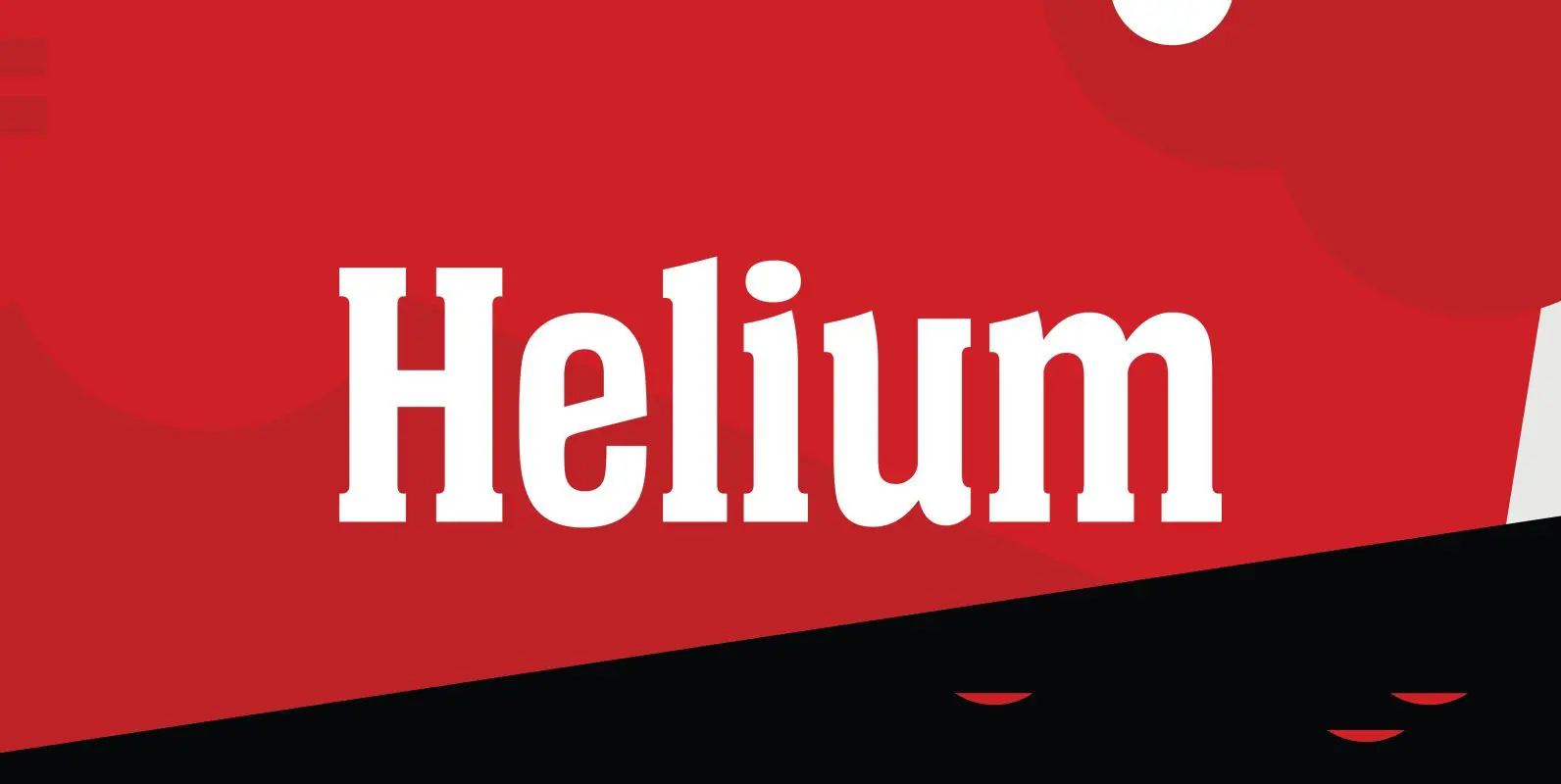
Helium Font
Designed by Steve Jackaman, Helium is a unique serif design re-tooled from the classic BF Collection. Published by Red RoosterDownload Helium
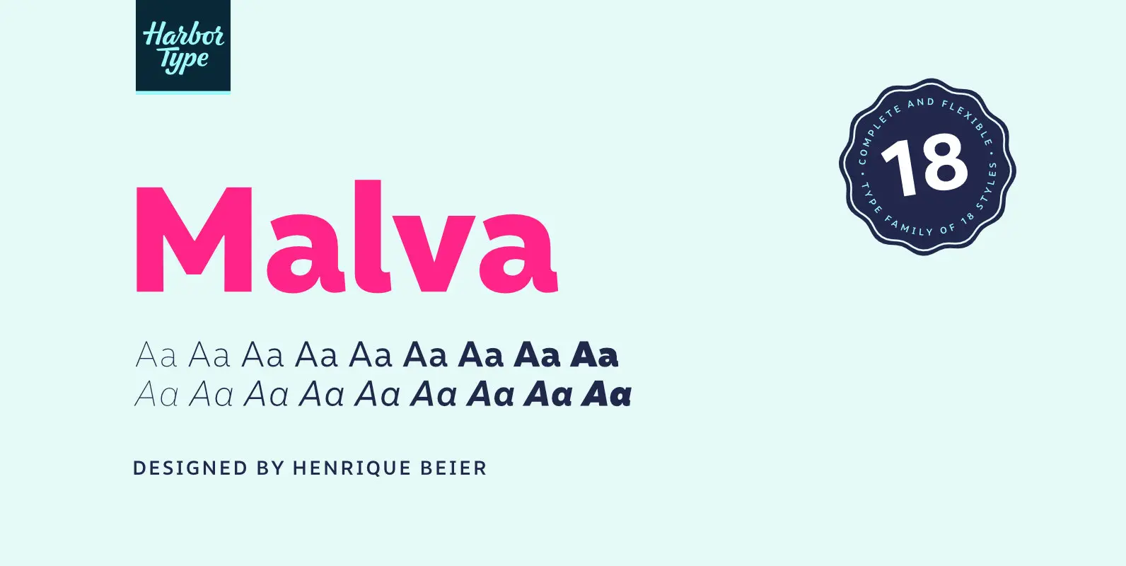
Malva Font
Malva was designed to perform as a branding element, providing a clean look for visual identities and publications. It brings a touch of friendliness to the communication without compromising the professional look every brand strives for. Legibility was one of
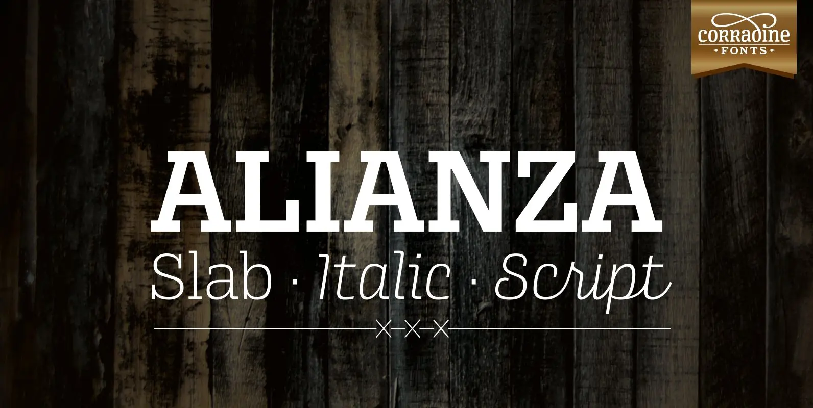
Alianza Font
This is a complex typographic system which includes three different but complementary styles so far: Slab, italic and script, with nine weights each one; plus three sets of ornamental fonts: labels, negative labels and ornaments. The soul of the family
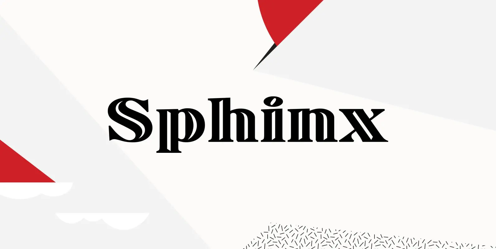
Sphinx Font
Designed by Steve Jackaman, Sphinx is a serif font based on the Deberny & Peignot, circa 1925. Originally, the inline was a capitals only font. Published by Red RoosterDownload Sphinx
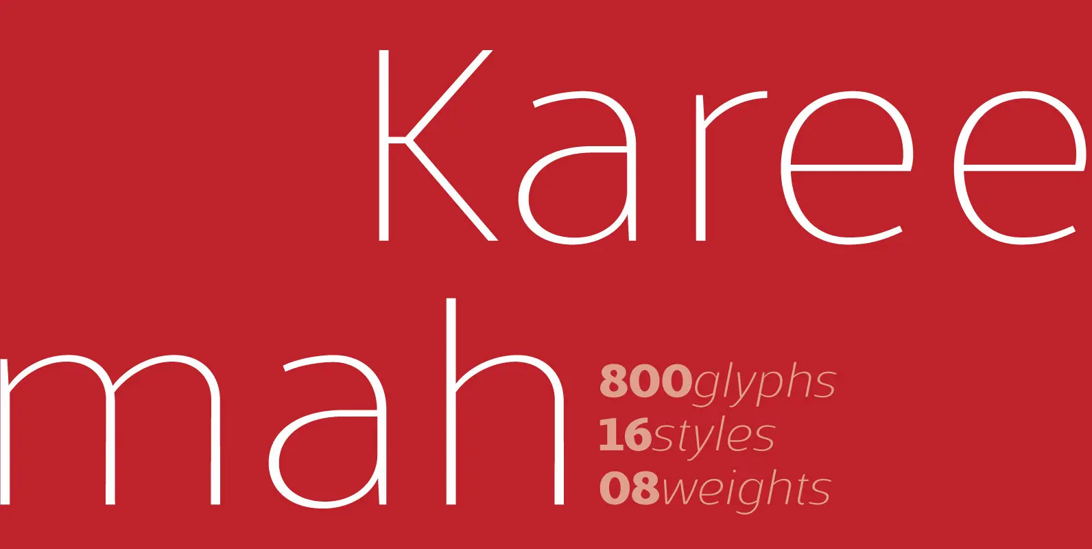
Kareemah Font
Kareemah is a humanist typography, composed by roman and italics with 16 styles and 08 weights (800 glyphs) including ligatures, alternates, small caps, old styles figures, fractions, superiors, inferiors and more. Perfectly legible and clean in the long, simple texts
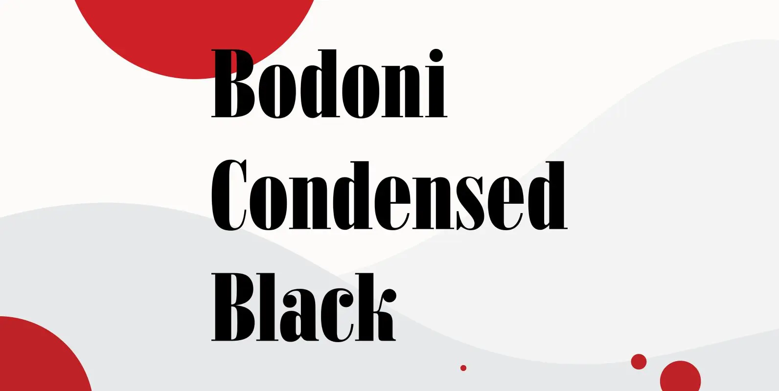
Bodoni Condensed Black Font
Bodoni Condensed Black was designed by R.H. Middleton for Ludlow, circa 1930. Digitally engineered by Steve Jackaman. Published by Red RoosterDownload Bodoni Condensed Black
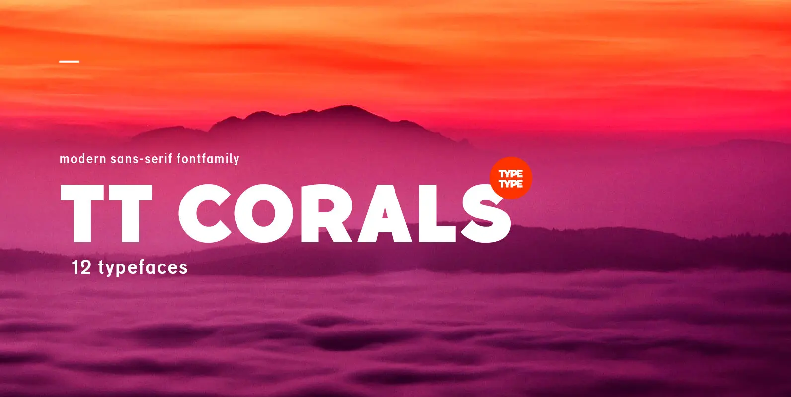
TT Corals Font
TT Corals is a modern humanistic sans-serif which has many typical traits of the beginning of the 20th century. For an increased functionality of the font family we’ve created 6 typefaces of various weights: Thin, Light, Regular, Bold, Extrabold, Black.
