Tag: legible
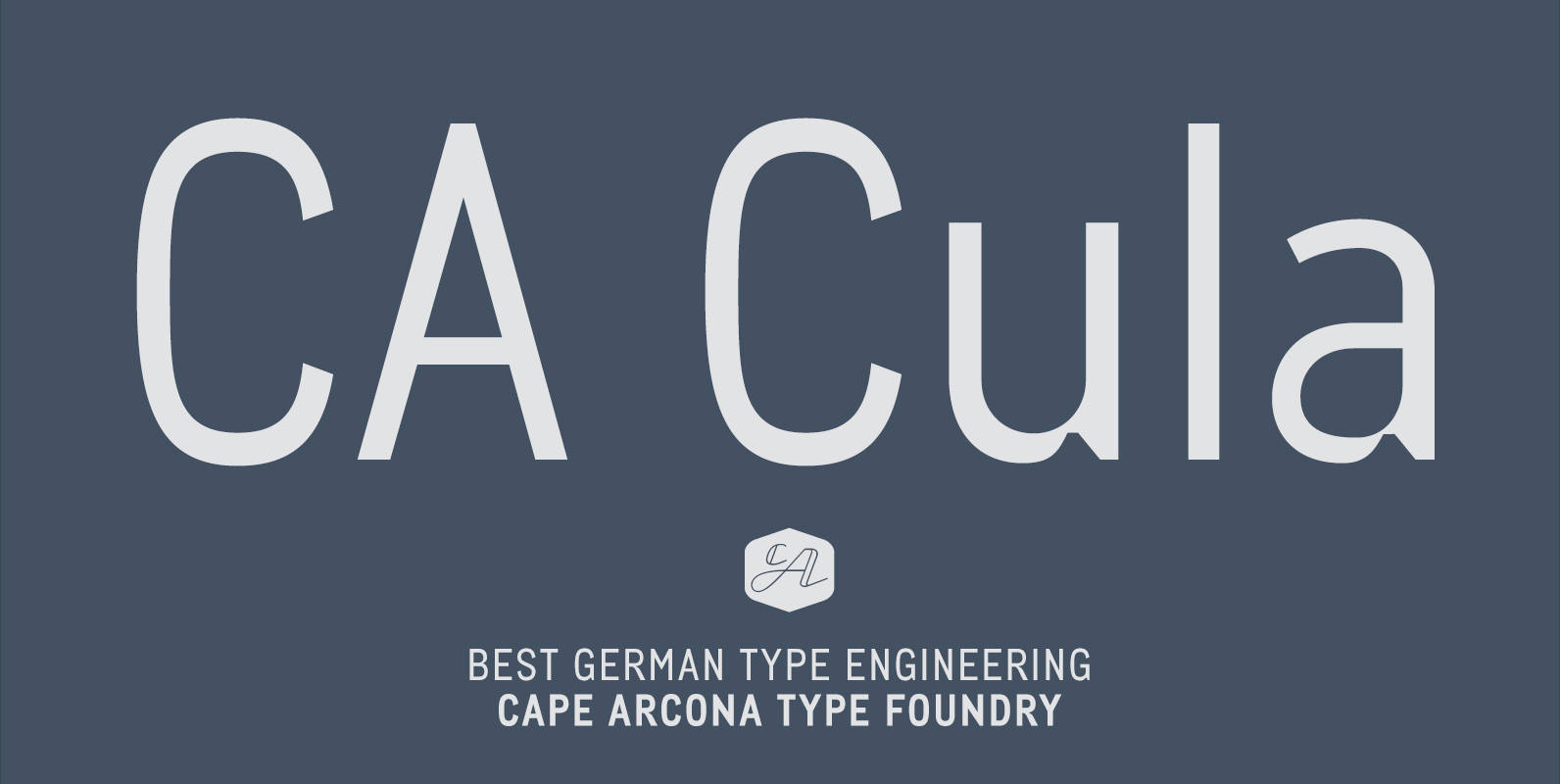
CA Cula Font
CA Cula is standing in the tradition of cool tempered sans serif typefaces like DIN. But at a closer look it reveals a tendency towards rounder reading-friendly forms. The denaturalized ink traps give CA Cula a very special and individual
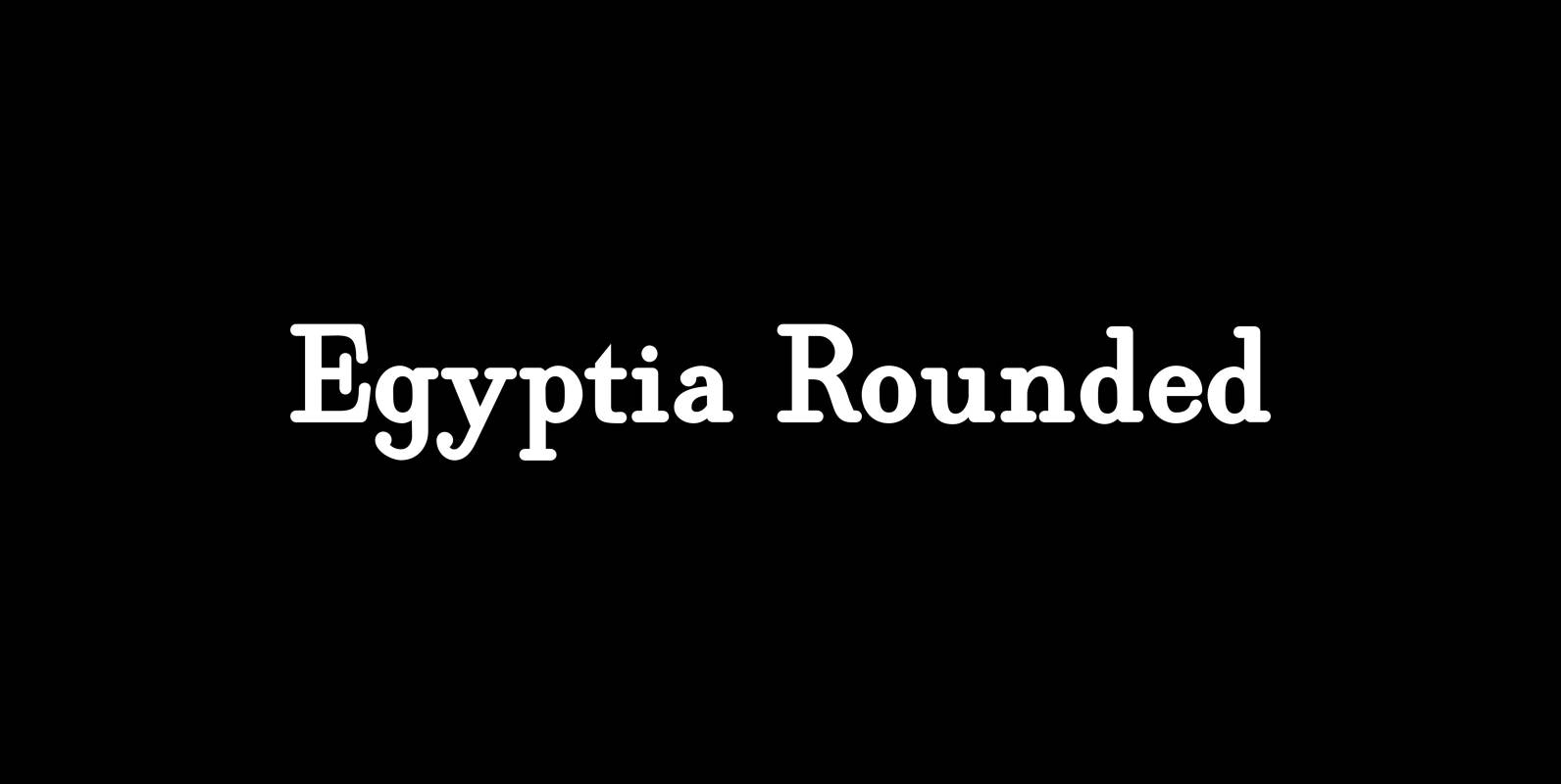
Egyptia Rounded Font
“Egyptia Rounded” is a modern slab serif with rounded slabs. I only sell pairs, but for a fair price. Published by Wiescher DesignDownload Egyptia Rounded
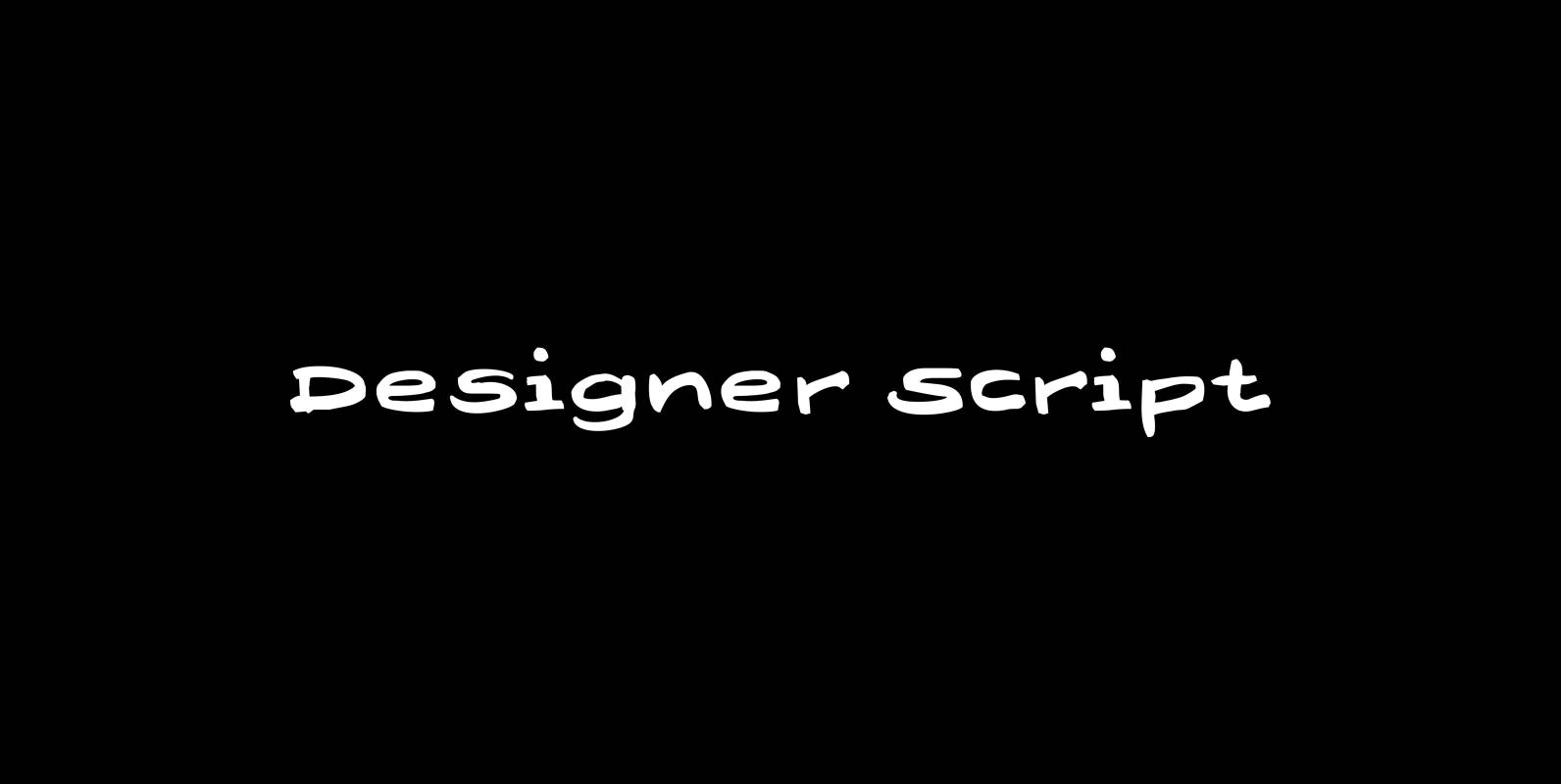
Designer Script Font
“Designer Script” is a very cool script, that has only one objective and that is pure transportation of information. Attracting as little attention to the script itself as possible. Published by Wiescher DesignDownload Designer Script
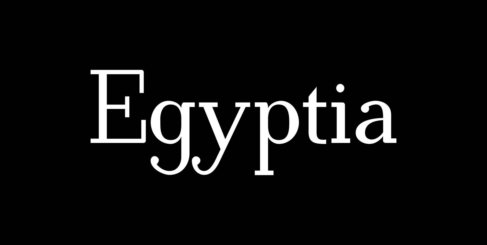
Egyptia Font
“Egyptia” is a modern slab serif with square slabs. I only sell pairs, but for a fair price. Published by Wiescher DesignDownload Egyptia
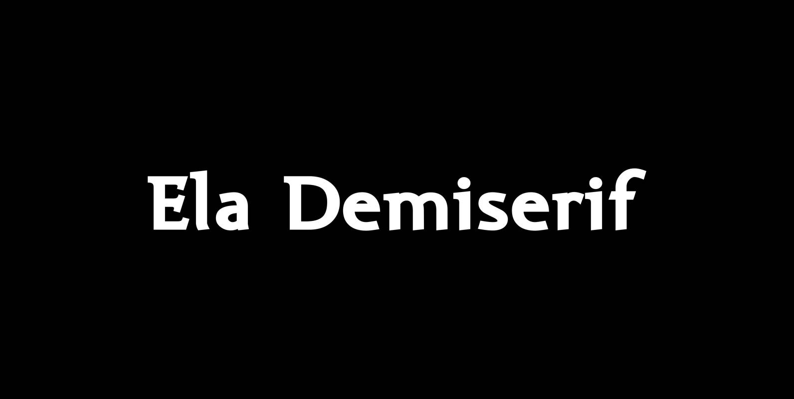
Ela Demiserif Font
Ela Demiserif is the typeface I originally designed for the business of my second wife and mother of my two sons; her name is, of course, Michaela. Ela – the typeface – is suitable for magazines, newspapers, posters, advertisements, books,
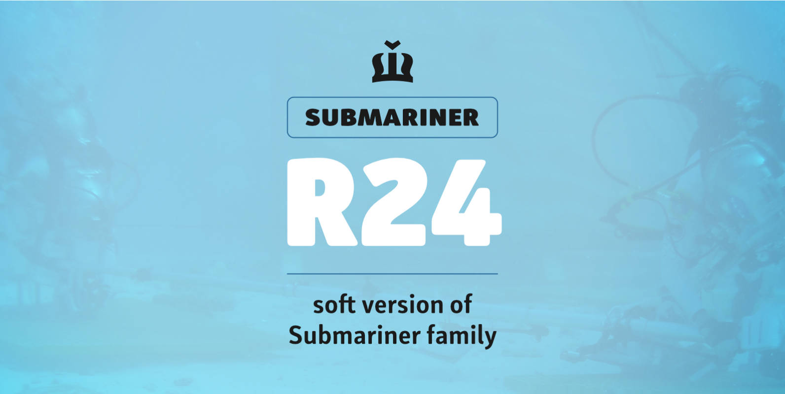
Submariner R24 Font
Submariner R24 is a modification of the Submariner type family. It still holds pleasant humanistic construction, but now the letters are easier. Rounded corners enhance the typeface’s sophistication and broaden its usability. It is a remarkable typographic discovery. The letter

Submariner Font
Submariner is a waterproof type family that displays the right amount of power and character on every depth level. Thanks to its strong and humanistic construction, it can endure great information pressure. It is a marvelous typographic experience. The letter
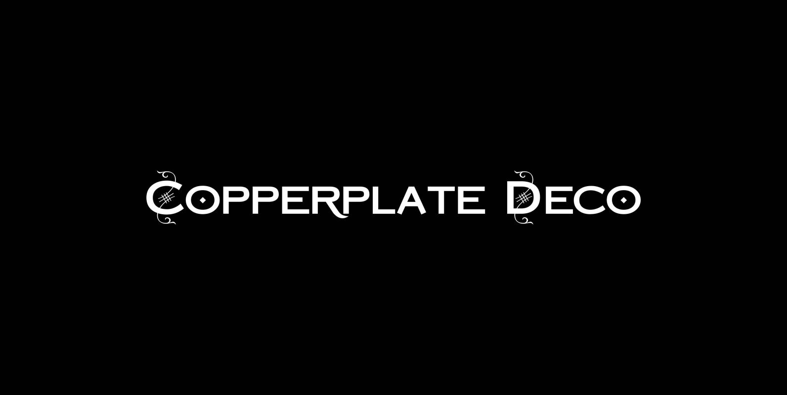
Copperplate Deco Font
“Copperplate Deco” is my sparingly decorated version of my Copperplate fonts. They can be used as stand alone fonts. Published by Wiescher DesignDownload Copperplate Deco
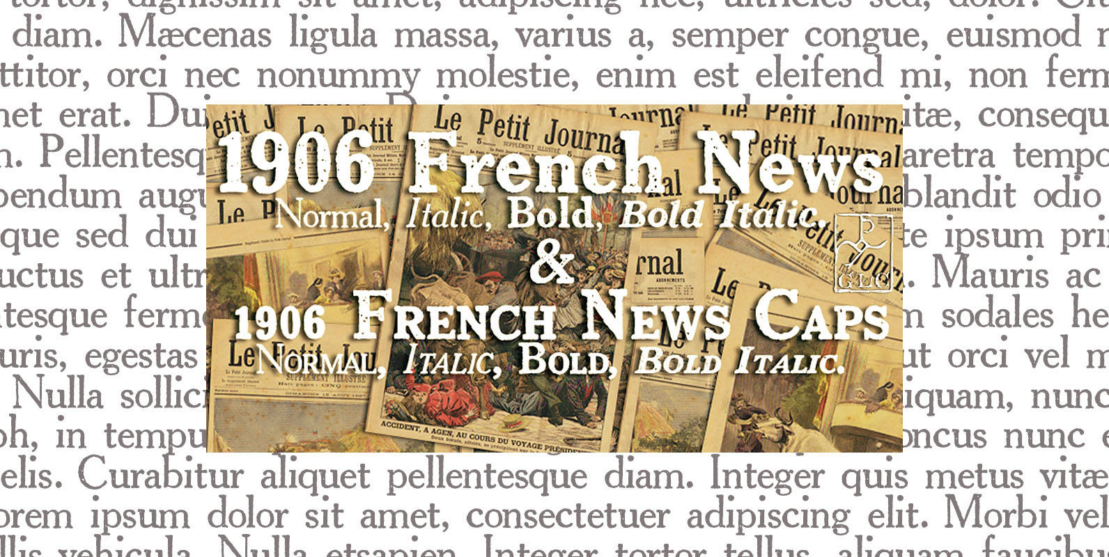
1906 French News Font
We have created this family inspired from the numerous derivatives in use for newspapers since the middle of 1800’s to the years 1970’s, inspired from the well known Clarendon. Mainly, the patterns are these used to print “Le Petit Journal”,
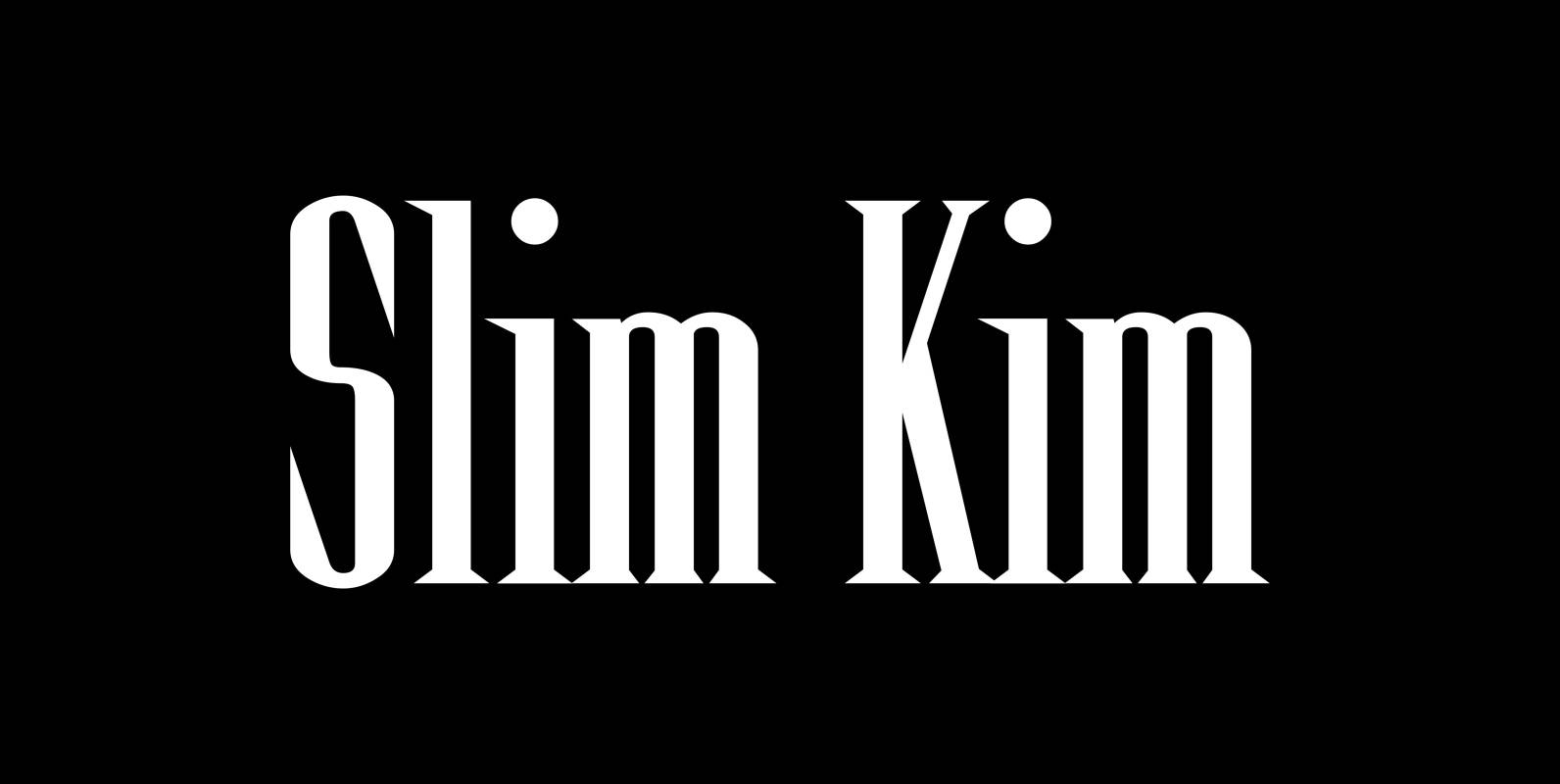
Slim Kim Font
“Slim Kim” is the sister font of “Julienne”. This font has very spiky serifs, so I did not want to make an extra slim version. This font mixes perfectly with “Julienn”. So whenever you need an especially slim serif font
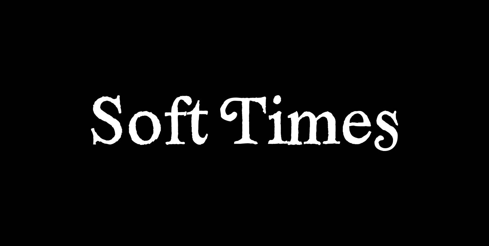
Soft Times Font
“Soft Times” has been easy on my nerves after the strain of “Hard Times”. The harder the Times are the more do we need some soft typefaces, this one is the soft counterpart for “HardTimes”. Published by Wiescher DesignDownload Soft
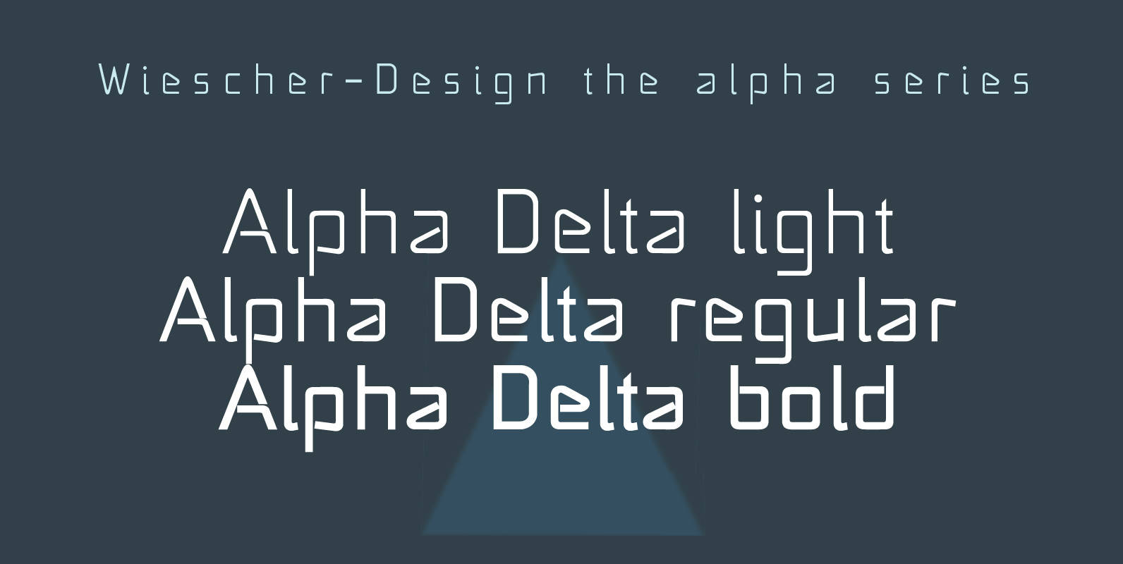
Alpha Delta Font
“Alpha Delta” the standard paperclip is the basic idea behind this font. By working on it, I changed it so that it doesn’t look too much like a paperclip any more. Published by Wiescher DesignDownload Alpha Delta
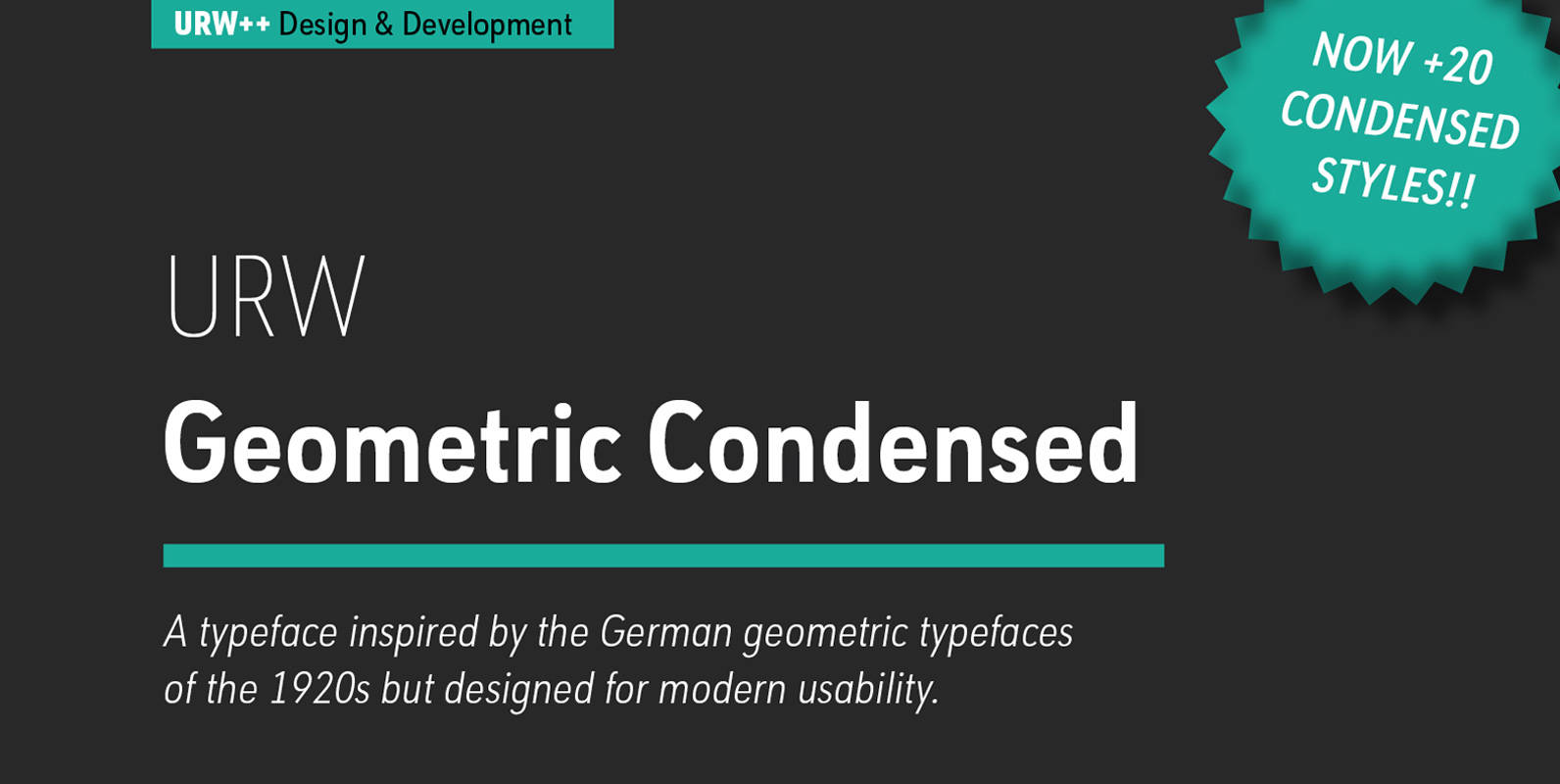
URW Geometric Condensed Font
URW Geometric Condensed is the matching complement for the URW Geometric. Including 20 additional condensed styles the URW Geometric Condensed is the space-saving alternative in the URW Geometric family. URW Geometric is a sans serif typeface inspired by the German
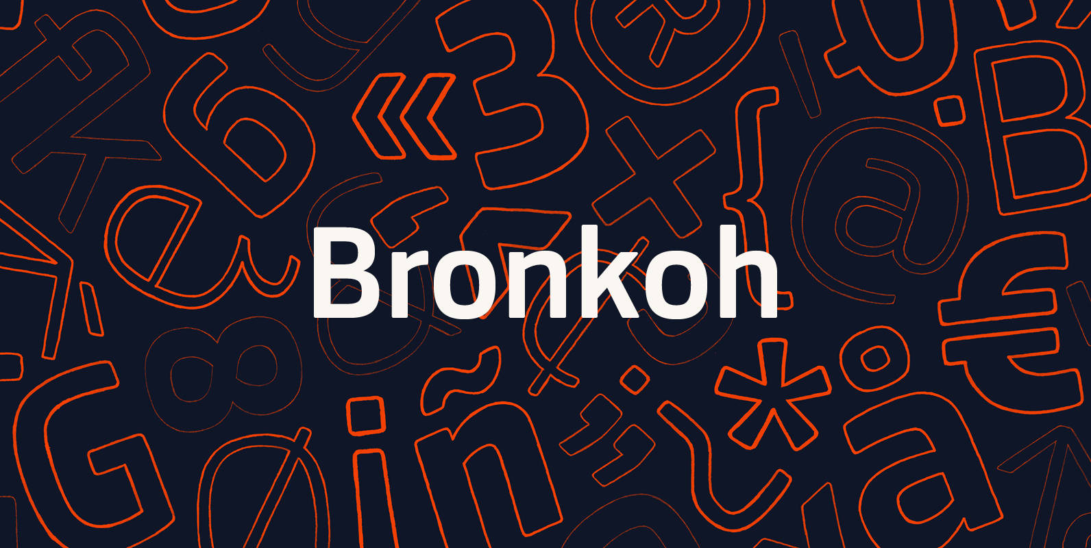
Bronkoh Font
A subtly softened sans, Bronkoh aims to give a friendly face and soft touch to type both onscreen and in print. Humanist forms and generous apertures make this a sturdy and legible face while it's softened curves and terminals give
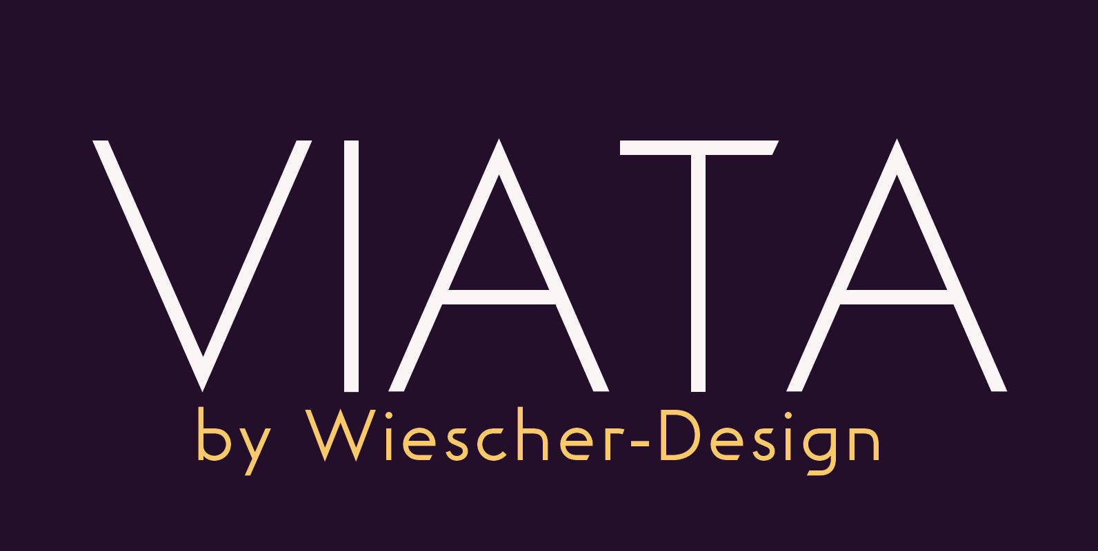
Viata Font
“VIATA” is my new experimental Sans again based on the modernistic, constructivist letterforms of the “Bauhaus” era. The names Herbert Bayer and Paul Renner come to mind as design beacons of that time. “VIATA” has flat tops and round bottoms,
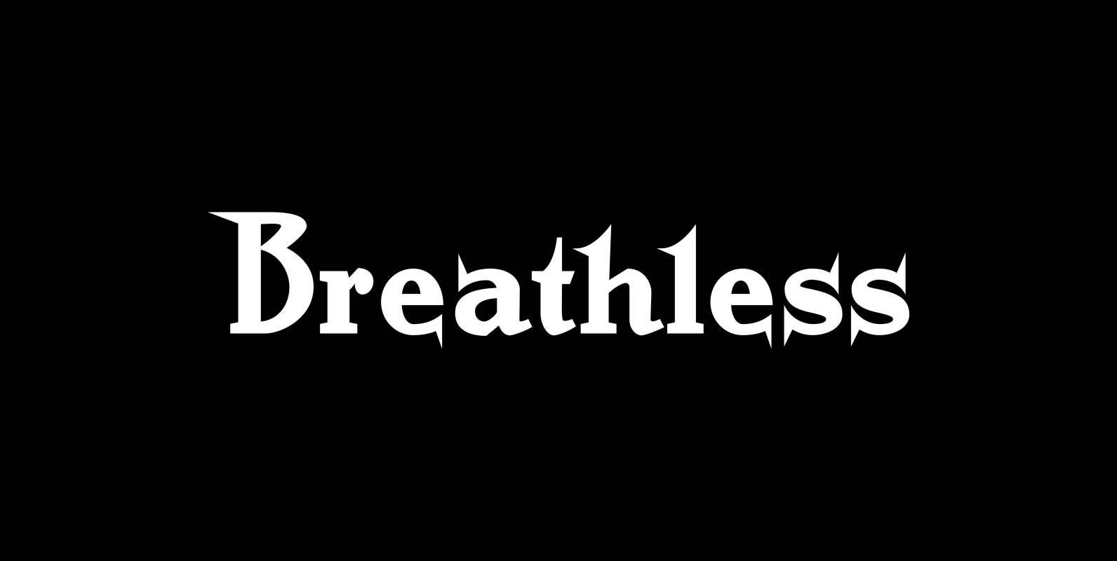
Breathless Font
“Breathless” was inspired by movie posters of the “Nouvelle Vague” era. When Jean Seberg and Jean-Paul Belmondo were young and films in black and white. So I named this very spiky affair after that phantastic movie of my youth “A
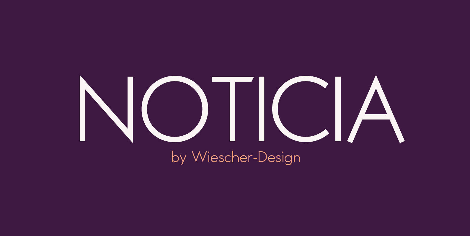
Noticia Font
“NOTICIA” is my new Sans based on the modernistic, constructivist letterforms of the “Bauhaus” era. The names Herbert Bayer and Paul Renner come to mind as design beacons of that time. “NOTICIA” is different in its proportions and long ascenders
