Tag: legible
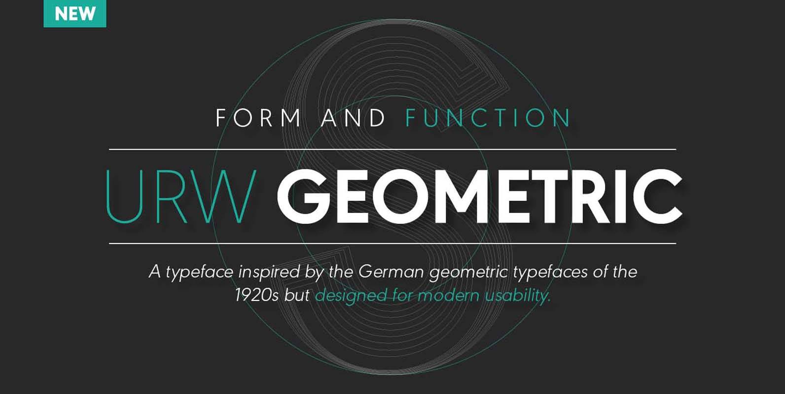
URW Geometric Font
URW Geometric is a sans serif typeface inspired by the German geometric typefaces of the 1920s but designed for modern usability. The character shapes have optimized proportions and an improved balance, the x-height is increased, ascenders and descenders are decreased.
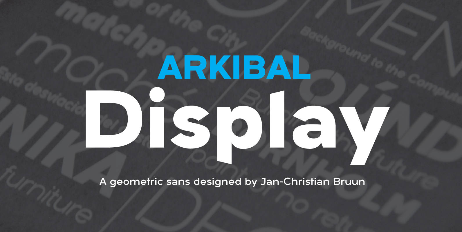
Arkibal Display Font
Display version is a little different from Sans family, where “a” is the center of the whole font. And letters “l, b, d, p, q and t” is the moved slight angle. The idea was to make two versions with
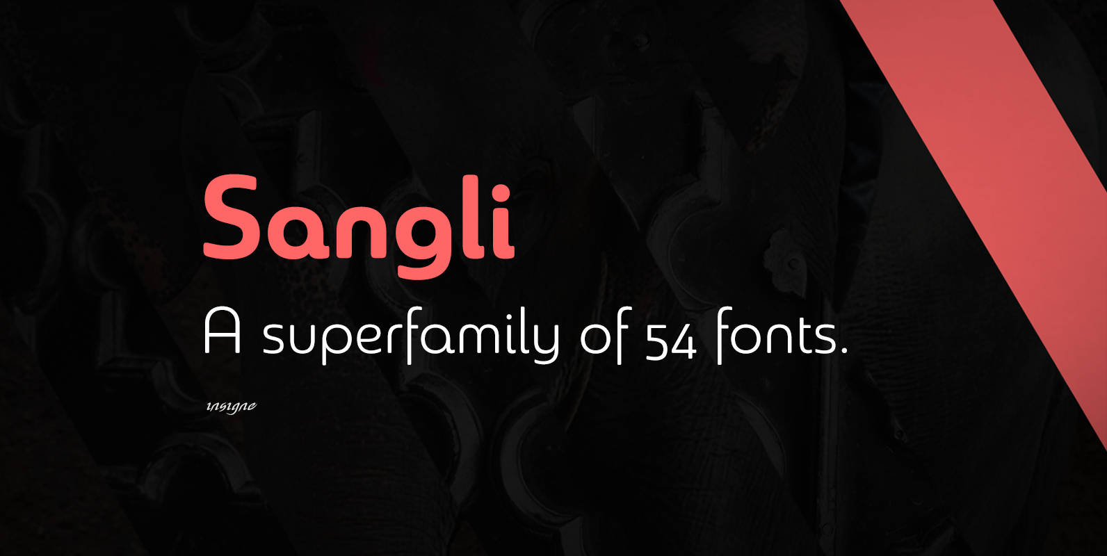
Sangli Font
It started in 2007 with Chennai, the first of a three-part series of sans that I envisioned with slab serif counterparts. Each font would differ from the others in how the stem terminals were expressed. The initial font was extremely
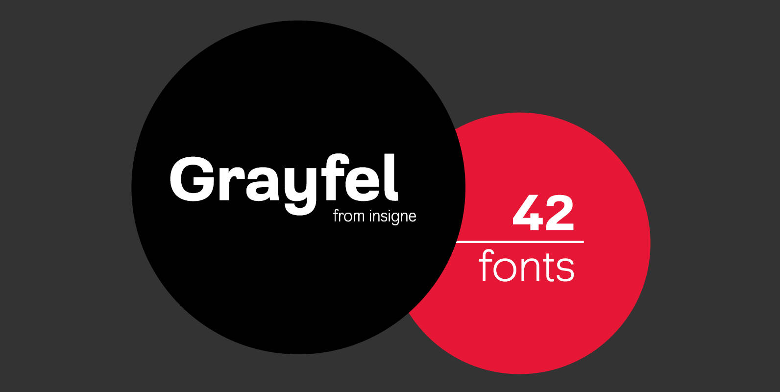
Grayfel Font
As designers, we seek perfection and originality. The more we step back and look at our work, the more changes we tend to find necessary. Drastic modifications are inevitable. The same is true of Grayfel. Grayfel began as an exercise
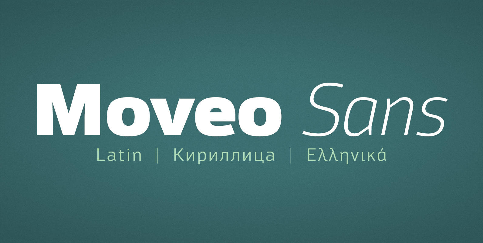
Moveo Sans Font
Moveo Sans is a modern multilingual sans serif font family designed for comfortable reading. Family include width 5, and 8 weights featuring Basic Latin, West European, Central European, Baltic, Turkish, Romanian, Cyrillic, Greek, also Ligatures and Small Caps. Published by

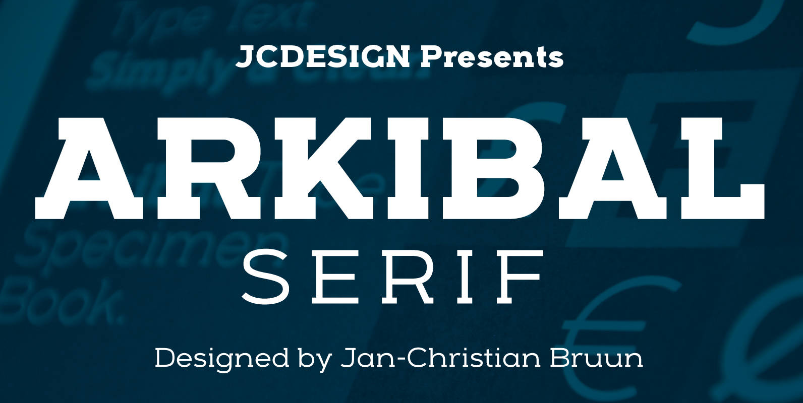
Arkibal Serif Font
The inspiration comes from some old documents and store signs from my great-grandfather’s old gold list factory from 1838. He delivered hits for many artists of that time, and various museums in Copenhagen. I priority increases to make a mixture
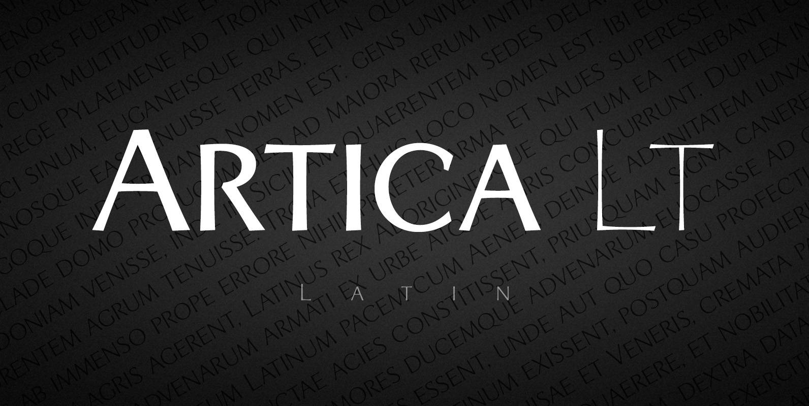
Artica Lt Font
Artica is an elegant sans serif typeface, offered in five weights. It was inspired by classic Roman letterforms. Artica Lt includes a Unicode Latin 1252 character set. Published by Green TypeDownload Artica Lt
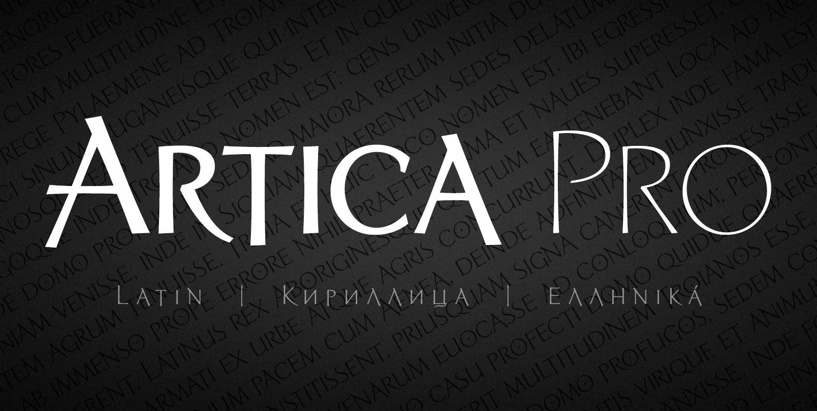
Artica Pro Font
Artica is an elegant sans serif typeface, offered in five weights. It was inspired by classic Roman letterforms. Artica Pro supports Latin, Cyrillic and modern Greek scripts, and includes swash initial & final forms, stylistic alternates and ligatures. Published by
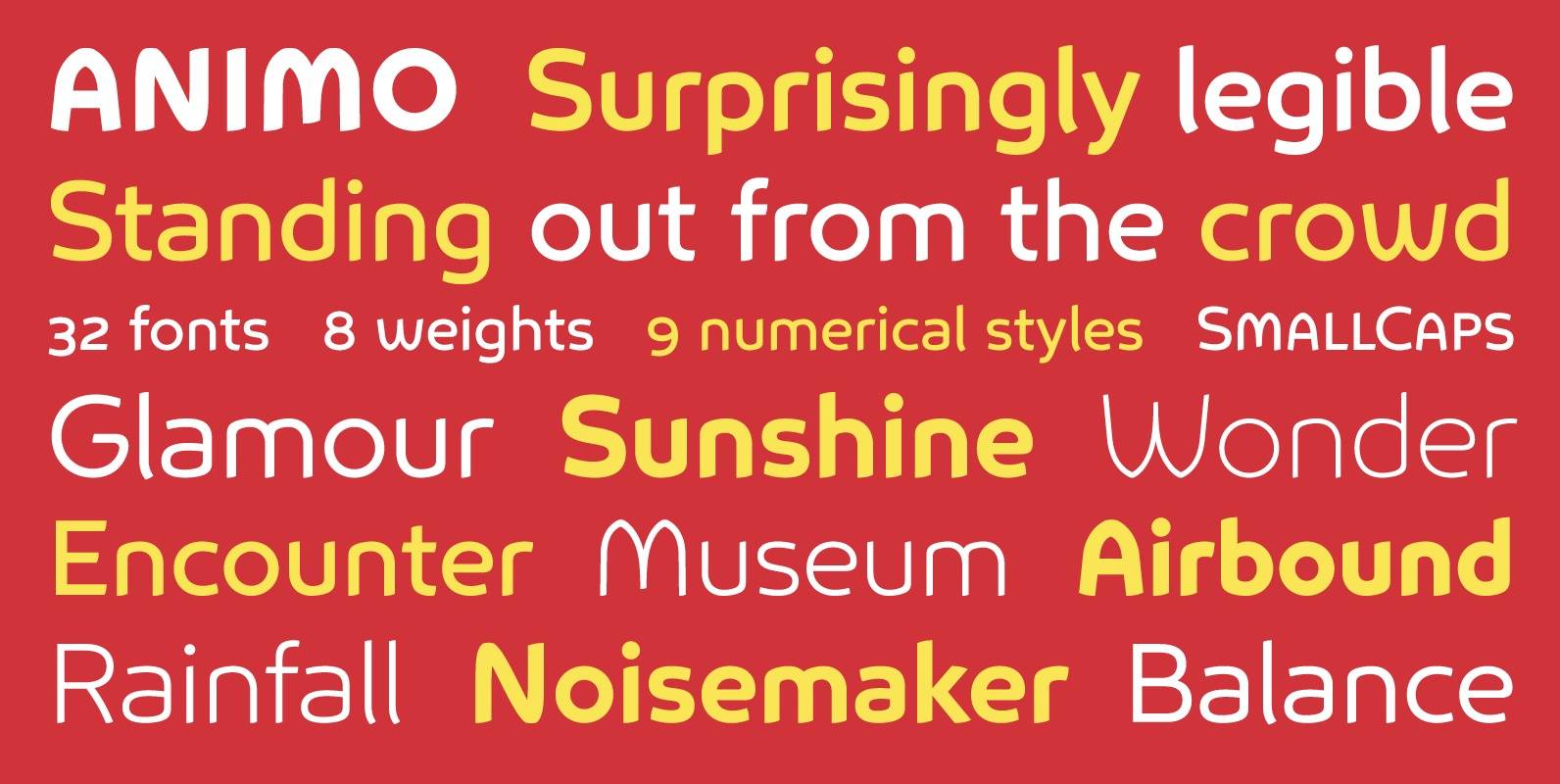
Animo Font
Animo stands out from the crowd. Animo is surprisingly legible for its outspoken personality. Many of Animo’s small details were crafted to enhance its legibility, while preserving its personality. Animo is suitable for both text and display use — for
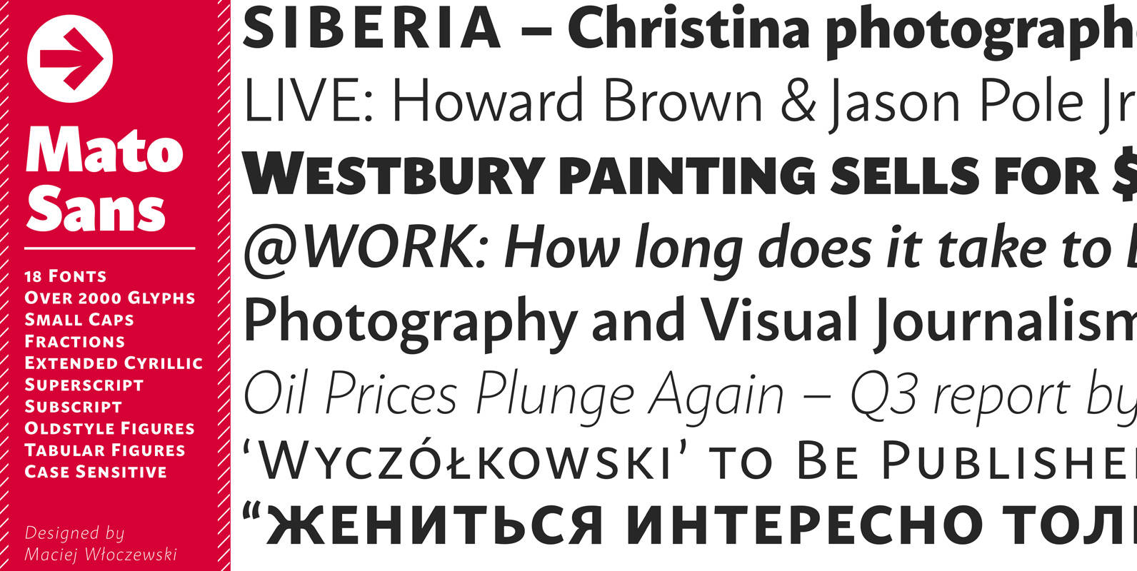
Mato Sans Font
Legible and dynamic shape, tons of OpenType options, different scripts – that’s Mato. Difficult small size, long text in vietnamese, huge heading in russian or table full of figures to create? It’s not a problem with this family. There are
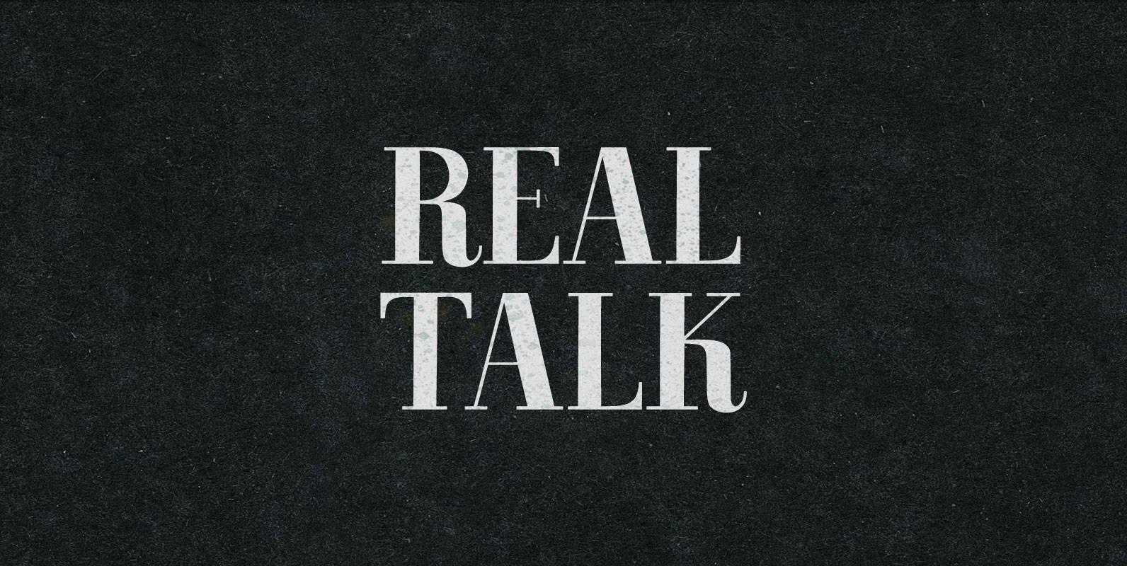
Real Talk Font
Real Talk packs the same lip flapping smacks and pharyngeal grunts as any old nonsense. But while a baby can only babble, a grown man can mean something. Put words in perspective, located on the axes of breadth and depth,
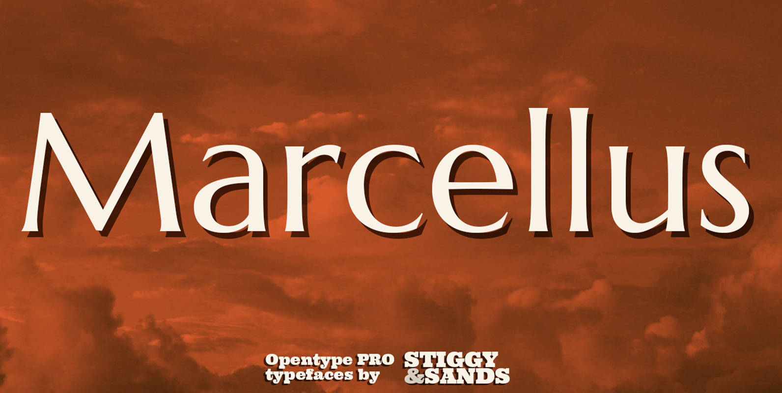
Marcellus Pro Font
Our Marcellus Pro was inspired by classic Roman inscription letterforms. Clarity and beauty are embodied in the standard lowercase, while this historically influenced typeface also nods to the powerful presence of the Trajan titling style with its SmallCaps set. When
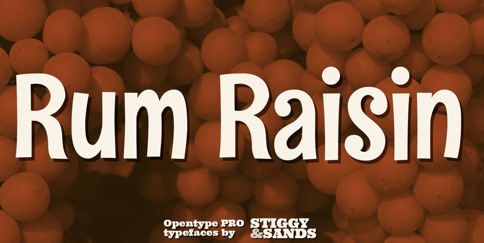
Rum Raisin Pro Font
Our Rum Raisin Pro was inspired by the lettering from a vintage Kellogg’s Raisin Bran cereal box, yet is has expanded from what was originally a unicase design to include a lowercase character set. For those seeking to use the
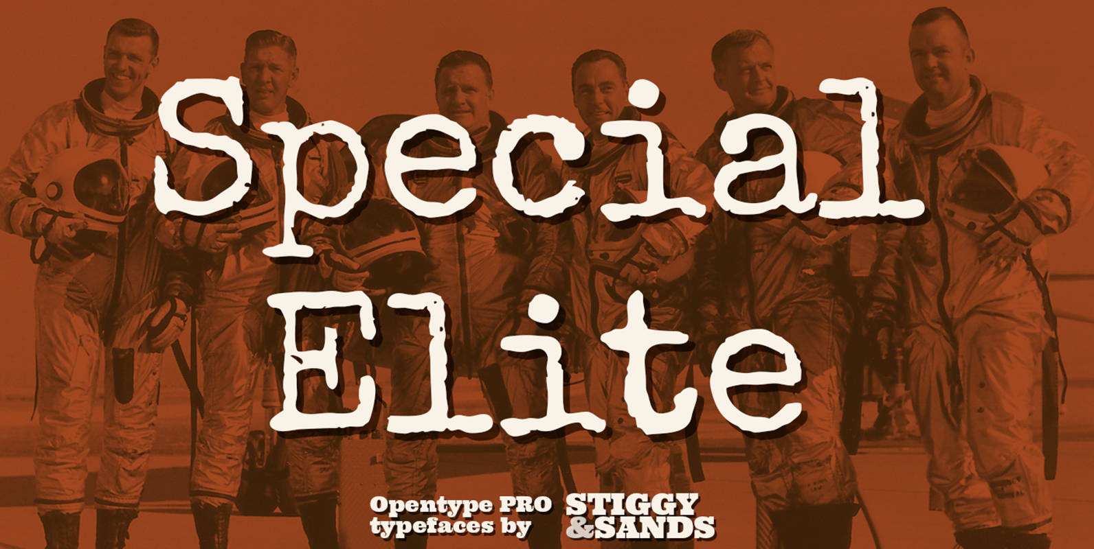
Special Elite Pro Font
Our Special Elite Pro brings the unique individuality of the Special Elite Type No. NR6 vintage typewriter keyset to the digital age. Antique typewriters would type with a warmth and appeal to them, primarily because of their unpredictable “grunge” results
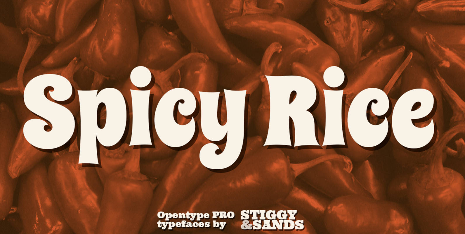
Spicy Rice Pro Font
Our Spicy Rice Pro has a festive flair to it that works through winter holidays to summertime jams. Casual and exciting, the extra heavy letterforms are imbued with a little exotic flair and flavor to spice up the party. The
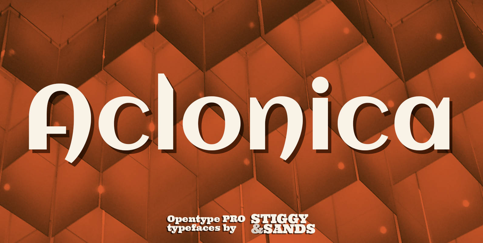
Aclonica Pro Font
Our Aclonica Pro is a strong and modern sans serif typeface with a slight deco/techno essence to it. Clean letterforms and a generous x-height lend to a friendlier feel and easily legible typestyle, while signature swoops and angular tapering stems
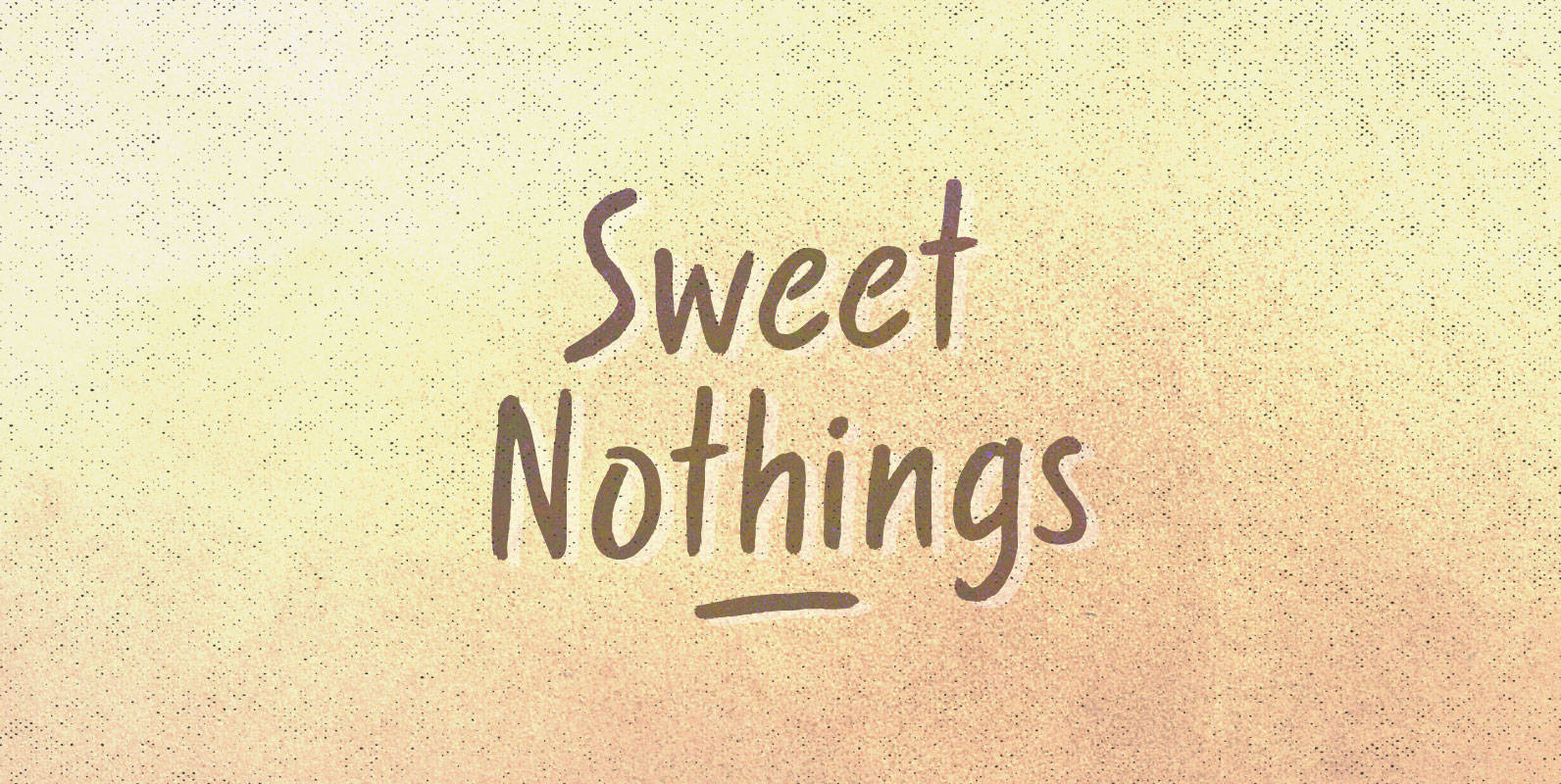
Sweet Nothings Font
Curled over and rolled up, warm words under blankets on November nights. What we whisper doesn’t matter, language lost in the space around our necks. Sweet Nothings but a rustle and a breath, understanding all that’s left. Published by BLKBKDownload