Tag: legible

Organda Font
Organda is a font design released for the Mecanorma Type Collection. Copyright 2004 Trip Productions BV. Published by MecanormaDownload Organda
Comic Strip Font
Comic Strip is a font design released for the Mecanorma Type Collection. Copyright 2004 Trip Productions BV. Published by MecanormaDownload Comic Strip
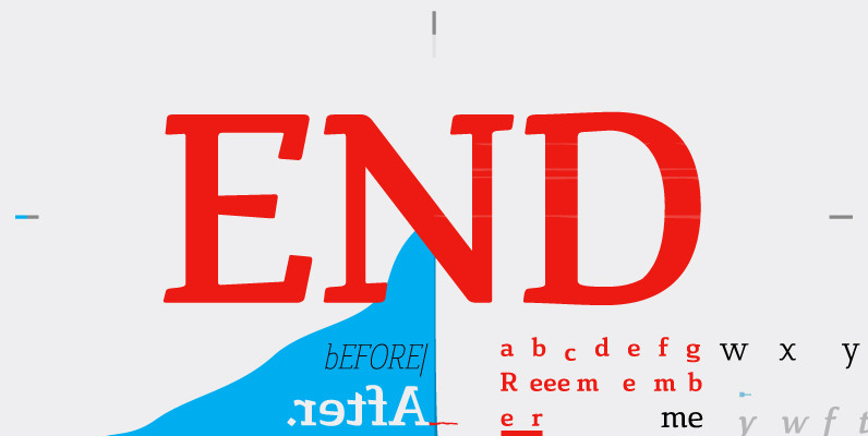
Aaux Next Pack B Font
When the original Aaux was introduced in 2002, I intended to go back and expand the family to offer more versatility. Years went by before I was willing to pick it up again and invest the proper time into building
Galba Font
Galba is a font design released for the Mecanorma Type Collection. Copyright 2004 Trip Productions BV. Published by MecanormaDownload Galba

Beton Font
Originally designed by Heinrich Jost in 1931, Beton is a clean and interesting slab serif type design. Beton contains language support for West, East, Turkish, Baltic, and Romanian. Beton is a trademark by Bauer Types SA. Published by URW Type
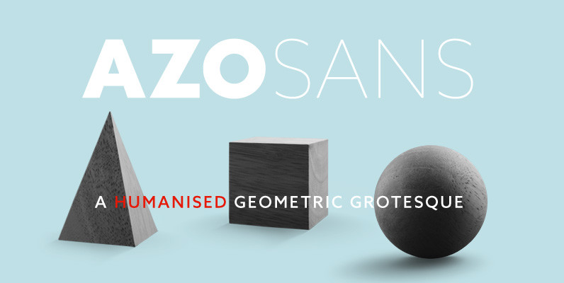
Azo Sans Font
Azo Sans is a new sans serif loosely based on the elementary forms of geometry. It is constructed in a geometric manner and inspired by the constructivist typefaces of the 1920’s, but is instilled with a humanistic quality. Azo Sans

Studio Font
Studio is a font design released for the Mecanorma Type Collection. Copyright 2004 Trip Productions BV. Published by MecanormaDownload Studio

Franklin Gothic Pro Font
Designed by Steve Jackaman & Ashley Muir. The original Franklin Gothic was designed in 1903 by Morris Fuller Benton. Franklin Gothic is named after Benjamin Franklin, America’s greatest printer. Our Franklin Gothic Black Condensed is unique because it is designed
Basilia Font
Basilia was originally designed in 1978 by Andre Gurtler of Swiss typographic team, Team 77, and released as Basilia Haas in 1982. Basilia is a clean text face with good contrast, similar to Walbaum. The contrast in thick and thin
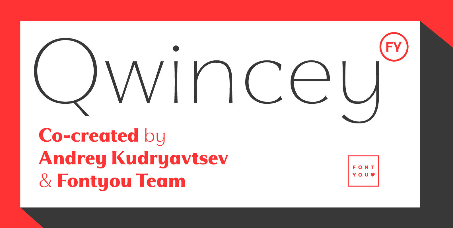
Qwincey FY Font
Qwincey is a new fresh & elegant font family available in five weights. With its flared and sharped endings, this font will give beautiful style to your layouts. With its round and generous proportions, its single storey lowercase a, open
Unger Fraktur Font
In the wake of the Enlightenment and the French Revolution there was a desire for a clear classical blackletter font without frills. That is why in 1793 the famous printer and editor Johann Friedrich Unger and his partner Johann Christian

Atlantic Serif Font
The original plan for Atlantic was to design a typeface in the Venetian syle of the Renaissance, with handwriting character and large ascenders. There is a wave-rolling unevenness in both the x- and cap-height caused by the strong ductus pointing
Charlotte Sans Font
The Charlotte Sans family of typefaces was designed specifically to co-ordinate with Charlotte roman typefaces in style, weight, and color. Designer Michael Gills created Charlotte Sans on screen with FontStudio software, and has achieved a perfect balance between the humanistic
Cavole Slab Font
Cavole Slab is a new slab serif, designed in early 2011, that has a strong influence from Dutch typography. The name is an altered form of the Portuguese word for feather, emphasizing the typefaceís soft and friendly character. Slab serifs
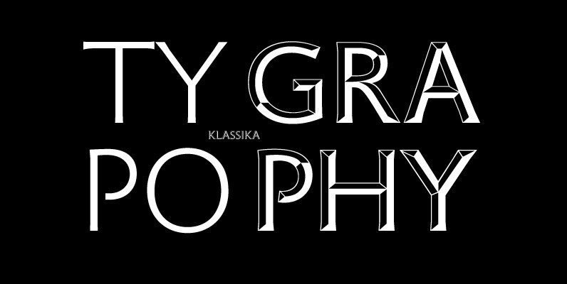
Klassika Font
A modern and clean sans originally designed by Hellmut G. Bomm, works great in body and headline usage. Contains a very interesting Bronze style that provides a vintage and 3d like option for headers. Published by URW Type Foundry GmbHDownload
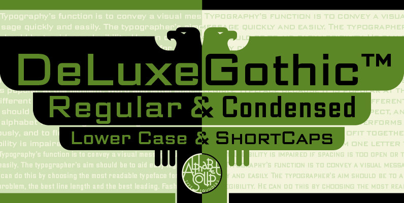
DeLuxe Gothic Font
Michael Doret was always very aware of the fact that Morris Fuller Benton’s classic Bank Gothic, a longtime favorite of his, didn’t contain any lowercase characters. So he set out to remedy that by designing his all new DeLuxe Gothic,

Futura Font
Futura. The very name brings to mind jet-age splendor of the highest order, and indeed the text on the commemorative plaque left behind on the Moon by the Apollo 11 astronauts in July, 1969 is set in Futura. There is
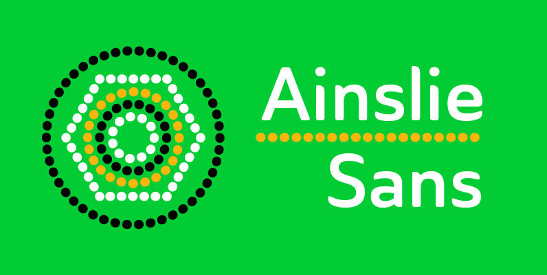
Ainslie Sans Font
The original Ainslie was inspired by Mt. Ainslie and the city of Canberra’s inner suburb of the same name. Canberra is Australia’s capital–a planned city designed by American architect Walter Burley Griffin. Griffin’s style and geometric design for the city,