Tag: legible
Canterbury Sans Font
Based on the Morris F. Benton for ATF in 1920, it was not completed for production until 1926. The serif version we released a few years ago was so popular, that we decided to design a complementary sans serif version
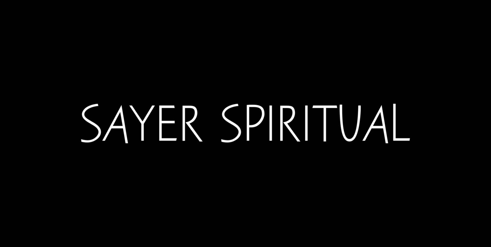
Sayer Spiritual Font
Sayer Spiritual is a font design released for the Mecanorma Type Collection. Copyright 2004 Trip Productions BV. Published by MecanormaDownload Sayer Spiritual
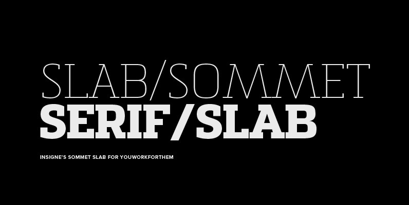
Sommet Slab Font
The Sommet family of typefaces has been updated with a new slab serif variant. Expanding on Sommet’s successful design principals, Sommet Slab is there when you need more impact and power. Sommet Slab is available with six weights and complementary
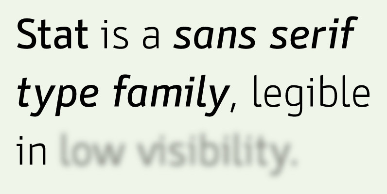
Stat Display Pro Font
Stat Display Pro is an information design sans serif type family legible in circumstances of low visibility. Its large character set with multiple weights is defined by optimal size ratio, distinctive letter shapes, wide aperture and balanced counters. Stat Display
Liebelei Font
“Liebelei” – dalliance, flirtation, hanky-panky (leo.org); kind of diminutive of “Liebe” (German for love) The typeface Liebelei has its roots back in 1932, when Vienna-based painter Rudolf Vogl created the poster for a movie called Liebelei after the popular play
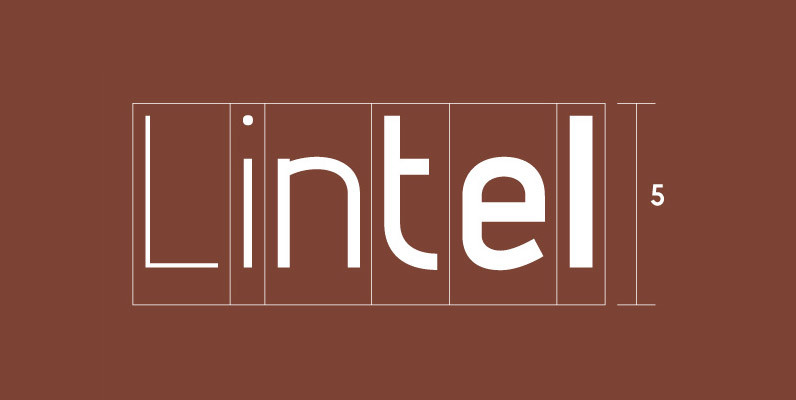
Lintel Font
A modern san serif typeface with a pure clean line form. The idea has been to design a font with a proportioned and balanced structure that is applicable to a wide variety of uses. Details include 6 weights with italics,
URW Egyptienne Font
URW Studio’s powerful slab-serif family, Egyptienne is a great choice for website designs. It contains over 50 styles with language support in both Western and Eastern European languages like Turkish or Baltic ones that can be found on some keyboards
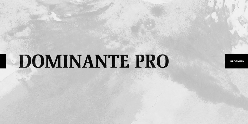
Dominante Pro Font
Dominante was originally designed by Johannes Schweitzer in 1959 for Ludwig Published by URW Type Foundry GmbHDownload Dominante Pro
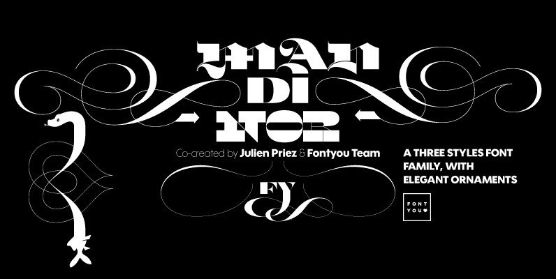
Mandinor FY Font
Normandie FY is a victorian modular family of 3 different typefaces very contrasted: Modern, Gothic & Italian. Perfect for headlines and any other titling creations, this font family feels very good when used in super poster size. Ornaments, letters (and
Raleigh Gothic Font
Designed by Steve Jackaman. Based on the ATF typeface by Morris F. Benton, circa 1934. Steve created two additional new weights. Published by Red RoosterDownload Raleigh Gothic
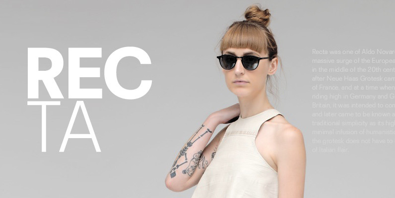
Recta Font
Recta was one of Aldo Novarese’s earliest contributions to the massive surge of the European sans serif genre that was booming in the middle of the 20th century. Initially published just one year after Neue Haas Grotesk came out of
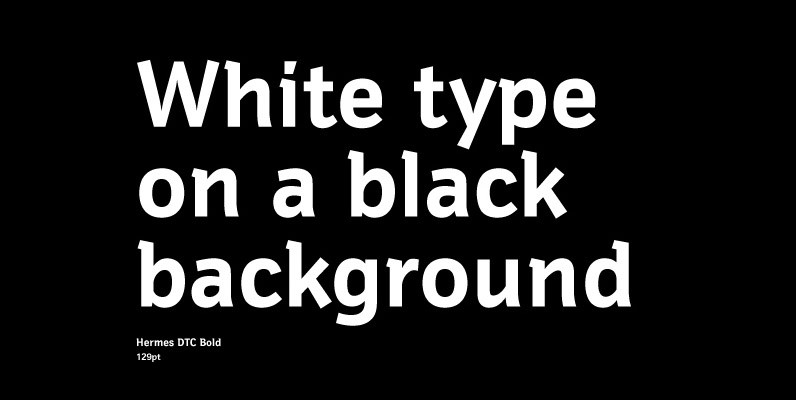
Hermes DTC Font
Both Hermes DTC and Imperial DTC font families are strongly influenced by Schnebel’s work on Latin characters to fit Japanese Kanjis. DTC Hermes is well-suited for office documents, looking good on screens as well as printed. Published by URW Type
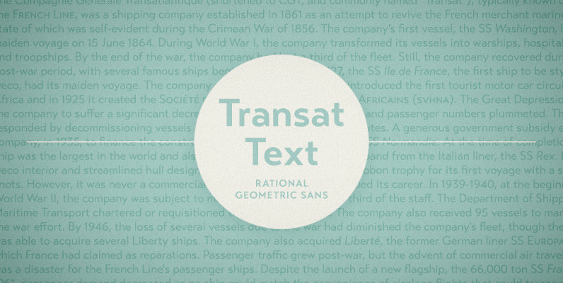
Transat Text Font
Transat Text is a geometric sans serif typeface, and is the more rational sibling to the unabashedly Art Deco “Transat”. Transat Text has a slightly taller x-height than its counterpart, making it easier to read at small sizes, but also

Ambassador Plus Font
Hairline display fonts are elegant and subtle with touch of luxury. They are the Champagne of type. Ambassador Plus Family represents a set of classy typefaces best suitable for magazines, cosmetics packaging, advertising or any kind of fine and sensitive
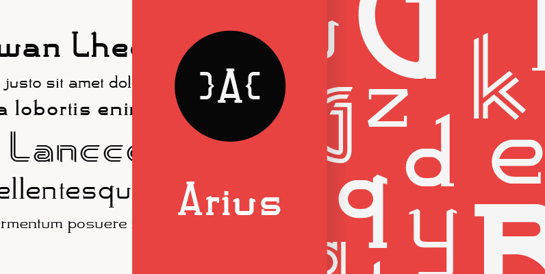
Arius Font
Designed by Karl Nayeri, Arius is a font released for the Prime Graphics Type Collection. Copyright Prime Graphics. Published by Prime GraphicsDownload Arius
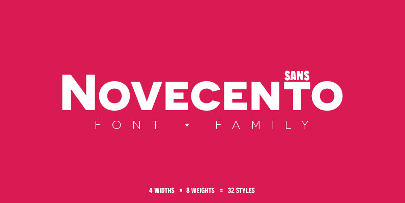
Novecento Sans Font
Novecento sans is an uppercase-only font family inspired on European typographic tendencies between the second half of 19th century and first half of the 20th. It looks rational and geometric. However, it is optically corrected and balanced. This font face