Tag: legible
Joker DTC Font
A vintage and classic serif designed by Volker Schnebel, Joker DTC brings elegance and class to any project. Works great in both content and headline usage. Published by URW Type Foundry GmbHDownload Joker DTC
Transport Font
Designed in 1980 by URW, Transport is a clean, minimal and effective sans-serif. Works great in both content and headline usage. Published by URW Type Foundry GmbHDownload Transport
URW Baskerville AI Font
URW Baskerville AI is a classic and elegant serif font designed byPhil Martin in 1972. URW Baskerville AI contains West, East, Turkish, Baltic, Romanian language support. Published by URW Type Foundry GmbHDownload URW Baskerville AI
Baskerville Font
Baskerville Handcut is a classic serif typeface, designed in 1961 by Yelena Tzaregorodtseva. Delivered in opentype format, it contains support for West, East, Turkish, Baltic, Romanian character sets. Published by URW Type Foundry GmbHDownload Baskerville
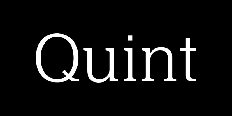
Quint Font
Designed by Phil Martin, Quint is a six weight serif family released and published by URW. Published by URW Type Foundry GmbHDownload Quint
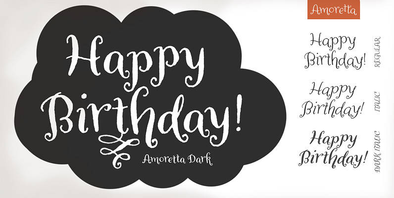
Amoretta Font
Amoretta = Little Love. Our sweet Amoretta is optimistic & bright. A charming balance of youth and sophistication, Amoretta is full of opportunity for print (Identity projects, stationery, book design, packaging design) or online applications (eBooks, games, websites). Easy to
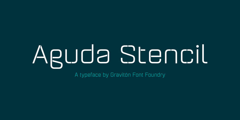
Aguda Stencil Font
Aguda Stencil font family is the stencil version of Aguda font family, it has been designed for Graviton Font Foundry by Pablo Balcells in 2014. Aguda Stencil consists of 16 styles. The 8 “Stencil 1” styles contain a narrow stem
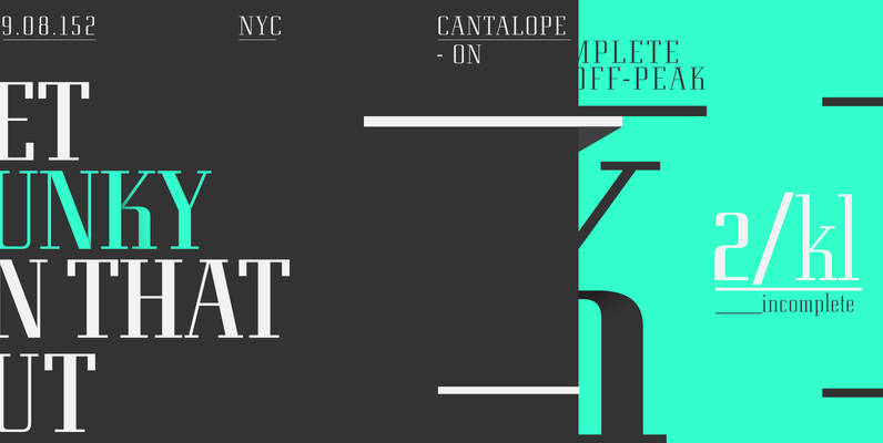
Eden Pro Font
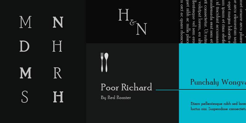
Based on the original 1934 Ludlow drawings by Robert Hunter Middleton, we created two additional weights that round out the family. Eden contains all the high-end features expected in a quality OpenType Pro font. Published by Red RoosterDownload Eden Pro
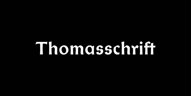
Thomasschrift Font
Friedel Thomas 1957 Typoart font, redesigned and extended, for vintage use. Published by RMU TypedesignDownload Thomasschrift

Filmotype Homer Font
Introduced by Filmotype in the early to mid-1950s, Filmotype Homer was created in response to customer demand for a wider brush script expanding on Filmotype’s popular sign painter sho-card lettering styles used in the late 1940s through the 1950s. With
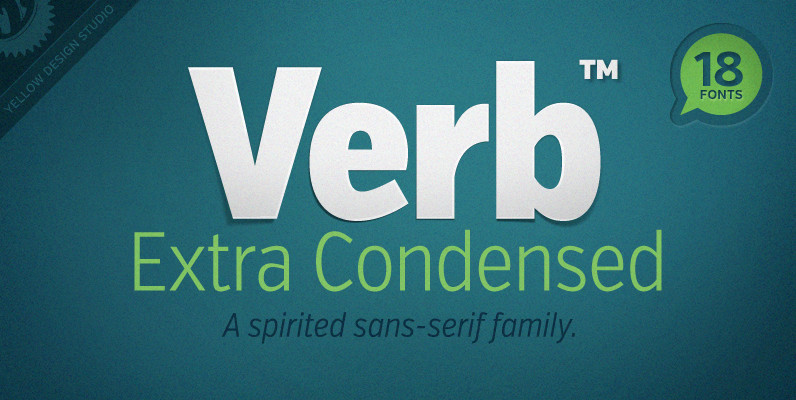
Verb Extra Condensed Font
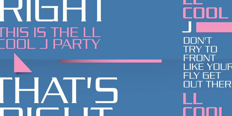
Like the original Verb family, Verb Extra Condensed from Yellow Design Studio is confident, friendly and energetic, but has been carefully re-drawn with space saving proportions. At text sizes it’s legible and economic, while at larger sizes it reveals lively
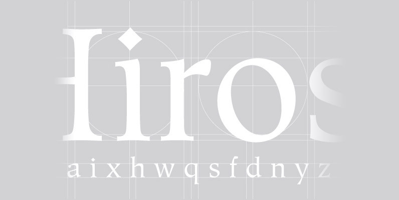
Hiroshige Font
A vintage and classic serif designed by Cynthia Hollandsworth, Hiroshige brings elegance and class to any project. Works great in both content and headline usage. Published by URW Type Foundry GmbHDownload Hiroshige
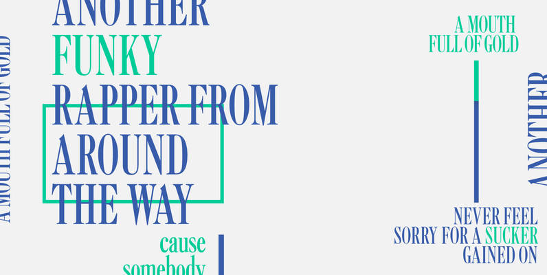
Caslon Extra Condensed Font
Designed by Steve Jackaman, Caslon Extra Condensed is based on the Ludlow/ATF versions of this great typeface. Published by Red RoosterDownload Caslon Extra Condensed
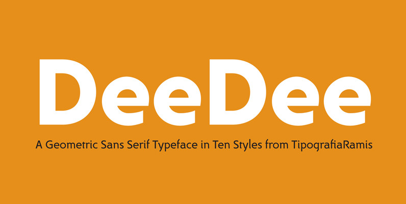
DeeDee Font
DeeDee is a geometric sans serif typeface family of ten styles – thin, light, regular, bold, heavy in roman and italic respectably. DeeDee typeface is direct relative to older siblings of Dina family. Although all glyphs have gone through complete
