Tag: legible
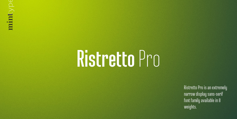
Ristretto Pro Font
Ristretto Pro is an extremely narrow display sans-serif font family available in 8 weights, with consistent character widths across weights. It features rich language support, 6 sets of figures and small caps. Published by Mint TypeDownload Ristretto Pro
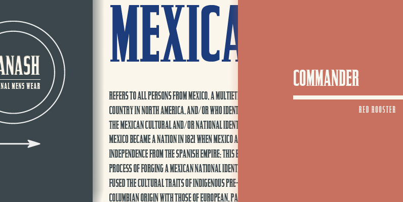
Commander Font
Designed by Steve Jackaman, Commander is an original decorative type design published by Red Rooster. Published by Red RoosterDownload Commander
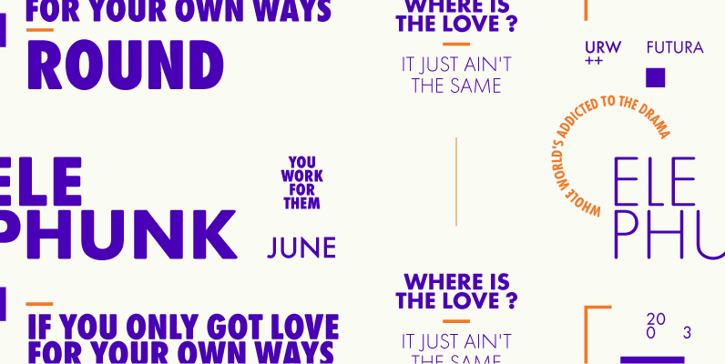
Futura Round Font
Futura. The very name brings to mind jet-age splendor of the highest order, and indeed the text on the commemorative plaque left behind on the Moon by the Apollo 11 astronauts in July, 1969 is set in Futura. There is
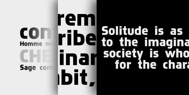
Chinon Font
Chinon is a font design released for the Mecanorma Type Collection. Copyright 2004 Trip Productions BV. Published by MecanormaDownload Chinon
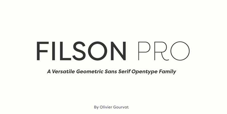
Filson Pro Font
Designed by Olivier Gourvat in 2014, Filson Pro is a new geometric sans serif family with versatility in mind. With its 575 glyphs and its round aspect, this typeface covers all kind of graphic and web design projects. This font
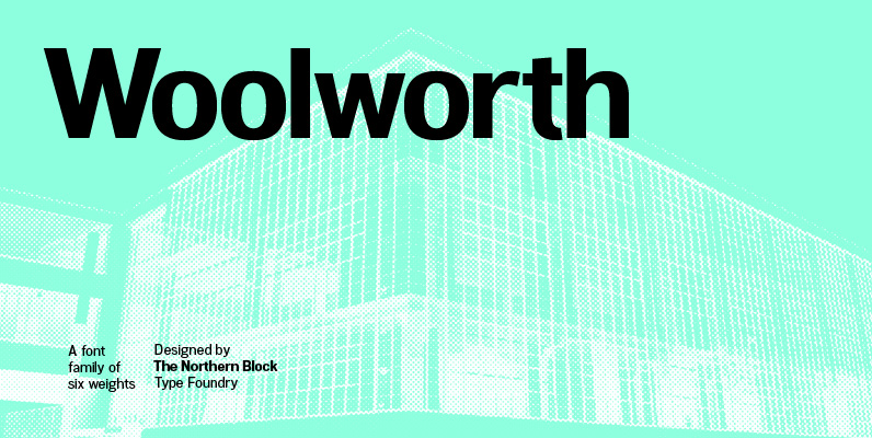
Woolworth Font
A modern sans serif font inspired by the grotesque designs of the late 19th century. Each letter has been developed with careful attention towards balance and purity of form, creating a clean functional and optically correct typeface. These handcrafted details create a
Glasgow Pro Font
Designed by Steve Jackaman & Ashley Muir. Glasgow Pro has been completely redrawn and remastered by Steve Jackaman and Ashley Muir. The new Glasgow Pro family has been fleshed out with a glyph set that is over 40% larger than
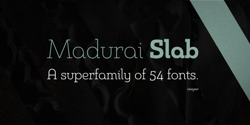
Madurai Slab Font
Chennai’s market-tested type styles have taken new form once again. The geometric forms of Chennai and its derivant Madurai, both successful in web-based applications and logotypes, have now been adapted for the superfamily Madurai Slab, a potent, square slab serif
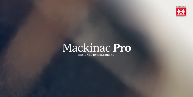
P22 Mackinac Font
P22 Mackinac Pro (pronounced Mackinaw) is a general-purpose, utilitarian design incorporating an abundance of OpenType features: small caps, ligatures, ordinals, numerous figure options plus a few bonus goodies. Mackinac supports 56 languages using the Latin-1 & Latin Extended-A character sets.
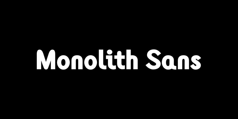
Monolith Sans Font
Designed by Tony Mayers in 2004, Monolith Sans is a unique and modern sans-serif type design. Published by ABCTypesDownload Monolith Sans
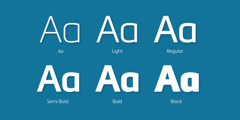
Metronic Pro Font
Created by Olivier Gourvat in early 2013, Metronic Pro is a sans-serif typeface with a technological and minimalist look for text and headlines. It has six versatile weights from Air to Black with an alternative glyph set to improve its

Raldo Re Pro Font
Quite unusual, Musenberg started his Raldo design with the italic. However, he managed to preserve the temperament and vividness of the italic in the roman without questioning the stability of the individual characters. Raldo is a modern Sans Serif family
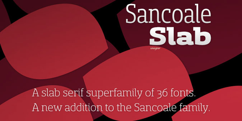
Sancoale Slab Font
The contemporary feel of the Sancoale superfamily takes a bolder turn with this futuristic slab Built from Sancoale’s successfully simple geometry, Slab’s serif elements and tall x-height give the face an energetic, yet clean figure that easily complements its cousins:

Fortis Font
Fortis™ (originally named Atlas) was released in 1992 and is a 21st century contemporary Latin. Also categorized as a Glyphic, Latins were first introduced in the last half of the nineteenth century and are characterized by large, sharp, triangular serifs.

Bertie Font
British designer Alan Meeks incorporated an unusual internal pattern into this Bodoni style letterform. The result is a reserved, 1930’s appearance. Bertie is an excellent choice for a variety of subjects where word settings in larger display sizes are required.

Dubbeldik Font
Dubbeldik is a font design released for the Mecanorma Type Collection. Copyright 2004 Trip Productions BV. Published by MecanormaDownload Dubbeldik
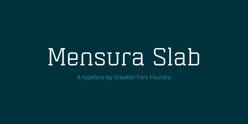
Mensura Slab Font
Mensura Slab font family has been designed for Graviton Font Foundry by Pablo Balcells in 2013. It is a modular, geometric typeface with subtle rounded angles that provides a soft, pleasant appearance. It has been conceived to be primarily a
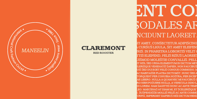
Claremont Font
Designed by Les Usherwood. Digitally engineered by Paul Hickson. Les never released this completed typeface before his untimely death in 1983. Published by Red RoosterDownload Claremont