Tag: lettering
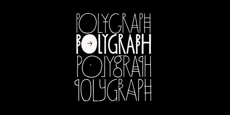
Polygraph Font
Inspired on posters by the extraordinary polish artist Leszek Zebrowski, Polygraph is a highly unusual face. Packed with eccentric alternates, it is an all-caps font with four exchangeable variations for each letter. These alternates are programmed to cycle when the
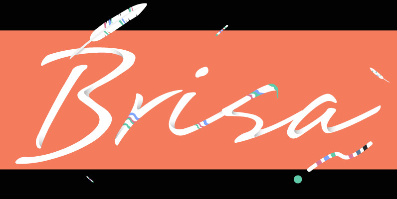
Brisa Font
The dynamic design duo of Koziupa and Paul strike again. This time they cover the space from light nonchalance to eerie darkness, and everything in between. Quicker than lightning and just as poignant, Brisa shows unprecedented determination, presence of spirit,
Ronde Script Font
Ronde Script™ (Ronde meaning “A kind of script in which the heavy strokes are nearly upright, giving the characters when taken together a round look.”) is based on the original design named Parisian Ronde released in 1878 by the Chappelle
Sabotage Font
Sabotage is inspired on the iconic Vertigo movie poster by Saul Bass. It is a bold all-caps font that will fit surprisingly well a wide range of eye-catching design projects. Check it out! Sabotage brings two versions for each letter,
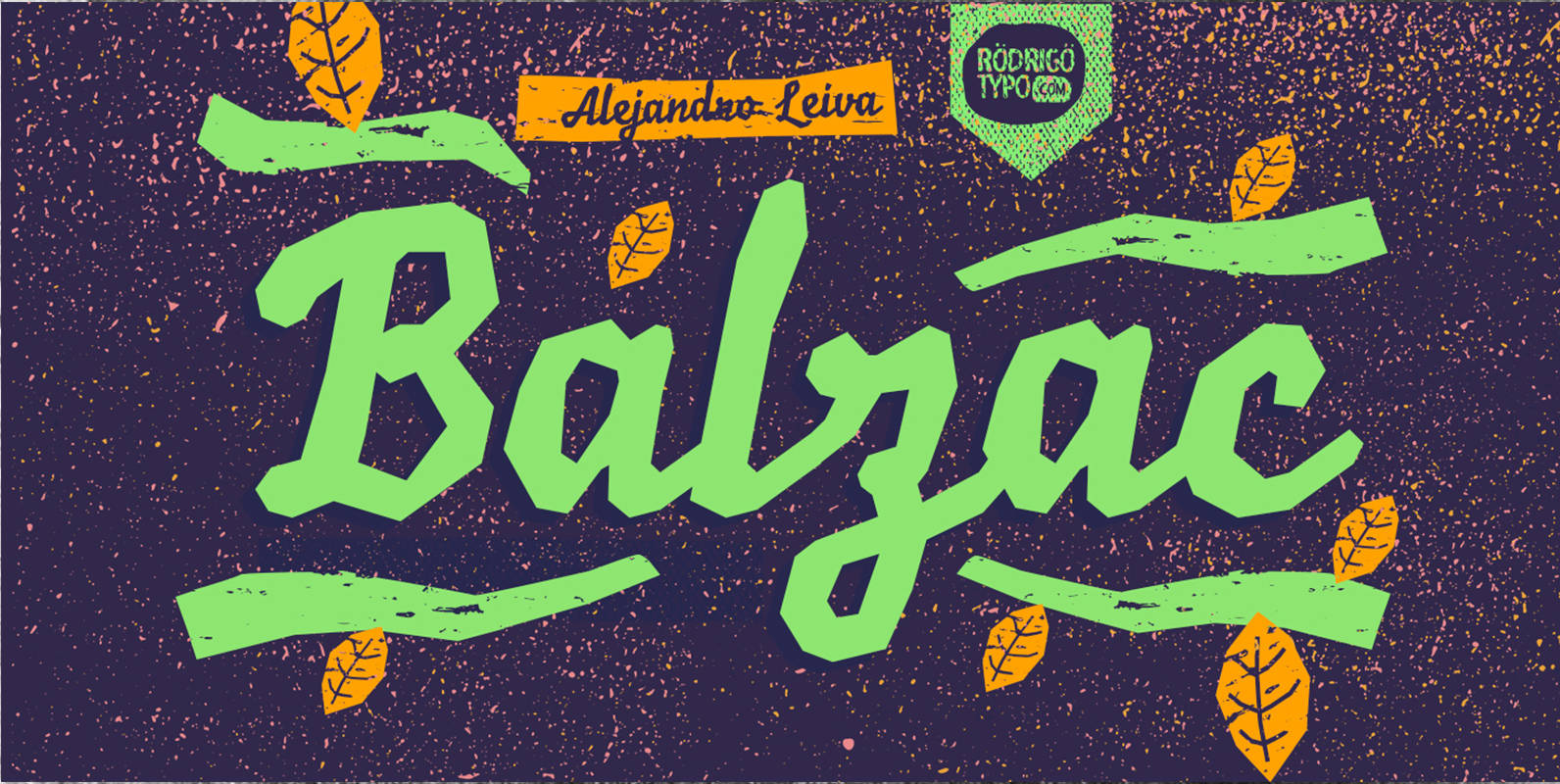
Balzac Font
Balzac is a typeface designed by Alejandro Leiva. Published by RodrigoTypoDownload Balzac
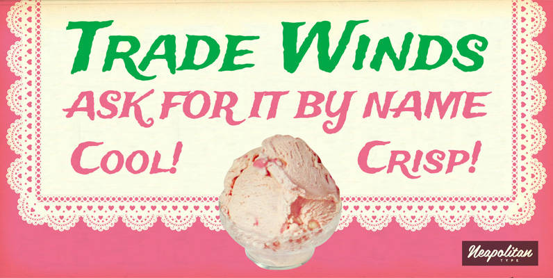
Trade Winds Pro Font
Ahoy, matey! Prepare to set sail on the high seas! Let Tradewinds guide you to exotic ports of call where your next adventure begins. This breezy font by Squid and Neapolian will blow you away! The Pro version has been
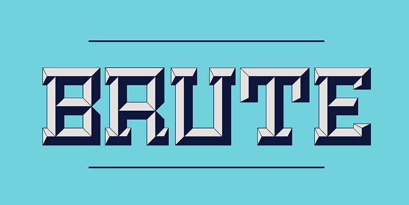
Brute Font
Brute is a new kind of beveled display face based upon a modular grid-like system. Its precisely sharp edges convey a solid yet aggressive feel that add personality to any project. Unlike many beveled typefaces, Brute puts the lighting direction
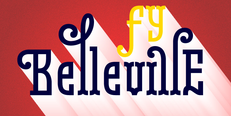
Belleville FY Font
Belleville FY is an original 16 retro and modern fonts family, inspired at the same time by New art movement, graffitis, 19th century wood type, and modern slab fonts. Each style has specific shapes and serifs which give it a
Chocolate Font
Most everyone agrees that chocolate is irresistible. Now the Koziupa & Paul tag team is offering you a choice of three irresistible flavors, from the bittersweet Amargo, to the mouth-watering Dulce, you now have three different possibilities for the pleasure
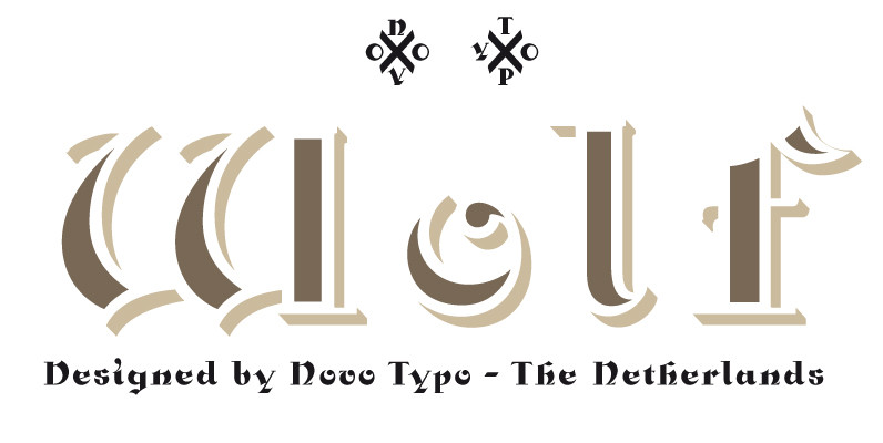
NT Wolf Font
Wolf is a package of four fonts. Wolf is perfect for multi-layered typography and the use of color in type. Wolf allows the user endless possibilities in color. Wolf is perfect for designing sophisticated logo’s, fashionable headings or other beautiful
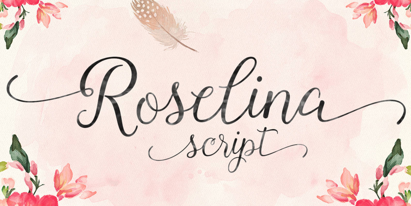
Roselina Font
Roselina Script is a contemporary calligraphy, with a vintage feel, style calligraphy with moving baseline and elegant touch. features 417+ glyphs and 183 alternate character. appearance initial letter and terminal letters, can be adjusted by using the glyph palette. alternately
Azalea Rough Font
Azalea’s careful, inky strokes reference classic brush script styles of the 1950s, but its jaunty angularity is distinctly modern. Artfully irregular thicks and thins lend it an organic feel. This rough-edged version is a rustic complement to Azalea Smooth. Azalea
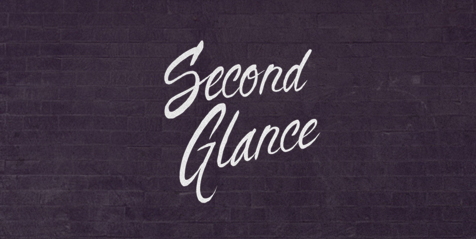
Second Glance Font
Ultimately, this is a play of light across cells. But in the moment after those photons glanced across your retina, all the things that make our fraught experiences real happened. You blink, turn, and take another moment to soak in
Stick-A-Round Font
Stick-A-Round started as an attempt to domesticate the wild Daft Brush font. During the process, though, it begun taking its own shape and personality, with friendly rounded terminals, dynamic interlock pairs and lots of alternates. There are at least 4
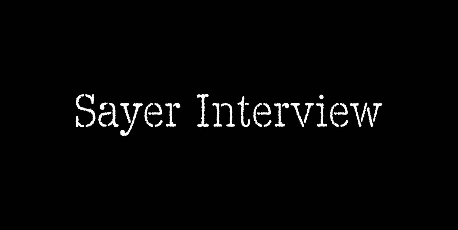
Sayer Interview Font
Sayer Interview is a font design released for the Mecanorma Type Collection. Copyright 2004 Trip Productions BV. Published by MecanormaDownload Sayer Interview
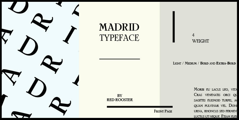
Madrid Font
Designed by Steve Jackaman, Madrid is based on the typeface Nacional by Carlos Winkow from the Spanish foundry, Nacional (1941). Published by Red RoosterDownload Madrid
Seashore Pro Font
A feminine, graceful script whose thicker horizontals create a wave-like rhythm — hence the name. Seashore is loosely based on an “eccentric” (left-leaning) penmanship style of the late 19th century. Used mainly by professional “engrossers” in certificates and tributes, or