Tag: ligatures
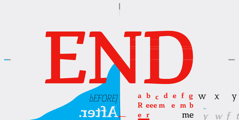
Cavole Slab Font
Cavole Slab is a new slab serif, designed in early 2011, that has a strong influence from Dutch typography. The name is an altered form of the Portuguese word for feather, emphasizing the typefaceís soft and friendly character. Slab serifs
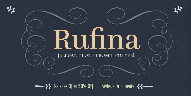
Rufina Font
Rufina was as tall and thin as a reed. Elegant, but with that distance which well defined forms seem to impose. Her voice, however, was sweeter, closer and when she spoke her name, like a slow whisper, one felt like
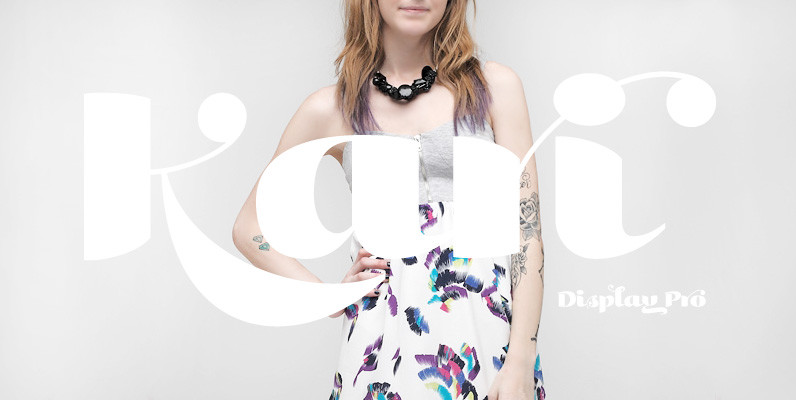
Kari Display Pro Font
Kari Display is the product of a long standing idea I had to give the well-received Positype typeface, Kari, plastic surgery. Just referring to giving a typeface plastic surgery, or letter lipo, stuck in the back of my head until
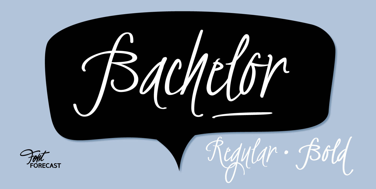
Bachelor Font
Bachelor Script is the preliminary design for Graduate Script. You can clearly see the resemblance between the two, but while Bachelor is frisky and authentic, Graduate is more polished and staged. Graduate Ornaments was originally designed to complement Graduate Script,
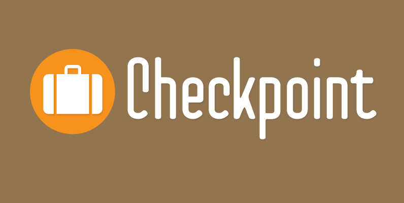
Checkpoint Font
Checkpoint is a condensed, display typeface family that contains three weights and their italics. Ranging from light to bold, this typeface can be used for short passages of text or for display uses like signage or tv titling. The font
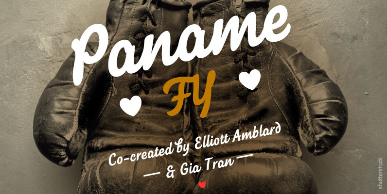
Paname FY Font
Paname FY, a new laid-back script font. With its bold felt ductus, Paname FY is a smooth and friendly vintage script. With its more cursive capital letters, its 74 ligatures and alternates with swash, this font will certainly find its
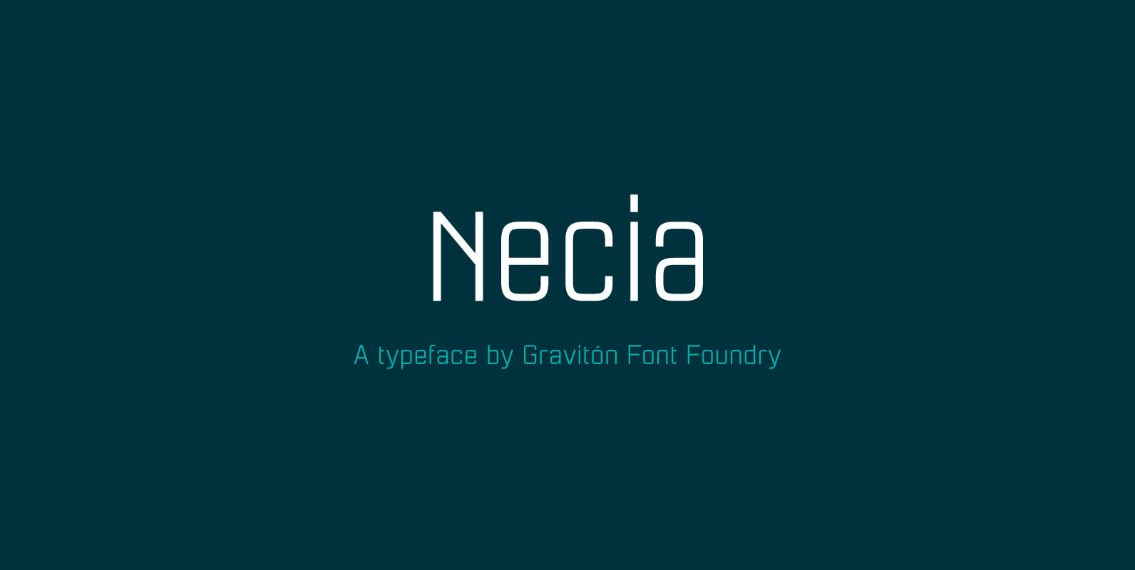
Necia Font
Necia font family has been designed for Graviton Font Foundry by Pablo Balcells in 2014. It is a modular, geometric and slightly condensed typeface which has been conceived to be primarily a display typeface, but given its clarity it can
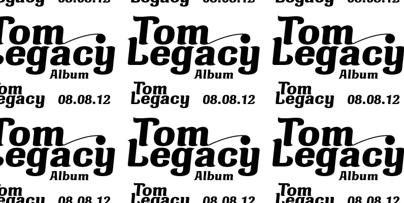
Marita Pro Font
Marita combines sternness with swing and, from this, develops its own, unique elegance. This makes Marita quite versatile, also and especially for headline settings. Apart from numerous ligatures, the font also includes old style figures. Marita is based on brush
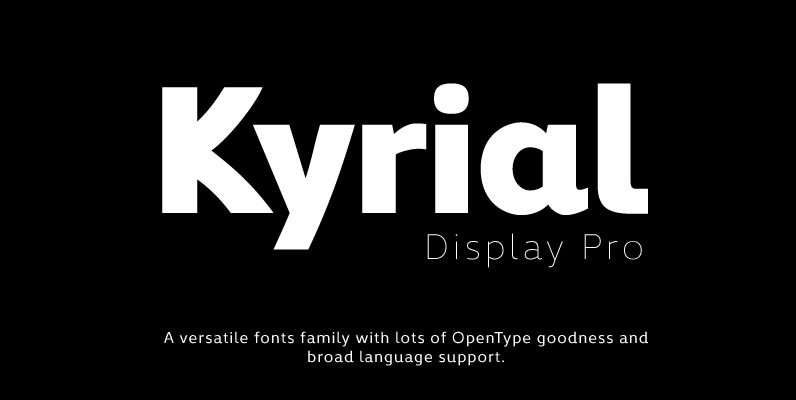
Kyrial Display Pro Font
Designed in 2011 by Olivier Gourvat, this font family has generous proportions with a range of weights make it a versatile family for print and web design work. Kyrial Display Pro is also a pratical typographic choice to express strength,
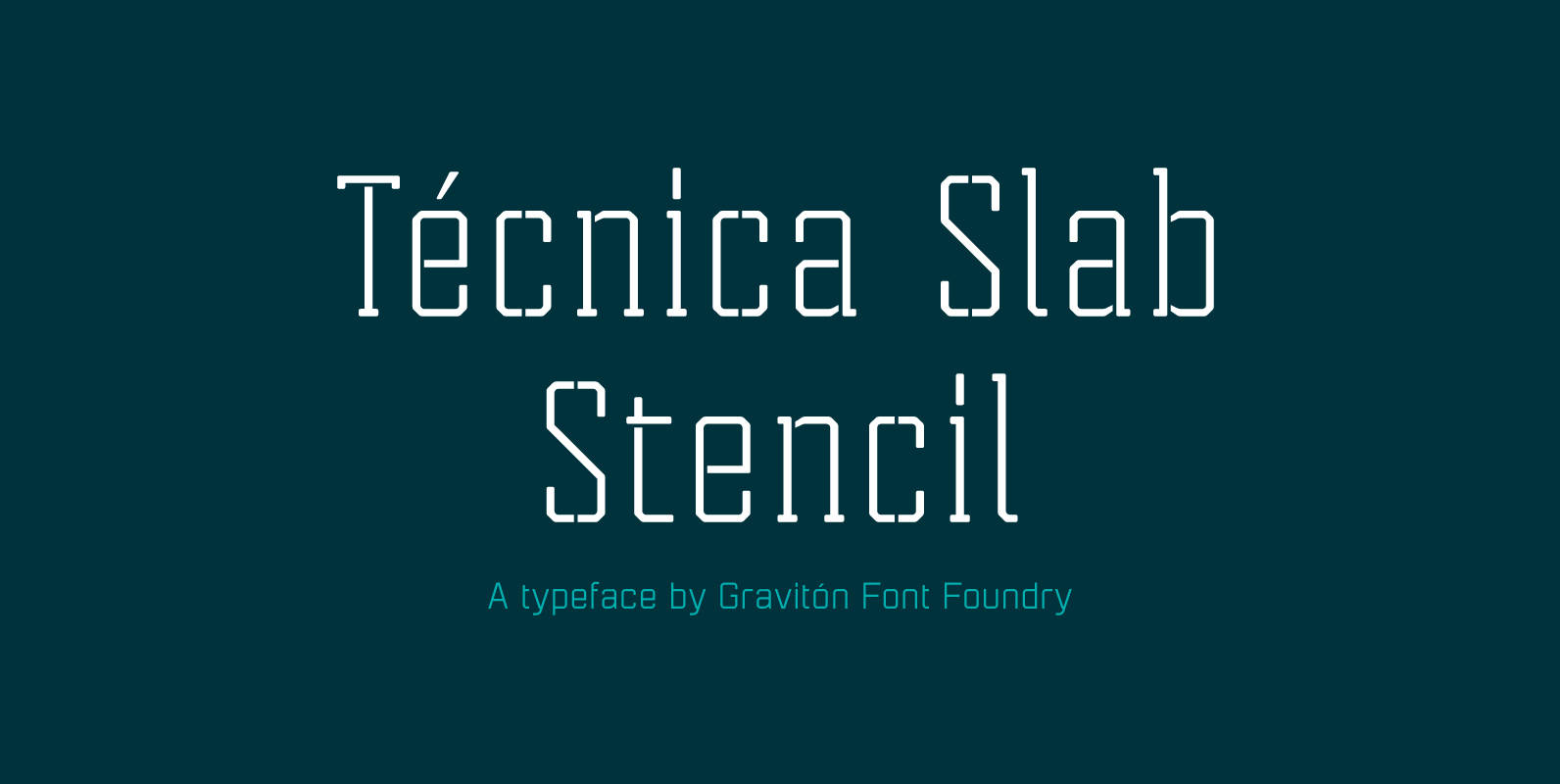
Tecnica Slab Stencil Font
Tecnica Slab Stencil font family is the stencil version of Tecnica Slab font family, it has been designed for Graviton Font Foundry by Pablo Balcells in 2014. Tecnica Slab Stencil consists of 8 styles. The 4 “Stencil 1” styles contain
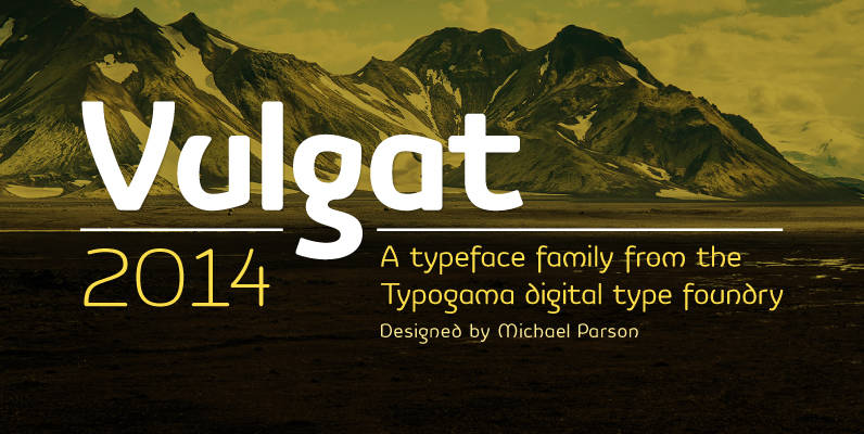
Vulgat Font
Vulgat is a Uncial inspired typeface that offers a vibrant personality while staying clear and legible in all applications, a contemporary style modeled by the past. This typeface features an extended Latin support for all European languages plus Cyrillic support.

Abelina Pro Font
Abelina is a typeface that can be used in display sizes for titles where part of the central premise is to emulate certain features of gestural handwriting. Concepts like spontaneity, speed and fluidity, associated with the use of certain calligraphic
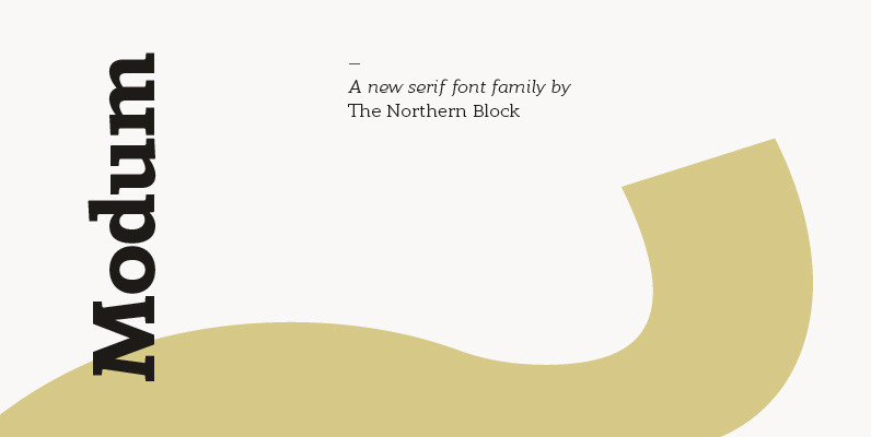
Modum Font
A contemporary serif font family. The design takes influence from traditional serif forms to develop a precise, highly functional text face with a low contrast. Smooth radius details are blended with carefully drawn angles that give a crisp, distinctive aesthetic
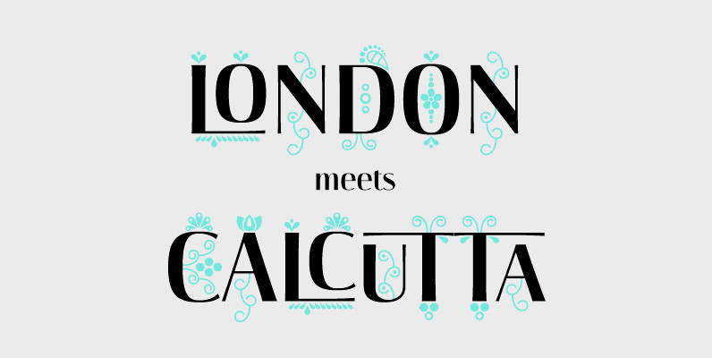
Darjeeling Font
Darjeeling combines British Elegance and Indian Flavor. It is flared like Optima, with a scent of Bodoni. By layering Regular and Ornaments over each other You will create astounding pieces of colorful typography. Additionally there is a Regnaments style which
