Tag: linear

MIT Iculvist Monos Font
An Ultimate Tool for Creative Expression: MIT Iculvist Monos It’s high time we introduced a refreshing new way to communicate visually in the realm of graphic and digital design! The MIT Iculvist Monos is the epitome of stylistic functionality, delivering
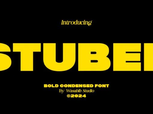
Stubed Font
The Power and Versatility of Stubed: A Graphic Designer’s Dream In a world where uniqueness is not just appreciated but constantly sought after, graphic and digital designers are being tasked with creating dynamic, impressive, and professional designs. As burgeoning or
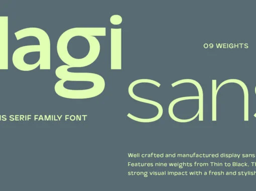
Magisans Font
In the intricate world of digital art, the tools of the trade can make or break a designer’s story. A digital product such as the innovative Magisans font walks that line, combining creativity with utility that is bound to captivate

Tropic Avenue Font
In recent years, digital and graphic design has become an evolving landscape, pushing boundaries with innovative ideas and techniques. One significant part of this evolution is typography, which forms the backbone of any design project. An exciting contribution to this

YWFT Registraat Font
Every graphic designer’s quest in their creative journey is the pursuit of the perfect typeface—one that is versatile, unique, and above all, affordable. Today’s graphic design realm is permeated with overpriced, monotonous sans serif fonts, causing an unavoidable stagnation in

403 Super Vega Font
In a world dominated by visual communication, design plays a tantamount role in creating both engaging and visually appealing content. Amid the bells and whistles, the humble font is often overlooked – this element breathes life into text, transforming it
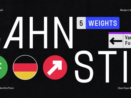
YWFT Bahnstil: The Renaissance of Traditional Design with a Modernist Twist
In the bustling realm of graphic and digital design, the harmonious fusion of traditional and modern aesthetics holds a special allure. Today, we put the spotlight on YWFT Bahnstil, a distinctive typeface that embodies this delicate balance, offering a unique
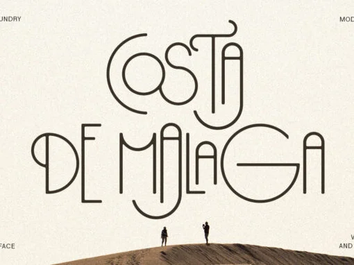
Costa de Malaga: Invigorating Design Narratives through Typeface Artistry
In the world of graphic and digital design, the visual power of fonts is undeniable. A well-selected typeface can breathe life into a message, capturing the viewer’s mind and imagination. Among the wide array of fonts available to the design
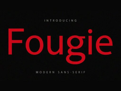
Unveiling Fougie Font: The Majestic Typeface Redefining Digital Design
Fonts are the essence of visual communication; an invaluable asset to graphic designers and digital creators. An aptly chosen typeface breathes life into a design, setting the mood, invoking emotions, and reflecting personality. The impact of a font goes beyond
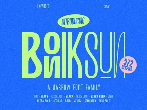
Boniksun Font
Boniksun Typeface, a contemporary sans serif font family, offers a range of weights from Thin to Heavy, featuring a high body for excellent readability at small sizes. With 572 glyphs, it provides extensive typographic options for designers. The condensed version
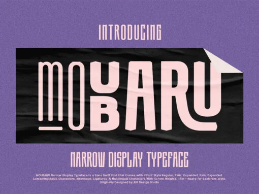
Moubaru Font
Moubaru, a modern sans serif font family, offers an array of weights from Thin to Heavy, ensuring versatility and adaptability. Its tall body allows for easy legibility, even in smaller sizes, while the extensive collection of 680 glyphs expands the
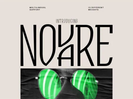
Novare Font
Introducing Novare font, a modern sans serif font family available in a range of weights from Thin to Heavy. With its high body, it remains legible even at small sizes. The font offers 600 glyphs, providing numerous typographic possibilities.
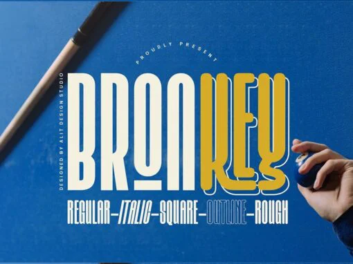
Bronkey Font
Introducing Bronkey, a bold and sporty sans serif typeface with a versatile range of styles like regular, italic, outline, square, and rough. Its high body makes it perfect for headlines, titles, or any project requiring an attention-grabbing font. With
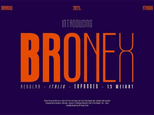
Bronex Font
“BRONEX Typeface” is a modern sans serif font that comes in a variety of weights, ranging from Thin to Heavy. It has a high body, making it easy to read even in small sizes. The font includes 494 glyphs, which
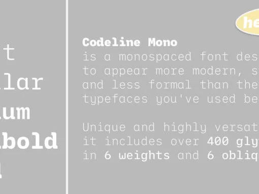
Codeline Mono Font
Codeline Mono is a friendly monospaced typeface designed to appear more modern, softer and less formal than the usually robotic and strict mono fonts. Unique and highly versatile, this family includes over 400 glyphs in each of its twelve styles
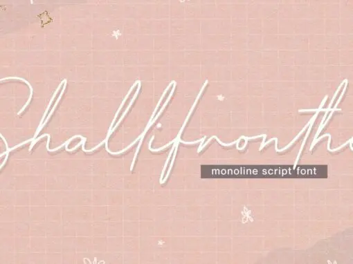
Shallifronthe Font
Shallifronthe is a script font design published by Allouse.Studio Published by Allouse.StudioDownload Shallifronthe
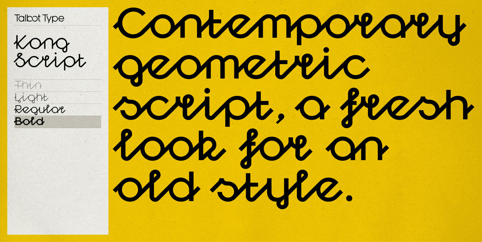
Kong Script Font
Kong Script is a geometric, script typeface, a contemporary interpretation of a traditional style. The upper and lower case character sets link seamlessly, in the manner of a traditional script, to create an easy, flowing look but with a crisp,
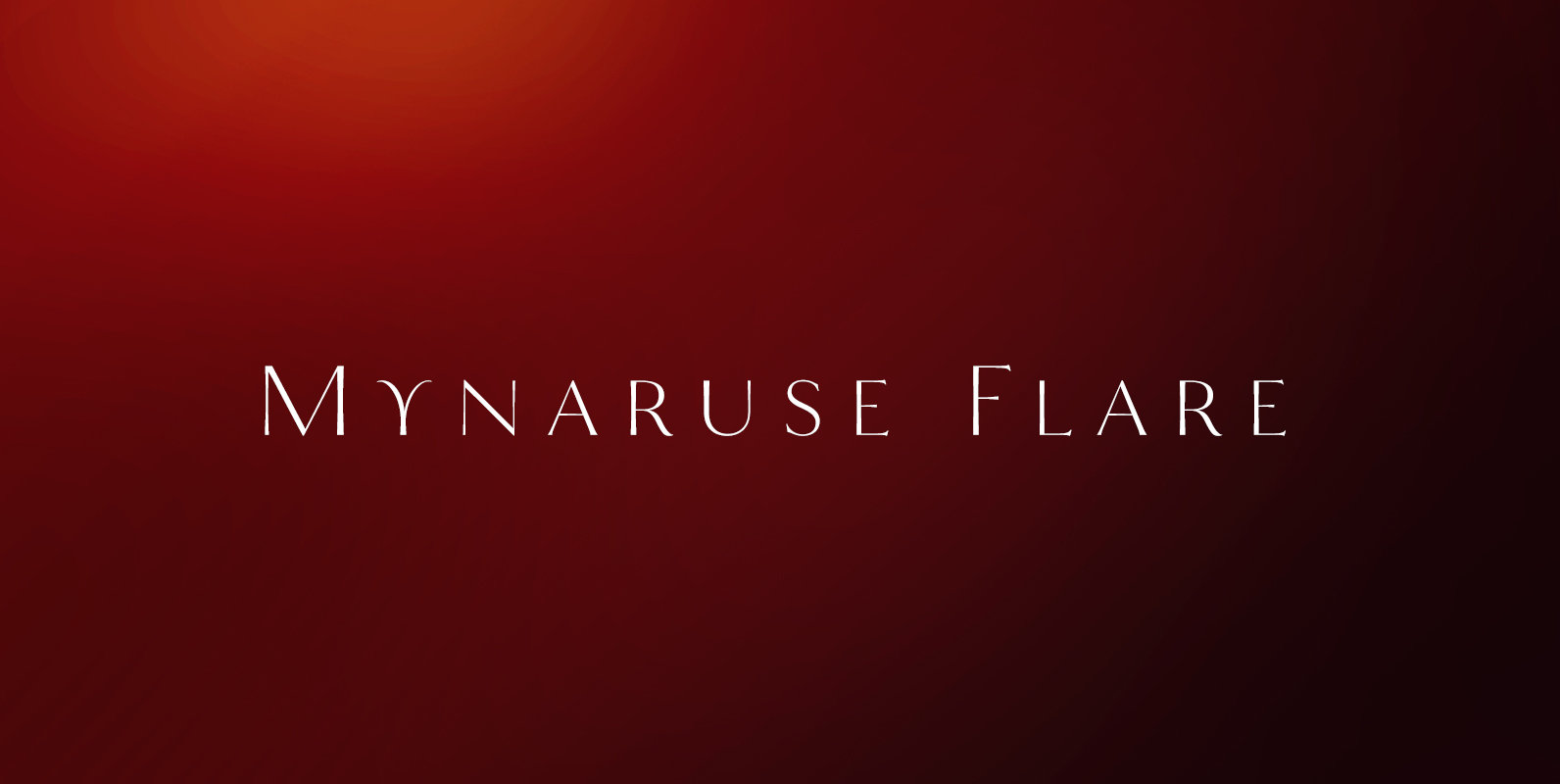
Mynaruse Flare Font
Mynaruse Flare is a new version of the Mynaruse superfamily. This version eliminates the elongated serifs of the original, and instead stems end with a flare. You will find that the thinner weights are delicate and beautiful, while the heavier