Tag: linear

Gerlach Sans Font
As the foundry’s new flagship family, Gerlach Sans was named after the highest peak in Slovakia. Its functional design is enhanced by a few subtle ingredients, adding life and giving words a more playful voice. The family has eight weights
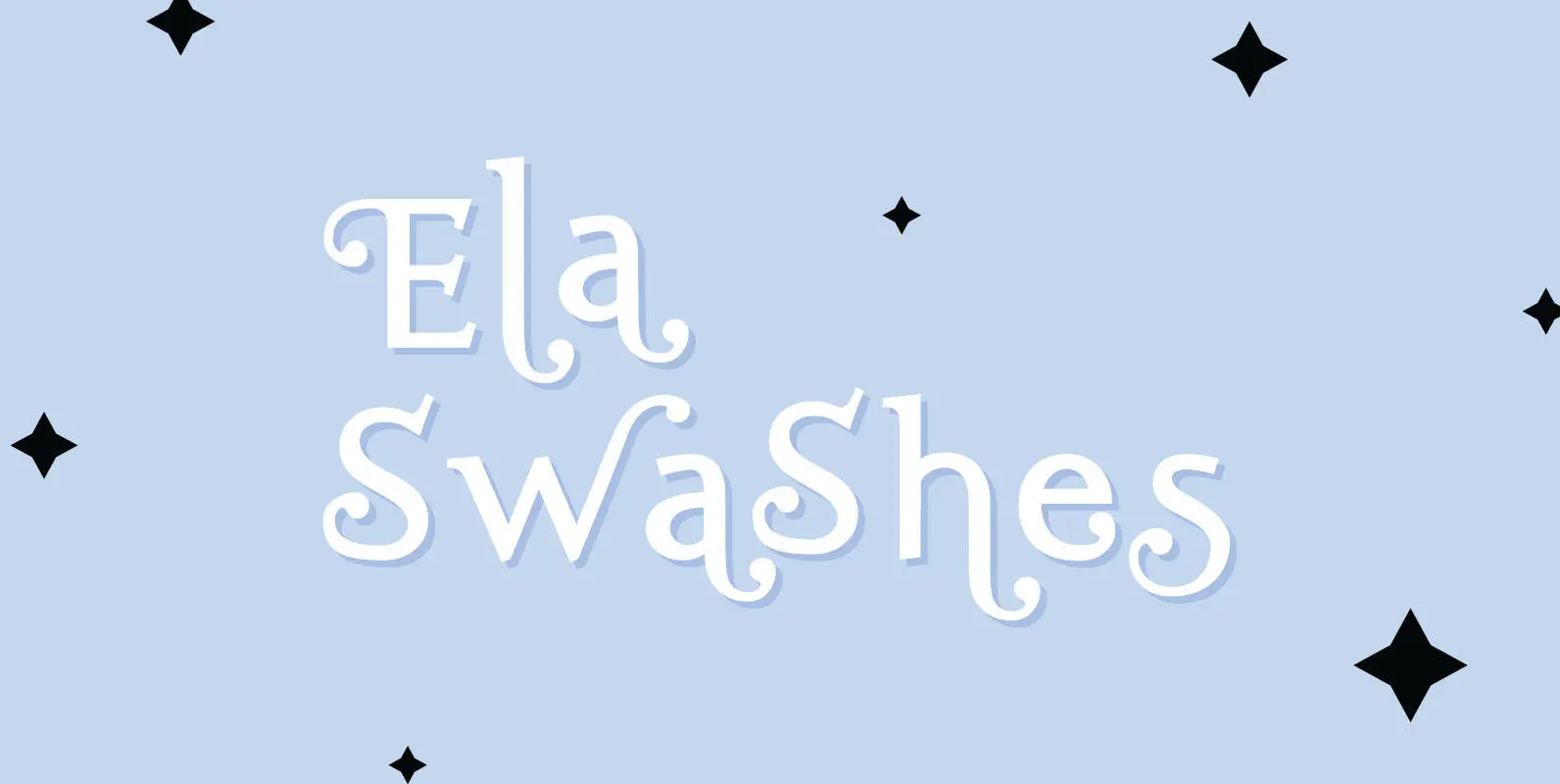
Ela Swashes Font
“Ela Swashes” are not meant to and can not be used as a standalone typeface. Swashes are a set of many different embellished letters to be used together with Ela Demiserif fonts of corresponding weights. Published by Wiescher DesignDownload Ela
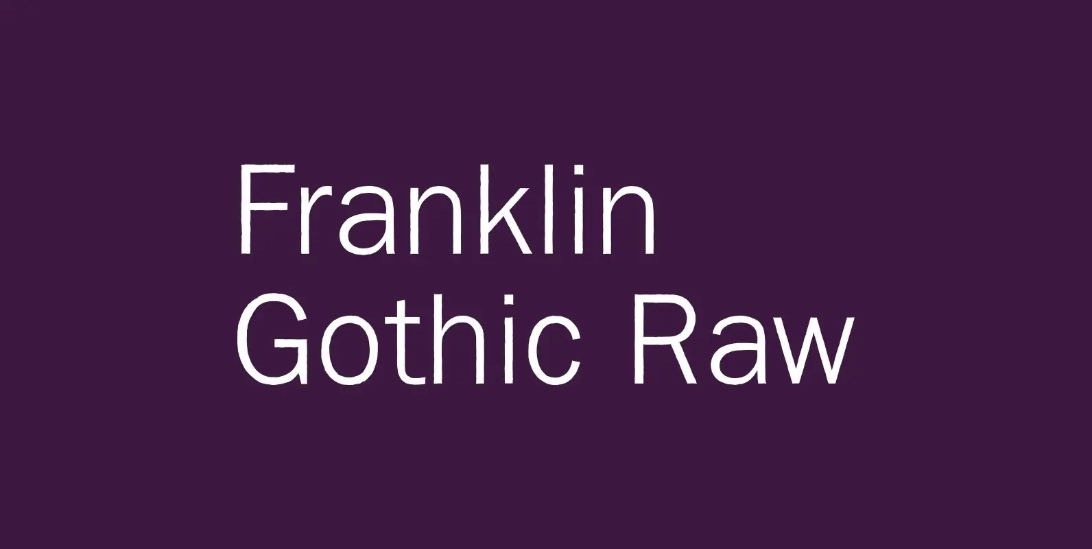
Franklin Gothic Raw Font
When drawing a new font, there is a time when the final form is found – almost – but the curves are not slick and clean yet, that’s what I call the “raw” form. Raw – no sweeteners added! In
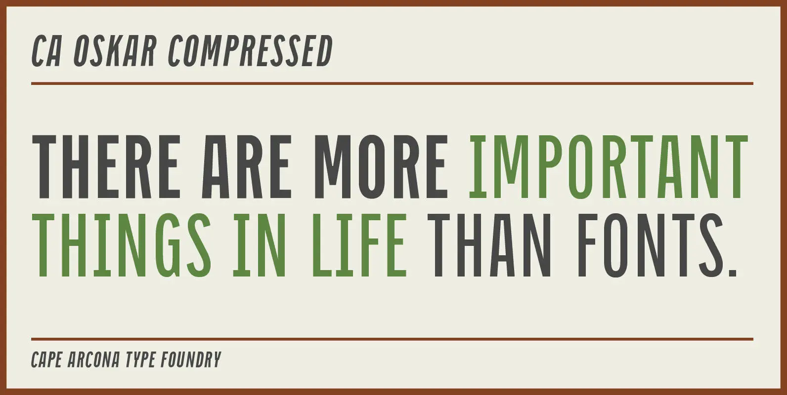
CA Oskar Compressed Font
CA Oskar came into being as a custom typeface for the international Traumzeit music festival. As a substantial part of the new corporate identity, it had to be characteristic, but also flexible in use. Starting with the design of compressed
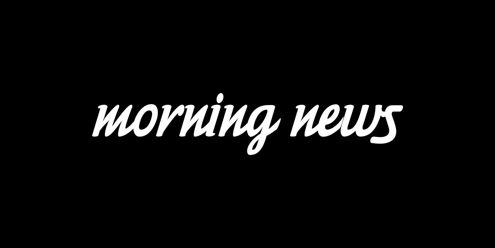
Morning News Font
“Morning News” is the sister font of “Evening News” which I designed some years ago for use with my local newspaper “Abendzeitung”. “Morning News” is an adaption, a little bit rounder, which gives the font a much softer touch. The
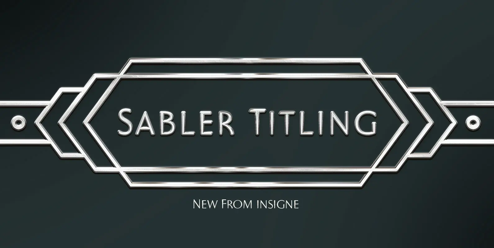
Sabler Titling Font
Make the right statement with the elegant Sabler Titling. This showstopping font features an inherent grace combined with the classic style of the Art Deco period. The subtle beauty of its letters is highlighted by the typeface’s stems, which taper
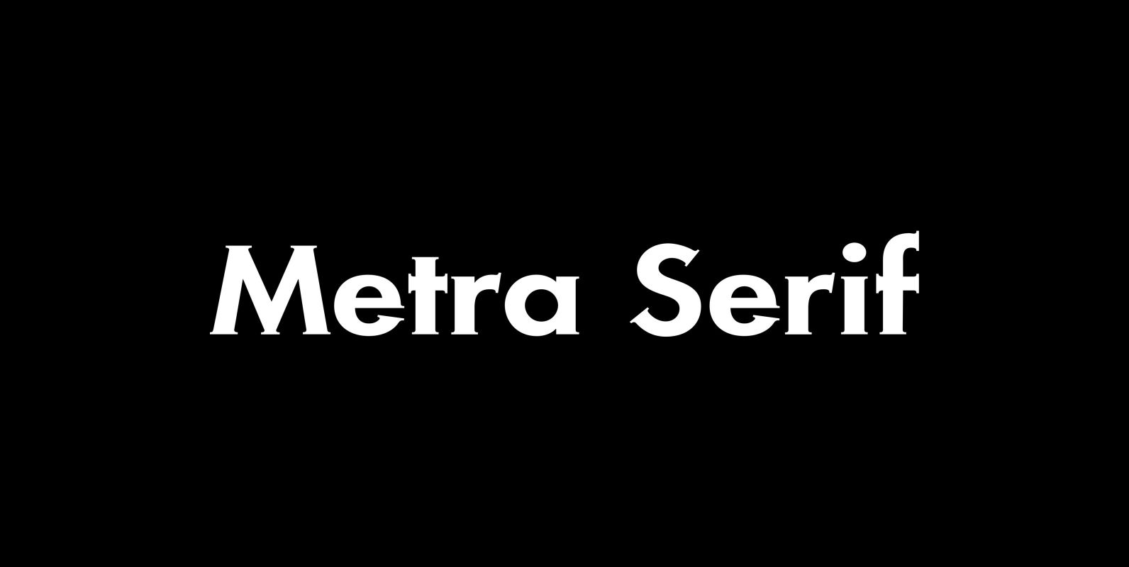
Metra Serif Font
“Metra” has the clarity of a classical Sans font and the charm and elegance of a Gothic Copperplate. I designed it because for some purposes one needs a Serif with that cool “Sans” look. I sell the font in 5
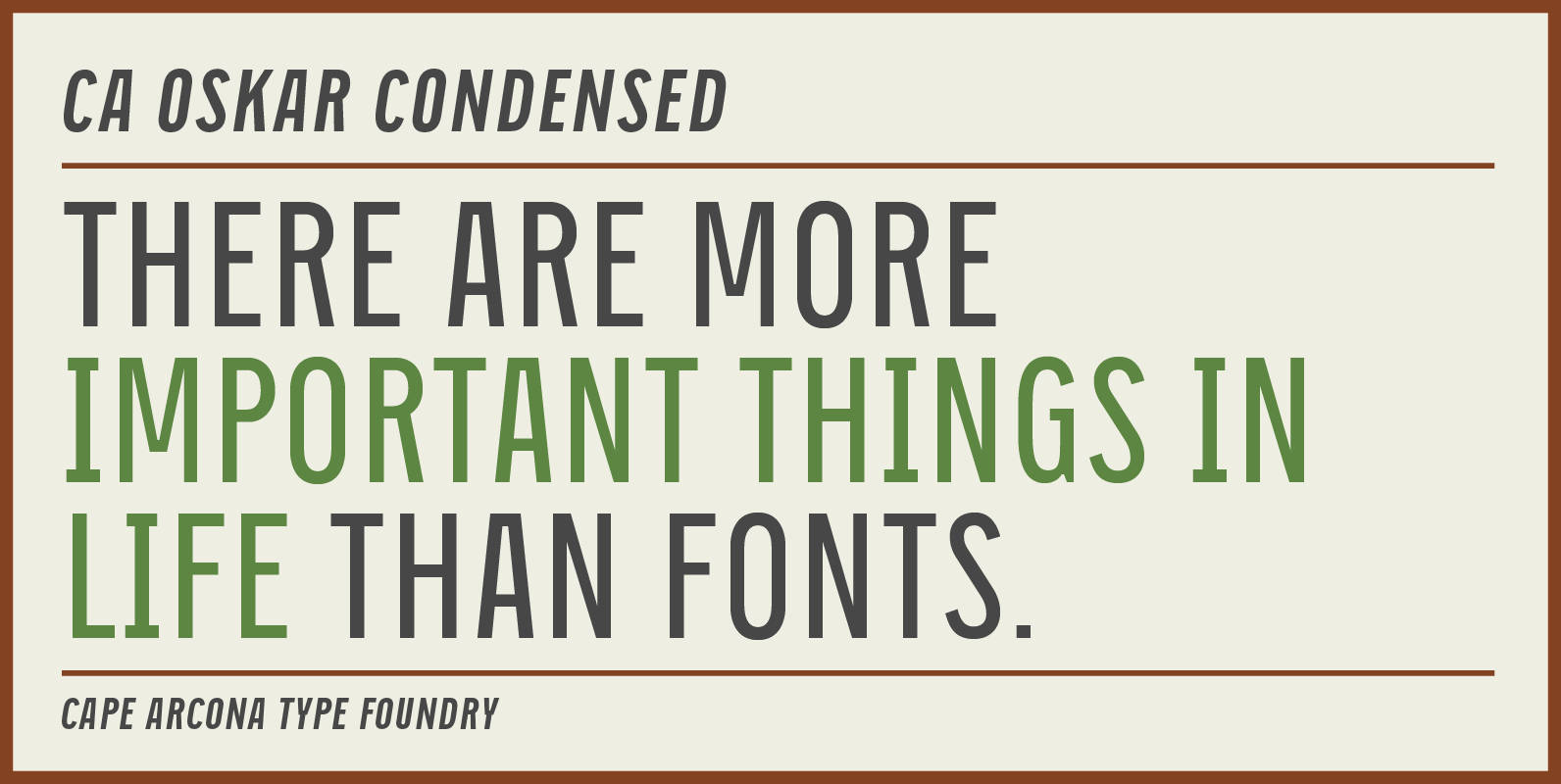
CA Oskar Condensed Font
CA Oskar came into being as a custom typeface for the international Traumzeit music festival. As a substantial part of the new corporate identity, it had to be characteristic, but also flexible in use. Starting with the design of compressed
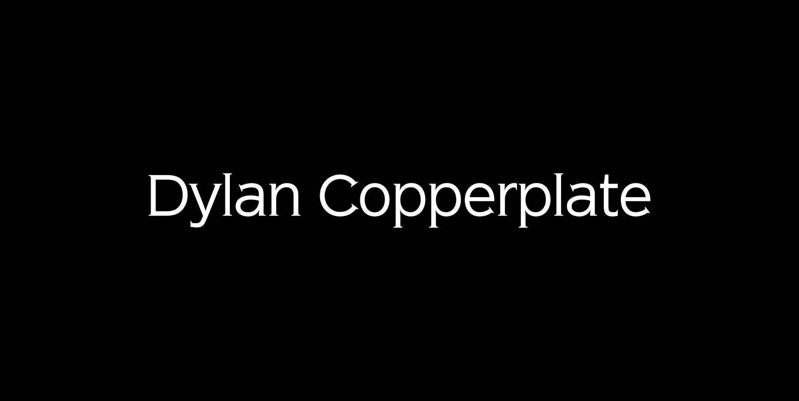
Dylan Copperplate Font
Dylan Copperplate is my newest addition to the ever growing family. The small flicks of the burin add an elegant touch to the solid font-design. Very handsome and useful for all kinds of invitations and business-cards as well as for
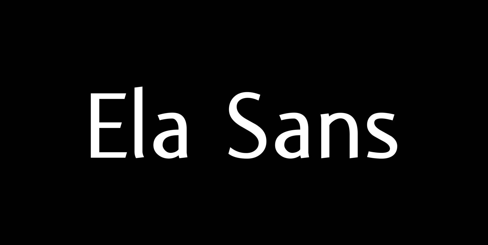
Ela Sans Font
“Ela Sans” is the sister of the typeface I originally designed for the business of my second wife and mother of my two sons, her name is – of course – Michaela. Ela – the typeface – is suitable for
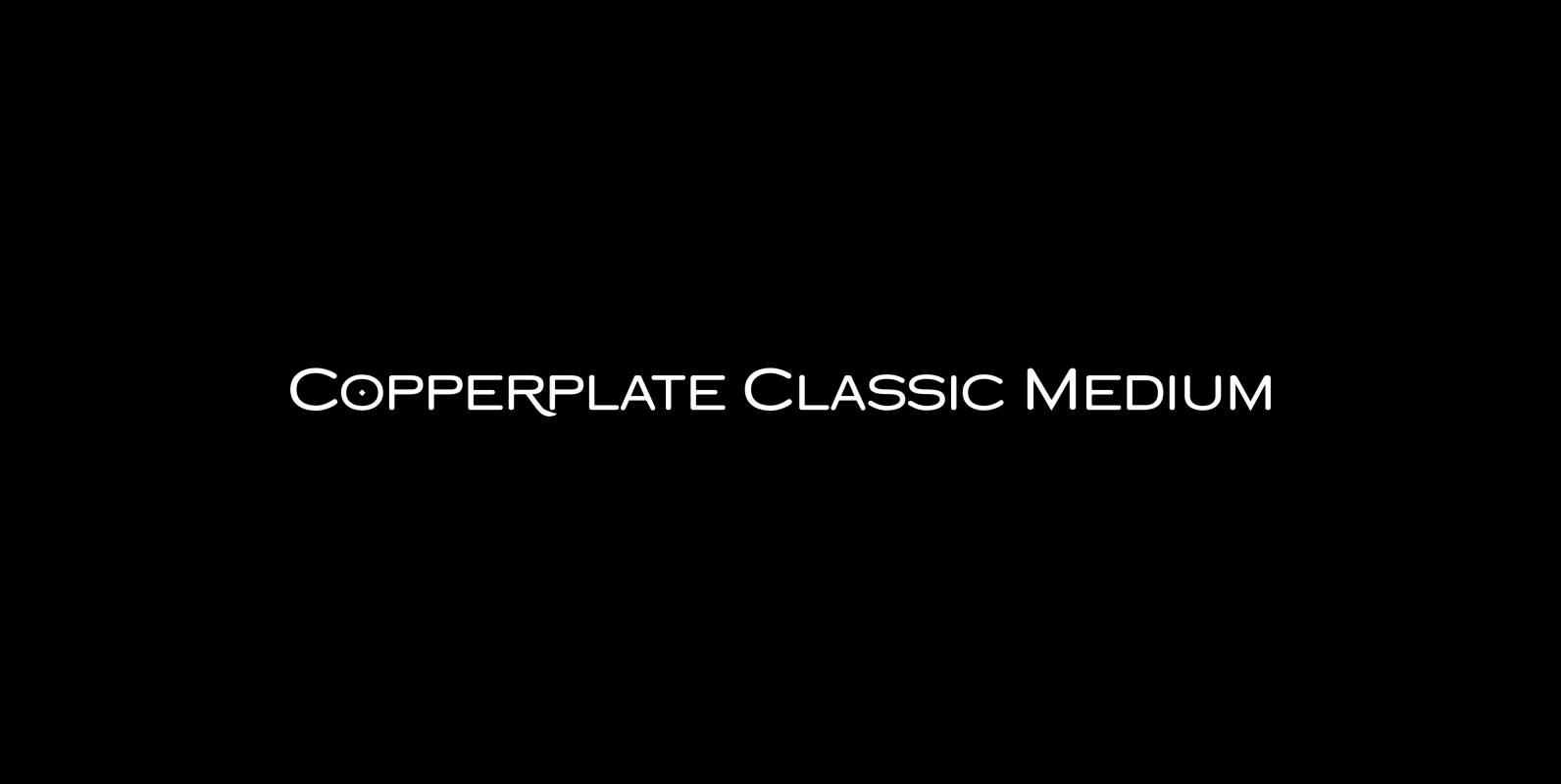
Copperplate Classic Medium Font
“Copperplate” was the classic nineteenth century engravers typeface, consisting of capitals and small caps only. Among others (for example Deberny & Peignot) F. W. Goudy’s cut for ATF around 1901 is probably the most widely known. Copperplate typefaces are traditionally
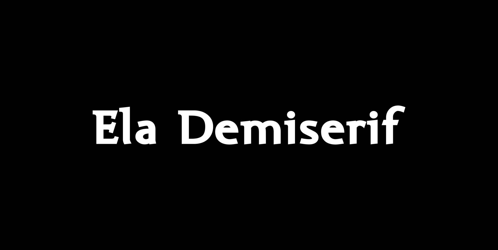
Ela Demiserif Font
Ela Demiserif is the typeface I originally designed for the business of my second wife and mother of my two sons; her name is, of course, Michaela. Ela – the typeface – is suitable for magazines, newspapers, posters, advertisements, books,
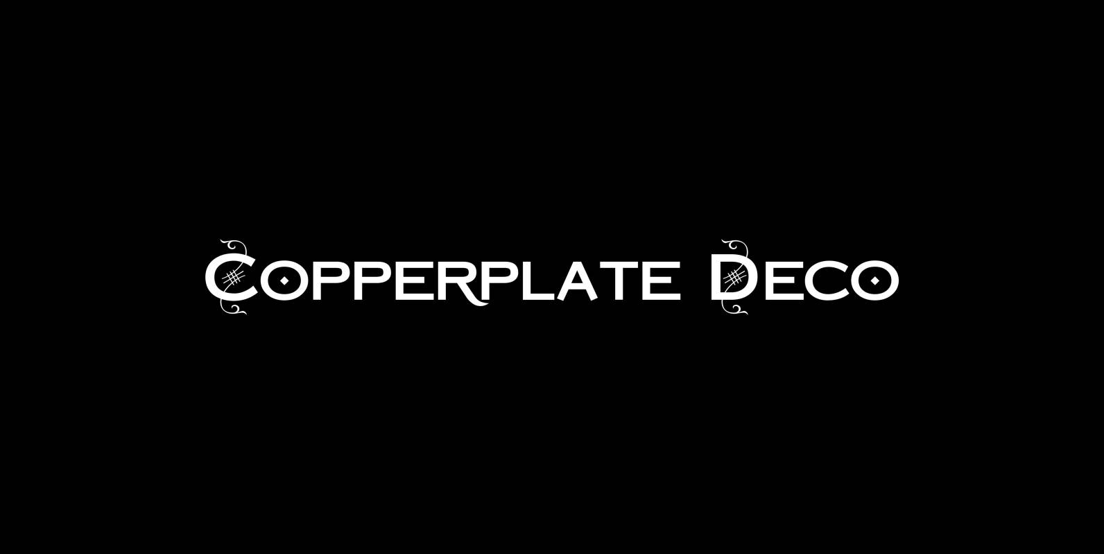
Copperplate Deco Font
“Copperplate Deco” is my sparingly decorated version of my Copperplate fonts. They can be used as stand alone fonts. Published by Wiescher DesignDownload Copperplate Deco
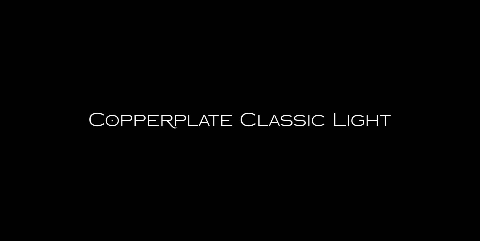
Copperplate Classic Light Font
“Copperplate” was the classic nineteenth century engravers typeface, consisting of capitals and small caps only. Among others (for example Deberny & Peignot) F. W. Goudy’s cut for ATF around 1901 is probably the most widely known. Copperplate typefaces are traditionally
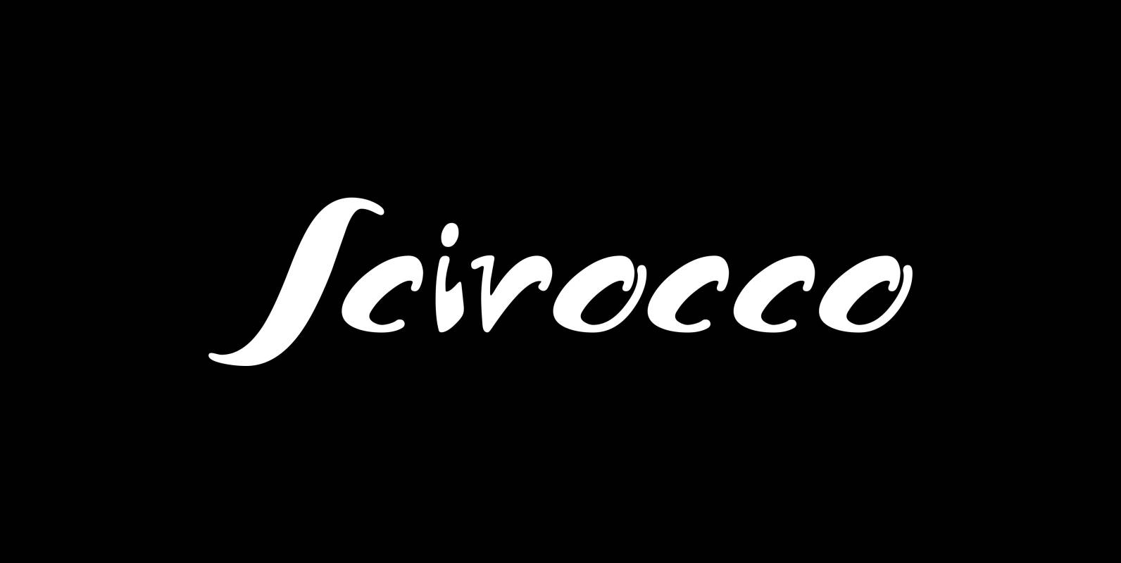
Scirocco Font
“Scirocco” is a hot and humid wind that blows from the Sahara over to France and Italy. It crosses the mediterranean sea and carries lots of fine desertdust with it. Once it hits the costs of Provençe one can feel
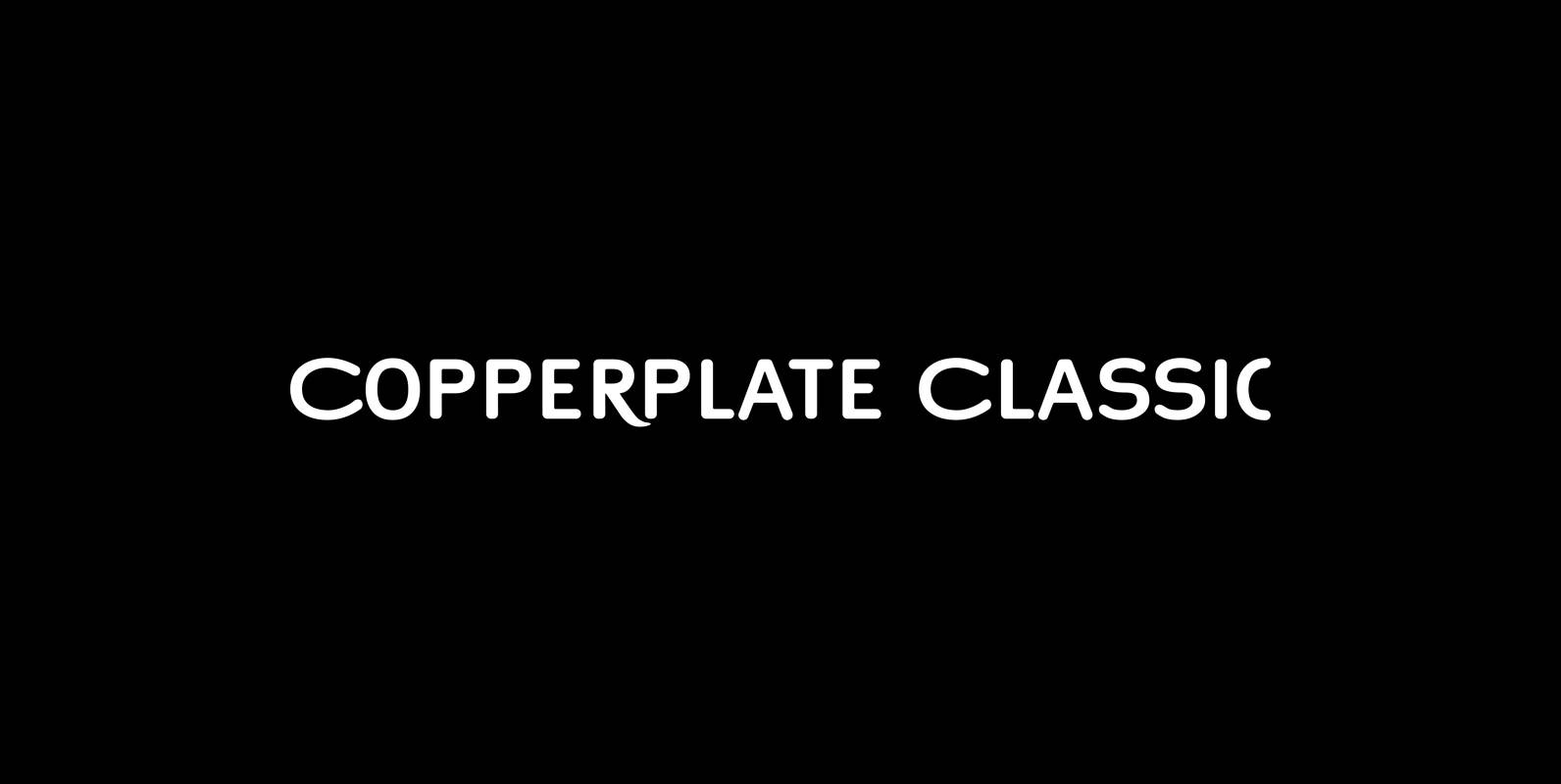
Copperplate Classic Font
“Copperplate” was the classic nineteenth century engravers typeface, consisting of capitals and small caps only. Among others (for example Deberny & Peignot) F. W. Goudy’s cut for ATF around 1901 is probably the most widely known. Copperplate typefaces are traditionally
