Tag: linear
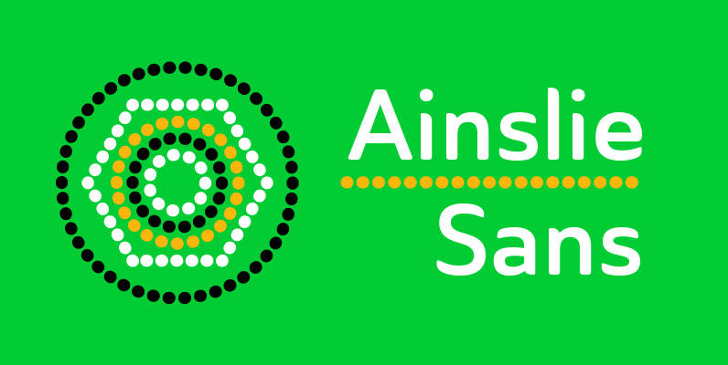
Ainslie Sans Font
The original Ainslie was inspired by Mt. Ainslie and the city of Canberra’s inner suburb of the same name. Canberra is Australia’s capital–a planned city designed by American architect Walter Burley Griffin. Griffin’s style and geometric design for the city,
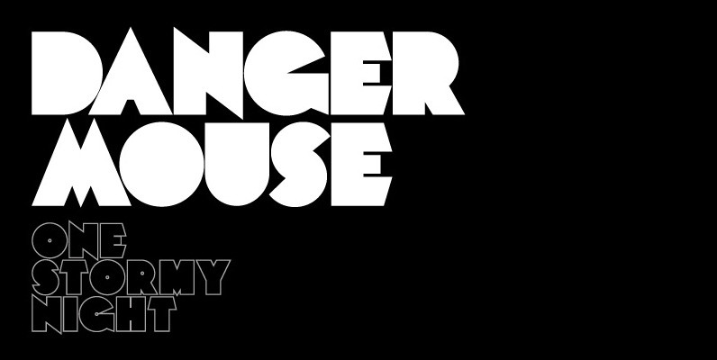
Mekon Font
A modern heavy weight typeface ideal for use on print, web, motion, t-shirts and apparel. Details include 4 styles with 3 alternatives, extended European character set, manually edited kerning and Euro symbol. Published by The Northern Block Download Mekon
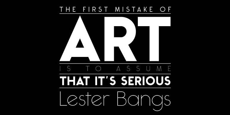
Ealing Font
The Ealing font is a clean, geometric design inspired by the historic modular designs of the 30’s. With a large weight contrast, this font ranges from a refined light cut to a chunky, black style. Published by Michael ParsonDownload Ealing
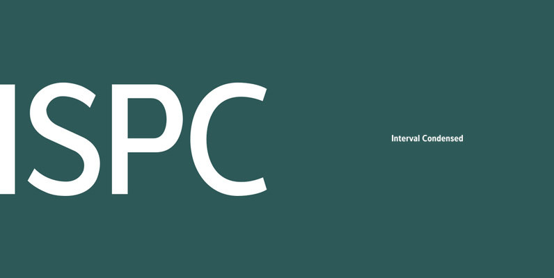
Interval Sans Pro Condensed Font
The new Interval Sans Pro is a pratical choice when you need a contemporary sans serif for text typography, headlines, signage or brands creation. This new version has many more OT features like small caps, ligatures, stylistic set, localized form.
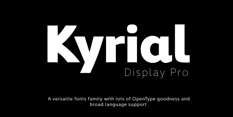
Kyrial Display Pro Font
Designed in 2011 by Olivier Gourvat, this font family has generous proportions with a range of weights make it a versatile family for print and web design work. Kyrial Display Pro is also a pratical typographic choice to express strength,
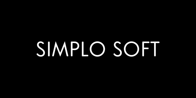
Simplo Soft Font
Simplo Soft is the soft companion of Simplo. In Simplo Soft, Simplo’s original sharp geometrics have been tempered by the moderate rounding of the edges of its characters — creating a softer and friendlier geometric typeface. Simplo Soft is ideal
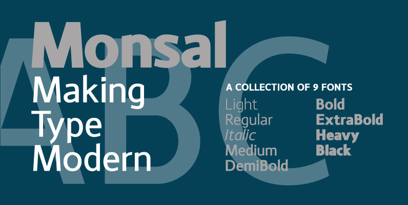
Monsal Font
A sans-serif typeface with clean and simple proportions. The design pays special attention towards balance and purity of form, creating a functional yet elegant typeface suitable for a wide variety of modern applications. Details include 9 weights, an extended European
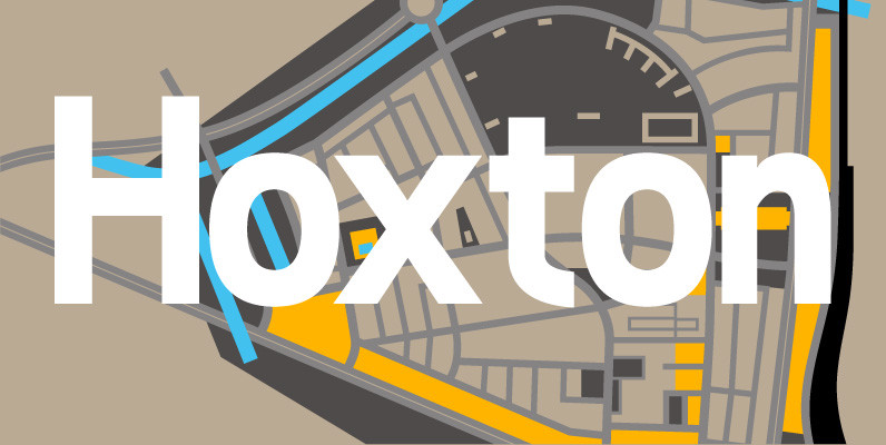
Hoxton Font
A modern humanistic san serif typeface. The horizontal structure of the font gives it a clean lateral dynamic that is ideal for on screen uses. Also the proportions have been condensed to maximise the use of space across various layouts.
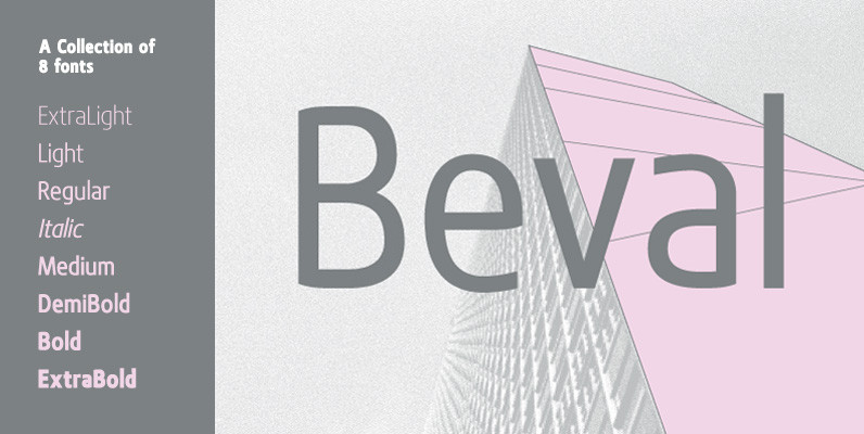
Beval Font
A humanistic sans-serif typeface with subtle chamfer detailing. It’s strong lateral emphasis is combined with open apertures to create sharp and legible letter forms. These balanced and narrow proportions make it ideally suited to a variety of online applications. Details
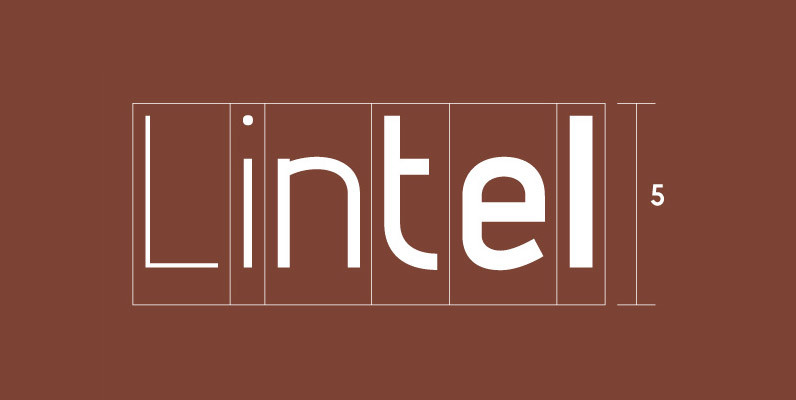
Lintel Font
A modern san serif typeface with a pure clean line form. The idea has been to design a font with a proportioned and balanced structure that is applicable to a wide variety of uses. Details include 6 weights with italics,
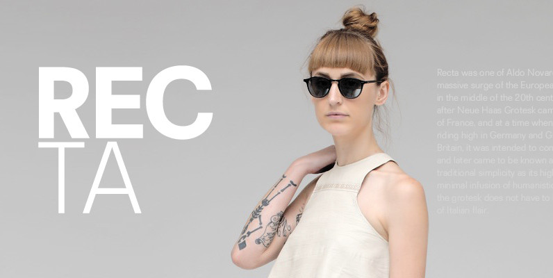
Recta Font
Recta was one of Aldo Novarese’s earliest contributions to the massive surge of the European sans serif genre that was booming in the middle of the 20th century. Initially published just one year after Neue Haas Grotesk came out of
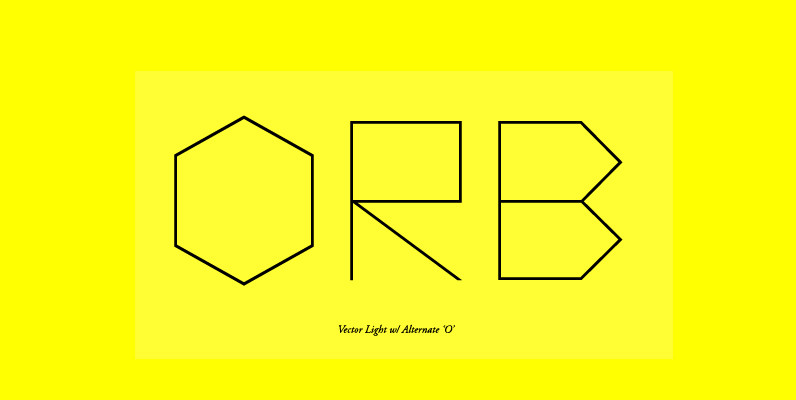
Vector Font
Vector is inspired by the 1979 Atari Asteroids video game UI screen font, yet it has been completely reworked to achieve a more balanced and refined visual aesthetic, loosely adhering to the original source. Letterform widths, angles, metrics and kerning
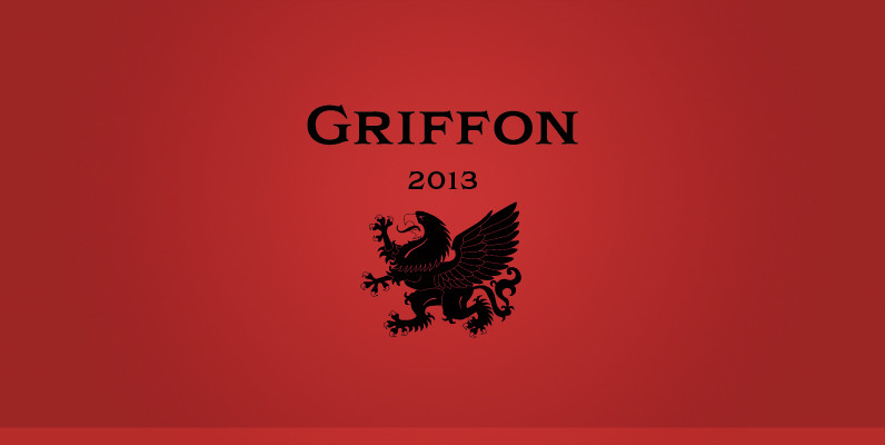
Griffon Font
Griffon, titling face with influence from classic letterforms, inspired by retro faces in the early 20th century. This font family was all redesigned from scratch and now released ranging in 5 weights with small caps from Light to Bold. The
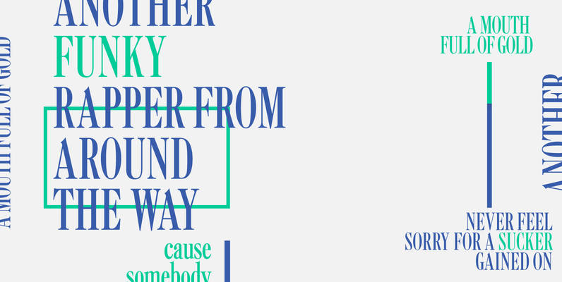
Caslon Extra Condensed Font
Designed by Steve Jackaman, Caslon Extra Condensed is based on the Ludlow/ATF versions of this great typeface. Published by Red RoosterDownload Caslon Extra Condensed
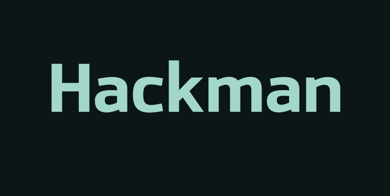
Hackman Font
A geometric sans serif with contemporary lines. Distinctive curves are combined with classical letterforms to produce a clean, linear typeface best suited to identity, mobile and web applications. Details include 9 weights with italics, 500 characters, 5 variations of numerals,
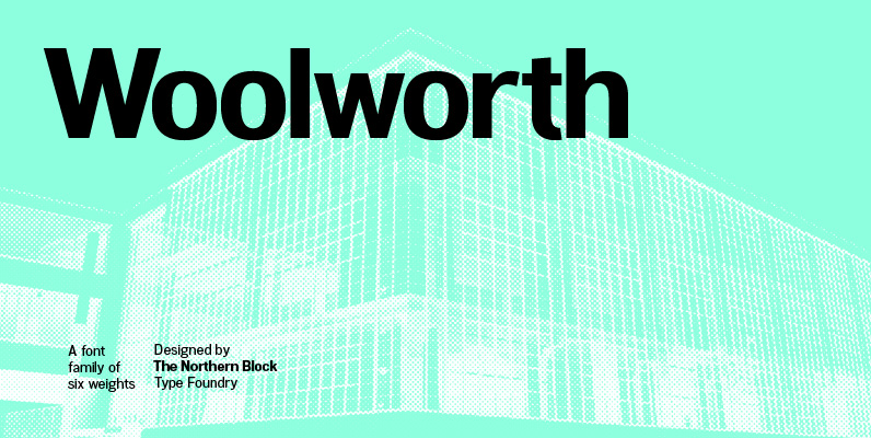
Woolworth Font
A modern sans serif font inspired by the grotesque designs of the late 19th century. Each letter has been developed with careful attention towards balance and purity of form, creating a clean functional and optically correct typeface. These handcrafted details create a
