Tag: luxury goods
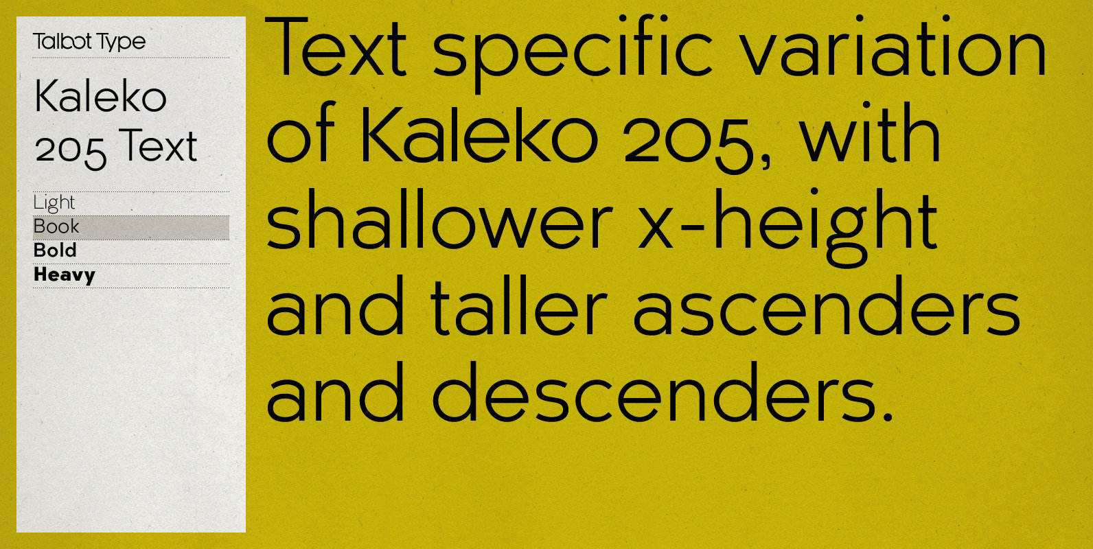
Kaleko 205 Text Font
Kaleko 205 Text is the text specific variation of stablemate, Kaleko 205. With a shallower x-height and longer ascenders and descenders, its more traditional proportions make it more economical with space and better suited to continuous text. It’s a well-balanced,
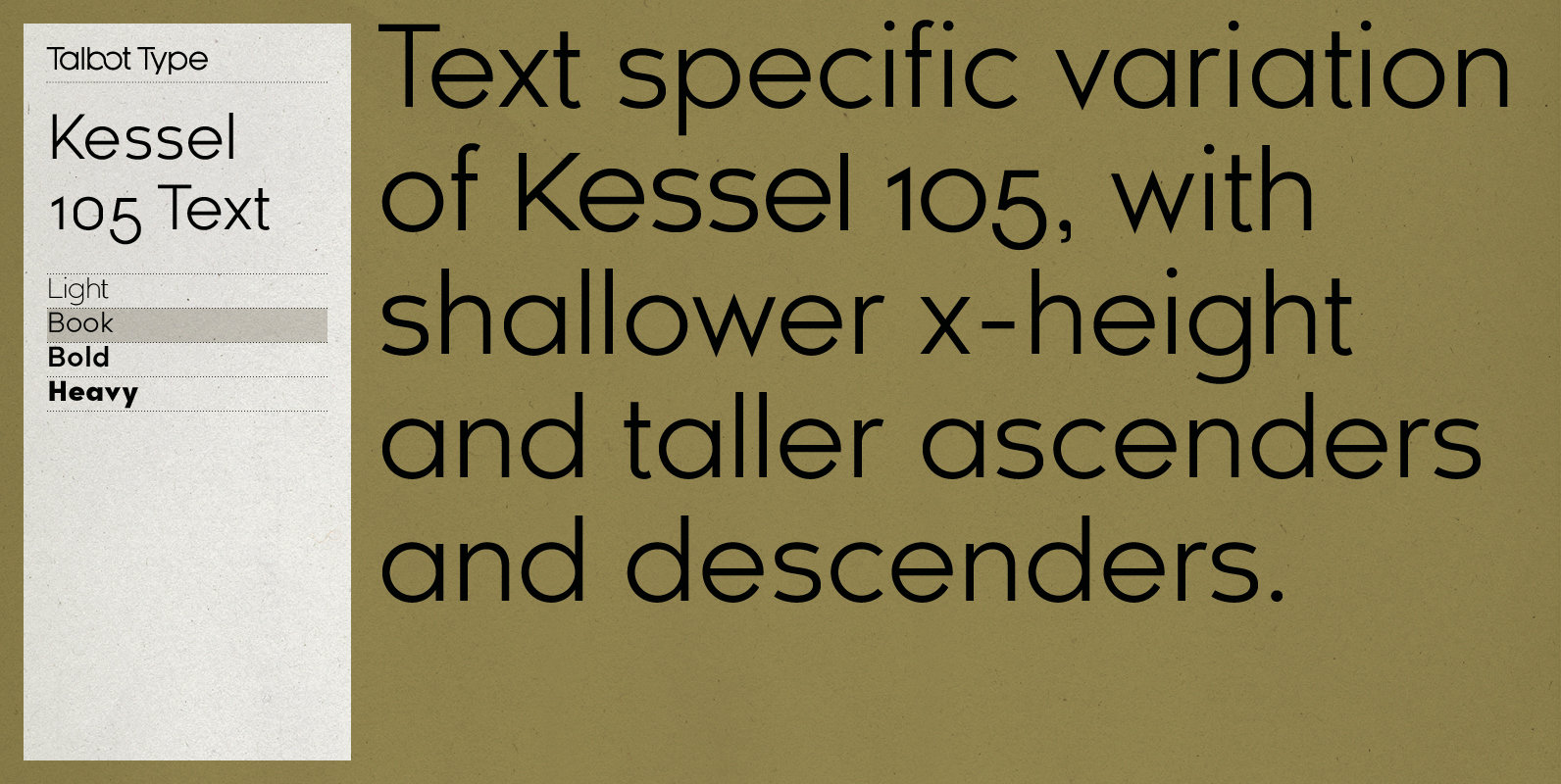
Kessel 105 Text Font
Kessel 105 Text is the text specific variation of stablemate, Kessel 105. With a narrower x-height and longer ascenders and descenders, its more traditional proportions make it more economical with space and better suited to continuous text. It’s a versatile,
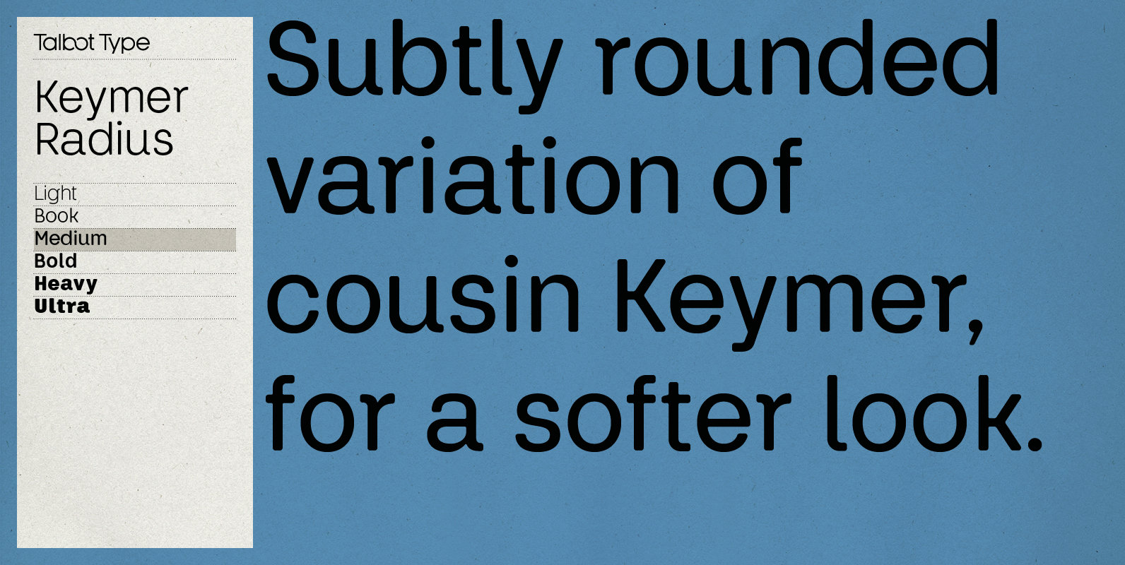
Keymer Radius Font
Talbot Type Keymer Radius is related to Talbot Type Keymer; where Keymer is square-edged, Keymer Radius is subtly rounded for a softer look. Keymer Radius mixes geometric and humanist traits to achieve a modern, clean, elegant appearance. It is a
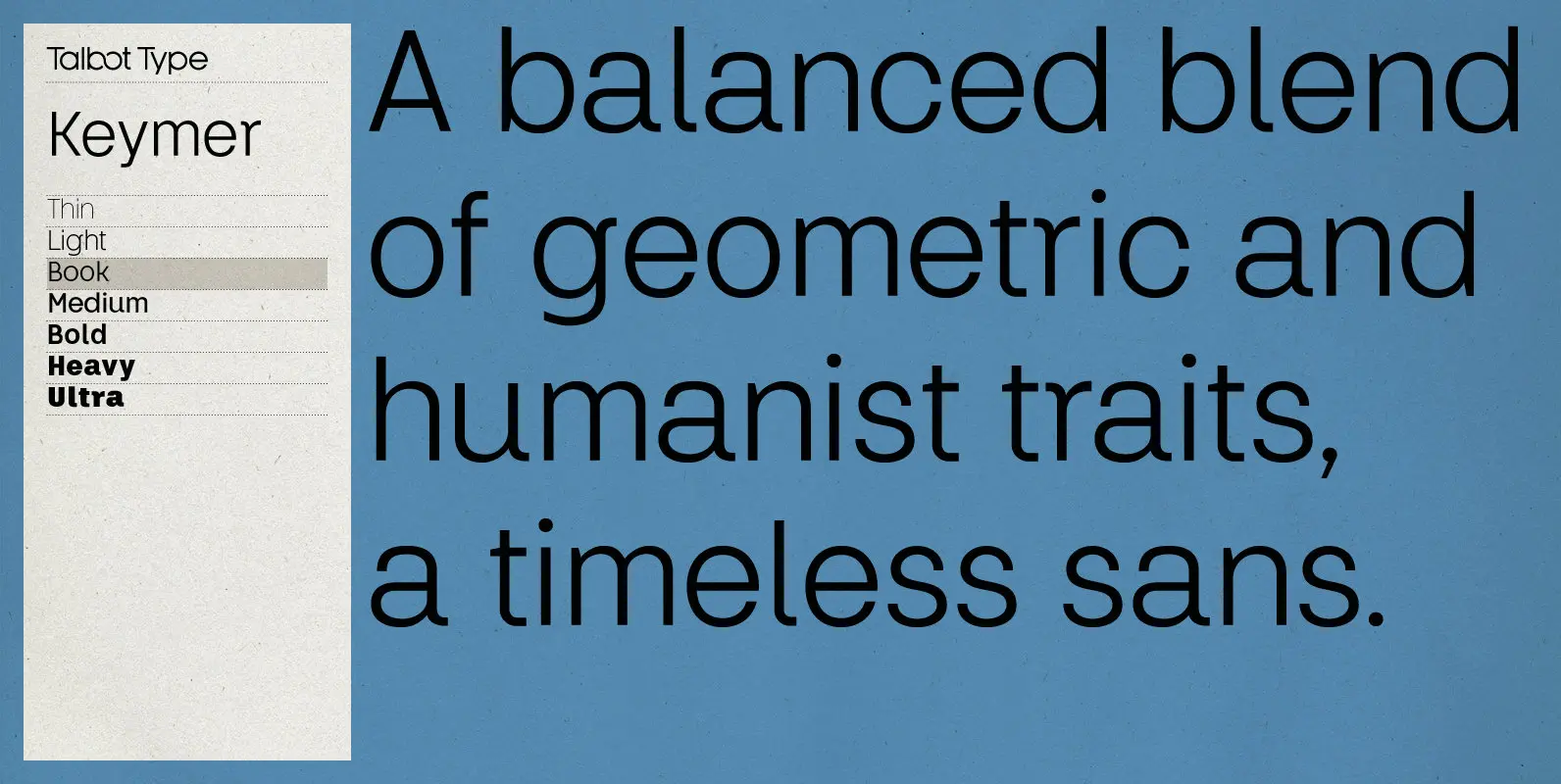
Keymer Font
Talbot Type Keymer is inspired by Margaret Calvert’s Transport typeface, designed for the British road sign system in the early 1960s. Keymer mixes geometric and humanist traits to achieve a modern, clean, elegant appearance. It is a legible and versatile
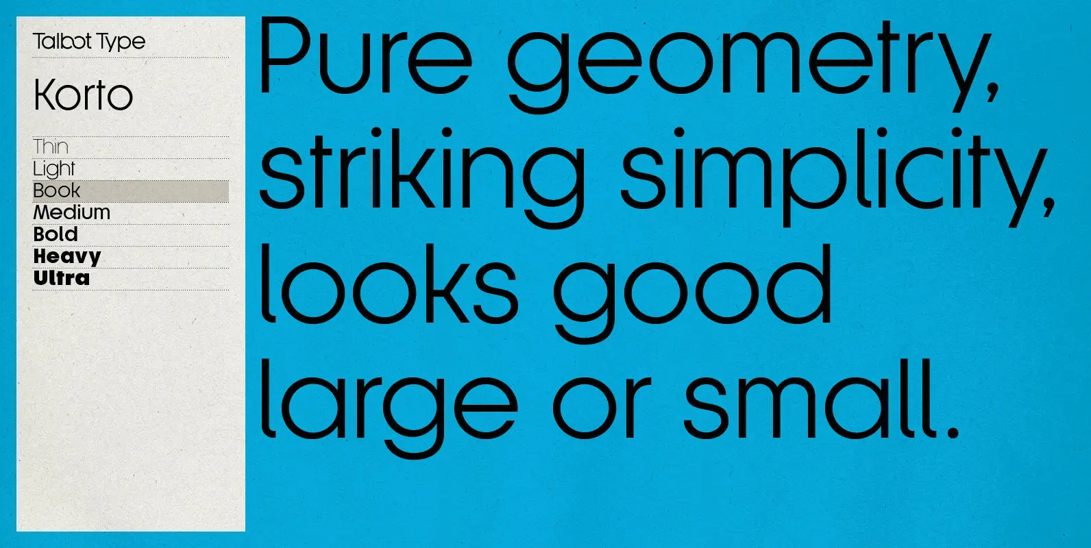
Korto Font
Korto is a clean, elegant and highly legible, geometric text and display font. Inspired by classic sans-serifs such as Futura and Avant Garde, this stylish, minimal typeface is available in a comprehensive family of seven weights and is suitable for
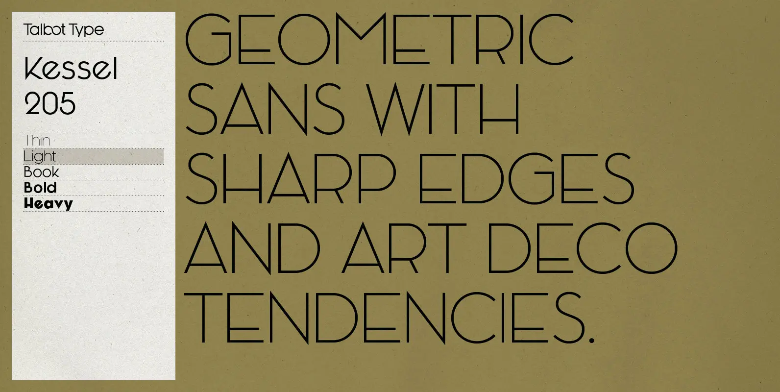
Kessel 205 Font
Kessel 205 is inspired by the classic, geometric sans-serifs such as Futura, but has shallower ascenders and descenders for a more compact look, and features an art deco influence with sharp points at the apex of many characters, lowered crossbars
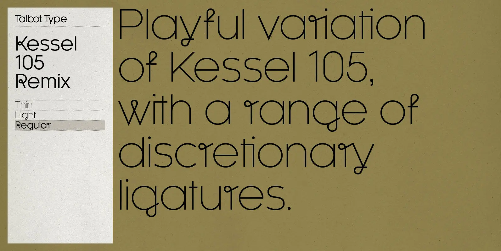
Kessel 105 Remix Font
A remixed variation, available in three weights, of the popular Talbot Type geometric sans Kessel 105. The addition of occasional flourishes at the intersections of strokes, in both upper and lower case, adds character charm, making the font a perfect
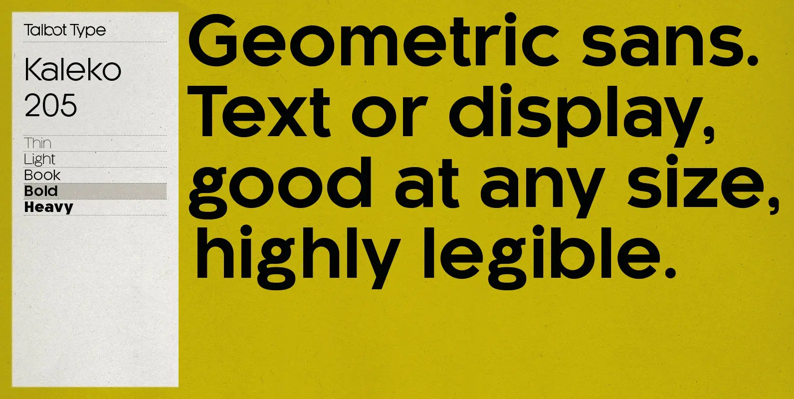
Kaleko 205 Font
Kaleko 205 is inspired by the classic, geometric sans-serifs such as Gill Sans, but has shallower ascenders and descenders for a more compact look. It’s a well-balanced, versatile, modern sans, highly legible as a text font and with a clean,
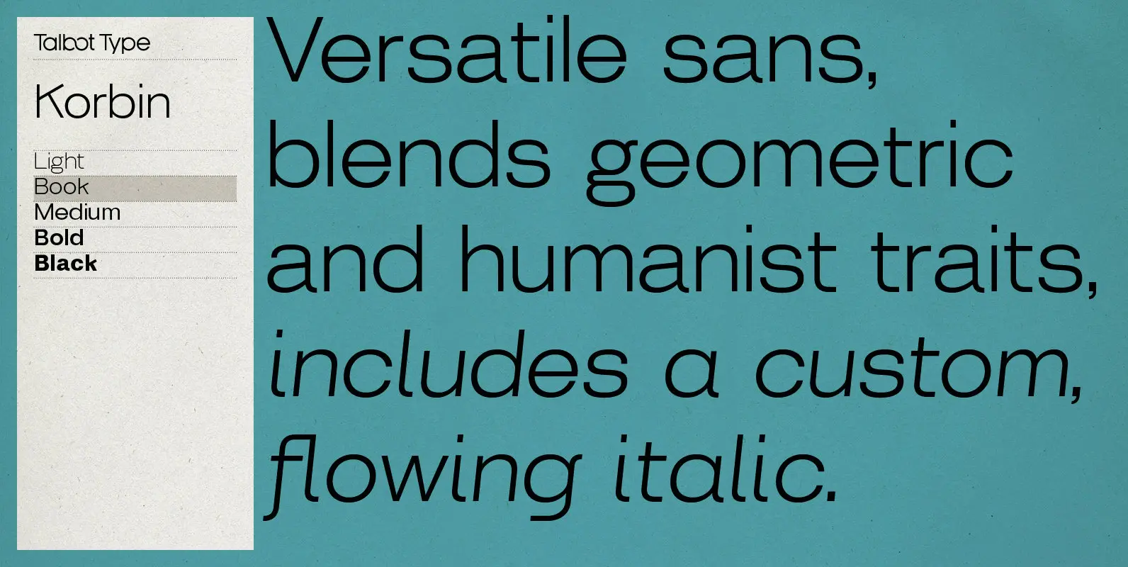
Korbin Font
Inspired by the sans-serifs of the late 19th and early 20th century, Korbin is a legible and versatile text and display face available in five weights. It mixes geometric and humanist traits to achieve a modern, clean, friendly appearance. The
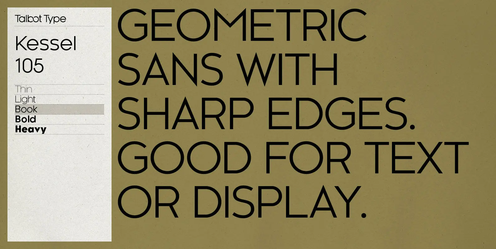
Kessel 105 Font
Kessel 105 is inspired by the classic, geometric sans-serifs such as Futura, but has shallower ascenders and descenders for a more compact look, and features an art deco influence with sharp points at the apex of many characters. It’s a
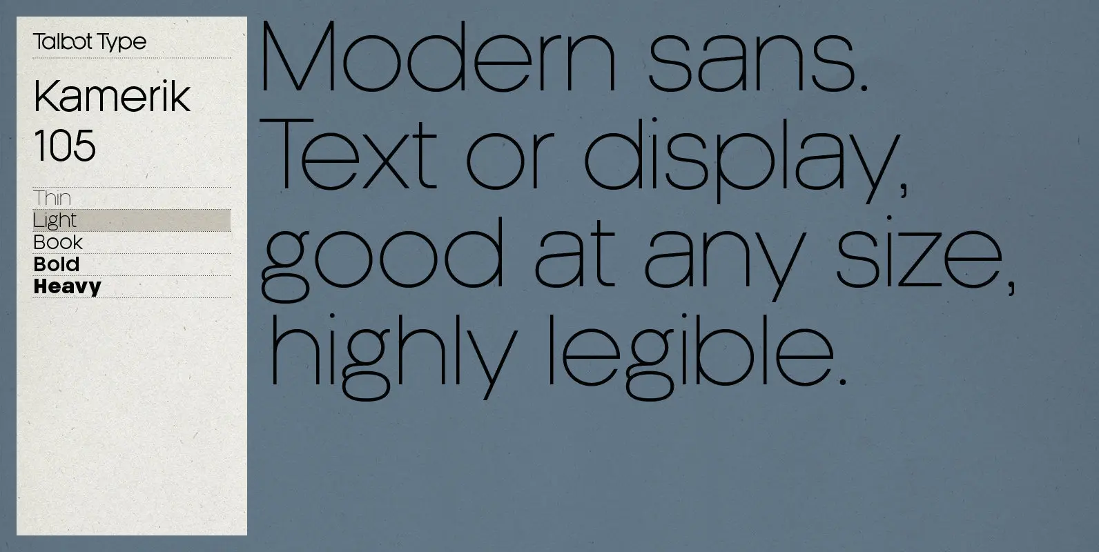
Kamerik 205 Font
Kamerik 205 is inspired by the classic, geometric sans-serifs such as Futura and Avant Garde, but has shallower ascenders and descenders for a more compact look, and features a traditional double-storey lower case a and g. It’s a versatile, modern
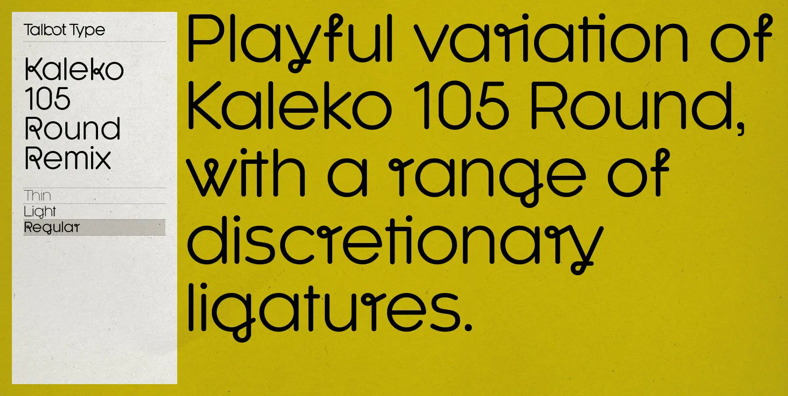
Kaleko 105 Round Remix Font
A remixed variation, available in three weights, of the popular Talbot Type geometric sans Kaleko 105 Round. The addition of occasional flourishes at the intersections of strokes, in both upper and lower case, adds character charm, making the font a
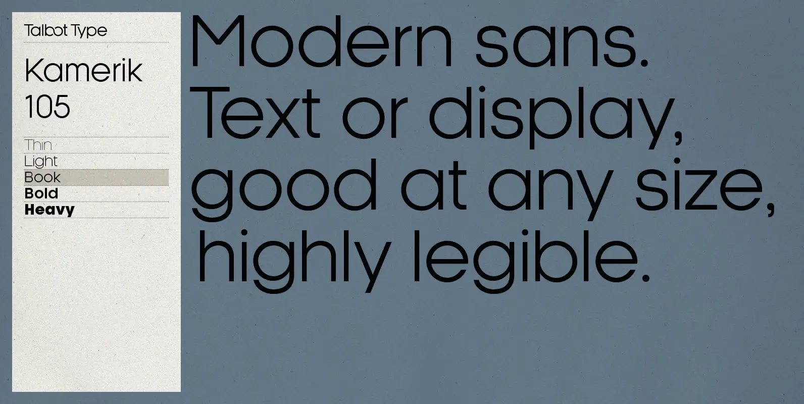
Kamerik 105 Font
Kamerik 105 is inspired by the classic, geometric sans-serifs such as Futura and Avant Garde, but has shallower ascenders and descenders for a more compact look. It’s a versatile, modern sans, highly legible as a text font and with a
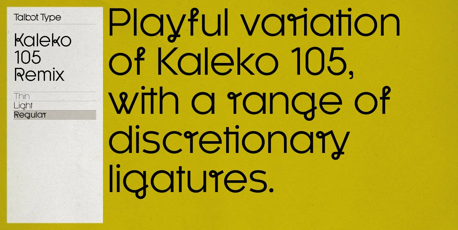
Kaleko 105 Remix Font
A remixed variation, available in three weights, of the popular Talbot Type geometric sans Kaleko 105. The addition of occasional flourishes at the intersections of strokes, in both upper and lower case, adds character charm, making the font a perfect
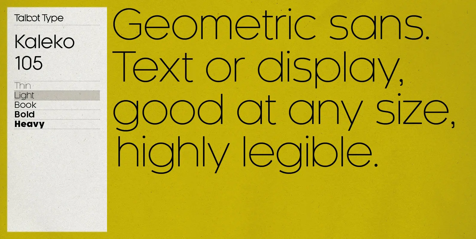
Kaleko 105 Font
Kaleko 105 is inspired by the classic, geometric sans-serifs such as Gill Sans, but has shallower ascenders and descenders for a more compact look. It’s a well-balanced, versatile, modern sans, highly legible as a text font and with a clean,
