Tag: machine
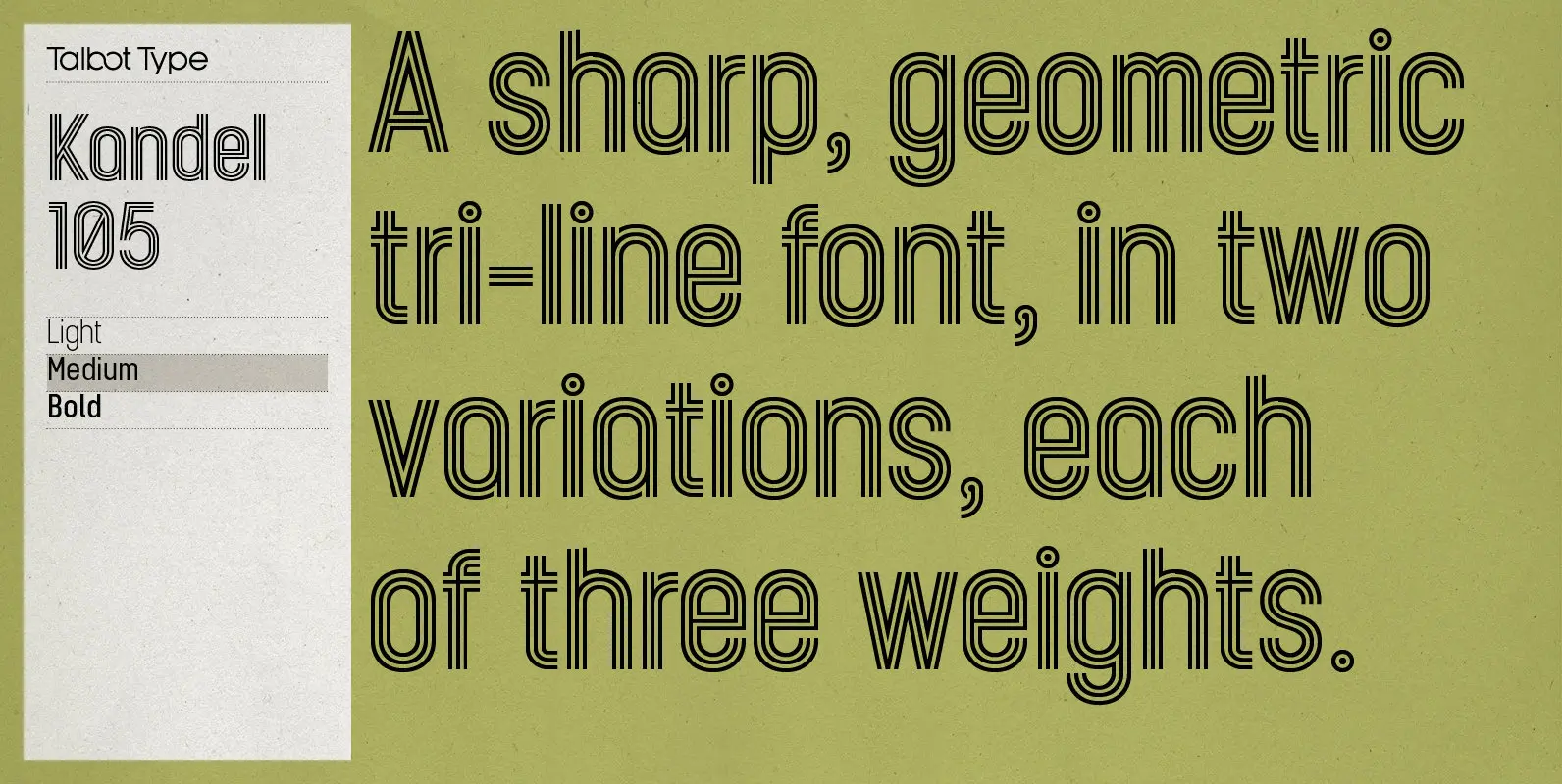
Kandel 105 Font
Kandel 105 is a geometric, tri-line, display and headline font available in a family of three weights. Its bold, graphic styling gives it great stand-out qualities and a highly individual look. It’s particularly well suited to bringing energy to designs,
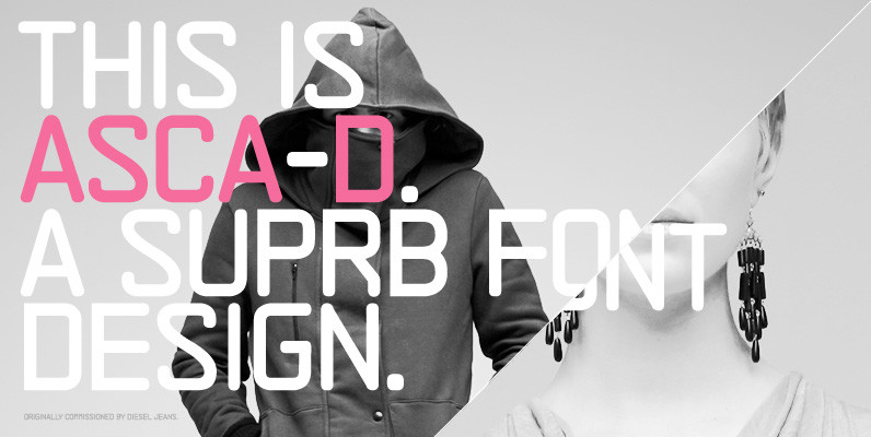
ASCA-D Font
ASCA-D is the latest version in the ASCA series from Suprb and the Subtype foundry. After the original version titled ASCA, ASCA-D was later developed as a lighter and cleaner version to represent Diesel’s online presence in Sweden for Diesel
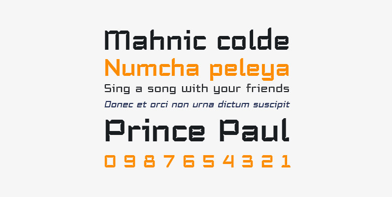
Trapper Sharp Family Font
Trapper is so named because it exploits a typographic design mechanism known as ink traps purely for graphic effect. Ink traps are a device used by type designers to create significantly higher legibility under adverse printing conditions, especially when the
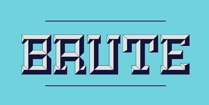
Brute Font
Brute is a new kind of beveled display face based upon a modular grid-like system. Its precisely sharp edges convey a solid yet aggressive feel that add personality to any project. Unlike many beveled typefaces, Brute puts the lighting direction
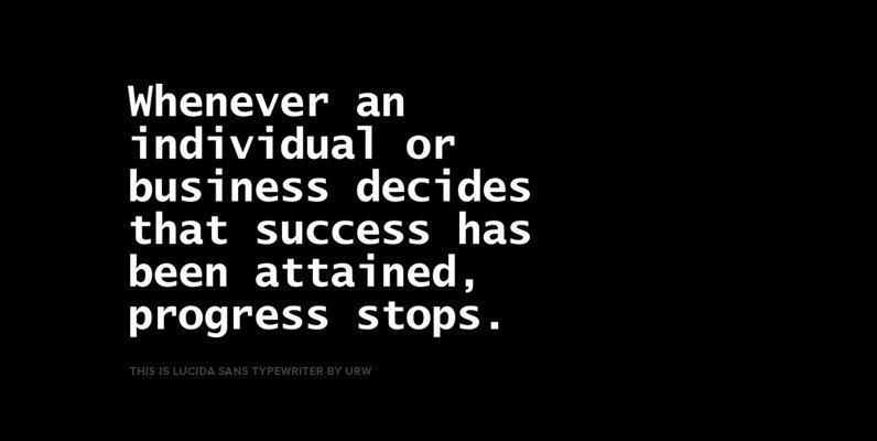
Lucida Sans Typewriter Font
Lucida is an extended family of related typefaces designed by Charles Bigelow and Kris Holmes in 1985. Contains language support for West, East, Turkish, Baltic, and Romanian. Published by URW++ Download Lucida Sans Typewriter
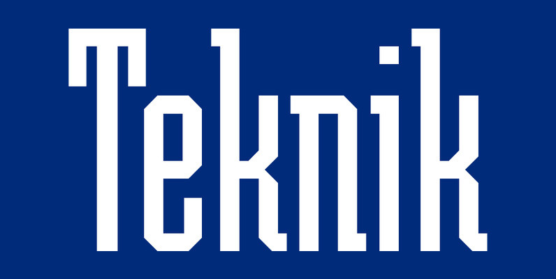
Teknik Font
Inspired by the powerful-looking geometric styles of the 1920’s Soviet constructivist movement, this strong, precise typeface is suitable for a wide variety of headline applications. Teknik is typographically categorized as an Egyptian style due to its slab serifs. Created by
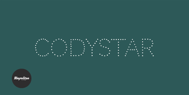
Codystar Font
As you stroll down Manhattan streets and through Times Square, look all around you at the sizzling lights! Sparkling. Brilliant. Codystar. The Pro version has been expanded and enhanced with more characters, dynamic OpenType ligatures and more! Published by NeapolitanDownload

LTC Tourist Gothic Font
Tourist Gothic is a Lanston Monotype adaptation of Modern Condensed Gothic (a design from the late 1800s.) Rounded alternate caps were designed by Sol Hess in 1928. The alternate version is offered as LTC Tourist Gothic Alt. Tourist Gothic Pro
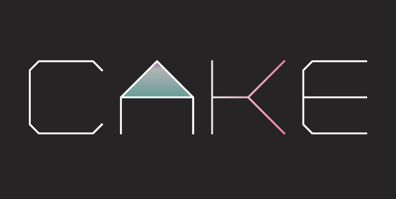
YWFT Formation Font
Influenced by an appreciation for Ed Ruscha and AutoCAD, YWFT Formation is an extensive typeface design that takes those principles and applies them in a unique way. Despite having a machine-like, masculine slickness on the surface, YWFT Formation can also
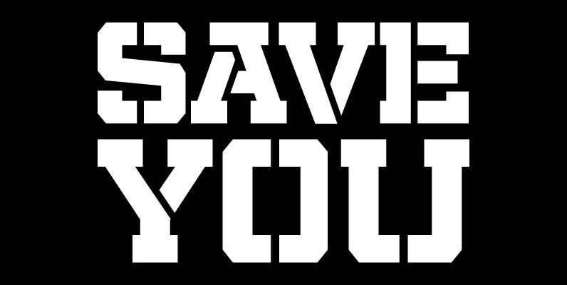
Militia Font
Militia is the face of well-orchestrated military coups, tanks and gun barrels, maps and covert plans, camouflage and war paint. It has no irony, patience, or give-and-take politic. It is strong, successful, swift and significantly in your face. Militia comes

Robotik Font
This slab serif Egyptian typeface follows the trend for simple, mechanically constructed typefaces and is an ideal choice for communicating a feeling of precision and strength. Robotik is equally effective when set with normal or wide letter and word spacing.

LTC Squareface Font
Designed by Sol Hess in 1940 as a variation of Stymie Extrabold, but with squared corners where round shapes would normally be. This striking display face is found in only some Lanston Monotype catalogs and specimens are somewhat hard to
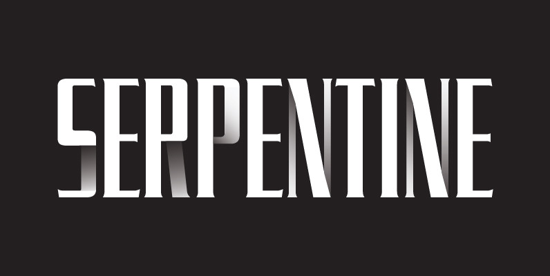
Serpentine Font
Designed by Dick Jensen in 1972, Serpentine is a glyphic sans font design. Serpentine is a font design owned by Linotype. Published by URW Type Foundry GmbHDownload Serpentine
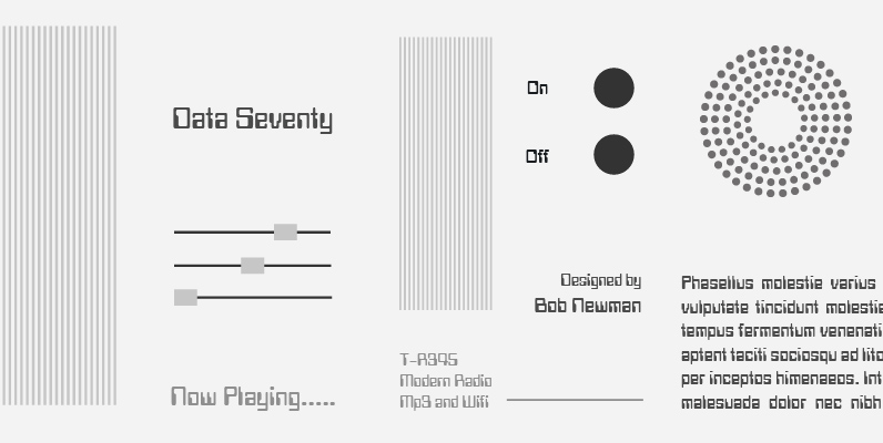
Data 70 Font
This high-tech typeface simulates output generated by computers. Data 70 is equally effective set in capitals or lowercase where the strong geometric shapes create a futuristic sense of the space age. Designed in the Type Studio by British artist Bob
