Tag: masculine
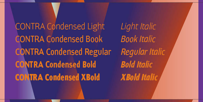
Contra Condensed Font
Contra Condensed is the condensed version of my Contra family of fonts. It is very condensed, but not yet narrow. It is well suited in all situations where one needs to save space. Published by Wiescher DesignDownload Contra Condensed
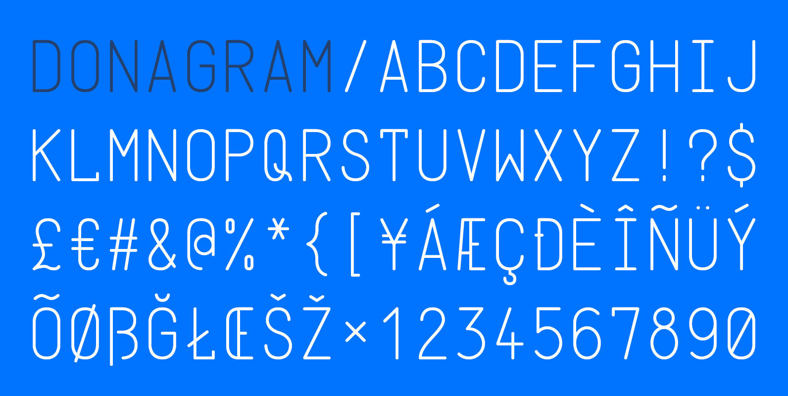
Donagram Font
Donagram is a typeface inspired by telegrams from the 1940s. Available in three weights, it’s roots are in the functional usage of the telegraph machine. Donagram has been developed into a modern, clean and elegant typeface. Published by AtworkDownload Donagram
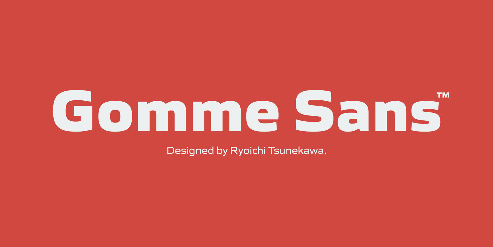
Gomme Sans Font
Gomme Sans is a wide and masculine sans-serif family for text designed by Ryoichi Tsunekawa and the whole family consists of 6 weights from ExtraLight to ExtraBold and their matching Italics. The basic concept of this family is not only
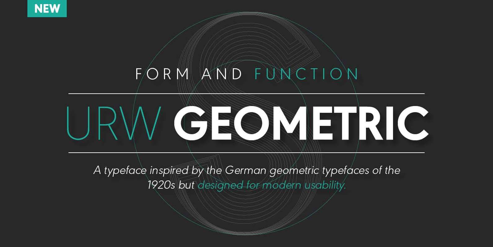
URW Geometric Font
URW Geometric is a sans serif typeface inspired by the German geometric typefaces of the 1920s but designed for modern usability. The character shapes have optimized proportions and an improved balance, the x-height is increased, ascenders and descenders are decreased.
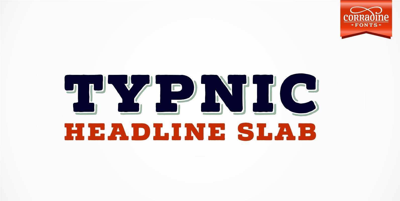
Typnic Headline Slab Font
Everybody likes to have a picnic: some fresh fruits, cheese, ham, wine and so on. Like a “typographic picnic”, Typnic font system gather many fonts with different flavors too, and you can enjoy them mixed or on their own. Typnic
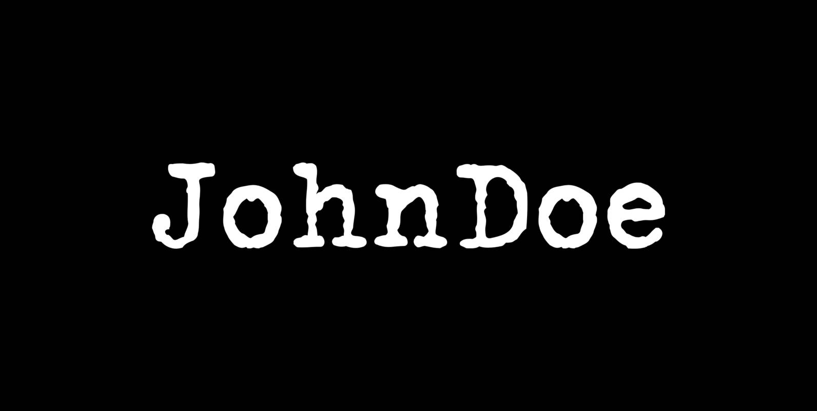
John Doe Font
John Doe is a font design published by Fonthead. Published by Fonthead Design Inc.Download John Doe

Solitas Slab Font
Slab serif, meet the curves of Solitas. The new slab sister of Insigne’s successful Solitas family will turn your head with its soft, but distinct look. Solitas Slab defies the typical feel of the robust slab category with her more
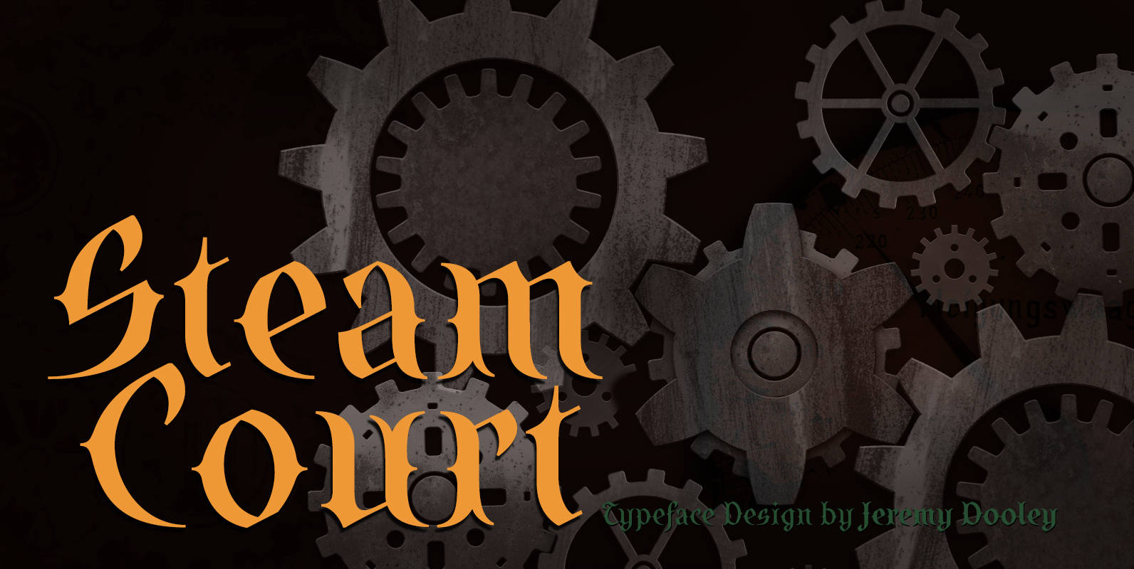
SteamCourt Font
A bit of background if you will: In early 2014, some friends from my college days banded together to form their own game company. Their first launch? A current Kickstarter they named SteamCourt. I love Kickstarter. It’s a fantastic platform,
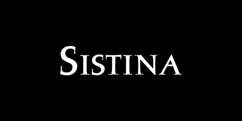
Sistina Font
Sistina, designed by Hermann Zapf in 1950 was first named Aurelia Titling. It is a heavy supplement to the Michelangelo Titling based on studies of inscriptions in Rome. First released in hotmetal at D. Stempel AG, Frankfurt in 1951, Sistina
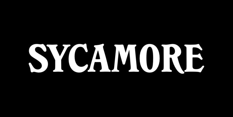
Sycamore Font
Designed by Les Usherwood, Sycamore was digitally engineered by Steve Jackaman. Published by Red RoosterDownload Sycamore
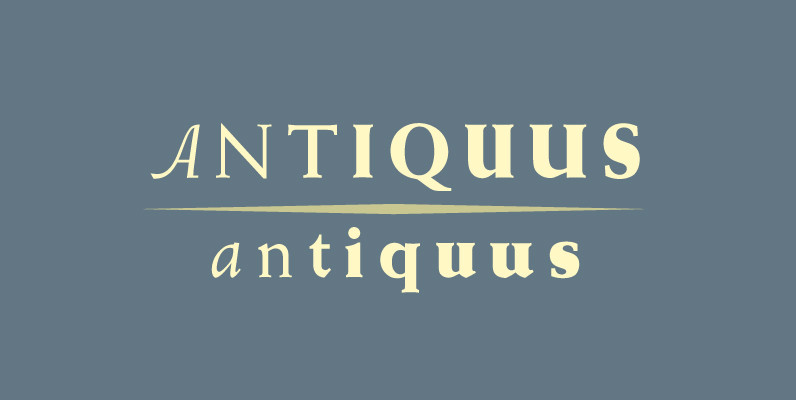
Weiss Antiqua Font
In 1928 Emil Rudolf Weiss designed Weiss Antiqua, a classic and and versatile serif design. Use this design in a wide range of projects, great for the design toolbox. Published by URW Type Foundry GmbHDownload Weiss Antiqua
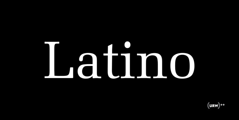
URW Latino Font
Designed by Hermann Zapf in 1990, URW Latino is an antique, heavy and slab-like serif. Latino contains a very classic and elegant feel, works great for important and high end design projects. Published by URW Type Foundry GmbHDownload URW Latino

Seagull Font
Designed by Adrian Williams & Bob McGrath in 1978, Seagull is a simple, smooth and elegant slab-seerif style font design. Published by URW Type Foundry GmbHDownload Seagull
